
Categories
- 3d CGI
- Amusements
- Animation
- Anime & Manga
- Art Materials
- Art Videos
- Blogroll
- Cartoons
- Color
- Comics
- Concept & Visual Dev.
- Creativity
- Digital Art
- Digital Painting
- Displaying Art on the Web
- Drawing
- Eye Candy for Today
- Gallery and Museum Art
- High-res Art Images
- Illustration
- Motion Graphics & Flash
- Museums
- Online Museums
- Outsider Art
- Painting
- Painting a Day
- Paleo Art
- Pastel, Conté & Chalk
- Pen & Ink
- Prints and Printmaking
- Reviews
- Sc-fi and Fantasy
- Sculpture & Dimensional
- Site Comments
- Sketching
- Storyboards
- Tools and Techniques
- Uncategorized
- Vector Art
- Videos & Podcasts
- Vision and Optics
- Watercolor and Gouache
- Webcomics
Archives
- April 2026
- March 2026
- February 2026
- January 2026
- December 2025
- November 2025
- October 2025
- September 2025
- August 2025
- July 2025
- June 2025
- May 2025
- January 2025
- December 2024
- November 2024
- October 2024
- September 2024
- August 2024
- June 2024
- April 2024
- March 2024
- February 2024
- January 2024
- December 2023
- November 2023
- October 2023
- September 2023
- August 2023
- July 2023
- May 2023
- April 2023
- March 2023
- February 2023
- January 2023
- December 2022
- November 2022
- September 2022
- August 2022
- July 2022
- June 2022
- May 2022
- April 2022
- March 2022
- February 2022
- January 2022
- December 2021
- November 2021
- October 2021
- September 2021
- August 2021
- July 2021
- June 2021
- May 2021
- April 2021
- March 2021
- February 2021
- January 2021
- December 2020
- November 2020
- October 2020
- September 2020
- August 2020
- July 2020
- June 2020
- May 2020
- April 2020
- March 2020
- February 2020
- January 2020
- December 2019
- November 2019
- October 2019
- September 2019
- August 2019
- July 2019
- June 2019
- May 2019
- April 2019
- March 2019
- February 2019
- January 2019
- December 2018
- November 2018
- October 2018
- September 2018
- August 2018
- July 2018
- June 2018
- May 2018
- April 2018
- March 2018
- February 2018
- January 2018
- December 2017
- November 2017
- October 2017
- September 2017
- August 2017
- July 2017
- June 2017
- May 2017
- April 2017
- March 2017
- February 2017
- January 2017
- December 2016
- November 2016
- October 2016
- September 2016
- August 2016
- July 2016
- June 2016
- May 2016
- April 2016
- March 2016
- February 2016
- January 2016
- December 2015
- November 2015
- October 2015
- September 2015
- August 2015
- July 2015
- June 2015
- May 2015
- April 2015
- March 2015
- February 2015
- January 2015
- December 2014
- November 2014
- October 2014
- September 2014
- August 2014
- July 2014
- June 2014
- May 2014
- April 2014
- March 2014
- February 2014
- January 2014
- December 2013
- November 2013
- October 2013
- September 2013
- August 2013
- July 2013
- June 2013
- May 2013
- April 2013
- March 2013
- February 2013
- January 2013
- December 2012
- November 2012
- October 2012
- September 2012
- August 2012
- July 2012
- June 2012
- May 2012
- April 2012
- March 2012
- February 2012
- January 2012
- December 2011
- November 2011
- October 2011
- September 2011
- August 2011
- July 2011
- June 2011
- May 2011
- April 2011
- March 2011
- February 2011
- January 2011
- December 2010
- November 2010
- October 2010
- September 2010
- August 2010
- July 2010
- June 2010
- May 2010
- April 2010
- March 2010
- February 2010
- January 2010
- December 2009
- November 2009
- October 2009
- September 2009
- August 2009
- July 2009
- June 2009
- May 2009
- April 2009
- March 2009
- February 2009
- January 2009
- December 2008
- November 2008
- October 2008
- September 2008
- August 2008
- July 2008
- June 2008
- May 2008
- April 2008
- March 2008
- February 2008
- January 2008
- December 2007
- November 2007
- October 2007
- September 2007
- August 2007
- July 2007
- June 2007
- May 2007
- April 2007
- March 2007
- February 2007
- January 2007
- December 2006
- November 2006
- October 2006
- September 2006
- August 2006
- July 2006
- June 2006
- May 2006
- April 2006
- March 2006
- February 2006
- January 2006
- December 2005
- November 2005
- October 2005
- September 2005
- August 2005
Relevant Blogs
Art, Painting & Sketch
- Gurney Journey
- Underpaintings
- Art and Influence
- Painting Perceptions
- Oil Painters of America
- Vasari Paint POV
- Flying Fox
- Urban Sketchers
- Bento (Smithsonian)
- Art Inconnu
- The Hidden Place
- Still Life
- Making a Mark
- The Art of the Landscape
- Exploring Color & Creativity
- Art Contrarian
- Artist A Day
- beinArt Surreal Art Collective
- Eye Level
- David Dunlop
- p.i.g.m.e.n.t.i.u.m
- CultureGrrl
- Joaquín Sorolla blog
- Artists in Pastel
“Painting a Day”
- A Painting a Day (Keiser)
- On Painting (Keiser)
- Julian Merrow-Smith
- Karen Jurick
- Jeffrey Hayes
- Carol Marine
- Abbey Ryan
- Daily Paintworks
Other Painting Blogs
- Virtual Gouache Land
- Neil Hollingsworth
- Marc Hanson
- Kevin Menck
- Marc Dalessio
- Larry Seiler
- Stapleton Kearns
- Colin Page
- Roos Schuring
- Hans Versfelt
- Titus Meeuws
- Régis Pettinari
- René Plein Air
- Belinda Del Pesco
- Robin Weiss
- Nathan Fowkes (Land Sketch)
- William Wray
- Frank Serrano
- Stephen Magsig
- Michael Chesley Johnson
- Twice a Week
- Sarah Wimperis
- Rob Adams
- Michael Cole Manley
- The Dirty Palette Club
- Mike Manley’s Draw!
Gallery Art & Illustration mix
Illustration
- Howard Pyle
- 100 Years of Illustration
- BibliOdyssey
- Illustration Art
- Today’s Inspiration
- Illustration Mundo
- Little Chimp Society
- Danny Gregory
- R D (John Martz
- Illustration Friday blog
- Monster Brains
- Illustrators & Illustrations (RU)
- Elwood H. Smith
- DaniDraws.com
- Designers Who Blog
- iSpot Blog
Sci-Fi & Fantasy
Illustration & Comics
Comics & Cartoons
- Comics Beat
- Robot 6
- Newsarama Blog
- Comic Vine
- Comics Alliance
- Forbidden Planet Int.
- Paolo Rivera
- Bolt City
- Flight
- Scott McCloud
- The Comics Journal
- Comixpedia
- Funnybook Babylon
- James Baker
- Middleton’s Sketchbook
- Boneville
- The Hotel Fred
- Paul Rivoche
- Daily Cartoonist
- Mad About Cartoons (William Wray)
- Digital Strips
Illustration & Concept
Animation & Concept
- Cartoon Brew
- Animation Blog
- Cold Hard Flash
- Concept Art World
- The CAB
- FY Concept Art
- Concept Ships
- Concept Robots
- John Nevarez
- Armand Serrano
- Marcos Mateu-Mestre
- all kinds of stuff (Kricfalusi)
- Yacin the faun (Man Arenas)
- Kelsey Mann
- Cre8tivemarks Blog
- Ice-Cream Monster Toon Cafe
- AAU Character & Creature Design
- AAU Animation Notes
- Articles and Texticles
Paleo & Scientific
Tools & Techniques
Other
Lists of Art Blogs
Art Image Resource Links
Historic Art Images
- Wikimedia Commons: Paintings
- Wikimedia Commons: Drawings
- The Athenaeum
- WikiArt (WikiPaintings)
- Google Art Project: Artists
- Google Art Project: Collections (Museums)
- ArtCyclopedia
- Web Gallery of Art
- Art Renewal Center
- Web Gallery of Impressionism
Auction Consolidation sites
Auction sites
- Sotheby’s
- Bonham’s
- Christies
- Heritage Auctions: Fine Art
- Heritage Auctions: Illustration
- Freeman’s Auctions
- Bukowskis
- Shannon’s
Image Search
Reverse Image Search (search by image)
- Tin Eye
- RevImg
- Google Image Search (camera icon)
- Bing Image Search (camera icon)
Promoting some friends and some clients of my website design business
- Twin Willows T’ai Chi studio in Wilmington DE. Taiji classes with Bryan Davis.
- Ray Hayward, Inspired Teacher of T’ai Chi ( Taiji ) in Minneapolis, Founder of Mindful Motion Tai Chi Academy
- OldHead Tattoo studio and Art Gallery in Wilmington DE. Tattoos and paintings by Bruce Gulick
- Sharon Domenico Art, pet portrait oil paintings
- Platinum Paperhanging, wallpaper hanging, Main Line and Philadelphia, PA
- Lisa Stone Design, interior designer, Main Line and Philadelphia, PA
- Studio12KPT, original art, prints, calendars and other custom printed items by Van Sickle & Rolleri
-
Gustav Tenggren in Illustration 21
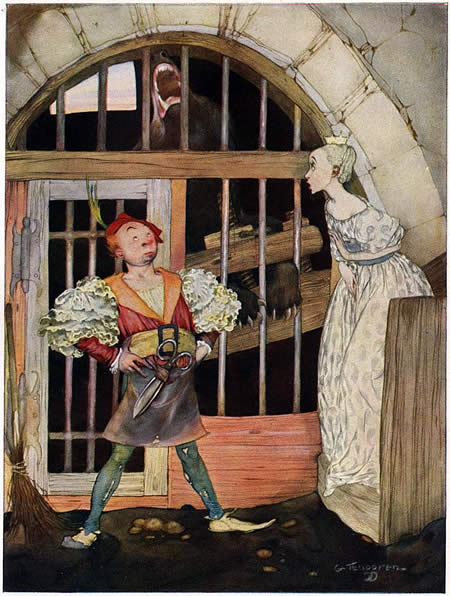
I wrote about Gustav Tenngren back in June. Like his countryman John Bauer, Tenggren was a wonderful and underappreciated Swedish illustrator who worked in the dark Art-Nouveau inspired style more commonly associated with Arthur Rackham, Edmund Dulac and Kay Neilsen.If your only exposure to Tenggren is his later style, as exemplified by his work on The Poky Little Puppy and similar books, you may find his earlier style quite surprising. Personally, I’m much more enthusiastic about his early style, with its dark mysteries, haunted forests, intense characters, beautiful linework and wonderfully subtle color.
The new issue (#21) of Illustration magazine focuses on a feature article about Tenggren, and covers both phases of his career, though the emphasis is on the fascinating early work. Illustration has done their usual remarkable job of finding superb examples of the artist’s work, often pieces that are difficult to find elsewhere, and printing them beautifully.
I’ve also written about Illustration magazine before (also here), and I now get to tell you “I told you so”, and you should have subscribed when I mentioned it because the price has gone up from the absurdly low $10 per issue to $15, still inexpensive for great classic illustrations printed this well.
This issue also includes articles about the Al Parker exhibit that was recently at the Norman Rockwell Museum, and Barbara Bradley of the Cooper Studio.
You can view thumbnails of the entire issue on the Illustration site, and you can still also preview thumbnails for the previous issue and its extended article on Andrew Loomis.
For more information and links related to Gustav Tenggren, see my previous post.
Categories:
-
Amulet, Book One: The Stonekeeper

Kazu Kibuishi, who I have mentioned before, both in reference to his wonderful online comic Copper (also here), and as the primary force behind the Flight comics anthologies, has been hard at work for the last two years on a graphic novel project that has finally been released.Amulet, Book One: The Stonekeeper is the first volume of a larger, three volume project (though it reads well as a story in itself).
The story is a fantasy adventure in which two siblings, an older sister and younger brother, must rescue their mother from deadly peril. It is something of a coming of age story in that they have the ability to take actions and effect events, but must take responsibility as well.
In it, Kibuishi combines some themes he has favored in his work on Copper and his longer pieces in Flight — the viewpoint of children, the visual textures of elements of the natural world like rocks and water, fanciful imaginative vistas, atmospheric color and eccentric flying machines.
I won’t describe it in too much detail because I enjoyed the little surprises I encountered in the story and I don’t want to deny you the same.
One of the most interesting aspects of the book, though, is the way Kibuishi has chosen to create his narrative.
You’ll find no panel-length word balloons with characters expounding on back-story or setup, no caption panels, no pages of exposition; everything is shown graphically, cinematically.
Many sequences are presented wordlessly, or almost so, relying on the flow of sequenced images to convey the narrative. This is where a comics artist’s skills as a visual storyteller are tested, and Kibuishi shows that he has studied some of the masters, probably both in comics and in film, where many of the same problems must be resolved. In both the set up and handling of the story you can see the influence of Anime masters like Hayao Miyazaki.
The drawings of the characters in Amulet are simplified, almost cartoonish; delineated with thin, single-weight outlines, and filled with areas of flat color or gentle gradations. Again, this is very like Anime, but without the slavish projection of Anime’s exaggerated stylizations to which so many young comics artists are inordinately prone.
The panel backgrounds in Amulet are often more implied that realized, with muted suggestions of detail overlayed with gradients of textured color. The exceptions are the dramatic establishing panels where the details of the background are important. There, of course, Kibuishi has a chance to show off his fertile imagination, in both fantasy and “real world” settings that are rich with texture and detail.
Throughout, his linework is controlled but retains a casual feeling; lines that accidentally cross another form or a panel border, and would normally be corrected, are left in place; nothing is ruled; even the panel borders are rough edged. Overall, the line, color and visual tone of the drawings are perfectly suited to the story.
One of the decisions about the presentation of this story that I’m not so fond of is the size of the book. The paperback edition is about 6×9″ (15x23cm), somewhat smaller than traditional comic book/graphic novel size. The book reads fine at that size, but I just prefer the larger canvas (which is why I really like the European graphic album format which is over twice the size of this volume).
The book is published by Scholastic, and this is the same format as their color editions of Jeff Smith’s Bone. In both cases it may be a compromise to keep the price of a 200 page color graphic novel down to under $10; which, for work of this caliber, is a tremendous bargain.
Kibuishi has created a page devoted to Amulet, in which he collects many of the posts from his Bolt City blog that have chronicled his work on the book; although, like many comics authors and artists, he has been so close to the project that he has neglected to include introductory information for newcomers.
As a better introduction, there is a 12 page excerpt from the beginning of the story (non-spoiler) on the New York magazine web site (who now has a terrific regular practice of excerpting recent graphic novels on their Comics Page). There is also an interview with Kibuishi about the project on Newsarama.
Categories:
-
National Geographic: The Art of Exploration
I’ve made the mistake in the past of putting off writing about an exhibition that I plan to go to in the hope of writing a first person account; and as a result wind up telling you about the show just as it’s about to close. I won’t do that this time.National Geographic: The Art of Exploration, an exhibition of some of the amazing art collected by the magazine in its more than 100 year history, has already had a run at the Norman Rockwell Museum, where it originated and was curated. It is now a traveling exhibit and it opens at the Allentown Art Museum in Pennsylvania this Sunday, January 27, 2008, and runs through May 25.
National Geographic, a magazine noted for its stunning photography, also has a long history of hiring some of the nation’s best illustrators to portray what the camera cannot, whether peering into the mitochondria of a cell, reaching out into the depths of space, looking over the shoulders of participants in historic events or penetrating the mists of prehistory.
Some of the best examples of that art, over 100 works, have been selected from the thousands of pieces in the magazine’s archives and arranged in an exhibit that spans not only the history of National Geographic, but the history of civilization and history of the natural world; not to mention the history of 20th Century illustration.
The exhibit features work by artists like N.C Wyeth (above, top), Andrew Wyeth, Charles R. Knight, Tom Lovell (see yesterday’s post), Michael Parfit (above, middle left), Ned Seidler (above, bottom,left), Kinuko Y. Craft, John Gurche, John Sibbick, Jack Unruh, Jean-Leon Huens, Robert McCall, Pierre Mion, Paul Calle, Robert Addison, Vincent DiFate, Noel Siclkles, Burton Silverman, Thornton Oakley and many others. Some are pieces commissioned by the magazine and others are simply drawn from the magazine’s extensive collection.
Among the artists represented is James Gurney, the author/artist of the beautifully illustrated Dinotopia series (see my posts about Gurney here, here and here), who will be making a personal appearance at the Allentown Art Museum in conjunction with the exhibit on March 9 from 12-4pm.
Gurney has several pieces in the exhibition, including the dramatic portrayal of the Argentinian dinosaur Giganotosaurus shown above, bottom right, which accompanied the article Uncovering Patagonia’s Lost World for the December 1997 issue of the magazine.
Gurney is featuring a piece about the making of this painting today on his always-fascinating art blog Gurney Journey.
The Allentown Art Museum is at 31 North 5th Street in Allentown, PA. Allentown is about 35 miles Northwest of Philadelphia, and less than an hours drive from there via the PA Turnpike extension. Here is an article from the local paper about the show: Magazine’s images a feast for curious eyes, and another with a list of related events.
Also see Irene Gallo’s post on The Art Department.
Categories:
-
Tom Lovell

Art can be a time machine, transporting us backward not only with paintings that have survived from the past, but with reconstructions of the past by contemporary artists.Tom Lovell considered himself “…a storyteller with a brush, a custodian of the past.” Best know as one of the premiere painters of the historical American West, he also created a famous series of paintings of the battles and events of the American Civil War for Life magazine, commemorating the centennial of the war’s end. He also painted other works depicting events from the Civil War, including the painting above, for National Geographic magazine.
Lovell was born in New York and his childhood fascination with the American Indian was fueled by visits to the collections in the Museum of Natural History where he would spend hours sketching the exhibits.
Armed with a fine arts degree from Syracuse University, he became an illustrator for pulp magazines like The Shadow and Wild West Weekly, eventually moving up to better paying assignments for mainstream magazines like Colliers, Cosmopolitan, Time, Life, National Geographic, and others.
In 1944 Lovell enlisted in the U.S. Marines, with the intention of becoming a combat artist, but was instead assigned to Leatherneck Magazine.
In the 1970’s Lovell was commissioned to paint a series of historical paintings portraying events in the Permian Basin in Western Texas for the Abell-Hanger Foundation. These are in the collection of The Petroleum Museum in Midland, Texas.
Lovell has also painted other historical scenes; here is a page with a pencil drawing, color rough and finished painting for The Battle of Hastings.
Lovell remains a very popular Western and historic artist and you will find prints of his work on many of the commercial print services, as well as limited edition prints.
The Art of Tom Lovell: An Invitation to History and Tom Lovell : Storyteller with a Brush are both out of print, but can be found used.
Lovell’s paintings are richly colored, often dramatically composed and filled with the kind of visual textures, details and touches that make a historical scene feel alive.
One of Lovell’s notable illustration clients was National Geographic magazine. Among his commissioned works for the magazine was the painting shown here, Surrender at Appomaomattox, in which the Civil War came to its official end.
This painting is part of a collection of paintings from the National Geographic Archives that will be on display at the Allentown Art Museum in Pennsylvania starting this weekend (more information about that exhibition in tomorrow’s post).
In this image, Lovell’s use of rough scumbling for textures of the walls is in marked contrast to the refined handling of the faces, which are rich with subtle colors.
What strikes me about this painting in particular is the composition. Lee and his military secretary are awash with light in the foreground, appearing dignified and gentlemanly as Lee signs the surrender papers, and commanding the generous space around them. Almost pushed into the corner, Grant and his Union brass form a dark mass in the background. Grant is seated a much less imposing table (perhaps this is historically accurate, I don’t know) and seems to have a troubled expression on his face, as if worried that Lee might change his mind at any second. The other Union officers seem likewise impatient. I don’t know anything about Lovell’s feelings about the role of the two factions in the Civil War; it’s just… interesting.
The interpretation of the past, whether in words or painted images, requires a point of view.
Categories:
-
Mian Situ

Mian Situ is a Chinese-American painter who was born in Guangdong (Canton), where he trained in a realist European style. I learned from his bio that this style was introduced to China from Russia as Socialist Realism, an inheritor of the 19th Century European Academic painting traditions that flourished in Russia under the Czars.Situ has tempered that realism with the influence of his ventures into California plein air painting, producing a blend of influences similar in approach to some of the more Academic-leaning American Impressionists, basically a painterly realism. Somehow looking through his work brings to my mind such seemingly diverse painters as William Merrit Chase, Sergi Bongart, Sargent, Sorolla and Daniel Ridgeway Knight.
Situ traveled extensively in his home province in China, studying and documenting the day-do-day look and feeling of life, traditional ways of dress and the visual texture of the time and place, which he understood was rapidly changing.
He has also made a study of the first wave of Chinese immigration to the U.S., particularly in the Chinese communities of San Francisco at the turn of the last century. This is largely the subject matter you will find in the Historical Works section of his web site. The story-telling component of these paintings give them some of the visual charm and emotional appeal of classic illustration, combined with the wonderful textures of the streets, buildings, and clothing that were present in that rough-edged time.
Situ’s fascination with the American West has carried over into his landscape paintings, which are more straightforwardly modern, but still painted with that crisp combination of realism and painterly brushwork.
It is in his Figurative Works that you will find all of these influences coming together, with images from the historical and contemporary American West and the rural communities of China; images that tell stories with dress, location, and most of all, with the emotive faces of the individuals he portrays.
It’s interesting in particular to watch what Situ does with value relationships. Many of his paintings are bathed in light and shadow, or accentuated with sharp value contrasts between shadows and brightly colored or white garments. In many others, however, he keeps his values restrained within a narrow range, for a very different visual and emotional feel.
Categories:
-
Donato Giancola (update)

There are a number of science fiction and fantasy artists who will acknowledge their study of old master painting techniques and tell how it has influenced their work; there are few, however, whose work demonstrates that heritage as visibly as Donato Giancola.Giancola is one of the finest science fiction and fantasy artists working in the field today, and to my mind, one of the best in the history of the genre. His extensive list of honors and awards, including multiple Chesley’s, Spectrum Gold and Silver Medals, World Fantasy Awards for Best Artist, the 2006 and 2007 Hugo Awards for Best Professional Artist, First Place in the Figurative category of the First International Art Renewal Center Open Salon and recognition in this year’s ARC event, indicates that not only do his contemporary artists and editors agree, but he is receiving notice in realist art circles at large. And well he should; Giancola is a terrific painter by any standard.
When I first wrote about Donato Giancola back in 2005, his web site was fairly well developed, but since then it has been expanded considerably, even if the appearance of the site hasn’t changed a great deal.
Giancola has added many new and larger images, and some paintings are accompanied by supplementary images of preliminary drawings, painted sketches and even works in progress on the easel.
Giancola’s excellent draftsmanship, graceful compositions and dramatic but refined use of color make his work a joy to look at. His blending and application of color in particular is exceptional, both in the overall composition and within the detailed rendering of individual subjects, particularly in in the portrayal of figures and faces. There his use of greens and multiple red hues give the sense of the varied and veinous character of caucasian skin found in Renaissance and Baroque painting.
He wears some of his other classical influences on his sleeve as well. His figures are painted with a chiaroscuro and drama inspired by Caravaggio and color and dynamism inherited from a study of Rubens. Some of his historical images reflect the influence of great illustrators like Howard Pyle and N.C. Wyeth. Most of all, though, Giancola seems enthralled with the painting mastery of Valezquez. (If you’re going to learn, learn from the best.)
Whether painting gleaming robots, intricate spaceship cockpits, towering dragons or armored warriors, Giancola’s study of old master painting gives his wildly imaginative fantasy and science fiction subjects a force and gravitas that is uncommon not only for the genre, but in contemporary illustration in general.
His site includes extensive galleries of science fiction and fantasy illustration, work done for the Magic: The Gathering collectable card game and a selection of concept art as well as a section of very nice life drawings. Unfortunately the latter two are hampered by one those annoying navigation schemes that require you to hover your mouse over little squares to view the images instead of simply clicking on them; but hey, I’ll take whatever Giancola art I can get.
The site also includes a section on technique that includes a discussion of his palette, a brief step-through of the editorial illustration process, a discussion of influences and a few step-through painting sequences (again with the roll-over dots navigation, but I’m picking nits).
In addition there is a Bio, a FAQ and a section of books, prints, card proofs and original art for sale.
The News section indicates that Giancola will be participating, along with Dan Dos Santos, Julie Bell, Boris Vallejo, Scott Fisher, Rebecca Guay and Greg Manchess, in a week-long Illustration Master Class to be held in Amherst, MA from June 16-22, 2008. (If you’re interested, act soon; attendance is limited to 90.) Special guest for the event will be Tor/Forge/Starscape Books art director extraordinaire Irene Gallo, whose informative and fascinating blog The Art Department features several mentions of Giancola.
Categories:


Charley’s Picks
Bookshop.org
(Bookshop.org affilliate links; sales benefit independent bookshop owners; I get a small percentage to help support my work on Lines and Colors)

John Singer Sargent: Watercolors


Urban Sketching: Understanding Perspective


Charley’s Picks
Amazon
(Amazon.com affiliate links; sales go to a larger yacht for Jeff Bezos; but I get a small percentage to help support my work on Lines and Colors)
John Singer Sargent: Watercolors
Urban Sketching: Understanding Perspective