
Categories
- 3d CGI
- Amusements
- Animation
- Anime & Manga
- Art Materials
- Art Videos
- Blogroll
- Cartoons
- Color
- Comics
- Concept & Visual Dev.
- Creativity
- Digital Art
- Digital Painting
- Displaying Art on the Web
- Drawing
- Eye Candy for Today
- Gallery and Museum Art
- High-res Art Images
- Illustration
- Motion Graphics & Flash
- Museums
- Online Museums
- Outsider Art
- Painting
- Painting a Day
- Paleo Art
- Pastel, Conté & Chalk
- Pen & Ink
- Prints and Printmaking
- Reviews
- Sc-fi and Fantasy
- Sculpture & Dimensional
- Site Comments
- Sketching
- Storyboards
- Tools and Techniques
- Uncategorized
- Vector Art
- Videos & Podcasts
- Vision and Optics
- Watercolor and Gouache
- Webcomics
Archives
- April 2026
- March 2026
- February 2026
- January 2026
- December 2025
- November 2025
- October 2025
- September 2025
- August 2025
- July 2025
- June 2025
- May 2025
- January 2025
- December 2024
- November 2024
- October 2024
- September 2024
- August 2024
- June 2024
- April 2024
- March 2024
- February 2024
- January 2024
- December 2023
- November 2023
- October 2023
- September 2023
- August 2023
- July 2023
- May 2023
- April 2023
- March 2023
- February 2023
- January 2023
- December 2022
- November 2022
- September 2022
- August 2022
- July 2022
- June 2022
- May 2022
- April 2022
- March 2022
- February 2022
- January 2022
- December 2021
- November 2021
- October 2021
- September 2021
- August 2021
- July 2021
- June 2021
- May 2021
- April 2021
- March 2021
- February 2021
- January 2021
- December 2020
- November 2020
- October 2020
- September 2020
- August 2020
- July 2020
- June 2020
- May 2020
- April 2020
- March 2020
- February 2020
- January 2020
- December 2019
- November 2019
- October 2019
- September 2019
- August 2019
- July 2019
- June 2019
- May 2019
- April 2019
- March 2019
- February 2019
- January 2019
- December 2018
- November 2018
- October 2018
- September 2018
- August 2018
- July 2018
- June 2018
- May 2018
- April 2018
- March 2018
- February 2018
- January 2018
- December 2017
- November 2017
- October 2017
- September 2017
- August 2017
- July 2017
- June 2017
- May 2017
- April 2017
- March 2017
- February 2017
- January 2017
- December 2016
- November 2016
- October 2016
- September 2016
- August 2016
- July 2016
- June 2016
- May 2016
- April 2016
- March 2016
- February 2016
- January 2016
- December 2015
- November 2015
- October 2015
- September 2015
- August 2015
- July 2015
- June 2015
- May 2015
- April 2015
- March 2015
- February 2015
- January 2015
- December 2014
- November 2014
- October 2014
- September 2014
- August 2014
- July 2014
- June 2014
- May 2014
- April 2014
- March 2014
- February 2014
- January 2014
- December 2013
- November 2013
- October 2013
- September 2013
- August 2013
- July 2013
- June 2013
- May 2013
- April 2013
- March 2013
- February 2013
- January 2013
- December 2012
- November 2012
- October 2012
- September 2012
- August 2012
- July 2012
- June 2012
- May 2012
- April 2012
- March 2012
- February 2012
- January 2012
- December 2011
- November 2011
- October 2011
- September 2011
- August 2011
- July 2011
- June 2011
- May 2011
- April 2011
- March 2011
- February 2011
- January 2011
- December 2010
- November 2010
- October 2010
- September 2010
- August 2010
- July 2010
- June 2010
- May 2010
- April 2010
- March 2010
- February 2010
- January 2010
- December 2009
- November 2009
- October 2009
- September 2009
- August 2009
- July 2009
- June 2009
- May 2009
- April 2009
- March 2009
- February 2009
- January 2009
- December 2008
- November 2008
- October 2008
- September 2008
- August 2008
- July 2008
- June 2008
- May 2008
- April 2008
- March 2008
- February 2008
- January 2008
- December 2007
- November 2007
- October 2007
- September 2007
- August 2007
- July 2007
- June 2007
- May 2007
- April 2007
- March 2007
- February 2007
- January 2007
- December 2006
- November 2006
- October 2006
- September 2006
- August 2006
- July 2006
- June 2006
- May 2006
- April 2006
- March 2006
- February 2006
- January 2006
- December 2005
- November 2005
- October 2005
- September 2005
- August 2005
Relevant Blogs
Art, Painting & Sketch
- Gurney Journey
- Underpaintings
- Art and Influence
- Painting Perceptions
- Oil Painters of America
- Vasari Paint POV
- Flying Fox
- Urban Sketchers
- Bento (Smithsonian)
- Art Inconnu
- The Hidden Place
- Still Life
- Making a Mark
- The Art of the Landscape
- Exploring Color & Creativity
- Art Contrarian
- Artist A Day
- beinArt Surreal Art Collective
- Eye Level
- David Dunlop
- p.i.g.m.e.n.t.i.u.m
- CultureGrrl
- Joaquín Sorolla blog
- Artists in Pastel
“Painting a Day”
- A Painting a Day (Keiser)
- On Painting (Keiser)
- Julian Merrow-Smith
- Karen Jurick
- Jeffrey Hayes
- Carol Marine
- Abbey Ryan
- Daily Paintworks
Other Painting Blogs
- Virtual Gouache Land
- Neil Hollingsworth
- Marc Hanson
- Kevin Menck
- Marc Dalessio
- Larry Seiler
- Stapleton Kearns
- Colin Page
- Roos Schuring
- Hans Versfelt
- Titus Meeuws
- Régis Pettinari
- René Plein Air
- Belinda Del Pesco
- Robin Weiss
- Nathan Fowkes (Land Sketch)
- William Wray
- Frank Serrano
- Stephen Magsig
- Michael Chesley Johnson
- Twice a Week
- Sarah Wimperis
- Rob Adams
- Michael Cole Manley
- The Dirty Palette Club
- Mike Manley’s Draw!
Gallery Art & Illustration mix
Illustration
- Howard Pyle
- 100 Years of Illustration
- BibliOdyssey
- Illustration Art
- Today’s Inspiration
- Illustration Mundo
- Little Chimp Society
- Danny Gregory
- R D (John Martz
- Illustration Friday blog
- Monster Brains
- Illustrators & Illustrations (RU)
- Elwood H. Smith
- DaniDraws.com
- Designers Who Blog
- iSpot Blog
Sci-Fi & Fantasy
Illustration & Comics
Comics & Cartoons
- Comics Beat
- Robot 6
- Newsarama Blog
- Comic Vine
- Comics Alliance
- Forbidden Planet Int.
- Paolo Rivera
- Bolt City
- Flight
- Scott McCloud
- The Comics Journal
- Comixpedia
- Funnybook Babylon
- James Baker
- Middleton’s Sketchbook
- Boneville
- The Hotel Fred
- Paul Rivoche
- Daily Cartoonist
- Mad About Cartoons (William Wray)
- Digital Strips
Illustration & Concept
Animation & Concept
- Cartoon Brew
- Animation Blog
- Cold Hard Flash
- Concept Art World
- The CAB
- FY Concept Art
- Concept Ships
- Concept Robots
- John Nevarez
- Armand Serrano
- Marcos Mateu-Mestre
- all kinds of stuff (Kricfalusi)
- Yacin the faun (Man Arenas)
- Kelsey Mann
- Cre8tivemarks Blog
- Ice-Cream Monster Toon Cafe
- AAU Character & Creature Design
- AAU Animation Notes
- Articles and Texticles
Paleo & Scientific
Tools & Techniques
Other
Lists of Art Blogs
Art Image Resource Links
Historic Art Images
- Wikimedia Commons: Paintings
- Wikimedia Commons: Drawings
- The Athenaeum
- WikiArt (WikiPaintings)
- Google Art Project: Artists
- Google Art Project: Collections (Museums)
- ArtCyclopedia
- Web Gallery of Art
- Art Renewal Center
- Web Gallery of Impressionism
Auction Consolidation sites
Auction sites
- Sotheby’s
- Bonham’s
- Christies
- Heritage Auctions: Fine Art
- Heritage Auctions: Illustration
- Freeman’s Auctions
- Bukowskis
- Shannon’s
Image Search
Reverse Image Search (search by image)
- Tin Eye
- RevImg
- Google Image Search (camera icon)
- Bing Image Search (camera icon)
Promoting some friends and some clients of my website design business
- Twin Willows T’ai Chi studio in Wilmington DE. Taiji classes with Bryan Davis.
- Ray Hayward, Inspired Teacher of T’ai Chi ( Taiji ) in Minneapolis, Founder of Mindful Motion Tai Chi Academy
- OldHead Tattoo studio and Art Gallery in Wilmington DE. Tattoos and paintings by Bruce Gulick
- Sharon Domenico Art, pet portrait oil paintings
- Platinum Paperhanging, wallpaper hanging, Main Line and Philadelphia, PA
- Lisa Stone Design, interior designer, Main Line and Philadelphia, PA
- Studio12KPT, original art, prints, calendars and other custom printed items by Van Sickle & Rolleri
-
Jeff Miracola

Illustrator Jeff Miracola has subtitled his web site “Here there be monsters!”, and his Paintings gallery is chock full of them — grinning, leering and gnashing their lovely monster teeth amid assorted bad guys and other nasties. Miracola has done a good bit for work with Wizards of the Coast for their collectable card game Magic: The Gathering, which is always a fertile ground for monsters.Miracola has also done illustration and occasionally conceptual toy design for companies like Warner Brothers, Jamdat Mobile/Electronic Arts, Upper Deck, Hasbro, White Wolf and others. His work has been featured in a number of books and collections, including several of the Spectrum collections of contemporary fantastic art.
In addition to the Paintings gallery, his site has a gallery of his Sketches, but what I find particularly fascinating is his forays into Digital Art, in which he is playing with iconic, almost primitive, decoration, particularly when applied to faces, often seen in a symmetrical head-on view like a mask, combined with modern gradient rendering techniques.
There is also a gallery, with additional comments, on the CGSociety site. His work has also been featured in in ImagineFX Magazine and is included in the February 2007 issue of Advanced Photoshop Magazine.
Categories:
-
Antonello da Messina (Antonello di Giovanni d’Antonio)

I will persist in my assertion that the early masters of oil painting were the special effects wizards of their day, astonishing those who viewed their works with the rich colors, brilliant luminosity and uncanny level of detail made possible by the new medium.Not that there aren’t wondrously beautiful works done in tempera (Botticelli leaps to mind), but oil painting was a different painting technology, and allowed effects that were previously impossible.
Antonello da Messina, (which simply means Antonello of Messina, the town in Sicily where he was born, his family name was Antonello di Giovanni d’Antonio), was painter of the Italian Renaissance who combined the fanatical detail of the Flemish masters of oil painting (see my post an Jan van Eyck) with the openness and simplicity of the Italian painters.
His paintings often exhibit a remarkable sense of space, whether in the open, spacious skies behind his many unique visions of the crucifixion, or in voluminous architectural spaces, as in the amazing St. Jerome in his Study (above), in which Antonello plays with our sense of space and pulls us into his invented world.
(View the image larger by clicking on the preview image on this page on the Web Gallery of Art, and then clicking on “100%” at the top of the viewer window, or view the same image here, from this post on the French blog, La Boîte à Images which prompted me to do this post. There is also a highly zoomable, but watermarked, image on the site of the National Gallery in London, where the painting resides.)
Antonello invites us to step through a trompe l’oiel doorway, its reality emphasized by the tactile details in the way he represents the texture of stone, and reinforced by the carefully rendered birds and brass bowl in the foreground.
Once inside, our eye can wander through the fascinatingly divided space, through passages of dark and light, over the minute details of the objects arrayed on the shelves and platform on which St. Jerome sits at his study. We can gaze at the underside of the dimly lit curves of stone arches, and let our eyes pass across the intricate patterns of the tiles floors, through arches, doorways and colonnade and finally out through windows at the far side of the building, to the broad sky and distant hills of the landscape beyond.
What a remarkable journey Antonello has taken us on in the space of an 18 x 14 inch (46 x 36 cm) wood panel.
As I said, a master of special effects.
Categories:
-
Ito Shinsui
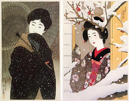
Ito Shinsui was a Japanese printmaker who, like his contemporaries Hiroshi Yoshida and Kawase Hasui, was part of the Shin Hanga movement in the early 20th Century. (In writing these artist’s names, I’m using the Western convention of putting the given name first.)Shin Hanga was essentially a revival of the art of Ukiyo-e woodblock prints from the previous century (see my post on Hokusai), often combined with influences from Western art. Interestingly, one of the major European influences on the Shin Hanga artists was that of the French Impressionists, who, in turn, had been dramatically influenced but the brilliant colors and subtle compositions of Ukiyo-e prints.
Unlike Yoshida and Hausi, who, in keeping with the majority of the Shin Hanga artists, concentrated on landscape and scenes of life in towns and cities, Shinsui focused on the depiction of people, in particular beautiful young women.
His elegant compositions, in which the negative space is as vital as the primary shapes, are often 3/4 length figures with minimal space around them in the the frame. His beautifully dressed subjects, their decorative robes flowing about them in graceful waves, are frequently engaged in the application of makeup or preparation for the bath, and are warm with an understated eroticism. His forms are delicately modeled, with fine lines delineating areas enlivened with rich but subtle color.
You can see some of the influence of European art in certain prints (in his later years, you can even see the influence of cubism), and the strong traditions of Ukiyo-e in others. Though his depictions of women are his most notable subjects, Shinsui also created beautiful, brilliantly colored landscapes, which are not to be missed. He was at one point awarded the status of “intangible living treasure” by the Japanese government.
Categories:
-
Edmond Alexander and Cynthia Turner

Even within the illustration community, which is itself often dissed by the fine arts world, medical illustration, like botanical illustration and architectural rendering, just doesn’t get the respect it deserves.Good medical illustration, to my eye, can be as exciting and visually fascinating as the most far out science fiction illustration or movie concept art and as bizarre and intriguing as the wildest surrealist imaginings. The striking thing about medical illustration when viewed in this light is to remember that it is essentially realism. It is realistic depictions of things that in many cases can’t be viewed with the unaided eye, but a form of realism nonetheless.
I’ve found medical illustration to be a vastly underappreciated branch of illustration, but I’ve always liked it. (I’ve even done a bit myself, in a way, in the form of the illustrations and Flash animation for The Interactive Body feature in the Gift of a Lifetime web documentary.)
Edmond Alexander and Cynthia Turner, who share a studio under the name of Alexander & Turner, have been notable names in the medical illustration field for over 20 years.
Alexander seems to specialize in envisioning biological processes at the cellular, and sometimes molecular, level (image above, left). He utilizes intense color relationships and dynamic contrasts of value to make the processes snap into clear relief in a way photomicrography can’t. The result can be dramatic compositions filled with fascinating forms, often intertwining in dramatic relationships.
Cynthia Turner works more often at the macroscopic level, portraying organs or other parts of the human body that need to be diagramatically sectioned or otherwise have elements accentuated, again in the service of making things clear and dramatic that would be difficult, if not impossible, with photography. Turner tends to work in a way that feels more traditionally illustrative, and I’m particularly fond of the illustrations in which she brings part of the painting or drawing to a high degree of finish and leaves other parts to blend out into the recognizable lines of the initial sketch (image above, right).
The Alexander and Turner site has short bios of each artist and a gallery of their work. Unfortunately, like many artists who have posted their images on the web, and particularly those in the field of medical illustration, Alexander and Turner have felt compelled to mar their larger images with watermarking, in the vain hope that it will somehow protect them from being swiped.
At the risk of being repetitive, I feel I have to point out again to artists on the web in general, that this will only protect images from the laziest of image swipers. If your work is in print, anyone with a $50 scanner can produce higher resolution files of your images that you will ever post on the web.
I tend not to feature artists on lines and colors whose web based work is watermarked, but I found some unblemished examples of Alexander and Turner’s paintings on the Medical Illustration Source Book site for you to enjoy.
When approaching medical illustrations as artworks, particularly those of microscopic terrains, try thinking of them as abstract at first, then let them resolve into realism. In the case of Turner’s work, look first at the drawings around the edges, in those images where where she has left them as part of the composition, and then move to the more rendered forms.
Categories:
-
Shaun Tan
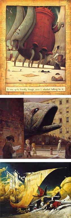 Shaun Tan is an Australian artist who creates and illustrates “picture books“, which in his case usually means wonderfully bizarre and imaginative flights of fancy that look, at least at first, like somewhat dark children’s fantasy, but are often aimed at both younger and older readers.
He sometimes works with a writer, as in the award winning The Rabbits (image at left, bottom), written by John Marsden, and sometimes writes the stories himself, as in The Lost Thing (image at left, top), which is also a theatre production and in development as a short animated film (more information here).
Tan starts his paintings with thin layers of acrylic over white lines on a dark background, working from dark to light and continuing with oil for the final rendering. He also works in other media, including sctatchboard, pen and ink , pastel crayons, gouache and watercolor, collage, assemblage and digital media.
You can see the multi-media and assemblage techniques in many of his illustrations which employ a stratified and multi-planed approach, with areas broken into smaller images within a larger whole, unified by textures and patterns playing across their surface.
Tan also mixes design elements with more painterly areas, and also works in a more straightforward painterly approach at times, creating a fascinatingly varied array of work.
Tan’s books have been translated into multiple languages and have received book awards in several countries. Tan is also involved in other interesting projects, including murals, theatre productions and a children’s “Art Trail”.
Some of his books, like The Red Tree (image at left, middle), feature experimental narratives, or absence thereof, leaving the reader to wander amid the images and form their own narrative, almost like a Surrealist collage-novel.
Link and suggestion courtesy of Jesper Svedberg
[Update, 2011: See my more recent posts on Shaun Tan.]
Categories:
-
Adam Rex

Adam Rex is an illustrator living here in Philadelphia who does fantasy themed and children’s book illustration for clients like Harcourt, Penguin, Knopf and a number of periodicals. Rex received the the Jack Gaugan Award for Best Emerging Artist, named for the noted Science Fiction artist, in 2005. He has also done a number of imaginative illustrations for Wizards of the Coast’s Magic: The Gathering collectable card game.He often employs brusque textures and mottled patches of color to give his images a rough-hewn appearance. Edges are deliberately left ragged and thin layers of color are scumbled against background colors. At other times, when the subject calls for it, the finish is more refined, though never to the point of being without some suggestion of texture.
His fantasy genre paintings frequently feature complex compositions with intricate backgrounds and multiple figures, and often carry a suggestion of Renaissance settings as in “Novice Griffin Rider” (above).
The galleries on his site feature examples of his work sorted by genre, Kids, Bigger kids, Teen/Adult and Fantasy. There are additional illustrations on the page that lists some of the books he has illustrated. (You can also find many of them with an Amazon search.)
Rex works mostly in oils, often over acrylic and opaque ink backgrounds; but he occasionally uses gouache, brush and ink, scratchboard, even Sculpey modeling, and a few digital touches, as in his bestselling children’s book, Frankenstein Makes a Sandwich (which is actually titled Frankenstein Makes a Sandwich and Other Stories You’re Sure to Like, Because They’re All About Monsters and Some of Them are Also About Food. You like Food Don’t You? Well, All Right Then).
His work for children’s books, including Tree Ring Circus, another for which he is the author a well as illustrator, carry forward that feeling of rough edges and also seem to have a hint of strangeness, as if to say that life has rough edges and we should revel in it rather than denying it with glossy fantasy.
Categories:


Charley’s Picks
Bookshop.org
(Bookshop.org affilliate links; sales benefit independent bookshop owners; I get a small percentage to help support my work on Lines and Colors)

John Singer Sargent: Watercolors


Urban Sketching: Understanding Perspective


Charley’s Picks
Amazon
(Amazon.com affiliate links; sales go to a larger yacht for Jeff Bezos; but I get a small percentage to help support my work on Lines and Colors)
John Singer Sargent: Watercolors
Urban Sketching: Understanding Perspective