
Categories
- 3d CGI
- Amusements
- Animation
- Anime & Manga
- Art Materials
- Art Videos
- Blogroll
- Cartoons
- Color
- Comics
- Concept & Visual Dev.
- Creativity
- Digital Art
- Digital Painting
- Displaying Art on the Web
- Drawing
- Eye Candy for Today
- Gallery and Museum Art
- High-res Art Images
- Illustration
- Motion Graphics & Flash
- Museums
- Online Museums
- Outsider Art
- Painting
- Painting a Day
- Paleo Art
- Pastel, Conté & Chalk
- Pen & Ink
- Prints and Printmaking
- Reviews
- Sc-fi and Fantasy
- Sculpture & Dimensional
- Site Comments
- Sketching
- Storyboards
- Tools and Techniques
- Uncategorized
- Vector Art
- Videos & Podcasts
- Vision and Optics
- Watercolor and Gouache
- Webcomics
Archives
- April 2026
- March 2026
- February 2026
- January 2026
- December 2025
- November 2025
- October 2025
- September 2025
- August 2025
- July 2025
- June 2025
- May 2025
- January 2025
- December 2024
- November 2024
- October 2024
- September 2024
- August 2024
- June 2024
- April 2024
- March 2024
- February 2024
- January 2024
- December 2023
- November 2023
- October 2023
- September 2023
- August 2023
- July 2023
- May 2023
- April 2023
- March 2023
- February 2023
- January 2023
- December 2022
- November 2022
- September 2022
- August 2022
- July 2022
- June 2022
- May 2022
- April 2022
- March 2022
- February 2022
- January 2022
- December 2021
- November 2021
- October 2021
- September 2021
- August 2021
- July 2021
- June 2021
- May 2021
- April 2021
- March 2021
- February 2021
- January 2021
- December 2020
- November 2020
- October 2020
- September 2020
- August 2020
- July 2020
- June 2020
- May 2020
- April 2020
- March 2020
- February 2020
- January 2020
- December 2019
- November 2019
- October 2019
- September 2019
- August 2019
- July 2019
- June 2019
- May 2019
- April 2019
- March 2019
- February 2019
- January 2019
- December 2018
- November 2018
- October 2018
- September 2018
- August 2018
- July 2018
- June 2018
- May 2018
- April 2018
- March 2018
- February 2018
- January 2018
- December 2017
- November 2017
- October 2017
- September 2017
- August 2017
- July 2017
- June 2017
- May 2017
- April 2017
- March 2017
- February 2017
- January 2017
- December 2016
- November 2016
- October 2016
- September 2016
- August 2016
- July 2016
- June 2016
- May 2016
- April 2016
- March 2016
- February 2016
- January 2016
- December 2015
- November 2015
- October 2015
- September 2015
- August 2015
- July 2015
- June 2015
- May 2015
- April 2015
- March 2015
- February 2015
- January 2015
- December 2014
- November 2014
- October 2014
- September 2014
- August 2014
- July 2014
- June 2014
- May 2014
- April 2014
- March 2014
- February 2014
- January 2014
- December 2013
- November 2013
- October 2013
- September 2013
- August 2013
- July 2013
- June 2013
- May 2013
- April 2013
- March 2013
- February 2013
- January 2013
- December 2012
- November 2012
- October 2012
- September 2012
- August 2012
- July 2012
- June 2012
- May 2012
- April 2012
- March 2012
- February 2012
- January 2012
- December 2011
- November 2011
- October 2011
- September 2011
- August 2011
- July 2011
- June 2011
- May 2011
- April 2011
- March 2011
- February 2011
- January 2011
- December 2010
- November 2010
- October 2010
- September 2010
- August 2010
- July 2010
- June 2010
- May 2010
- April 2010
- March 2010
- February 2010
- January 2010
- December 2009
- November 2009
- October 2009
- September 2009
- August 2009
- July 2009
- June 2009
- May 2009
- April 2009
- March 2009
- February 2009
- January 2009
- December 2008
- November 2008
- October 2008
- September 2008
- August 2008
- July 2008
- June 2008
- May 2008
- April 2008
- March 2008
- February 2008
- January 2008
- December 2007
- November 2007
- October 2007
- September 2007
- August 2007
- July 2007
- June 2007
- May 2007
- April 2007
- March 2007
- February 2007
- January 2007
- December 2006
- November 2006
- October 2006
- September 2006
- August 2006
- July 2006
- June 2006
- May 2006
- April 2006
- March 2006
- February 2006
- January 2006
- December 2005
- November 2005
- October 2005
- September 2005
- August 2005
Relevant Blogs
Art, Painting & Sketch
- Gurney Journey
- Underpaintings
- Art and Influence
- Painting Perceptions
- Oil Painters of America
- Vasari Paint POV
- Flying Fox
- Urban Sketchers
- Bento (Smithsonian)
- Art Inconnu
- The Hidden Place
- Still Life
- Making a Mark
- The Art of the Landscape
- Exploring Color & Creativity
- Art Contrarian
- Artist A Day
- beinArt Surreal Art Collective
- Eye Level
- David Dunlop
- p.i.g.m.e.n.t.i.u.m
- CultureGrrl
- Joaquín Sorolla blog
- Artists in Pastel
“Painting a Day”
- A Painting a Day (Keiser)
- On Painting (Keiser)
- Julian Merrow-Smith
- Karen Jurick
- Jeffrey Hayes
- Carol Marine
- Abbey Ryan
- Daily Paintworks
Other Painting Blogs
- Virtual Gouache Land
- Neil Hollingsworth
- Marc Hanson
- Kevin Menck
- Marc Dalessio
- Larry Seiler
- Stapleton Kearns
- Colin Page
- Roos Schuring
- Hans Versfelt
- Titus Meeuws
- Régis Pettinari
- René Plein Air
- Belinda Del Pesco
- Robin Weiss
- Nathan Fowkes (Land Sketch)
- William Wray
- Frank Serrano
- Stephen Magsig
- Michael Chesley Johnson
- Twice a Week
- Sarah Wimperis
- Rob Adams
- Michael Cole Manley
- The Dirty Palette Club
- Mike Manley’s Draw!
Gallery Art & Illustration mix
Illustration
- Howard Pyle
- 100 Years of Illustration
- BibliOdyssey
- Illustration Art
- Today’s Inspiration
- Illustration Mundo
- Little Chimp Society
- Danny Gregory
- R D (John Martz
- Illustration Friday blog
- Monster Brains
- Illustrators & Illustrations (RU)
- Elwood H. Smith
- DaniDraws.com
- Designers Who Blog
- iSpot Blog
Sci-Fi & Fantasy
Illustration & Comics
Comics & Cartoons
- Comics Beat
- Robot 6
- Newsarama Blog
- Comic Vine
- Comics Alliance
- Forbidden Planet Int.
- Paolo Rivera
- Bolt City
- Flight
- Scott McCloud
- The Comics Journal
- Comixpedia
- Funnybook Babylon
- James Baker
- Middleton’s Sketchbook
- Boneville
- The Hotel Fred
- Paul Rivoche
- Daily Cartoonist
- Mad About Cartoons (William Wray)
- Digital Strips
Illustration & Concept
Animation & Concept
- Cartoon Brew
- Animation Blog
- Cold Hard Flash
- Concept Art World
- The CAB
- FY Concept Art
- Concept Ships
- Concept Robots
- John Nevarez
- Armand Serrano
- Marcos Mateu-Mestre
- all kinds of stuff (Kricfalusi)
- Yacin the faun (Man Arenas)
- Kelsey Mann
- Cre8tivemarks Blog
- Ice-Cream Monster Toon Cafe
- AAU Character & Creature Design
- AAU Animation Notes
- Articles and Texticles
Paleo & Scientific
Tools & Techniques
Other
Lists of Art Blogs
Art Image Resource Links
Historic Art Images
- Wikimedia Commons: Paintings
- Wikimedia Commons: Drawings
- The Athenaeum
- WikiArt (WikiPaintings)
- Google Art Project: Artists
- Google Art Project: Collections (Museums)
- ArtCyclopedia
- Web Gallery of Art
- Art Renewal Center
- Web Gallery of Impressionism
Auction Consolidation sites
Auction sites
- Sotheby’s
- Bonham’s
- Christies
- Heritage Auctions: Fine Art
- Heritage Auctions: Illustration
- Freeman’s Auctions
- Bukowskis
- Shannon’s
Image Search
Reverse Image Search (search by image)
- Tin Eye
- RevImg
- Google Image Search (camera icon)
- Bing Image Search (camera icon)
Promoting some friends and some clients of my website design business
- Twin Willows T’ai Chi studio in Wilmington DE. Taiji classes with Bryan Davis.
- Ray Hayward, Inspired Teacher of T’ai Chi ( Taiji ) in Minneapolis, Founder of Mindful Motion Tai Chi Academy
- OldHead Tattoo studio and Art Gallery in Wilmington DE. Tattoos and paintings by Bruce Gulick
- Sharon Domenico Art, pet portrait oil paintings
- Platinum Paperhanging, wallpaper hanging, Main Line and Philadelphia, PA
- Lisa Stone Design, interior designer, Main Line and Philadelphia, PA
- Studio12KPT, original art, prints, calendars and other custom printed items by Van Sickle & Rolleri
-
Maxfield Parrish

In many ways Maxfield Parrish was the antithesis of the popular image of bohemian artists, struggling for recognition and starving in noble sacrifice for their art. He was precise, orderly and methodical and was successful throughout his career.Born into a family that unflaggingly encouraged his interest in art, he was taught initially by his father, Stephen Parrish, an engraver and landscape artist. Maxfield, whose given name was Frederick, chose to use his Grandmother’s maiden name as his middle name and became known by it. He was born in Philadelphia, graduated from Haverford College and went on to study at the Pennsylvania Academy of The Fine Arts and also attended classes given by the great illustrator Howard Pyle at Drexel.
Pyle reportedly looked at Parrrish’s portfolio and said that there was nothing he could teach him, and simply encouraged him to develop a unique style. That is something Parrish certainly did. His work, although an integral part of the Golden Age of illustration, was unlike any artistic school, style or movement at the time. Since then, of course, he has been very influential and much imitated.
Few can imitate his actual technique, however. Parrish would painstakingly build up his luminescent colors in layer after layer of transparent glazes. Unlike the old masters who originated this technique, Parrish used a blue and white underpainting, rather then the traditional grissaile or terra verde. If you ever get to see his originals, you wll be struck by the jewel-like quality of his colors, almost like looking through stained glass. Parrish, in fact, collaborated with the famous glass artist Louis Comfort Tiffany on glass mosaic mural called The Dream Garden, which can be seen in the Curtis Center near Independence Hall here in Philadelphia.
Parrish was renowned for his unorthodox use of color. His images are ablaze with brilliant hues that are often contrasted with their complementary color in the same image or on the same object, causing them to be intensified. He was also unorthodox in his mechanistic and methodical approach to composition and usually prepared his paintings from elaborate combinations of photographic reference, models and constructions. After making his mark as an illustrator for magazines like Colliers, he moved into painting specifically for reproduction as mass-produced prints, the first and most successful of which is his famous Daybreak (detail here).
What he really enjoyed doing most was landscape, and he created landscapes for 30 years for Brown & Bigelow, a calendar and greeting card company. His landscapes were never painted from life, though, and seldom referenced any real place. They were usually amalgams of images from various sources, a tree from his yard, a photograph of a mountain and a stream from somewhere else.
In fact, Parrish would often “construct” his own landscapes. He kept 30 or so pieces of granite, quartz and other rocks in his studio. These were painted a neutral brown and arranged on a piece of glass, giving the appearance of a reflective lake, set in layers of powered rock and strongly lit to give him the custom-designed landscape he wanted to paint. His colors were obviously those of his own choice and not those of nature, together producing a world of landscapes as unique as the masterful approach of the artist who painted them.
Categories:
-
Elwood H. Smith
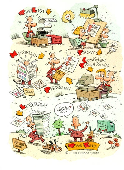
About 10 years ago, my wife and I bought a copy of The Book of Classic Board Games, a spiral-bound book with thick pasteboard pages that came with attached pouches of “Go”-style game pieces and served as both a text about, and playable examples of, simple but timeless board games.It was an example of brilliant book packaging, highlighted by illustrations throughout. By far the most memorable of these, including the cover, were done by an artist whose work I recognized but whose name I didn’t know at the time. It was Elwood H. Smith. We’ve used the book countless times, and I’ve never failed to be delighted by the pages containing his illustrations. Since then I’ve always been pleased to find his work in other books or periodicals.
Chances are you’ve seen his illustrations too, in the pages of Time, Newsweek, The Wall Street Journal The New York Times and many other editorial and advertising venues.
His whimsical cartoon illustrations carry echos of great comic strip artists from the early 20th Century, like Bud Fisher, Cliff Sterrett, and in particular, George Herriman.
Many cartoon style illustrators fall flat for me by simplifying their drawings to the point of leaving out anything of visual interest. Smith has an uncanny knack for balancing just the right amounts of stylization, color, tiny bits of detail and wonderful elements of simple texture to charm your eye and make his drawings a joy to look at.
Addendum: Elwood Smith has written to let us know that he also has a blog at www.drawger.com/greenmonkey on which he posts his animation experiments, new images and thoughts on all manner of subjects, including his search for the perfect brush, and his favorite india ink and favorite drawing pen, the Pelikan 120.
Categories:
-
Michael Komarck

Michael Komarck is an illustrator who transitioned from local graphic design work to fantasy and science fiction illustration for national-level clients like Wizards of the Coast, Fantasy Flight Games, Upper Deck and White Wolf.He also made transitions through different media, moving, as he describes it, “…from crayons to pencils to acrylics to oils…”. In the course of his graphic design business, he began to work in Flash and Photoshop and eventually moved into digital painting.
His paintings have a nice sense of atmosphere and a gritty feeling of the texture of stone, metal and the leathery wings of dragons. He also has a nice sense of compositional drama and lighting that give his paintings a feeling of motion and excitement. He employs color dramatically, often pushing his images toward an almost monochromatic palette punctuated with sharp highlights of complementary colors.
Categories:
-
Hendrick Goltzius
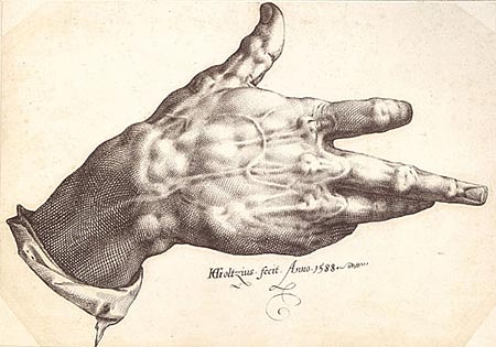
Despite the fact that he was limited to the use of one hand, his other having been crippled by fire, 16th Century Dutch artist Hendrick Goltzius was a master of the art of engraving, as well as a supremely accomplished pen draughtsman.He was also accomplished at drawing with chalks, notably the “trois crayon” method of drawing with black, red and white chalks on tinted paper to achieve a painting-like effect, usually for portraits or figures. In his later years, Goltzius left engraving to devote himself to painting, but never achieved a mastery of that medium comparable to his extraordinary accomplishments with burin and pen.
Goltzius was very impressed with the work of Michelangelo, which he encountered on a trip to Italy. Many of his works are influenced the Italian master’s more strained and convoluted figures, and his most dramatic examples of foreshortening.
It is in Goltzius’s own command of the engraving burin and drawing pen that he really shines, though. He brought ink techniques, like the use of varied width lines, to engraving; and his ink drawings are amazing emulations of the line style of engravings, like the extraordinary pen drawing of his crippled right hand (image above), for which you can see chalk studies here.
Like most artists of his day, many of his chalk drawings were preparatory for finished works, like this chalk study for his famous engraving depicting the lost classical sculpture known as the Farnese Hercules (Wikipedia article)
Goltzius did a number of remarkable large scale “penworks”, pen and ink drawings, often drawn on specially prepared canvas and colored with delicate washes of transparent oil. These were done a much larger size than was common for ink drawings, as in the striking Without Ceres and Bacchus, Venus Would Freeze, acquired in the early 90’s by the Philadelphia Museum of Art, which is 41 x 31 inches (105 x 80 cm).
He also did large panoramas of landscapes in his native Holland, which were some of the earliest of their kind and helped pave the way for great Dutch artists to follow, like Rembrandt.
Categories:
-
Charles Robinson

Charles Robinson was an illustrator of children’s books in the “Golden Age” of illustration, a time roughly from the late 1800’s to the early 1900’s.His black an white illustrations are subtle combinations of line and stipple, often simple and at times simply silhouettes, at other times leaning toward a more elaborate, Art Nouveau style that carried similarities to Aubrey Beardsley or Kay Neilsen.
It is his watercolor illustrations, though, primarily for the covers of the books he illustrated, that are most fascinating for me. In ways reminiscent of Arthur Rackham, or the more open style of Edmund Dulac, his watercolors have a grace and charm that make me wish he had been able to do more full color illustrations for the interiors of his books.
Robinson, along with his brothers, Thomas Heath Robinson and William Heath Robinson, who were also illustrators, were among the first generation of artists who could actually see their work reproduced in books by way of photo engraving.
Previously, artists would have their work interpreted by specialty engravers, such as the Robinson brothers’ father, who would copy the illustrator’s work in preparing the actual engravings which could be used for printing. Interior color reproduction was difficult and expensive as individual plates that were “tipped in”, or added to the book after it was printed.
Charles Robinson illustrated classics like Beauty and the Beast, Bluebeard, Cinderella, The Frog Prince, Little Red Riding Hood and Hansel and Gretel (image above).
Categories:
-
Terry Miura

Terry Miura is an artist who took a path from an illustration career to a dedication to gallery painting. After working in New York for six years creating illustrations for clients like Time, Newsweek, Random House and GRP Records, he transitioned his part-time devotion to painting into a full time pursuit.He returned to California, where he had studied at the Art Center College of Design, and his subject matter followed suit, from New York cityscapes to landscapes of the Caifornia hills and valleys. In exploring his galleries, you will also find paintings from trips to Umbria, primarily landscapes with a few scenes of streets and cafes, and occasionally a still life. The paintings are arranged by gallery showing.
All reveal an open, painterly approach that dwells as much on atmosphere and mood as on the features of the scenes themselves. There is also a very strong sense of the importance of composition, geometry and the arrangement of areas of color as elements in themselves.
He is currently working on landscapes that are non-specific, or according to Miura, “Although they’re still very much representational, they’re not about specific locations.” Instead the landscapes are meant to represent evoked memories.
His site is arranged as a blog, with links to the galleries to the left.
Categories:


Charley’s Picks
Bookshop.org
(Bookshop.org affilliate links; sales benefit independent bookshop owners; I get a small percentage to help support my work on Lines and Colors)

John Singer Sargent: Watercolors


Urban Sketching: Understanding Perspective


Charley’s Picks
Amazon
(Amazon.com affiliate links; sales go to a larger yacht for Jeff Bezos; but I get a small percentage to help support my work on Lines and Colors)
John Singer Sargent: Watercolors
Urban Sketching: Understanding Perspective