
Categories
- 3d CGI
- Amusements
- Animation
- Anime & Manga
- Art Materials
- Art Videos
- Blogroll
- Cartoons
- Color
- Comics
- Concept & Visual Dev.
- Creativity
- Digital Art
- Digital Painting
- Displaying Art on the Web
- Drawing
- Eye Candy for Today
- Gallery and Museum Art
- High-res Art Images
- Illustration
- Motion Graphics & Flash
- Museums
- Online Museums
- Outsider Art
- Painting
- Painting a Day
- Paleo Art
- Pastel, Conté & Chalk
- Pen & Ink
- Prints and Printmaking
- Reviews
- Sc-fi and Fantasy
- Sculpture & Dimensional
- Site Comments
- Sketching
- Storyboards
- Tools and Techniques
- Uncategorized
- Vector Art
- Videos & Podcasts
- Vision and Optics
- Watercolor and Gouache
- Webcomics
Archives
- April 2026
- March 2026
- February 2026
- January 2026
- December 2025
- November 2025
- October 2025
- September 2025
- August 2025
- July 2025
- June 2025
- May 2025
- January 2025
- December 2024
- November 2024
- October 2024
- September 2024
- August 2024
- June 2024
- April 2024
- March 2024
- February 2024
- January 2024
- December 2023
- November 2023
- October 2023
- September 2023
- August 2023
- July 2023
- May 2023
- April 2023
- March 2023
- February 2023
- January 2023
- December 2022
- November 2022
- September 2022
- August 2022
- July 2022
- June 2022
- May 2022
- April 2022
- March 2022
- February 2022
- January 2022
- December 2021
- November 2021
- October 2021
- September 2021
- August 2021
- July 2021
- June 2021
- May 2021
- April 2021
- March 2021
- February 2021
- January 2021
- December 2020
- November 2020
- October 2020
- September 2020
- August 2020
- July 2020
- June 2020
- May 2020
- April 2020
- March 2020
- February 2020
- January 2020
- December 2019
- November 2019
- October 2019
- September 2019
- August 2019
- July 2019
- June 2019
- May 2019
- April 2019
- March 2019
- February 2019
- January 2019
- December 2018
- November 2018
- October 2018
- September 2018
- August 2018
- July 2018
- June 2018
- May 2018
- April 2018
- March 2018
- February 2018
- January 2018
- December 2017
- November 2017
- October 2017
- September 2017
- August 2017
- July 2017
- June 2017
- May 2017
- April 2017
- March 2017
- February 2017
- January 2017
- December 2016
- November 2016
- October 2016
- September 2016
- August 2016
- July 2016
- June 2016
- May 2016
- April 2016
- March 2016
- February 2016
- January 2016
- December 2015
- November 2015
- October 2015
- September 2015
- August 2015
- July 2015
- June 2015
- May 2015
- April 2015
- March 2015
- February 2015
- January 2015
- December 2014
- November 2014
- October 2014
- September 2014
- August 2014
- July 2014
- June 2014
- May 2014
- April 2014
- March 2014
- February 2014
- January 2014
- December 2013
- November 2013
- October 2013
- September 2013
- August 2013
- July 2013
- June 2013
- May 2013
- April 2013
- March 2013
- February 2013
- January 2013
- December 2012
- November 2012
- October 2012
- September 2012
- August 2012
- July 2012
- June 2012
- May 2012
- April 2012
- March 2012
- February 2012
- January 2012
- December 2011
- November 2011
- October 2011
- September 2011
- August 2011
- July 2011
- June 2011
- May 2011
- April 2011
- March 2011
- February 2011
- January 2011
- December 2010
- November 2010
- October 2010
- September 2010
- August 2010
- July 2010
- June 2010
- May 2010
- April 2010
- March 2010
- February 2010
- January 2010
- December 2009
- November 2009
- October 2009
- September 2009
- August 2009
- July 2009
- June 2009
- May 2009
- April 2009
- March 2009
- February 2009
- January 2009
- December 2008
- November 2008
- October 2008
- September 2008
- August 2008
- July 2008
- June 2008
- May 2008
- April 2008
- March 2008
- February 2008
- January 2008
- December 2007
- November 2007
- October 2007
- September 2007
- August 2007
- July 2007
- June 2007
- May 2007
- April 2007
- March 2007
- February 2007
- January 2007
- December 2006
- November 2006
- October 2006
- September 2006
- August 2006
- July 2006
- June 2006
- May 2006
- April 2006
- March 2006
- February 2006
- January 2006
- December 2005
- November 2005
- October 2005
- September 2005
- August 2005
Relevant Blogs
Art, Painting & Sketch
- Gurney Journey
- Underpaintings
- Art and Influence
- Painting Perceptions
- Oil Painters of America
- Vasari Paint POV
- Flying Fox
- Urban Sketchers
- Bento (Smithsonian)
- Art Inconnu
- The Hidden Place
- Still Life
- Making a Mark
- The Art of the Landscape
- Exploring Color & Creativity
- Art Contrarian
- Artist A Day
- beinArt Surreal Art Collective
- Eye Level
- David Dunlop
- p.i.g.m.e.n.t.i.u.m
- CultureGrrl
- Joaquín Sorolla blog
- Artists in Pastel
“Painting a Day”
- A Painting a Day (Keiser)
- On Painting (Keiser)
- Julian Merrow-Smith
- Karen Jurick
- Jeffrey Hayes
- Carol Marine
- Abbey Ryan
- Daily Paintworks
Other Painting Blogs
- Virtual Gouache Land
- Neil Hollingsworth
- Marc Hanson
- Kevin Menck
- Marc Dalessio
- Larry Seiler
- Stapleton Kearns
- Colin Page
- Roos Schuring
- Hans Versfelt
- Titus Meeuws
- Régis Pettinari
- René Plein Air
- Belinda Del Pesco
- Robin Weiss
- Nathan Fowkes (Land Sketch)
- William Wray
- Frank Serrano
- Stephen Magsig
- Michael Chesley Johnson
- Twice a Week
- Sarah Wimperis
- Rob Adams
- Michael Cole Manley
- The Dirty Palette Club
- Mike Manley’s Draw!
Gallery Art & Illustration mix
Illustration
- Howard Pyle
- 100 Years of Illustration
- BibliOdyssey
- Illustration Art
- Today’s Inspiration
- Illustration Mundo
- Little Chimp Society
- Danny Gregory
- R D (John Martz
- Illustration Friday blog
- Monster Brains
- Illustrators & Illustrations (RU)
- Elwood H. Smith
- DaniDraws.com
- Designers Who Blog
- iSpot Blog
Sci-Fi & Fantasy
Illustration & Comics
Comics & Cartoons
- Comics Beat
- Robot 6
- Newsarama Blog
- Comic Vine
- Comics Alliance
- Forbidden Planet Int.
- Paolo Rivera
- Bolt City
- Flight
- Scott McCloud
- The Comics Journal
- Comixpedia
- Funnybook Babylon
- James Baker
- Middleton’s Sketchbook
- Boneville
- The Hotel Fred
- Paul Rivoche
- Daily Cartoonist
- Mad About Cartoons (William Wray)
- Digital Strips
Illustration & Concept
Animation & Concept
- Cartoon Brew
- Animation Blog
- Cold Hard Flash
- Concept Art World
- The CAB
- FY Concept Art
- Concept Ships
- Concept Robots
- John Nevarez
- Armand Serrano
- Marcos Mateu-Mestre
- all kinds of stuff (Kricfalusi)
- Yacin the faun (Man Arenas)
- Kelsey Mann
- Cre8tivemarks Blog
- Ice-Cream Monster Toon Cafe
- AAU Character & Creature Design
- AAU Animation Notes
- Articles and Texticles
Paleo & Scientific
Tools & Techniques
Other
Lists of Art Blogs
Art Image Resource Links
Historic Art Images
- Wikimedia Commons: Paintings
- Wikimedia Commons: Drawings
- The Athenaeum
- WikiArt (WikiPaintings)
- Google Art Project: Artists
- Google Art Project: Collections (Museums)
- ArtCyclopedia
- Web Gallery of Art
- Art Renewal Center
- Web Gallery of Impressionism
Auction Consolidation sites
Auction sites
- Sotheby’s
- Bonham’s
- Christies
- Heritage Auctions: Fine Art
- Heritage Auctions: Illustration
- Freeman’s Auctions
- Bukowskis
- Shannon’s
Image Search
Reverse Image Search (search by image)
- Tin Eye
- RevImg
- Google Image Search (camera icon)
- Bing Image Search (camera icon)
Promoting some friends and some clients of my website design business
- Twin Willows T’ai Chi studio in Wilmington DE. Taiji classes with Bryan Davis.
- Ray Hayward, Inspired Teacher of T’ai Chi ( Taiji ) in Minneapolis, Founder of Mindful Motion Tai Chi Academy
- OldHead Tattoo studio and Art Gallery in Wilmington DE. Tattoos and paintings by Bruce Gulick
- Sharon Domenico Art, pet portrait oil paintings
- Platinum Paperhanging, wallpaper hanging, Main Line and Philadelphia, PA
- Lisa Stone Design, interior designer, Main Line and Philadelphia, PA
- Studio12KPT, original art, prints, calendars and other custom printed items by Van Sickle & Rolleri
-
Jane Tomlinson
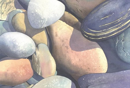
In one way or another, all artists make choices about subject matter. Our subjects define our work as much as our style, approach or materials.UK watercolorist Jane Tomlinson, who was trained in printmaking and paperworks but is self-taught as a painter, paints sunflowers, animals, scenes from her travels abroad, and scenes of “Earth Magic” such as Stonehenge and other stone circles, earthen mounds and locations of spiritual or ritual significance to ancient cultures in the British Isles.
What drew me to her work, however, are her “pebbles”, careful and straightforward observations of river stones, worn smooth by water and time and revealed in their differences of hue and texture by warm sunlight.
In addition to the galleries of her work, her site includes a Journal, which occasionally features step-by-step walk-throughs of her painting process.
Her galleries are divided by subject matter, including a Sketchbook with travel sketches from her apparently extensive travels, and the Pebbles, which is one of the more extensive gallery sections.
Carefully arranged so that their surfaces and shadows overlap and interact, Tomlinson’s pebbles form compositions that are essentially landscape still-lifes, making a fascinating intersection of two different, and usually quite separate, kinds of artistic subjects.
Categories:
-
Iain McCaig
 The fantastic characters that populate modern fantasy and science fiction movies have to take their initial form in someone’s imagination, long before the casting director, costumers and actors bring them to the screen. Usually, they first come to life in the mind of a concept designer. The more fertile that designer’s imagination, the more striking and memorable the character.
Iain McCaig is one of the leading concept designers in the film industry. His most recognizable work would be his character designs for the last three Star Wars films. He created the character of Darth Maul, was instrumental in creating the look of Jar Jar Binks (hate him or loathe him, you do remember him), and Queen Amidala, along with much of the costuming and designs for many other characters and creatures.
He has also worked on films like Hook, Terminator II, StarTrek VI, Peter Pan and Harry Potter and the Goblet of Fire.
His precise but fluid linework, excellent draughtsmanship and wild imagination make his concept drawings and paintings stand out.
McCaig is an instructor at the Gnomon Workshop, which has a gallery of his work and publishes several DVD tutorials based on his specialty of visual storytelling.
His own site has been “under construction” for at least two years, so I suggest the Gnomon Workshop gallery. The CGSociety also has the DVDs and their pages for them feature some of McCaig’s art.
There is a short bio here, an article on StarWars.com here, and an interesting report on a storyboarding workshop here. You can also probably turn up some interesting stuff with a Google image search.
There is a good selection of his costume designs at The Royal Handmaiden Society’s Star Wars concept art galleries along with related design drawings by Dermot Power, who I recently profiled.
One of the best places to see McCaig’s work is in the Art of Star Wars books: The Art of Star Wars, Episode I – The Phantom Menace, The Art of Star Wars, Episode II – Attack of the Clones and The Art of Star Wars, Episode III – Revenge of the Sith. I particularly recommend the volume for Episode I which has lots of McCaig’s character designs and many of his beautiful costume drawings (image and detail above).
Categories:
-
Travis Charest

Over years I’ve been enjoying comics I’ve noticed that many comic book artists get to a certain level of proficiency and “hold” there, evidently feeling that they have sufficient skills to turn out acceptable work on a continuing basis.I’ll certainly grant that drawing a 24-page comic book on a monthly schedule can be a demanding task, and is not always conducive to creative explorations and artistic growth. Some comic book artists, however, are not satisfied with “good enough” and insist on growing and changing, rising above the limitations of the monthly schedule, even if it makes them incapable of keeping up that pace.
Canadian comics artist and illustrator Travis Charest (pronounced “sha-RAY”) started his career working with Jim Lee and the Homage Studios stable of artists. His early work shows the influence of the Homage style at the time, rife with over-muscled, grimacing superheros and a rendering style thick with superfluous hatching (sometimes referred to as “hay” by those who took a dim view of that inking style).
Charest soon outgrew that niche style and began to exhibit the influence of comic art greats like Al Williamson, Alex Raymond and Jean Giraud (Moebius). As he matured as an artist, he kept a high level of detail and hatching, which he seems to enjoy, but he graduated from lines for their own sake to a sophisticated rendering style more reminiscent of classic pen and ink illustrators.
He has done comics work and covers for Wildstorm on titles like WildC.A.T.s and for DC Comics on Flash and Darkstars, among others (checklist here). He gradually moved away from monthly comics, unsuited to the level of work and detail in his images, and began to do specials and covers, developing a detail-oriented painting style in the process.
There is an Unofficial Travis Charest Art Gallery site that includes galleries and features lots of convention sketches. His “official” site seems to be a MSN discussion group, The Art of Travis Charest, which includes tutorials, news and galleries (note the gallery sub-categories in the navigation bar on the left).
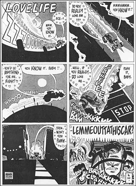
Also on that site is a delightful comic strip that Charest is posting to the web called Spacegirl (image above, top).
Charest almost apologizes for Spacegirl, saying: “This is just a bit of fun I get to have for an hour a week, don’t take it too seriously.”, but it is among my favorite of his endeavors. Perhaps because it’s “off the cuff”, his art for Spacegirl is wonderfully loose and has a freedom not always evident in his more polished work. Plus it has an Alex Raymond meets Moebius look to it that I just love, as they are probably my two favorite comics artists.
Charest left Wildstorm and made a logical move to French comics publisher Humanoïdes Associés, publishers of Metal Hurlant and home to many of Europe’s top comics artists. (The American branch is Humanoids Publishing). There he is currently working on a Metabarons graphic novel (promotional image: above, middle and detail, bottom) that has been a long time in development and promises to be spectacular.
As always, Charest continues to push himself to new levels of accomplishment, never satisfied with “good enough”.
Link via the heights of sublimation
Categories:
-
Rob Gonsalves

Rob Gonsalves is fascinated with the twilight zone between worlds.The Canadian artist creates crisp, detailed acrylic paintings that walk that boundary by simultaneously representing both worlds, and the seemingly impossible connection between them, in the same image.
In pursuing this he walks a shifting path himself, between the hauntingly connected juxtapositions of Magritte and the inverted logical constructs of M.C. Escher.
You will see people casually refer to his work as surreal, but I think it would be more correct to use the term “Magic Realism”, simply because Surrealism relies on images from the subconscious and Gonsalves works are much closer in intention to Escher’s carefully constructed excursions into the nature of perception and thought.
As you explore his work, you’ll see several themes that Gonsalves likes to return to and investigate repeatedly, much like Monet painting the same haystack multiple times.
The largest group consists of the merging of worlds of differing scale, a series of elaborate variations on a theme first explored by Escher in a woodcut that is one of my favorites of his, Still Life snd Street.
The other large theme is that of the blending of two worlds by similarities of repeated shape, again a favorite theme of Escher, but explored by Gonsalves in paintings that allow for the effects of color and atmosphere to carry some of the transition between the perceived realities.
Gonsalves’ ability to carry off these transitions is so effective that it’s often difficult to pin down exactly where in the image your mind makes the mental shift from one point of view to the other.
He explores other, smaller themes that lean more toward Magritte’s colorful collisions of realities. Among my favorites are Gonsalves’ wonderful images of what appear to be bodies of water in the distance that are revealed to be mirrored tiles in the foreground.
There are two volumes of Gonsalves’ work, accompanied by lyrical text and aimed at children. One is night-themed, Imagine A Night, the other, Imagine a Day, features daylight images and has text by Sarah L. Thompson.
Take some time and let Rob Gonsalves walk you along that shifting path where the boundaries of “here” and “there” shimmer and change with the merest movement of an eye.
Link via Kottke.org.
Categories:
-
Frederick Lord Leighton
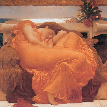
Frederick Lord Leighton (not to be confused with Edmund Blair Leighton, who I profiled last week), was one of the most influential of all Victorian Academic painters.He was very much within the academic neoclassical tradition, in contrast to the painters of that time who were favored in retrospect by the 20th century art establishment, and were remembered primarily for their rejection of that tradition. For much of the 20th Century, art historians and critics considered rejection of 19th Century Academic art a badge of honor, because Academic art was the “bad”, “repressive” art from which the modern art movements “liberated” us.
I’ll resist going into a big rant about what a poisonous attitude this overt rejection of tradition by the modernist establishment was. I like a lot of modern painting, but I have nothing good to say about the concerted campaign the modernists waged to discredit figurative art when they came to dominate the art establishment. I’ll just say that I enjoy Academic art and, in spite of the formality and absence of emotion in much neoclassical painting, I would rather spend my time in front of one of Leighton’s beautifully executed canvasses than a museum full of late 20th Century “isms”, which were bred from another kind of formality and dearth of emotion. (OK, so I did rant, but it wasn’t a big rant.)
Leighton was closely tied to the Royal Academy, exhibited most of his major works there and was elected its president in 1878. He painted with the emphasis on draughtsmanship and elegant rendering that was fundamental to the neoclassical style, and his subject matter was mostly scenes from ancient history, mythology or the Bible. Unlike some of the weaker Academic painters who got caught up in the mere visual reconstruction of those times or subjects, Leighton was faithful to the original vision of neo-classical art and the pursuit of timeless beauty.
Leighton’s early work was influenced by the Pre-Raphaelites and he shared their literary subject matter, painting scenes from Shakespeare and Dante, but he moved into more classical subjects as he travelled and was exposed to contemporary French and Italian Classical art.
As a mature artist, Leighton was so influential among Victorian Classical painters that Edward Burne-Jones, himself one of the great figures of Victorian art, nicknamed him “Jupiter Olympus”.
Categories:
-
Alex Toth
To say that Alex Toth was a master of the comics art form is perhaps an understatement.I first encountered his uniquely elegant and spare drawing style in issues of Pete Millar’s CARtoons and Drag Cartoons, drag racing and custom car oriented comics magazines in which he stood out like a Corvette in a parking lot full of Chevy sedans (image above). I then noticed his unmistakably fresh style in the pages of Warren’s Creepy and Eerie. Again, Toth shone like a midnight sun, even among the Warren magazines stable of superb comics artists.
Toth (pronounced like “both”) had a rare ability to abstract and simplify in his drawings to a degree that makes his work seem a bit like Chinese ink paintings or Japanese prints; not in any obvious similarity of style, Toth’s drawing style is as American as can be, but in accordance with the difficult-to follow maxim of “What doesn’t add, subtracts.”
In his pursuit of capturing the essence of things with very few lines, Toth brought to bear his superior draughtsmanship and his exceptional skills as a designer. His panels are composed, elements arranged, blacks spotted, white space controlled and figures and backgrounds drawn or simply suggested with a skill that passes into the sublime. Where the majority of comics artists, even the most accomplished, would use 5 lines to describe something, Toth would do it with two. Where they would draw a detailed object, Toth would suggest with deceptively simple areas of black or halftone.
His pages, particularly in black and white, were textbook examples of treating an entire comics page as a carefully designed whole, not just an arrangement of panels. Within that balanced and carefully arranged design, Toth exhibited storytelling skills, the ability to convey a story in images, that were among the best of the best. Like his drawing, his storytelling was dramatically different, unique, daringly cinematic and uncannily effective.
Toth originally wanted to do newspaper comics, but adventure comics were fading from the newspaper pages when he started his career, so he switched to comic books. He carried on the artistic tradition of newspaper comics greats like Milton Caniff and Noel Sickles, however, and was the main artist to bring that dramatic chiariscuro style to comic books, where it has been continued and championed by artists like Frank Miller.
Toth was also a terrific character designer and left his mark on the beautifully simplified characters for Space Ghost, Johnny Quest and the DC Comics series Super Friends.
Here is an excellent gallery of his work presented in black and white, from scans of the original art on the Comicartville site.
There is a multi-volume series of books on The Art of Alex Toth from Auad Publishing (where you will also find a Toth gallery), and you should still be able to find the Image Comics collection of his work on the comic book adaptation of the Zorro television show.
This post on Toth has been on the back burner for a while now. When I can, I like to let the posts on the artists who are at the very top of their artform simmer a while, in case I think of something else good to say; but I brought this post forward and finished it because Alex Toth died yesterday (May 27, 2006) at the age of 77. In what is probably as fitting a way to go as any artist could hope for, Alex Toth literally died at his drawing table.
Categories:


Charley’s Picks
Bookshop.org
(Bookshop.org affilliate links; sales benefit independent bookshop owners; I get a small percentage to help support my work on Lines and Colors)

John Singer Sargent: Watercolors


Urban Sketching: Understanding Perspective


Charley’s Picks
Amazon
(Amazon.com affiliate links; sales go to a larger yacht for Jeff Bezos; but I get a small percentage to help support my work on Lines and Colors)
John Singer Sargent: Watercolors
Urban Sketching: Understanding Perspective