
Categories
- 3d CGI
- Amusements
- Animation
- Anime & Manga
- Art Materials
- Art Videos
- Blogroll
- Cartoons
- Color
- Comics
- Concept & Visual Dev.
- Creativity
- Digital Art
- Digital Painting
- Displaying Art on the Web
- Drawing
- Eye Candy for Today
- Gallery and Museum Art
- High-res Art Images
- Illustration
- Motion Graphics & Flash
- Museums
- Online Museums
- Outsider Art
- Painting
- Painting a Day
- Paleo Art
- Pastel, Conté & Chalk
- Pen & Ink
- Prints and Printmaking
- Reviews
- Sc-fi and Fantasy
- Sculpture & Dimensional
- Site Comments
- Sketching
- Storyboards
- Tools and Techniques
- Uncategorized
- Vector Art
- Videos & Podcasts
- Vision and Optics
- Watercolor and Gouache
- Webcomics
Archives
- June 2026
- May 2026
- April 2026
- March 2026
- February 2026
- January 2026
- December 2025
- November 2025
- October 2025
- September 2025
- August 2025
- July 2025
- June 2025
- May 2025
- January 2025
- December 2024
- November 2024
- October 2024
- September 2024
- August 2024
- June 2024
- April 2024
- March 2024
- February 2024
- January 2024
- December 2023
- November 2023
- October 2023
- September 2023
- August 2023
- July 2023
- May 2023
- April 2023
- March 2023
- February 2023
- January 2023
- December 2022
- November 2022
- September 2022
- August 2022
- July 2022
- June 2022
- May 2022
- April 2022
- March 2022
- February 2022
- January 2022
- December 2021
- November 2021
- October 2021
- September 2021
- August 2021
- July 2021
- June 2021
- May 2021
- April 2021
- March 2021
- February 2021
- January 2021
- December 2020
- November 2020
- October 2020
- September 2020
- August 2020
- July 2020
- June 2020
- May 2020
- April 2020
- March 2020
- February 2020
- January 2020
- December 2019
- November 2019
- October 2019
- September 2019
- August 2019
- July 2019
- June 2019
- May 2019
- April 2019
- March 2019
- February 2019
- January 2019
- December 2018
- November 2018
- October 2018
- September 2018
- August 2018
- July 2018
- June 2018
- May 2018
- April 2018
- March 2018
- February 2018
- January 2018
- December 2017
- November 2017
- October 2017
- September 2017
- August 2017
- July 2017
- June 2017
- May 2017
- April 2017
- March 2017
- February 2017
- January 2017
- December 2016
- November 2016
- October 2016
- September 2016
- August 2016
- July 2016
- June 2016
- May 2016
- April 2016
- March 2016
- February 2016
- January 2016
- December 2015
- November 2015
- October 2015
- September 2015
- August 2015
- July 2015
- June 2015
- May 2015
- April 2015
- March 2015
- February 2015
- January 2015
- December 2014
- November 2014
- October 2014
- September 2014
- August 2014
- July 2014
- June 2014
- May 2014
- April 2014
- March 2014
- February 2014
- January 2014
- December 2013
- November 2013
- October 2013
- September 2013
- August 2013
- July 2013
- June 2013
- May 2013
- April 2013
- March 2013
- February 2013
- January 2013
- December 2012
- November 2012
- October 2012
- September 2012
- August 2012
- July 2012
- June 2012
- May 2012
- April 2012
- March 2012
- February 2012
- January 2012
- December 2011
- November 2011
- October 2011
- September 2011
- August 2011
- July 2011
- June 2011
- May 2011
- April 2011
- March 2011
- February 2011
- January 2011
- December 2010
- November 2010
- October 2010
- September 2010
- August 2010
- July 2010
- June 2010
- May 2010
- April 2010
- March 2010
- February 2010
- January 2010
- December 2009
- November 2009
- October 2009
- September 2009
- August 2009
- July 2009
- June 2009
- May 2009
- April 2009
- March 2009
- February 2009
- January 2009
- December 2008
- November 2008
- October 2008
- September 2008
- August 2008
- July 2008
- June 2008
- May 2008
- April 2008
- March 2008
- February 2008
- January 2008
- December 2007
- November 2007
- October 2007
- September 2007
- August 2007
- July 2007
- June 2007
- May 2007
- April 2007
- March 2007
- February 2007
- January 2007
- December 2006
- November 2006
- October 2006
- September 2006
- August 2006
- July 2006
- June 2006
- May 2006
- April 2006
- March 2006
- February 2006
- January 2006
- December 2005
- November 2005
- October 2005
- September 2005
- August 2005
Relevant Blogs
Art, Painting & Sketch
- Gurney Journey
- Underpaintings
- Art and Influence
- Painting Perceptions
- Oil Painters of America
- Vasari Paint POV
- Flying Fox
- Urban Sketchers
- Bento (Smithsonian)
- Art Inconnu
- The Hidden Place
- Still Life
- Making a Mark
- The Art of the Landscape
- Exploring Color & Creativity
- Art Contrarian
- Artist A Day
- beinArt Surreal Art Collective
- Eye Level
- David Dunlop
- p.i.g.m.e.n.t.i.u.m
- CultureGrrl
- Joaquín Sorolla blog
- Artists in Pastel
“Painting a Day”
- A Painting a Day (Keiser)
- On Painting (Keiser)
- Julian Merrow-Smith
- Karen Jurick
- Jeffrey Hayes
- Carol Marine
- Abbey Ryan
- Daily Paintworks
Other Painting Blogs
- Virtual Gouache Land
- Neil Hollingsworth
- Marc Hanson
- Kevin Menck
- Marc Dalessio
- Larry Seiler
- Stapleton Kearns
- Colin Page
- Roos Schuring
- Hans Versfelt
- Titus Meeuws
- Régis Pettinari
- René Plein Air
- Belinda Del Pesco
- Robin Weiss
- Nathan Fowkes (Land Sketch)
- William Wray
- Frank Serrano
- Stephen Magsig
- Michael Chesley Johnson
- Twice a Week
- Sarah Wimperis
- Rob Adams
- Michael Cole Manley
- The Dirty Palette Club
- Mike Manley’s Draw!
Gallery Art & Illustration mix
Illustration
- Howard Pyle
- 100 Years of Illustration
- BibliOdyssey
- Illustration Art
- Today’s Inspiration
- Illustration Mundo
- Little Chimp Society
- Danny Gregory
- R D (John Martz
- Illustration Friday blog
- Monster Brains
- Illustrators & Illustrations (RU)
- Elwood H. Smith
- DaniDraws.com
- Designers Who Blog
- iSpot Blog
Sci-Fi & Fantasy
Illustration & Comics
Comics & Cartoons
- Comics Beat
- Robot 6
- Newsarama Blog
- Comic Vine
- Comics Alliance
- Forbidden Planet Int.
- Paolo Rivera
- Bolt City
- Flight
- Scott McCloud
- The Comics Journal
- Comixpedia
- Funnybook Babylon
- James Baker
- Middleton’s Sketchbook
- Boneville
- The Hotel Fred
- Paul Rivoche
- Daily Cartoonist
- Mad About Cartoons (William Wray)
- Digital Strips
Illustration & Concept
Animation & Concept
- Cartoon Brew
- Animation Blog
- Cold Hard Flash
- Concept Art World
- The CAB
- FY Concept Art
- Concept Ships
- Concept Robots
- John Nevarez
- Armand Serrano
- Marcos Mateu-Mestre
- all kinds of stuff (Kricfalusi)
- Yacin the faun (Man Arenas)
- Kelsey Mann
- Cre8tivemarks Blog
- Ice-Cream Monster Toon Cafe
- AAU Character & Creature Design
- AAU Animation Notes
- Articles and Texticles
Paleo & Scientific
Tools & Techniques
Other
Lists of Art Blogs
Art Image Resource Links
Historic Art Images
- Wikimedia Commons: Paintings
- Wikimedia Commons: Drawings
- The Athenaeum
- WikiArt (WikiPaintings)
- Google Art Project: Artists
- Google Art Project: Collections (Museums)
- ArtCyclopedia
- Web Gallery of Art
- Art Renewal Center
- Web Gallery of Impressionism
Auction Consolidation sites
Auction sites
- Sotheby’s
- Bonham’s
- Christies
- Heritage Auctions: Fine Art
- Heritage Auctions: Illustration
- Freeman’s Auctions
- Bukowskis
- Shannon’s
Image Search
Reverse Image Search (search by image)
- Tin Eye
- RevImg
- Google Image Search (camera icon)
- Bing Image Search (camera icon)
Promoting some friends and some clients of my website design business
- Twin Willows T’ai Chi studio in Wilmington DE. Taiji classes with Bryan Davis.
- Ray Hayward, Inspired Teacher of T’ai Chi ( Taiji ) in Minneapolis, Founder of Mindful Motion Tai Chi Academy
- OldHead Tattoo studio and Art Gallery in Wilmington DE. Tattoos and paintings by Bruce Gulick
- Sharon Domenico Art, pet portrait oil paintings
- Platinum Paperhanging, wallpaper hanging, Main Line and Philadelphia, PA
- Lisa Stone Design, interior designer, Main Line and Philadelphia, PA
- Studio12KPT, original art, prints, calendars and other custom printed items by Van Sickle & Rolleri
-
James Gurney’s Fantasy in the Wild

In his “In the Wild” series of instructional painting videos, painter, illustrator, writer and instructor James Gurney has previously given us Watercolor in the Wild and Gouache in the Wild (links to my reviews), delving into the use of those mediums on location.He has followed up with an interesting variation, Fantasy in the Wild: Painting Concept Art on Location (link is to description, preview video and download order form on Gumroad).
I will point out before going further that this video would be of interest to plein air painters and those interested in the mediums of casein and gouache — as well as concept painters and illustrators — so you may want to read through even if concept art is not your thing.
For those who are familiar with concept art, you’re probably aware that there are any number of concept art tutorials available, on the web, downloadable for a fee, and for sale on DVD.
This one, to my knowledge, is unique. The majority of concept art tutorials deal with digital painting in Photoshop, Corel Painter and similar digital art programs. Those few that deal with traditional media still take a similar tack of making up scenes out of whole cloth, or at most, using photographs for reference.
Gurney here is taking the approach of using location painting both as inspiration and reference for fantasy painting, going into the field with casein, gouache and watercolor in search of settings and subjects for fantastic realism.
Starting with an overview of previously painted plein air subjects in the small town of Rhinebeck, NY — comparing the finished paintings to their original subjects — he shows how artistic decisions about changing the reality of the scene lead logically into the notion of taking the scene as raw material for something imaginative the artist creates.
The first painting demonstration is of a street scene, into which the fictional incident of a mysteriously floating car is introduced. Gurney goes through the use of a model as an addition to the location painting reference, matching lighting, position and scale to achieve a composite image. In the process, we follow him as he paints the plein air aspect of the painting, then applies his own variation in lighting as well as the invented addition of the floating car.
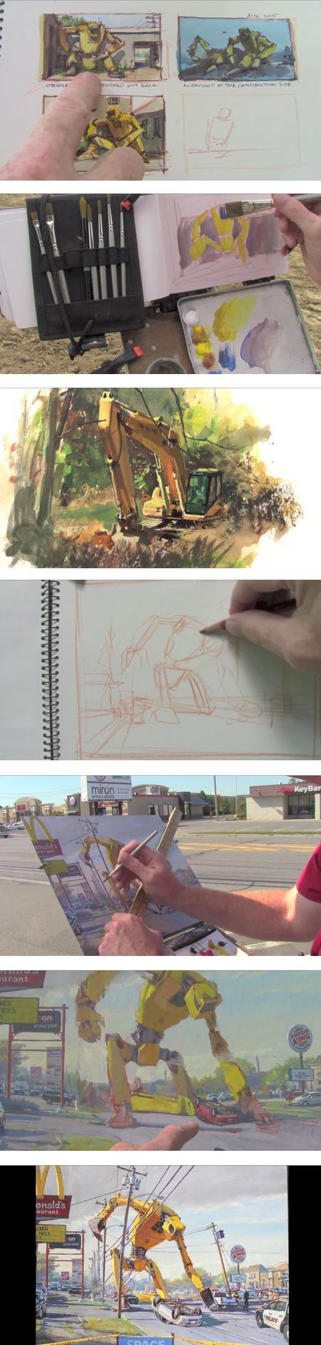
The other set of paintings involve a giant robot set into a typical franchise-strewn stretch of highway in another fantastical incident. Here, Gurney looks to construction machinery as the source of his imaginary robot, giving the machine a sense of solidity and realism that would be difficult to accomplish without the visual information gleaned from the real world machines.He augments this with a quickly constructed maquette, allowing him to more accurately visualize lighting for his imaginary giant robot to match the scene.
In the process we again get to follow Gurney as he paints plein air location studies, in this case of construction machinery, in addition to the finished location background for his larger composition. These demos, as well as that of the first painting, include instruction in the nature and handling of casein, notably using the opaque and quick drying nature of the medium to advantage in painting out and replacing elements of the composition.
While in continuity with his other “In the Wild” instructional videos, Fantasy in the Wild is also a continuation of themes Gurney began exploring with in his 2009 book, Imaginative Realism: How to Paint What Doesn’t Exist (link to my review).
If you enjoyed that book, you will likely find the video appealing, and vice-versa. Also, like all of Gurney’s instructional books and videos, there is a wealth of related supplementary material on his blog, Gurney Journey, accessible by search or by the subject tags in the left column.
To me, the approach taken in Fantasy in the Wild — and the general theme of taking inspiration and reference from the study of the real world as raw material for imagined scenes — reveals an appealing undercurrent relevant to plein air painting: the implied freedom of not feeling limited to reproducing the scene being painted, but instead taking nature as a source for painting whatever the artist wishes.
Too often, beginning location painters can feel restrained to be rigidly faithful to the scene in front of them rather than to their own artistic decisions.
At the other end of the spectrum, those learning illustration and concept art may feel that everything has to be “made up” out of thin air, when in fact, artists throughout history have been using nature as a treasure trove of source material for imagined realities, whether Classical, Romantic or fantastic.
In that light, Fantasy in the Wild is actually a more classic and general guide to painting than might be assumed from the title.
Categories:
-
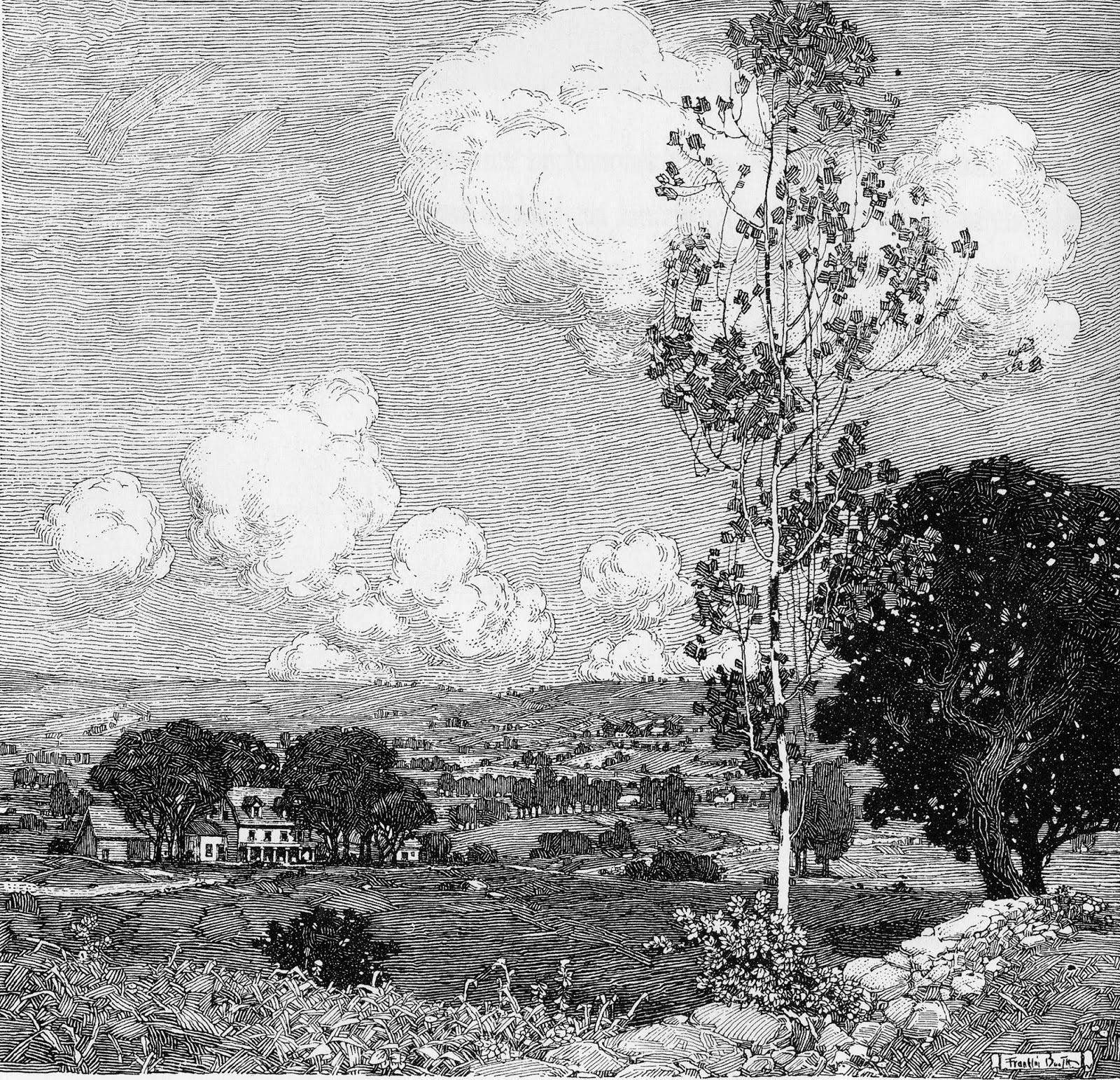
Eye Candy for Today: Franklin Booth pen and ink landscape drawing

Landscape drawing (untitled), Franklin BoothLink is to Outside Logic, from this page of Franklin Booth drawings. I don’t know of a reference to the title or use of this drawing as an illustration.
Golden Age American illustrator Franklin Booth developed his brilliant and unique style of pen and ink illustration from the mistaken assumption that the illustrations in his favorite books and magazines were drawn in pen and ink rather than being wood engravings.
He is renowned for his dramatic fantasy themed illustrations, but his less well known drawings of quiet domestic interiors and simple landscapes are also wonderful examples of his style.
I love the foreground tree in this drawing, simple and unassuming, but brilliantly composed. Its lacy form, delicate branches and distinct areas of black and white are melded together into a harmonious, naturalistic tree shape, and yet are so delightfully stylized as to be a treat for the eye on several levels.
It’s particularly interesting how Booth has swirled the lines of the cloud forms around and through those of the leaves and branches.
Categories:
-
George Hendrik Breitner

Dutch painter George Hendrik Breitner, who was active in the late 19th and early 20th centuries, was noted for his rough, brushy, textural approach and his subject matter of city streets, working people, military horsemen and figures.In particular he is famous for his recurrent subject of young women in kimonos, their bright colors a sharp contrast to his otherwise subdued, earth color palette.
Many of his pieces are so rough and sketchy as to look unfinished, a criticism that was leveled at him during his career by those who favored more traditionally finished styles.
The Rijksmuseum in Amsterdam, which has a key collection of Breitner’s work, has mounted an exhibition bringing together all 14 of his versions of Girl in a Kimono compositions, along with preparatory drawings and the artist’s reference photographs.
“Breitner: Girl in Kimono” is on view at the Rijksmuseum until 22 May 2016.
See also my previous post: Eye Candy: Breitner’s Girl in a Whte Kimono.
Categories:
-
Eye Candy for Today: David Roberts’ Edinburgh

Edinburgh from the Calton Hill, David RobertsThe link is to a zoomable version on The Google Art Project; there is a downloadable file on Wikimedia Commons; the original is in the Art Gallery of New South Wales in Australia.
Mid-19th century painter David Roberts was known primarily for his views of exotic locations and landmarks in Egypt and the eastern Mediterranean, but he also painted his native Scotland.
Here he makes Edinburgh look almost like a view of Rome. I love the way shadows fall dramatically across the landscape, highlighting some areas and concealing others, with subtle mini-compositions of groups of figures in many of the dark foreground areas.
The painting has enormous depth, extending from the immediate foreground of the activity on the hill to our right back into the distance over the tops of the city’s buildings. Roberts’ use of atmospheric perspective is subtle, without the sharp contrasts in definition found in some paintings of great distance.
The overall sensation is one of inviting the viewer’s gaze into the painting at several entry points, with multiple areas of interest and visual pleasure over which to linger.
For more, see my previous post on David Roberts.
Categories:
-
Fian Arroyo

Fian Arroyo is an illustrator and character designer based in North Carolina whose clients include The Los Angeles Times, U.S. News and World Report, Houghton Mifflin, Scholastic, Disney, General Motors and The U.S. Postal Service.In the portfolios on his website and Behance pages you’ll find work in a variety of genres, done in a lively outline and color style in both digital and traditional media.
What really stand out, though, are his wonderfully loopy and over-the-top monsters and creatures. These are done with a cartoony verve and wry humor that makes them a particular delight.
There is an interview with Arroyo on StudioVox.
[Via The iSpot]
Categories:
-
Eye Candy for Today: Botticelli’s Birth of Venus

The birth of Venus, Sandro BotticelliThe link is to a zoomable version on The Google Art Project; the original is in the Uffizi Gallery; there is a very hi-resolution downloadable file on Wikimedia Commons (Note that the full-resolution file on Wikimedia Commons is one of the largest I’ve seen on the web, over 200MB, and may choke your browser. You may want to download the file from the link rather than viewing it in a browser window.)
When I had the pleasure of visiting the city of Florence on a trip to Italy a few years ago, there were two paintings at the top of my “must see” list. Both were in the Uffiz Gallery — arguably the finest collection of Italian art anywhere — both were in the same room, and both were by the same artist, Renaissance master Sandro Bottecelli.
One was La Primavera, which I have written about previously, the other was The birth of Venus.
Like Da Vinci’s Mona Lisa, The birth of Venus is such a cultural icon, so famous and familiar and set in our mental map of the world that it’s difficult to see it as a painting.
The name was assigned after the fact by artist/historian Giorgio Vasari, and the painting might more properly be called “The arrival of Venus”, as it depicts the Roman goddess of love and beauty (and mother to Cupid) arriving at the shore, propelled by the breath of Zephyrus, the West Wind, and his companion Chloris, a nymph (minor deity). Waiting to cloak her in floral raiment is one of the Horae, or goddesses of seasons and nature. This one may be Flora, Goddess of Spring, and the subject of La Primavera, but all interpretation here is speculative.
This painting and La Primavera are often thought of as companion pieces. They have many similarities — both were likely commissioned by the Medici, both are of mythological subjects, laced with symbolism and meaning, and both are strikingly large and totally captivating when you stand in front of them.
The feeling and approach of The birth of Venus is quite different from La Primavera, which predates it by three or four years.
The dark, mysterious woods and more naturalistic figures of the latter are replaced by figures set in a soft, ethereal light, cast across the flat, calligraphically indicated surface of the sea.
The birth of Venus is roughly 6×9 feet (173×279 cm); and as much as I also was impressed with La Primavera (not to mention the other Botticelli works in the gallery, the rest of the museum’s astonishing collection), I found The birth of Venus entrancing as few paintings I’ve ever seen.
To someone familiar with the humanistic naturalism of the later Renaissance and subsequent centuries of painting, the painting is both wrong and completely right. The lovingly rendered figures are so stylized as to be anatomically impossible; allegory and iconography have swept away realism, and we are transported to the realm of the fantastic.
The beauty of Chloris and Venus is idealized, portrayed as otherworldly perfection. The face of the Hora, however — shown in striking profile — is another kind of perfection, having to my eye the hallmarks of a carefully studied portrait of a real individual.
It has been suggested that this figure (or even that of Venus) could be a likeness of Simonetta Vespucci, a Florentine noblewoman renowned for her beauty, and supposedly the subject of unrequited love on the part of Botticelli. There is little to substantiate this, but it makes for interesting speculation.
In the very high resolution images on Wikimedia Commons and the Google Art project, you can see the sensitive drawing-like characteristics of Botticelli’s painstaking application of egg tempera, particularly evident in the hands and the (sometimes oddly shaped) feet. What isn’t discernible in photographs, even those as high in resolution as this, is the captivating translucency and delicate textural qualities of the painted surface.
Unfortunately, I believe that the color in the high-resolution images is a bit over saturated, as often seems to be the case in art images posted to the web. I’ve taken the liberty of adjusting the color somewhat in the images above, based on my memory of the painting, and on other Botticelli paintings I have seen.
The birth of Venus was a landmark work, even in its own time. It was one of the first large scale works painted in Florence, and one of the earliest painted on canvas rather than wood panel. The painting deserves its reputation for beauty, and has earned its place in popular culture.
Categories:


Charley’s Picks
Bookshop.org
(Bookshop.org affilliate links; sales benefit independent bookshop owners; I get a small percentage to help support my work on Lines and Colors)

John Singer Sargent: Watercolors


Urban Sketching: Understanding Perspective


Charley’s Picks
Amazon
(Amazon.com affiliate links; sales go to a larger yacht for Jeff Bezos; but I get a small percentage to help support my work on Lines and Colors)
John Singer Sargent: Watercolors
Urban Sketching: Understanding Perspective