
Categories
- 3d CGI
- Amusements
- Animation
- Anime & Manga
- Art Materials
- Art Videos
- Blogroll
- Cartoons
- Color
- Comics
- Concept & Visual Dev.
- Creativity
- Digital Art
- Digital Painting
- Displaying Art on the Web
- Drawing
- Eye Candy for Today
- Gallery and Museum Art
- High-res Art Images
- Illustration
- Motion Graphics & Flash
- Museums
- Online Museums
- Outsider Art
- Painting
- Painting a Day
- Paleo Art
- Pastel, Conté & Chalk
- Pen & Ink
- Prints and Printmaking
- Reviews
- Sc-fi and Fantasy
- Sculpture & Dimensional
- Site Comments
- Sketching
- Storyboards
- Tools and Techniques
- Uncategorized
- Vector Art
- Videos & Podcasts
- Vision and Optics
- Watercolor and Gouache
- Webcomics
Archives
- May 2026
- April 2026
- March 2026
- February 2026
- January 2026
- December 2025
- November 2025
- October 2025
- September 2025
- August 2025
- July 2025
- June 2025
- May 2025
- January 2025
- December 2024
- November 2024
- October 2024
- September 2024
- August 2024
- June 2024
- April 2024
- March 2024
- February 2024
- January 2024
- December 2023
- November 2023
- October 2023
- September 2023
- August 2023
- July 2023
- May 2023
- April 2023
- March 2023
- February 2023
- January 2023
- December 2022
- November 2022
- September 2022
- August 2022
- July 2022
- June 2022
- May 2022
- April 2022
- March 2022
- February 2022
- January 2022
- December 2021
- November 2021
- October 2021
- September 2021
- August 2021
- July 2021
- June 2021
- May 2021
- April 2021
- March 2021
- February 2021
- January 2021
- December 2020
- November 2020
- October 2020
- September 2020
- August 2020
- July 2020
- June 2020
- May 2020
- April 2020
- March 2020
- February 2020
- January 2020
- December 2019
- November 2019
- October 2019
- September 2019
- August 2019
- July 2019
- June 2019
- May 2019
- April 2019
- March 2019
- February 2019
- January 2019
- December 2018
- November 2018
- October 2018
- September 2018
- August 2018
- July 2018
- June 2018
- May 2018
- April 2018
- March 2018
- February 2018
- January 2018
- December 2017
- November 2017
- October 2017
- September 2017
- August 2017
- July 2017
- June 2017
- May 2017
- April 2017
- March 2017
- February 2017
- January 2017
- December 2016
- November 2016
- October 2016
- September 2016
- August 2016
- July 2016
- June 2016
- May 2016
- April 2016
- March 2016
- February 2016
- January 2016
- December 2015
- November 2015
- October 2015
- September 2015
- August 2015
- July 2015
- June 2015
- May 2015
- April 2015
- March 2015
- February 2015
- January 2015
- December 2014
- November 2014
- October 2014
- September 2014
- August 2014
- July 2014
- June 2014
- May 2014
- April 2014
- March 2014
- February 2014
- January 2014
- December 2013
- November 2013
- October 2013
- September 2013
- August 2013
- July 2013
- June 2013
- May 2013
- April 2013
- March 2013
- February 2013
- January 2013
- December 2012
- November 2012
- October 2012
- September 2012
- August 2012
- July 2012
- June 2012
- May 2012
- April 2012
- March 2012
- February 2012
- January 2012
- December 2011
- November 2011
- October 2011
- September 2011
- August 2011
- July 2011
- June 2011
- May 2011
- April 2011
- March 2011
- February 2011
- January 2011
- December 2010
- November 2010
- October 2010
- September 2010
- August 2010
- July 2010
- June 2010
- May 2010
- April 2010
- March 2010
- February 2010
- January 2010
- December 2009
- November 2009
- October 2009
- September 2009
- August 2009
- July 2009
- June 2009
- May 2009
- April 2009
- March 2009
- February 2009
- January 2009
- December 2008
- November 2008
- October 2008
- September 2008
- August 2008
- July 2008
- June 2008
- May 2008
- April 2008
- March 2008
- February 2008
- January 2008
- December 2007
- November 2007
- October 2007
- September 2007
- August 2007
- July 2007
- June 2007
- May 2007
- April 2007
- March 2007
- February 2007
- January 2007
- December 2006
- November 2006
- October 2006
- September 2006
- August 2006
- July 2006
- June 2006
- May 2006
- April 2006
- March 2006
- February 2006
- January 2006
- December 2005
- November 2005
- October 2005
- September 2005
- August 2005
Relevant Blogs
Art, Painting & Sketch
- Gurney Journey
- Underpaintings
- Art and Influence
- Painting Perceptions
- Oil Painters of America
- Vasari Paint POV
- Flying Fox
- Urban Sketchers
- Bento (Smithsonian)
- Art Inconnu
- The Hidden Place
- Still Life
- Making a Mark
- The Art of the Landscape
- Exploring Color & Creativity
- Art Contrarian
- Artist A Day
- beinArt Surreal Art Collective
- Eye Level
- David Dunlop
- p.i.g.m.e.n.t.i.u.m
- CultureGrrl
- Joaquín Sorolla blog
- Artists in Pastel
“Painting a Day”
- A Painting a Day (Keiser)
- On Painting (Keiser)
- Julian Merrow-Smith
- Karen Jurick
- Jeffrey Hayes
- Carol Marine
- Abbey Ryan
- Daily Paintworks
Other Painting Blogs
- Virtual Gouache Land
- Neil Hollingsworth
- Marc Hanson
- Kevin Menck
- Marc Dalessio
- Larry Seiler
- Stapleton Kearns
- Colin Page
- Roos Schuring
- Hans Versfelt
- Titus Meeuws
- Régis Pettinari
- René Plein Air
- Belinda Del Pesco
- Robin Weiss
- Nathan Fowkes (Land Sketch)
- William Wray
- Frank Serrano
- Stephen Magsig
- Michael Chesley Johnson
- Twice a Week
- Sarah Wimperis
- Rob Adams
- Michael Cole Manley
- The Dirty Palette Club
- Mike Manley’s Draw!
Gallery Art & Illustration mix
Illustration
- Howard Pyle
- 100 Years of Illustration
- BibliOdyssey
- Illustration Art
- Today’s Inspiration
- Illustration Mundo
- Little Chimp Society
- Danny Gregory
- R D (John Martz
- Illustration Friday blog
- Monster Brains
- Illustrators & Illustrations (RU)
- Elwood H. Smith
- DaniDraws.com
- Designers Who Blog
- iSpot Blog
Sci-Fi & Fantasy
Illustration & Comics
Comics & Cartoons
- Comics Beat
- Robot 6
- Newsarama Blog
- Comic Vine
- Comics Alliance
- Forbidden Planet Int.
- Paolo Rivera
- Bolt City
- Flight
- Scott McCloud
- The Comics Journal
- Comixpedia
- Funnybook Babylon
- James Baker
- Middleton’s Sketchbook
- Boneville
- The Hotel Fred
- Paul Rivoche
- Daily Cartoonist
- Mad About Cartoons (William Wray)
- Digital Strips
Illustration & Concept
Animation & Concept
- Cartoon Brew
- Animation Blog
- Cold Hard Flash
- Concept Art World
- The CAB
- FY Concept Art
- Concept Ships
- Concept Robots
- John Nevarez
- Armand Serrano
- Marcos Mateu-Mestre
- all kinds of stuff (Kricfalusi)
- Yacin the faun (Man Arenas)
- Kelsey Mann
- Cre8tivemarks Blog
- Ice-Cream Monster Toon Cafe
- AAU Character & Creature Design
- AAU Animation Notes
- Articles and Texticles
Paleo & Scientific
Tools & Techniques
Other
Lists of Art Blogs
Art Image Resource Links
Historic Art Images
- Wikimedia Commons: Paintings
- Wikimedia Commons: Drawings
- The Athenaeum
- WikiArt (WikiPaintings)
- Google Art Project: Artists
- Google Art Project: Collections (Museums)
- ArtCyclopedia
- Web Gallery of Art
- Art Renewal Center
- Web Gallery of Impressionism
Auction Consolidation sites
Auction sites
- Sotheby’s
- Bonham’s
- Christies
- Heritage Auctions: Fine Art
- Heritage Auctions: Illustration
- Freeman’s Auctions
- Bukowskis
- Shannon’s
Image Search
Reverse Image Search (search by image)
- Tin Eye
- RevImg
- Google Image Search (camera icon)
- Bing Image Search (camera icon)
Promoting some friends and some clients of my website design business
- Twin Willows T’ai Chi studio in Wilmington DE. Taiji classes with Bryan Davis.
- Ray Hayward, Inspired Teacher of T’ai Chi ( Taiji ) in Minneapolis, Founder of Mindful Motion Tai Chi Academy
- OldHead Tattoo studio and Art Gallery in Wilmington DE. Tattoos and paintings by Bruce Gulick
- Sharon Domenico Art, pet portrait oil paintings
- Platinum Paperhanging, wallpaper hanging, Main Line and Philadelphia, PA
- Lisa Stone Design, interior designer, Main Line and Philadelphia, PA
- Studio12KPT, original art, prints, calendars and other custom printed items by Van Sickle & Rolleri
-
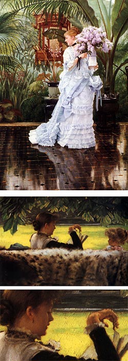
James Jacques Joseph Tissot
 Small museums are not only a treat because of the wonderful gems sometimes found in their collections; they can also one-up larger museums in their ability to be flexible and open minded about their exhibitions. (They often have to be so, when vying to assemble exhibitions by borrowing from larger and more prestigious institutions.) The result can often be small informal exhibitions that larger museums wouldn’t be able to fit into their schedule or display spaces.
Such is the case with a small exhibition at one of my favorite small art museums, The Delaware Art Museum, which has built a tiny but beautiful show around three paintings. An anonymous private collector has loaned the museum three wonderful paintings by James Jacques Joseph Tissot (often simply called James Tissot), a French painter who was dissed for many years as a society fashion artist; which, in fact, he was. (Picture a painter today who specialized in portraying fashionable members of high society decked in haute couture, sharing drinks and gossip at the latest Hollywood party.)
Tissot has only recently regained favor as an accomplished academically trained painter (which he also was, having trained at the Académie des Beaux-Arts in Paris and the atielier of Ingres), who combined those skills with the subtle light and color of his friends Whistler and Degas in the service of a keen observation of social realism.
It wasn’t what we usually think of as social realism, revealing the plight of the poor and downtrodden, but rather insightful observations of the lives of the fashionable members of the upper class, among whom Tissot moved comfortably in both Paris and, when the social upheaval of the Commune made things made things too hot there, in London. As an example, see In the Conservatory (sometimes called The Rivals).
The three paintings on loan to the DAM are Mavoureen, (an Irish term meaning “my darling”, also known as Portrait of Kathleen Newton), a beautiful three-quarter length portrait of his mistress and favorite model, which has a feeling of Manet or Degas, Dans le Serre (In the Greenhouse), my favorite of the three as it sits on one of those sublime edges where impressionism meets realism, and Young Ladies Admiring Japanese Objects, a shining little jewel of academic realism and 19th Century Orientalism around which the museum has fleshed out the exhibit with three Japanese woodblock prints from their collection. (I’ve chosen other works to show above, just because I like them and found reproductions online that show Tissot’s style to better advantage than some others.)
Tissot’s scintillating colors and facile technique did little to endear him to critics at the time, or to most of of the Impressionist circle, aside from his two friends, but it works great for me. I love his paintings of beautiful young women, decked out in their finest, amid lush tropical plants and the polished tile floors of conservatories, the sun washed decks of luxury cruise ships and the bright lawns and formal gardens that were the playgrounds of the privileged in London and Paris.
His body of work in these areas was preceded by early history and literary themed paintings and followed by other subjects. The untimely death of his lover, who was stricken with consumption (tuberculosis), left him devastated. He immediately sold his house in St Johns Wood (which was later bought by Alma-Tedema) and moved back to Paris. He became involved in Spiritualism, which was popular at the time, in an attempt to contact the spirit of his beloved Kathleen. Eventually, after frequent visits to churches while researching settings for certain paintings, he had a profound religious experience and he devoted much of his later work to religious themes.
Tissot was also an accomplished etcher, having learned much from Whistler, and sharing with him a fascination with the docks along the Thames waterfront in London (his paintings of which are some of his best work, IMHO). He also shared with Whistler, and many of the Impressionists, a fascination with oriental objects, prints and furnishings.
The Tissot paintings on view at Delaware Art Museum will be there to March 30, 2007. At other times, and in other places, look through the list on Artcyclopedia for museums displaying his work. Reproductions, even those in books, don’t give a real feeling for his wonderful command of color, terrific draughstmanship and deft handling of the medium of oil painting.
Categories:
-
Khang Le

Khang Le is a concept artist working in the gaming industry. Aside from that I know very little. The “About” section of his site is another of the many I’ve encountered in which the information about the artist is “Coming soon”.I do know that, in addition to this concept work, he has been a contributor to all three of the excellent Flight comics anthologies to date. You can see previews on the Flight site for his work in Volume 2 and Volume 3.
(Amazon links Flight Volume 1, Volume 2, Volume 3)
His web site has a small showcase of his concept work, industrial designs and character designs, accompanied by sections of traditional drawings, paintings and sketches. (I can’t give you direct links to the site sections because the site is in frames.)
The concept and character designs are fascinating, but there’s little indication about the project they belong to and I’m not familiar enough with the games involved to hazard a guess about which ones he’s worked on. I particularly like the drawings in which he uses touches of art nouveau in his backgrounds and settings, as in the image above from the “Industrial Design” section which is called “Drumstickville”.
There is also a good links list on Le’s site that mentions many concept artists that I’ve profiled on lines and colors.
Prior to embarking on his career, Le attended the Art Center College of Design in Pasadena. During his study there he and two other students, Mike Yamada and Felix Yoon, participated in a project with their instructor, Scott Robertson, in which they created design solutions for environments, props, characters, and vehicles for a retelling of The Skillful Huntsman, a Brothers Grimm fairy tale, and chronicled their work and working process. The result has been published as a book that serves as a glimpse into the process of concept design and the creation of concept art for the entertainment industry. (More info here.)
You can also find a selection of prints of Le’s work at the Nucleus Gallery.
Categories:
-
Daniel Garber: Romantic Realist

I’m not sure “Romantic Realist” is the tagline I would assign to Daniel Garber, but I think it’s possibly more accurate than “Pensylvania Impressionist”, the category to which he is usually assigned.Daniel Garber: Romatic Realist is the name of a retrospective exhibition, displayed jointly at the Pennsylvania Academy of the Fine Arts, here in Philadelphia, where Garber studied and then taught for many years (1909-1950), and the the James A Michener Art Museum in nearby Bucks County, where Garber settled and painted for most of his later life.
I wrote about Garber back in November in anticipation of this show and I finally got to see it on Sunday. The first thing I’ll say is that my already high opinion of this remarkable painter is now even higher. The reason I take issue with either the “Pennnsylvania Impressionist” or “Romantic Realist” labels is that Garber is both. As a friend of mine astutely pointed out at the show, if you get up close, Garber is an impressionist; if you step back, he’s a realist.
Actually, up really close, the surfaces of his paintings, although occasionally spattered with bright daubs and flecks of pure tube color as bright and separate as the most brilliant Monet, are more often reminiscent of the great globs of scumbled, broken color the Expressionists used to exclaim “Paintings are made of paint!“. But, when you step back, and we found ourselves doing a lot of stepping up and back at this show, Garber’s chunks and bumps and scratches and splashes of color somehow, in some remarkable painter’s alchemy, resolve themselves into stunningly beautiful scenes of the Bucks County countryside that can look distinctly representational and “realist”.
Garber has been quoted as saying “I’m not a colorist… I’ve had to work hard for all the color I’ve acquired.” Wow. Here’s an example of hard work paying off. If anything impresses me about Garber, and goes a long way toward explaining his alchemy, it’s his command of color. Not only in the placement of hues in skies and water as brilliant and intense as any exaggeration by Maxfield Parrish, but in unexpected places. I noticed it particularly in the shadows of trees, where a flat single brushstroke of cobalt blue, that up close looks like it couldn’t possibly be a shadow on the bend of a bright sycamore limb, assumes that role when viewed from a few feet back as perfectly as if the limb had been delicately modeled with painstaking blending.
The Parrish comparison is an apt one, both because Garber also worked as an illustrator for a time and because of his Parrish-like intensely colored rock faces and quarry walls, though Garber’s tend to be bleached out by the true light of the Pennsylvania summers, rather than Parrish’s imaginary light from a storybook sun. There were also times when I felt the presence of Pyle and Wyeth, both in the handling of the paint and the kinship of the Bucks County countryside to the hills of the Brandywine Valley. My wife was a Bucks County girl, and I grew up in Delaware near the Brandywine; and Garber’s evocative paintings of these familiar landscapes made us both feel right at home.
Comparisons of Garber with other artists come to mind, including delightful echoes of Corot, and the wonderful mix of realism and Impressionism found in the work of Caillebotte and Sisley. Garber shared with Sisley the repeated theme of framing a scene with darker foreground trees, revealing the scene behind them as bands of color: earth, water and sky. This framing device is one of the things I love most about Garber’s compositions. He makes it work again and again to remarkable effect.
But it is Garber’s ability to suggest that I think painters working in this vein will most admire; whether it is the simple split-hair drybrush suggestion of stands of bare trees against the haze of a distant hillside, or the magically controlled blobby strokes that somehow make a perfect effect of the feathery traces of willows when viewed from a few steps back.
You can also see the influence of other “American Impressionists”, particularly in Garber’s room interiors and figures, areas where he isn’t as as strong as, say, Edmund Tarbell or Childe Hassam, but shines nonetheless. You can also see influence from another great Academy alumni and instructor, Thomas Eakins. Garber studied with Thomas Anshutz, who was a student of Eakins.
The portion of the exhibition at the Pennsylvania Academy of the Fine Arts only runs until Aprli 8, the portion at the Michener is there until until May 6, 2007. The Michener also offers a driving tour (instructions online) of the areas where Garber painted.
I haven’t yet gotten to the Michener Museum’s portion of the show, which covers Garber’s later work (1930-1955) just the portion at the the Academy.
It’s wonderful to see this show hung in the Academy’s beautiful Frank Furness building. The Academy’s portion of the show, which constitutes the larger part and covers his work from 1897 to 1929, includes many of his etchings and beautiful charcoal drawings, including student cast drawings done from casts (plaster replicas of antique sculpture) that were still in use when I was a student at the Academy.
Categories:
-
Joseph Pennell
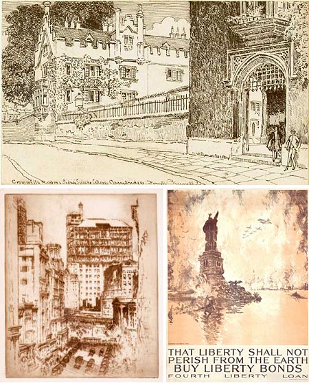
Some artists are drawn to nature’s raw and wild beauty, some to fantasies of other times or imagined worlds, but few follow Joseph Pennell’s fascination with the urban and industrial landscape of his time. He was more interested in a riverbank flanked by factories throwing columns of smoke into the air than one in pristine nature lined with willow trees.Pennell was an american artist and writer. He was most renowned for his etchings. Born in Philadelphia, he studied here at the Pennsylvania School of Industrial Art and later at the Pennsylvania Academy of the Fine Arts; but, like his friend James McNeill Whistler, he was soon drawn to Europe. Pennell lived there from 1883 to 1917, when he moved back to the U.S. and settled in New York.
Pennell’s etching style is dramatically influenced by Whistler, which is a Good Thing, as Whistler, at least in my humble opinion, is probably the second greatest etcher in Western art, behind only Rembrandt. Pennell’s lines seem softer than Whistler’s, but both had an amazing ability to project mood, surface, light and atmosphere with their etched lines.
In Europe he drew the streets, buildings and factories of London and other European cities (image above, top), and, on his return to the U.S. did a remarkable series of etchings of New York city. Many artists might be overwhelmed by the visual complexity of the early 20th Century New York cityscape, with its beautiful buildings textured with ornate cornices, elaborate window ledges and hundreds of windows.
Pennell had a remarkable eye, matched by surety of hand, for reducing that complexity to a simple visual language that still retained the feeling of the complex within his deceptively simple rendering (image above, lower left).
There is a nice inexpensive Dover book of his remarkably evocative simplifications of the complexity of New York skyscrapers and city streets, Pennell’s New York Etchings: 90 Prints, and a less common book of Joseph Pennell’s pictures of Philadelphia, as well as books of his etchings of London, New Orleans and the the Panama Canal. (Unfortunately, many of the books linked here are out of print, but you may be able to find them with a little digging.)
This was at a time when photography was in its infancy and people could only see other parts of the world through the eyes of artists like Pennell.
Pennell is also the author of several books on illustration and pen drawing, particularly one I’m fortunate to have a copy of, Pen Drawings and Pen Draughtsmen. Their Work and Their Methods. If you can’t find a copy to buy, look for it in libraries.
Pennell was also an illustrator, perhaps most famous in that role for his World War II poster for war bonds (image above, lower right), which showed New York city under attack, and the Statue of Liberty engulfed in flames and smoke. [ Erratum: mark Morris has written to let me know that the poster was for World War I, not WW II. See this post’s comments. ]
One of the best sources I’ve found form Pennell images on the web is the site for the Philadelphia Print Shop, from which you can buy original Pennell etchings.
Categories:
-
“Painting a Day” Blogs (Round 6),
The Daily Painters Guild I’ve been following the phenomenon of “painting-a-day” blogs since my post on the originator of the practice, Duane Keiser, in October of 2005.
At the time only Keiser, and Julian Merrow-Smith were engaged (as far as I know) in this practice of painting one small, roughly postcard-size, painting a day, posting it on a blog and offering it for sale directly over then net at a cost much lower than would be feasible through a gallery.
Before long, other artists began to take notice and adopt the practice. In the past six or eight months, the phenomenon has snowballed, as more and more painting-a-day blogs have appeared.
There seem to be two major philosophies about the practice. The first goes something like:
If I adopt the practice of painting one small painting every day, I will grow and become more disciplined as a painter, learning more rapidly, becoming stronger in my ability to grapple with challenges and push through artistic blocks. If I make my practice public by posting my daily painting to a blog, I will be more encouraged to keep to my schedule, I’ll have a visual record of my progress, and I may also be able to make some money in the process by selling my small works on the net.
The second is more like:
If I start a painting-a-day blog, the world will beat a path to my door and I’ll make lots of money.
The former is a worthwhile endeavor, the latter is folly.
Unfortunately, the latter seems to be a dominant factor in the decision of many to jump on the bandwagon, and those who are doing so with that intention are finding themselves in a crowded field.
Painting-a-day bloggers must clamor for attention now amid their own growing numbers, and quickly find that the practice of daily painting is no longer a novelty or a draw in itself.
Micah Condon’s Daily Painters Art Gallery, at one point an attempt to provide a single portal for daily painters, is up to 50 daily painters, and the once open roster is now juried. The site now seems devoted specifically to promoting itself as a marketing vehicle for the members, for which it now charges a monthly membership fee.
I think the the level of ability of the painters on that site varies widely, partly because the “juried” aspect came late in the process, and is indicative of how the phenomenon has become watered down.
By “watered down” I don’t mean to suggest that anyone should refrain from the practice because of their current level of development as a painter. On the contrary, I think it is a superb discipline for any painter, but it should be undertaken in the spirit of the first philosophy I mentioned, not the latter.
However the ‘painting-a-day label used to be associated with artists who were already disciplined and had benefitted from long periods of study and hard work that had matured them as painters.
These artists, unfortunately, are receiving less attention now in their painting-a-day practice than they should because of the sheer number of those who have adopted the label (to the point where some have stopped associating themselves with the “painting-a-day” phrase).
Many of these painters recognized the quality evident in the work of their compatriots and began listing each other’s blogs on their blogrolls, forming a loose association of sorts. In visiting their blogs I would notice many of the same names consistently.
David R. Darrow has written to let me know that several of those painters have now formed a more direct association in an attempt to be seen again above the background radiation of the large number of “daily painters”. The result is the Daily Painters Guild, a group of (at the moment) 15 painters who share a common, professionally consistent, site in addition to their own blogs.
Though the Guild doesn’t include “Painting a Day” originator Duane Keiser, or Julian Merrow Smith, who followed close after, neither of whom need such an association to keep their profile high, the list otherwise reads like the cream of the crop of the daily painters of which I’m currently aware.
Most of them are artists I have already mentioned on lines and colors, many of them in the course of my posts about Painting a Day blogs, like
Louis Boileau (Round 3),
Justin Clayton (Round 4),
David R. Darrow (Round 1), and
Darren Maurer (Round 3).Others are artists I have had a chance to feature individually, like
Belinda del Pesco,
Jeff Hayes,
Neil Hollingsworth,
Karin Jurick,
Carol Marine,
Mick McGinty, and
William Wray.Many of these painters were featured before they started their painting-a-day blogs, so check on the Daily Painters Guild site for their current blog URLs.
The remaining four I haven’t gotten to yet, though two were on my list for the next round of “Painting a Day” blogs, and the other two I hadn’t visited yet.
M Collier
J Matt Miller
Vivienne St. Clair
Peter YesisThe Daily Painters Guild site has links to the artists’ blogs and websites as well as individual pages with short bios. You can bypass the somewhat awkward drop-down navigation from the main page by clicking on the artist’s name for their DPG bio page, an on the “Click here to see more” link for their blog. There is also some general information about the Guild on the “About” page.
Membership in the Daily Painters Guild is by invitation, but they also maintain a large list of Worldwide Daily Painters, to which artists can be added by request.
I don’t mean to imply that the members of the Guild are the only daily painters working at this level, simply that they are representative of the practice at its best and can serve as an example for other artists who are interested in investigating the phenomenon.
I certainly wouldn’t want any of this to intimidate or discourage any artist, whatever their current level of accomplishment, from taking on the challenge of the painting-a-day discipline.
Allowing yourself to be intimidated by the accomplishments of others is one of the deadliest traps an artist can fall prey to (I speak here from experience). Rather, artists who are starting down this road can simply take the Daily Painters Guild as a signpost of where others are going.
If you take up the practice daily painting with the intentions of the first philosophical approach I mention above, you may find that the result is a quicker advancement toward that signpost and beyond.
Categories:
-
Alyssa Monks

Alyssa Monks paints figures. Starting from that simple statement, her figures are explorations of the forms within the human form, something that figurative artists have found compelling for hundreds of years.The figures in her compositions are sometimes collapsed into contracted positions, arms wrapped around themselves, almost, but usually not quite, fetally. My guess is that this is not so much conceptual as visual, a desire to perceive the forms as forms, often revealed in sheets of light and shade cascading across their surface.
If you look through her online galleries, which are arranged by year, you will find excursions into more traditional figures, laying in beds, standing in rooms or arranged almost as portraits, but her most intensely focused work isolates the figures in the space of the composition, with just a bit of the surrounding environment. She uses the white of beedsheets or, in her recent work, the porcelain bathtubs or wall tiles of bathrooms, to compose the figure as dark elements against light.
There is an erotic element in her work, but I think it is fairly subdued, and comes through stronger in her images of clothed figures, like Surrender from 2002 (second row of thumbnails, middle image) than in her nudes. Her work can sometimes feel intimate, but more often the viewpoint feels objective and detached, as though we are an observer, but not a participant in the scene.
In her work from the past year, she is focusing in more closely on small parts of the figure, like part of a face and neck, a composition consisting of a breast, hand and cheek, or other small glimpses of the form, accenting the perception of the figure almost as landscape.
In her work from 2002, the environment came forward, and some of her paintings from that year are interiors without figures, or interiors in which the figure is only a small element. It’s fascinating to look at her eye for these spaces and compare it to her exploration of the figure as both a form and a place.
Link via Neil Hollingsworth
Categories:


Charley’s Picks
Bookshop.org
(Bookshop.org affilliate links; sales benefit independent bookshop owners; I get a small percentage to help support my work on Lines and Colors)

John Singer Sargent: Watercolors


Urban Sketching: Understanding Perspective


Charley’s Picks
Amazon
(Amazon.com affiliate links; sales go to a larger yacht for Jeff Bezos; but I get a small percentage to help support my work on Lines and Colors)
John Singer Sargent: Watercolors
Urban Sketching: Understanding Perspective