
Categories
- 3d CGI
- Amusements
- Animation
- Anime & Manga
- Art Materials
- Art Videos
- Blogroll
- Cartoons
- Color
- Comics
- Concept & Visual Dev.
- Creativity
- Digital Art
- Digital Painting
- Displaying Art on the Web
- Drawing
- Eye Candy for Today
- Gallery and Museum Art
- High-res Art Images
- Illustration
- Motion Graphics & Flash
- Museums
- Online Museums
- Outsider Art
- Painting
- Painting a Day
- Paleo Art
- Pastel, Conté & Chalk
- Pen & Ink
- Prints and Printmaking
- Reviews
- Sc-fi and Fantasy
- Sculpture & Dimensional
- Site Comments
- Sketching
- Storyboards
- Tools and Techniques
- Uncategorized
- Vector Art
- Videos & Podcasts
- Vision and Optics
- Watercolor and Gouache
- Webcomics
Archives
- May 2026
- April 2026
- March 2026
- February 2026
- January 2026
- December 2025
- November 2025
- October 2025
- September 2025
- August 2025
- July 2025
- June 2025
- May 2025
- January 2025
- December 2024
- November 2024
- October 2024
- September 2024
- August 2024
- June 2024
- April 2024
- March 2024
- February 2024
- January 2024
- December 2023
- November 2023
- October 2023
- September 2023
- August 2023
- July 2023
- May 2023
- April 2023
- March 2023
- February 2023
- January 2023
- December 2022
- November 2022
- September 2022
- August 2022
- July 2022
- June 2022
- May 2022
- April 2022
- March 2022
- February 2022
- January 2022
- December 2021
- November 2021
- October 2021
- September 2021
- August 2021
- July 2021
- June 2021
- May 2021
- April 2021
- March 2021
- February 2021
- January 2021
- December 2020
- November 2020
- October 2020
- September 2020
- August 2020
- July 2020
- June 2020
- May 2020
- April 2020
- March 2020
- February 2020
- January 2020
- December 2019
- November 2019
- October 2019
- September 2019
- August 2019
- July 2019
- June 2019
- May 2019
- April 2019
- March 2019
- February 2019
- January 2019
- December 2018
- November 2018
- October 2018
- September 2018
- August 2018
- July 2018
- June 2018
- May 2018
- April 2018
- March 2018
- February 2018
- January 2018
- December 2017
- November 2017
- October 2017
- September 2017
- August 2017
- July 2017
- June 2017
- May 2017
- April 2017
- March 2017
- February 2017
- January 2017
- December 2016
- November 2016
- October 2016
- September 2016
- August 2016
- July 2016
- June 2016
- May 2016
- April 2016
- March 2016
- February 2016
- January 2016
- December 2015
- November 2015
- October 2015
- September 2015
- August 2015
- July 2015
- June 2015
- May 2015
- April 2015
- March 2015
- February 2015
- January 2015
- December 2014
- November 2014
- October 2014
- September 2014
- August 2014
- July 2014
- June 2014
- May 2014
- April 2014
- March 2014
- February 2014
- January 2014
- December 2013
- November 2013
- October 2013
- September 2013
- August 2013
- July 2013
- June 2013
- May 2013
- April 2013
- March 2013
- February 2013
- January 2013
- December 2012
- November 2012
- October 2012
- September 2012
- August 2012
- July 2012
- June 2012
- May 2012
- April 2012
- March 2012
- February 2012
- January 2012
- December 2011
- November 2011
- October 2011
- September 2011
- August 2011
- July 2011
- June 2011
- May 2011
- April 2011
- March 2011
- February 2011
- January 2011
- December 2010
- November 2010
- October 2010
- September 2010
- August 2010
- July 2010
- June 2010
- May 2010
- April 2010
- March 2010
- February 2010
- January 2010
- December 2009
- November 2009
- October 2009
- September 2009
- August 2009
- July 2009
- June 2009
- May 2009
- April 2009
- March 2009
- February 2009
- January 2009
- December 2008
- November 2008
- October 2008
- September 2008
- August 2008
- July 2008
- June 2008
- May 2008
- April 2008
- March 2008
- February 2008
- January 2008
- December 2007
- November 2007
- October 2007
- September 2007
- August 2007
- July 2007
- June 2007
- May 2007
- April 2007
- March 2007
- February 2007
- January 2007
- December 2006
- November 2006
- October 2006
- September 2006
- August 2006
- July 2006
- June 2006
- May 2006
- April 2006
- March 2006
- February 2006
- January 2006
- December 2005
- November 2005
- October 2005
- September 2005
- August 2005
Relevant Blogs
Art, Painting & Sketch
- Gurney Journey
- Underpaintings
- Art and Influence
- Painting Perceptions
- Oil Painters of America
- Vasari Paint POV
- Flying Fox
- Urban Sketchers
- Bento (Smithsonian)
- Art Inconnu
- The Hidden Place
- Still Life
- Making a Mark
- The Art of the Landscape
- Exploring Color & Creativity
- Art Contrarian
- Artist A Day
- beinArt Surreal Art Collective
- Eye Level
- David Dunlop
- p.i.g.m.e.n.t.i.u.m
- CultureGrrl
- Joaquín Sorolla blog
- Artists in Pastel
“Painting a Day”
- A Painting a Day (Keiser)
- On Painting (Keiser)
- Julian Merrow-Smith
- Karen Jurick
- Jeffrey Hayes
- Carol Marine
- Abbey Ryan
- Daily Paintworks
Other Painting Blogs
- Virtual Gouache Land
- Neil Hollingsworth
- Marc Hanson
- Kevin Menck
- Marc Dalessio
- Larry Seiler
- Stapleton Kearns
- Colin Page
- Roos Schuring
- Hans Versfelt
- Titus Meeuws
- Régis Pettinari
- René Plein Air
- Belinda Del Pesco
- Robin Weiss
- Nathan Fowkes (Land Sketch)
- William Wray
- Frank Serrano
- Stephen Magsig
- Michael Chesley Johnson
- Twice a Week
- Sarah Wimperis
- Rob Adams
- Michael Cole Manley
- The Dirty Palette Club
- Mike Manley’s Draw!
Gallery Art & Illustration mix
Illustration
- Howard Pyle
- 100 Years of Illustration
- BibliOdyssey
- Illustration Art
- Today’s Inspiration
- Illustration Mundo
- Little Chimp Society
- Danny Gregory
- R D (John Martz
- Illustration Friday blog
- Monster Brains
- Illustrators & Illustrations (RU)
- Elwood H. Smith
- DaniDraws.com
- Designers Who Blog
- iSpot Blog
Sci-Fi & Fantasy
Illustration & Comics
Comics & Cartoons
- Comics Beat
- Robot 6
- Newsarama Blog
- Comic Vine
- Comics Alliance
- Forbidden Planet Int.
- Paolo Rivera
- Bolt City
- Flight
- Scott McCloud
- The Comics Journal
- Comixpedia
- Funnybook Babylon
- James Baker
- Middleton’s Sketchbook
- Boneville
- The Hotel Fred
- Paul Rivoche
- Daily Cartoonist
- Mad About Cartoons (William Wray)
- Digital Strips
Illustration & Concept
Animation & Concept
- Cartoon Brew
- Animation Blog
- Cold Hard Flash
- Concept Art World
- The CAB
- FY Concept Art
- Concept Ships
- Concept Robots
- John Nevarez
- Armand Serrano
- Marcos Mateu-Mestre
- all kinds of stuff (Kricfalusi)
- Yacin the faun (Man Arenas)
- Kelsey Mann
- Cre8tivemarks Blog
- Ice-Cream Monster Toon Cafe
- AAU Character & Creature Design
- AAU Animation Notes
- Articles and Texticles
Paleo & Scientific
Tools & Techniques
Other
Lists of Art Blogs
Art Image Resource Links
Historic Art Images
- Wikimedia Commons: Paintings
- Wikimedia Commons: Drawings
- The Athenaeum
- WikiArt (WikiPaintings)
- Google Art Project: Artists
- Google Art Project: Collections (Museums)
- ArtCyclopedia
- Web Gallery of Art
- Art Renewal Center
- Web Gallery of Impressionism
Auction Consolidation sites
Auction sites
- Sotheby’s
- Bonham’s
- Christies
- Heritage Auctions: Fine Art
- Heritage Auctions: Illustration
- Freeman’s Auctions
- Bukowskis
- Shannon’s
Image Search
Reverse Image Search (search by image)
- Tin Eye
- RevImg
- Google Image Search (camera icon)
- Bing Image Search (camera icon)
Promoting some friends and some clients of my website design business
- Twin Willows T’ai Chi studio in Wilmington DE. Taiji classes with Bryan Davis.
- Ray Hayward, Inspired Teacher of T’ai Chi ( Taiji ) in Minneapolis, Founder of Mindful Motion Tai Chi Academy
- OldHead Tattoo studio and Art Gallery in Wilmington DE. Tattoos and paintings by Bruce Gulick
- Sharon Domenico Art, pet portrait oil paintings
- Platinum Paperhanging, wallpaper hanging, Main Line and Philadelphia, PA
- Lisa Stone Design, interior designer, Main Line and Philadelphia, PA
- Studio12KPT, original art, prints, calendars and other custom printed items by Van Sickle & Rolleri
-
Forget the film, watch the titles
 What a great idea this is. The Submarine Channel, a web based launching point for independent film and multimedia producers, has started a new feature called Forget the film, watch the titles.
This is the start of an ongoing collection of animated film titles, featuring examples of both opening and closing film credits divided into sub-genres like Animation (meaning animated characters), Motion Graphics (animated graphic design), 3-D (animated 3-D computer graphics) and Mixed (title sequences that use multimedia or mix the previous techniques).
Film titles are an art in themselves, usually done by a different creative team than that of the main movie, and often much better than the movie itself. (A case in point are Jamie Caliri’s wonderful closing titles to Lemony Snicket’s A Series of Unfortunate Events, which are unfortunately not part of this collection.)
Don’t be disappointed, as I was initially, that Forget the Film Watch the Titles. is not yet a huge compendium in which you can look up your favorite title sequences and classics like the Saul Bass gems. The project is just in its infancy, and the collection is small (maybe 20 or so in all at the moment). It’s an ongoing project and it’s going to take a while because they’re trying to do this by the book and secure permission to display the title sequences, a laborious process to say the least.
Think of it like a new blog, just starting, but promising and fun to check in periodically to see what’s new and watch the collection progressing. There are enough titles here for you to get a feeling for what they’re doing, and they do have some good ones (images at left, top to bottom: Nanny McPhee, Kiss Kiss Bang Bang, Made in Yu, Moog).
Link via Cold Hard Flash
Categories:
-
Glen Orbik
 Somewhere there is a place where the dark corridors and smoke filled rooms of pulp noir crime fiction meet the cape filled skies of comic book super heroes. While there are a number of illustrators and comic book artists who regularly visit that intersection (Jim Steranko comes to mind), most are transients. Glen Orbik is a resident.
Even in his numerous comic book covers for Marvel and DC Comics, you can see the influence of terrific paperback and poster artists like Robert McGinniss and Gil Elvgren, and, in particular, Fred Fixler, with whom Orbik studied.
Fixler was a noted illustrator of movie posters and a widely respected teacher. Fixler studied with Frank Reilly and Robert Beverly Hale at the Art Student’s League (where his classmates included James Bama) and later established his own school, The California Art Institute. When he retired from teaching, Orbik took over his classes.
In addition to the major comic book companies, Orbik’s clients include Warner Brothers, Universal Pictures, Sony, Avon Books, Random House and others.
Orbik has a web site, which he shares with his partner and fellow teacher, illustrator Laurel Blechman. The gallery is arranged in one of those PHP gallery modules that can seem a bit awkward and unresponsive, but is navigable. However, once you’re into Orbik’s galleries, it’s easy to miss the fact that you need to come back out to the home page to access Blechman’s work, which you will find at the bottom of the home page and is definitely worth looking for.
The bulk of the galleries are devoted to Orbik’s work, though occasionally you will find works, marked with and asterisk, on which the two artists collaborated. There are sections devoted to Orbik’s pulp noir book covers (which include covers for books by Stephen King and Ray Bradbury) that are steeped in the feeling of classic pulp covers and movie posters. Orbik loves to play with restricted palettes that are almost monochromatic or duotone, where the overall color dominates the mood of the piece, at times punctuated with a vibrant bit of a contrasting color.
His comic book work, largely covers and posters, leans either toward the mythically heroic style of movie posters, ideal for characters like Superman, or to the intimate chiaroscuro of pulp novel covers, a perfect fit for characters like Batman or Catwoman, or his wonderful pulp cover take on the DC Comics’ character Azrael (left, top).
You will also find some unexpected treats in the galleries: storyboards for ads, comic character model sheets, lenticular art, and several sections of very nice figure drawings, studies and demos. Orbik’s figure drawings, not surprisingly, can often have a bit of melodramatic lighting and a pulp illustration feeling about them. Like I said, he lives there.
Suggestion courtesy of Jack Harris
Categories:
-
Michael Phipps

I’m going to make an assumption about this artist, simply because I don’t know much about him, but I do know a couple of things. The assumption I’m making is that he is relatively young and just beginning his career.The reason I might assume this is because the list of credits on his web site is not long, and there are only a few of his illustrations displayed; but his illustrations are so compelling and he is so obviously talented that this could only be because he is just getting started.
Here is what little else I do know at this point. Michael Phipps is an illustrator currently living in Utah. He has a Bachelor of Fine Arts in Illustration from the University of Utah and his clients include Musea Records, Diversified Metals, Wyndam Hotel, Kameleon Design, Progressiveears.com, Musclemag International, Duo, Sceyence Records and Cedar Fort, Inc.
His work is featured in the 2006 Commuincation Arts Illustration Annual, and Illustrators 45, the Society of Illustrators Juried Annual.
He paints primarily in acrylic, although there is some colored pencil work on his site. The site itself only showcases 8 of his illustrations on the main page, and a few more are shown at a smaller size on the Original Art page, where you can purchase the originals.
Phipps has a fascinating treatment of dimensionality in his paintings. Objects hang in space, materials like clouds assume solidified form, waves are treated like two-dimensional stage props, and tree limbs twist and turn in on themselves like three dimensional puzzles. He has a knack for using subdued color and often plays with repeated forms.
The other thing I know is that I haven’t seen nearly enough illustrations by Phipps, and the small taste on his site has left me hoping we’ll see much more from him.
But I think that’s a fairly safe assumption.
Categories:
-
Daryl Cagle’s Professional Cartoonist Index

After yesterday’s rant I think I need some cartoons to lighten up, but I’m still feeling snarky enough to want some cartoons with bite, so lets head on over, as I often do, to Daryl Cagle’s Professional Cartoonist Index.For many years now, Cagle has had a presence on the web showcasing the work of professional cartoonists. It started as one of those large compendiums in which there was an attempt to list all of the professional cartoonists who had a presence on the web (a list I don’t think he maintains any more), that had a “front page” of some of the day’s featured editorial cartoonists. Over the years it has evolved into a showcase focusing more and more on editorial cartoons and now serves as a one-stop-shopping location for viewing the current and past work of a long roster of editorial cartoonists.
Cagles’s political cartoonists feature used to be on the venerable online magazine Slate, but has since moved over to MSNBC. Slate, meanwhile, has recovered by creating their own political cartoon feature that is very similar in format to the one Cagle established.
You may actually find the Slate version easier to deal with. The design of Cagle’s site, unfortunately, is incredibly busy, with banners and lists and ads trying to crowd each other off of every page, but it’s much more full-featured than the Slate cartoon section, and with a little perseverance you can find lots of great stuff.
The home page acts a jumping off point for viewing recent cartoons from a number of cartoonists arranged by topic. This is really the highlight of the site and you can
waste, er, spend a lot of time here, fascinated not only by the cartoons themselves, but by the comparison of how various cartoonists have tackled the same topic on the same day. At times there can be uncanny similarities between several of them, not because of plagiarism, I think that’s actually rare, but simply because some ideas are just “naturals” and suggest themselves readily in the context of a given situation. You’ll also find interesting variety and strong opinions from both sides of the political fence.For real variety, check in on the “Political Cartoons” page, which features Cagle’s selection for the day’s top cartoons, regardless of topic. On the left side of the page is a long list of American editorial cartoonists. At the bottom of this page, past the banner ads and another chance to view the cartoons by topic, is a list of Canadian and worldwide cartoonists. Like reading newspapers from England, Austraila, France and other places around the globe, viewing political cartoons from other countries can be eye opening. It’s astonishing how insular and self-consumed we can be in America. The rest of the world seems much more aware of what’s going on in the world as a whole. We seem oblivious to anything that doesn’t involve us directly.
Cagle is himself a cartoonist and his own work is usually featured on this page. Cagle maintains a blog, Daryl Cagle’s Cartoon Weblog, which you may have seen listed on the lines and colors blogroll. It focuses, logically enough, on editorial cartooning.
There is also a page on the site where you can order reprints of political cartoons for a fee, searchable through an extensive database. There is a Teacher Guide, accessible from a link on the home page, that provides lesson plans for using political cartoons in classes on Social Sciences, Art, Journalism and English.
Back on the home page, in addition to the long row of topic highlights running down the right side, and the extensive text list of further topics at page bottom, there is a set of “Year in Review” links on the left. These gives you access to collections of cartoons that let you re-live your favorite debacles, disasters and diabolical deeds from recent years.
Ah, the memories.
Categories:
-
The Continuing Saga of the Thomas Eakins Gross Clinic Art-as-Commodity Scandal

For background on this post, please see my previous post: Eakins’ The Gross Clinic – Held for Ransom?.It looked as if the potentially tragic loss to Philadelphia of the Thomas Eakins materspiece by clandestine sale to Wal-Mart heiress Alice Walton, for her artificial island of culture in Arkansas, The Crystal Bridges Museum, was going to be avoided. Prompted by outrage among the local art community, city leaders and the ranks of their own students, teachers and alumni, Thomas Jefferson University’s board of directors agreed to delay their “get-capital-quick” scheme for long enough for other city institutions to cough up their ransom demands and raise $68 million to purchase the painting and keep it here in Philadelphia.
The Philadelphia Museum of Art and my old alma mater, the Pennsylvania Academy of the Fine Arts, where Eakins studied and taught (see my post on Thomas Eakins), sponsored a joint fund-raising campaign to allow The Gross Clinic to stay in the city and be jointly owned by the PMA and the Academy’s Museum of American Art.
Unfortunately, there is further fallout and the attempt to keep one great painting in the city has resulted the loss of another.
In order to meet the Jefferson board’s deadline, the museums arranged a loan through Wachovia bank to secure the painting. The fundraising campaign has fallen short, however, and has lost its momentum. The Academy may have stepped in a little over its head on this one, and has just announced the hasty and unfortunate sale of another great Eakins work, The Cello Player, to an unnamed private individual to help cover their share of the debt.
The Cello Player can be considered a “lesser work” than The Gross Clinic, which is one of the acknowledged masterpieces of American art, but it is a beautiful painting and is certainly the finest of the Academy’s three finished Eakins paintings. The purchaser has apparently promised to loan the painting back to the Academy for display to some degree, but there is no disclosure of who has bought the painting or where it will eventually go.
Herbert Riband, the vice chair of the board of the Academy has promised that the buyer is not Alice “I wanna buy me sum Kulture” Walton [my words, not his], but he also states the the Academy doesn’t know the identity of the purchaser and is making that statement on the word of an intermediary who is evidently brokering the sale.
For more interesting detail on the matter, see Lee Rosenbaum’s post on on the subject on her CultureGrrl blog (part of the Arts Journal site). Rosenbaum was on Radio Times with Marty Moss-Coane this morning on WHYY, the Public Radio affiliate here in Philadelphia (when you follow the link, filter for February 5, 2007, it’s in Hour 2). If you’re at all interested in the issue of the “de-acquisition” of works by museums and other public institutions, or this instance specifically, this program makes a fascinating listen. There are three guests, but Rosenbaum in particular is articulate and fascinating (makes me kind of wish she had her own radio show or podcast).
As Rosenbaum points out, this incident raises all kind of disturbing questions about who has the right to make these decisions about important works that are part of the cultural heritage of institutions and cities. Yes, museums “own” their works, except those on loan, and, barring stipulations made on gifts and bequests, can legally sell them; but these institutions exist partially on the basis of tax breaks and operating subsidies paid for with our tax dollars, (as well as our contributions) so in a real, as well as cultural sense, the public also “owns” these works.
To my mind, that’s one of the reasons we support our museums; so great paintings like The Gross Clinic and The Cello Player can be displayed in the cities where they have been a part of the cultural legacy for hundreds of years, and their fate is not left to the egotistical whims of priveledged megalomaniacs who need to make themselves feel cultured by robbing the treasures of other cities, or self-serving members of institutional boards (I’m talking about Jefferson’s board here, not the Academy’s) who treat those treasures like grist for expedient garage sales, simply because they’re too lazy to do actual work of fund raising.
Categories:
-
Christian Pearce
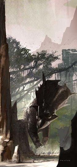 King Kong was on HBO last night, the lavish 2005 Peter Jackson version, not the 1933 classic or the unbelievably bad remake from 1976. (A King Kong remake without dinosaurs? What were they thinking?)
Anyway, watching the recent version was a good reason to take another look through The World of Kong, A Natural History of Skull Island, a book set up as if it was a report on species found on subsequent scientific trips to Kong’s home, profusely illustrated by the talented concept artists from Jackson’s Weta Workshop special effects company.
When I first looked through the book, I was struck by the terrific concept paintings, particularly of dinosaurs, which I just love, by a number of artists who were obviously accomplished, but whose work I hadn’t encountered before (discoveries from the uncharted and mist-enshrouded South Pacific mystery island of New Zealand). I did a post on one of them, Greg Broadmore, back in November.
One of the others who immediately caught my eye was Christian Pearce. His paintings of dinosaurs (and other bizarre Skull Island creatures) have a freshness and breezy handling of color and texture that make them stand out, both as concept art and paleo illustration (noting that the King Kong “dinosaurs”, while freely adopted from real species, are usually made up species that never actually existed).
In addition to King Kong, Pearce has worked on the Lion the Witch and the Wardrobe and the proposed, but unfortunately on hold, live action version of the popular anime Neon Genesis Evangelion. Pearce has also done illustration for children’s books, trading cards, games and comics.
His gallery on the Weta Workshop site, contains some of his professional work. Unfortunately the profile on that site is frivolous and uninformative. There is a little bit more of a bio on the home page of his own site, and the galleries there have both professional work and paintings done for his own amusement.
Categories:


Charley’s Picks
Bookshop.org
(Bookshop.org affilliate links; sales benefit independent bookshop owners; I get a small percentage to help support my work on Lines and Colors)

John Singer Sargent: Watercolors


Urban Sketching: Understanding Perspective


Charley’s Picks
Amazon
(Amazon.com affiliate links; sales go to a larger yacht for Jeff Bezos; but I get a small percentage to help support my work on Lines and Colors)
John Singer Sargent: Watercolors
Urban Sketching: Understanding Perspective