
Categories
- 3d CGI
- Amusements
- Animation
- Anime & Manga
- Art Materials
- Art Videos
- Blogroll
- Cartoons
- Color
- Comics
- Concept & Visual Dev.
- Creativity
- Digital Art
- Digital Painting
- Displaying Art on the Web
- Drawing
- Eye Candy for Today
- Gallery and Museum Art
- High-res Art Images
- Illustration
- Motion Graphics & Flash
- Museums
- Online Museums
- Outsider Art
- Painting
- Painting a Day
- Paleo Art
- Pastel, Conté & Chalk
- Pen & Ink
- Prints and Printmaking
- Reviews
- Sc-fi and Fantasy
- Sculpture & Dimensional
- Site Comments
- Sketching
- Storyboards
- Tools and Techniques
- Uncategorized
- Vector Art
- Videos & Podcasts
- Vision and Optics
- Watercolor and Gouache
- Webcomics
Archives
- May 2026
- April 2026
- March 2026
- February 2026
- January 2026
- December 2025
- November 2025
- October 2025
- September 2025
- August 2025
- July 2025
- June 2025
- May 2025
- January 2025
- December 2024
- November 2024
- October 2024
- September 2024
- August 2024
- June 2024
- April 2024
- March 2024
- February 2024
- January 2024
- December 2023
- November 2023
- October 2023
- September 2023
- August 2023
- July 2023
- May 2023
- April 2023
- March 2023
- February 2023
- January 2023
- December 2022
- November 2022
- September 2022
- August 2022
- July 2022
- June 2022
- May 2022
- April 2022
- March 2022
- February 2022
- January 2022
- December 2021
- November 2021
- October 2021
- September 2021
- August 2021
- July 2021
- June 2021
- May 2021
- April 2021
- March 2021
- February 2021
- January 2021
- December 2020
- November 2020
- October 2020
- September 2020
- August 2020
- July 2020
- June 2020
- May 2020
- April 2020
- March 2020
- February 2020
- January 2020
- December 2019
- November 2019
- October 2019
- September 2019
- August 2019
- July 2019
- June 2019
- May 2019
- April 2019
- March 2019
- February 2019
- January 2019
- December 2018
- November 2018
- October 2018
- September 2018
- August 2018
- July 2018
- June 2018
- May 2018
- April 2018
- March 2018
- February 2018
- January 2018
- December 2017
- November 2017
- October 2017
- September 2017
- August 2017
- July 2017
- June 2017
- May 2017
- April 2017
- March 2017
- February 2017
- January 2017
- December 2016
- November 2016
- October 2016
- September 2016
- August 2016
- July 2016
- June 2016
- May 2016
- April 2016
- March 2016
- February 2016
- January 2016
- December 2015
- November 2015
- October 2015
- September 2015
- August 2015
- July 2015
- June 2015
- May 2015
- April 2015
- March 2015
- February 2015
- January 2015
- December 2014
- November 2014
- October 2014
- September 2014
- August 2014
- July 2014
- June 2014
- May 2014
- April 2014
- March 2014
- February 2014
- January 2014
- December 2013
- November 2013
- October 2013
- September 2013
- August 2013
- July 2013
- June 2013
- May 2013
- April 2013
- March 2013
- February 2013
- January 2013
- December 2012
- November 2012
- October 2012
- September 2012
- August 2012
- July 2012
- June 2012
- May 2012
- April 2012
- March 2012
- February 2012
- January 2012
- December 2011
- November 2011
- October 2011
- September 2011
- August 2011
- July 2011
- June 2011
- May 2011
- April 2011
- March 2011
- February 2011
- January 2011
- December 2010
- November 2010
- October 2010
- September 2010
- August 2010
- July 2010
- June 2010
- May 2010
- April 2010
- March 2010
- February 2010
- January 2010
- December 2009
- November 2009
- October 2009
- September 2009
- August 2009
- July 2009
- June 2009
- May 2009
- April 2009
- March 2009
- February 2009
- January 2009
- December 2008
- November 2008
- October 2008
- September 2008
- August 2008
- July 2008
- June 2008
- May 2008
- April 2008
- March 2008
- February 2008
- January 2008
- December 2007
- November 2007
- October 2007
- September 2007
- August 2007
- July 2007
- June 2007
- May 2007
- April 2007
- March 2007
- February 2007
- January 2007
- December 2006
- November 2006
- October 2006
- September 2006
- August 2006
- July 2006
- June 2006
- May 2006
- April 2006
- March 2006
- February 2006
- January 2006
- December 2005
- November 2005
- October 2005
- September 2005
- August 2005
Relevant Blogs
Art, Painting & Sketch
- Gurney Journey
- Underpaintings
- Art and Influence
- Painting Perceptions
- Oil Painters of America
- Vasari Paint POV
- Flying Fox
- Urban Sketchers
- Bento (Smithsonian)
- Art Inconnu
- The Hidden Place
- Still Life
- Making a Mark
- The Art of the Landscape
- Exploring Color & Creativity
- Art Contrarian
- Artist A Day
- beinArt Surreal Art Collective
- Eye Level
- David Dunlop
- p.i.g.m.e.n.t.i.u.m
- CultureGrrl
- Joaquín Sorolla blog
- Artists in Pastel
“Painting a Day”
- A Painting a Day (Keiser)
- On Painting (Keiser)
- Julian Merrow-Smith
- Karen Jurick
- Jeffrey Hayes
- Carol Marine
- Abbey Ryan
- Daily Paintworks
Other Painting Blogs
- Virtual Gouache Land
- Neil Hollingsworth
- Marc Hanson
- Kevin Menck
- Marc Dalessio
- Larry Seiler
- Stapleton Kearns
- Colin Page
- Roos Schuring
- Hans Versfelt
- Titus Meeuws
- Régis Pettinari
- René Plein Air
- Belinda Del Pesco
- Robin Weiss
- Nathan Fowkes (Land Sketch)
- William Wray
- Frank Serrano
- Stephen Magsig
- Michael Chesley Johnson
- Twice a Week
- Sarah Wimperis
- Rob Adams
- Michael Cole Manley
- The Dirty Palette Club
- Mike Manley’s Draw!
Gallery Art & Illustration mix
Illustration
- Howard Pyle
- 100 Years of Illustration
- BibliOdyssey
- Illustration Art
- Today’s Inspiration
- Illustration Mundo
- Little Chimp Society
- Danny Gregory
- R D (John Martz
- Illustration Friday blog
- Monster Brains
- Illustrators & Illustrations (RU)
- Elwood H. Smith
- DaniDraws.com
- Designers Who Blog
- iSpot Blog
Sci-Fi & Fantasy
Illustration & Comics
Comics & Cartoons
- Comics Beat
- Robot 6
- Newsarama Blog
- Comic Vine
- Comics Alliance
- Forbidden Planet Int.
- Paolo Rivera
- Bolt City
- Flight
- Scott McCloud
- The Comics Journal
- Comixpedia
- Funnybook Babylon
- James Baker
- Middleton’s Sketchbook
- Boneville
- The Hotel Fred
- Paul Rivoche
- Daily Cartoonist
- Mad About Cartoons (William Wray)
- Digital Strips
Illustration & Concept
Animation & Concept
- Cartoon Brew
- Animation Blog
- Cold Hard Flash
- Concept Art World
- The CAB
- FY Concept Art
- Concept Ships
- Concept Robots
- John Nevarez
- Armand Serrano
- Marcos Mateu-Mestre
- all kinds of stuff (Kricfalusi)
- Yacin the faun (Man Arenas)
- Kelsey Mann
- Cre8tivemarks Blog
- Ice-Cream Monster Toon Cafe
- AAU Character & Creature Design
- AAU Animation Notes
- Articles and Texticles
Paleo & Scientific
Tools & Techniques
Other
Lists of Art Blogs
Art Image Resource Links
Historic Art Images
- Wikimedia Commons: Paintings
- Wikimedia Commons: Drawings
- The Athenaeum
- WikiArt (WikiPaintings)
- Google Art Project: Artists
- Google Art Project: Collections (Museums)
- ArtCyclopedia
- Web Gallery of Art
- Art Renewal Center
- Web Gallery of Impressionism
Auction Consolidation sites
Auction sites
- Sotheby’s
- Bonham’s
- Christies
- Heritage Auctions: Fine Art
- Heritage Auctions: Illustration
- Freeman’s Auctions
- Bukowskis
- Shannon’s
Image Search
Reverse Image Search (search by image)
- Tin Eye
- RevImg
- Google Image Search (camera icon)
- Bing Image Search (camera icon)
Promoting some friends and some clients of my website design business
- Twin Willows T’ai Chi studio in Wilmington DE. Taiji classes with Bryan Davis.
- Ray Hayward, Inspired Teacher of T’ai Chi ( Taiji ) in Minneapolis, Founder of Mindful Motion Tai Chi Academy
- OldHead Tattoo studio and Art Gallery in Wilmington DE. Tattoos and paintings by Bruce Gulick
- Sharon Domenico Art, pet portrait oil paintings
- Platinum Paperhanging, wallpaper hanging, Main Line and Philadelphia, PA
- Lisa Stone Design, interior designer, Main Line and Philadelphia, PA
- Studio12KPT, original art, prints, calendars and other custom printed items by Van Sickle & Rolleri
-
Jan van Eyck
 15th Century painter Jan van Eyck was the first great master of oil painting, though he was not, as was commonly believed, the originator of the practice of oil painting.
When oil based paint was first formulated it was used for practical or craft-like applications on objects, because it was more durable in that role than the (usually egg-based) tempera paint traditionally used by artists during the middle ages. (By durable, I mean resistant to abrasion, there are extant examples of tempera paintings that are almost 2000 years old.)
Tempera dries very quickly and is often applied in quick, thin layers, or small cross-hatch strokes. The ability of the medium to carry pigment is limited, as a result so is the saturation of color. Oil paint is fundamentally different. It dries much more slowly, and the qualities of linseed oil that allow it to hold the pigment suspended in beautiful transparent layers gave artists like van Eyck the freedom to create smooth blended tones and luxuriously layered glazes, saturated with vibrant color.
Van Eyck must have been the special effects genius of his day, dazzling anyone who encountered his work with a virtuoso display of the capabilities of this remarkable painting medium, along with the ability it gave him to create works that were painted with astonishing levels of realism and an almost insane degree of detail.
Figurative painting in some respects grew out of a tradition of decorating objects. In medieval painting in particular there is a tendency to treat the painting as both an image and a decorative object, filled with elaborate details of decorative elements. Van Eyck is a central point where this tradition meets the beginning of the more image-centric traditions of the Renaissance and the results are an uncanny mix of realism and detail.
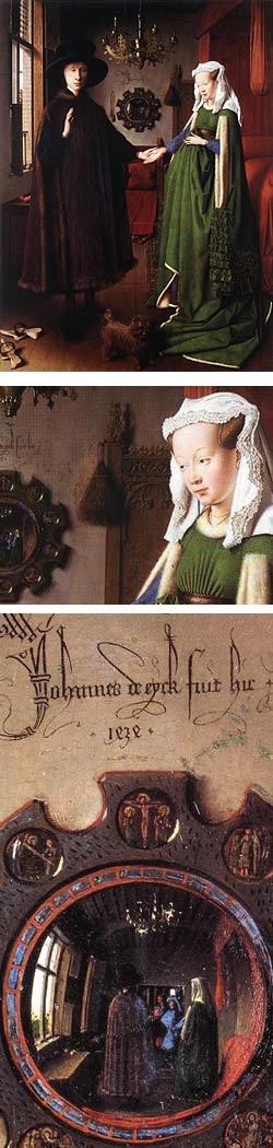
I have often stood in the Philadelphia Museum of Art, magnifying glass in hand, marveling at the incredibly fine details in the foreground objects and background scene in van Eyck’s St Francis of Assisi Receiving the Stigmata. If you see this painting in reproductions, you assume it must be bigger than its actual size of 5 x 5¾” (12.7 x 14.6 cm).
For all his uncanny realism, van Eyck still displays (at least to my eye) some of the primitivism of medieval painting in the form of lapses in perspective and proportion. His figures’ hands, for example, often seem flattened and disproportionately small. Perspective sometimes seems off in his super-detailed backgrounds, but his display of painting virtuosity and the astonishing levels of detail make you forgive him almost anything.
Take a look at his larger work, The Virgin and Child with Nicolas Rolin, and a detail from the background of the same painting. (it was common for the powerful patrons who commissioned paintings at the time to have themselves portrayed cozying up with saints and other religious figures.) Van Eyck’s truly large works, like the famous Ghent Altarpiece, must have taken people’s breath away and seemed like miracles in and of themselves.
The painting shown here, Portrait of Giovanni Arnolfini and his Wife is also filled with detail. Images like this were also charged with symbolism. Almost everything in the painting, from the formal arrangement of the couple, their dress, hand positions, the shoes, the carpet, the oranges on the windowsill, means something. For a more elaborate and scholarly interpretation than I can possibly go into here, see Craig Harrison’s Jan Van Eyck, The Play of Realism. (There is also a teen-novel based around this painting, The Wedding: An Encounter with Jan van Eyck by Elizabet Rees.)
There are other interesting things about this work in particular, notably in the question of who is “here” in the scene. The couple seem unaware of us as observers, but the dog at their feet is looking directly at us (perhaps imbued with an uncanny 6th sense that allows him to know he is being watched by observers from another time).
Among the fascinating details in the room is a convex mirror on the wall behind, and between, the couple. In the reflection in the mirror we can see, past the backs of the main figures, two more individuals, one in red, the other in blue, who are witnesses to the scene (and presumably the actual subject of the dog’s attention). The mystery figures are, in fact, standing where they would have our view of the scene and we, as observers of the painting, are taking their place in the room.
There is also a gargoyle, part of the furniture in the background, but positioned as if sitting on the joined hands of the couple. (There are no accidents here.)
The mirror is flanked by a whisk broom on one side and a set of glass prayer beads on the other. Above it is a date (1434) and the artist’s signature. Van Eyck was the only Northern painter of his day to sign his work, but even then the signature was usually subdued, or perhaps even part of the frame.
Here, indicating that van Eyck was somehow more personally involved in this image than others, it is painted as if inscribed on the wall itself, like some elaborately penned example of 15th Century graffiti. The inscription is Latin for “Jan van Eyck was here.”
Indeed he was.
Categories:
-
The Mysterious Geographic Explorations of Jasper Morello
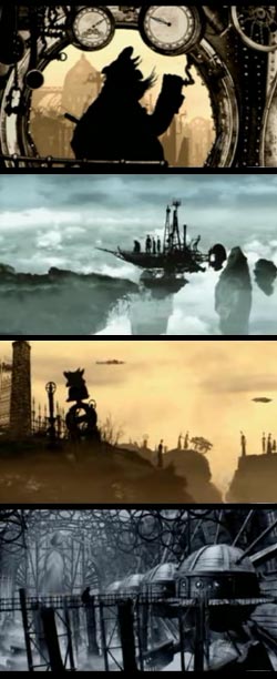 Silhouette animation is a form of cut-out animation. The latter is familiar as the style used to give that extra-cheezy feeling to South Park. If you were to take South Park style cut-outs and light them from behind, rather than the front, so that surface colors and textures were eliminated leaving only black silhouettes, you would have silhouette animation.
Despite the crude image this analogy conjures up, silhouette animation can be used artfully and effectively, particularly if great attention is given to the detail in the silhouetted shapes. The oldest surviving full-length animation, in fact, is a silhouette animation called The Adventures of Prince Achmed, created by German animator Lotte Reiniger and released in 1926.
Today, it’s almost a lost form except in experimental shorts. An exceptional example of this is The Mysterious Geographic Explorations of Jasper Morello. This is a series of wonderfully done short animations that have been nominated for an Academy Award and already won awards at Annecy, AFI and various festivals in several countries.
Directed by Anthony Lucas and written by Mark Shirrefs, this “triolgy” (actually 4 episodes) follows the adventures of a Jasper Morello, airship navigator from the city of Gothia. The films are set in a somewhat dystopian world with a decidedly steampunk look and feel. It’s in the graphical representation of that world, full of arcane Victorian machinery, elaborate airships, cranes, gantries, gears and attendant intricate objects that the silhouette format becomes a brilliant choice. Though not strictly limited to silhouettes, the backgrounds can be rich with detail at times, the characters are all simply black cut-out shapes, with the eerie exception of one characters glasses. The detail in the backgrounds is handled with a subdued chromatic range and blended with the silhouetted characters to make a harmonious whole.
There is a site devoted to the films, The Gothia Gazette, done in period style and fun to explore. It includes a trailer and you can order all four stories on DVD. Much better than the trailer, though, in demonstrating how effective these stories are, is the availability now of the entire first short, Jasper Morello and the Lost Airship, on YouTube. You can see all three segments of that short pulled together on the Wired blog Table of Malcontents.
Given that the characters are simply black silhouettes, the piece is remarkably effective, and affecting, even if a bit gruesome. The design, drawing and production values of these shorts have a unique look and feel and enough atmosphere to put many feature movies to shame.
Link via Wired
Categories:
-
Roberto Parada
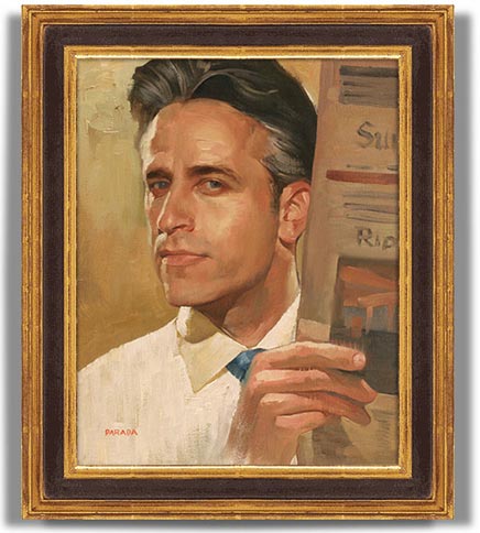
Roberto Parada is an American illustrator who specializes in editorial illustrations with portraits of rock music luninaries, sports stars, movie and TV personalities and political figures.At times his portrait images are quite straightforward, like his straight-on takes on John Stewart (above) or Michael Caine. Often, though, there is a nice twist or bit of wry commentary, like his portrait of Gary Shandling as Moby Dick (the whale, not Ahab), Jack Black as a Shakespearian actor in his Nacho Libre garb, or George W. Bush as Nero.
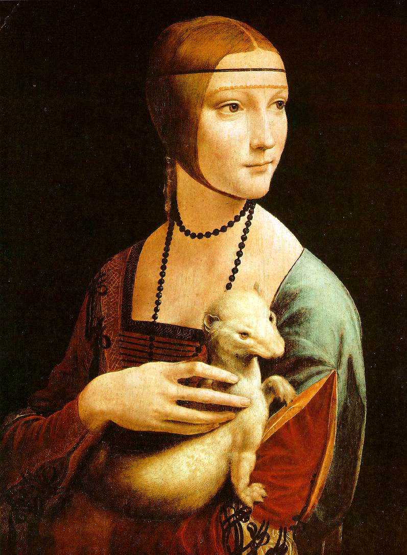
Parada can also be quite funny, and his paintings often make reference to art history, as in his “portrait” of Homer Simpson as a real person, as if painted by Andrew Wyeth, and his hilarious portrait of Canadian Billionaire Ken Thompson posed with his dog as a send-up of Da Vinci’s Lady With an Ermine.
Parada was born in a New Jersey suburb of New York and studied at the Pratt Institute in Brooklyn. He started his career working in acrylics but gained the confidence to switch to oil by talking with illustrator Tim O’Brien.
Parada’s paintings in oil can be smoothly blended or, as in the case of the John Stewart image, quite painterly. (There is nice big reproduction of that image in the July 2006 Communication Arts Illustration Annual.)
In addition to the galleries, his web site features a selection of prints that can be ordered, and that section also includes images that are not seen in the other galleries. You will also find images painted from life in the Studio section.
In the About section of his site, Parada tells of his encounter at age 33 with a life threatening condition known as Severe Aplastic Anemia, or severe bone marrow failure. After undergoing drastic treatments of aggressive immune surpression, he was the fortunate recipient of an anonymous donor bone marrow transplant. The News page tells about his eventual meeting with the donor who saved his life.
There is a good chance that exposure to benzine, a toxic chemical found in paint thinners and other art materials, was the trigger for his condition. Parada still works in oils, but is vigilant about the use of non-toxic art materials, including his paint thinners, and has become concerned with raising awareness about the dangers of toxic art materials as well as awareness of bone marrow donation.
A personal note: Although I don’t have any first hand knowledge of bone marrow transplants, I am myself the fortunate recipient of a kidney transplant (14 years as of last September), and I encourage you to take a look a the links that Parada provides to the National Bone Marrow Donor Program and other resources.
You may have also noticed my constant links on the lines and colors right sidebar to the Donate Life site, and the Gift of a Lifetime site. The latter is a fascinating web documentary on organ and tissue donation. I was glad to be a member of the team, coordinated by FusionSpark Media, that created this site. I did the illustration and programming for the Flash module called The Interactive Body, which uses animation and interactivity to inform about the organs and tissues that can be transplanted. There is also information on the Gift of a Lifetime site about bone marrow donation.
Categories:
-
Carol Marine
 Some artists search fervently for variety in their subject matter. Some fall into repetition in subject and handling, lulled into the comfort of repeating success. Some, however, have an eye to finding variety and novelty within limited subject matter, by virtue of imaginative variation in the handling of the subject. Monet, for example, would paint the same scene over and over, catching the fugitive variations in light that changed by the hour or season.
As I was reading through Bert Dodson’s book on Drawing with Imagination (yesterday’s post), which is in many ways about finding invention in variation on a theme, it brought to mind a painter I had mentioned in my last post on “Painting a Day” painters, who finds wonderful variety and freshness within a limited subject.
Carol Marine is a painter in Texas who has been practicing the painting a day regimen since October of 2006. Many of the painting a day painters find themselves, naturally enough, painting subjects that are easily at hand, small household objects, food and, in particular, that staple of traditional still life painting, fruit. In addition to other subjects, Marine has taken apples, pears, nectarines, and other, predominantly round fruit, some of the most basic and familiar of nature’s forms, and made them the subject of numerous paintings.
If you ever think you are at a loss for subject matter, Marine’s variations on simple arrangements of apples, for example, make an eye-opening course in how to find variety, freshness, novelty, and seemingly endless discovery within a humble subject. Her small still life paintings are little marvels of dynamic composition, bold paint handling and daring color contrasts.
Though always representational, there is a great deal of abstraction in her work, in the truest and best sense of that word, meaning to abstract or refine the essence of something. The negative spaces are almost equally as strong as the objects in her compositions. The forms themselves are defined with strong tonal contrasts, great glowing chunks of color and solid but free draftsmanship. At times, she gives her forms a hint of a drawn edge, a line, somewhat like Cezanne, another painter who found great variation within the humble subject of fruit.
In addition to her blog, Marine has a primary web site on which you will find more finished works, including florals, portraits and very nice landscapes. You will also find a more refined but still fresh and dynamic handling of still life subjects, including, yes, fruit.
Categories:
-
Keys to Drawing with Imagination by Bert Dodson
I received a review copy of Keys to Drawing with Imagination by Bert Dodson from F+W Publications.Bert Dodson is a painter, illustrator, teacher and author whose previous book on the subject of drawing, Keys to Drawing is a standard in the field of popular “how to draw” books. In a vein somewhat similar to Betty Edwards’ Drawing on the Right Side of the Brain, it guided you through 55 “keys”, or principles, that were designed to help you see what is actually in front of you, and to draw what you see. It was also designed to stimulate and encourage you, and to have you participating, drawing, right from the start.
Although it too encourages immediate participation, the intention of Dodson’s new book, Keys to Drawing with Imagination: Strategies for Gaining Confidence and Enhancing Your Creativity, which I may refer to by the more succinct title, Drawing with Imagination, has a different aim. This is not a “how to draw” book for novices, but, as the title suggests, a course in drawing with, and from, your imagination, and is essentially an extension and elaboration on themes begun in his previous book’s last chapter.
Anyone who has tried to come up with concept art for movies or games, design scenes or characters for comics, create imaginative editorial or advertising illustrations or even produce gallery art that deals with the imaginary or the imaginative interpretation of the real, knows that “creativity” can quickly go from an abstract concept to a very real and formidable challenge, particularly when you are faced with deadlines and the prospect of “creativity on demand” (an oxymoron if ever there was one).
Dodson seeks to address that situation with a course in imaginative thinking. Unlike many books on creative thinking that try to appeal to writers, business people and a very general sense of “creativity”, this one is focused specifically on drawing. Perhaps most importantly, it is focused on the process of drawing, and how that process can be, in itself, a creative process.
The book is obviously meant to be used, not read. The publisher has gone to the extra length of making it spiral bound so it can be laid flat on your drawing table, within a hard cover that has a flat spine so it can be seen on the shelves in the bookstores.
Like the original Keys to Drawing, Keys to Drawing with Imagination is divided up into short exercises that encourage you to jump in and begin doing immediately, putting thinking aside for the time being. The free generation of ideas, without interference from the critical part of the brain, is one of the long established principles for encouraging creativity. In fact, most of the creativity enhancing principles in the book are not new (which Dodson readily acknowledges). What is new, and makes Drawing with Imagination successful, is the concrete and immediate instructions and exercises for applying those principles through the practice of drawing.
If you are used to skipping introductions to books, make an exception for this one; as Dodson’s intro serves as a concise two page essay on those principles, and acts as a key, if you’ll excuse the expression, to the rest of the book. His exercises encourage you to take the familiar and make it into the unfamiliar, whether by extending doodles into more realized drawings, combining existing drawings, reversing and adding to sketches from life, combining forms, adding elements of texture and shading in novel ways, abstracting simplified graphic elements out of more complex ones, or any of a number of other ways he has laid out to encourage idea generation while drawing.
One of my reservations about Dodson’s previous book was that I thought the drawings chosen to accompany the text could have included more gems from the masters, and I wondered if he perhaps felt that very accomplished drawings might intimidate beginners. Here he has taken an interesting tack and chosen, in addition to his own drawings, examples to illustrate his points from unexpected sources, like M.C. Escher, underground comix artists Victor Moscoso (a personal favorite) and Robert Crumb, classic newspaper comics genius Winsor McCay, illustrators George Dugan, Steven Guarnaccia and Trina Schart Hyman, storyboard artist Michael Mitchell and gallery artists Zelma Loseke and Mya Lyn, among others.
You can preview some sample pages on the Bert Dodson Studio site (although the image files on the site are of inexplicably poor quality, and don’t reflect the way they appear in the book).
Though not necessarily for everyone, artists who deal in imagination and the imaginary, as well as those who want creativity enhancing exercises based directly on drawing, should take a look. It occurred to me while initially thumbing through the book, that here are a few hundred potential levers to wedge your way out of “stuckness”. The “key”, of course, it to take up pencil or pen and apply them.
Categories:
-
William Merritt Chase
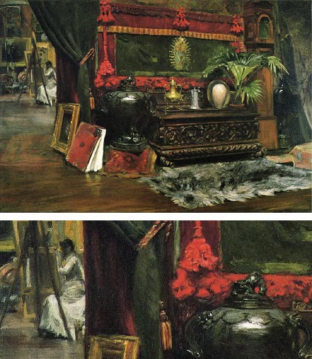
“The desire to draw was born in me.” said William Merritt Chase, in resistance to his father’s hope that he follow him into the women’s shoe business.Born in Indiana, he trained with local artist Barton S.Hays and then at the National Adacemy of Design in New York. He moved to St. Louis and began his career painting still lifes. He became active in the St. Louis art community and, with the help of local patrons, traveled to Europe for two years, in return for paintings and the promise of helping the collectors acquire European art.
Chase studied there at the Academy of Fine Arts, Munich, a school that was attracting a number of Americans at the time, including Frank Duveneck. Chase traveled to Venice with Duveneck and John Henry Twatchman. On returning to the U.S. he began teaching at the Art Students League. He was perhaps the most noted art teacher of his time and also taught at the Brooklyn Art Association, the Pennsylvania Academy of the Fine Arts, and at two schools that he founded, the Shinnecock Summer School of Art and the New York School of art.
In addition to his work in oil, Chase was masterful in pastel and also worked in watercolor and produced etchings. He is renowned for his impressionist style landscapes of Prospect Park in Brooklyn and Central Park in New York, as well as a series painted in the summer sun at Shinnecock. He continued to paint still lifes and portraits throughout his career.
Chase is perhaps best known as founder and leader of the Society of American Artists, a group of avant-garde American artists who broke away from the conservative National Academy of Design in 1877. Members included J. Alden Weir, Albert Pinkham Ryder and John Henry Twatchman.
As is always the way, the avant-garde soon became the establishment and several of the Society’s members broke away to form a new group, the Ten American Painters, whose ranks included Weir and Twatchman along with major American painters like Childe Hassam, William Metcalf, Frank Benson, and Edmund Tarbell. Chase joined them when Twatchman died in 1902.
All of these painters were influenced by the dazzling explosion of French Impressionism. One of the things that I find particularly appealing about “American Impressionism” is that the American artists seemed less intent on making a complete break with the traditions of academic realism than their French counterparts. The result can often be a blurring of the lines between impressionist color and realist draftsmanship; and Chase is a prime example of this wonderful blend, as exemplified by the image above, A Corner of My Studio.
Categories:


Charley’s Picks
Bookshop.org
(Bookshop.org affilliate links; sales benefit independent bookshop owners; I get a small percentage to help support my work on Lines and Colors)

John Singer Sargent: Watercolors


Urban Sketching: Understanding Perspective


Charley’s Picks
Amazon
(Amazon.com affiliate links; sales go to a larger yacht for Jeff Bezos; but I get a small percentage to help support my work on Lines and Colors)
John Singer Sargent: Watercolors
Urban Sketching: Understanding Perspective