
Categories
- 3d CGI
- Amusements
- Animation
- Anime & Manga
- Art Materials
- Art Videos
- Blogroll
- Cartoons
- Color
- Comics
- Concept & Visual Dev.
- Creativity
- Digital Art
- Digital Painting
- Displaying Art on the Web
- Drawing
- Eye Candy for Today
- Gallery and Museum Art
- High-res Art Images
- Illustration
- Motion Graphics & Flash
- Museums
- Online Museums
- Outsider Art
- Painting
- Painting a Day
- Paleo Art
- Pastel, Conté & Chalk
- Pen & Ink
- Prints and Printmaking
- Reviews
- Sc-fi and Fantasy
- Sculpture & Dimensional
- Site Comments
- Sketching
- Storyboards
- Tools and Techniques
- Uncategorized
- Vector Art
- Videos & Podcasts
- Vision and Optics
- Watercolor and Gouache
- Webcomics
Archives
- May 2026
- April 2026
- March 2026
- February 2026
- January 2026
- December 2025
- November 2025
- October 2025
- September 2025
- August 2025
- July 2025
- June 2025
- May 2025
- January 2025
- December 2024
- November 2024
- October 2024
- September 2024
- August 2024
- June 2024
- April 2024
- March 2024
- February 2024
- January 2024
- December 2023
- November 2023
- October 2023
- September 2023
- August 2023
- July 2023
- May 2023
- April 2023
- March 2023
- February 2023
- January 2023
- December 2022
- November 2022
- September 2022
- August 2022
- July 2022
- June 2022
- May 2022
- April 2022
- March 2022
- February 2022
- January 2022
- December 2021
- November 2021
- October 2021
- September 2021
- August 2021
- July 2021
- June 2021
- May 2021
- April 2021
- March 2021
- February 2021
- January 2021
- December 2020
- November 2020
- October 2020
- September 2020
- August 2020
- July 2020
- June 2020
- May 2020
- April 2020
- March 2020
- February 2020
- January 2020
- December 2019
- November 2019
- October 2019
- September 2019
- August 2019
- July 2019
- June 2019
- May 2019
- April 2019
- March 2019
- February 2019
- January 2019
- December 2018
- November 2018
- October 2018
- September 2018
- August 2018
- July 2018
- June 2018
- May 2018
- April 2018
- March 2018
- February 2018
- January 2018
- December 2017
- November 2017
- October 2017
- September 2017
- August 2017
- July 2017
- June 2017
- May 2017
- April 2017
- March 2017
- February 2017
- January 2017
- December 2016
- November 2016
- October 2016
- September 2016
- August 2016
- July 2016
- June 2016
- May 2016
- April 2016
- March 2016
- February 2016
- January 2016
- December 2015
- November 2015
- October 2015
- September 2015
- August 2015
- July 2015
- June 2015
- May 2015
- April 2015
- March 2015
- February 2015
- January 2015
- December 2014
- November 2014
- October 2014
- September 2014
- August 2014
- July 2014
- June 2014
- May 2014
- April 2014
- March 2014
- February 2014
- January 2014
- December 2013
- November 2013
- October 2013
- September 2013
- August 2013
- July 2013
- June 2013
- May 2013
- April 2013
- March 2013
- February 2013
- January 2013
- December 2012
- November 2012
- October 2012
- September 2012
- August 2012
- July 2012
- June 2012
- May 2012
- April 2012
- March 2012
- February 2012
- January 2012
- December 2011
- November 2011
- October 2011
- September 2011
- August 2011
- July 2011
- June 2011
- May 2011
- April 2011
- March 2011
- February 2011
- January 2011
- December 2010
- November 2010
- October 2010
- September 2010
- August 2010
- July 2010
- June 2010
- May 2010
- April 2010
- March 2010
- February 2010
- January 2010
- December 2009
- November 2009
- October 2009
- September 2009
- August 2009
- July 2009
- June 2009
- May 2009
- April 2009
- March 2009
- February 2009
- January 2009
- December 2008
- November 2008
- October 2008
- September 2008
- August 2008
- July 2008
- June 2008
- May 2008
- April 2008
- March 2008
- February 2008
- January 2008
- December 2007
- November 2007
- October 2007
- September 2007
- August 2007
- July 2007
- June 2007
- May 2007
- April 2007
- March 2007
- February 2007
- January 2007
- December 2006
- November 2006
- October 2006
- September 2006
- August 2006
- July 2006
- June 2006
- May 2006
- April 2006
- March 2006
- February 2006
- January 2006
- December 2005
- November 2005
- October 2005
- September 2005
- August 2005
Relevant Blogs
Art, Painting & Sketch
- Gurney Journey
- Underpaintings
- Art and Influence
- Painting Perceptions
- Oil Painters of America
- Vasari Paint POV
- Flying Fox
- Urban Sketchers
- Bento (Smithsonian)
- Art Inconnu
- The Hidden Place
- Still Life
- Making a Mark
- The Art of the Landscape
- Exploring Color & Creativity
- Art Contrarian
- Artist A Day
- beinArt Surreal Art Collective
- Eye Level
- David Dunlop
- p.i.g.m.e.n.t.i.u.m
- CultureGrrl
- Joaquín Sorolla blog
- Artists in Pastel
“Painting a Day”
- A Painting a Day (Keiser)
- On Painting (Keiser)
- Julian Merrow-Smith
- Karen Jurick
- Jeffrey Hayes
- Carol Marine
- Abbey Ryan
- Daily Paintworks
Other Painting Blogs
- Virtual Gouache Land
- Neil Hollingsworth
- Marc Hanson
- Kevin Menck
- Marc Dalessio
- Larry Seiler
- Stapleton Kearns
- Colin Page
- Roos Schuring
- Hans Versfelt
- Titus Meeuws
- Régis Pettinari
- René Plein Air
- Belinda Del Pesco
- Robin Weiss
- Nathan Fowkes (Land Sketch)
- William Wray
- Frank Serrano
- Stephen Magsig
- Michael Chesley Johnson
- Twice a Week
- Sarah Wimperis
- Rob Adams
- Michael Cole Manley
- The Dirty Palette Club
- Mike Manley’s Draw!
Gallery Art & Illustration mix
Illustration
- Howard Pyle
- 100 Years of Illustration
- BibliOdyssey
- Illustration Art
- Today’s Inspiration
- Illustration Mundo
- Little Chimp Society
- Danny Gregory
- R D (John Martz
- Illustration Friday blog
- Monster Brains
- Illustrators & Illustrations (RU)
- Elwood H. Smith
- DaniDraws.com
- Designers Who Blog
- iSpot Blog
Sci-Fi & Fantasy
Illustration & Comics
Comics & Cartoons
- Comics Beat
- Robot 6
- Newsarama Blog
- Comic Vine
- Comics Alliance
- Forbidden Planet Int.
- Paolo Rivera
- Bolt City
- Flight
- Scott McCloud
- The Comics Journal
- Comixpedia
- Funnybook Babylon
- James Baker
- Middleton’s Sketchbook
- Boneville
- The Hotel Fred
- Paul Rivoche
- Daily Cartoonist
- Mad About Cartoons (William Wray)
- Digital Strips
Illustration & Concept
Animation & Concept
- Cartoon Brew
- Animation Blog
- Cold Hard Flash
- Concept Art World
- The CAB
- FY Concept Art
- Concept Ships
- Concept Robots
- John Nevarez
- Armand Serrano
- Marcos Mateu-Mestre
- all kinds of stuff (Kricfalusi)
- Yacin the faun (Man Arenas)
- Kelsey Mann
- Cre8tivemarks Blog
- Ice-Cream Monster Toon Cafe
- AAU Character & Creature Design
- AAU Animation Notes
- Articles and Texticles
Paleo & Scientific
Tools & Techniques
Other
Lists of Art Blogs
Art Image Resource Links
Historic Art Images
- Wikimedia Commons: Paintings
- Wikimedia Commons: Drawings
- The Athenaeum
- WikiArt (WikiPaintings)
- Google Art Project: Artists
- Google Art Project: Collections (Museums)
- ArtCyclopedia
- Web Gallery of Art
- Art Renewal Center
- Web Gallery of Impressionism
Auction Consolidation sites
Auction sites
- Sotheby’s
- Bonham’s
- Christies
- Heritage Auctions: Fine Art
- Heritage Auctions: Illustration
- Freeman’s Auctions
- Bukowskis
- Shannon’s
Image Search
Reverse Image Search (search by image)
- Tin Eye
- RevImg
- Google Image Search (camera icon)
- Bing Image Search (camera icon)
Promoting some friends and some clients of my website design business
- Twin Willows T’ai Chi studio in Wilmington DE. Taiji classes with Bryan Davis.
- Ray Hayward, Inspired Teacher of T’ai Chi ( Taiji ) in Minneapolis, Founder of Mindful Motion Tai Chi Academy
- OldHead Tattoo studio and Art Gallery in Wilmington DE. Tattoos and paintings by Bruce Gulick
- Sharon Domenico Art, pet portrait oil paintings
- Platinum Paperhanging, wallpaper hanging, Main Line and Philadelphia, PA
- Lisa Stone Design, interior designer, Main Line and Philadelphia, PA
- Studio12KPT, original art, prints, calendars and other custom printed items by Van Sickle & Rolleri
-
Hendrick Goltzius
Despite the fact that he was limited to the use of one hand, his other having been crippled by fire, 16th Century Dutch artist Hendrick Goltzius was a master of the art of engraving, as well as a supremely accomplished pen draughtsman.He was also accomplished at drawing with chalks, notably the “trois crayon” method of drawing with black, red and white chalks on tinted paper to achieve a painting-like effect, usually for portraits or figures. In his later years, Goltzius left engraving to devote himself to painting, but never achieved a mastery of that medium comparable to his extraordinary accomplishments with burin and pen.
Goltzius was very impressed with the work of Michelangelo, which he encountered on a trip to Italy. Many of his works are influenced the Italian master’s more strained and convoluted figures, and his most dramatic examples of foreshortening.
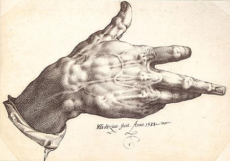
It is in Goltzius’s own command of the engraving burin and drawing pen that he really shines, though. He brought ink techniques, like the use of varied width lines, to engraving; and his ink drawings are amazing emulations of the line style of engravings, like the extraordinary pen drawing of his crippled right hand (image above), for which you can see chalk studies here.
Like most artists of his day, many of his chalk drawings were preparatory for finished works, like this chalk study for his famous engraving depicting the lost classical sculpture known as the Farnese Hercules (Wikipedia article)
Goltzius did a number of remarkable large scale “penworks”, pen and ink drawings, often drawn on specially prepared canvas and colored with delicate washes of transparent oil. These were done a much larger size than was common for ink drawings, as in the striking Without Ceres and Bacchus, Venus Would Freeze, acquired in the early 90’s by the Philadelphia Museum of Art, which is 41 x 31 inches (105 x 80 cm).
He also did large panoramas of landscapes in his native Holland, which were some of the earliest of their kind and helped pave the way for great Dutch artists to follow, like Rembrandt.
Categories:
-
Charles Robinson

Charles Robinson was an illustrator of children’s books in the “Golden Age” of illustration, a time roughly from the late 1800’s to the early 1900’s.His black an white illustrations are subtle combinations of line and stipple, often simple and at times simply silhouettes, at other times leaning toward a more elaborate, Art Nouveau style that carried similarities to Aubrey Beardsley or Kay Neilsen.
It is his watercolor illustrations, though, primarily for the covers of the books he illustrated, that are most fascinating for me. In ways reminiscent of Arthur Rackham, or the more open style of Edmund Dulac, his watercolors have a grace and charm that make me wish he had been able to do more full color illustrations for the interiors of his books.
Robinson, along with his brothers, Thomas Heath Robinson and William Heath Robinson, who were also illustrators, were among the first generation of artists who could actually see their work reproduced in books by way of photo engraving.
Previously, artists would have their work interpreted by specialty engravers, such as the Robinson brothers’ father, who would copy the illustrator’s work in preparing the actual engravings which could be used for printing. Interior color reproduction was difficult and expensive as individual plates that were “tipped in”, or added to the book after it was printed.
Charles Robinson illustrated classics like Beauty and the Beast, Bluebeard, Cinderella, The Frog Prince, Little Red Riding Hood and Hansel and Gretel (image above).
Categories:
-
Terry Miura

Terry Miura is an artist who took a path from an illustration career to a dedication to gallery painting. After working in New York for six years creating illustrations for clients like Time, Newsweek, Random House and GRP Records, he transitioned his part-time devotion to painting into a full time pursuit.He returned to California, where he had studied at the Art Center College of Design, and his subject matter followed suit, from New York cityscapes to landscapes of the Caifornia hills and valleys. In exploring his galleries, you will also find paintings from trips to Umbria, primarily landscapes with a few scenes of streets and cafes, and occasionally a still life. The paintings are arranged by gallery showing.
All reveal an open, painterly approach that dwells as much on atmosphere and mood as on the features of the scenes themselves. There is also a very strong sense of the importance of composition, geometry and the arrangement of areas of color as elements in themselves.
He is currently working on landscapes that are non-specific, or according to Miura, “Although they’re still very much representational, they’re not about specific locations.” Instead the landscapes are meant to represent evoked memories.
His site is arranged as a blog, with links to the galleries to the left.
Categories:
-
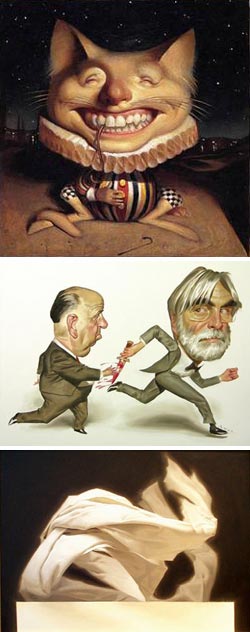
Robolus (Roberto Freire)

Roberto Freire does wonderful caricatures and, as of January 1 of this year, has repurposed his blog, Robolus.com, to be dedicated to his New Year’s resolution to draw and post “A Caricature a Day”.He had my attention immediately when I saw his caricatures done from drawings by the great portrait artist Hans Holbein the Younger (above, left). He insured the fact that I will be checking back often when I saw his wonderful portrait/caricature of Hal Foster, one of my all time favorite comic strip artists (above, right).
Be sure to click on the images in his blog postings to view the larger versions, so you can see the really nice line and tone quality in his drawings. At times his line work can have some of the wonderful looseness you see in Mort Drucker’s terrific caricatures.
I’m fascinated to know where Freire will look next for inspiration. He’s already done caricatures from other painters, from film and television and other sources.
Beyond the daily project, you can find other caricatures on previous months in the archives of the blog, along with paintings, musings and articles of interest on a number of topics.
Link and suggestion courtesy of Thomas Wunsch
Categories:
-
Hakjoon Kang

I’m constantly surprised and delighted at the growing number of artists, of many diverse genres and approaches to visual arts, who are chronicling some aspect of their work on blogs.As a result we get to see an insider’s look at many creative endeavors that would have been “behind the scenes” before.
As a case in point, Hakjoon Kang is a background artist for television animation. What he often posts to his blog, be4be4, is not just concepts of what the story backgrounds might look like, but the actual drawings that are used in the final animation. Plus, you frequently get to see both his ink drawings and the finished background as colored by the background color crew.
Kang has worked on animated series like Teen Titans, The Batman, Men in Black, Max Steel, Extreme Ghostbusters, and the sadly ill-fated adaptation of Geoff Darrow’s The Big Guy and Rusty the Robot.
In addition to “background” in the sense of a place, Kang also gets to create some cool futuristic machinery and architecture. His backgrounds are drawn with imagination and precision. They are sometimes straightforward and almost realistic and at other times highly stylized, depending on what is appropriate to the story.
There are some interesting tidbits on the blog. On this page, he posts a scanned document that provides a short primer for the process of creating an episode of an animated TV series. (A “half hour” episode, which would actually consist of a little over 20 minutes of actual animation, can take 8-12 months to produce from start to finish.) There is also a fun short clip from a Teen Titans episode in which the characters are trapped in a fantasy gaming environment and the secret chant that can defeat the bad guy is “Hakjoon Kang!, Hakjoon Kang!…”). These are the kind of fun details that you can only get from an an insider.
Kang’s blogroll also provides a list of links to many others in the animation arts who are blogging their working process and posting their artwork.
Link via ArtDojo
Categories:
-
Daniel Adel
 Daniel Adel is an illustrator, portrait and gallery artist. He has done editorial illustration for clients like The New Yorker, The New York Times, Vanity Fair, Forbes and Esquire, as well as cover art for those publications and others like Newsweek and Time, including the Time Man of the Year cover in 2004.
His illustrations are often whimsical portraits of celebrities and newsmakers, rendered with a confident realism, and anthropomorphic animals that look like they might be suitable for somewhat dark children’s book illustration.
He also paints commissioned portraits, with a number of prestigious clients, and he is represented by Arcadia Fine Arts in New York, a gallery with a terrific roster of artists, but an unfortunately awkward online gallery arrangement that requires horizontal scrolling by hovering your mouse over a JavaScript link.
After looking at his illustrations, you might expect his gallery work to be straightforwardly figurative, or at most, stylized figurative work, but the paintings are intentionally narrow in subject matter and follow a fascinating theme of light and dark.
They are dramatically staged draperies, arranged to look as though they were in motion, along with arrangements of crumpled paper, theatrically lit as if large in scale and, recently, paintings of white fluids in dynamic cascades and waves, as though roiled by violent motion. These paintings have a common theme of twisting and turning movement, intricate folds, and a consistent arrangement of white foreground subject set against a dark background.
Adel and his wife divide their time between New York and the village of Lacoste in Provence, France, where Adel established a gallery and studio and from which he publishes a local arts journal, “L’Os de Figue” (The Figbone). There is section of his site devoted The Figbone, from which you can download a PDF copy.
The “Art” section of his site links to the Arcadia site for his oils, but also includes photographs and straightforward watercolors of buildings and countryside in Provence.
My thanks to two different sources who suggested a post on Adel within a week of one another. One is David Malan, who responded to my post about him with a suggestion to check out Adel’s site. The other is Michael Connors, who coded Adel’s website and created and maintains morgueFile, a free image reference site. (Comic book artists and illustrators, myself included, would often maintain “morgue files”, folders of photos clipped from magazines for visual reference. The web now provides a much easier alternative.)
Categories:


Charley’s Picks
Bookshop.org
(Bookshop.org affilliate links; sales benefit independent bookshop owners; I get a small percentage to help support my work on Lines and Colors)

John Singer Sargent: Watercolors


Urban Sketching: Understanding Perspective


Charley’s Picks
Amazon
(Amazon.com affiliate links; sales go to a larger yacht for Jeff Bezos; but I get a small percentage to help support my work on Lines and Colors)
John Singer Sargent: Watercolors
Urban Sketching: Understanding Perspective