
Categories
- 3d CGI
- Amusements
- Animation
- Anime & Manga
- Art Materials
- Art Videos
- Blogroll
- Cartoons
- Color
- Comics
- Concept & Visual Dev.
- Creativity
- Digital Art
- Digital Painting
- Displaying Art on the Web
- Drawing
- Eye Candy for Today
- Gallery and Museum Art
- High-res Art Images
- Illustration
- Motion Graphics & Flash
- Museums
- Online Museums
- Outsider Art
- Painting
- Painting a Day
- Paleo Art
- Pastel, Conté & Chalk
- Pen & Ink
- Prints and Printmaking
- Reviews
- Sc-fi and Fantasy
- Sculpture & Dimensional
- Site Comments
- Sketching
- Storyboards
- Tools and Techniques
- Uncategorized
- Vector Art
- Videos & Podcasts
- Vision and Optics
- Watercolor and Gouache
- Webcomics
Archives
- July 2026
- June 2026
- May 2026
- April 2026
- March 2026
- February 2026
- January 2026
- December 2025
- November 2025
- October 2025
- September 2025
- August 2025
- July 2025
- June 2025
- May 2025
- January 2025
- December 2024
- November 2024
- October 2024
- September 2024
- August 2024
- June 2024
- April 2024
- March 2024
- February 2024
- January 2024
- December 2023
- November 2023
- October 2023
- September 2023
- August 2023
- July 2023
- May 2023
- April 2023
- March 2023
- February 2023
- January 2023
- December 2022
- November 2022
- September 2022
- August 2022
- July 2022
- June 2022
- May 2022
- April 2022
- March 2022
- February 2022
- January 2022
- December 2021
- November 2021
- October 2021
- September 2021
- August 2021
- July 2021
- June 2021
- May 2021
- April 2021
- March 2021
- February 2021
- January 2021
- December 2020
- November 2020
- October 2020
- September 2020
- August 2020
- July 2020
- June 2020
- May 2020
- April 2020
- March 2020
- February 2020
- January 2020
- December 2019
- November 2019
- October 2019
- September 2019
- August 2019
- July 2019
- June 2019
- May 2019
- April 2019
- March 2019
- February 2019
- January 2019
- December 2018
- November 2018
- October 2018
- September 2018
- August 2018
- July 2018
- June 2018
- May 2018
- April 2018
- March 2018
- February 2018
- January 2018
- December 2017
- November 2017
- October 2017
- September 2017
- August 2017
- July 2017
- June 2017
- May 2017
- April 2017
- March 2017
- February 2017
- January 2017
- December 2016
- November 2016
- October 2016
- September 2016
- August 2016
- July 2016
- June 2016
- May 2016
- April 2016
- March 2016
- February 2016
- January 2016
- December 2015
- November 2015
- October 2015
- September 2015
- August 2015
- July 2015
- June 2015
- May 2015
- April 2015
- March 2015
- February 2015
- January 2015
- December 2014
- November 2014
- October 2014
- September 2014
- August 2014
- July 2014
- June 2014
- May 2014
- April 2014
- March 2014
- February 2014
- January 2014
- December 2013
- November 2013
- October 2013
- September 2013
- August 2013
- July 2013
- June 2013
- May 2013
- April 2013
- March 2013
- February 2013
- January 2013
- December 2012
- November 2012
- October 2012
- September 2012
- August 2012
- July 2012
- June 2012
- May 2012
- April 2012
- March 2012
- February 2012
- January 2012
- December 2011
- November 2011
- October 2011
- September 2011
- August 2011
- July 2011
- June 2011
- May 2011
- April 2011
- March 2011
- February 2011
- January 2011
- December 2010
- November 2010
- October 2010
- September 2010
- August 2010
- July 2010
- June 2010
- May 2010
- April 2010
- March 2010
- February 2010
- January 2010
- December 2009
- November 2009
- October 2009
- September 2009
- August 2009
- July 2009
- June 2009
- May 2009
- April 2009
- March 2009
- February 2009
- January 2009
- December 2008
- November 2008
- October 2008
- September 2008
- August 2008
- July 2008
- June 2008
- May 2008
- April 2008
- March 2008
- February 2008
- January 2008
- December 2007
- November 2007
- October 2007
- September 2007
- August 2007
- July 2007
- June 2007
- May 2007
- April 2007
- March 2007
- February 2007
- January 2007
- December 2006
- November 2006
- October 2006
- September 2006
- August 2006
- July 2006
- June 2006
- May 2006
- April 2006
- March 2006
- February 2006
- January 2006
- December 2005
- November 2005
- October 2005
- September 2005
- August 2005
Relevant Blogs
Art, Painting & Sketch
- Gurney Journey
- Underpaintings
- Art and Influence
- Painting Perceptions
- Oil Painters of America
- Vasari Paint POV
- Flying Fox
- Urban Sketchers
- Bento (Smithsonian)
- Art Inconnu
- The Hidden Place
- Still Life
- Making a Mark
- The Art of the Landscape
- Exploring Color & Creativity
- Art Contrarian
- Artist A Day
- beinArt Surreal Art Collective
- Eye Level
- David Dunlop
- p.i.g.m.e.n.t.i.u.m
- CultureGrrl
- Joaquín Sorolla blog
- Artists in Pastel
“Painting a Day”
- A Painting a Day (Keiser)
- On Painting (Keiser)
- Julian Merrow-Smith
- Karen Jurick
- Jeffrey Hayes
- Carol Marine
- Abbey Ryan
- Daily Paintworks
Other Painting Blogs
- Virtual Gouache Land
- Neil Hollingsworth
- Marc Hanson
- Kevin Menck
- Marc Dalessio
- Larry Seiler
- Stapleton Kearns
- Colin Page
- Roos Schuring
- Hans Versfelt
- Titus Meeuws
- Régis Pettinari
- René Plein Air
- Belinda Del Pesco
- Robin Weiss
- Nathan Fowkes (Land Sketch)
- William Wray
- Frank Serrano
- Stephen Magsig
- Michael Chesley Johnson
- Twice a Week
- Sarah Wimperis
- Rob Adams
- Michael Cole Manley
- The Dirty Palette Club
- Mike Manley’s Draw!
Gallery Art & Illustration mix
Illustration
- Howard Pyle
- 100 Years of Illustration
- BibliOdyssey
- Illustration Art
- Today’s Inspiration
- Illustration Mundo
- Little Chimp Society
- Danny Gregory
- R D (John Martz
- Illustration Friday blog
- Monster Brains
- Illustrators & Illustrations (RU)
- Elwood H. Smith
- DaniDraws.com
- Designers Who Blog
- iSpot Blog
Sci-Fi & Fantasy
Illustration & Comics
Comics & Cartoons
- Comics Beat
- Robot 6
- Newsarama Blog
- Comic Vine
- Comics Alliance
- Forbidden Planet Int.
- Paolo Rivera
- Bolt City
- Flight
- Scott McCloud
- The Comics Journal
- Comixpedia
- Funnybook Babylon
- James Baker
- Middleton’s Sketchbook
- Boneville
- The Hotel Fred
- Paul Rivoche
- Daily Cartoonist
- Mad About Cartoons (William Wray)
- Digital Strips
Illustration & Concept
Animation & Concept
- Cartoon Brew
- Animation Blog
- Cold Hard Flash
- Concept Art World
- The CAB
- FY Concept Art
- Concept Ships
- Concept Robots
- John Nevarez
- Armand Serrano
- Marcos Mateu-Mestre
- all kinds of stuff (Kricfalusi)
- Yacin the faun (Man Arenas)
- Kelsey Mann
- Cre8tivemarks Blog
- Ice-Cream Monster Toon Cafe
- AAU Character & Creature Design
- AAU Animation Notes
- Articles and Texticles
Paleo & Scientific
Tools & Techniques
Other
Lists of Art Blogs
Art Image Resource Links
Historic Art Images
- Wikimedia Commons: Paintings
- Wikimedia Commons: Drawings
- The Athenaeum
- WikiArt (WikiPaintings)
- Google Art Project: Artists
- Google Art Project: Collections (Museums)
- ArtCyclopedia
- Web Gallery of Art
- Art Renewal Center
- Web Gallery of Impressionism
Auction Consolidation sites
Auction sites
- Sotheby’s
- Bonham’s
- Christies
- Heritage Auctions: Fine Art
- Heritage Auctions: Illustration
- Freeman’s Auctions
- Bukowskis
- Shannon’s
Image Search
Reverse Image Search (search by image)
- Tin Eye
- RevImg
- Google Image Search (camera icon)
- Bing Image Search (camera icon)
Promoting some friends and some clients of my website design business
- Twin Willows T’ai Chi studio in Wilmington DE. Taiji classes with Bryan Davis.
- Ray Hayward, Inspired Teacher of T’ai Chi ( Taiji ) in Minneapolis, Founder of Mindful Motion Tai Chi Academy
- OldHead Tattoo studio and Art Gallery in Wilmington DE. Tattoos and paintings by Bruce Gulick
- Sharon Domenico Art, pet portrait oil paintings
- Platinum Paperhanging, wallpaper hanging, Main Line and Philadelphia, PA
- Lisa Stone Design, interior designer, Main Line and Philadelphia, PA
- Studio12KPT, original art, prints, calendars and other custom printed items by Van Sickle & Rolleri
-
Antony Bridge and Carl Melegari

I first came across Antony Bridge in the form of his time-lapse YouTube videos about pochade painting, when I was doing research on pochade boxes.In them you can see Antony painting at various locations in the English countryside and towns, using his small hand-held pochade box, as well as painting small self portraits.
I followed links to the site at pochade.co.uk where he displays and sells his paintings with other pochade artists like Carl Melegari and Ben Spurling, interviews artists who do pochade painting, (including Carol Marine, who I wrote about here), shares a blog with other painters on the site, and also sells the small hand-held pochade boxes he uses. These are made on a small scale basis by a UK carpenter and designer who works under the name of Red Top designs.
More recently, Bridge and Carl Melegari have chosen to display and sell their work on a joint site called The Pochade Gallery, with a current painting by each artist on the home page and an archive of both artist’s work. (The arrangement of the archive is a little confusing at first glance, take note of the artist signatures above the left and right sets of three columns.)
Antony Bridge (image above, top) studied illustration and, when not pochade painting, works as a freelance designer creating title sequences for TV productions as well as doing event branding. His pochade paintings range from hillsides and town scenes to still life and interiors. He also has a series of self portrait studies.
Ben Spurling (image above, bottom) was also trained in illustration. His painting subjects lean toward coastlines, mountains and dramatic skies, in addition to smaller scale subjects and still life.
They both have a passion for traveling the countryside, pochade box at the ready to capture a fleeting scene. As the description of pochade painting on the pochade.co.uk site declares: “Who needs a camera?”
Categories:
-
P. Craig Russell on PCR TV

Independent filmmaker Wayne Alan Harold, who has done segments for MTV News, and underground films like Killer Nerd, Bride of Killer Nerd, Girlfriends and Townies, recently launched an online video network called Lurid.com (a great name).One of the leading items on the site is a series called PCR TV, featuring short segments, not quite interviews, more like expositions, by P. Craig Russell, the veteran comics artist who I mentioned in my recent post about his graphic adaptation of Neil Gaiman’s Coraline, as well as in one of the earliest posts on Lines and Colors back in 2005.
In the segments, Russell talks about various aspects of graphic stroytelling. Subjects in the four videos so far include Introductions, for which he uses as reference his work on graphic adaptations of Pelléas & Mélisande and Salmoe; and Parallel Narrative, for which he makes reference to his adaptation of Gaiman’s Murder Mysteries.
They are instructional both for comics artists and anyone interested in the craft and techniques of graphic storytelling.
The idea for the feature is a spin off of Harold’s recently completed documentary, Night Music: The Art of P. Craig Russell (Amazon link here).
The segments are being added to once a week. I don’t know how many there will be.
Categories:
-
Animated TV Titles
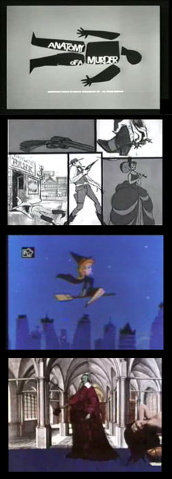 In the 1950’s 60’s and 70’s, a number of non-animated television shows had animated titles, something that was also common in movies of the time.
Undoubtedly influenced by the film title mini-masterpieces of Saul Bass, the TV titles were usually much cruder and less imaginative, but still amusing nonetheless.
Some of them were in fact pretty good, notably:
the clever opening titles for The Wild Wild West (image at left, second down), a terrific 60’s television show (not to be confused with the tragic mess that was the 90’s remake movie with Will Smith), I love the way in this title the seemingly separate scenes in the panels progressively interact with the main character in the center panel;
Bewitched, the titles for which were more fully animated than most (third down);
and, of course, Terry Gilliam’s wonderfully loony animated collage titles for Monty Python’s Flying Circus, of which there were several versions (bottom).
Fanboy.com has posted a nice article with some examples of these and others, titled The Golden Age of Animated TV Opening Titles.
Some of them are a little over-compressed and you may be able to find better copies by cruising YouTube and the other video aggregation sites, I don’t know.
While you’re thinking about animated titles, it’s always worth a stop by the Submarine Channel’s Forget the Film, Watch the Titles, to see what delights have been added to their selection of movie titles (see my posts on Forget the Film, Watch the Titles).
[Via Digg]
Categories:
-
Chris J. Anderson

Chris J. Anderson is a concept artist and illustrator working in both the film and video game industries.He was working with NCsoft, but beyond that I have no information as neither his web site or his blog have any biographical or client history information. (There a link on the web site for a future client list, but it’s not active yet.)
His site is divided between environments, which is evidently his area of specialty, and props & vehicles, characters, illustrations and other sketches and studies.
There is also no information about process; though it looks to me like much of it is digital painting, with perhaps some watercolor or gouache pieces and traditional drawing materials in the sketches.
[Via io9]
Categories:
-
Lane Bennion

Utah artist Lane Bennion finds subjects for paintings were I, for one, would never think to look for them.I’m fascinated in particular with his recent series of oils of interiors of department stores and malls. Here he finds intricate grids of light and shadow, geometric latticeworks of colorful planes, and compositions in which he meets the challenge of creating strong statements from the daunting complexity of a multiplicity of small objects.
Bennion’s older work shows a fascination with complexity as well, with compositions of toys jumbled in piles and street scenes with piles of trash and scattered objects. He also has a nice series of paintings of small carnivals and amusement arcades at night, which fall in with the way he revels in the artificial lights in the the store interiors, bright contrasts of light and dark, punctuated with the intense colors of painted surfaces.
You can view the work on his site through the link for Recent Works or the Archive, where you will also find some more traditional landscape subjects as well as outdoor scenes win which industrial or commercial structures and equipment take a prominent role.
Bennion studied at the University of Utah, under artists like David Dornan, Paul Davis and Tony Smith. He later graduated from the Medical College of Georgia with a specialty in Medical Illustration, though I can’t find reference to medical illustrations by him online.
In addition to his web site, Bennion maintains two blogs Studies in Oil and Notes on Making Paintings.. The former includes quick studies of areas around his home and small still life subjects, and the latter focuses on his gallery work, though it also includes subjects not found on his main web site. Both of them feature larger images of many of his paintings (click on the image in the blog post), that allow you to see the brushwork that is not evident in the smaller reproductions.
[Suggestion courtesy of Karin Jurick]
Categories:
-
Larry Francis
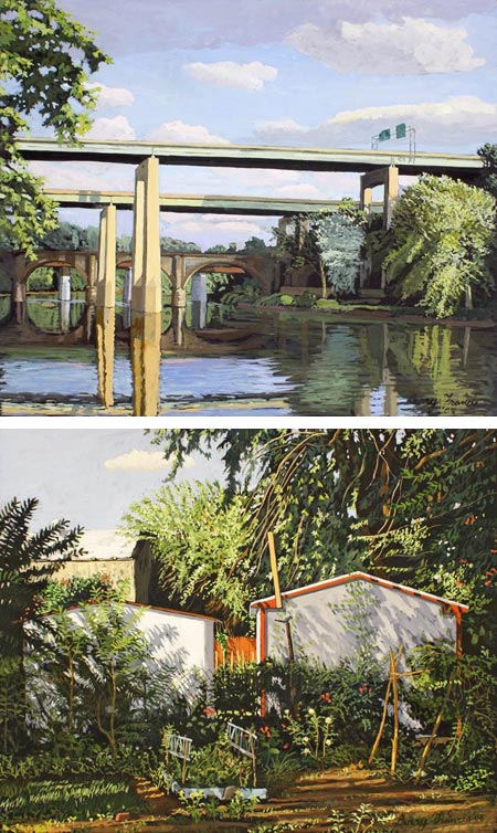
Scale is an interesting aspect of painting and drawing. I’m always fascinated when artists choose to work at both relatively large and relatively small size, particularly when working with the same subject matter (see my posts about Thomas Paquette and his large oils and very small guoache paintings).Philadelphia area painter Larry Francis also paints fairly large oils (perhaps 48×60″; 121x152cm), and small gouache paintings (around 11×14″; 27x35cm) . His subject matter, which is consistent in both types of paintings, includes an interesting range of ordinary subjects in and around Philadelphia.
By “ordinary” I mean commonplace scenes that would not be thought of as particularly scenic, like images of suburban houses and yards, typical city street corners, small sections of parks, neighborhood stores, bridges and other views, the like of which we pass by every day without thinking.
This, of course, is one of the things that art does best, to wake us to more alert observation of our surroundings and remind us that the ordinary is extraodinary, the commonplace worthy of notice and appreciation.
Even Francis’ views of the Schuylkill river, which could have been chosen from more scenic vantage points, instead are often views of bridges and bridge piers, the kind of view commuters might glance at without noticing day after day as they make their routine trips into center city along the river drives.
I particularly like his paintings of Schuylkill river bridges, which perhaps can be thought of as in the tradition of Thomas Eakins, who often included Schuylkill river bridges in his portrayals of scullers. Eakins obviously couldn’t have painted the Route 1 expressway bridge (foreground of the image at top, larger version here), though I have to think he might have included it had it existed at the time.
Francis consistently reveals beauty in the ordinary, with geometric arrangements of houses and commercial buildings arrayed in planes of light, broken with dappled shadows from vegetation and the horizontal bands of color in streets and sidewalks.
I was struck but the issue of scale because I had encountered an oil painting of his at the Pennsylvania Academy of the Fine Arts, where he is an instructor, showing a view of the Schuylkill river from the same vantage point as the one above, though wider in aspect and much larger in size, perhaps 4’x12′ (121x365cm). I was struck by the painting, and delighted to have the chance to see his small gouache paintings of the same area at his current show at the Gross McCleaf Gallery, which is focused in particular on his small gouaches.
I was also glad I had a chance to meet the artist at the opening, and I asked him about his approach. I had made an assumption because of the finessed attention to detail, and the unhurried feeling of relaxed observation evident in these small works, that he was working, at least in part, from photographic reference. He paints these gouache paintings on location, however, working perhaps two paintings a day to catch the different states of light, and returning to the scene two or three times to finish them.
Those in the Philadelphia area still have a chance to catch the show at the Gross McCleaf Gallery, which runs until this Saturday, January 24, 2009.
Categories:


Charley’s Picks
Bookshop.org
(Bookshop.org affilliate links; sales benefit independent bookshop owners; I get a small percentage to help support my work on Lines and Colors)

John Singer Sargent: Watercolors


Urban Sketching: Understanding Perspective


Charley’s Picks
Amazon
(Amazon.com affiliate links; sales go to a larger yacht for Jeff Bezos; but I get a small percentage to help support my work on Lines and Colors)
John Singer Sargent: Watercolors
Urban Sketching: Understanding Perspective