
Categories
- 3d CGI
- Amusements
- Animation
- Anime & Manga
- Art Materials
- Art Videos
- Blogroll
- Cartoons
- Color
- Comics
- Concept & Visual Dev.
- Creativity
- Digital Art
- Digital Painting
- Displaying Art on the Web
- Drawing
- Eye Candy for Today
- Gallery and Museum Art
- High-res Art Images
- Illustration
- Motion Graphics & Flash
- Museums
- Online Museums
- Outsider Art
- Painting
- Painting a Day
- Paleo Art
- Pastel, Conté & Chalk
- Pen & Ink
- Prints and Printmaking
- Reviews
- Sc-fi and Fantasy
- Sculpture & Dimensional
- Site Comments
- Sketching
- Storyboards
- Tools and Techniques
- Uncategorized
- Vector Art
- Videos & Podcasts
- Vision and Optics
- Watercolor and Gouache
- Webcomics
Archives
- June 2026
- May 2026
- April 2026
- March 2026
- February 2026
- January 2026
- December 2025
- November 2025
- October 2025
- September 2025
- August 2025
- July 2025
- June 2025
- May 2025
- January 2025
- December 2024
- November 2024
- October 2024
- September 2024
- August 2024
- June 2024
- April 2024
- March 2024
- February 2024
- January 2024
- December 2023
- November 2023
- October 2023
- September 2023
- August 2023
- July 2023
- May 2023
- April 2023
- March 2023
- February 2023
- January 2023
- December 2022
- November 2022
- September 2022
- August 2022
- July 2022
- June 2022
- May 2022
- April 2022
- March 2022
- February 2022
- January 2022
- December 2021
- November 2021
- October 2021
- September 2021
- August 2021
- July 2021
- June 2021
- May 2021
- April 2021
- March 2021
- February 2021
- January 2021
- December 2020
- November 2020
- October 2020
- September 2020
- August 2020
- July 2020
- June 2020
- May 2020
- April 2020
- March 2020
- February 2020
- January 2020
- December 2019
- November 2019
- October 2019
- September 2019
- August 2019
- July 2019
- June 2019
- May 2019
- April 2019
- March 2019
- February 2019
- January 2019
- December 2018
- November 2018
- October 2018
- September 2018
- August 2018
- July 2018
- June 2018
- May 2018
- April 2018
- March 2018
- February 2018
- January 2018
- December 2017
- November 2017
- October 2017
- September 2017
- August 2017
- July 2017
- June 2017
- May 2017
- April 2017
- March 2017
- February 2017
- January 2017
- December 2016
- November 2016
- October 2016
- September 2016
- August 2016
- July 2016
- June 2016
- May 2016
- April 2016
- March 2016
- February 2016
- January 2016
- December 2015
- November 2015
- October 2015
- September 2015
- August 2015
- July 2015
- June 2015
- May 2015
- April 2015
- March 2015
- February 2015
- January 2015
- December 2014
- November 2014
- October 2014
- September 2014
- August 2014
- July 2014
- June 2014
- May 2014
- April 2014
- March 2014
- February 2014
- January 2014
- December 2013
- November 2013
- October 2013
- September 2013
- August 2013
- July 2013
- June 2013
- May 2013
- April 2013
- March 2013
- February 2013
- January 2013
- December 2012
- November 2012
- October 2012
- September 2012
- August 2012
- July 2012
- June 2012
- May 2012
- April 2012
- March 2012
- February 2012
- January 2012
- December 2011
- November 2011
- October 2011
- September 2011
- August 2011
- July 2011
- June 2011
- May 2011
- April 2011
- March 2011
- February 2011
- January 2011
- December 2010
- November 2010
- October 2010
- September 2010
- August 2010
- July 2010
- June 2010
- May 2010
- April 2010
- March 2010
- February 2010
- January 2010
- December 2009
- November 2009
- October 2009
- September 2009
- August 2009
- July 2009
- June 2009
- May 2009
- April 2009
- March 2009
- February 2009
- January 2009
- December 2008
- November 2008
- October 2008
- September 2008
- August 2008
- July 2008
- June 2008
- May 2008
- April 2008
- March 2008
- February 2008
- January 2008
- December 2007
- November 2007
- October 2007
- September 2007
- August 2007
- July 2007
- June 2007
- May 2007
- April 2007
- March 2007
- February 2007
- January 2007
- December 2006
- November 2006
- October 2006
- September 2006
- August 2006
- July 2006
- June 2006
- May 2006
- April 2006
- March 2006
- February 2006
- January 2006
- December 2005
- November 2005
- October 2005
- September 2005
- August 2005
Relevant Blogs
Art, Painting & Sketch
- Gurney Journey
- Underpaintings
- Art and Influence
- Painting Perceptions
- Oil Painters of America
- Vasari Paint POV
- Flying Fox
- Urban Sketchers
- Bento (Smithsonian)
- Art Inconnu
- The Hidden Place
- Still Life
- Making a Mark
- The Art of the Landscape
- Exploring Color & Creativity
- Art Contrarian
- Artist A Day
- beinArt Surreal Art Collective
- Eye Level
- David Dunlop
- p.i.g.m.e.n.t.i.u.m
- CultureGrrl
- Joaquín Sorolla blog
- Artists in Pastel
“Painting a Day”
- A Painting a Day (Keiser)
- On Painting (Keiser)
- Julian Merrow-Smith
- Karen Jurick
- Jeffrey Hayes
- Carol Marine
- Abbey Ryan
- Daily Paintworks
Other Painting Blogs
- Virtual Gouache Land
- Neil Hollingsworth
- Marc Hanson
- Kevin Menck
- Marc Dalessio
- Larry Seiler
- Stapleton Kearns
- Colin Page
- Roos Schuring
- Hans Versfelt
- Titus Meeuws
- Régis Pettinari
- René Plein Air
- Belinda Del Pesco
- Robin Weiss
- Nathan Fowkes (Land Sketch)
- William Wray
- Frank Serrano
- Stephen Magsig
- Michael Chesley Johnson
- Twice a Week
- Sarah Wimperis
- Rob Adams
- Michael Cole Manley
- The Dirty Palette Club
- Mike Manley’s Draw!
Gallery Art & Illustration mix
Illustration
- Howard Pyle
- 100 Years of Illustration
- BibliOdyssey
- Illustration Art
- Today’s Inspiration
- Illustration Mundo
- Little Chimp Society
- Danny Gregory
- R D (John Martz
- Illustration Friday blog
- Monster Brains
- Illustrators & Illustrations (RU)
- Elwood H. Smith
- DaniDraws.com
- Designers Who Blog
- iSpot Blog
Sci-Fi & Fantasy
Illustration & Comics
Comics & Cartoons
- Comics Beat
- Robot 6
- Newsarama Blog
- Comic Vine
- Comics Alliance
- Forbidden Planet Int.
- Paolo Rivera
- Bolt City
- Flight
- Scott McCloud
- The Comics Journal
- Comixpedia
- Funnybook Babylon
- James Baker
- Middleton’s Sketchbook
- Boneville
- The Hotel Fred
- Paul Rivoche
- Daily Cartoonist
- Mad About Cartoons (William Wray)
- Digital Strips
Illustration & Concept
Animation & Concept
- Cartoon Brew
- Animation Blog
- Cold Hard Flash
- Concept Art World
- The CAB
- FY Concept Art
- Concept Ships
- Concept Robots
- John Nevarez
- Armand Serrano
- Marcos Mateu-Mestre
- all kinds of stuff (Kricfalusi)
- Yacin the faun (Man Arenas)
- Kelsey Mann
- Cre8tivemarks Blog
- Ice-Cream Monster Toon Cafe
- AAU Character & Creature Design
- AAU Animation Notes
- Articles and Texticles
Paleo & Scientific
Tools & Techniques
Other
Lists of Art Blogs
Art Image Resource Links
Historic Art Images
- Wikimedia Commons: Paintings
- Wikimedia Commons: Drawings
- The Athenaeum
- WikiArt (WikiPaintings)
- Google Art Project: Artists
- Google Art Project: Collections (Museums)
- ArtCyclopedia
- Web Gallery of Art
- Art Renewal Center
- Web Gallery of Impressionism
Auction Consolidation sites
Auction sites
- Sotheby’s
- Bonham’s
- Christies
- Heritage Auctions: Fine Art
- Heritage Auctions: Illustration
- Freeman’s Auctions
- Bukowskis
- Shannon’s
Image Search
Reverse Image Search (search by image)
- Tin Eye
- RevImg
- Google Image Search (camera icon)
- Bing Image Search (camera icon)
Promoting some friends and some clients of my website design business
- Twin Willows T’ai Chi studio in Wilmington DE. Taiji classes with Bryan Davis.
- Ray Hayward, Inspired Teacher of T’ai Chi ( Taiji ) in Minneapolis, Founder of Mindful Motion Tai Chi Academy
- OldHead Tattoo studio and Art Gallery in Wilmington DE. Tattoos and paintings by Bruce Gulick
- Sharon Domenico Art, pet portrait oil paintings
- Platinum Paperhanging, wallpaper hanging, Main Line and Philadelphia, PA
- Lisa Stone Design, interior designer, Main Line and Philadelphia, PA
- Studio12KPT, original art, prints, calendars and other custom printed items by Van Sickle & Rolleri
-
Matt Gaser
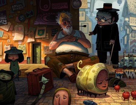
Matt Gaser is a concept artist currently working for Lucasfilm Animation on the new Star Wars CG television series.
He was Senior Concept Artist for Stormfront Studios on their recent game Forgotten Realms Dreamstone. Prior to that he was Concept Artist on their game for The Lord of the Rings The Two Towers.
He started out with an interest in animation when, in high school, he was appointed California Art Scholar and had the opportunity to attend a summer art seminar in traditional animation at Cal Arts. He majored in Illustration as Art Center College of Design and went on to intern at Klasky Group (Rugrats).
Amid his professional work, Gaser finds time to work on his own projects, including a GC short film and two children’s books. You will also find in his galleries, that he keeps up with figure drawing and finds time to sketch and doodle.
Gaser works primarily digitally, but his images have a nice feeling of paint surface and materials. He has a terrific sense of color and a wonderful command of lighting as a theatrical device for creating focus within a composition. He knows how to control your eye and make a small area of an image snap into clear relief as a focal point.
In the Projects gallery, you’ll find some his work for the Dreamstone project. As with many concept artists, however, I find myself most drawn to the work in his Personal section, where he has been able to let his considerably fertile imagination run free, with delightful results.
When left to his own devices, Gaser creates bizarre landscapes populated with offbeat characters that make you want to know more about the “story”, even if there isn’t one.
Categories:
-
Portraits of Sandra Day O’Connor

For many years I have been going, on and off, to open figure drawing and painting sessions here in Phliadelphia at either the Philadelphia Sketch Club or the Plastic Club, two of the country’s oldest arts organizations.These are not classes, per se, with a set course of instruction, but simply sessions where artists jointly pay a model fee and are free to pursue figure drawing or painting in the medium of their choice. The sessions consist of a series of long and short poses, usually over three hours or so; and there is no requirement to sign up for a formal class. You can attend when it’s convenient. Hopefully, you have access to similar sessions in your area (they are sometimes part of the continuing education offerings of art schools).
There is a somewhat similar artist organization, or club, in New York called the Painting Group. It’s a little different from most in that it has a closed membership and is led by the renowned caricaturist and watercolorist David Levine, and the highly regarded portrait painter Aaron Shikler, who counts among his portraits the official portraits of John F. Kennedy Jackie Kennedy and Nancy Regan. They have been meeting regularly as a painting group for over 40 years.
Last October Supreme Court Justice Sandra Day O’Connor sat for the group in a unique full-day portrait session, resulting in a fascinating situation in which 25 artists painted her portrait at the same time. You may have seen mention of it on the CBS Sunday Morning magazine show a few weeks ago.
The resulting works are being presented in an exhibit at the Smithsonian’s National Portrait Gallery in Washington, DC. through October 8. 2007. (See my previous post about the National Portrait Gallery.)
There is a slideshow online on the NPG site of seven of the portraits and a couple of photos of the session.
My thanks to Daniel van Benthuysen for the link and additional information
Categories:
-
William Joyce

I finally got to see Meet the Robinsons, Disney’s 3-D, 3-D CGI animated feature. (How are we going to phrase that?)I have to say that I was pleasantly surprised and liked it much more than I anticipated. Part of that is due to the design work, adapted from concept drawings by William Joyce, who wrote and illustrated the children’s book A Day with Wilbur Robinson, on which the film was based.
Joyce is also the author/illustrator of several wonderfully idiosyncratic children’s books, including Rolie Polie Olie and George Shrinks both of which have been adapted for television animation, Bently & Egg, Santa Calls, and the terrific Dinosaur Bob and His Adventures with the Family Lizardo (interior image here).
The production design on the film owes a lot to concept art by art directors Robh Ruppel (who I profiled last October) and David Goetz. Ruppel has finally begun posting some of the production art on his blog, The Broadview Blog. I found some other production art for the film scattered about on the Unofficial Disney Animation Archive and CanMag. There is a small book of The Art of Meet the Robinsons; and you can also see some early production art for the MtR game on San Neilson’s Tasty Art blog.
As much as I like the wonderful 1930’s retro-future, art deco meets the Jetsons by way of Flash Gordon look of the film, I can’t help but think how much better it might have been if the production team had been able to cleave even closer to Joyce’s charmingly quirky production drawings. Word is that the Disney execs wanted to change the title to “Get Lewis”, so you can imagine that they were pressing the production artists to make the design less original and more like other successful CGI features. A lot of Joyce’s originality comes through, but once you apply that standard CGI sheen over everything, it loses some of the visual charm it might have had if it were, dare I say it, a traditional drawn animation.
Joyce is no stranger to concept design for films, having worked on Toy Story and A Bug’s Life as a character designer and Robots as a producer and production designer. There are a few of his wonderfully quirky concept drawings in the beautiful, but unfortunately out of print, oversize book Toy Story: The Art and Making of the Animated Film. (Search alibris. There is also a miniature edition of this title, I don’t know how much of the original it contains.)
Joyce’s site has some of his original concept drawings for Meet the Robinsons, (above) along with some renderings from the final movie (inset) that you can compare. Unfortunately, I haven’t found any kind of gallery of his illustrations or concept art for other films, but I may not have dug hard enough. There is, however, a book called The World of William Joyce Scrapbook, that includes some of his illustrations in the working stages, as well anecdotes about his childhood, sketches and photos.
There is an info page about Joyce on the Harper Children’s site, along with a page about the books themselves. There are some short video interviews with Joyce on the Reading Rockets site.
Categories:
-
Camille Pissarro

It’s remarkable how much of our picture of history is formed by generalized impressions. There is an impression, for example, that Claude Monet was the central figure around which the revolutionary painting style of French Impressionism formed; as it crystalized out of the pioneering Realism of Gustav Courbetand the incisive directness of Camille Corot and the Barbizon school amid the social turmoil engendered by Napoleon III’s military campaigns and the rebuilding of Paris.The assumption seems to be that Monet was the “father of Impressionism”, when, in fact, it was Camille Pissaro who was actually called “Père Impressionism” by his colleagues (particularly Cezanne and Gaughan, to whom he was a mentor and father figure), and who was as instrumental in the creation of Impressionist technique and theory as Monet, if not more so.
Like the other painters who would form the group that came to be known as the French Impressionists, Pissarro was a realist landscape painter. He counted among his instructors Jean-Babtiste-Camille Corot, Gustav Courbet and Charles-Francois Daubigny. (Wow, talk about amazing influences!)
With the exception of a brief fling with Pointillism, Pissaro probably remained truest to the Impressionist techniques that he helped to define and refine, and was the only one of the original group to exhibit at all eight of the Impressionist exhibitions. Within the refinement of that technique, however, his restless explorations of methods for applying paint, using brushstrokes, and searching for the Impressionist ideals led him through wonderful variations in color, paint surface and subject.
Pissarro’s brilliant, sparkling canvasses are all that we have come to expect from Impressionist painting, full of those wonderful splashes of pure pigment, energetic brushstrokes, brilliant color, and dazzling light captured from plein air painting in the French countryside.
There is currently a rare opportunity, however, to see Pissaro and Impressionist painting in its nascent stages, when the first colorful buds were blossoming on the tree of French landscape painting.
There is an exhibition of Pissarro’s work, Pissarro: Creating the Impressionist Landscape, curated by Baltimore Museum of Art, that focuses on his early work and the development of Impressionist technique out of his roots in the traditions of 19th Century landscape painting.
The show is only at the Baltimore Museum until May 13th (sorry about the short notice) and then moves to the Milwaukee Art Museum in Wisconsin for a run from June 9-September 9, 2007, and finishes at the Memphis Brooks Museum of Art in Tennessee from October 7, 2007 to January 6, 2008.
For those in other locations, Pissarro’s work is well represented in many museums (including 9 here in the Philadelphia Musuem of Art). You can find a list of museums containing his work on the Artcyclopedia site.
I don’t know if the image shown here, “The Hermaitage at Pontoise“, is in the exhibition, but it’s one of his early paintings and illustrative of the transition from traditional landscape to Impressionism (plus, I just love it). The original is in the collection of the Guggenheim in New York.
Link via Art Knowledge News
Categories:
-
Colin Wilson

In addition to the multitude of individual artists’ styles in comics art, there are some very broad generalized categories, like the intense stylizations of Japanese manga, the anatomical exaggerations and dynamic action of American super hero comics, and the somewhat more restrained amalgam of styles that could loosely be called “European”, although practiced by comics artists in Europe, the UK, Scandinavia, South America, Australia and New Zealand.I’m particularly fond of the latter, which is often characterized by a more naturalistic portrayal of people than is usually found in mainstream American or Japanese comics. The figures are often loosely handled, with open line work and quick suggestions of details, and are commonly set against richly detailed backgrounds.
That’s a pretty succinct description of the approach of one of my favorite artists working in the “European” style, New Zealander Colin Wilson (not to be confused with the well-known writer of The Outsider — if you do a Google search, use a qualifier like “comics”).
Colin Wilson, the comics artist, started in his native New Zealand, where he published a comics fanzine called Strips, which included his work and that of several other artists, and is credited with helping to spark a comics revival in the country. He moved to the UK, where he worked for 2000AD on titles like Rogue Trooper and Judge Dredd, alongside such talents as Dave Gibbons, Brian Bolland and Mike McMahon. He later moved to France where he kept up his association with comics greats by working with Jean-Michel Charlier on on La Jeunesse de Blueberry (Young Blueberry), a spin off of the wonderful and immensely popular Lt. Blueberry series by Charlier and Jean (Moebius) Giraud (more on Giraud in a future post).
Just before his stint on Blueberry, Wilson wrote and drew a series of comic albums called Real, Mantell and Alia, part of a series called Into the Shadow of the Sun. I first encountered Wilson’s work in a U.S. reprint of Rael from Acme Press/Eclipse Books (out of print).
Wilson has done some work for the American comics market, including the Point Blank series for Wildstorm. Written by Ed Brubaker, who has been getting good bit of attention lately, Point Blank is not a superhero story, though it features characters from the established Wildstorm Universe, but more of a crime noir saga, a genre to which Wilson’s gritty and casual drawing style is an excellent fit.
There is an interview with Wilson on Newsarama from around the time of that release.
Since then he has worked with French Comics writer Maitz on another crime noir series in Europe, Du Plomb Dans La Tete (literally translated as “Lead in the Head”).
Wilson has recently done more work for the American market: three issues of Star Wars: Legacy for Dark Horse, two of which just published (#9 and #10), the other of which should come out in the another month or so (#13).
If you can’t find those, look for the Trade Paperback collection of Point Blank, or, even better, the Dark Horse printing of Rain Dogs (image above), a story originally printed in short chapters in 2000AD, and reprinted here in the U.S. in the style of a European graphic album: 48 pages, large format, great printing and no ads.
Wilson has a blog, albeit infrequently updated, on which he posts artwork and talks about his projects and other items of interest.
Categories:
-
PJ Loughran
PJ Loughran is a busy guy.In addition to his career as an illustrator, creating his wonderful line and color illustrations for clients like The New York Times, Newsweek, Time, Sports Illustrated, Nike, Ford, Simon and Schuster and Harper Collins, he has served as the Design Director and Creative Director at the AGENCY.COM, and has recently founded his own firm, Kerosense Creative Services.
If that weren’t enough, Loughran is a musician and songwriter, with two full length records to his credit and performances that have included opening for the likes of R.E.M, Taj Mahal, Todd Rundgren, REO SPeedwagon and the North Mississippi All-Stars.
Oh yes, Loughran is also an adjunct professor at Parsons, teaching classes in web design, illustration and drawing, and has been a guest lecturer at a number of other art schools and universities.
And I thought I had a busy schedule.
While wearing his illustrator’s hat, Loughran has garnered recognition from The Art Directors Club of New York, Communication Arts Magazine, Print Magazine and the Society of Illustrators (more details here).
His illustrations have a wonderfully loose, almost casual feeling, with lots of varied-weight to his ink lines, bright, freely-applied areas of color, interesting suggestions of texture and the frequent use of open, irregularly shaped compositions, in which the image is not constrained by a rectangle. He sometimes incorporates collage-like elements of photographs, colored and integrated with the drawings.
His portfolio opens to an initial page from which you choose a category of subject matter. Once in a sub-section, you can click on one of the large images for an enlarged view, which opens in a pop-up that allows you to conveniently click forward and aback through all of the images if you like. (Are you paying attention, all you designers of artists’ web sites who think that “pop-up and close, pop-up and close” is a good arrangement for an artist’s portfolio?)
There is an article about Loughran from a few years ago on the Adobe site that features a brief how-to for one of his sports themed images.
Categories:


Charley’s Picks
Bookshop.org
(Bookshop.org affilliate links; sales benefit independent bookshop owners; I get a small percentage to help support my work on Lines and Colors)

John Singer Sargent: Watercolors


Urban Sketching: Understanding Perspective


Charley’s Picks
Amazon
(Amazon.com affiliate links; sales go to a larger yacht for Jeff Bezos; but I get a small percentage to help support my work on Lines and Colors)
John Singer Sargent: Watercolors
Urban Sketching: Understanding Perspective