
Categories
- 3d CGI
- Amusements
- Animation
- Anime & Manga
- Art Materials
- Art Videos
- Blogroll
- Cartoons
- Color
- Comics
- Concept & Visual Dev.
- Creativity
- Digital Art
- Digital Painting
- Displaying Art on the Web
- Drawing
- Eye Candy for Today
- Gallery and Museum Art
- High-res Art Images
- Illustration
- Motion Graphics & Flash
- Museums
- Online Museums
- Outsider Art
- Painting
- Painting a Day
- Paleo Art
- Pastel, Conté & Chalk
- Pen & Ink
- Prints and Printmaking
- Reviews
- Sc-fi and Fantasy
- Sculpture & Dimensional
- Site Comments
- Sketching
- Storyboards
- Tools and Techniques
- Uncategorized
- Vector Art
- Videos & Podcasts
- Vision and Optics
- Watercolor and Gouache
- Webcomics
Archives
- May 2026
- April 2026
- March 2026
- February 2026
- January 2026
- December 2025
- November 2025
- October 2025
- September 2025
- August 2025
- July 2025
- June 2025
- May 2025
- January 2025
- December 2024
- November 2024
- October 2024
- September 2024
- August 2024
- June 2024
- April 2024
- March 2024
- February 2024
- January 2024
- December 2023
- November 2023
- October 2023
- September 2023
- August 2023
- July 2023
- May 2023
- April 2023
- March 2023
- February 2023
- January 2023
- December 2022
- November 2022
- September 2022
- August 2022
- July 2022
- June 2022
- May 2022
- April 2022
- March 2022
- February 2022
- January 2022
- December 2021
- November 2021
- October 2021
- September 2021
- August 2021
- July 2021
- June 2021
- May 2021
- April 2021
- March 2021
- February 2021
- January 2021
- December 2020
- November 2020
- October 2020
- September 2020
- August 2020
- July 2020
- June 2020
- May 2020
- April 2020
- March 2020
- February 2020
- January 2020
- December 2019
- November 2019
- October 2019
- September 2019
- August 2019
- July 2019
- June 2019
- May 2019
- April 2019
- March 2019
- February 2019
- January 2019
- December 2018
- November 2018
- October 2018
- September 2018
- August 2018
- July 2018
- June 2018
- May 2018
- April 2018
- March 2018
- February 2018
- January 2018
- December 2017
- November 2017
- October 2017
- September 2017
- August 2017
- July 2017
- June 2017
- May 2017
- April 2017
- March 2017
- February 2017
- January 2017
- December 2016
- November 2016
- October 2016
- September 2016
- August 2016
- July 2016
- June 2016
- May 2016
- April 2016
- March 2016
- February 2016
- January 2016
- December 2015
- November 2015
- October 2015
- September 2015
- August 2015
- July 2015
- June 2015
- May 2015
- April 2015
- March 2015
- February 2015
- January 2015
- December 2014
- November 2014
- October 2014
- September 2014
- August 2014
- July 2014
- June 2014
- May 2014
- April 2014
- March 2014
- February 2014
- January 2014
- December 2013
- November 2013
- October 2013
- September 2013
- August 2013
- July 2013
- June 2013
- May 2013
- April 2013
- March 2013
- February 2013
- January 2013
- December 2012
- November 2012
- October 2012
- September 2012
- August 2012
- July 2012
- June 2012
- May 2012
- April 2012
- March 2012
- February 2012
- January 2012
- December 2011
- November 2011
- October 2011
- September 2011
- August 2011
- July 2011
- June 2011
- May 2011
- April 2011
- March 2011
- February 2011
- January 2011
- December 2010
- November 2010
- October 2010
- September 2010
- August 2010
- July 2010
- June 2010
- May 2010
- April 2010
- March 2010
- February 2010
- January 2010
- December 2009
- November 2009
- October 2009
- September 2009
- August 2009
- July 2009
- June 2009
- May 2009
- April 2009
- March 2009
- February 2009
- January 2009
- December 2008
- November 2008
- October 2008
- September 2008
- August 2008
- July 2008
- June 2008
- May 2008
- April 2008
- March 2008
- February 2008
- January 2008
- December 2007
- November 2007
- October 2007
- September 2007
- August 2007
- July 2007
- June 2007
- May 2007
- April 2007
- March 2007
- February 2007
- January 2007
- December 2006
- November 2006
- October 2006
- September 2006
- August 2006
- July 2006
- June 2006
- May 2006
- April 2006
- March 2006
- February 2006
- January 2006
- December 2005
- November 2005
- October 2005
- September 2005
- August 2005
Relevant Blogs
Art, Painting & Sketch
- Gurney Journey
- Underpaintings
- Art and Influence
- Painting Perceptions
- Oil Painters of America
- Vasari Paint POV
- Flying Fox
- Urban Sketchers
- Bento (Smithsonian)
- Art Inconnu
- The Hidden Place
- Still Life
- Making a Mark
- The Art of the Landscape
- Exploring Color & Creativity
- Art Contrarian
- Artist A Day
- beinArt Surreal Art Collective
- Eye Level
- David Dunlop
- p.i.g.m.e.n.t.i.u.m
- CultureGrrl
- Joaquín Sorolla blog
- Artists in Pastel
“Painting a Day”
- A Painting a Day (Keiser)
- On Painting (Keiser)
- Julian Merrow-Smith
- Karen Jurick
- Jeffrey Hayes
- Carol Marine
- Abbey Ryan
- Daily Paintworks
Other Painting Blogs
- Virtual Gouache Land
- Neil Hollingsworth
- Marc Hanson
- Kevin Menck
- Marc Dalessio
- Larry Seiler
- Stapleton Kearns
- Colin Page
- Roos Schuring
- Hans Versfelt
- Titus Meeuws
- Régis Pettinari
- René Plein Air
- Belinda Del Pesco
- Robin Weiss
- Nathan Fowkes (Land Sketch)
- William Wray
- Frank Serrano
- Stephen Magsig
- Michael Chesley Johnson
- Twice a Week
- Sarah Wimperis
- Rob Adams
- Michael Cole Manley
- The Dirty Palette Club
- Mike Manley’s Draw!
Gallery Art & Illustration mix
Illustration
- Howard Pyle
- 100 Years of Illustration
- BibliOdyssey
- Illustration Art
- Today’s Inspiration
- Illustration Mundo
- Little Chimp Society
- Danny Gregory
- R D (John Martz
- Illustration Friday blog
- Monster Brains
- Illustrators & Illustrations (RU)
- Elwood H. Smith
- DaniDraws.com
- Designers Who Blog
- iSpot Blog
Sci-Fi & Fantasy
Illustration & Comics
Comics & Cartoons
- Comics Beat
- Robot 6
- Newsarama Blog
- Comic Vine
- Comics Alliance
- Forbidden Planet Int.
- Paolo Rivera
- Bolt City
- Flight
- Scott McCloud
- The Comics Journal
- Comixpedia
- Funnybook Babylon
- James Baker
- Middleton’s Sketchbook
- Boneville
- The Hotel Fred
- Paul Rivoche
- Daily Cartoonist
- Mad About Cartoons (William Wray)
- Digital Strips
Illustration & Concept
Animation & Concept
- Cartoon Brew
- Animation Blog
- Cold Hard Flash
- Concept Art World
- The CAB
- FY Concept Art
- Concept Ships
- Concept Robots
- John Nevarez
- Armand Serrano
- Marcos Mateu-Mestre
- all kinds of stuff (Kricfalusi)
- Yacin the faun (Man Arenas)
- Kelsey Mann
- Cre8tivemarks Blog
- Ice-Cream Monster Toon Cafe
- AAU Character & Creature Design
- AAU Animation Notes
- Articles and Texticles
Paleo & Scientific
Tools & Techniques
Other
Lists of Art Blogs
Art Image Resource Links
Historic Art Images
- Wikimedia Commons: Paintings
- Wikimedia Commons: Drawings
- The Athenaeum
- WikiArt (WikiPaintings)
- Google Art Project: Artists
- Google Art Project: Collections (Museums)
- ArtCyclopedia
- Web Gallery of Art
- Art Renewal Center
- Web Gallery of Impressionism
Auction Consolidation sites
Auction sites
- Sotheby’s
- Bonham’s
- Christies
- Heritage Auctions: Fine Art
- Heritage Auctions: Illustration
- Freeman’s Auctions
- Bukowskis
- Shannon’s
Image Search
Reverse Image Search (search by image)
- Tin Eye
- RevImg
- Google Image Search (camera icon)
- Bing Image Search (camera icon)
Promoting some friends and some clients of my website design business
- Twin Willows T’ai Chi studio in Wilmington DE. Taiji classes with Bryan Davis.
- Ray Hayward, Inspired Teacher of T’ai Chi ( Taiji ) in Minneapolis, Founder of Mindful Motion Tai Chi Academy
- OldHead Tattoo studio and Art Gallery in Wilmington DE. Tattoos and paintings by Bruce Gulick
- Sharon Domenico Art, pet portrait oil paintings
- Platinum Paperhanging, wallpaper hanging, Main Line and Philadelphia, PA
- Lisa Stone Design, interior designer, Main Line and Philadelphia, PA
- Studio12KPT, original art, prints, calendars and other custom printed items by Van Sickle & Rolleri
-
Coles Phillips
 Just as there was a “Gibson Girl” in the 1890’s, in which the illustrations of Charles Dana Gibson came to be the personification of the ideal of a modern woman, so, in the early part of the 20th Century there was a “Phillips Girl”, a less well known, but also influential, ideal, portraying an on-the-go and socially active modern woman.
Phillips is perhaps more well known for another stylistic aspect of his work, the “Fade-away Girl”. In one of his illustrations for Life Magazine, which was initially a humor magazine, Phillips used a clever graphic device of making the foreground color of his model’s garment the same color as the background, creating a sort of inverse silhouette. This went over so well that Phillips repeated it, and went on to create many variations on the theme (left, bottom).
Phillips was a strong and talented artist, but in an era when he was surrounded by great illustrators like Joseph Clement Coll, N.C. Wyeth, James Montgomery Flagg, Harvey Dunn, Maxfield Parrish and Edmund Dulac, who can blame him for finding a way to stand out.
It’s easy to think of Phillips as being too reliant on the technique, but he needed a masterful sense of design to pull it off, and his terrific draftsmanship and obvious skill as a painter come through.
Personally I prefer his illustrations that don’t depend on the “Fade-away Girl” (left, top). His beautiful use of color, handling of figures and rendering of fabrics and folds put him in the company (and probably mutual influence) of greats like J. C. Leyendecker.
There is a wonderfully inexpensive collection called All-American Girl: The Art of Coles Phillips by Michael Schau.
the American Art Archives site has an excellent bio and a the best selection of Phillips images on the web.
Categories:
-
Ghostbot (update)
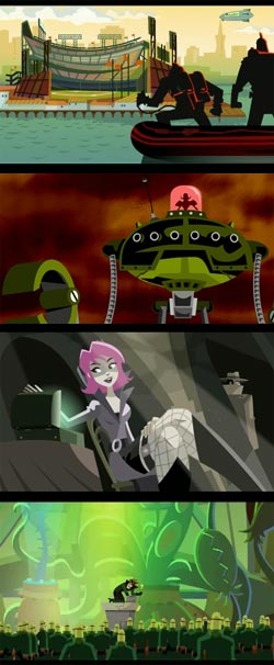 I don’t know about you, but I’m starting to get weary of the overuse of 3-D CGI in TV commercials.
Yes, some of it is clever and very well done, but there’s just so much of it that the 2-D, spy-themed mini-cartoons for eSurance, produced by WildBrain (who I profiled here) and animated by the Ghostbot studio, are a welcome relief; and, to my mind, much more entertaining than slick CGI spots like the Geico Gecko.
Ghostbot, who I first wrote about back in November of 2005, has now created 9 of the animated commercials. Ghostbot is an animation studio in San Francisco that does TV commercial animation in Flash, a vector animation technology created for web animation that is finding increasing use in television cartoons.
A bit 60’s modern, a bit 90’s retro, Ghostbot’s sharply stylized, colorful and nicely realized cartoon shorts have a bit of the feeling of classic film title animation, though hyped up to a frenetic pace that allows them to suggest the basics of a story in 30 seconds.
Their Projects gallery features the eSurance spots as well as other Ghostbot projects, including a music video for Five Iron Frenzy.
Advertisers are beginning to realize the value of commercials that entertain; and the eSurance site offers a download of a longer (3 minute) WildBrain/Ghostbot animation called “Carbon Copy” (left, bottom), that is even more fully realized than the TV shorts, and uses the same characters, but has only minimal branding at the end of the story.
Ghostbot sometimes wears their influences on their sleeve; several of their commercials feature variations of giant robots (above, second image) that feel like homages to Brad Bird’s terrific feature, The Iron Giant, and their “Quick Draw” commercial looks a lot like Kazu Kibuishi’s Daisy Kutter comics series; but I like aggregations of influences and references to other bits of entertainment, like Ghostbot’s 30’s film noir nod to Casablanca in their recent “Proof” eSurance spot (above, third image).
One of the nice features of Ghostbot’s site is that they not only make the sample shorts available (in Quicktime), but they also have a section of preliminary concept drawings and Storyboards (unfortunately reproduced a little small, but large enough to get some idea of what they look like).
In the Portfolios section, there are individual portfolios for co-conspirators Alan Lau, Roque Ballesteros and Brad Rau, as well as links to friends and associates like Kenn Navarro, Rhode Montjo and Arvin Bsutista.
There is also a login for the “Ghostbot Secret Base“, whose mysteries are beyond the reach of this writer.
The Ghostbot principals also maintain the long-running Punch Pants blog, with news and views on their work and projects by friends and others in the commercial animation community.
Categories:
-
Christopher Stott
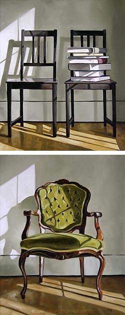 Christopher Stott is a Canadian painter living and working in Saskatoon, Saskatchewan. For the past three years, Stott has been self-represented. In the “About the Artist” section of his site he makes a point about the dedication and work this entails.
Stott’s paintings could be considered either still lifes or interiors, usually focusing on objects like chairs, of which he has done a series, books, suitcases, and smaller objects like clocks or shoes.
At first I was tempted to describe his work as reserved, but I don’t think that’s quite right. I think that was a result of the initial impression I had of his paintings of chairs; which, in some odd way, feel like formal portraits.
On closer inspection, his work reveals a controlled but painterly approach, focusing on the play of light across and around the objects and the surfaces on which they rest. The result is a sort of contemplative quiet within which there is a drama in the patterns of light, and suggestion of the advance of time. The kind of oblique lighting in these views is always fleeting, and a viewer of the real scene would find the composition dramatically different within the space of an hour.
Stott’s color palette tends to be muted. The dark wood of his chairs, the warm grays and neutral cover colors of his stacks of books and the soft grays of his backgrounds all lend to the feeling of settled equanimity, making it clear that the patterns of light are the key players in the compositions. (Stott’s fascination with the way light falls across objects in rooms brings to mind the work of two painters I’ve featured previously, Neil Hollingsworth and Karen Hollinsgworth.)
Stott has recently started a blog on which he features recent paintings and talks a bit about the choice of subject and process.
He offers his available work through an eBay store, and, if you’re willing to put up with the usual horrendous eBay interface (you’d think a company with those resources would have a better one by now), you can see come of his work reproduced larger, though unfortunately watermarked.
Stott’s gallery section promises that more will be added soon, and I’m looking forward to seeing a broader range of his work.
Addendum: Stott has, in fact, added significantly to his gallery since I put up the original post. If you viewed it at that point, check back for a number of additional paintings, including many paintings of small objects, of which I particularly enjoy several that feature clocks.
Categories:
-
Xia Xiaowan – Mariléne Oliver

You may occasionally hear me refer to 3-D in the sense of 3-D CGI, the creation of two dimensional images based on three dimensional computer models; but there’s another aspect of 3-D in relation to art, the perception of images in 3-D.Holography has been used in gallery art for a number of years; and, as technologies advance, the three-dimensional perception of images is coming to the fore in other ways. The new Disney animated feature, Meet the Robinsons, is being shown in certain theaters using a new, sophisticated screen and projection technology for 3-D (a 3-D CGi movie being shown in 3-D); and the word is that DreamWorks Animation SKG may start releasing only 3-D movies as of 2009.
It is a natural part of the way we perceive the world and, if you think about it, the real appeal of sculpture is in the three dimensional perception of its form, photographs of sculpture always feel flat to me.
That being said, here’s an artist walking an interesting line (puns are popping up everywhere in this post) between drawing and sculpture. Xia Xiaowan creates objects that could be considered either.
Drawing with a “special pencil” (the gallery’s description) on tinted glass, Xiaowan constructs images that feel three dimensional by the arrangement of a sequence of images (usually 14) stacked in a spatial arrangement that allows them to act almost like an analog hologram (above).
 My comment about sculpture holds true here, though, in that I would really enjoy seeing these in a sequence of photographs taken from different angles or, even better, an animation or video. Short of that, you can view individual pieces that have been photographed from different angles and get an idea of the dimensionality of the works.
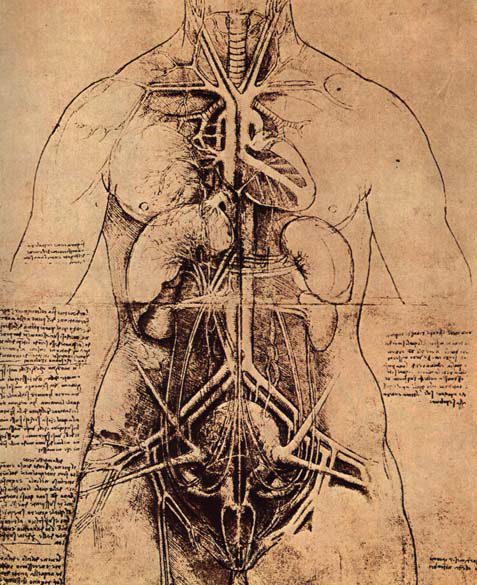
There is another artist named Mariléne Oliver who is working in a related fashion, producing inkjet-rendered drawings on pieces of clear material that are stacked, usually vertically, displaying, in effect, a three-dimensional drawing within them, like her 3-D deconstruction of the famous anatomical drawing by Leonardo that has come to be called “The Great Lady” (left), shown here in process on the Royal College of Art site.
Stray thought: The arrangement of a series of images like these, in which the sequence is spatial, prompts thoughts of an intriguing relationship to comics, a two-dimensional art form involving multiple images in which the sequence is temporal.
Link via Kottke.org
Categories:
-
Francis Tsai
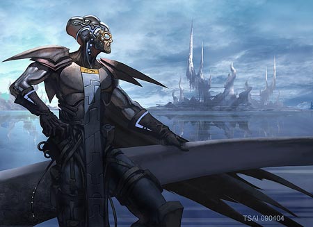
Francis Tsai was trained as an architect, but now works as an illustrator, concept designer and visual development artist for the gaming industry.His website, TeamGT Studios, which he shares with architect Linda Glaze, contains a portfolio of his illustration, concept design and “other stuff“, which includes sketches, experiments and life drawings.
Tsai appears to work primarily digitally, and there are images in the portfolio of character designs, creatures, vehicles and environments in various stages of rendering and finish.
Tsai also maintains a sketchblog on which he posts images and sketches, and comments on techniques and works in progress.
There is also a section of “Basic Tutorials” on his web site which includes basic instruction in 2 Point Perspective and Casting Shadows in perspective, as well as the more expected demos on character painting.
Tsai has also had tutorials published in ImagineFX magazine (which I wrote about here), and he will sometimes make a reprint of a tutorial available from the blog as images, or send you to a link for a PDF version from the ImagineFX site. The tutorial linked to here is for a painting done in ArtRage, the simple and very inexpensive ($20) digital painting program from Ambient Design.
Tsai has been blogging since November of 2005, so there is a good bit of stuff in the archives, including nice straightforward travel sketches. In addition, his blog sports a good blogroll of other art blogs, with an emphasis on concept artists.
Tsai draws great robots and is one of the contributors to Keith Thompson’s fun how-to-draw book, 50 Robots to Draw and Paint, and also contributed to Chris Patmore’s How to Draw Fantasy Females.
Categories:
-
Sterling Hundley
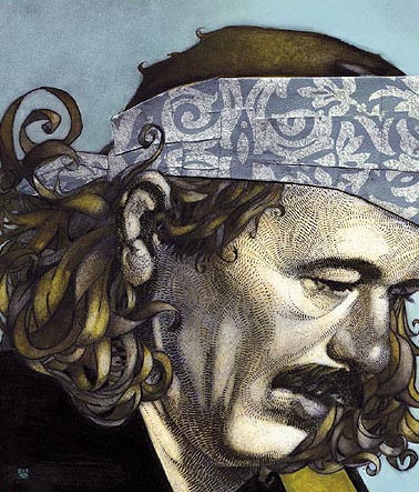
Sterling Hundley’s career as an illustrator got off to a quick start. While still a student at Virginia Commonwealth University, his work was chosen for the Society of Illustrators Student Scolarship Competition and the Society’s Illustrators Annual, and appeared in CMYK and Step by Step Magazine.He continues to garner awards and notice from the Society of Illustrators, The Illustrators Club, The LA Society of Illustrators, Communication Arts, Print Magazine and others.
His clients include The New Yorker, The Atlantic Monthly, Rolling Stone, GQ, The New York Times, Entertainment Weekly, Harper Collins and Putnam. He is represented by Richard Solomon (which says a fair bit in itself).
Hundley’s illustrations demonstrate a bold sense of design and are enlivened with imaginative variations of patterns and textures. His color palette tends to be muted, allowing the textures to assume part of the role normally assigned to color.
In his posters and book covers he often makes the title and other text an integral part of the illustration; and hand lettered text is used like a texture in some of his works (an interesting way to think of the word “texture”) .
His figures and faces are sometimes exaggerated, sometimes straightforwardly drawn and often a combination of both approaches. He also manages to combine abstracted shapes and pure design elements with more directly representational imagery. The result is a mixture of graphic elements, drawing and painting that gives the eye lots of variety within a coherent whole, like a nicely rounded meal.
Eschewing the usual categories into which artists separate their work when presenting it, Hundley interestingly divides his online portfolio into two sections titled “smart” and “pretty”.
His web site seems to be incomplete, as the “For Sale” and “Journal” sections still promise “Coming Soon”. Although, I’m not sure what “Journal” will be, as the “News” section is already in blog format. Unfortunately the blog as presented on the site is confined to scrolling within a limited-height frame, for reasons that are lost on me. You can view the blog without the frame here. You can also find Hundley posting, blog-style, to Drawger. You will find additional images on the blog and Drawger posts that are not in his online portfolio.
He apparently works in acrylic and oil, sometimes with digital additions.
I’m particularly fond of his intriguing portraits of musicians like Carlos Santana (above), Bob Dylan and Gerry Garcia.
Categories:


Charley’s Picks
Bookshop.org
(Bookshop.org affilliate links; sales benefit independent bookshop owners; I get a small percentage to help support my work on Lines and Colors)

John Singer Sargent: Watercolors


Urban Sketching: Understanding Perspective


Charley’s Picks
Amazon
(Amazon.com affiliate links; sales go to a larger yacht for Jeff Bezos; but I get a small percentage to help support my work on Lines and Colors)
John Singer Sargent: Watercolors
Urban Sketching: Understanding Perspective