
Categories
- 3d CGI
- Amusements
- Animation
- Anime & Manga
- Art Materials
- Art Videos
- Blogroll
- Cartoons
- Color
- Comics
- Concept & Visual Dev.
- Creativity
- Digital Art
- Digital Painting
- Displaying Art on the Web
- Drawing
- Eye Candy for Today
- Gallery and Museum Art
- High-res Art Images
- Illustration
- Motion Graphics & Flash
- Museums
- Online Museums
- Outsider Art
- Painting
- Painting a Day
- Paleo Art
- Pastel, Conté & Chalk
- Pen & Ink
- Prints and Printmaking
- Reviews
- Sc-fi and Fantasy
- Sculpture & Dimensional
- Site Comments
- Sketching
- Storyboards
- Tools and Techniques
- Uncategorized
- Vector Art
- Videos & Podcasts
- Vision and Optics
- Watercolor and Gouache
- Webcomics
Archives
- June 2026
- May 2026
- April 2026
- March 2026
- February 2026
- January 2026
- December 2025
- November 2025
- October 2025
- September 2025
- August 2025
- July 2025
- June 2025
- May 2025
- January 2025
- December 2024
- November 2024
- October 2024
- September 2024
- August 2024
- June 2024
- April 2024
- March 2024
- February 2024
- January 2024
- December 2023
- November 2023
- October 2023
- September 2023
- August 2023
- July 2023
- May 2023
- April 2023
- March 2023
- February 2023
- January 2023
- December 2022
- November 2022
- September 2022
- August 2022
- July 2022
- June 2022
- May 2022
- April 2022
- March 2022
- February 2022
- January 2022
- December 2021
- November 2021
- October 2021
- September 2021
- August 2021
- July 2021
- June 2021
- May 2021
- April 2021
- March 2021
- February 2021
- January 2021
- December 2020
- November 2020
- October 2020
- September 2020
- August 2020
- July 2020
- June 2020
- May 2020
- April 2020
- March 2020
- February 2020
- January 2020
- December 2019
- November 2019
- October 2019
- September 2019
- August 2019
- July 2019
- June 2019
- May 2019
- April 2019
- March 2019
- February 2019
- January 2019
- December 2018
- November 2018
- October 2018
- September 2018
- August 2018
- July 2018
- June 2018
- May 2018
- April 2018
- March 2018
- February 2018
- January 2018
- December 2017
- November 2017
- October 2017
- September 2017
- August 2017
- July 2017
- June 2017
- May 2017
- April 2017
- March 2017
- February 2017
- January 2017
- December 2016
- November 2016
- October 2016
- September 2016
- August 2016
- July 2016
- June 2016
- May 2016
- April 2016
- March 2016
- February 2016
- January 2016
- December 2015
- November 2015
- October 2015
- September 2015
- August 2015
- July 2015
- June 2015
- May 2015
- April 2015
- March 2015
- February 2015
- January 2015
- December 2014
- November 2014
- October 2014
- September 2014
- August 2014
- July 2014
- June 2014
- May 2014
- April 2014
- March 2014
- February 2014
- January 2014
- December 2013
- November 2013
- October 2013
- September 2013
- August 2013
- July 2013
- June 2013
- May 2013
- April 2013
- March 2013
- February 2013
- January 2013
- December 2012
- November 2012
- October 2012
- September 2012
- August 2012
- July 2012
- June 2012
- May 2012
- April 2012
- March 2012
- February 2012
- January 2012
- December 2011
- November 2011
- October 2011
- September 2011
- August 2011
- July 2011
- June 2011
- May 2011
- April 2011
- March 2011
- February 2011
- January 2011
- December 2010
- November 2010
- October 2010
- September 2010
- August 2010
- July 2010
- June 2010
- May 2010
- April 2010
- March 2010
- February 2010
- January 2010
- December 2009
- November 2009
- October 2009
- September 2009
- August 2009
- July 2009
- June 2009
- May 2009
- April 2009
- March 2009
- February 2009
- January 2009
- December 2008
- November 2008
- October 2008
- September 2008
- August 2008
- July 2008
- June 2008
- May 2008
- April 2008
- March 2008
- February 2008
- January 2008
- December 2007
- November 2007
- October 2007
- September 2007
- August 2007
- July 2007
- June 2007
- May 2007
- April 2007
- March 2007
- February 2007
- January 2007
- December 2006
- November 2006
- October 2006
- September 2006
- August 2006
- July 2006
- June 2006
- May 2006
- April 2006
- March 2006
- February 2006
- January 2006
- December 2005
- November 2005
- October 2005
- September 2005
- August 2005
Relevant Blogs
Art, Painting & Sketch
- Gurney Journey
- Underpaintings
- Art and Influence
- Painting Perceptions
- Oil Painters of America
- Vasari Paint POV
- Flying Fox
- Urban Sketchers
- Bento (Smithsonian)
- Art Inconnu
- The Hidden Place
- Still Life
- Making a Mark
- The Art of the Landscape
- Exploring Color & Creativity
- Art Contrarian
- Artist A Day
- beinArt Surreal Art Collective
- Eye Level
- David Dunlop
- p.i.g.m.e.n.t.i.u.m
- CultureGrrl
- Joaquín Sorolla blog
- Artists in Pastel
“Painting a Day”
- A Painting a Day (Keiser)
- On Painting (Keiser)
- Julian Merrow-Smith
- Karen Jurick
- Jeffrey Hayes
- Carol Marine
- Abbey Ryan
- Daily Paintworks
Other Painting Blogs
- Virtual Gouache Land
- Neil Hollingsworth
- Marc Hanson
- Kevin Menck
- Marc Dalessio
- Larry Seiler
- Stapleton Kearns
- Colin Page
- Roos Schuring
- Hans Versfelt
- Titus Meeuws
- Régis Pettinari
- René Plein Air
- Belinda Del Pesco
- Robin Weiss
- Nathan Fowkes (Land Sketch)
- William Wray
- Frank Serrano
- Stephen Magsig
- Michael Chesley Johnson
- Twice a Week
- Sarah Wimperis
- Rob Adams
- Michael Cole Manley
- The Dirty Palette Club
- Mike Manley’s Draw!
Gallery Art & Illustration mix
Illustration
- Howard Pyle
- 100 Years of Illustration
- BibliOdyssey
- Illustration Art
- Today’s Inspiration
- Illustration Mundo
- Little Chimp Society
- Danny Gregory
- R D (John Martz
- Illustration Friday blog
- Monster Brains
- Illustrators & Illustrations (RU)
- Elwood H. Smith
- DaniDraws.com
- Designers Who Blog
- iSpot Blog
Sci-Fi & Fantasy
Illustration & Comics
Comics & Cartoons
- Comics Beat
- Robot 6
- Newsarama Blog
- Comic Vine
- Comics Alliance
- Forbidden Planet Int.
- Paolo Rivera
- Bolt City
- Flight
- Scott McCloud
- The Comics Journal
- Comixpedia
- Funnybook Babylon
- James Baker
- Middleton’s Sketchbook
- Boneville
- The Hotel Fred
- Paul Rivoche
- Daily Cartoonist
- Mad About Cartoons (William Wray)
- Digital Strips
Illustration & Concept
Animation & Concept
- Cartoon Brew
- Animation Blog
- Cold Hard Flash
- Concept Art World
- The CAB
- FY Concept Art
- Concept Ships
- Concept Robots
- John Nevarez
- Armand Serrano
- Marcos Mateu-Mestre
- all kinds of stuff (Kricfalusi)
- Yacin the faun (Man Arenas)
- Kelsey Mann
- Cre8tivemarks Blog
- Ice-Cream Monster Toon Cafe
- AAU Character & Creature Design
- AAU Animation Notes
- Articles and Texticles
Paleo & Scientific
Tools & Techniques
Other
Lists of Art Blogs
Art Image Resource Links
Historic Art Images
- Wikimedia Commons: Paintings
- Wikimedia Commons: Drawings
- The Athenaeum
- WikiArt (WikiPaintings)
- Google Art Project: Artists
- Google Art Project: Collections (Museums)
- ArtCyclopedia
- Web Gallery of Art
- Art Renewal Center
- Web Gallery of Impressionism
Auction Consolidation sites
Auction sites
- Sotheby’s
- Bonham’s
- Christies
- Heritage Auctions: Fine Art
- Heritage Auctions: Illustration
- Freeman’s Auctions
- Bukowskis
- Shannon’s
Image Search
Reverse Image Search (search by image)
- Tin Eye
- RevImg
- Google Image Search (camera icon)
- Bing Image Search (camera icon)
Promoting some friends and some clients of my website design business
- Twin Willows T’ai Chi studio in Wilmington DE. Taiji classes with Bryan Davis.
- Ray Hayward, Inspired Teacher of T’ai Chi ( Taiji ) in Minneapolis, Founder of Mindful Motion Tai Chi Academy
- OldHead Tattoo studio and Art Gallery in Wilmington DE. Tattoos and paintings by Bruce Gulick
- Sharon Domenico Art, pet portrait oil paintings
- Platinum Paperhanging, wallpaper hanging, Main Line and Philadelphia, PA
- Lisa Stone Design, interior designer, Main Line and Philadelphia, PA
- Studio12KPT, original art, prints, calendars and other custom printed items by Van Sickle & Rolleri
-
The Castle of Cagliostro

Lupin III: The Castle of Cagliostro (Rupan Sansei: Kariosutoro no Shiro) was the first feature length animation by Japanese master Hayao Miyazaki.Released in 1979 and soon overshadowed by films like Nausicaa, Laputa and Totoro, The Castle of Cagliostro is often overlooked in Miyazaki’s oeuvre, but undeservedly so. It’s a terrific film and one of the most fun adventure movies I can recall, animated or otherwise.
It doesn’t have the extraordinary graphic sophistication of Miyazaki’s mature work, but the backgrounds are lush and beautiful, there are intimations of the wonderful landscapes that would grace his later features and the staging and “cinematography” are excellent. (I realize “cinematography” isn’t quite the right term for animation, but I don’t know what else to use to describe the elements of composition, “camera movement” and cutting that are the equivalent of photographed films.)
You’ll also see hints of Miyazaki themes to come: wonderful flying craft, mysterious castles, dramatic landscapes and a fascination with the architecture of European cities. Also Miyazaki’s beautiful drawing, rich color and striking use of night and twilight scenes are very much in play.
You won’t find the sophisticated and thought provoking themes of Miayazaki’s later works, but in their place we have a superb lighthearted adventure fantasy that has much of the feeling of those great 1960’s spy thrillers and thief caper movies.
Although it’s part of the Lupin the III series, the story works just fine on its own. Brash, goofy and adventurous Arséne Lupin III, professional thief and inveterate playboy, is equipped with enough gadgets, wisecracks and casually reckless daring-do to make James Bond jealous. In the course of the movie he encounters a beautiful princess, an evil count, secret passages, traps, guards, Interpol agents, former lovers, car chases and all manner of other great adventure movie fare. It’s all played out against beautifully realized settings and is artfully staged and timed.
A new print of the film that has been released by Manga Entertainment. (Unfortunately, Manga’s Flash-based site that doesn’t allow for a direct link to the info for this film.)
The new print is beautiful. The picture quality is excellent. The colors are rich and vibrant and the linework is crisp and clear. The subtitles and dub are quite good and much closer to the spirit of the original than the VHS version from the early 90’s.
The one gaff is that Manga has inexplicably cut the film’s beautiful original opening sequence and replaced it with a montage of stills for the opening credits. (What were they thinking?! Just play the English credits before the full, complete film!! Hello?!)
Anyway, don’t let that lapse in judgement, or the poor choice in DVD cover art, dissuade you from appreciating this version. It’s still the best English language release of this wonderful film. Manga released a version in 2000 that had some other problems, make sure you look for the new one.
If you think you don’t like anime, perhaps because your impression of it is limited to giant battle robots, senseless, herky-jerky fighting amid frenetic motion lines, incomprehensible magical creatures and triangular-faced characters with enormous eyes, you should let Hayao Miyazaki show you how limited and inaccurate those impressions are; and allow him give you a taste of what you’re missing. The Castle of Cagliostro can be a great place to start.
Categories:
-
Deconstructing Roy Lichtenstein
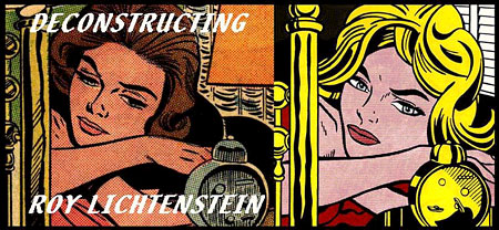
Pop artist Roy Lichtenstein was most famous for his large canvasses in which he reproduced bits of popular advertisements and, in particular, panels from comic books, complete with renderings of oversize process color dots.As much as I enjoyed seeing representations of comic panels displayed large, I always had a problem with Lichtenstein’s use of them. My most basic objection was the fact that he was treating them the way Warhol treated soup cans (and also comic panels), in that there was an assumption that the act of isolating and painting them as he had was elevating them to the status of “art”, with the tacit assumption, of course, that they were not art in the first place.
This is not an assumption I endorse, obviously. Comic art (or graphic narrative if you want a high-tone term) is as viable an art form as any form of visual art or literature, and is actually the unique and special point where those two otherwise separate forms of human expression join.
So, despite the fun gee-whiz campy color dot fizz of it all, Lichtenstein’s uncredited swipes (as they are called in comic circles) from comic book artists’ work did not please me.
Not only did the panels not need to be “elevated” to the status of art, Lichtenstein’s renderings of them (image above, right) were flat, lifeless and seemingly clueless to the appeal of the original panels (above, left). This is possibly deliberate on his part, but the effect is a drab one regardless, and I have never seen anything from Lichtenstein that demonstrates an ability to draw as well as even the least talented second string comic artists whose work he cavalierly “borrowed”.
This is evident when you compare his renditions with the original comic panels, a process that has been spotty and difficult in the past but is now facilitated by a project called Deconstructing Roy Lichtenstein by David Barsalou.
Barsalou has painstakingly found assembled and documented the original comic panels (and other sources) on which Lichtenstein based his panels.
I should point out that Barsalou probably does not share my attitude toward Lichtenstein’s work, and in fact, probably has the opposite opinion. I don’t want to seem like I’m putting words in his mouth.
His project, however, is a treat for me, because it makes it easier to say: “compare the originals”.
Link suggestion courtesy of Jack Harris.
Categories:
-
Edwin Austin Abbey

Edwin Austin Abbey was an American illustrator and muralist. Born here in Philadelphia, he moved to New York as a teenager (not that the term “teenager” was used in those days) and began doing illustration for Harper’s. When he was in his 20’s, Harper’s sent him to England to do research for an illustration project and he became a lifelong Anglophile, settling in London when he was 30.He was one of the great pen and ink illustrators of the “Golden Age” of illustration. As his career progressed, he moved into painting and large scale murals. He was commissioned to do murals for the Boston Public Library, along with sculptor Augustus Saint-Gaudens and painter John Singer Sargent, with whom he was friends, and created large scale works based on the quest for the Holy Grail. He also did murals and decorations for the Pennsylvania State Capitol in Harrisburg, which were finished by Sargent after Abbey’s death.
He was influenced by the Pre-Raphaelite painters, and shared their fondness for subjects from English literature, particularly Shakespeare. He did a series of wonderful works based on scenes from Shakespeare’s plays, such as the scene from Hamlet, above.
I’ve been unable to find many reproductions of his murals on the web. There are somewhat better resources for his painted illustrations. One of the best sources for his pen and ink work is Paul Giambarba’s nicely illustrated article on 100 Years of Illustration and Design.
There is a page on the John Singer Sargent Virtual Gallery that features some of Abbey’s work as well as Sargent’s charcoal portrait of him.
Abbey’s images were rich in detail, vibrant in color, full of intense contrasts of dark and light and populated by graceful figures and dramatic faces.
Categories:
-
William Wray
 William Wray is a California painter. His blog, in fact, is titled California Painter William Wray.
He paints quickly realized, direct and painterly images of the California landscape in the area around where he lives; and frequently posts the paintings to his blog. He works primarily en plein air and sometimes supplements the outdoor work with reference photographs and further work in the studio.
He works in a muted, often dark palette, punctuated with brighter areas and splashes of color that sometimes become the focal point of the image and sometimes push the darker forms forward. He says in his recent posts that he is trying to move toward abstraction, stepping slowly through more flattened and geometric forms in his paintings from life.
Personally, I’m sorry to hear that, because I really like the balance he has already achieved between natural forms and abstracted blocks and chunks of color. His paintings read well as compositions, with large areas of light and dark balanced against bits of texture and detail. His brushstrokes are obvious and forceful, his subject matter is pulled from the everyday and overlooked rather than the picturesque, and his color choices owe more to Expressionism than Impressionism.
Wray has a background in animation and comics and is familiar to many for his work with painted colors on the Ren and Stimpy Show, as well as comics work for Mad Magazine and on Hellboy Jr. with Mike Mignola.
You can see a little of that history in the “springyness” of his forms at times, but most of the influence on his work seems to come from other California plein air painters, the Expressionists and the immediate nature of the California landscape itself.
Categories:
-
JacksonPollock.org

Ever wanted to be Jackson Pollock, indulge in “Action Painting”, be the darling of the smart set and express your existential angst by throwing paint at the canvas?JacksonPollock.org is a web site by Miltos Manetas that lets you do just that, at least virtually. It’s a Flash-based interactive in which you can spatter, drip and blob colors onto your virtual canvas to your heart’s content, whiling away those tedious hours that could be spent doing something ridiculous, like working.
Like Mr. PicassoHead, JacksonPollock.org is essentially a fun diversion based loosely on the characteristics of the work of a famous painter.
It opens with a blank screen, with no indication of what to expect until you happen to move your mouse, and then… color happens! Based on the Flash interactive, “Splatter” by Michal Migurski of Stamen Design, the interactive responds to movements of your mouse (or stylus – Wheeee!) with lines, blobs and swaths of color. Drag, click and create! Click to change colors. Click and hold to get bigger blobs. No art training necessary!
And you don’t even get paint on your pants.
Suggested by Lisa Harris.
Categories:
-
Elizabeth Traynor

I’m particularly fond of pen and ink illustration, and its less common variant, scratchboard.Scratchboard is the inverse, or “dark side” (I couldn’t resist) of pen and ink drawing, in which a specially prepared board, coated with a thin layer of white clay, is used as the foundation for the drawing. Large areas of (usually) black ink are then painted onto the board, allowing the artist to scratch crisp white lines out of the black ink. There are special scratchboard tools, multi-pronged scratchboard “rakes” and so on, but any sharp instrument can be used.
Scratchboard is often combined with traditional pen and ink drawing on the same surface, as in the work of illustrator Virgil Finlay, and sometimes combined with color, particularly in some modern illustration. There are also artists, like Chet Phillips who mimic the effect with “digital scratchboard” in Corel Painter.
It’s not often that you see true scratchboard these days, and less frequent still that you see as exceptionally well handled as it is in the scratchboard illustrations of Elizabeth Traynor.
Traynor is an illustrator, formerly based in Delaware and now in Massachussets, who has done editorial work for companies like Simon & Schuster and Random House, publications like The Wall Street Journal, Fortune and Esquire and advertising illustration and logo design for companies ranging from American Express to Coca-Cola.
Her colored scratchboard illustrations have a wonderful feeling of being simultaneously modern and traditional. She also does rich, detailed watercolor illustrations and her site includes examples of her logo design as well. The image above, in fact, was extracted from one of her logo designs.
Link suggestion courtesy of Jack Harris.
Categories:


Charley’s Picks
Bookshop.org
(Bookshop.org affilliate links; sales benefit independent bookshop owners; I get a small percentage to help support my work on Lines and Colors)

John Singer Sargent: Watercolors


Urban Sketching: Understanding Perspective


Charley’s Picks
Amazon
(Amazon.com affiliate links; sales go to a larger yacht for Jeff Bezos; but I get a small percentage to help support my work on Lines and Colors)
John Singer Sargent: Watercolors
Urban Sketching: Understanding Perspective