
Categories
- 3d CGI
- Amusements
- Animation
- Anime & Manga
- Art Materials
- Art Videos
- Blogroll
- Cartoons
- Color
- Comics
- Concept & Visual Dev.
- Creativity
- Digital Art
- Digital Painting
- Displaying Art on the Web
- Drawing
- Eye Candy for Today
- Gallery and Museum Art
- High-res Art Images
- Illustration
- Motion Graphics & Flash
- Museums
- Online Museums
- Outsider Art
- Painting
- Painting a Day
- Paleo Art
- Pastel, Conté & Chalk
- Pen & Ink
- Prints and Printmaking
- Reviews
- Sc-fi and Fantasy
- Sculpture & Dimensional
- Site Comments
- Sketching
- Storyboards
- Tools and Techniques
- Uncategorized
- Vector Art
- Videos & Podcasts
- Vision and Optics
- Watercolor and Gouache
- Webcomics
Archives
- May 2026
- April 2026
- March 2026
- February 2026
- January 2026
- December 2025
- November 2025
- October 2025
- September 2025
- August 2025
- July 2025
- June 2025
- May 2025
- January 2025
- December 2024
- November 2024
- October 2024
- September 2024
- August 2024
- June 2024
- April 2024
- March 2024
- February 2024
- January 2024
- December 2023
- November 2023
- October 2023
- September 2023
- August 2023
- July 2023
- May 2023
- April 2023
- March 2023
- February 2023
- January 2023
- December 2022
- November 2022
- September 2022
- August 2022
- July 2022
- June 2022
- May 2022
- April 2022
- March 2022
- February 2022
- January 2022
- December 2021
- November 2021
- October 2021
- September 2021
- August 2021
- July 2021
- June 2021
- May 2021
- April 2021
- March 2021
- February 2021
- January 2021
- December 2020
- November 2020
- October 2020
- September 2020
- August 2020
- July 2020
- June 2020
- May 2020
- April 2020
- March 2020
- February 2020
- January 2020
- December 2019
- November 2019
- October 2019
- September 2019
- August 2019
- July 2019
- June 2019
- May 2019
- April 2019
- March 2019
- February 2019
- January 2019
- December 2018
- November 2018
- October 2018
- September 2018
- August 2018
- July 2018
- June 2018
- May 2018
- April 2018
- March 2018
- February 2018
- January 2018
- December 2017
- November 2017
- October 2017
- September 2017
- August 2017
- July 2017
- June 2017
- May 2017
- April 2017
- March 2017
- February 2017
- January 2017
- December 2016
- November 2016
- October 2016
- September 2016
- August 2016
- July 2016
- June 2016
- May 2016
- April 2016
- March 2016
- February 2016
- January 2016
- December 2015
- November 2015
- October 2015
- September 2015
- August 2015
- July 2015
- June 2015
- May 2015
- April 2015
- March 2015
- February 2015
- January 2015
- December 2014
- November 2014
- October 2014
- September 2014
- August 2014
- July 2014
- June 2014
- May 2014
- April 2014
- March 2014
- February 2014
- January 2014
- December 2013
- November 2013
- October 2013
- September 2013
- August 2013
- July 2013
- June 2013
- May 2013
- April 2013
- March 2013
- February 2013
- January 2013
- December 2012
- November 2012
- October 2012
- September 2012
- August 2012
- July 2012
- June 2012
- May 2012
- April 2012
- March 2012
- February 2012
- January 2012
- December 2011
- November 2011
- October 2011
- September 2011
- August 2011
- July 2011
- June 2011
- May 2011
- April 2011
- March 2011
- February 2011
- January 2011
- December 2010
- November 2010
- October 2010
- September 2010
- August 2010
- July 2010
- June 2010
- May 2010
- April 2010
- March 2010
- February 2010
- January 2010
- December 2009
- November 2009
- October 2009
- September 2009
- August 2009
- July 2009
- June 2009
- May 2009
- April 2009
- March 2009
- February 2009
- January 2009
- December 2008
- November 2008
- October 2008
- September 2008
- August 2008
- July 2008
- June 2008
- May 2008
- April 2008
- March 2008
- February 2008
- January 2008
- December 2007
- November 2007
- October 2007
- September 2007
- August 2007
- July 2007
- June 2007
- May 2007
- April 2007
- March 2007
- February 2007
- January 2007
- December 2006
- November 2006
- October 2006
- September 2006
- August 2006
- July 2006
- June 2006
- May 2006
- April 2006
- March 2006
- February 2006
- January 2006
- December 2005
- November 2005
- October 2005
- September 2005
- August 2005
Relevant Blogs
Art, Painting & Sketch
- Gurney Journey
- Underpaintings
- Art and Influence
- Painting Perceptions
- Oil Painters of America
- Vasari Paint POV
- Flying Fox
- Urban Sketchers
- Bento (Smithsonian)
- Art Inconnu
- The Hidden Place
- Still Life
- Making a Mark
- The Art of the Landscape
- Exploring Color & Creativity
- Art Contrarian
- Artist A Day
- beinArt Surreal Art Collective
- Eye Level
- David Dunlop
- p.i.g.m.e.n.t.i.u.m
- CultureGrrl
- Joaquín Sorolla blog
- Artists in Pastel
“Painting a Day”
- A Painting a Day (Keiser)
- On Painting (Keiser)
- Julian Merrow-Smith
- Karen Jurick
- Jeffrey Hayes
- Carol Marine
- Abbey Ryan
- Daily Paintworks
Other Painting Blogs
- Virtual Gouache Land
- Neil Hollingsworth
- Marc Hanson
- Kevin Menck
- Marc Dalessio
- Larry Seiler
- Stapleton Kearns
- Colin Page
- Roos Schuring
- Hans Versfelt
- Titus Meeuws
- Régis Pettinari
- René Plein Air
- Belinda Del Pesco
- Robin Weiss
- Nathan Fowkes (Land Sketch)
- William Wray
- Frank Serrano
- Stephen Magsig
- Michael Chesley Johnson
- Twice a Week
- Sarah Wimperis
- Rob Adams
- Michael Cole Manley
- The Dirty Palette Club
- Mike Manley’s Draw!
Gallery Art & Illustration mix
Illustration
- Howard Pyle
- 100 Years of Illustration
- BibliOdyssey
- Illustration Art
- Today’s Inspiration
- Illustration Mundo
- Little Chimp Society
- Danny Gregory
- R D (John Martz
- Illustration Friday blog
- Monster Brains
- Illustrators & Illustrations (RU)
- Elwood H. Smith
- DaniDraws.com
- Designers Who Blog
- iSpot Blog
Sci-Fi & Fantasy
Illustration & Comics
Comics & Cartoons
- Comics Beat
- Robot 6
- Newsarama Blog
- Comic Vine
- Comics Alliance
- Forbidden Planet Int.
- Paolo Rivera
- Bolt City
- Flight
- Scott McCloud
- The Comics Journal
- Comixpedia
- Funnybook Babylon
- James Baker
- Middleton’s Sketchbook
- Boneville
- The Hotel Fred
- Paul Rivoche
- Daily Cartoonist
- Mad About Cartoons (William Wray)
- Digital Strips
Illustration & Concept
Animation & Concept
- Cartoon Brew
- Animation Blog
- Cold Hard Flash
- Concept Art World
- The CAB
- FY Concept Art
- Concept Ships
- Concept Robots
- John Nevarez
- Armand Serrano
- Marcos Mateu-Mestre
- all kinds of stuff (Kricfalusi)
- Yacin the faun (Man Arenas)
- Kelsey Mann
- Cre8tivemarks Blog
- Ice-Cream Monster Toon Cafe
- AAU Character & Creature Design
- AAU Animation Notes
- Articles and Texticles
Paleo & Scientific
Tools & Techniques
Other
Lists of Art Blogs
Art Image Resource Links
Historic Art Images
- Wikimedia Commons: Paintings
- Wikimedia Commons: Drawings
- The Athenaeum
- WikiArt (WikiPaintings)
- Google Art Project: Artists
- Google Art Project: Collections (Museums)
- ArtCyclopedia
- Web Gallery of Art
- Art Renewal Center
- Web Gallery of Impressionism
Auction Consolidation sites
Auction sites
- Sotheby’s
- Bonham’s
- Christies
- Heritage Auctions: Fine Art
- Heritage Auctions: Illustration
- Freeman’s Auctions
- Bukowskis
- Shannon’s
Image Search
Reverse Image Search (search by image)
- Tin Eye
- RevImg
- Google Image Search (camera icon)
- Bing Image Search (camera icon)
Promoting some friends and some clients of my website design business
- Twin Willows T’ai Chi studio in Wilmington DE. Taiji classes with Bryan Davis.
- Ray Hayward, Inspired Teacher of T’ai Chi ( Taiji ) in Minneapolis, Founder of Mindful Motion Tai Chi Academy
- OldHead Tattoo studio and Art Gallery in Wilmington DE. Tattoos and paintings by Bruce Gulick
- Sharon Domenico Art, pet portrait oil paintings
- Platinum Paperhanging, wallpaper hanging, Main Line and Philadelphia, PA
- Lisa Stone Design, interior designer, Main Line and Philadelphia, PA
- Studio12KPT, original art, prints, calendars and other custom printed items by Van Sickle & Rolleri
-
Dan McPharlin
Illustrator and designer Dan McPharlin gives little information about himself, his work or his clients on his website, which essentially just offers a download of a PDF portfolio from 2006 (also lacking in background information) and a link to his Flickr stream, which serves as his actual portfolio on the web.In the latter you can browse through his larger photostream, or focus on a set devoted to Selected Work.
He has apparently illustrated covers for a number of audio recordings. Some of his work is graphic and design oriented, but the pieces I find most interesting are his science fiction themed illustrations that have a wonderful feeling of 1960’s Ace/Berkeley science fiction book covers.
There is a brief interview with McPharlin on Sci-Fi-O-rama, from which I glean that he works digitally.
Categories:
-
The Athenaeum

The Athenaeum is essentially a virtual museum, in some ways similar to the Art Renewal Center (my post here) or the Web Gallery of Art (my post here), but with its own focus and strengths.As of this writing, The Athenaeum lists their online collection of art images at 43,339 (with 14 added in the last seven days), making it one one the largest art resources on the web, perhaps second only to the Art Renewal Center.
The Athenaeum is one of my favorite online sources of images from art history; they frequently have good selections of a given artist’s work, reproduced large enough to enjoy and with well balanced color (which can be a problem on some art image repositories).
You can search the archive via Google with the search box on the home page or the “Visual Arts” landing page.
You can also browse alphabetically by artist name, or even name of the work.
In the lists for individual artists, be aware that there are frequently multiple pages of thumbnails, linked from small numbers at the top of the list. You can sort these lists by title, date and medium and toggle the order of each.
Click through the thumbnail or title link to the detail page for the work, and click on the image again for the large reproduction.
You can also browse a museum list; these lists can be sorted by title, artist or date. In the museum listing details click on “Artworks at this museum” at the top to see works in the Athenaeum archive from that museum’s collections.
This can be a fascinating way to browse, in that it produces an interesting mix of artists and styles.
The above images, for example, are all from the collection of The Pennsylvania Academy of the Fine Arts (from top: Edmund Tarbell, Raphaelle Peale, Thomas Eakins [no longer in the collection, alas], Cecilia Beaux, Winslow Homer and Theodore Robinson).
(See also my posts on Edmund Tarbell, Thomas Eakins, Cecilia Beaux and the web site of The Pennsylvania Academy of the Fine Arts.)
Categories:
-
Steve Thomas

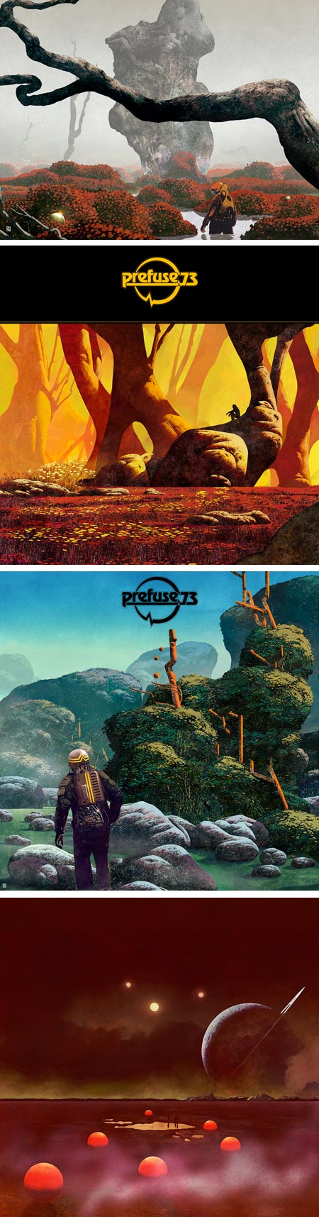
Illustrator Steve Thomas, when not creating graphics and illustrations for newspapers in his day job, turns his imagination to other places, creating wonderful retro-future travel posters that invite you to explore interplanetary travel to destinations in the Solar System, or interstellar travel in a familiar galaxy that is “far far away”.In addition to the travel posters, his website also has sections of designs in propaganda poster style, marketing, business and other designs. Thomas also has blog where he posts both current and older work, some in a different style.
He has a store on Zazzle with his some of his designs as posters and T-shirts.
His series of Star Wars posters, done in his nicely graphic 1030’s – 1940’s style, can be seen in a group here.
Enjoy them you will.
Categories:
-
Color Vision & Art
Color Vision & Art is an online feature on WebExhibits, which describes itself as an “interactive museum of science, humanities and culture”.The feature is a series of related articles, accompanied by images and simple Flash interactives, that explore the relationship of human color perception to the uses of color in art. The feature is more extensive than it appears first, each section divided into secondary and sometimes tertiary levels of topics.
The articles move from basic information about light, color and vision, through color theory and the color wheel (additionally, see my post on History of the Color Wheel), paints and pigments (for which there is a dedicated feature on WebExhibits, Pigments Through the Ages) into color interactions and peripheral vision. The latter has some interesting essays on the use of detail and blurring in paintings at various points in art history.
I found the section on Color Interactions Simultaneous Contrast a little spare, as I feel this is at the core of understanding and using color, and could have benefitted from additional interactions and demonstrations, (particularly demonstrations such as the striking examples of simultaneous contrast shown by modern color perception demonstrations like the ones I wrote about here and here).
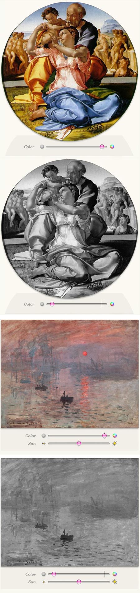
However, I found particular interest in the section on Luminance and equiluminance, or value contrasts and value similarities. This is illustrated particularly well in simple interactives that use sliders to remove the color and show the strong value relationships in Michelangelo’s Doni Holy Family and the very different ones in Monet’s Impression: Sunrise. The latter is the painting from which the term “Impressionism”, originally a bit of derisive mockery by critics, came into use.
The interactives allow you to gradually remove the color from both paintings, viewing the difference in their color contrasts and value contrasts. (The images above are just screen captures and are not interactive.)
Most fascinating is the combination of deliberate lack of value contrast and simultaneous strong color contrast in the key parts of Monet’s painting, also demonstrated in his Poppies, near Argenteuil, producing a conflict in the perception of the contrast within the brain that makes the area seem to vibrate.
Overall, the features are, if you will excuse the expression, illuminating, and well worth both casual perusal and more dedicated reading if you have the time.
Other features in WebExhibits of particular interest to Lines and Colors readers include Causes of Color, Pigments Through the Ages, Bellini’s “Feast of the Gods” and Van Gogh’s Letters.
Categories:
-
PumpkinMixer

I don’t often talk about my own projects on Lines and Colors, but sometimes they’re enough fun to be worthy of note.PumpkinMixer is my new app for the iPhone and iPod touch. Like my other apps, DinoMixer and MonsterMixer, it was developed with my friend and colleague Leon Stankowski, who created the coding to fit with my design and illustrations, worked with me on the functionality and coordinated the sound.
Similar to the other “Mixer” apps, PumpkinMixer is based loosely on the old Surrealist game of Exquisite Corpse, in which artists would fold over paper and draw three independent parts of a drawing, head, body and legs, without seeing the outcome until all were in place. This concept made its way into popular culture as a children’s game (my friends and I played it in elementary school), and was eventually adapted in publishing as “mix-n-match” children’s picture books (usually spiral-bound, with stiff cardboard pages that are divided in three).
PumpkinMixer, like DinoMixer and MonsterMixer, is an electronic version of this. In the case of PumpkinMixer, you swipe side to side to swap sets of eyes, noses and mouths, with an extra horizontal band at the top to switch between three backgrounds. Swiping on the iPhone screen vertically switches between pumpkins and swaps out the colors of the animated “candle flame” behind the face cut-outs.
In designing the interface and creating the artwork, which was done digitally in Painter and Photoshop in the same way I draw my webcomic, Argon Zark!, I faced the same challenges I outlined in my post about creating the artwork for DinoMixer.
Like many illustration projects, this one, in addition to the design and technical challenges, had a deadline. Since PumpkinMixer just made it through the App Store approval process and became available today, one day before Halloween, you might say we just made it; though we obviously had an earlier release in mind.
On the other hand, you could say we’re just really really early for next Halloween!
Categories:
-
Chappatte

Patrick Chappatte is a political cartoonist with an international reach, and a personal history to match. Born in Pakistan, Chappatte was raised in Singapore and later Switzerland. He lived in New York for a time and now lives and works in Geneva.Chappette’s global view comes across in his cartoons for the International Herald Tribune and other publications.
He is known in particular for his forays into cartoon journalism, in which he visits parts of the world, reporting on the situation there in cartoon or comic strip form. An example is his In the Slums of Nairobi (image above, bottom), which was published in a series on Nairobi in the Global Opinion section of the New York Times website.
Note how the use of cartoon imagery, while it doesn’t lessen the impact of the dire situation, makes for a lower barrier to entry into an uncomfortable subject than stark photographs might have.
You can see some other examples of his work in this direction on graphicjournalism.net.
Chappatte explores this increasing trend toward cartoon journalism, along with the impact, influence and role of cartoons in world events, in a fascinating talk on The Power of Cartoons for the TED (Technology Entertainment and Design) conference (you can also view the video on YouTube). He punctuates his comments with some of his cartoons.
You can see more of them on his website (French version here). When looking through his cartoons by topic (drop down menu at right), be aware that most categories have several pages, accessed from small page numbers under the cartoon thumbnails at lower right.
His work has also been published in a number of books.
Despite the difficulties faced by traditional newspapers, and their resultant decisions to abandon much of their original content, like editorial cartoons (brilliant, of course — when cicrculation is dropping, drop the content people find worthwhile), cartoons will continue to play an important part in political and social discourse.
[Via Digg, via Geeks Are Sexy]
Categories:


Charley’s Picks
Bookshop.org
(Bookshop.org affilliate links; sales benefit independent bookshop owners; I get a small percentage to help support my work on Lines and Colors)

John Singer Sargent: Watercolors


Urban Sketching: Understanding Perspective


Charley’s Picks
Amazon
(Amazon.com affiliate links; sales go to a larger yacht for Jeff Bezos; but I get a small percentage to help support my work on Lines and Colors)
John Singer Sargent: Watercolors
Urban Sketching: Understanding Perspective