
Categories
- 3d CGI
- Amusements
- Animation
- Anime & Manga
- Art Materials
- Art Videos
- Blogroll
- Cartoons
- Color
- Comics
- Concept & Visual Dev.
- Creativity
- Digital Art
- Digital Painting
- Displaying Art on the Web
- Drawing
- Eye Candy for Today
- Gallery and Museum Art
- High-res Art Images
- Illustration
- Motion Graphics & Flash
- Museums
- Online Museums
- Outsider Art
- Painting
- Painting a Day
- Paleo Art
- Pastel, Conté & Chalk
- Pen & Ink
- Prints and Printmaking
- Reviews
- Sc-fi and Fantasy
- Sculpture & Dimensional
- Site Comments
- Sketching
- Storyboards
- Tools and Techniques
- Uncategorized
- Vector Art
- Videos & Podcasts
- Vision and Optics
- Watercolor and Gouache
- Webcomics
Archives
- May 2026
- April 2026
- March 2026
- February 2026
- January 2026
- December 2025
- November 2025
- October 2025
- September 2025
- August 2025
- July 2025
- June 2025
- May 2025
- January 2025
- December 2024
- November 2024
- October 2024
- September 2024
- August 2024
- June 2024
- April 2024
- March 2024
- February 2024
- January 2024
- December 2023
- November 2023
- October 2023
- September 2023
- August 2023
- July 2023
- May 2023
- April 2023
- March 2023
- February 2023
- January 2023
- December 2022
- November 2022
- September 2022
- August 2022
- July 2022
- June 2022
- May 2022
- April 2022
- March 2022
- February 2022
- January 2022
- December 2021
- November 2021
- October 2021
- September 2021
- August 2021
- July 2021
- June 2021
- May 2021
- April 2021
- March 2021
- February 2021
- January 2021
- December 2020
- November 2020
- October 2020
- September 2020
- August 2020
- July 2020
- June 2020
- May 2020
- April 2020
- March 2020
- February 2020
- January 2020
- December 2019
- November 2019
- October 2019
- September 2019
- August 2019
- July 2019
- June 2019
- May 2019
- April 2019
- March 2019
- February 2019
- January 2019
- December 2018
- November 2018
- October 2018
- September 2018
- August 2018
- July 2018
- June 2018
- May 2018
- April 2018
- March 2018
- February 2018
- January 2018
- December 2017
- November 2017
- October 2017
- September 2017
- August 2017
- July 2017
- June 2017
- May 2017
- April 2017
- March 2017
- February 2017
- January 2017
- December 2016
- November 2016
- October 2016
- September 2016
- August 2016
- July 2016
- June 2016
- May 2016
- April 2016
- March 2016
- February 2016
- January 2016
- December 2015
- November 2015
- October 2015
- September 2015
- August 2015
- July 2015
- June 2015
- May 2015
- April 2015
- March 2015
- February 2015
- January 2015
- December 2014
- November 2014
- October 2014
- September 2014
- August 2014
- July 2014
- June 2014
- May 2014
- April 2014
- March 2014
- February 2014
- January 2014
- December 2013
- November 2013
- October 2013
- September 2013
- August 2013
- July 2013
- June 2013
- May 2013
- April 2013
- March 2013
- February 2013
- January 2013
- December 2012
- November 2012
- October 2012
- September 2012
- August 2012
- July 2012
- June 2012
- May 2012
- April 2012
- March 2012
- February 2012
- January 2012
- December 2011
- November 2011
- October 2011
- September 2011
- August 2011
- July 2011
- June 2011
- May 2011
- April 2011
- March 2011
- February 2011
- January 2011
- December 2010
- November 2010
- October 2010
- September 2010
- August 2010
- July 2010
- June 2010
- May 2010
- April 2010
- March 2010
- February 2010
- January 2010
- December 2009
- November 2009
- October 2009
- September 2009
- August 2009
- July 2009
- June 2009
- May 2009
- April 2009
- March 2009
- February 2009
- January 2009
- December 2008
- November 2008
- October 2008
- September 2008
- August 2008
- July 2008
- June 2008
- May 2008
- April 2008
- March 2008
- February 2008
- January 2008
- December 2007
- November 2007
- October 2007
- September 2007
- August 2007
- July 2007
- June 2007
- May 2007
- April 2007
- March 2007
- February 2007
- January 2007
- December 2006
- November 2006
- October 2006
- September 2006
- August 2006
- July 2006
- June 2006
- May 2006
- April 2006
- March 2006
- February 2006
- January 2006
- December 2005
- November 2005
- October 2005
- September 2005
- August 2005
Relevant Blogs
Art, Painting & Sketch
- Gurney Journey
- Underpaintings
- Art and Influence
- Painting Perceptions
- Oil Painters of America
- Vasari Paint POV
- Flying Fox
- Urban Sketchers
- Bento (Smithsonian)
- Art Inconnu
- The Hidden Place
- Still Life
- Making a Mark
- The Art of the Landscape
- Exploring Color & Creativity
- Art Contrarian
- Artist A Day
- beinArt Surreal Art Collective
- Eye Level
- David Dunlop
- p.i.g.m.e.n.t.i.u.m
- CultureGrrl
- Joaquín Sorolla blog
- Artists in Pastel
“Painting a Day”
- A Painting a Day (Keiser)
- On Painting (Keiser)
- Julian Merrow-Smith
- Karen Jurick
- Jeffrey Hayes
- Carol Marine
- Abbey Ryan
- Daily Paintworks
Other Painting Blogs
- Virtual Gouache Land
- Neil Hollingsworth
- Marc Hanson
- Kevin Menck
- Marc Dalessio
- Larry Seiler
- Stapleton Kearns
- Colin Page
- Roos Schuring
- Hans Versfelt
- Titus Meeuws
- Régis Pettinari
- René Plein Air
- Belinda Del Pesco
- Robin Weiss
- Nathan Fowkes (Land Sketch)
- William Wray
- Frank Serrano
- Stephen Magsig
- Michael Chesley Johnson
- Twice a Week
- Sarah Wimperis
- Rob Adams
- Michael Cole Manley
- The Dirty Palette Club
- Mike Manley’s Draw!
Gallery Art & Illustration mix
Illustration
- Howard Pyle
- 100 Years of Illustration
- BibliOdyssey
- Illustration Art
- Today’s Inspiration
- Illustration Mundo
- Little Chimp Society
- Danny Gregory
- R D (John Martz
- Illustration Friday blog
- Monster Brains
- Illustrators & Illustrations (RU)
- Elwood H. Smith
- DaniDraws.com
- Designers Who Blog
- iSpot Blog
Sci-Fi & Fantasy
Illustration & Comics
Comics & Cartoons
- Comics Beat
- Robot 6
- Newsarama Blog
- Comic Vine
- Comics Alliance
- Forbidden Planet Int.
- Paolo Rivera
- Bolt City
- Flight
- Scott McCloud
- The Comics Journal
- Comixpedia
- Funnybook Babylon
- James Baker
- Middleton’s Sketchbook
- Boneville
- The Hotel Fred
- Paul Rivoche
- Daily Cartoonist
- Mad About Cartoons (William Wray)
- Digital Strips
Illustration & Concept
Animation & Concept
- Cartoon Brew
- Animation Blog
- Cold Hard Flash
- Concept Art World
- The CAB
- FY Concept Art
- Concept Ships
- Concept Robots
- John Nevarez
- Armand Serrano
- Marcos Mateu-Mestre
- all kinds of stuff (Kricfalusi)
- Yacin the faun (Man Arenas)
- Kelsey Mann
- Cre8tivemarks Blog
- Ice-Cream Monster Toon Cafe
- AAU Character & Creature Design
- AAU Animation Notes
- Articles and Texticles
Paleo & Scientific
Tools & Techniques
Other
Lists of Art Blogs
Art Image Resource Links
Historic Art Images
- Wikimedia Commons: Paintings
- Wikimedia Commons: Drawings
- The Athenaeum
- WikiArt (WikiPaintings)
- Google Art Project: Artists
- Google Art Project: Collections (Museums)
- ArtCyclopedia
- Web Gallery of Art
- Art Renewal Center
- Web Gallery of Impressionism
Auction Consolidation sites
Auction sites
- Sotheby’s
- Bonham’s
- Christies
- Heritage Auctions: Fine Art
- Heritage Auctions: Illustration
- Freeman’s Auctions
- Bukowskis
- Shannon’s
Image Search
Reverse Image Search (search by image)
- Tin Eye
- RevImg
- Google Image Search (camera icon)
- Bing Image Search (camera icon)
Promoting some friends and some clients of my website design business
- Twin Willows T’ai Chi studio in Wilmington DE. Taiji classes with Bryan Davis.
- Ray Hayward, Inspired Teacher of T’ai Chi ( Taiji ) in Minneapolis, Founder of Mindful Motion Tai Chi Academy
- OldHead Tattoo studio and Art Gallery in Wilmington DE. Tattoos and paintings by Bruce Gulick
- Sharon Domenico Art, pet portrait oil paintings
- Platinum Paperhanging, wallpaper hanging, Main Line and Philadelphia, PA
- Lisa Stone Design, interior designer, Main Line and Philadelphia, PA
- Studio12KPT, original art, prints, calendars and other custom printed items by Van Sickle & Rolleri
-
Exquisite Corpse

When I was in grade school my friends and I, particularly those of us who considered ourselves “artists”, played a game with no name; in which we would fold an elongated piece of paper in thirds or quarters, and take turns drawing parts of a figure.The first participant would usually start by drawing a head on the top third of the paper, leaving two lines indicating a neck extending slightly below the fold into the middle third of the paper. The top third was then folded under so that it couldn’t be seen, and the paper handed off (usually surreptitiously in the middle of class) to the next participant, who would then draw a torso, likewise leaving two lines indicating a waist extending over the fold into the bottom third of the paper for the last artist, who would add legs and feet (or some bizarre substitute for them). The variation was a paper folded in fourths, in which the waist and upper legs are separate from the lower legs and feet.
It wasn’t until the last part was added that the paper was unfolded and the work of the other participants revealed, that the final figure seen in all its collaborative glory.
As young as we were, our artistic collaborations usually involved grinning, slobbering monsters, Frankenstein monster heads, superhero torsos, dinosaur tails, webbed feet and the like; but it was a fun game; and looking back, surprisingly creative and imaginatively liberating.
It wasn’t until I discovered books on Surrealism lurking in the dark corners of my high school library (changed me forever) that I found that the Surrealists had indulged in the same game; and had codified it and given it a name, “le cadavre exquise”, or “the exquisite corpse”.
The phrase was taken from one of the results from an early session in which they played a verbal version of the game (based on an earlier parlor game called “Consequences”), in which parts of phrases are written by the participants without knowledge of the other’s input. Their session yielded the phrase: “Le cadavre exquis boira le vin nouveau.” (“The exquisite corpse will drink the new wine.”).
Provided the participants aren’t inclined to cheat, this can be done by mail; and recently, of course, these collaborative artworks can be assembled digitally. There have also been variations in music, film, video and sculpture.
Photographer Jon Rendell maintains an excellent site devoted to the subject at www.exquisitecorpse.com, including a brief history of the practice by Surrealist leader, poet Andre Breton (Surrealism was primarily a literary movement, at least initially), and a nice Morgue of some of the original Surrealist corpses (from which the images here were taken).
I’ve listed some other resources below to current digital revivals of the practice and other items of related interest.
The best way to explore The Exquisite Corpse, of course, is to get together with your friends, artistically inclined or not, and make some. Only then can the exquisite corpse drink the new wine.
The best exquisite corpse is a live one.
Categories:
-
Jaime Jones

Illustrator Jaime Jones studied at the Corcoran College of Art and has worked for companies like Arenanet, and currently Bungie, as well as doing freelance work for Wizards of the Coast, Image Comics, Alderac Entertainment and others.Jones works primarily digitally and his online galleries are divided into sections like Digital Paintings, Digital Sketches and Old Work and includes a section of drawings and sketches in Traditional Media.
In his primary Digital Painting galleries you’ll find a nice crisp approach to digital rendering; that often carries a feeling of painterly brushstrokes and spattered textures. His background renderings are often atmospheric; with enough suggestions of detail to ground them in tactile reality without weighing them down.
As often seems to be the case with digital artists, some of the most interesting images are in the section for digital sketches including studies after Bouguereau, Corot, Degas and Alma-Tadema.
There is a brief interview on Irene Gallo’s blog, The Art Department as well as an additional gallery of Jone’s work on the Tor.com site.
Categories:
-
Paths to Impressionism

Long time readers of Lines and Colors will know that I have a particular fondness for painters at the edges of French Impressionism, both in terms of precursors to the Impressionist style and a range of other painters who were influenced by that style but took it in somewhat different directions, most notably the painters who are labeled “American Impressionists”.Over the weekend I had the opportunity to take in a new exhibition at The Newark Museum in New Jersey that showcases works in all three categories.
Paths to Impressionism, French and American Landscape Paintings from the Worcester Art Museum opens with one of Monet’s paintings of waterlillies and features paintings from Impressionist precursors in the Barbizon School and other early exponents of en plein air landscape painting, like Camile Corot, Charles-François Daubigny, Constant Troyon, Julien Dupre, Eugene Boudin (who was directly influential on Claude Monet) and Georges Michel, who was one of the first French landscape painters to make a regular practice of painting on location.
The show then moves into American painters influenced by the Barbizon school, like Joseph H. Greenwood, Jervis McEntee, John Francis Murphy and Dwight Williem Tyron. A highlight is a series of stunning small landscapes (and a few larger ones) by George Inness, who grew up in Newark and later settled in nearby Montclair, New Jersey.
As you progress through the exhibit it then presents you with a few paintings by French Impressionists, notably Alfred Sisley and Camille Pissarro (also here); and it moves into a gallery of American Impressionist painters for a grand finale that includes a number of striking paintings by Childe Hassam, a beautiful Sargent landscape and a small jewel by Luther Van Gorden.
It’s a beautiful show, and while not large by blockbuster museum exhibit standards, is complete enough within itself to give a very nice overview of the influences leading to and away from the nexus of artistic styles known as Impressionism.
The exhibit is nicely complimented by another exhibit at the Newark Museum called Small by Sublime: Intimate Views by Durand, Bierstadt and Inness, featuring works from the Hudson River School and Tonalist movement in the U.S; and for those like me who are visiting the Newark Museum for the first time, can be supplemented with a number of pieces to be found in the permanent collection, including landscapes by Childe Hassam and one of my favorites by Pennsylvania Impressionist Daniel Garber.
(When in the Newark Museum’s permanent collection, be prepared to be assaulted at least once by the museum’s poorly implemented proximity alarms, that hoot and screech long after you’ve removed your nose from the painting, giving you no indication of how close is too close, and leaving the poor guards to exasperatedly ask someone to move back every few minutes. Somebody at the museum needs to re-think this — mark the floor and/or set the alarms to cease as soon as the offending nose is back far enough from the painting. Fortunately, this only seems to be in place in the permanent collection, and doesn’t mar your enjoyment of the featured exhibit.)
Paths to Impressionism was organized by the Worcester Art Museum in Massachusetts in 2004, and traveled to The Allentown Art Museum in Pennsylvania and the Frist Center for the Visual Arts in Nashville, Tennessee, and possibly other regional museums, before it’s current run in Newark (the page devoted to the exhibition on the Worcester Art Museum site is not up-to-date with the exhibition’s schedule). I don’t know where, if anywhere, it goes from here.
Paths to Impressionism, French and American Landscape Paintings from the Worcester Art Museum is at the Newark Museum until January 4, 2009. There is a catalog accompanying the exhibiton.
(Image above: Julien Dupre, Luther Van Gorden, George Inness, John Singer Sargent, Camille Pissarro, Childe Hassam)
Categories:
-
Bill Carman

Bill Carman has an approach that combines stylish exaggeration, line, painted rendering, texture, design and a variety of applications of color to achieve an entertaining and eye-catching range of illustrations, paintings and drawings.Carman studied at De Anze College and Brigham Young University and is currently a professor of illustration and drawing at Boise State University.
In addition to his work for clients like Lucas Arts Entertainment, TSR, Opera Idaho, Ford Aerospace, UTNE Reader, and a number of other editorial and commercial accounts, his work has been featured in publications like the Society of Illustrators Annuals, American Illustration and the Spectrum collections of contemporary fantastic art. He is the author and illustrator of the children’s book What’s That Noise?, from random House.
The gallery on his own site is essentially just a shopping cart for giclee prints; of more interest is the wider range of work shown on his gallery on Boise State University, which is divided into sections like illustration, children’s books, paint stuff and draw stuff. I particularly like the pieces in the painted stuff section. Don’t miss the Altoids icon at the bottom of the pop-up that leads to a selection of painted Altoid tins, and the sketchbook link to the right of that.
There are also larger images of some of his paintings in the Tor.com gallery.
Categories:
-
Erin Kelso

When I discovered Erin Kelso’s work on conceptart.org, I did my usual dig to see what else I could find about the artist, who was listed only as “bluefooted”.I eventually found out that she also has a presence on deviantART, where she is also listed only as “bluefooted”, but no actual website or blog.
I eventually contacted her, found that she does have an actual name, and that she a PhD in evolutionary biology and a Master’s in zoology and is working for a university; and her art is done in her off hours.
Kelso is largely self taught as an artist (though I think I saw in a post that she is taking a class of some kind currently), and takes her inspiration from numerous sources. When I contacted her, she confirmed my thoughts that she was influenced by artists like Arthur Rackham, Edmund Dulac, Gustav Tenggren and Gustav Klimt; and mentioned contemporary artists like James Jean, Jon Foster, Yoshitaka Amano, Michael Kaluta in addition.
Kelso does her drawings in pen and ink, and sometimes pencil, scans them and applies color and textures in Photoshop and Painter. (She has a brief Fake Watercolor Tutorial on her sketchbook post on the conceptart.org forums – about halfway down.)
It is the strong design elements and artful use of texture that make her work particularly appealing for me. I also enjoy the pen and ink and watercolor approach that carries some of the flavor of both drawing and painting; and her nice combination of Rackham-inspired line work with areas of Klimt-like textures and patterns.
Categories:
-
Peder Mork Mønsted
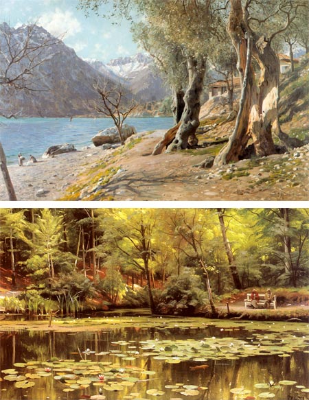
Peder Mork Mønsted was a Danish painter active in the late 19th and early 20th Century.Looking through his work you will find lush, color saturated paintings of his native Denmark, where Mønstead studied at the Copenhagen Academy, as well as landscapes from lands where he traveled, including Norway, Sweden, Switzerland, North Africa and Italy.
His paintings ring with a crisp, vibrant naturalism, emphasized by passages of sharp detail and strong value contrasts. The detail doesn’t keep them from being painterly, and lively with the feeling of the artist’s hand.
His subjects ranged from shade darkened streams, dappled with sunlight, to snow covered Nordic fields and the warm sun of the Italian coast.
Mønsted’s fascination with water and small streams remind me of Norwegian painter Frits Thaulow (also here).
Overall Mønsted’s style is a wonderful blend of intense, almost impressionistic color with strong academic underpinnings.
Categories:


Charley’s Picks
Bookshop.org
(Bookshop.org affilliate links; sales benefit independent bookshop owners; I get a small percentage to help support my work on Lines and Colors)

John Singer Sargent: Watercolors


Urban Sketching: Understanding Perspective


Charley’s Picks
Amazon
(Amazon.com affiliate links; sales go to a larger yacht for Jeff Bezos; but I get a small percentage to help support my work on Lines and Colors)
John Singer Sargent: Watercolors
Urban Sketching: Understanding Perspective