
Categories
- 3d CGI
- Amusements
- Animation
- Anime & Manga
- Art Materials
- Art Videos
- Blogroll
- Cartoons
- Color
- Comics
- Concept & Visual Dev.
- Creativity
- Digital Art
- Digital Painting
- Displaying Art on the Web
- Drawing
- Eye Candy for Today
- Gallery and Museum Art
- High-res Art Images
- Illustration
- Motion Graphics & Flash
- Museums
- Online Museums
- Outsider Art
- Painting
- Painting a Day
- Paleo Art
- Pastel, Conté & Chalk
- Pen & Ink
- Prints and Printmaking
- Reviews
- Sc-fi and Fantasy
- Sculpture & Dimensional
- Site Comments
- Sketching
- Storyboards
- Tools and Techniques
- Uncategorized
- Vector Art
- Videos & Podcasts
- Vision and Optics
- Watercolor and Gouache
- Webcomics
Archives
- May 2026
- April 2026
- March 2026
- February 2026
- January 2026
- December 2025
- November 2025
- October 2025
- September 2025
- August 2025
- July 2025
- June 2025
- May 2025
- January 2025
- December 2024
- November 2024
- October 2024
- September 2024
- August 2024
- June 2024
- April 2024
- March 2024
- February 2024
- January 2024
- December 2023
- November 2023
- October 2023
- September 2023
- August 2023
- July 2023
- May 2023
- April 2023
- March 2023
- February 2023
- January 2023
- December 2022
- November 2022
- September 2022
- August 2022
- July 2022
- June 2022
- May 2022
- April 2022
- March 2022
- February 2022
- January 2022
- December 2021
- November 2021
- October 2021
- September 2021
- August 2021
- July 2021
- June 2021
- May 2021
- April 2021
- March 2021
- February 2021
- January 2021
- December 2020
- November 2020
- October 2020
- September 2020
- August 2020
- July 2020
- June 2020
- May 2020
- April 2020
- March 2020
- February 2020
- January 2020
- December 2019
- November 2019
- October 2019
- September 2019
- August 2019
- July 2019
- June 2019
- May 2019
- April 2019
- March 2019
- February 2019
- January 2019
- December 2018
- November 2018
- October 2018
- September 2018
- August 2018
- July 2018
- June 2018
- May 2018
- April 2018
- March 2018
- February 2018
- January 2018
- December 2017
- November 2017
- October 2017
- September 2017
- August 2017
- July 2017
- June 2017
- May 2017
- April 2017
- March 2017
- February 2017
- January 2017
- December 2016
- November 2016
- October 2016
- September 2016
- August 2016
- July 2016
- June 2016
- May 2016
- April 2016
- March 2016
- February 2016
- January 2016
- December 2015
- November 2015
- October 2015
- September 2015
- August 2015
- July 2015
- June 2015
- May 2015
- April 2015
- March 2015
- February 2015
- January 2015
- December 2014
- November 2014
- October 2014
- September 2014
- August 2014
- July 2014
- June 2014
- May 2014
- April 2014
- March 2014
- February 2014
- January 2014
- December 2013
- November 2013
- October 2013
- September 2013
- August 2013
- July 2013
- June 2013
- May 2013
- April 2013
- March 2013
- February 2013
- January 2013
- December 2012
- November 2012
- October 2012
- September 2012
- August 2012
- July 2012
- June 2012
- May 2012
- April 2012
- March 2012
- February 2012
- January 2012
- December 2011
- November 2011
- October 2011
- September 2011
- August 2011
- July 2011
- June 2011
- May 2011
- April 2011
- March 2011
- February 2011
- January 2011
- December 2010
- November 2010
- October 2010
- September 2010
- August 2010
- July 2010
- June 2010
- May 2010
- April 2010
- March 2010
- February 2010
- January 2010
- December 2009
- November 2009
- October 2009
- September 2009
- August 2009
- July 2009
- June 2009
- May 2009
- April 2009
- March 2009
- February 2009
- January 2009
- December 2008
- November 2008
- October 2008
- September 2008
- August 2008
- July 2008
- June 2008
- May 2008
- April 2008
- March 2008
- February 2008
- January 2008
- December 2007
- November 2007
- October 2007
- September 2007
- August 2007
- July 2007
- June 2007
- May 2007
- April 2007
- March 2007
- February 2007
- January 2007
- December 2006
- November 2006
- October 2006
- September 2006
- August 2006
- July 2006
- June 2006
- May 2006
- April 2006
- March 2006
- February 2006
- January 2006
- December 2005
- November 2005
- October 2005
- September 2005
- August 2005
Relevant Blogs
Art, Painting & Sketch
- Gurney Journey
- Underpaintings
- Art and Influence
- Painting Perceptions
- Oil Painters of America
- Vasari Paint POV
- Flying Fox
- Urban Sketchers
- Bento (Smithsonian)
- Art Inconnu
- The Hidden Place
- Still Life
- Making a Mark
- The Art of the Landscape
- Exploring Color & Creativity
- Art Contrarian
- Artist A Day
- beinArt Surreal Art Collective
- Eye Level
- David Dunlop
- p.i.g.m.e.n.t.i.u.m
- CultureGrrl
- Joaquín Sorolla blog
- Artists in Pastel
“Painting a Day”
- A Painting a Day (Keiser)
- On Painting (Keiser)
- Julian Merrow-Smith
- Karen Jurick
- Jeffrey Hayes
- Carol Marine
- Abbey Ryan
- Daily Paintworks
Other Painting Blogs
- Virtual Gouache Land
- Neil Hollingsworth
- Marc Hanson
- Kevin Menck
- Marc Dalessio
- Larry Seiler
- Stapleton Kearns
- Colin Page
- Roos Schuring
- Hans Versfelt
- Titus Meeuws
- Régis Pettinari
- René Plein Air
- Belinda Del Pesco
- Robin Weiss
- Nathan Fowkes (Land Sketch)
- William Wray
- Frank Serrano
- Stephen Magsig
- Michael Chesley Johnson
- Twice a Week
- Sarah Wimperis
- Rob Adams
- Michael Cole Manley
- The Dirty Palette Club
- Mike Manley’s Draw!
Gallery Art & Illustration mix
Illustration
- Howard Pyle
- 100 Years of Illustration
- BibliOdyssey
- Illustration Art
- Today’s Inspiration
- Illustration Mundo
- Little Chimp Society
- Danny Gregory
- R D (John Martz
- Illustration Friday blog
- Monster Brains
- Illustrators & Illustrations (RU)
- Elwood H. Smith
- DaniDraws.com
- Designers Who Blog
- iSpot Blog
Sci-Fi & Fantasy
Illustration & Comics
Comics & Cartoons
- Comics Beat
- Robot 6
- Newsarama Blog
- Comic Vine
- Comics Alliance
- Forbidden Planet Int.
- Paolo Rivera
- Bolt City
- Flight
- Scott McCloud
- The Comics Journal
- Comixpedia
- Funnybook Babylon
- James Baker
- Middleton’s Sketchbook
- Boneville
- The Hotel Fred
- Paul Rivoche
- Daily Cartoonist
- Mad About Cartoons (William Wray)
- Digital Strips
Illustration & Concept
Animation & Concept
- Cartoon Brew
- Animation Blog
- Cold Hard Flash
- Concept Art World
- The CAB
- FY Concept Art
- Concept Ships
- Concept Robots
- John Nevarez
- Armand Serrano
- Marcos Mateu-Mestre
- all kinds of stuff (Kricfalusi)
- Yacin the faun (Man Arenas)
- Kelsey Mann
- Cre8tivemarks Blog
- Ice-Cream Monster Toon Cafe
- AAU Character & Creature Design
- AAU Animation Notes
- Articles and Texticles
Paleo & Scientific
Tools & Techniques
Other
Lists of Art Blogs
Art Image Resource Links
Historic Art Images
- Wikimedia Commons: Paintings
- Wikimedia Commons: Drawings
- The Athenaeum
- WikiArt (WikiPaintings)
- Google Art Project: Artists
- Google Art Project: Collections (Museums)
- ArtCyclopedia
- Web Gallery of Art
- Art Renewal Center
- Web Gallery of Impressionism
Auction Consolidation sites
Auction sites
- Sotheby’s
- Bonham’s
- Christies
- Heritage Auctions: Fine Art
- Heritage Auctions: Illustration
- Freeman’s Auctions
- Bukowskis
- Shannon’s
Image Search
Reverse Image Search (search by image)
- Tin Eye
- RevImg
- Google Image Search (camera icon)
- Bing Image Search (camera icon)
Promoting some friends and some clients of my website design business
- Twin Willows T’ai Chi studio in Wilmington DE. Taiji classes with Bryan Davis.
- Ray Hayward, Inspired Teacher of T’ai Chi ( Taiji ) in Minneapolis, Founder of Mindful Motion Tai Chi Academy
- OldHead Tattoo studio and Art Gallery in Wilmington DE. Tattoos and paintings by Bruce Gulick
- Sharon Domenico Art, pet portrait oil paintings
- Platinum Paperhanging, wallpaper hanging, Main Line and Philadelphia, PA
- Lisa Stone Design, interior designer, Main Line and Philadelphia, PA
- Studio12KPT, original art, prints, calendars and other custom printed items by Van Sickle & Rolleri
-
Gobelins Students’ Animations at Annecy Animated Film Festival 2008
 If, like me, you have grown just a little weary of super-slick and oh-so-kinetic CGI animated movies, and long occasionally for the simpler pleasures of hand-drawn animated films, here’s a site to make your day.
Every year the graduating students at the Gobelins school in Paris, where they apparently have some incredibly effective instructors and/or amazingly talented students, form teams and create animated shorts that serve as introductions to each day’s screenings at the world renowned Festival International du Film d’Animation d’Annecy in the Rhône-Alpes region of France.
I don’t know that hand drawn animation is a requirement, but it certainly forms the majority of the student’s projects for the Annecy shorts, much to my delight.
The shorts are only 90 seconds long, but if you have ever done any hand-drawn animation, you know that even that short time involves a large amount of work. The teams work on the animations for 4 months, from January to April, and they are then shown at the festival in early June.
The films are posted to the Gobelins web site as they are introduced at the festival, one a day for the duration of the six day event.
This year’s festival is in progress as of this writing and there are five films posted, with one remaining to debut tomorrow (Saturday). You can check back to the Gobelins page that lists the animations, or you can follow along with notices, and comments, by Michael Hirsh on his ever-entertaining and informative blog, Articles and Texticles, which is where I hear about the event each year.
Here are my previous posts about Gobelins students’ Annecy animations 2007 land 2006; links for previous years are listed below.
France, in general, is a bastion of hand-drawn animation, standing with Japan as the largest remaining bulwarks against the tide of increasingly formulaic CGI from the American studios.
Don’t get me wrong, I really enjoy CGI animation when it’s done well, and The Incredibles is one of my favorite films, but there is something about the visual pleasures of moving drawings that I don’t think CGI will ever quite recapture.
Categories:
-
Keith Thompson

Keith Thompson specializes in the grotesque. Whether desiccated, corpse like figures wandering across bleak landscapes; alarmingly emaciated creatures, teeth and fangs protruding from folds of hide; strangely organic robots, scratched and worn and suggestive of some sinister purpose; or bizarrely armored warriors of some arcane and forgotten civilization; his drawings and paintings seem to find patterns and textures that suggest the creepier side of the visual world.His work often harkens to the past, rife with hints of Renaissance grotesqueries, nods to Golden Age illustrators like Arthur Rackham, and, most notably, echoes of the nightmare visions of Hieronymous Bosch.
Thompson applies his talent for the creepy and disturbing to both illustration and concept art. His site has galleries for both, and includes subsections for black and white and color illustration as well as various categories of concept art.
His work has been featured in the Spectrum collections of contemporary fantastic art and his traditional and digital processes are demonstrated in an instructional DVD from the Gnomon Workshop on Character Design Techniques. There are some images from the DVD on the DVD product page as well as an instructor gallery on the Gnomon Workshop site.
Categories:
-
Shitao

Shitao (Yuanji Shih T’ao, original name Zhu Rueji) was a Chinese painter of the early Quing period, active in the late 1600’s.Shitao was a member of Ming royalty, and survived the fall of that house to invaders from Manchuria, changed his name and became a Buddhist monk.
He is classed as an “individualist” painter. Along with some of his contemporaries, he broke with staid and restrictive traditions of the time and utilized new ways of handling washes, perspective and composition.
My knowledge of Chinese ink painting is frustratingly meager, but I see in Shitao’s calligraphic impressions of misty cliffs and cloud filled valleys many of the visual charms that I find so mesmerizing about the best examples of traditional Chinese painting I have seen.
The Shitao section at the Metropolitan Museum of Art contains a series of images called Returning Home, that includes translations of the poems accompanying the images, as well as background information on the artist, the time and the paintings. There is also a stunning handscroll called The Sixteen Lohans.
The Museum of Fine Arts, Boston, has several of his pieces,
The Nelson-Atkins Museum of Art had a nicely zoomable image of Mountain on the Other Side of the River in which you can see the brushwork and washes close up.
The Princeton Art Museum has some good-size images and a short bio.
One of the most extensive resources is a series of 8 unconnected gallery pages of 20 images each on ImageNETion, which can be accessed from this Artcyclopedia page. They are worth the annoying banner ads with which they are saddled.
In Shitso’s remarkable paintings there is a gestural fluidity and marvelous range of line weights, textures and tones (often referred to as “colors” in the context of ink painting) that can be fascinating over extended viewing. Just the contrast between passages of intricate, delicate detail and disarming simplicity can be captivating.
If you’re not familiar with Chinese ink painting, my suggestion is to flip through a few of Shitao’s images to find one that seems appealing or interesting, but then put the others aside and spend some time with that image.
Let Shitao’s magical lines lead you into and through the painting. Though Chinese ink painting is actually more truthfully representational than many Western observers think (you can actually find those “fanciful” mountains in photographs of rural China), the intention is not so much to convey the literal scene, but the spiritual essence of nature, and humankind’s place place in the broader landscape.
Contemplation, as they say, will be rewarded.
Categories:
-
Impressionist Giverny: American Painters in France, 1885-1915

Contrary to to the dreary picture that Hollywood and popular culture sometimes like to paint of tortured, misunderstood loners living lives of desperation “for the sake of their art”, artists are usually quite social, and often like to congregate with other artists, particularly those who share their viewpoints on artistic direction.This seems to have been particularly true about artists who paint en plein air (i.e. outdoors), whose commonality often calls them to live in the same communities, forming artist “colonies”. These were usually in rural areas that allowed the artists to paint the countryside and still have access to a major city to sell their work. You can see most of them developing as the result of one artist discovering a particularly good spot and spreading the word (“You must come and look! The light is wonderful and the tavern owner extends credit!”)
This practice of like minded artists leaving the city for village life was evident in Barbizon, not far from Paris, where the progenitors of French Impressionism gathered to paint in the Forest of Fontainbleau. One of them, Caude Monet, would later in his life settle in a small village on the other side of Paris called Giverny, along the banks of the Seine. The force of his personality and his remarkable skills as a painter would eventually form the nucleus of a colony there
The colony at Giverny was notable also for its transient residents, artists like John Singer Sargent who would come to see the great painter and his milieu. American artists in particular seemed attracted to Giverny, as the passion for painting in the Impressionist style spread through the East Coast art centers of Boston, New York and Philadelphia.
These artists would return impressed not only with the painting styles of their French counterparts, but with the idyllic situation of art colony village life outside the cities, and would soon form their own versions.
This happened across Europe; and in the U.S., Artists from Philadelphia and the Pennsylvania Academy of the Fine Arts bought farms in New Hope, on the edge of the Delaware River; those from Boston and New York found ideal settings in places like Shinnecock, New York and in Cos Cob and Old Lyme Connecticut. Eventually, a number of artists would travel west to the newly accessible territory of California, starting the California school of plein air painting in places like Carmel and Laguna Beach.
Old Lyme, Connecticut would retain strong ties to Giverny, with many artists, including Willard Metcalf, staying for long periods in both places. Old Lyme sometimes gets tagged as the “American Giverny” and the Florence Griswold boardinghouse there, where many of the artists congregated, is now a museum.
When I visited Giverny in 2002, both to see they beautiful countryside along the Seine, and the house and gardens of Monet, which have been restored to a beautiful approximation of their original state based on photographs and his own paintings, I was surprised to find a small museum devoted to American Art in the heart of French Impressioninst territory, the Musée d’art Américain (the link is to the English version of the site, French and other languages are accessible at the lower right of the page).
That museum, which is administered by the Terra Fondation for American Art, currently has an exhibition of over 50 of the works from its collection on exhibit at the Florence Griswold Museum in Old Lyme, Connecticut.
The exhibition features work by John Leslie Breck, Frederick MacMonnies, Theodore Robinson, Willard Leroy Metcalf, Lilla Cabot Perry, Frederick Carl Frieseke, Dawson-Dawson Watkins, and Will H. Low, and includes the painting above, The Wedding March, by Theodore Robinson, which shows the close ties of Old Lyme to Giverny in the wedding of American artist Theodore Butler to Monet’s stepdaughter Suzanne Hoschedé.
Unfortunately, the Florence Griswold Museum doesn’t have much in the way of images on their site (and the search feature for their own collection seems to be having problems), but the Terra Foundation has a nicely searchable collection online and features zoomable images. The Terra Collection includes a number of paintings on extended loan to the Art Institute of Chicago as well as other exhibitions.
The exhibit, Impressionist Giverny: American Painters in France, 1885-1915, runs until July 27, 2008, and will then move to Albany, New York to the Albany Institute of History and Art form August 23 to January 3, 2009.
[Link via Art Knowledge News]
Categories:
-
ZuneJourney.net
 I have never been a fan of Microsoft, their approach to software, their “squash the little guy” business practices or their design and interface choices.
Just a personal point of view, of course, but I think their years of market dominance in computer operating systems and their huge corporate bureaucracy have made them complacent and arrogant, leading to the “you’ll use it this way because we said so” approach to design; (and the joke: “Q: How many Microsoft engineers does it take to screw in a lightbulb? A: None; they just declare darkness the standard.”)
Granted, I have yet to check out Expression, their new graphics and design production suite, which is based on Creature House Expression, a vector based “Natural Media” drawing tool originally form Creature House and Fractal Design that I liked very much; but the fact that Microsoft’s Expression promotional page doesn’t even display correctly in Firefox for Mac doesn’t fill me with enthusiasm.
I do try to keep my eye out, though, and once in a while interesting things do come out of Redmond (Microsoft Surface, for example), and occasionally, they pull out a cool piece of design or animation.
ZuneJourney.net is an interactive promotional site for Microsoft’s Zune media player, which has received less than overwhelming acceptance in the market dominated by Apple’s iPod. The site is largely composed of a fun Flash based animation that you drill into by holding your mouse down in the center of the scene.
You thus appear to move through a tunnel-effect tour of a series of animated scenes, in a way quite reminiscent of The Zoomquilt (originality doesn’t seem to be one of Microsoft’s strong points either).
Original or not, the result is a fun visual amusement, lots of colorful screens and a nice bit of interaction. Moving your mouse away from the center of the screen reverses the process and you appear to move backward, with the images receding instead of advancing toward you.
This is the kind of animation that Flash does well, and points out one of the advantages of the scalability of vector graphics, an image format that still doesn’t have native support in the major browsers (they let the Flash plug-in handle it).
Unfortunately (for Microsoft), the informational component of the site, presumably its purpose, is minimal and not easily accessible; pointing out once again that good design is less about how things look than how they work.
Categories:
-
Bill Watterson
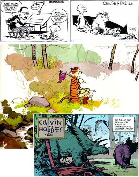
I’m not going to attempt to write an appreciation of Calvin and Hobbes here, I don’t have the time or the room.I’ll simply say that if, for some bizarre reason, you’re unfamiliar with the greatest comic strip of the last quarter of the 20th Century (and one of the best for that entire century, which which is to say the history of newspaper comics in general), run right out to the bookstore and restore this unbalance in your life by picking up a copy of The Essential Calvin and Hobbes, The Indispensable Calvin And Hobbes, The Authoritative Calvin And Hobbes or any of the other Calvin and Hobbes collections; and immersing yourself in the worlds within worlds inhabited by a young boy who fits nowhere and everywhere.
Barring the long-windied tome I have spared you about how wonderful Calvin and Hobbes is, I want to talk instead about Watterson’s drawings, which are also among the best in the history of newspaper comics.
Though you won’t find the grandeur of Winsor McCay, or the representational draftsmanship of Hal Foster or Alex Raymond, you will find a lineage to greats like Greorge Herriman, Walt Kelly and Charles Schulz.
Watterson’s drawings, like his writing, scintillate with whimsical charm, leading your eye around swooping calligraphic lines that are punctuated with the kinetic exclamation mark of his wonderfully out of control lead character.
His short, “Peanuts-headed” kids and lean, liquid-backboned tiger are rendered with a stylistic confidence and visual aplomb that would make his drawings a treat even if you were to delete the dialog and randomize the panels.
Look at something as simple at his trees, a couple of thick, wiggly lines delineating a trunk, some curved hatching for texture and form and a few light lines suggesting limbs, put together with that lively, casual feeling sometimes achieved by the most accomplishes political cartoonists in their line work.
Simplicity was more than a matter of choice, though. Unlike the great newspaper strips of the early 20th Century, which often had the full width of the newspaper sheet across which to unfold their pen and ink worlds, modern newspaper comics have been squeezed smaller and smaller over the last 50 years, to the point where they are more like icons tagged onto word balloons than visual stories.
(Hey, here’s a great idea for newspapers. Circulation is dropping, so let’s take the things people like most about newspapers, like comics and political cartoons, and shrink them down, reduce their number or leave them out entirely, so we can fill more space with ads and flyers and drive more people away and reduce circulation further and then eliminate more features that people like, and so on…, and then complain about how the internet is killing newspapers! Brilliant.)
Watterson bemoaned the stupid shrinking of the comics, but actually had enough clout to change that, even if only slightly and only for his strip, but it was a great change nonetheless. He managed to get his syndicate to offer the Sunday C&H as a solid block, not the collection of individual panels preferred by the editors so they could rearrange (and drop out) panels to fit them into their tiny spaces.
Watterson took advantage of this with marvelously imaginative and adventurous layouts. His colors for the Sunday strips were extraordinary as well. Not that he had any extra colors, he just used them better. At the time, I was convinced that newspapers had reduced the color available to Sunday comics artists, but when Watterson started doing his beautiful, subtle coloring for Calvin’s “Spacemann Spiff” and dinosaur adventures, I realized that the other cartoonists just weren’t taking the time, or trouble, or simply lacked the artistic skill, to take full advantage of what newspaper comic coloring could do.
Unfortunately, the real subtlety of some of this work doesn’t always come through in the reproductions in books. Much like the reprints of comic books from the 1960’s and 70’s, these strips were originally printed on newsprint, a rough, cheap paper that, particularly at the time, was off-white. When reproduced on bright white high-quality book paper, the strips lose some of their tonal subtlety, like a Baroque bistre pen drawing that was originally done on cream paper being reproduced in black and white (that’s right, I’m talking about things like tonal subtlety in reference to a late 20th Century newspaper comic strip).
His longer format strips, done specifically for publication in some of the books, fare better in reproduction and will give you an idea of what I mean about his subtle coloring.
Not to get too high-minded here, I’ll also mention that Watterson drew great dinosaurs, a subject I particularly enjoy; and there were rumors at one point of an actual dinosaur book from him. Though I don’t know if many paleontological artists would worry about him as competition, I do think that most of them would immediately buy a copy if it ever came out.
Watterson retired from Calvin and Hobbes after 10 years, and seems to have been largely quiet since, at least in terms of work available the public; but he left us a great legacy of not only a treasure of a comic strip, but 10 years worth of comic strip drawing at its best.
There are some nice online resources now for Watterson drawings, including much material outside his work on the strip, notably the extensive tribite site Calvin and Hobbes: Magic on Paper which includes a great section of Rare Bill Watterson Art and lots of links to other resources.
Wikipedia has a nice article on Calvin and Hobbes and a shorter one on Bill Watterson, that have links to other resources.
The Universal Press Syndicate’s Calvin and Hobbes official site is rerunning the original strip, just to make our daily routine a little brighter.
Categories:


Charley’s Picks
Bookshop.org
(Bookshop.org affilliate links; sales benefit independent bookshop owners; I get a small percentage to help support my work on Lines and Colors)

John Singer Sargent: Watercolors


Urban Sketching: Understanding Perspective


Charley’s Picks
Amazon
(Amazon.com affiliate links; sales go to a larger yacht for Jeff Bezos; but I get a small percentage to help support my work on Lines and Colors)
John Singer Sargent: Watercolors
Urban Sketching: Understanding Perspective