
Categories
- 3d CGI
- Amusements
- Animation
- Anime & Manga
- Art Materials
- Art Videos
- Blogroll
- Cartoons
- Color
- Comics
- Concept & Visual Dev.
- Creativity
- Digital Art
- Digital Painting
- Displaying Art on the Web
- Drawing
- Eye Candy for Today
- Gallery and Museum Art
- High-res Art Images
- Illustration
- Motion Graphics & Flash
- Museums
- Online Museums
- Outsider Art
- Painting
- Painting a Day
- Paleo Art
- Pastel, Conté & Chalk
- Pen & Ink
- Prints and Printmaking
- Reviews
- Sc-fi and Fantasy
- Sculpture & Dimensional
- Site Comments
- Sketching
- Storyboards
- Tools and Techniques
- Uncategorized
- Vector Art
- Videos & Podcasts
- Vision and Optics
- Watercolor and Gouache
- Webcomics
Archives
- May 2026
- April 2026
- March 2026
- February 2026
- January 2026
- December 2025
- November 2025
- October 2025
- September 2025
- August 2025
- July 2025
- June 2025
- May 2025
- January 2025
- December 2024
- November 2024
- October 2024
- September 2024
- August 2024
- June 2024
- April 2024
- March 2024
- February 2024
- January 2024
- December 2023
- November 2023
- October 2023
- September 2023
- August 2023
- July 2023
- May 2023
- April 2023
- March 2023
- February 2023
- January 2023
- December 2022
- November 2022
- September 2022
- August 2022
- July 2022
- June 2022
- May 2022
- April 2022
- March 2022
- February 2022
- January 2022
- December 2021
- November 2021
- October 2021
- September 2021
- August 2021
- July 2021
- June 2021
- May 2021
- April 2021
- March 2021
- February 2021
- January 2021
- December 2020
- November 2020
- October 2020
- September 2020
- August 2020
- July 2020
- June 2020
- May 2020
- April 2020
- March 2020
- February 2020
- January 2020
- December 2019
- November 2019
- October 2019
- September 2019
- August 2019
- July 2019
- June 2019
- May 2019
- April 2019
- March 2019
- February 2019
- January 2019
- December 2018
- November 2018
- October 2018
- September 2018
- August 2018
- July 2018
- June 2018
- May 2018
- April 2018
- March 2018
- February 2018
- January 2018
- December 2017
- November 2017
- October 2017
- September 2017
- August 2017
- July 2017
- June 2017
- May 2017
- April 2017
- March 2017
- February 2017
- January 2017
- December 2016
- November 2016
- October 2016
- September 2016
- August 2016
- July 2016
- June 2016
- May 2016
- April 2016
- March 2016
- February 2016
- January 2016
- December 2015
- November 2015
- October 2015
- September 2015
- August 2015
- July 2015
- June 2015
- May 2015
- April 2015
- March 2015
- February 2015
- January 2015
- December 2014
- November 2014
- October 2014
- September 2014
- August 2014
- July 2014
- June 2014
- May 2014
- April 2014
- March 2014
- February 2014
- January 2014
- December 2013
- November 2013
- October 2013
- September 2013
- August 2013
- July 2013
- June 2013
- May 2013
- April 2013
- March 2013
- February 2013
- January 2013
- December 2012
- November 2012
- October 2012
- September 2012
- August 2012
- July 2012
- June 2012
- May 2012
- April 2012
- March 2012
- February 2012
- January 2012
- December 2011
- November 2011
- October 2011
- September 2011
- August 2011
- July 2011
- June 2011
- May 2011
- April 2011
- March 2011
- February 2011
- January 2011
- December 2010
- November 2010
- October 2010
- September 2010
- August 2010
- July 2010
- June 2010
- May 2010
- April 2010
- March 2010
- February 2010
- January 2010
- December 2009
- November 2009
- October 2009
- September 2009
- August 2009
- July 2009
- June 2009
- May 2009
- April 2009
- March 2009
- February 2009
- January 2009
- December 2008
- November 2008
- October 2008
- September 2008
- August 2008
- July 2008
- June 2008
- May 2008
- April 2008
- March 2008
- February 2008
- January 2008
- December 2007
- November 2007
- October 2007
- September 2007
- August 2007
- July 2007
- June 2007
- May 2007
- April 2007
- March 2007
- February 2007
- January 2007
- December 2006
- November 2006
- October 2006
- September 2006
- August 2006
- July 2006
- June 2006
- May 2006
- April 2006
- March 2006
- February 2006
- January 2006
- December 2005
- November 2005
- October 2005
- September 2005
- August 2005
Relevant Blogs
Art, Painting & Sketch
- Gurney Journey
- Underpaintings
- Art and Influence
- Painting Perceptions
- Oil Painters of America
- Vasari Paint POV
- Flying Fox
- Urban Sketchers
- Bento (Smithsonian)
- Art Inconnu
- The Hidden Place
- Still Life
- Making a Mark
- The Art of the Landscape
- Exploring Color & Creativity
- Art Contrarian
- Artist A Day
- beinArt Surreal Art Collective
- Eye Level
- David Dunlop
- p.i.g.m.e.n.t.i.u.m
- CultureGrrl
- Joaquín Sorolla blog
- Artists in Pastel
“Painting a Day”
- A Painting a Day (Keiser)
- On Painting (Keiser)
- Julian Merrow-Smith
- Karen Jurick
- Jeffrey Hayes
- Carol Marine
- Abbey Ryan
- Daily Paintworks
Other Painting Blogs
- Virtual Gouache Land
- Neil Hollingsworth
- Marc Hanson
- Kevin Menck
- Marc Dalessio
- Larry Seiler
- Stapleton Kearns
- Colin Page
- Roos Schuring
- Hans Versfelt
- Titus Meeuws
- Régis Pettinari
- René Plein Air
- Belinda Del Pesco
- Robin Weiss
- Nathan Fowkes (Land Sketch)
- William Wray
- Frank Serrano
- Stephen Magsig
- Michael Chesley Johnson
- Twice a Week
- Sarah Wimperis
- Rob Adams
- Michael Cole Manley
- The Dirty Palette Club
- Mike Manley’s Draw!
Gallery Art & Illustration mix
Illustration
- Howard Pyle
- 100 Years of Illustration
- BibliOdyssey
- Illustration Art
- Today’s Inspiration
- Illustration Mundo
- Little Chimp Society
- Danny Gregory
- R D (John Martz
- Illustration Friday blog
- Monster Brains
- Illustrators & Illustrations (RU)
- Elwood H. Smith
- DaniDraws.com
- Designers Who Blog
- iSpot Blog
Sci-Fi & Fantasy
Illustration & Comics
Comics & Cartoons
- Comics Beat
- Robot 6
- Newsarama Blog
- Comic Vine
- Comics Alliance
- Forbidden Planet Int.
- Paolo Rivera
- Bolt City
- Flight
- Scott McCloud
- The Comics Journal
- Comixpedia
- Funnybook Babylon
- James Baker
- Middleton’s Sketchbook
- Boneville
- The Hotel Fred
- Paul Rivoche
- Daily Cartoonist
- Mad About Cartoons (William Wray)
- Digital Strips
Illustration & Concept
Animation & Concept
- Cartoon Brew
- Animation Blog
- Cold Hard Flash
- Concept Art World
- The CAB
- FY Concept Art
- Concept Ships
- Concept Robots
- John Nevarez
- Armand Serrano
- Marcos Mateu-Mestre
- all kinds of stuff (Kricfalusi)
- Yacin the faun (Man Arenas)
- Kelsey Mann
- Cre8tivemarks Blog
- Ice-Cream Monster Toon Cafe
- AAU Character & Creature Design
- AAU Animation Notes
- Articles and Texticles
Paleo & Scientific
Tools & Techniques
Other
Lists of Art Blogs
Art Image Resource Links
Historic Art Images
- Wikimedia Commons: Paintings
- Wikimedia Commons: Drawings
- The Athenaeum
- WikiArt (WikiPaintings)
- Google Art Project: Artists
- Google Art Project: Collections (Museums)
- ArtCyclopedia
- Web Gallery of Art
- Art Renewal Center
- Web Gallery of Impressionism
Auction Consolidation sites
Auction sites
- Sotheby’s
- Bonham’s
- Christies
- Heritage Auctions: Fine Art
- Heritage Auctions: Illustration
- Freeman’s Auctions
- Bukowskis
- Shannon’s
Image Search
Reverse Image Search (search by image)
- Tin Eye
- RevImg
- Google Image Search (camera icon)
- Bing Image Search (camera icon)
Promoting some friends and some clients of my website design business
- Twin Willows T’ai Chi studio in Wilmington DE. Taiji classes with Bryan Davis.
- Ray Hayward, Inspired Teacher of T’ai Chi ( Taiji ) in Minneapolis, Founder of Mindful Motion Tai Chi Academy
- OldHead Tattoo studio and Art Gallery in Wilmington DE. Tattoos and paintings by Bruce Gulick
- Sharon Domenico Art, pet portrait oil paintings
- Platinum Paperhanging, wallpaper hanging, Main Line and Philadelphia, PA
- Lisa Stone Design, interior designer, Main Line and Philadelphia, PA
- Studio12KPT, original art, prints, calendars and other custom printed items by Van Sickle & Rolleri
-
History of the Color Wheel
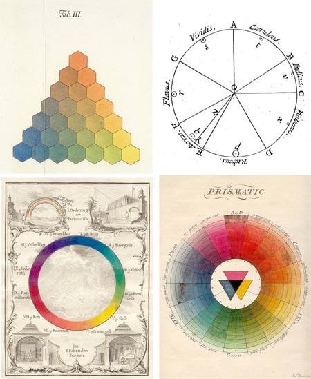
It’s been the subject of much discussion, some suggesting that it is misleading enough that it should be rethought entirely, but the color wheel remains the most common and convenient method for visually understanding and comparing the relationships of different hues.As part of the Gutenberg-e project by the American Historical Association and Columbia University Press, Sarah Lowengard has written a scholarly treatise on The Creation of Color in Eighteenth-Century Europe, the third chapter of which, Number Order, Form, delves into the history of color wheels and other visual systems of ordering and visualizing the relationships of colors.
The link going around the web currently (I found it on Digg) is to a post on the Color Lovers blog, which has extracted selections from her paper into an article on the History of the Color Wheel.
Color circles have been used to describe associations of colors from medieval times, but the first known example of the representation of hue in the form of a wheel, or circle, commonly suggested as the original color wheel, is traced to Sir Isaac Newton; whose keen mind was for some time focused on the nature of light and color.
Other systematic visual arrangements of colors precede it, like Tobias Mayer’s Trhchromatic Graph [correction – see below], which he first described in 1758 (interpreted by Georg Christoph Lichtenberg, image above, top left), but Newton’s circle is recognizable as the predecessor of the one in modern art texts. (For a couple of color wheels that I find particularly useful, see my links to Bruce MacEvoy’s artist pigment color wheels on handprint at the end of this article.)
Newton’s experimentation splitting sunlight with a prism is relatively well-known. (It’s still a fun and instructive practice is you haven’t indulged in it, I got mine from Edmund Scientific.)
Less well known is Newton’s original color circle, or hue circle, which was actually a kind of pie-chart (image above, top right), in which the bands of color he observed were distributed in wedges corresponding to their width in the observed spectrum, and arranged around the circle in the order of their wavelength. Newton emphasized that his circle represented the properties of the color of light (additive color), not artists’ pigments (subtractive color).
It was Newton who accomplished something that I have long been fascinated with, and confused by — the “closing of the circle”.
Physical wavelengths of light, which our eyes and brains interpret as different hues, can be thought of a part of a linear arrangement, segments of the electromagnetic spectrum; a continuous band of wavelengths of energy from the very short (X-rays and Gamma rays), with wavelengths measured in the distances equivalent to atomic nuclei, to the very long (radio waves) with wavelengths measured in distances on a human scale (meters or 10’s of meters).
The spectrum of visible light sits somewhere in between, at wavelengths the size of protozoa (micrometers, or millionths of a meter, also known as microns), ranging from red on the short end at 700nm, to violet on the long end at 400nm.
But how, my fevered little brain would like to know, does this linear relationship bend back on itself, like the optical equivalent of a Möebius strip, and connect in a continuous band; and how does it fit into that neat and oh-so-convenient system of primary, secondary and tertiary colors, triads; and in particular, the dramatic, and apparently biologically founded, relationship of color wheel opposites, or complementary colors?
This seems to have something to do with a “gap” in the color wheel, between the physical wavelengths of red and violet, in which the purples fill in with colors that are not discrete frequencies on the spectrum, but combinations of others.
I have to admit that I’m still basically unclear about this, but let’s face it, we always knew purple was weird.
Correction and addendum: Divid Briggs, author of The Dimensions of Color, was kind enough to write a comment and point out that though many systems of color charts precede Newton, Mayer’s was not one of them.
He also appears to have an answer to my question about the “closing of the circle”, which comes from the opponent model of vision. He explains if briefly in his comment on this post, and in more detail on The Dimensions of Color.
It turns out that I’m obliquely familiar with this model of human vision, which is based on two “channels” or scales of color, redness vs greenness and yellowness vs blueness, and a lightness scale or channel, in that this is the color model on which the LAB (CIELAB) color space is modeled.
CIELAB (“LAB color”) is a color space used in Photoshop, and is the fundamental color space on which Photoshop bases its interpretations of other color spaces. If you convert between CMYK and RGB, for example, Photoshop converts to the first color space to LAB and then from LAB to the other. (Here’s Adobe’s Technote.)
The CIELAB color space, based in part on Munsell but founded on the biological way in which the cones in the eye react to color, was codified in 1931 by the Commission Internationale d’Eclairage (International Commission on Illumination) to describe all colors visible to the human eye.
The closed circle of the color wheel is a product of the related opponent model of vision in which the interaction of the redness to greenness and blueness to yellowness scales forms a circle, and the oppositions produce the famous complementary color effects with which artists are so familiar.
So there’s my answer. It’s in the eye of the beholder.
Categories:
-
Piltdown
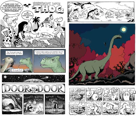
Here’s a little diversion for a Saturday morning.Fresh on the heels of Free Comic Book Day we have a free comic with prehistoric theme, in either HTML or downloadable PDF from, called Piltdown, from Wide Awake Press.
Naming the book after one of the great scientific hoaxes of the 20th Century gives you an idea of how serious it is. The book is an anthology with short stories by a variety of artists.
This is the second free downloadable comic from WAP, the first being EATS, which can also be viewed in HTML or PDF format, as well as the specialty comic book screen reader format of CBZ.
[Link via Palaeoblog, via The Comics Reporter]
Categories:
-
Gnomon Workshop: Live!, June 2008
 The Gnomon Workshop, which is the online extension of the Gnomon School of Visual Effects in Hollywood, is hosting Gnomon Workshop: Live!, a live weekend workshop at the school on June 14th and 15th, 2008.
These in person workshops, meant to bring together interested participants and leading professionals in the fields of concept art, production design, matte painting and character design for the entertainment industry, are held twice a year.
They include both members of the Gnomon Workshop’s distinguished staff and guest artists, many of whom have been the subject of previous posts here on lines and colors.
The June event promises an extraordinary list of guest artists, including: Erik Tiemens, Ian McCaig, William Stout, Marc Gabbana, Gerge Hull, James Clyne, Wayne Barlowe and TyRuben Ellingson.
The page for the event includes links to the artist’s websites, but, in addition to those and the resources you will find on my previous posts (linked above), there is a page on CGTalk devoted to a list of links for some of these artists.
The event will also feature a “recruiting room”, in which supervisors and art directors from the industry will be looking at portfolios and answering the questions of aspiring concept and production artists.
(Images at left: Clyne, Gabbana, Tiemens, Hull, Stout)
Categories:
-
John Cuneo

John Cuneo’s illustration clients include Esquire, Rolling Stone Mother Jones, Entertainment Weekly, The Atlantic, The New Yorker, and quite possibly every other high-end glossy magazine on the planet.
His wonderfully lose, sketch-like pen drawings, enlivened with deft applications of watercolor, are a visual treat.
Cuneo is a wonderful caricaturist, capturing the essence of his subject with a few seemingly casual lines an deceptively simple watercolor washes. His ink lines seem to squiggle and jump across the page, almost as if making an image was a byproduct of their travel.
His watercolor tones similarly have a feeling of light, almost incidental additions to the drawings, but if you slow down and examine them, they are applied with a keen sense of form and contrast.
Like many artists, Cuneo likes to sketch and paint amusing subjects that are not part of any project or assignment, simply for his own enjoyment. Also like many artists, some of these images are off-color, sexually frank and sometimes even disturbing. Artists like to let their demons and muses alike come out and dance on the paper.
Unlike most artists, Cuneo allowed some friends, illustrators Tim Bower and Joe Ciardiello, talk him into showing some of these not-for publication drawings to a publisher, and the result is a delightfully naughty and refreshingly politically incorrect collection called nEuROTIC (more details here).
You can see some of these drawings in the Personal section of his web site, which is prefaced with an “inappropriate for children and may be offensive to some” style advisory.
His site also contains some (not enough!) of his professional illustration work, divided into sections for People and Situations, along with a section of abandoned drawings called RIP.
There is an additional portfolio of his work on illoz.
Note: Some of the images on the sites linked here are NSFW and inappropriate for children.
Categories:
-
Don Gray
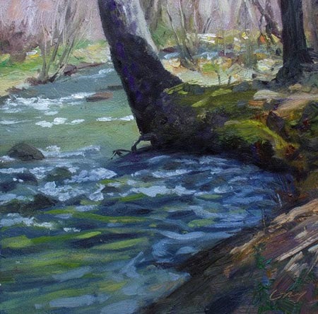
I initially came cross Oregon born, California based painter Don Gray by way of his daily painting blog Daily Art West, in which he posts his small paintings of varied subjects, sometimes following the model of small indoor still life subjects common to the “painting a day” practice, but more often of outdoor scenes, frequently painted en plein air.Following links from the blog, I found some of his more finished gallery work and discovered that he is a muralist.
Gray paints his small paintings in both oil and watercolor. His 30 years of painting have taken him through much of the Pacific Northwest; and he has applied his direct realist style to a variety of landscapes, both intimate and grand in scale. He has also developed the figurative work that features more prominently in his murals, which most often are of historical subjects.
Gray has in recent years experimented with moving away from realism in his contemporary work.
Perhaps because I don’t have much personal experience with the western mountains, I connect most readily with his smaller scale landscapes of woods, small fields and creeks. In particular his small plein air paintings of these subjects have a feeling of immediacy and deftness of execution that I find particularly appealing.
Looking back through his blog posts, which are plentiful as one would expect from the painting a day regimen, is a fascinating journey through varied countryside, as well as another sort of journey through the artist’s interest in certain subjects. These fascinations often result in small series — of his brushes, of pillows on a love seat, or the current small series of fruit wrapped in clear plastic bags.
His landscapes show a freedom of subject choice that indicates he is not reliant on the “picturesque”. Gray has developed an enviable ability to see painting worthy subjects in almost anything on which his eye alights.
Categories:
-
John Asaro
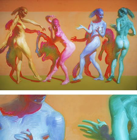
John Asaro’s web site opens with a statement about a change in artistic direction, from a 30 year career as a painter of “genre scenes” to a new commitment to exclusively painting the female figure.The site contains little else in the way of information or background and is simply a gallery of work. The paintings themselves, which Asaro calls “figure portraits in arrangements” are striking. Single or multiple figures are indeed arranged compositionally against intense almost flat color backgrounds, with a singular eye to negative space.
The figures themselves, though sometimes colored naturalistically, are more often rendered in high-chroma colors; giving an impression of being monochromatic, but actually resonating with a rich variety of color.
Asaro paints in oil on canvas, and he lays in his bold colors with equally bold brushstrokes, wrapping them around the figures in a way that both emphasizes the forms and creates a vibrant visual texture.
When you look at the detail images that sometimes accompany the main images on the site, you can come away with the impression that the brushwork is so free that it must have been painted quickly, but I think the accuracy of the drawing indicates a more careful application of paint. I think it is confidence born of many years of painting that gives the impression of loose application.
Though his site is devoted to work in the new direction, you can still see some of Asaro’s previous work, which is in demand as limited edition serigraphs, on other sites.
Asaro is apparently represented by Lela Harty Studio/Gallery and on their site, despite a terrible navigation interface which keeps it all but hidden, you can find a long list of sold paintings linked to images. Asaro’s “genre painting” occasionally consists of straightforward landscapes, but most often is of figures in landscape, in the tradition of Sarolla, Anders Zorn and many of the painters labeled “American Impressionists”.
The Lela Harty site also lists a book, Asaro: A New Romanticism, which is out of print and unfortunately expensive used, and a new video, Asaro: A Retrospective, which is available on DVD.
Note: Some of the images in the sites linked here might be considered NSFW.
[Suggestion courtesy of Belinda Del Pesco (see my previous post on Belinda Del Pesco)]
Categories:


Charley’s Picks
Bookshop.org
(Bookshop.org affilliate links; sales benefit independent bookshop owners; I get a small percentage to help support my work on Lines and Colors)

John Singer Sargent: Watercolors


Urban Sketching: Understanding Perspective


Charley’s Picks
Amazon
(Amazon.com affiliate links; sales go to a larger yacht for Jeff Bezos; but I get a small percentage to help support my work on Lines and Colors)
John Singer Sargent: Watercolors
Urban Sketching: Understanding Perspective