
Categories
- 3d CGI
- Amusements
- Animation
- Anime & Manga
- Art Materials
- Art Videos
- Blogroll
- Cartoons
- Color
- Comics
- Concept & Visual Dev.
- Creativity
- Digital Art
- Digital Painting
- Displaying Art on the Web
- Drawing
- Eye Candy for Today
- Gallery and Museum Art
- High-res Art Images
- Illustration
- Motion Graphics & Flash
- Museums
- Online Museums
- Outsider Art
- Painting
- Painting a Day
- Paleo Art
- Pastel, Conté & Chalk
- Pen & Ink
- Prints and Printmaking
- Reviews
- Sc-fi and Fantasy
- Sculpture & Dimensional
- Site Comments
- Sketching
- Storyboards
- Tools and Techniques
- Uncategorized
- Vector Art
- Videos & Podcasts
- Vision and Optics
- Watercolor and Gouache
- Webcomics
Archives
- May 2026
- April 2026
- March 2026
- February 2026
- January 2026
- December 2025
- November 2025
- October 2025
- September 2025
- August 2025
- July 2025
- June 2025
- May 2025
- January 2025
- December 2024
- November 2024
- October 2024
- September 2024
- August 2024
- June 2024
- April 2024
- March 2024
- February 2024
- January 2024
- December 2023
- November 2023
- October 2023
- September 2023
- August 2023
- July 2023
- May 2023
- April 2023
- March 2023
- February 2023
- January 2023
- December 2022
- November 2022
- September 2022
- August 2022
- July 2022
- June 2022
- May 2022
- April 2022
- March 2022
- February 2022
- January 2022
- December 2021
- November 2021
- October 2021
- September 2021
- August 2021
- July 2021
- June 2021
- May 2021
- April 2021
- March 2021
- February 2021
- January 2021
- December 2020
- November 2020
- October 2020
- September 2020
- August 2020
- July 2020
- June 2020
- May 2020
- April 2020
- March 2020
- February 2020
- January 2020
- December 2019
- November 2019
- October 2019
- September 2019
- August 2019
- July 2019
- June 2019
- May 2019
- April 2019
- March 2019
- February 2019
- January 2019
- December 2018
- November 2018
- October 2018
- September 2018
- August 2018
- July 2018
- June 2018
- May 2018
- April 2018
- March 2018
- February 2018
- January 2018
- December 2017
- November 2017
- October 2017
- September 2017
- August 2017
- July 2017
- June 2017
- May 2017
- April 2017
- March 2017
- February 2017
- January 2017
- December 2016
- November 2016
- October 2016
- September 2016
- August 2016
- July 2016
- June 2016
- May 2016
- April 2016
- March 2016
- February 2016
- January 2016
- December 2015
- November 2015
- October 2015
- September 2015
- August 2015
- July 2015
- June 2015
- May 2015
- April 2015
- March 2015
- February 2015
- January 2015
- December 2014
- November 2014
- October 2014
- September 2014
- August 2014
- July 2014
- June 2014
- May 2014
- April 2014
- March 2014
- February 2014
- January 2014
- December 2013
- November 2013
- October 2013
- September 2013
- August 2013
- July 2013
- June 2013
- May 2013
- April 2013
- March 2013
- February 2013
- January 2013
- December 2012
- November 2012
- October 2012
- September 2012
- August 2012
- July 2012
- June 2012
- May 2012
- April 2012
- March 2012
- February 2012
- January 2012
- December 2011
- November 2011
- October 2011
- September 2011
- August 2011
- July 2011
- June 2011
- May 2011
- April 2011
- March 2011
- February 2011
- January 2011
- December 2010
- November 2010
- October 2010
- September 2010
- August 2010
- July 2010
- June 2010
- May 2010
- April 2010
- March 2010
- February 2010
- January 2010
- December 2009
- November 2009
- October 2009
- September 2009
- August 2009
- July 2009
- June 2009
- May 2009
- April 2009
- March 2009
- February 2009
- January 2009
- December 2008
- November 2008
- October 2008
- September 2008
- August 2008
- July 2008
- June 2008
- May 2008
- April 2008
- March 2008
- February 2008
- January 2008
- December 2007
- November 2007
- October 2007
- September 2007
- August 2007
- July 2007
- June 2007
- May 2007
- April 2007
- March 2007
- February 2007
- January 2007
- December 2006
- November 2006
- October 2006
- September 2006
- August 2006
- July 2006
- June 2006
- May 2006
- April 2006
- March 2006
- February 2006
- January 2006
- December 2005
- November 2005
- October 2005
- September 2005
- August 2005
Relevant Blogs
Art, Painting & Sketch
- Gurney Journey
- Underpaintings
- Art and Influence
- Painting Perceptions
- Oil Painters of America
- Vasari Paint POV
- Flying Fox
- Urban Sketchers
- Bento (Smithsonian)
- Art Inconnu
- The Hidden Place
- Still Life
- Making a Mark
- The Art of the Landscape
- Exploring Color & Creativity
- Art Contrarian
- Artist A Day
- beinArt Surreal Art Collective
- Eye Level
- David Dunlop
- p.i.g.m.e.n.t.i.u.m
- CultureGrrl
- Joaquín Sorolla blog
- Artists in Pastel
“Painting a Day”
- A Painting a Day (Keiser)
- On Painting (Keiser)
- Julian Merrow-Smith
- Karen Jurick
- Jeffrey Hayes
- Carol Marine
- Abbey Ryan
- Daily Paintworks
Other Painting Blogs
- Virtual Gouache Land
- Neil Hollingsworth
- Marc Hanson
- Kevin Menck
- Marc Dalessio
- Larry Seiler
- Stapleton Kearns
- Colin Page
- Roos Schuring
- Hans Versfelt
- Titus Meeuws
- Régis Pettinari
- René Plein Air
- Belinda Del Pesco
- Robin Weiss
- Nathan Fowkes (Land Sketch)
- William Wray
- Frank Serrano
- Stephen Magsig
- Michael Chesley Johnson
- Twice a Week
- Sarah Wimperis
- Rob Adams
- Michael Cole Manley
- The Dirty Palette Club
- Mike Manley’s Draw!
Gallery Art & Illustration mix
Illustration
- Howard Pyle
- 100 Years of Illustration
- BibliOdyssey
- Illustration Art
- Today’s Inspiration
- Illustration Mundo
- Little Chimp Society
- Danny Gregory
- R D (John Martz
- Illustration Friday blog
- Monster Brains
- Illustrators & Illustrations (RU)
- Elwood H. Smith
- DaniDraws.com
- Designers Who Blog
- iSpot Blog
Sci-Fi & Fantasy
Illustration & Comics
Comics & Cartoons
- Comics Beat
- Robot 6
- Newsarama Blog
- Comic Vine
- Comics Alliance
- Forbidden Planet Int.
- Paolo Rivera
- Bolt City
- Flight
- Scott McCloud
- The Comics Journal
- Comixpedia
- Funnybook Babylon
- James Baker
- Middleton’s Sketchbook
- Boneville
- The Hotel Fred
- Paul Rivoche
- Daily Cartoonist
- Mad About Cartoons (William Wray)
- Digital Strips
Illustration & Concept
Animation & Concept
- Cartoon Brew
- Animation Blog
- Cold Hard Flash
- Concept Art World
- The CAB
- FY Concept Art
- Concept Ships
- Concept Robots
- John Nevarez
- Armand Serrano
- Marcos Mateu-Mestre
- all kinds of stuff (Kricfalusi)
- Yacin the faun (Man Arenas)
- Kelsey Mann
- Cre8tivemarks Blog
- Ice-Cream Monster Toon Cafe
- AAU Character & Creature Design
- AAU Animation Notes
- Articles and Texticles
Paleo & Scientific
Tools & Techniques
Other
Lists of Art Blogs
Art Image Resource Links
Historic Art Images
- Wikimedia Commons: Paintings
- Wikimedia Commons: Drawings
- The Athenaeum
- WikiArt (WikiPaintings)
- Google Art Project: Artists
- Google Art Project: Collections (Museums)
- ArtCyclopedia
- Web Gallery of Art
- Art Renewal Center
- Web Gallery of Impressionism
Auction Consolidation sites
Auction sites
- Sotheby’s
- Bonham’s
- Christies
- Heritage Auctions: Fine Art
- Heritage Auctions: Illustration
- Freeman’s Auctions
- Bukowskis
- Shannon’s
Image Search
Reverse Image Search (search by image)
- Tin Eye
- RevImg
- Google Image Search (camera icon)
- Bing Image Search (camera icon)
Promoting some friends and some clients of my website design business
- Twin Willows T’ai Chi studio in Wilmington DE. Taiji classes with Bryan Davis.
- Ray Hayward, Inspired Teacher of T’ai Chi ( Taiji ) in Minneapolis, Founder of Mindful Motion Tai Chi Academy
- OldHead Tattoo studio and Art Gallery in Wilmington DE. Tattoos and paintings by Bruce Gulick
- Sharon Domenico Art, pet portrait oil paintings
- Platinum Paperhanging, wallpaper hanging, Main Line and Philadelphia, PA
- Lisa Stone Design, interior designer, Main Line and Philadelphia, PA
- Studio12KPT, original art, prints, calendars and other custom printed items by Van Sickle & Rolleri
-
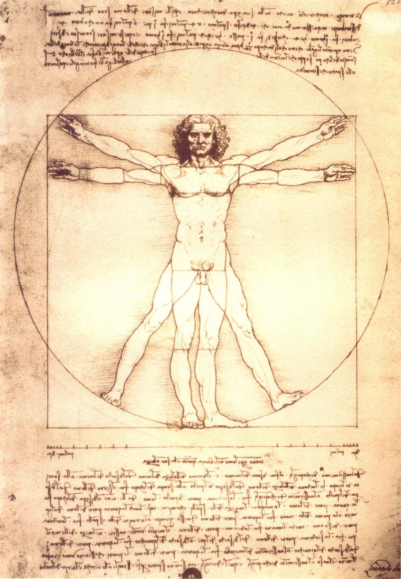
The Face of Leonardo?

It has long been assumed that the red chalk drawing shown above is a self-portrait by Leonardo da Vinci.It certainly looks like what we expect or want the great Renaissance artist to look like, his penetrating deep-set eyes gazing out at us from distant past, weighted with the perhaps painful wisdom of great insight into the nature of the world and the ways of man; but its status as a self portrait has been called into question in recent years by prominent art historians; leading to the inevitable question of whether we really know what Leonardo looked like.
There are even those who claim, based on the assumption that the above image is a self-portrait, that similarities between key points in the facial structure show that the enigmatic face of the Mona Lisa could have been modeled on his own.
I don’t buy that one, but I have always accepted the above image as a self portrait, mainly because I recognize in it that “look” that I’ve seen in hundreds of self-portraits. It’s a look that I associate with a particular shift in mental state associated with drawing, something to do with where and how the eyes are focusing (see my post on Drawing on the Right Side of the Brain).
It’s a little hard to tell from this reproduction, and I was hard pressed to find a better one on the web. This is a very old, and very delicate, chalk drawing that is difficult to reproduce, and to see it more clearly you need to look for it in print, as on the back cover of Taschen’s excellent volume Leonardo da Vinci: Sketches and Drawings by Frank Zollner (part of a two volume set of his paintings and drawings – technically not in print in the US, but you can sometimes find it used or even discounted). There, and in other good reproductions, you can see the way the eyes are focused right at the viewer (or a mirror) and have that particular look of an artist deep in the mindset of concentrated drawing.
Still, scholars are saying the assumption that this is Leonardo is in question.
The only portrait of Leonardo for which we have reasonably reliable attribution is Verrocchio’s David, a statue for which Leonardo is believed to have posed as a boy of 15, but it’s difficult to draw immediate comparisons between that and the image of a man who is at least in his late 60’s.
This all leads to a fascinating four-minute presentation at this year’s TED (Technology Entertainment Design) Conference by Siegfried Woldhek, in which he does an astonishing analysis of Da Vinci’s drawings, systematically narrowing them down to possible candidates for self-portraits.
Siegfried Woldhek is a well known Dutch illustrator whose speciality is faces. He’s drawn over a thousand of them, mostly political and literary portraits and caricatures, for newspapers and magazines in Europe.
Drawing on his own experience (if you’ll excuse the expression) and the assumption that Leonardo, who drew everything around him with a passion bordering on obsession, must have created some self portraits (an assumption with which I agree), Woldhek searches through Leonardo’s drawings for evidence of a record of his own visage.
The resulting talk is a wonderfully condensed argument, establishing (without question in my mind) that we do indeed know what Leonardo da Vinci looked like, and from more than one image.
[Link to TED video via BoingBoing]
Categories:
-
Barrett Bailey

Barrett Bailey is an Alabama artist working in the classical realist tradition.Though you will find small still life paintings and an occasional landscape in his online galleries, Bailey is primarily a figure and portrait artist. The Paintings section of his site includes paintings in a range of sizes and degrees of finish, from small portrait sketches to larger scale figure works. For an idea of the scale of his more recent paintings, glance at the photograph of his studio on the Bio page.
Particularly appealing to me are his drawings, both figure drawings and portraits. These are primarily in graphite or charcoal, often on toned paper, and have a variety of surface textures.
Bailey’s site includes a video of the creation of one of his drawings in time lapse, condensing two an a half hours of drawing into less than two minutes. (I mentioned this video previously in my post about ArtDemonstrations.com.)
His bio section also includes a Bookshelf, with some of the books he recommends on figure drawing, portrait painting and related subjects.
Barrett exhibits in Alabama and New York, where he studied at the New York Academy of Art. He in an instructor at Huntingdon College and teaches private Portrait Drawing Classes in Montgomery.
Categories:
-
Marco Sassone

I have to say that I don’t normally respond well to paintings in which representational imagery has been “pushed” stylistically to the point where it borders on being non-representational. Contemporary artists often lose me at that juncture. There seems to be a point where it becomes boring for me, and I seldom follow artists who work in that direction.Marcon Sassone’s work, however, grabbed my attention and appealed to me right off, even though it fits that description. Sassone’s brusque brushstrokes threaten to break up the representational image, as if it were on the verge of dissolution, but he holds back just enough, and includes enough elements of visual interest in his paintings, that they work both as representations of real scenes and severe abstractions from them (all art being “abstract” in the strict sense of that word).
His urban landscapes, in particular, have a feeling of vibration and almost random energy, within which they still form palpable images of real places.
Sassone was born in Tuscany, Italy, studied at the Instituto Galilei and later with Silvio Loffredo, a professor of art at the Academia i Florence.
He later emigrated to California, though a number of his paintings are from a series of views of Venice. He currently works in Toronto and Florence, and exhibits in the U.S. and Europe.
There is currently an Exhibition of his work at the Odon Wagner Gallery in Toronto, that features a number of his views of that city. It runs from April 4 to April 26, 2008.
The images on the Wagner Gallery site are somewhat larger than those on Sassone’s own site, giving you a better feeling for the texture and surface character of his work.
[Link via Art Knowledge News]
Categories:
-
Bobby Chiu

Bobby Chiu is a Canadian illustrator and concept designer who also teaches digital painting, both at Seneca College School of Communication Arts and online through the web-based Schoolism.Chiu shares the Imaginism Studios web site with illustrator Kei Acedera, and also collaborates with her on various works. The Imaginism portfolio can be viewed by work for either artist or jointly by categories like Girls, Guys, Fairies, Creatures and Cats and Dogs.
There is a section of Subway Sketches, and Chiu maintains a group blog devoted to the subject. There is also an Imaginism Studios blog, more general in topic, shared with Acedera, Stephen Silver, Jason Seiler, and Thierry LaFontaine.
The Imaginism site offers a line of books and prints. The books include the works of numerous guest artists.
You can also find Chiu on the CGSociety site, with a gallery and tutorials like his Making of Three Samurai on Horseback.
Chiu does digital painting of whimsical and bizarre animals (particularly rabbit-sort-of-things), more realistic animals like cats and dogs (though in fanciful interpretations), and and assortment of odd characters including fairies and dragons.
Chiu sometimes works in a detailed and highly rendered style, which can give the cartoon-like aspects of his subjects an extra punch, and at other times in a looser, more casual style.
Categories:
-
George Gardner Symons
George Gardner Symons was an Amreican painter active in the late 19th and early 20th Centuries. He was born in Chicago and was one of the early artists to live and work in California in the 1890’s, after the trans-continanal railroad made the previously remote section of the U.S. more accessible (see my posts on Guy Rose, Granville Redmond and Hanson Puthuff).Symons studied at the Art Institute of Chicago, and later extended his studies in London, Paris and Munich before returning to the U.S. and California.
He also maintained a studio in New York City and another in the Berkshires, traveling between there and Laguna Beach, where he was an active participant in the thriving art community.
He worked as an illustrator for a time and was commissioned by the Santa Fe Railroad in 1914 to create paintings of the Grand Canyon for promotional campaigns.
Symons’ exposure to Impressionism in Europe has a lasting influence on his work. He painted “en plein air” and is generally classified as an “American Impressionist”. Though he is noted in particular for his scenes of New England in the Winter, he is considered a member of the California School of American Impressionism.
Confusingly enough, you might also find him associated with the Impressionist influenced painters who worked in New Hope in Bucks County, PA; and labeled as a Pennsylvania Impressionist (see my posts on Daniel Garber, Edward Redfield and Fern Coppedge).
Though there is obvious commonality in his approach and subject matter, the definitive book on Pennsylvania Impressionism says there is no evidence for this; and all of his known winter scenes were painted in new England. (The upside of this is that Encore Editions includes him in their catalog of images and inexpensive prints.)
Wherever he painted, Symons rendered his landscapes in clear, strong compositions, with a vibrant color sense, and the kind of crisp, deliberate brushwork that makes the work of so many American Impressionist painters wonderfully appealing.
Categories:
-
Al Jaffee

Al Jaffee is a cartoonist and comics artist who is best known as a long-time contributor to Mad magazine. Early in his career, Jaffee worked for Timely Comics and then Atlas Comics, which were early forms of the company that became Marvel Comics.Jaffee joined Mad magazine in in 1955, shortly after editor Harvey Kurtzman transformed it from a comic book to magazine format to dodge the restrictions of the anti-comics backlash that had been stirred up against Mad’s sibling E.C. horror comics.
Jaffee is the longest running contributor to the magazine and may have been in more issues than any other single artist. He also joined Kurtzman on his other humor magazines, Trump and Humbug.
Jaffee is a writer as well as an artist and has created many series and single features for the magazine over the years, including Snappy Answers to Stupid Questions, many of which have been published as a series of collections. There have also been collections of some of Jaffee’s other work for the magazine published as Mad’s Vastly Overrated Al Jaffee and Al Jaffee Gets His Just Deserts.
Jaffee always seemed to be part cartoonist, part inventor, and many of his features have been based on weird gadgets, outrageous fake inventions and clever designs for things. Jaffee is most associated with one of his own “inventions”, the “Mad Fold-in”, which is one of the longest-runing features in the magazine, started in 1964 and continuing today. There is also a collection of those: Mad Fold This Book!: A Ridiculous Collection of Fold-Ins.
These were originally a parody of “fold-outs” in Playboy and other men’s magazines, in which an extra, originally folded over page would fold out to allow an extra large photograph to be printed across three pages (bringing to mind Martin Mull’s quip: “Playboy is like National Geographic — lots of nice pictures of beautiful places you’ll never visit.”)
Jafee’s Mad version was, of course, the opposite, a fold-in in which the image became smaller, but in the process changed its meaning by becoming a different image altogether. This requires some cleverness and careful planning, a task to which Jaffee’s inventive mind is adroitly suited. The idea was a hit, and has become, in essence, the toy prize in the Crackerjack box for each issue the magazine. Jaffee has used the idea both for fun and for sometimes biting social commentary that has ruffled more than a few feathers.
Jaffee has won major cartoonists awards from National Cartoonist Society and is one of three nominees for this year’s Ruben Awards.
Much to the delight of Jaffee fans everywhere, he’s still at it today at the age of 87. In 2006, on his 85th Birthday, Steven Colbert invited Jaffee on his show and presented him with a fold-in birthday cake, which had typically complimentary wishes written on the icing that, when the middle section of the cake was removed, became reduced to “Al, you are old.”
The New York Times has just published an article on Jaffee, along with a great interactive feature of Al Jaffee’s Fold-ins, Past and Present, that showcases a dozen or more of his clever pieces, starting from the early 1960’s, in an Flash module that lets you fold them over.
This, of course, neatly sidesteps the dilemma we had as kids of whether to fold in and crease your copy of the back cover, or try to figure out what it was without folding, or hope your friends had already folded theirs.
Categories:


Charley’s Picks
Bookshop.org
(Bookshop.org affilliate links; sales benefit independent bookshop owners; I get a small percentage to help support my work on Lines and Colors)

John Singer Sargent: Watercolors


Urban Sketching: Understanding Perspective


Charley’s Picks
Amazon
(Amazon.com affiliate links; sales go to a larger yacht for Jeff Bezos; but I get a small percentage to help support my work on Lines and Colors)
John Singer Sargent: Watercolors
Urban Sketching: Understanding Perspective