
Categories
- 3d CGI
- Amusements
- Animation
- Anime & Manga
- Art Materials
- Art Videos
- Blogroll
- Cartoons
- Color
- Comics
- Concept & Visual Dev.
- Creativity
- Digital Art
- Digital Painting
- Displaying Art on the Web
- Drawing
- Eye Candy for Today
- Gallery and Museum Art
- High-res Art Images
- Illustration
- Motion Graphics & Flash
- Museums
- Online Museums
- Outsider Art
- Painting
- Painting a Day
- Paleo Art
- Pastel, Conté & Chalk
- Pen & Ink
- Prints and Printmaking
- Reviews
- Sc-fi and Fantasy
- Sculpture & Dimensional
- Site Comments
- Sketching
- Storyboards
- Tools and Techniques
- Uncategorized
- Vector Art
- Videos & Podcasts
- Vision and Optics
- Watercolor and Gouache
- Webcomics
Archives
- July 2026
- June 2026
- May 2026
- April 2026
- March 2026
- February 2026
- January 2026
- December 2025
- November 2025
- October 2025
- September 2025
- August 2025
- July 2025
- June 2025
- May 2025
- January 2025
- December 2024
- November 2024
- October 2024
- September 2024
- August 2024
- June 2024
- April 2024
- March 2024
- February 2024
- January 2024
- December 2023
- November 2023
- October 2023
- September 2023
- August 2023
- July 2023
- May 2023
- April 2023
- March 2023
- February 2023
- January 2023
- December 2022
- November 2022
- September 2022
- August 2022
- July 2022
- June 2022
- May 2022
- April 2022
- March 2022
- February 2022
- January 2022
- December 2021
- November 2021
- October 2021
- September 2021
- August 2021
- July 2021
- June 2021
- May 2021
- April 2021
- March 2021
- February 2021
- January 2021
- December 2020
- November 2020
- October 2020
- September 2020
- August 2020
- July 2020
- June 2020
- May 2020
- April 2020
- March 2020
- February 2020
- January 2020
- December 2019
- November 2019
- October 2019
- September 2019
- August 2019
- July 2019
- June 2019
- May 2019
- April 2019
- March 2019
- February 2019
- January 2019
- December 2018
- November 2018
- October 2018
- September 2018
- August 2018
- July 2018
- June 2018
- May 2018
- April 2018
- March 2018
- February 2018
- January 2018
- December 2017
- November 2017
- October 2017
- September 2017
- August 2017
- July 2017
- June 2017
- May 2017
- April 2017
- March 2017
- February 2017
- January 2017
- December 2016
- November 2016
- October 2016
- September 2016
- August 2016
- July 2016
- June 2016
- May 2016
- April 2016
- March 2016
- February 2016
- January 2016
- December 2015
- November 2015
- October 2015
- September 2015
- August 2015
- July 2015
- June 2015
- May 2015
- April 2015
- March 2015
- February 2015
- January 2015
- December 2014
- November 2014
- October 2014
- September 2014
- August 2014
- July 2014
- June 2014
- May 2014
- April 2014
- March 2014
- February 2014
- January 2014
- December 2013
- November 2013
- October 2013
- September 2013
- August 2013
- July 2013
- June 2013
- May 2013
- April 2013
- March 2013
- February 2013
- January 2013
- December 2012
- November 2012
- October 2012
- September 2012
- August 2012
- July 2012
- June 2012
- May 2012
- April 2012
- March 2012
- February 2012
- January 2012
- December 2011
- November 2011
- October 2011
- September 2011
- August 2011
- July 2011
- June 2011
- May 2011
- April 2011
- March 2011
- February 2011
- January 2011
- December 2010
- November 2010
- October 2010
- September 2010
- August 2010
- July 2010
- June 2010
- May 2010
- April 2010
- March 2010
- February 2010
- January 2010
- December 2009
- November 2009
- October 2009
- September 2009
- August 2009
- July 2009
- June 2009
- May 2009
- April 2009
- March 2009
- February 2009
- January 2009
- December 2008
- November 2008
- October 2008
- September 2008
- August 2008
- July 2008
- June 2008
- May 2008
- April 2008
- March 2008
- February 2008
- January 2008
- December 2007
- November 2007
- October 2007
- September 2007
- August 2007
- July 2007
- June 2007
- May 2007
- April 2007
- March 2007
- February 2007
- January 2007
- December 2006
- November 2006
- October 2006
- September 2006
- August 2006
- July 2006
- June 2006
- May 2006
- April 2006
- March 2006
- February 2006
- January 2006
- December 2005
- November 2005
- October 2005
- September 2005
- August 2005
Relevant Blogs
Art, Painting & Sketch
- Gurney Journey
- Underpaintings
- Art and Influence
- Painting Perceptions
- Oil Painters of America
- Vasari Paint POV
- Flying Fox
- Urban Sketchers
- Bento (Smithsonian)
- Art Inconnu
- The Hidden Place
- Still Life
- Making a Mark
- The Art of the Landscape
- Exploring Color & Creativity
- Art Contrarian
- Artist A Day
- beinArt Surreal Art Collective
- Eye Level
- David Dunlop
- p.i.g.m.e.n.t.i.u.m
- CultureGrrl
- Joaquín Sorolla blog
- Artists in Pastel
“Painting a Day”
- A Painting a Day (Keiser)
- On Painting (Keiser)
- Julian Merrow-Smith
- Karen Jurick
- Jeffrey Hayes
- Carol Marine
- Abbey Ryan
- Daily Paintworks
Other Painting Blogs
- Virtual Gouache Land
- Neil Hollingsworth
- Marc Hanson
- Kevin Menck
- Marc Dalessio
- Larry Seiler
- Stapleton Kearns
- Colin Page
- Roos Schuring
- Hans Versfelt
- Titus Meeuws
- Régis Pettinari
- René Plein Air
- Belinda Del Pesco
- Robin Weiss
- Nathan Fowkes (Land Sketch)
- William Wray
- Frank Serrano
- Stephen Magsig
- Michael Chesley Johnson
- Twice a Week
- Sarah Wimperis
- Rob Adams
- Michael Cole Manley
- The Dirty Palette Club
- Mike Manley’s Draw!
Gallery Art & Illustration mix
Illustration
- Howard Pyle
- 100 Years of Illustration
- BibliOdyssey
- Illustration Art
- Today’s Inspiration
- Illustration Mundo
- Little Chimp Society
- Danny Gregory
- R D (John Martz
- Illustration Friday blog
- Monster Brains
- Illustrators & Illustrations (RU)
- Elwood H. Smith
- DaniDraws.com
- Designers Who Blog
- iSpot Blog
Sci-Fi & Fantasy
Illustration & Comics
Comics & Cartoons
- Comics Beat
- Robot 6
- Newsarama Blog
- Comic Vine
- Comics Alliance
- Forbidden Planet Int.
- Paolo Rivera
- Bolt City
- Flight
- Scott McCloud
- The Comics Journal
- Comixpedia
- Funnybook Babylon
- James Baker
- Middleton’s Sketchbook
- Boneville
- The Hotel Fred
- Paul Rivoche
- Daily Cartoonist
- Mad About Cartoons (William Wray)
- Digital Strips
Illustration & Concept
Animation & Concept
- Cartoon Brew
- Animation Blog
- Cold Hard Flash
- Concept Art World
- The CAB
- FY Concept Art
- Concept Ships
- Concept Robots
- John Nevarez
- Armand Serrano
- Marcos Mateu-Mestre
- all kinds of stuff (Kricfalusi)
- Yacin the faun (Man Arenas)
- Kelsey Mann
- Cre8tivemarks Blog
- Ice-Cream Monster Toon Cafe
- AAU Character & Creature Design
- AAU Animation Notes
- Articles and Texticles
Paleo & Scientific
Tools & Techniques
Other
Lists of Art Blogs
Art Image Resource Links
Historic Art Images
- Wikimedia Commons: Paintings
- Wikimedia Commons: Drawings
- The Athenaeum
- WikiArt (WikiPaintings)
- Google Art Project: Artists
- Google Art Project: Collections (Museums)
- ArtCyclopedia
- Web Gallery of Art
- Art Renewal Center
- Web Gallery of Impressionism
Auction Consolidation sites
Auction sites
- Sotheby’s
- Bonham’s
- Christies
- Heritage Auctions: Fine Art
- Heritage Auctions: Illustration
- Freeman’s Auctions
- Bukowskis
- Shannon’s
Image Search
Reverse Image Search (search by image)
- Tin Eye
- RevImg
- Google Image Search (camera icon)
- Bing Image Search (camera icon)
Promoting some friends and some clients of my website design business
- Twin Willows T’ai Chi studio in Wilmington DE. Taiji classes with Bryan Davis.
- Ray Hayward, Inspired Teacher of T’ai Chi ( Taiji ) in Minneapolis, Founder of Mindful Motion Tai Chi Academy
- OldHead Tattoo studio and Art Gallery in Wilmington DE. Tattoos and paintings by Bruce Gulick
- Sharon Domenico Art, pet portrait oil paintings
- Platinum Paperhanging, wallpaper hanging, Main Line and Philadelphia, PA
- Lisa Stone Design, interior designer, Main Line and Philadelphia, PA
- Studio12KPT, original art, prints, calendars and other custom printed items by Van Sickle & Rolleri
-
Anders Zorn

As an art student, with an art student’s typical financial state, I used to haunt the used bookstores in and around Philadelphia, looking for those occasional gems of great art books that I could somehow afford.At one point, I came across a ragged copy of a small catalog of prints called Prints of Distinction, bearing the imprint of Charles Sessler, the Philadelphia rare book dealer. The book included graphic work by Rembrandt and Durer, and I could afford it because it was damaged, so it was a definite find. It was there that I was introduced to Whistler’s fantastic etchings, as well as the graphics of D.Y. Cameron, James McBey and Joseph Pennell, and the beautiful etchings of Anders Zorn.
Zorn was one of the greatest modern etchers, approaching even Whistler in his faculty for suggesting varying textures, lighting and atmosphere in etched line. (See my effusive post about Whistler’s Etchings.)
Anders Zorn is best known as a painter, however, and is often thought of as a “Swedish Impressionist”. He started his career as a sculptor, shifted to working in watercolor and gouache, and later moved to oil. He was renowned in his lifetime for his portraits, but is known today more for his beautiful, glowing and painterly nudes, and his impressionistic fascination with the reflective characteristics of water.
His subject matter can be divided into a few major categories, female nudes, water (often combined in images of women wading in shallow water at the edges of streams or lakes), genre pantings of farms and workers, and portraits. His portraits included sculptor Auguste Rodin, US President Grover Cleveland and his wife, and members of European society, as well as many portraits of himself, his wife, Emma, and other members of his family.
In his portraits in particular, I find it hard look at Zorn’s work without thinking of Sargent (which is a Good Thing). Like Sargent, Zorn exhibits a confident looseness and deceptively casual appearance to his handling of the paint that masks an exacting sense of composition and control of color.
I don’t know if they met or influenced one another, but I have to assume Zorn was aware of Sargent. Zorn traveled extensively in Europe and the US, working and learning, but always returned to his native Sweden, to the region of Dalarna and the town of Mora, where he was born.
The Zorn Collections are a group of four museums in Mora based on donations to the state of Sweeden by Zorn and his wife. The official site contains a bio and gallery that includes oils, watercolors, etchings and drawings, as well as information about the museums.
Unfortunately, I don’t know of any inexpensive books on Zorn that I can recommend. There is no Dover book of his etchings, (though there should be) and most of what’s in print is on the expensive side.
The best I can suggest for those of you who are on an arts student’s budget is that you haunt the used bookstores, looking for those unexpected surprises.
Categories:
-
The Comics Curmudgeon
Apartment 3-G, 3/22/06

OK. I know I’m dating myself by saying this, but I remember when newspaper comics used to actually be funny.No! Really! I’m serious!
It used to be that you could open the comics page of a major metropolitan newspaper like the The Philadelphia Inquirer, The Bulletin, or The Baltimore Sun and pretty reliably expect to laugh out loud several times in the course of reading the comics.
Don’t look at me that way! It’s true! Go ask your Mom.
Of course, with very few exceptions, the current crop of bland, sanitized, tiny-paneled, poorly drawn and inexcusably unfunny comics are more likely to elicit bemusement, as in “Why is this page even here?”, and I won’t even go into the sorry state of newspaper adventure comics.
Enter The Comics Curmudgeon, a delightful blog by freelance writer Josh Fruhlinger that was originally called I Read The Comics So You Don’t Have To, in which he posts current comic strips and comments on them like… well, like the wonderful curmudgeon he is.
Here’s a sample snippet of his take on the Apartment 3-G strip shown above from March 23:
“Holy crap but that’s a scary word balloon. It doesn’t just have icicles; it has slime-dripping tentacles, like a floating jellyfish of scorn. Watch out, Eskimo-kissing couple in the background (or, alternately, waiter with poor sense of personal space and startled restaurant patron)! Margo’s octopus of disdain has been unleashed, and there’s no stopping it!“
As he goes on, strip after strip, you not only realize how unfunny many of these strips are, but how truly and absolutely weird and bizarre the comics pages have become. His comments are often as funny as the newspaper comics “back when” used to be.
The best way to read Josh’s posts is to click into the detail of a post so you can read his reader’s comments, many of which are almost as funny as Josh’s take, and then click through in the convenient “Next Post/Previous Post” links to other posts with comments.
Why aren’t these people writing comics?
Categories:
-
The Tale of How
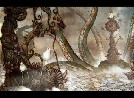
Some drawings just look like they should be animated. I would love to see Van Gogh’s lively stipple dance across the screen, or Miro’s already living line actually grow and move like the organic thing it is. Fortunately some drawings that look like they should be animated actually reach that state.When I first wrote about fascinating South African artist and illustrator Ree Treweek last month, and tried to describe her intricately detailed and wonderfully original drawings, I mentioned that she and her artist’s group (collectively known as “The Blackheart Gang”) were working on animating some of her drawings from a series called The Tale of How, which in turn is part of a larger scale project called The Household. (See my post about Ree Treweek from March 15, which includes links to more of her work.)
At the time there was a brief bit of teaser video of the animated work available on Brian Goodwin’s site, but The Blackheart Gang has recently posted a larger and longer clip, much to my delight.
I was already impressed with the unique look of Treweek’s illustration, but combined with the interesting way the images have been isolated into parts and animated, with the addition of cgi and lots of imaginative thought, the resulting animation is something really original and wonderful.
Treweek’s Blackheart Gang collaborators are Jannes Hendrikz (who sometimes collaborates on her illustrations), musician Marcus Wormstrom (still haven’t found the music video on which the group also worked together), and animators Justin Baker, Brian Goodwin and others (credits at the end of the clip).
I initially encountered some problems with the downloaded movie file (see “Site Quirks”, below), but it works fine in a browser and if you have a broadband connection, it’s definitely worth viewing. When this is released it’s going to make a stir in the animation community.
In the meanwhile, we have a double treat. We get to enjoy Treweek’s wonderful drawings both as drawings and as part of The Blackheart Gang’s fantastic animated world.
Categories:
-
The Morgan Library and Museum
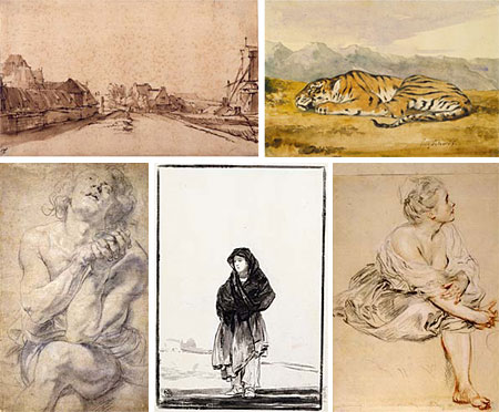
Finally! After 3 years of being off the map, one of the foremost collections and exhibition spaces for works on paper in the US is back. The newly renamed Morgan Library and Museum (formerly The Pierpont Morgan Library) is set to reopen this Saturday, April 29, 2006.I’ve been to number of exhibitions of master drawings at the Morgan over the years and they have all been memorable. The Library itself, developed from the private library of financier and all-around-rich-guy Pierpont Morgan, has a terrific collection of old master drawings, as well as historic manuscripts, books, bindings, music notation, Near Eastern scrolls, tablets and other art objects.
The museum, which is located on Madison Ave. at 36th Street in New York (entrance on 36th), has undergone its most extensive renovation ever with new gallery space, four story court, cafe and auditorium, as well as an unfortunately inappropriate new Bauhausian entrance structure, but that’s a minor quibble.
The Library and Museum will debut its dramatically expanded exhibition space with a show of treasures from its own holdings: Masterworks from the Morgan, which runs from April 29 to July 2, 2006. And treasures they are. Old Pierpont had pretty good taste in master drawings (image above, clockwise from top-left: Rembrandt, Delacroix, Watteau, Goya, Rubens).
The Morgan also has a renovated web site which allows you to look through some of the drawings and other artifacts and, like the same feature on the Met’s site, zoom way in on them.
Link via Artnet News.
Categories:
-
Panos Fake Roadsigns
 Art is usually a bit isolated. Paintings and sculpture sit quietly in museum halls, hang in place on gallery walls or in collectors’ homes. A certain amount of sculpture punctuates city streets and parks, but for the most part we don’t encounter that many art objects unintentionally.
Panos Fake Roadsigns is a collaborative project that takes the work of 47 artists from around the world, in the form of 105 fake road signs, and turns the streets of Lyon, France into an enormous gallery without walls.
The round red and white signs look enough like real European traffic signs that you might take them for granted, but weird enough if you notice them to make you stop and think; which is likely what people will do with signs that seem to indicate “octopus ahead”, “bubble blowing not permitted”, “feces area” or “fallopian tube zone”.
I’m not always fond of “installation” art that takes itself too seriously, but this project has a delightful sense of humor, lots playful absurdity and a wonderful scale. The accompanying web site gives a little (very little) background on the project, but the interesting thing, of course, is the signs themselves.
Unfortunately the site is hampered by a rather cramped Flash interface. Go to the “Artists” tab and click through them to see the signs both in situ and close up. Under the sign design you will find links to all of that artist’s designs as well as a link to that artist or studio’s site. Each artist or studio contributed one to three designs.
The exhibition is produced by Unchi Leisure Center and curated by Kanardo. Contributors include tokyoplastic, who I recently profiled, and from whose Press section I learned about the exhibit.
Keep your eyes open when you’re walking around, you never know when you may be walking through a gallery.
Categories:
-
Flight 3 preview
 I have a rant and then a rave. First, let me go on record as saying that I like superhero comics. I really do. I’ve been reading them for years and I’ll continue to read them. There is some great stuff being done in the genre. It’s just that there are… so many of them.
They crowd the shelves of the comic book specialty shops, shelf after shelf, row after row, title after title; an endless procession of teeth-gritting, brow-furrowing, muscle-popping, ridiculously costumed and stupidly named second and third string characters smashing and bashing their way through mind-numbingly repetitive stories month after month… AAAARRRRGGGGHHHH!
It’s not that that’s bad in itself. I’m an enthusiastic supporter of comics in any form, so you would think my attitude would be “the more the merrier”, but this overwhelming dominance of superhero comics is not a good thing. What essentially should be a niche genre (and is, in other countries where comics are popular, like France, Italy and Japan) has been the essence and substance of the American comic book mainstream for 50 years. It’s one of the main reasons comics are disrespected as a valid art form in the US; it has stifled the growth of the medium; and worst of all, kept some of the most creative and talented voices out there from being heard by anything but a tiny audience. Yes, occasionally exceptions, like Jeff Smith’s Bone, will actually break out and reach a wider audience, but these are rare.
The problem with the dominance of the mainstream superhero comic “products” (and that’s what they are to the people who own these companies, make no mistake) is that they crowd everything else off the shelves. In a field that relies on small, usually independent, comic book specialty shops for most of its distribution network, it doesn’t take much to fill up the shelves, and the shop owners’ purchasing budget, with the reams of poor quality second string superhero titles the big companies keep pumping out; which, of course, is exactly what they’re for. This is a deliberate and calculated policy on the part of the large comic book companies to stifle competition (the latest insane expression of which is the attempt by Marvel and DC to jointly trademark the generic term “superhero” so smaller companies can’t use it).
So the wonderfully varied and imaginative work of hundreds of talented independent comics creators, work that has a real potential to change public perception of the medium and dramatically expand the audience and market for comics in general, is suppressed by the mainstream companies while they fight over shelf space in their tiny superhero market ghetto. Brilliant.
Meanwhile, out in the creative hinterlands, where the aforementioned independent comics creators toil in obscurity, wonderful things are happening. Independently created webcomics, unrestrained by the narrow minded mainstream comics distribution system, are growing like crazy, creators are being noticed and voices are being heard. Delightfully, some of this creative explosion is making its way into print and actually showing up on the comic book shelves next to the latest issue of The Ultimate, Amazing, Spectacular Spider-clone.
Another exceptional breakout is trying to happen, this time with multiple creators in an anthology book, a comics format that has a notoriously poor track record but is somehow working this time. Kazu Kibuishi, one of those wonderful independent comic creators I keep telling you about, has been quietly starting a revolution with an experiment that has grown into a series of terrific anthology books that do exactly what needs to be done; using the very variety and quality of these independent creator’s voices to support one another. Each of the previous editions of Flight, Flight 1 and Flight 2, have showcased a number of wonderfully talented comics creators with unique voices, styles and things to say. By putting them together, the Flight anthologies have made a proverbial whole greater than the sum if its parts that demonstrates some of the potential out there.
The latest volume, Flight 3, is due in June. If you shop at a comics specialty store, you can go there now and pre-order it. You can also order it from your local independent bookshop (if you’re lucky enough to still have one), chain bookstore, or Amazon.
Flight 3 promises to be the best, most varied and most enjoyable volume yet and you can get a nice taste of it in advance courtesy of the Comic Book Resources site, which has put up a multi page preview of dozens of beautiful pages that you can view online. The preview is in two parts, part 1 here, and part 2 here. (Images above, from top: Johane Matte, Rodolphe Guenoden, Paul Harmon.)
You can also visit the Flight Blog, and Kibuishi’s Bolt City, for news about the upcoming release. There are also previews for Flight 1 here, and Flight 2 here.
If you thought comics are not for you because you’re just not into the whole teeth-gritting, knuckle bashing, spandex tights superhero thing; or even if you already enjoy superhero comics (as I do, remember), but are just curious about what else is out there in the way of new, different and creative comics, here’s a great place to start.
Categories:


Charley’s Picks
Bookshop.org
(Bookshop.org affilliate links; sales benefit independent bookshop owners; I get a small percentage to help support my work on Lines and Colors)

John Singer Sargent: Watercolors


Urban Sketching: Understanding Perspective


Charley’s Picks
Amazon
(Amazon.com affiliate links; sales go to a larger yacht for Jeff Bezos; but I get a small percentage to help support my work on Lines and Colors)
John Singer Sargent: Watercolors
Urban Sketching: Understanding Perspective