
Categories
- 3d CGI
- Amusements
- Animation
- Anime & Manga
- Art Materials
- Art Videos
- Blogroll
- Cartoons
- Color
- Comics
- Concept & Visual Dev.
- Creativity
- Digital Art
- Digital Painting
- Displaying Art on the Web
- Drawing
- Eye Candy for Today
- Gallery and Museum Art
- High-res Art Images
- Illustration
- Motion Graphics & Flash
- Museums
- Online Museums
- Outsider Art
- Painting
- Painting a Day
- Paleo Art
- Pastel, Conté & Chalk
- Pen & Ink
- Prints and Printmaking
- Reviews
- Sc-fi and Fantasy
- Sculpture & Dimensional
- Site Comments
- Sketching
- Storyboards
- Tools and Techniques
- Uncategorized
- Vector Art
- Videos & Podcasts
- Vision and Optics
- Watercolor and Gouache
- Webcomics
Archives
- July 2026
- June 2026
- May 2026
- April 2026
- March 2026
- February 2026
- January 2026
- December 2025
- November 2025
- October 2025
- September 2025
- August 2025
- July 2025
- June 2025
- May 2025
- January 2025
- December 2024
- November 2024
- October 2024
- September 2024
- August 2024
- June 2024
- April 2024
- March 2024
- February 2024
- January 2024
- December 2023
- November 2023
- October 2023
- September 2023
- August 2023
- July 2023
- May 2023
- April 2023
- March 2023
- February 2023
- January 2023
- December 2022
- November 2022
- September 2022
- August 2022
- July 2022
- June 2022
- May 2022
- April 2022
- March 2022
- February 2022
- January 2022
- December 2021
- November 2021
- October 2021
- September 2021
- August 2021
- July 2021
- June 2021
- May 2021
- April 2021
- March 2021
- February 2021
- January 2021
- December 2020
- November 2020
- October 2020
- September 2020
- August 2020
- July 2020
- June 2020
- May 2020
- April 2020
- March 2020
- February 2020
- January 2020
- December 2019
- November 2019
- October 2019
- September 2019
- August 2019
- July 2019
- June 2019
- May 2019
- April 2019
- March 2019
- February 2019
- January 2019
- December 2018
- November 2018
- October 2018
- September 2018
- August 2018
- July 2018
- June 2018
- May 2018
- April 2018
- March 2018
- February 2018
- January 2018
- December 2017
- November 2017
- October 2017
- September 2017
- August 2017
- July 2017
- June 2017
- May 2017
- April 2017
- March 2017
- February 2017
- January 2017
- December 2016
- November 2016
- October 2016
- September 2016
- August 2016
- July 2016
- June 2016
- May 2016
- April 2016
- March 2016
- February 2016
- January 2016
- December 2015
- November 2015
- October 2015
- September 2015
- August 2015
- July 2015
- June 2015
- May 2015
- April 2015
- March 2015
- February 2015
- January 2015
- December 2014
- November 2014
- October 2014
- September 2014
- August 2014
- July 2014
- June 2014
- May 2014
- April 2014
- March 2014
- February 2014
- January 2014
- December 2013
- November 2013
- October 2013
- September 2013
- August 2013
- July 2013
- June 2013
- May 2013
- April 2013
- March 2013
- February 2013
- January 2013
- December 2012
- November 2012
- October 2012
- September 2012
- August 2012
- July 2012
- June 2012
- May 2012
- April 2012
- March 2012
- February 2012
- January 2012
- December 2011
- November 2011
- October 2011
- September 2011
- August 2011
- July 2011
- June 2011
- May 2011
- April 2011
- March 2011
- February 2011
- January 2011
- December 2010
- November 2010
- October 2010
- September 2010
- August 2010
- July 2010
- June 2010
- May 2010
- April 2010
- March 2010
- February 2010
- January 2010
- December 2009
- November 2009
- October 2009
- September 2009
- August 2009
- July 2009
- June 2009
- May 2009
- April 2009
- March 2009
- February 2009
- January 2009
- December 2008
- November 2008
- October 2008
- September 2008
- August 2008
- July 2008
- June 2008
- May 2008
- April 2008
- March 2008
- February 2008
- January 2008
- December 2007
- November 2007
- October 2007
- September 2007
- August 2007
- July 2007
- June 2007
- May 2007
- April 2007
- March 2007
- February 2007
- January 2007
- December 2006
- November 2006
- October 2006
- September 2006
- August 2006
- July 2006
- June 2006
- May 2006
- April 2006
- March 2006
- February 2006
- January 2006
- December 2005
- November 2005
- October 2005
- September 2005
- August 2005
Relevant Blogs
Art, Painting & Sketch
- Gurney Journey
- Underpaintings
- Art and Influence
- Painting Perceptions
- Oil Painters of America
- Vasari Paint POV
- Flying Fox
- Urban Sketchers
- Bento (Smithsonian)
- Art Inconnu
- The Hidden Place
- Still Life
- Making a Mark
- The Art of the Landscape
- Exploring Color & Creativity
- Art Contrarian
- Artist A Day
- beinArt Surreal Art Collective
- Eye Level
- David Dunlop
- p.i.g.m.e.n.t.i.u.m
- CultureGrrl
- Joaquín Sorolla blog
- Artists in Pastel
“Painting a Day”
- A Painting a Day (Keiser)
- On Painting (Keiser)
- Julian Merrow-Smith
- Karen Jurick
- Jeffrey Hayes
- Carol Marine
- Abbey Ryan
- Daily Paintworks
Other Painting Blogs
- Virtual Gouache Land
- Neil Hollingsworth
- Marc Hanson
- Kevin Menck
- Marc Dalessio
- Larry Seiler
- Stapleton Kearns
- Colin Page
- Roos Schuring
- Hans Versfelt
- Titus Meeuws
- Régis Pettinari
- René Plein Air
- Belinda Del Pesco
- Robin Weiss
- Nathan Fowkes (Land Sketch)
- William Wray
- Frank Serrano
- Stephen Magsig
- Michael Chesley Johnson
- Twice a Week
- Sarah Wimperis
- Rob Adams
- Michael Cole Manley
- The Dirty Palette Club
- Mike Manley’s Draw!
Gallery Art & Illustration mix
Illustration
- Howard Pyle
- 100 Years of Illustration
- BibliOdyssey
- Illustration Art
- Today’s Inspiration
- Illustration Mundo
- Little Chimp Society
- Danny Gregory
- R D (John Martz
- Illustration Friday blog
- Monster Brains
- Illustrators & Illustrations (RU)
- Elwood H. Smith
- DaniDraws.com
- Designers Who Blog
- iSpot Blog
Sci-Fi & Fantasy
Illustration & Comics
Comics & Cartoons
- Comics Beat
- Robot 6
- Newsarama Blog
- Comic Vine
- Comics Alliance
- Forbidden Planet Int.
- Paolo Rivera
- Bolt City
- Flight
- Scott McCloud
- The Comics Journal
- Comixpedia
- Funnybook Babylon
- James Baker
- Middleton’s Sketchbook
- Boneville
- The Hotel Fred
- Paul Rivoche
- Daily Cartoonist
- Mad About Cartoons (William Wray)
- Digital Strips
Illustration & Concept
Animation & Concept
- Cartoon Brew
- Animation Blog
- Cold Hard Flash
- Concept Art World
- The CAB
- FY Concept Art
- Concept Ships
- Concept Robots
- John Nevarez
- Armand Serrano
- Marcos Mateu-Mestre
- all kinds of stuff (Kricfalusi)
- Yacin the faun (Man Arenas)
- Kelsey Mann
- Cre8tivemarks Blog
- Ice-Cream Monster Toon Cafe
- AAU Character & Creature Design
- AAU Animation Notes
- Articles and Texticles
Paleo & Scientific
Tools & Techniques
Other
Lists of Art Blogs
Art Image Resource Links
Historic Art Images
- Wikimedia Commons: Paintings
- Wikimedia Commons: Drawings
- The Athenaeum
- WikiArt (WikiPaintings)
- Google Art Project: Artists
- Google Art Project: Collections (Museums)
- ArtCyclopedia
- Web Gallery of Art
- Art Renewal Center
- Web Gallery of Impressionism
Auction Consolidation sites
Auction sites
- Sotheby’s
- Bonham’s
- Christies
- Heritage Auctions: Fine Art
- Heritage Auctions: Illustration
- Freeman’s Auctions
- Bukowskis
- Shannon’s
Image Search
Reverse Image Search (search by image)
- Tin Eye
- RevImg
- Google Image Search (camera icon)
- Bing Image Search (camera icon)
Promoting some friends and some clients of my website design business
- Twin Willows T’ai Chi studio in Wilmington DE. Taiji classes with Bryan Davis.
- Ray Hayward, Inspired Teacher of T’ai Chi ( Taiji ) in Minneapolis, Founder of Mindful Motion Tai Chi Academy
- OldHead Tattoo studio and Art Gallery in Wilmington DE. Tattoos and paintings by Bruce Gulick
- Sharon Domenico Art, pet portrait oil paintings
- Platinum Paperhanging, wallpaper hanging, Main Line and Philadelphia, PA
- Lisa Stone Design, interior designer, Main Line and Philadelphia, PA
- Studio12KPT, original art, prints, calendars and other custom printed items by Van Sickle & Rolleri
-
Whistler’s Etchings

I’ll do a general post about James Abbot McNeill Whistler at some point, but for this one I want to concentrate on his etchings. In the general sense, suffice it to say that if your only familiarity with Whistler is his rather staid profile portrait of his mother sitting in a chair (Arrangement in Grey and Black: Portrait of the Painter’s Mother, commonly known as Whistler’s Mother), you’re missing out on a unique and amazing artist.Apart from his considerable skill as a painter, he was an astonishingly accomplished etcher and printmaker. Whistler is my second favorite etcher, after only Rembrandt, and that’s saying something. His masterfully atmospheric etchings could capture with equal aplomb the delicate grace of a young girl or the rough textures of the London waterfront.
Etching is a painstaking process. The metal plate (copper in the past, these days steel or aluminum unless you’re rich) is coated with a wax ground, into which the artist draws with an etching needle or other sharp instrument. The plate is then immersed in acid which “bites” (etches) lines into the plate where the wax resist has been removed by the needle. The plate is then prepared, inked and wiped so that the ink only remains in the recessed lines, and then run through a press with a dampened sheet of special (usually soft) paper, transferring the ink to the paper through pressure.
The artist doesn’t truly know what a print (or impression) will look like until going through the entire process. Often the artist must repeat the process and bite the plate again if the lines are not definite enough, or the plate can be ruined if the lines are bitten too far or the resist is corrupted with dirt or pinholes. (All in all though, as painstaking as it is, there is something soothing and appealing about the process. It produces some of the state of “mindfulness” often engendered by craft that requires careful attention.)
The advantage of etching, other than the ability to produce and sell multiple versions of the same drawing, is the beautifully fine line that is possible with an etching needle and the careful biting of a plate. Whistler was a master etcher, and also worked in drypoint, the creation of plates without acid by scratching directly into the surface, producing a coarser but softer-edged line that is sometimes preferred.
His most famous series of etchings is of the banks and docks of the Thames River (image above) in his adopted home of London. (Whistler was an American by birth.) He also produced two wonderful sets of Venice, which he sometimes added to with pastel after they were printed, and a French set.
His images can be heavily rendered in one section of the composition, giving an illusion of solid reality, and dissolve into obvious lines on paper a few inches away. (I just love that effect and the mental shift it produces.)
There is a beautiful but expensive volume, The Etchings of James McNeill Whistler by Katharine A. Lochnan, but there is also a very nice and inexpensive Dover book, Etchings of James A. McNeill Whistler (Dover Art Collections) by Maria Naylor.
The Dover volumes as a whole are wonderfully inexpensive, but image quality often suffers in the inexpensive printing. Etching, however, survives reproduction in books far better than drawing or painting, largely because it is a graphic process to begin with and deals with line, and this book is a bargain for the price (about $13). (Dover also has a terrific and very inexpensive volume of The Complete Etchings of Rembrandt: Reproduced in Original Size by Gary D. Schwartz.)
The link below is to a wonderfull collection of Whitsler’s etchings and drypoints at the Freer Saclker Online Collection of American Art from the Smithsonian.
There is something irresistible and other-worldly about etched lines, and a subtle delicacy that is unmatched in any other drawing medium (except perhaps for metalpoint). In Whistler’s hands, etched lines become things of wonder.
Categories:
-
Ed von Lee
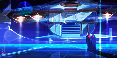
Ed Lee draws cool ‘bots, wild characters, fantastic environments and nasty villains. He studied fine arts but his interest in such things led him to a career in commercial art (something I can identify with). He studied at Pratt Institute in Brooklyn, NY, but lives and works in Korea.Lee is a concept artist and has worked on projects like Underworld 2: Evolution, The Green Mile, Batman & Robin, MGM:EFX and Guild Wars. He has worked with ILM and prior to that was a production designer, visual effects designer and computer graphics director for Rhythm and Hues.
He has also been teaching concept design at Dongseo University in Busan. He works in traditional media, digital painting and CGI, utilizing whatever medium is more appropriate for the task at hand.
Lee’s character designs have a fun, loose feeling and exaggerated features that emphasize the character. His environments play with dramatic contrasts of light and dark to emphasize mood and his ‘bots look like blueprints for an alien robot assembly line that’s about to go into production. Fun stuff.
In addition to the web site, Lee also has a blog where he often posts his work.
Categories:
-
Collected Tears of the Weeping Nivbed (Justin Cherry)
 I’ll start out by saying that I don’t know much about Justin Cherry.
I know that he does terrific images, sometimes in comics outline style and sometimes painted in both traditional and digital media. I know that he is mentioned often (but briefly) on CGI sites, and at one time, he worked at Troika Games. I know that he has been featured in the Expose 1 collection of digital illustration, and I know that I like his work.
He is working on a personal project called Unreal Doco. He has a blog here that hasn’t done much to answer my basic questions but does have some more of his drawings and sketches.
What I don’t know is what he does professionally, who his clients are, where his work has been published (other then Expose), where he studied, or any of the other background info it’s usually easy to come by about artists and illustrators on the web.
I don’t know if he is intentionally keeping his personal (and professional) information out of the spotlight, culturing a mysterioso persona or simply doesn’t think that kind of information is worth posting.
He has a GC gallery and traditional media gallery on his site. There is also a Justin Cherry gallery at Epilogue.net, and a Nivbed gallery at Bugglefug.
I also don’t have a clue what Collected Tears of the Weeping Nivbed refers to. I do know that I’ll keep stopping back to see if he’s posted any more of his terrific images.
Categories:
-
Michael J. Deas

You’ve probably seen Michael Deas’ work without realizing it. In addition to his revitalization of the Columbia Pictures logo (above) Deas created the illustrations for some the most popular commemorative stamps ever released by the U.S. Postal service (James Dean, Marilyn Monroe and Audrey Hepburn and others).His beautifully realized illustrations have been on the cover of magazines like Time and Commuincation Arts (in which he was the subject of a cover story) and he has received numerous awards from the Society of Illustrators.
He initially wanted to be a realist painter, unfortunately at a time when realism was being pronounced prematurely dead by the art establishment, and turned his attention to illustration.
He carries his admiration for traditional technique into his working method for illustration. He paints in oil on prepared wooden panels, first creating a detailed underpainting on top of which he builds his final color in glazes.
Categories:
-
Nancy Depew
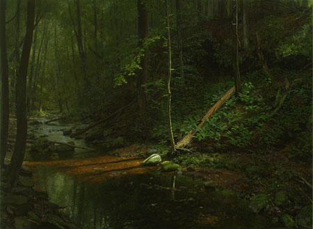
Nancy Depew paints landscapes, still lifes and figures. In each case her approach, although consistent in many ways, is so strongly tied to her intentions toward the subject that you might think it the work of three different artists if you didn’t know otherwise.Her landscape paintings are usually deep within the woods, at the edge or center of streams, in thickly canopied areas occasionally punctuated with light. She works in a meticulous and refined realist style and infuses her landscapes with subtle emotions by controlling the light. The light invites you in, but the darkness is always there, at the edges. Her landscape images are at once appealing and slightly disconcerting.
Depew’s still life paintings are primarily of floral subjects. Rather than the expected arrangements in a vase, her flowers are often lying on a flat surface, as if carelessly tossed aside, or pulled up roots and all. The colors are simultaneously delicate and strong, vibrant and subdued. She often plays with a subtle spotlight effect as in her landscapes, drawing your eye to a particular point from which you then move to other areas of the image, exploring her wonderfully rendered textures and careful arrangements of tone.
There are also figure paintings and charcoal drawings on the site. Her figures are most often in curled or contorted positions, as if haunted by something or struggling with emotional isolation. Her figure paintings show a masterful command of traditional techniques and perhaps a fondness for Velázquez.
After seeing the figures your perception of her landscape and still life paintings may be altered, so I recommend viewing the figure work last.
The paintings are in oil. Unfortunately, Depew has taken down the small gouache landscapes that used to accompany the oils.
Categories:
-
Kazu Kibuishi

When I started lines and colors last summer, Kazu Kibuishi’s beautiful web comic Copper was the topic of one of my first posts.Kibuishi is the creator of several other comics, including Daisy Cutter and Clive and Cabbage and is the driving force behind Flight, a terrific series of comics anthologies. He is currently working on a new graphic novel series called Amulet. His freelance work includes clients like Walt Disney Animation, Mattel, Nickelodeon Magazine and Sony Computer Entertainment.
If you aren’t familiar with Copper, you’re in for a treat. I’ll repeat the advice I gave in my original post: go to the Copper page, look at one of the current strips to see how beautiful they are, then scroll to page bottom, start with the earliest and read them all. When you’re looking for more (and you will be) there are previews for Copper stories in the Flight anthologies here and here.
Kibuishi has recently updated his site to include a superb multi-page tutorial on the making of Copper (images above). He starts with the thumbnail sketches, moves to layout, though pencil drawing, inking, scanning and finally right down to the details of applying digital color in Photoshop. In the process he discusses his tools and materials, both traditional and digital, even to the point of posting images of his pens, papers and work space. The whole process, in fact, is supplemented with wonderfully large, detailed images. (Here is the final page for the process shown in the tutorial.)
You could consider this a mini-course in modern comic creation methods. Kibuishi points out, however, that his approach to Copper is different than his usual process when working on longer format comics. He discusses the difference and talks about how long it takes to draw a Copper page in this post on his blog.
For those in the Los Angeles area, you have the opportunity to learn about the process in person. Kibuishi is giving a Graphic Narrative Workshop at Gallery Nucleus in Alhambra on Sunday, March 5th.
The latest edition of the Flight comics anthology, Flight Volume Three, is now available for pre-order on Amazon. Flight Volume 1 and Flight Volume 2 are also available, along with Kibuishi’s Daisy Kutter: The Last Train comics album.
Categories:


Charley’s Picks
Bookshop.org
(Bookshop.org affilliate links; sales benefit independent bookshop owners; I get a small percentage to help support my work on Lines and Colors)

John Singer Sargent: Watercolors


Urban Sketching: Understanding Perspective


Charley’s Picks
Amazon
(Amazon.com affiliate links; sales go to a larger yacht for Jeff Bezos; but I get a small percentage to help support my work on Lines and Colors)
John Singer Sargent: Watercolors
Urban Sketching: Understanding Perspective