
Categories
- 3d CGI
- Amusements
- Animation
- Anime & Manga
- Art Materials
- Art Videos
- Blogroll
- Cartoons
- Color
- Comics
- Concept & Visual Dev.
- Creativity
- Digital Art
- Digital Painting
- Displaying Art on the Web
- Drawing
- Eye Candy for Today
- Gallery and Museum Art
- High-res Art Images
- Illustration
- Motion Graphics & Flash
- Museums
- Online Museums
- Outsider Art
- Painting
- Painting a Day
- Paleo Art
- Pastel, Conté & Chalk
- Pen & Ink
- Prints and Printmaking
- Reviews
- Sc-fi and Fantasy
- Sculpture & Dimensional
- Site Comments
- Sketching
- Storyboards
- Tools and Techniques
- Uncategorized
- Vector Art
- Videos & Podcasts
- Vision and Optics
- Watercolor and Gouache
- Webcomics
Archives
- July 2026
- June 2026
- May 2026
- April 2026
- March 2026
- February 2026
- January 2026
- December 2025
- November 2025
- October 2025
- September 2025
- August 2025
- July 2025
- June 2025
- May 2025
- January 2025
- December 2024
- November 2024
- October 2024
- September 2024
- August 2024
- June 2024
- April 2024
- March 2024
- February 2024
- January 2024
- December 2023
- November 2023
- October 2023
- September 2023
- August 2023
- July 2023
- May 2023
- April 2023
- March 2023
- February 2023
- January 2023
- December 2022
- November 2022
- September 2022
- August 2022
- July 2022
- June 2022
- May 2022
- April 2022
- March 2022
- February 2022
- January 2022
- December 2021
- November 2021
- October 2021
- September 2021
- August 2021
- July 2021
- June 2021
- May 2021
- April 2021
- March 2021
- February 2021
- January 2021
- December 2020
- November 2020
- October 2020
- September 2020
- August 2020
- July 2020
- June 2020
- May 2020
- April 2020
- March 2020
- February 2020
- January 2020
- December 2019
- November 2019
- October 2019
- September 2019
- August 2019
- July 2019
- June 2019
- May 2019
- April 2019
- March 2019
- February 2019
- January 2019
- December 2018
- November 2018
- October 2018
- September 2018
- August 2018
- July 2018
- June 2018
- May 2018
- April 2018
- March 2018
- February 2018
- January 2018
- December 2017
- November 2017
- October 2017
- September 2017
- August 2017
- July 2017
- June 2017
- May 2017
- April 2017
- March 2017
- February 2017
- January 2017
- December 2016
- November 2016
- October 2016
- September 2016
- August 2016
- July 2016
- June 2016
- May 2016
- April 2016
- March 2016
- February 2016
- January 2016
- December 2015
- November 2015
- October 2015
- September 2015
- August 2015
- July 2015
- June 2015
- May 2015
- April 2015
- March 2015
- February 2015
- January 2015
- December 2014
- November 2014
- October 2014
- September 2014
- August 2014
- July 2014
- June 2014
- May 2014
- April 2014
- March 2014
- February 2014
- January 2014
- December 2013
- November 2013
- October 2013
- September 2013
- August 2013
- July 2013
- June 2013
- May 2013
- April 2013
- March 2013
- February 2013
- January 2013
- December 2012
- November 2012
- October 2012
- September 2012
- August 2012
- July 2012
- June 2012
- May 2012
- April 2012
- March 2012
- February 2012
- January 2012
- December 2011
- November 2011
- October 2011
- September 2011
- August 2011
- July 2011
- June 2011
- May 2011
- April 2011
- March 2011
- February 2011
- January 2011
- December 2010
- November 2010
- October 2010
- September 2010
- August 2010
- July 2010
- June 2010
- May 2010
- April 2010
- March 2010
- February 2010
- January 2010
- December 2009
- November 2009
- October 2009
- September 2009
- August 2009
- July 2009
- June 2009
- May 2009
- April 2009
- March 2009
- February 2009
- January 2009
- December 2008
- November 2008
- October 2008
- September 2008
- August 2008
- July 2008
- June 2008
- May 2008
- April 2008
- March 2008
- February 2008
- January 2008
- December 2007
- November 2007
- October 2007
- September 2007
- August 2007
- July 2007
- June 2007
- May 2007
- April 2007
- March 2007
- February 2007
- January 2007
- December 2006
- November 2006
- October 2006
- September 2006
- August 2006
- July 2006
- June 2006
- May 2006
- April 2006
- March 2006
- February 2006
- January 2006
- December 2005
- November 2005
- October 2005
- September 2005
- August 2005
Relevant Blogs
Art, Painting & Sketch
- Gurney Journey
- Underpaintings
- Art and Influence
- Painting Perceptions
- Oil Painters of America
- Vasari Paint POV
- Flying Fox
- Urban Sketchers
- Bento (Smithsonian)
- Art Inconnu
- The Hidden Place
- Still Life
- Making a Mark
- The Art of the Landscape
- Exploring Color & Creativity
- Art Contrarian
- Artist A Day
- beinArt Surreal Art Collective
- Eye Level
- David Dunlop
- p.i.g.m.e.n.t.i.u.m
- CultureGrrl
- Joaquín Sorolla blog
- Artists in Pastel
“Painting a Day”
- A Painting a Day (Keiser)
- On Painting (Keiser)
- Julian Merrow-Smith
- Karen Jurick
- Jeffrey Hayes
- Carol Marine
- Abbey Ryan
- Daily Paintworks
Other Painting Blogs
- Virtual Gouache Land
- Neil Hollingsworth
- Marc Hanson
- Kevin Menck
- Marc Dalessio
- Larry Seiler
- Stapleton Kearns
- Colin Page
- Roos Schuring
- Hans Versfelt
- Titus Meeuws
- Régis Pettinari
- René Plein Air
- Belinda Del Pesco
- Robin Weiss
- Nathan Fowkes (Land Sketch)
- William Wray
- Frank Serrano
- Stephen Magsig
- Michael Chesley Johnson
- Twice a Week
- Sarah Wimperis
- Rob Adams
- Michael Cole Manley
- The Dirty Palette Club
- Mike Manley’s Draw!
Gallery Art & Illustration mix
Illustration
- Howard Pyle
- 100 Years of Illustration
- BibliOdyssey
- Illustration Art
- Today’s Inspiration
- Illustration Mundo
- Little Chimp Society
- Danny Gregory
- R D (John Martz
- Illustration Friday blog
- Monster Brains
- Illustrators & Illustrations (RU)
- Elwood H. Smith
- DaniDraws.com
- Designers Who Blog
- iSpot Blog
Sci-Fi & Fantasy
Illustration & Comics
Comics & Cartoons
- Comics Beat
- Robot 6
- Newsarama Blog
- Comic Vine
- Comics Alliance
- Forbidden Planet Int.
- Paolo Rivera
- Bolt City
- Flight
- Scott McCloud
- The Comics Journal
- Comixpedia
- Funnybook Babylon
- James Baker
- Middleton’s Sketchbook
- Boneville
- The Hotel Fred
- Paul Rivoche
- Daily Cartoonist
- Mad About Cartoons (William Wray)
- Digital Strips
Illustration & Concept
Animation & Concept
- Cartoon Brew
- Animation Blog
- Cold Hard Flash
- Concept Art World
- The CAB
- FY Concept Art
- Concept Ships
- Concept Robots
- John Nevarez
- Armand Serrano
- Marcos Mateu-Mestre
- all kinds of stuff (Kricfalusi)
- Yacin the faun (Man Arenas)
- Kelsey Mann
- Cre8tivemarks Blog
- Ice-Cream Monster Toon Cafe
- AAU Character & Creature Design
- AAU Animation Notes
- Articles and Texticles
Paleo & Scientific
Tools & Techniques
Other
Lists of Art Blogs
Art Image Resource Links
Historic Art Images
- Wikimedia Commons: Paintings
- Wikimedia Commons: Drawings
- The Athenaeum
- WikiArt (WikiPaintings)
- Google Art Project: Artists
- Google Art Project: Collections (Museums)
- ArtCyclopedia
- Web Gallery of Art
- Art Renewal Center
- Web Gallery of Impressionism
Auction Consolidation sites
Auction sites
- Sotheby’s
- Bonham’s
- Christies
- Heritage Auctions: Fine Art
- Heritage Auctions: Illustration
- Freeman’s Auctions
- Bukowskis
- Shannon’s
Image Search
Reverse Image Search (search by image)
- Tin Eye
- RevImg
- Google Image Search (camera icon)
- Bing Image Search (camera icon)
Promoting some friends and some clients of my website design business
- Twin Willows T’ai Chi studio in Wilmington DE. Taiji classes with Bryan Davis.
- Ray Hayward, Inspired Teacher of T’ai Chi ( Taiji ) in Minneapolis, Founder of Mindful Motion Tai Chi Academy
- OldHead Tattoo studio and Art Gallery in Wilmington DE. Tattoos and paintings by Bruce Gulick
- Sharon Domenico Art, pet portrait oil paintings
- Platinum Paperhanging, wallpaper hanging, Main Line and Philadelphia, PA
- Lisa Stone Design, interior designer, Main Line and Philadelphia, PA
- Studio12KPT, original art, prints, calendars and other custom printed items by Van Sickle & Rolleri
-
Mark Schultz

Mark Schultz is a comics artist best know for his creation Xenozoic Tales, otherwise known as Cadillacs and Dinosaurs, which first appeared in the eighth issue of Death Rattle, a black and white horror anthology comic from Kitchen Sink Press, in the 80’s.The story was so successful that Schultz went on to produce 14 issues of Xenozoic Tales, many of which were collected into a pair of trade paperbacks from Dark Horse Comics, and several others were published by Kitchen Sink Press. The feature was also made into an animated TV cartoon called Cadillacs and Dinosaurs in the early 90’s.
Schultz draws the aforementioned Cadillacs, and especially dinosaurs, with beautifully rendered pen and ink line and hatching. In addition he draws wonderful lost civilizations, elaborate palaces, beautiful characters and fantastic landscapes.
Initially, Schultz seemed very heavily influenced by Wally Wood, (something I know all too much about
). At some point he was introduced to the beautiful comics work of Al Williamson, and his artistic hero, Alex Raymond, as well as Hal Foster, contemporary of Raymond and one of Wood’s great influences. It’s fascinating to look through the Xenozoic Tales stories in sequence. Schultz isn’t afraid to wear his influences on his sleeve as he goes through a period of studying the characteristics of these great comics artists, digesting the parts he likes and absorbing those techniques into the developing whole of his own work. Recently, he has shown the influence great pen and ink illustrators like Joseph Clement Coll and Franklin Booth.
I saw some of his original pages for Xenozoic Tales at a comics convention several years ago, and they were rendered at an unbelievable level of detail, including details that you can’t even see in the printed comics.
A book of Schultz’s drawings has been published by Flesk Publications, a terrific small publisher who has also done superb collections of the work of Joseph Clement Coll and Franklin Booth, and has announced new collections of the work of illustrator and realist painter James Bama (who did those wonderful Doc Savage paperback covers), illustrator Bob Peake and contemporary comics artist Steve Rude (see my post on Steve Rude), as well as a second volume of work by Mark Schultz.
There are several trade paperback editions of the Xenozoic Tales stories: Xenozoic Tales Vol 1 After The End TP, Xenozoic Tales Vol 2 The New World TP, Dinosaur Shaman: Nine Tales from the Xenozoic Age, Scenes from the Xenozoic Age, and some under the title Cadillacs and Dinosaurs and Time in Overdrive.
Michael J. Ryan’s Paleoblog has a nice review of the Flesk book of Schultz drawings.
There in no official site for Mark Schultz as far as I know, so the link below points to the gallery on the Flesk Publications site. Schultz also writes comic books and is currently writing the Prince Valiant newspaper strip.
The Flesk site also includes an interview with Schultz.
Categories:
-
Brom
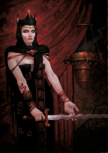
Brom started his career creating commercial illustration for clients like Coke, IBM and CNN. He was soon seduced the dark side (of illustration, that is) and shifted into working full time for TSR, creating wonderfully dark and twisted fantasy illustrations for TSR’s publications (image above). He eventually went freelance again and has continued to do fantasy illustrations for books, games and comics.His paintings are deliberately horrific and disturbing, often featuring distorted figures with “alternate” body parts, grotesque demons, gothic fetish costuming and unnervingly bizarre implements and weapons.
The painting here is one of his milder ones, and was inspired by a trip to the Tate gallery in London and their collections of Pre-Raphaelite and other 19th Century realist paintings. (See my post on William Holman Hunt.) You can see the influence in his affection for elaborate costume and the surface textures and details of decorative objects like the hanging urn. Brom’s work also shows the influence of classic illustrators, like those mentioned in the previous two posts, as well as more contemporary fantasy illustrators like Frank Frazetta.
Brom has just completed his new project, Plucker, a 160 page illustrated novel with over 100 images. The book has its own web site.
Plucker‘s images deal with many subjects that you might find in children’s books; provided, of course, that you wanted to scar your children for life. What happens to the innocent objects of childhood when the encounter the horrors of grown-up reality? Brom knows.
You may also be able to find earlier collections of his work, Darkwerks: The Art of Brom, and Offerings. He is also featured in Fantasy Art Masters: The Best Fantasy and Science Fiction Artists Show How They Work by Dick Jude, a beautifully illustrated volume in which Brom and nine other fantasy and science fiction artists discuss their work and working techniques in detail.
Categories:
-
100 Years of Illustration and Design (Paul Giambarba)
 While we’re on the delicious subject of the great American illustrators (see my previous post about the Kelly Collection of American Illustration, below), allow me to recommend another superb blog. 100 Years of Illustration and Design is a cornucopia of rich, detailed posts about a long roster of great illustrators.
You’ll find fascinating and profusely illustrated (I love that phrase!) posts about Howard Pyle, N.C. Wyeth, Maxfield Parrish, Jessie Wilcox Smith, Charles Dana Gibson and many others. If you can’t get to the Dahesh exhibit, here is a terrific tour of a virtual museum of great golden age illustration.
The real treat is that on this virtual museum tour you have a wonderfully experienced and knowledgeable guide. Author Paul Giambarba is an illustrator, cartoonist and caricaturist in addition to being a designer and former corporate art director for Polaroid. He has lectured on Graphic Design at Cornell and Wellesley.
Most importantly, he has a deep respect and admiration for these artists and their accomplishments, and it shows. His posts are thoughtful, perceptive and endlessly informative; full of rich details and interesting comparisons. He also has a great eye and the posts are chock full of some of best examples of each artist’s work.
I’m sure to be pointing you back to Giambarba’s treasure trove of illustration appreciation in the future as I do my own posts on some of these fantastic artists.
Giambarba also maintains a blog about Cartoons and Caricatures.
Categories:
-
Stories To Tell: Masterworks from The Kelly Collection of American Illustration (at the Dahesh Museum)
I’ve had this exhibition listed in the Exhibitions list on the lines and colors sidebar for months now, and I’ve been looking forward to it for just as long. I was hoping to have a personal report for you by this time, but my schedule just isn’t letting me get to NY (or anywhere else) at the moment, so I want to at least mention the exhibition while it’s early in the run.The Dahesh Museum in New York has a rare mission; it’s dedicated to 19th century salon and academic art, a branch of art that has been aggressively ignored by the art establishment from the mid 20th Century until just recently, and it’s worth a visit for that alone.
The museum’s current exhibition, however, is particularly appealing; it features selections from a remarkable collection of illustration, with a bounty of masters from the “golden age” of American illustration (roughly 1880-1930).
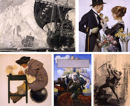
The works extracted (out of 90 in the show) and highlighted in a gallery on the museum’s site read like a who’s who of the great American illustrators: Howard Pyle, N.C. Wyeth, J.C. Leyendecker, Joseph Clement Coll, Franklin Booth, Dean Cornwell, Maxfield Parrish, Norman Rockwell, Charles Dana Gibson, Jessie Wilcox Smith, Harrison Cady, James Montgomery Flagg and several others! Wow!
To my knowledge, the collection is not normally on view unless loaned out, and the exhibition doesn’t seem to be slated to travel. So if you’re in reach of NYC, this my be your only opportunity to see these particular works. I’ve sampled a few of the highlights in the image above. (Clockwise from top left: Franklin Booth, J.C. Leyendecker, Joseph Clement Coll, N.C. Wyeth and Maxfield Parrish.)
The exhibition runs to May 21, 2006. If you want to see some fine work by the greatest American illustrators, run to this exhibition.
Addendum: David Apatoff wrote in to say that he has seen the show (see comments on this post) and has posted more (and larger) images on his Illustration Art blog.
Categories:
-
Drawn!
 I’m sure many of you are familiar with Drawn!, but if not, it’s a blog that would be of interest to almost anyone who reads lines and colors.
Although it bills itself as “The Illustration blog”, Drawn! actually covers a wide range of visual arts, including many of the categories covered by lines and colors: cartooning, comics, drawing and motion design, in addition to illustration.
The emphasis and approach are different, though, and you may find the two blogs nicely complimentary.
While lines and colors places an emphasis on traditional technique and classical draughtsmanship and leans toward realism and realist styles, Drawn! is into the new, modern, hip and more highly stylized artists. Their emphasis is on what’s fresh and what’s current, (although they do pay their respects to the classics).
Unlike lines and colors, which depends on the efforts of your humble writer to produce one (hopefully thoughtful) post a day, Drawn! is collaborative, drawing on a roster of talented illustrators and artists, each with their own discoveries to share and their own knowledge and experience to add to the mix. Drawn! is updated more frequently than lines and colors; new short posts are often added two or three times a day. The ability to add multiple posts per day and to leverage the network of many contributors allows Drawn! to act as a news source in addition to the “What’s cool” aspect.
Drawn! turned one year old on Saturday, and their frequent updating has produced a nice big archive of goodies to look through. The sidebar features a long rotating list of “Random Creative Blogs” in addition to a more steady lst of “More Inspiration”.
Don’t miss the page devoted to the Drawn! contributors that has brief descriptions of them and links to their individual web sites, portfolios, webcomics and blogs. In particular, founding contributor and principlal driving force John Martz has a blog at RobotJohnny.com that has been running considerably longer than Drawn!.
Drawn! was nominated for a Bloggie this year as “Best New Weblog”. (Winners should be announced sometime in March.)
Drawn! has recently added a Discussion Forum, with a variery of topics of interest to illustrators, cartoonists, comics artists and draw-ers of all stripes.
Categories:
-
Mike Wieringo (update)

I first wrote about comics artist Mike Wieringo (“Ringo”), back in September. At the time I mentioned that he had started a blog, Mike’s own personal soapbox!, and was posting nice large images of his drawings (in contrast to the rather small images in his site’s galleries).He’s still at it, frequently updating the blog with wonderful new drawings of comics characters, sometimes his own (above), sometimes other artist’s and sometimes company owned. In every case, he has his own unique take on the character and his style is immediately recognizable.
As I mentioned in my earlier post, although his work looks terrific inked and colored, his pencil drawings are particularly appealing. They have a loose, confident quality and energy that is sometimes submerged in the finished work, so it’s a treat to see lots of his pencil work on the blog.
Unfortunately, even though he’s up over 200 posts, he doesn’t seem to have any provision for permalinks or archives on the blog, so once the current posts are replaced by new ones, they’re out of reach. It’s a good reason to check in often I guess, but maybe if we all write and ask nice, he’ll open up the blog archives and let us have a look at the older posts once in while.
Categories:


Charley’s Picks
Bookshop.org
(Bookshop.org affilliate links; sales benefit independent bookshop owners; I get a small percentage to help support my work on Lines and Colors)

John Singer Sargent: Watercolors


Urban Sketching: Understanding Perspective


Charley’s Picks
Amazon
(Amazon.com affiliate links; sales go to a larger yacht for Jeff Bezos; but I get a small percentage to help support my work on Lines and Colors)
John Singer Sargent: Watercolors
Urban Sketching: Understanding Perspective