
Categories
- 3d CGI
- Amusements
- Animation
- Anime & Manga
- Art Materials
- Art Videos
- Blogroll
- Cartoons
- Color
- Comics
- Concept & Visual Dev.
- Creativity
- Digital Art
- Digital Painting
- Displaying Art on the Web
- Drawing
- Eye Candy for Today
- Gallery and Museum Art
- High-res Art Images
- Illustration
- Motion Graphics & Flash
- Museums
- Online Museums
- Outsider Art
- Painting
- Painting a Day
- Paleo Art
- Pastel, Conté & Chalk
- Pen & Ink
- Prints and Printmaking
- Reviews
- Sc-fi and Fantasy
- Sculpture & Dimensional
- Site Comments
- Sketching
- Storyboards
- Tools and Techniques
- Uncategorized
- Vector Art
- Videos & Podcasts
- Vision and Optics
- Watercolor and Gouache
- Webcomics
Archives
- May 2026
- April 2026
- March 2026
- February 2026
- January 2026
- December 2025
- November 2025
- October 2025
- September 2025
- August 2025
- July 2025
- June 2025
- May 2025
- January 2025
- December 2024
- November 2024
- October 2024
- September 2024
- August 2024
- June 2024
- April 2024
- March 2024
- February 2024
- January 2024
- December 2023
- November 2023
- October 2023
- September 2023
- August 2023
- July 2023
- May 2023
- April 2023
- March 2023
- February 2023
- January 2023
- December 2022
- November 2022
- September 2022
- August 2022
- July 2022
- June 2022
- May 2022
- April 2022
- March 2022
- February 2022
- January 2022
- December 2021
- November 2021
- October 2021
- September 2021
- August 2021
- July 2021
- June 2021
- May 2021
- April 2021
- March 2021
- February 2021
- January 2021
- December 2020
- November 2020
- October 2020
- September 2020
- August 2020
- July 2020
- June 2020
- May 2020
- April 2020
- March 2020
- February 2020
- January 2020
- December 2019
- November 2019
- October 2019
- September 2019
- August 2019
- July 2019
- June 2019
- May 2019
- April 2019
- March 2019
- February 2019
- January 2019
- December 2018
- November 2018
- October 2018
- September 2018
- August 2018
- July 2018
- June 2018
- May 2018
- April 2018
- March 2018
- February 2018
- January 2018
- December 2017
- November 2017
- October 2017
- September 2017
- August 2017
- July 2017
- June 2017
- May 2017
- April 2017
- March 2017
- February 2017
- January 2017
- December 2016
- November 2016
- October 2016
- September 2016
- August 2016
- July 2016
- June 2016
- May 2016
- April 2016
- March 2016
- February 2016
- January 2016
- December 2015
- November 2015
- October 2015
- September 2015
- August 2015
- July 2015
- June 2015
- May 2015
- April 2015
- March 2015
- February 2015
- January 2015
- December 2014
- November 2014
- October 2014
- September 2014
- August 2014
- July 2014
- June 2014
- May 2014
- April 2014
- March 2014
- February 2014
- January 2014
- December 2013
- November 2013
- October 2013
- September 2013
- August 2013
- July 2013
- June 2013
- May 2013
- April 2013
- March 2013
- February 2013
- January 2013
- December 2012
- November 2012
- October 2012
- September 2012
- August 2012
- July 2012
- June 2012
- May 2012
- April 2012
- March 2012
- February 2012
- January 2012
- December 2011
- November 2011
- October 2011
- September 2011
- August 2011
- July 2011
- June 2011
- May 2011
- April 2011
- March 2011
- February 2011
- January 2011
- December 2010
- November 2010
- October 2010
- September 2010
- August 2010
- July 2010
- June 2010
- May 2010
- April 2010
- March 2010
- February 2010
- January 2010
- December 2009
- November 2009
- October 2009
- September 2009
- August 2009
- July 2009
- June 2009
- May 2009
- April 2009
- March 2009
- February 2009
- January 2009
- December 2008
- November 2008
- October 2008
- September 2008
- August 2008
- July 2008
- June 2008
- May 2008
- April 2008
- March 2008
- February 2008
- January 2008
- December 2007
- November 2007
- October 2007
- September 2007
- August 2007
- July 2007
- June 2007
- May 2007
- April 2007
- March 2007
- February 2007
- January 2007
- December 2006
- November 2006
- October 2006
- September 2006
- August 2006
- July 2006
- June 2006
- May 2006
- April 2006
- March 2006
- February 2006
- January 2006
- December 2005
- November 2005
- October 2005
- September 2005
- August 2005
Relevant Blogs
Art, Painting & Sketch
- Gurney Journey
- Underpaintings
- Art and Influence
- Painting Perceptions
- Oil Painters of America
- Vasari Paint POV
- Flying Fox
- Urban Sketchers
- Bento (Smithsonian)
- Art Inconnu
- The Hidden Place
- Still Life
- Making a Mark
- The Art of the Landscape
- Exploring Color & Creativity
- Art Contrarian
- Artist A Day
- beinArt Surreal Art Collective
- Eye Level
- David Dunlop
- p.i.g.m.e.n.t.i.u.m
- CultureGrrl
- Joaquín Sorolla blog
- Artists in Pastel
“Painting a Day”
- A Painting a Day (Keiser)
- On Painting (Keiser)
- Julian Merrow-Smith
- Karen Jurick
- Jeffrey Hayes
- Carol Marine
- Abbey Ryan
- Daily Paintworks
Other Painting Blogs
- Virtual Gouache Land
- Neil Hollingsworth
- Marc Hanson
- Kevin Menck
- Marc Dalessio
- Larry Seiler
- Stapleton Kearns
- Colin Page
- Roos Schuring
- Hans Versfelt
- Titus Meeuws
- Régis Pettinari
- René Plein Air
- Belinda Del Pesco
- Robin Weiss
- Nathan Fowkes (Land Sketch)
- William Wray
- Frank Serrano
- Stephen Magsig
- Michael Chesley Johnson
- Twice a Week
- Sarah Wimperis
- Rob Adams
- Michael Cole Manley
- The Dirty Palette Club
- Mike Manley’s Draw!
Gallery Art & Illustration mix
Illustration
- Howard Pyle
- 100 Years of Illustration
- BibliOdyssey
- Illustration Art
- Today’s Inspiration
- Illustration Mundo
- Little Chimp Society
- Danny Gregory
- R D (John Martz
- Illustration Friday blog
- Monster Brains
- Illustrators & Illustrations (RU)
- Elwood H. Smith
- DaniDraws.com
- Designers Who Blog
- iSpot Blog
Sci-Fi & Fantasy
Illustration & Comics
Comics & Cartoons
- Comics Beat
- Robot 6
- Newsarama Blog
- Comic Vine
- Comics Alliance
- Forbidden Planet Int.
- Paolo Rivera
- Bolt City
- Flight
- Scott McCloud
- The Comics Journal
- Comixpedia
- Funnybook Babylon
- James Baker
- Middleton’s Sketchbook
- Boneville
- The Hotel Fred
- Paul Rivoche
- Daily Cartoonist
- Mad About Cartoons (William Wray)
- Digital Strips
Illustration & Concept
Animation & Concept
- Cartoon Brew
- Animation Blog
- Cold Hard Flash
- Concept Art World
- The CAB
- FY Concept Art
- Concept Ships
- Concept Robots
- John Nevarez
- Armand Serrano
- Marcos Mateu-Mestre
- all kinds of stuff (Kricfalusi)
- Yacin the faun (Man Arenas)
- Kelsey Mann
- Cre8tivemarks Blog
- Ice-Cream Monster Toon Cafe
- AAU Character & Creature Design
- AAU Animation Notes
- Articles and Texticles
Paleo & Scientific
Tools & Techniques
Other
Lists of Art Blogs
Art Image Resource Links
Historic Art Images
- Wikimedia Commons: Paintings
- Wikimedia Commons: Drawings
- The Athenaeum
- WikiArt (WikiPaintings)
- Google Art Project: Artists
- Google Art Project: Collections (Museums)
- ArtCyclopedia
- Web Gallery of Art
- Art Renewal Center
- Web Gallery of Impressionism
Auction Consolidation sites
Auction sites
- Sotheby’s
- Bonham’s
- Christies
- Heritage Auctions: Fine Art
- Heritage Auctions: Illustration
- Freeman’s Auctions
- Bukowskis
- Shannon’s
Image Search
Reverse Image Search (search by image)
- Tin Eye
- RevImg
- Google Image Search (camera icon)
- Bing Image Search (camera icon)
Promoting some friends and some clients of my website design business
- Twin Willows T’ai Chi studio in Wilmington DE. Taiji classes with Bryan Davis.
- Ray Hayward, Inspired Teacher of T’ai Chi ( Taiji ) in Minneapolis, Founder of Mindful Motion Tai Chi Academy
- OldHead Tattoo studio and Art Gallery in Wilmington DE. Tattoos and paintings by Bruce Gulick
- Sharon Domenico Art, pet portrait oil paintings
- Platinum Paperhanging, wallpaper hanging, Main Line and Philadelphia, PA
- Lisa Stone Design, interior designer, Main Line and Philadelphia, PA
- Studio12KPT, original art, prints, calendars and other custom printed items by Van Sickle & Rolleri
-
DinoMixer: on creating art for an iPhone app

Regular readers will know that I rarely feature my own projects or work on Lines and Colors, but once in a while I’ll be indulgent (as on my birthday, which happens to be today), particularly if I have a project going that is of interest.I tend to be involved in many things — web site design, web comics, Flash animation, cartooning, sketching and painting, among others.
I also have a long running fascination with dinosaurs and paleontological art. Recently, I had the opportunity to combine several of those skill sets and interests; and, along with a two friends of mine, programmer Leon Stankowski and artist/sound designer Bruce Gulick, created an application for the iPhone and iPod Touch.
If you ever wanted to put a tyrannosaurus head on a pachycephalosaurus body and add a stegosaurus tail — there’s an app for that! It’s called DinoMixer.
DinoMixer is an amusement, in which kids and dinosaur art fans of all ages can mix and match dinosaur heads, bodies and tails to make crazy mixed-up dinosaurs, or un-mix them to match up the real dinosaurs.
I designed the app and did the illustration for it, which proved to be an interesting process.
Any form of illustration has its intended method of final display, from paperback book cover to CD jewel-box to computer monitor to console game screen. The iPhone is its own display paradigm.
If you haven’t seen one in person, the screen is very nice, it’s 480×320 pixels displayed in a relatively small area, so the the actual pixels-per-inch resolution is sharper than most computer displays (160ppi vs 103ppi or less for monitors) and the color is excellent; so even though the screen is small, the image is detailed and sharp. It’s a nice platform to do art for.
I had to do a little digging to find out the preferred image format. Though the iPhone will display a variety of image files, PNG is the native image file-type for the device. PNG (Portable Network Graphics) is an underrated and terrific image format that allows both a wide color gamut of millions of colors and a full channel of alpha transparency.
Beyond those basics, though, I had given myself a challenge simply in the design of my particular app. To make the dinosaur parts match up, I had to divide the screen proportions into a grid, one that would accommodate the disparate body sizes and shapes of the various animals, and allow them to meet up at critical junctures where the illusion of joining them together could be accomplished. In addition, I wanted the dinosaurs to be relatively large on the screen, and use the small area to best advantage.
Fortunately, I’ve had this idea in one form or another percolating in my brain pan for several years (originally intended as a web feature, in dHTML or Flash), so the grid was a matter of adaptation to the iPhone screen proportions and refinement. But it was still quite a challenge to draw the animals so that they fit the grid, matched against one another and still retained a degree of scientific accuracy (there is no one quicker to notice discrepancies than a 10-year old dinosaur fan).
Once the dinosaurs were penciled to fit within the grid, I inked them, and in saying “penciled” or “inked”, I’m speaking of the digital equivalents, using a Wacom tablet and Corel Painter. I then applied digitally painted color and texture using Painter and Photoshop, in much the same method as I have used for the 15 years I’ve been doing my Argon Zark! digital web comic.
The use of ink lines filled with color wasn’t just a choice from my comfort with the technique, but vital, I realized, to producing the sense of unity necessary to make the dinosaur “mixes” work — the outlines connect precisely at their juncture points and form a whole.
I also took pains to blend the colors to an extent. While I wanted the colors of the dinosaurs to vary, to provide eye-pleasing variety, I also wanted some relationship between them. Though it’s difficult to see in the reduced resolution images, I found that working multiple colors into each dominant color, a technique often used by painters to produce overall harmony, was useful in giving the different colored dinos a bit of additional visual “glue”. Each of the dominant colors had accents and highlights of several of the other dominant colors within them.
In addition, I had to design a background that would showcase the animals and also connect them to the ground with a shadow, one that would meet the feet of all of the different shaped dinosaurs and serve as a universal shadow for all of them.
Lastly, I was not just creating illustrations that mixed and matched with one another, I was creating an application, and interface, with room for branding and functional controls, and the images had to work within that.
The final images, in particular the dinosaur heads, bodies and tails, had to be saved out as set-sized PNG files with transparent backgrounds, that would line up precisely with one another and allow the background to be seen behind them.
I created the original art at a much higher resolution than the target screen (3000 x 2000 pixels), both to give myself lots of leeway in creating detailed art, and to allow for repurposing the images (perhaps for T-shirts or other uses). I do the same with my web comic, create the original art at many times its intended display size.
10 dinosaurs (divided into 30 parts), a background, splash screen, nav bar and application icon later, I’m happy to say the resulting app works well, and has been getting good reviews. The seemingly simple premise took a lot of work (I conservatively estimate 200+ hours just on my part), but part of that was uptake on learning how to design and publish an iPhone app.
You can see the DinoMixer web site here, which includes screen shots as well as a short video, and those who use iTunes can see the DinoMixer app page in the iTunes App Store (link opens in iTunes).
I just submitted a new upgrade version of DinoMixer (v1.1) to the App Store yesterday, with features that include an additional dinosaur, multiple backgrounds and a dinosaur name box that pops up when you match a dinosaur correctly. If all goes well, it should make its way through the App Store approval process and be released in about a week.
Like many iPhone and iPod Touch apps, DinoMixer will be contine be upgraded with free revisions that add features and functionality. In my case, I’ll be drawing and adding new dinosaurs and backgrounds (as well as other features) for weeks to come. I can also update or revise the existing art whenever I want to invest the time and effort. It’s an illustration project with no set end or limit, something that makes it particularly appealing.
Categories:
-
Odilon Redon

Odilon Redon (Bertrand-Jean Redon) was a French Expressionist/Symbolist painter and pastel artist whose career in the latter half of the 19th Century was marked by restless experimentation with spare compositions, intense colors and blurred images that suggest more than they reveal.His dreamlike excursions into shifting mists of color and soft suggestions of form and emotion anticipated the Surrealists fascination with dreams and unconscious imagery.
His textured pastels, often collisions of half hidden shapes and lost edges, presaged the break up of naturalistic forms into geometry that would herald Cubism; and his brilliant intense clashes of undiluted color bridged Impressionism and Fauvism.
Redon was also a lithographer, working in dramatic black and white works that seem to have emotional color under their surface, waiting to be released.
He originally failed his entrance examinations for the École des Beaux-Arts, but later was admitted and studied with Jean-Léon Gérôme. In sharp contrast to Gérôme’s precise renderings, Redon’s images often blend recognizable forms with passages that dissolve into ambiguous intimations of subjects, vague hints of objects and scenes whose definition is left to be filled in by the viewer’s subconscious.
Categories:
-
Vasily Surikov
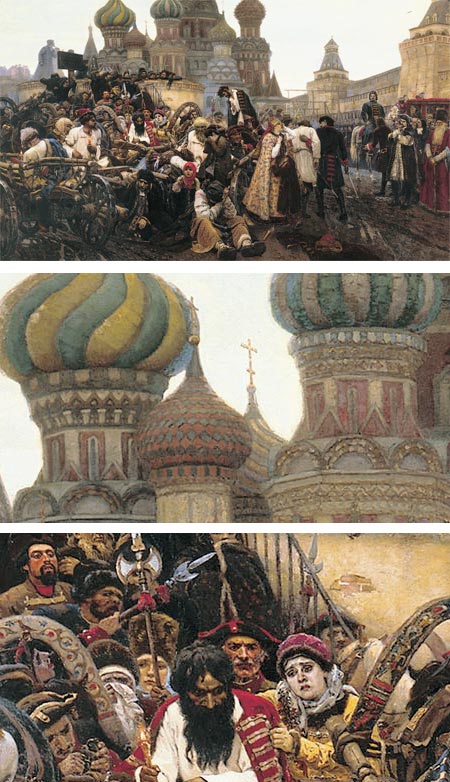
Vasily Surikov (Wassilij Iwanowitsch Surikow) was probably the foremost history painter in Russia. He was active in the late 19th and early 20th centuries.Born into a Cossack family in Krasnoyarsk, Siberia, he studied at the Imperial Academy of Arts in St. Petersburg. Garnering awards and acclaim for his paintings, Surikov moved to Moscow, where he became friends with noted Russian artist Ilya Repin, and along with him, Ivan Kramskoy and others became an exhibitor in the traveling exhibitions by the Peredvizhniki (the Itenerants), a group of painters who chose to distance themselves from the Russian Academy.
Surikov lent his brush to the portrayal of great Russian historical tragedies, political upheavals and the deaths of leaders and political figures, as in Morning of the Execution of the Streltsy by Tsar Peter I (image above, with details).
Surikov would spend months or years gathering background information, costuming details and biographical studies; and producing multiple preliminary sketches to create his large scale historical works. He also often painted the same scene in differing sizes, either as a preliminary or as a variation on a larger or smaller version.
He also produced many individual portraits, landscapes and watercolors.
There is an official (I think) web site in Russian, but the links across the top are to galleries easily accessible to non-Russian speakers.
Categories:
-
Bob Peak
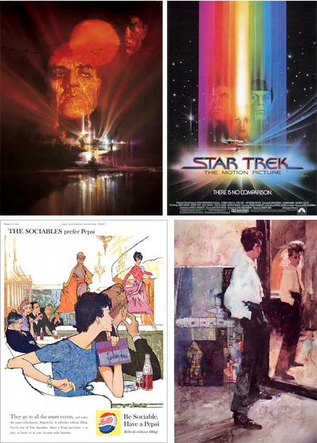
Influential illustrator Bob Peak had an impact a generation of illustrators and helped define the design and format of modern movie posters.Active in the middle of the 20th Century, Peak transformed movie posters from staid photographic collages or glamour shots to expressive excursions into a variety of design directions, from detailed rendering to spare graphics to freeform watermedia.
Peak did over 100 movie posters, starting with West Side Story in 1961, and created many memorable posts for movies like Apocalypse Now (above, top left), and the original Star Trek: The Motion Picture.
He also had a number of commercial clients and did editorial illustration for a variety of magazines, including a series of highly regarded covers for Time magazine and TV Guide. In addition he did artwork for gallery display, such as his portrait of Expressionist painter Egon Schiele (above, lower right).
The Society of Illustrators elected him to the Hall of Fame in 1977. Peak also taught at his own school, the Art Students League and Famous Artists School.
Peak’s methods were as varied as his graphic approach, utilizing, oil, acrylic, charcoal and mixtures of them. He chose colors, textures and design approaches that he felt appropriate for the subject.
Bob peak’s son Matthew Peak is also an artist and designer and poster artist of note, and maintains a web site devoted to his father’s work with extensive galleries. [Note: see addendum below.] There is also an official site. Leif Peng has a nice set of Bob Peak illustrations on his Flickr set.
Gallery Nucleus in Southern California is hosting a major retrospective of Peak’s work titled Bob Peak: Father of The Modern Hollywood Poster. The show runs until June 25, 2009.
[Addendum, 12/21/10: The pages on the Matthew Peak site are no longer being maintained. Instead, see the Sanguin Fine Art Gallery, also maintained by Matthew Peak, where you will find Bob Peak’s work in various categories: drawing, illustrations, paintings and pastels, though they are mixed in with three other artists. You can also choose “Bob Peak” in the footer of the page and see a text list of work titles.]
Categories:
-
Ben Aronson

Two things strike me about painter Ben Aronson’s work, geometry and edges.The geometry is often prominent, as in his cityscapes and interiors, arrayed not only in the patterns of their own geometric intersections, but in the slashing diagonals of shafts of light and dark, punctuated with floating solids of sun and shadow.
Aronson’s edges, on the other hand, are often subdued, softened and blurred so they are simultaneously clear and indefinite. You know without question that two shapes meet with an edge, you just don’t quite know where. This is most evident in his figurative work; though even here he places his figures within geometrically complex interiors.
These elements combine with even more subtlety in is contemplative still life subjects, often simple arrangements of flowers in a glass, that are little marvels of light, shadow, shapes and playful edges.
Aronson was born into an artistic family, both of his parents active as painters, and his father a well known teacher, as well as inheriting a lineage from his great grandmother who was a painter and illustrator.
In addition to his family influence, and his study with painters like Phillip Guston and James Weeks at Boston University, Aronson takes inspiration from artists both traditional and modernist. His work is represented in a number of museums and private collections.
[Via Painting Perceptions]
Categories:
-
Winona Nelson

Concept artist and illustrator Winona Nelson attended the Conceptart.org Atelier, and currently works for Planet Moon Studios.She previously worked for Flagship Studios in Hellgate London and has done work for Wizards of the Coast, Platinum Studios and others.
In addition to her concept art, character and object design and illustration, Nelson also does some comics work.
Her web site has example from various categories, but particularly of interest is the “Fine Art” section which includes some very nice figure drawings, cast drawings and portraits, including the self-portrait above, lower left.
Nelson also maintains a blog on which she posts sketches, finished paintings and works in progress; and discusses her ongoing and upcoming projects.
[Via Marc Taro Holmes (see my post on Marc Taro Holmes)]
Categories:


Charley’s Picks
Bookshop.org
(Bookshop.org affilliate links; sales benefit independent bookshop owners; I get a small percentage to help support my work on Lines and Colors)

John Singer Sargent: Watercolors


Urban Sketching: Understanding Perspective


Charley’s Picks
Amazon
(Amazon.com affiliate links; sales go to a larger yacht for Jeff Bezos; but I get a small percentage to help support my work on Lines and Colors)
John Singer Sargent: Watercolors
Urban Sketching: Understanding Perspective