
Categories
- 3d CGI
- Amusements
- Animation
- Anime & Manga
- Art Materials
- Art Videos
- Blogroll
- Cartoons
- Color
- Comics
- Concept & Visual Dev.
- Creativity
- Digital Art
- Digital Painting
- Displaying Art on the Web
- Drawing
- Eye Candy for Today
- Gallery and Museum Art
- High-res Art Images
- Illustration
- Motion Graphics & Flash
- Museums
- Online Museums
- Outsider Art
- Painting
- Painting a Day
- Paleo Art
- Pastel, Conté & Chalk
- Pen & Ink
- Prints and Printmaking
- Reviews
- Sc-fi and Fantasy
- Sculpture & Dimensional
- Site Comments
- Sketching
- Storyboards
- Tools and Techniques
- Uncategorized
- Vector Art
- Videos & Podcasts
- Vision and Optics
- Watercolor and Gouache
- Webcomics
Archives
- May 2026
- April 2026
- March 2026
- February 2026
- January 2026
- December 2025
- November 2025
- October 2025
- September 2025
- August 2025
- July 2025
- June 2025
- May 2025
- January 2025
- December 2024
- November 2024
- October 2024
- September 2024
- August 2024
- June 2024
- April 2024
- March 2024
- February 2024
- January 2024
- December 2023
- November 2023
- October 2023
- September 2023
- August 2023
- July 2023
- May 2023
- April 2023
- March 2023
- February 2023
- January 2023
- December 2022
- November 2022
- September 2022
- August 2022
- July 2022
- June 2022
- May 2022
- April 2022
- March 2022
- February 2022
- January 2022
- December 2021
- November 2021
- October 2021
- September 2021
- August 2021
- July 2021
- June 2021
- May 2021
- April 2021
- March 2021
- February 2021
- January 2021
- December 2020
- November 2020
- October 2020
- September 2020
- August 2020
- July 2020
- June 2020
- May 2020
- April 2020
- March 2020
- February 2020
- January 2020
- December 2019
- November 2019
- October 2019
- September 2019
- August 2019
- July 2019
- June 2019
- May 2019
- April 2019
- March 2019
- February 2019
- January 2019
- December 2018
- November 2018
- October 2018
- September 2018
- August 2018
- July 2018
- June 2018
- May 2018
- April 2018
- March 2018
- February 2018
- January 2018
- December 2017
- November 2017
- October 2017
- September 2017
- August 2017
- July 2017
- June 2017
- May 2017
- April 2017
- March 2017
- February 2017
- January 2017
- December 2016
- November 2016
- October 2016
- September 2016
- August 2016
- July 2016
- June 2016
- May 2016
- April 2016
- March 2016
- February 2016
- January 2016
- December 2015
- November 2015
- October 2015
- September 2015
- August 2015
- July 2015
- June 2015
- May 2015
- April 2015
- March 2015
- February 2015
- January 2015
- December 2014
- November 2014
- October 2014
- September 2014
- August 2014
- July 2014
- June 2014
- May 2014
- April 2014
- March 2014
- February 2014
- January 2014
- December 2013
- November 2013
- October 2013
- September 2013
- August 2013
- July 2013
- June 2013
- May 2013
- April 2013
- March 2013
- February 2013
- January 2013
- December 2012
- November 2012
- October 2012
- September 2012
- August 2012
- July 2012
- June 2012
- May 2012
- April 2012
- March 2012
- February 2012
- January 2012
- December 2011
- November 2011
- October 2011
- September 2011
- August 2011
- July 2011
- June 2011
- May 2011
- April 2011
- March 2011
- February 2011
- January 2011
- December 2010
- November 2010
- October 2010
- September 2010
- August 2010
- July 2010
- June 2010
- May 2010
- April 2010
- March 2010
- February 2010
- January 2010
- December 2009
- November 2009
- October 2009
- September 2009
- August 2009
- July 2009
- June 2009
- May 2009
- April 2009
- March 2009
- February 2009
- January 2009
- December 2008
- November 2008
- October 2008
- September 2008
- August 2008
- July 2008
- June 2008
- May 2008
- April 2008
- March 2008
- February 2008
- January 2008
- December 2007
- November 2007
- October 2007
- September 2007
- August 2007
- July 2007
- June 2007
- May 2007
- April 2007
- March 2007
- February 2007
- January 2007
- December 2006
- November 2006
- October 2006
- September 2006
- August 2006
- July 2006
- June 2006
- May 2006
- April 2006
- March 2006
- February 2006
- January 2006
- December 2005
- November 2005
- October 2005
- September 2005
- August 2005
Relevant Blogs
Art, Painting & Sketch
- Gurney Journey
- Underpaintings
- Art and Influence
- Painting Perceptions
- Oil Painters of America
- Vasari Paint POV
- Flying Fox
- Urban Sketchers
- Bento (Smithsonian)
- Art Inconnu
- The Hidden Place
- Still Life
- Making a Mark
- The Art of the Landscape
- Exploring Color & Creativity
- Art Contrarian
- Artist A Day
- beinArt Surreal Art Collective
- Eye Level
- David Dunlop
- p.i.g.m.e.n.t.i.u.m
- CultureGrrl
- Joaquín Sorolla blog
- Artists in Pastel
“Painting a Day”
- A Painting a Day (Keiser)
- On Painting (Keiser)
- Julian Merrow-Smith
- Karen Jurick
- Jeffrey Hayes
- Carol Marine
- Abbey Ryan
- Daily Paintworks
Other Painting Blogs
- Virtual Gouache Land
- Neil Hollingsworth
- Marc Hanson
- Kevin Menck
- Marc Dalessio
- Larry Seiler
- Stapleton Kearns
- Colin Page
- Roos Schuring
- Hans Versfelt
- Titus Meeuws
- Régis Pettinari
- René Plein Air
- Belinda Del Pesco
- Robin Weiss
- Nathan Fowkes (Land Sketch)
- William Wray
- Frank Serrano
- Stephen Magsig
- Michael Chesley Johnson
- Twice a Week
- Sarah Wimperis
- Rob Adams
- Michael Cole Manley
- The Dirty Palette Club
- Mike Manley’s Draw!
Gallery Art & Illustration mix
Illustration
- Howard Pyle
- 100 Years of Illustration
- BibliOdyssey
- Illustration Art
- Today’s Inspiration
- Illustration Mundo
- Little Chimp Society
- Danny Gregory
- R D (John Martz
- Illustration Friday blog
- Monster Brains
- Illustrators & Illustrations (RU)
- Elwood H. Smith
- DaniDraws.com
- Designers Who Blog
- iSpot Blog
Sci-Fi & Fantasy
Illustration & Comics
Comics & Cartoons
- Comics Beat
- Robot 6
- Newsarama Blog
- Comic Vine
- Comics Alliance
- Forbidden Planet Int.
- Paolo Rivera
- Bolt City
- Flight
- Scott McCloud
- The Comics Journal
- Comixpedia
- Funnybook Babylon
- James Baker
- Middleton’s Sketchbook
- Boneville
- The Hotel Fred
- Paul Rivoche
- Daily Cartoonist
- Mad About Cartoons (William Wray)
- Digital Strips
Illustration & Concept
Animation & Concept
- Cartoon Brew
- Animation Blog
- Cold Hard Flash
- Concept Art World
- The CAB
- FY Concept Art
- Concept Ships
- Concept Robots
- John Nevarez
- Armand Serrano
- Marcos Mateu-Mestre
- all kinds of stuff (Kricfalusi)
- Yacin the faun (Man Arenas)
- Kelsey Mann
- Cre8tivemarks Blog
- Ice-Cream Monster Toon Cafe
- AAU Character & Creature Design
- AAU Animation Notes
- Articles and Texticles
Paleo & Scientific
Tools & Techniques
Other
Lists of Art Blogs
Art Image Resource Links
Historic Art Images
- Wikimedia Commons: Paintings
- Wikimedia Commons: Drawings
- The Athenaeum
- WikiArt (WikiPaintings)
- Google Art Project: Artists
- Google Art Project: Collections (Museums)
- ArtCyclopedia
- Web Gallery of Art
- Art Renewal Center
- Web Gallery of Impressionism
Auction Consolidation sites
Auction sites
- Sotheby’s
- Bonham’s
- Christies
- Heritage Auctions: Fine Art
- Heritage Auctions: Illustration
- Freeman’s Auctions
- Bukowskis
- Shannon’s
Image Search
Reverse Image Search (search by image)
- Tin Eye
- RevImg
- Google Image Search (camera icon)
- Bing Image Search (camera icon)
Promoting some friends and some clients of my website design business
- Twin Willows T’ai Chi studio in Wilmington DE. Taiji classes with Bryan Davis.
- Ray Hayward, Inspired Teacher of T’ai Chi ( Taiji ) in Minneapolis, Founder of Mindful Motion Tai Chi Academy
- OldHead Tattoo studio and Art Gallery in Wilmington DE. Tattoos and paintings by Bruce Gulick
- Sharon Domenico Art, pet portrait oil paintings
- Platinum Paperhanging, wallpaper hanging, Main Line and Philadelphia, PA
- Lisa Stone Design, interior designer, Main Line and Philadelphia, PA
- Studio12KPT, original art, prints, calendars and other custom printed items by Van Sickle & Rolleri
-
Arthur Rackham

British book illustrator Arthur Rackham, who was active from the late 1800’s to the 1930’s, was one of the all time great illustrators and one of my favorites. He was particularly noted for his illustrations of children’s books. Whatever he tackled, Fairy Tales of the Brothers Grimm, Rip van Winkle, The Wind in the Willows, Peter Pan in Kensington Gardens…, Rackham would own it. His unique vision and amazingly strong images became an integral part of the experience of reading the story.Of the many artists who have tried to illustrate Alice in Wonderland in the footsteps of the amazing Sir John Tenniel, Rackham is the only artist I can think who doesn’t disappear into Tenniel’s shadow like a Cheshire Cat fading into the gloom.
Rackham’s fairy tale worlds are sometimes steeped in gloom and mystery. His misty forests are inhabited by elves and goblins peering about twisted roots, massive gnarled trees, mushrooms, ferns and sinuous, tangled undergrowth. I think his fairy tale illustrations were one of the main starting points for modern fantasy illustration, influencing artists like Frank Frazetta and Roy Krenkel and the generations of fantasy artists behind them.
Rackham was a deft pen and ink artist and most of his paintings started as pen and ink drawings into which he worked layer after layer of transparent watercolor glaze, a painstaking method associated more with classical painting than modern illustration.
The Arthur Rackham Society site has a good selection of links to Rackham’s illustrations online (pop-up warning: Angelfire hosted site).
There is a nice selection of images from J.M. Barrie’s Peter Pan in Kensington Gardens here.
There are complete facsimiles of his illustrated versions of Aesop’s Fables and English Fairy Tales available online as part of Project Gutenberg. (For the quickest view of the material, go to the “Format” section, choose “HTML”, Compression: “None” and look to the index of illustrations.)
Here is a beautiful set of Rackham’s Alice in Wonderland illustrations courtesy of good ol’ Doc Ozone.
The link I’m suggesting below is to a nice broad cross-section of Rackham’s work on the Art Passions site.
Categories:
-
Mark Goerner
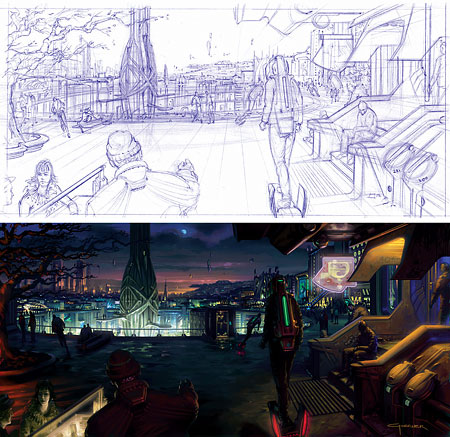
Concept artist Mark Goerner has done conceptual illustrations for props, sets and environments for films like Minority Report, Constantine, X-men 2 and The Terminal, as well as upcoming films like the new Superman and Battle Angel Alita (for James Cameron).Goerner’s site contains concept art from many of those movies as well as some of his other professional work and even some of his student work. The Superman section is interesting in particular because it showcases sketches and alternate versions as well as some of the finished design renderings. The “Student Work” section has an interesting variety of work, including product design, sketches and figure drawing.
His sleek futuristic designs remind me a bit of master concept artist Syd Mead (who I profiled in last November).
Goerner has done three training CDs for the Gnomon Workshop, for whom he is in instructor. There is an additional gallery of his work on the Gnomon Workshop site (images above). There is also an illustrated interview with Goerner on the CG Channel.
Categories:
-
Kawase Hasui
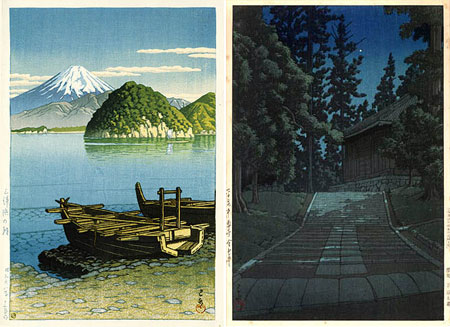
Kawase Hasui was a Japanese printmaker, active in the first half of the 20th century, who created wonderfully subtle and entrancingly beautiful woodblock prints of landscape scenes.His images were sometimes brimming with light and the brilliant colors of Spring or Autumn at other times almost monochromatic, depicting scenes at night, twilight or in the rain or fog.
He had a fascination with the play of light and shadow, the subtle patterns of dappled sunlight or moonlight, and the strange highlights created by late morning or early evening sun. He also often composed his scenes near water, adding reflections to his fascination with light.
Even though there is no overt similarity, I feel like he has a kinship with the impressionists in his pursuit of the qualities of light and the visual characteristics of the natural world. He sometimes created multiple images of the same scene at different times of the day or in different seasons, much as Monet did.
At times he takes a solid outline filled with color approach that is suggestive of comic book art. At the other end of his stylistic range, his linework is minimal and almost overpowered by the colored inks. He traveled extensively in Japan making watercolor sketches of his subjects and many of his prints have a watercolor feel to them.
The site linked below is to the listing about Hasui on the Hanga Gallery site. The gallery site contains a remarkably complete representation of his work, containing images of almost all of his nearly 600 extant prints, arranged by publisher and year or by series. I’m particularly fond of his work from the 1940’s.
There is also a nice gallery here, with click-through navigation and a good article about Hasui here.
Link via Illustrated Ideas.
Categories:
-
Electric Sheep Comix (Patrick Farley)

Electric Sheep Comix is a blanket title for a site featuring several webcomics by Patrick Farley. (“Electric Sheep” comes from the title of the Phillip K. Dick novel, Do androids Dream of Electric Sheep, from which the movie Blade Runner was adapted.) Electric Sheep Comix includes three main comics and several older ones. Some of them are drawn traditionally (ink on paper) and some use various digital image creation techniques. Some of the comics are augmented with bits of animation, (something that comics purists seem to object to, but I obviously don’t since I’ve always done it with my own webcomic).Delta Thrives: set the controls for the heart of the sun (image above) is my favorite, a sci-fi short story done with images created in Poser and Bryce and then heavily manipulated and digitally painted in Photoshop. The comic is read in a long horizontal scroll, a format I’m normally not fond of, but Farley uses it to advantage here as his panels and background elements blend continuously into a horizontal band, creating the effect of one continuous graphic.
The Spiders is a much longer, traditionally drawn sci-fi comic about an alternate war in Afganastan, and Apocamon is “the manga version of the New Testament Book of Revelation”.
There is also a assortment of older, usually shorter, works, as well as a prologue for a new strip called Mother of all Bombs that is reachable only from the home page, not from the table of contents. I’m unsure of how recently the site has been updated. I do know that the site depends on donations to keep going; there are PayPal and BitPass links to make it easy to make a small donation. (I used BitPass, which also allows you to access or donate to a number of other online comics).
Note: the material contains nudity, sexual references, strong language and violence. Avoid it if you’re likely to be offended.
Categories:
-
Mark Hallett

One of the most difficult challenges in paleontological illustration is making it naturalistic. That sounds like a contradiction. Dinosaur art is, after all, natural history illustration; but by naturalistic I mean that the animals need to look like they could really be alive. They need to stand and move like real animals.It’s one thing to do that in paintings and drawings of modern animals, for which there are living examples and photographic reference; it’s quite another thing for animals that have been extinct for millions of years and must be painstakingly reconstructed from the evidence of fossilized bone and a knowledge of animal anatomy.
Paleo artist Mark Hallett has been doing it superbly for over 30 years. His giant sauropods look as though they should walk right past you, as if you should feel their footsteps vibrate the ground under your own feet. His Staurikosaurus and Compsognathus look as if they should dart out from the bushes as quickly as a bird.
Hallet’s work has been in major publications like National Geographic, Smithsonian, Natural History and Life magazine. His paintings have been on view in museums in the US, Europe, Australia and Japan.
Hallett’s site doesn’t have nearly enough of his art for you to get a real feeling for the scope and richness of his work. Consider the site a taste and look for some of the books he’s illustrated, some on dinosaurs, like “Seismosaurus”, with writer David Gillette (image above), and some in the series on prehistoric mammals with writer Barbara Hehner: “Ice Age Sabertooth : The Most Ferocious Cat That Ever Lived” , “Ice Age Mammoth : Will This Ancient Giant Come Back to Life?” and “Ice Age Cave Bear : The Giant Beast That Terrified Ancient Humans”.
Categories:
-
Felice Varini
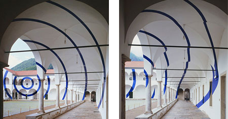
 Felice Varini is an artist who paints on or in architectural elements in a way that creates the illusion of a flat pattern or object where one does not actually exist.
The illusion is visible only from one specific angle; when viewed from other points, you can see the fascinating series of markings that make up the piece. He paints on the outside of buildings, inside of rooms, in corridors, across walls, skylights, doors and archways, often creating the illusion of a physical object in space in the middle of an open area. His patterns are frequently optical patterns themselves, creating a sensation of Op Art by way of Christo.
At first it looks as if the pattern might be Photoshopped onto the image until you see the views from other perspectives; then the remarkable finesse with which Varini has created his patterned spaces becomes apparent. This work in particular is remarkable for it’s scale (not quite Christo scale, but pretty amazing nonetheless) in which he creates his illusory pattern across the space of a city street using painted markings on multiple buildings.
I learned about this from the gravestmor blog, which has a brief overview with a few sets of images. The Felice Varini site itself is harder to navigate, but worth the trouble. See my “Site Quirks” notes below.
Link via gravestmor.
Categories:


Charley’s Picks
Bookshop.org
(Bookshop.org affilliate links; sales benefit independent bookshop owners; I get a small percentage to help support my work on Lines and Colors)

John Singer Sargent: Watercolors


Urban Sketching: Understanding Perspective


Charley’s Picks
Amazon
(Amazon.com affiliate links; sales go to a larger yacht for Jeff Bezos; but I get a small percentage to help support my work on Lines and Colors)
John Singer Sargent: Watercolors
Urban Sketching: Understanding Perspective