
Categories
- 3d CGI
- Amusements
- Animation
- Anime & Manga
- Art Materials
- Art Videos
- Blogroll
- Cartoons
- Color
- Comics
- Concept & Visual Dev.
- Creativity
- Digital Art
- Digital Painting
- Displaying Art on the Web
- Drawing
- Eye Candy for Today
- Gallery and Museum Art
- High-res Art Images
- Illustration
- Motion Graphics & Flash
- Museums
- Online Museums
- Outsider Art
- Painting
- Painting a Day
- Paleo Art
- Pastel, Conté & Chalk
- Pen & Ink
- Prints and Printmaking
- Reviews
- Sc-fi and Fantasy
- Sculpture & Dimensional
- Site Comments
- Sketching
- Storyboards
- Tools and Techniques
- Uncategorized
- Vector Art
- Videos & Podcasts
- Vision and Optics
- Watercolor and Gouache
- Webcomics
Archives
- May 2026
- April 2026
- March 2026
- February 2026
- January 2026
- December 2025
- November 2025
- October 2025
- September 2025
- August 2025
- July 2025
- June 2025
- May 2025
- January 2025
- December 2024
- November 2024
- October 2024
- September 2024
- August 2024
- June 2024
- April 2024
- March 2024
- February 2024
- January 2024
- December 2023
- November 2023
- October 2023
- September 2023
- August 2023
- July 2023
- May 2023
- April 2023
- March 2023
- February 2023
- January 2023
- December 2022
- November 2022
- September 2022
- August 2022
- July 2022
- June 2022
- May 2022
- April 2022
- March 2022
- February 2022
- January 2022
- December 2021
- November 2021
- October 2021
- September 2021
- August 2021
- July 2021
- June 2021
- May 2021
- April 2021
- March 2021
- February 2021
- January 2021
- December 2020
- November 2020
- October 2020
- September 2020
- August 2020
- July 2020
- June 2020
- May 2020
- April 2020
- March 2020
- February 2020
- January 2020
- December 2019
- November 2019
- October 2019
- September 2019
- August 2019
- July 2019
- June 2019
- May 2019
- April 2019
- March 2019
- February 2019
- January 2019
- December 2018
- November 2018
- October 2018
- September 2018
- August 2018
- July 2018
- June 2018
- May 2018
- April 2018
- March 2018
- February 2018
- January 2018
- December 2017
- November 2017
- October 2017
- September 2017
- August 2017
- July 2017
- June 2017
- May 2017
- April 2017
- March 2017
- February 2017
- January 2017
- December 2016
- November 2016
- October 2016
- September 2016
- August 2016
- July 2016
- June 2016
- May 2016
- April 2016
- March 2016
- February 2016
- January 2016
- December 2015
- November 2015
- October 2015
- September 2015
- August 2015
- July 2015
- June 2015
- May 2015
- April 2015
- March 2015
- February 2015
- January 2015
- December 2014
- November 2014
- October 2014
- September 2014
- August 2014
- July 2014
- June 2014
- May 2014
- April 2014
- March 2014
- February 2014
- January 2014
- December 2013
- November 2013
- October 2013
- September 2013
- August 2013
- July 2013
- June 2013
- May 2013
- April 2013
- March 2013
- February 2013
- January 2013
- December 2012
- November 2012
- October 2012
- September 2012
- August 2012
- July 2012
- June 2012
- May 2012
- April 2012
- March 2012
- February 2012
- January 2012
- December 2011
- November 2011
- October 2011
- September 2011
- August 2011
- July 2011
- June 2011
- May 2011
- April 2011
- March 2011
- February 2011
- January 2011
- December 2010
- November 2010
- October 2010
- September 2010
- August 2010
- July 2010
- June 2010
- May 2010
- April 2010
- March 2010
- February 2010
- January 2010
- December 2009
- November 2009
- October 2009
- September 2009
- August 2009
- July 2009
- June 2009
- May 2009
- April 2009
- March 2009
- February 2009
- January 2009
- December 2008
- November 2008
- October 2008
- September 2008
- August 2008
- July 2008
- June 2008
- May 2008
- April 2008
- March 2008
- February 2008
- January 2008
- December 2007
- November 2007
- October 2007
- September 2007
- August 2007
- July 2007
- June 2007
- May 2007
- April 2007
- March 2007
- February 2007
- January 2007
- December 2006
- November 2006
- October 2006
- September 2006
- August 2006
- July 2006
- June 2006
- May 2006
- April 2006
- March 2006
- February 2006
- January 2006
- December 2005
- November 2005
- October 2005
- September 2005
- August 2005
Relevant Blogs
Art, Painting & Sketch
- Gurney Journey
- Underpaintings
- Art and Influence
- Painting Perceptions
- Oil Painters of America
- Vasari Paint POV
- Flying Fox
- Urban Sketchers
- Bento (Smithsonian)
- Art Inconnu
- The Hidden Place
- Still Life
- Making a Mark
- The Art of the Landscape
- Exploring Color & Creativity
- Art Contrarian
- Artist A Day
- beinArt Surreal Art Collective
- Eye Level
- David Dunlop
- p.i.g.m.e.n.t.i.u.m
- CultureGrrl
- Joaquín Sorolla blog
- Artists in Pastel
“Painting a Day”
- A Painting a Day (Keiser)
- On Painting (Keiser)
- Julian Merrow-Smith
- Karen Jurick
- Jeffrey Hayes
- Carol Marine
- Abbey Ryan
- Daily Paintworks
Other Painting Blogs
- Virtual Gouache Land
- Neil Hollingsworth
- Marc Hanson
- Kevin Menck
- Marc Dalessio
- Larry Seiler
- Stapleton Kearns
- Colin Page
- Roos Schuring
- Hans Versfelt
- Titus Meeuws
- Régis Pettinari
- René Plein Air
- Belinda Del Pesco
- Robin Weiss
- Nathan Fowkes (Land Sketch)
- William Wray
- Frank Serrano
- Stephen Magsig
- Michael Chesley Johnson
- Twice a Week
- Sarah Wimperis
- Rob Adams
- Michael Cole Manley
- The Dirty Palette Club
- Mike Manley’s Draw!
Gallery Art & Illustration mix
Illustration
- Howard Pyle
- 100 Years of Illustration
- BibliOdyssey
- Illustration Art
- Today’s Inspiration
- Illustration Mundo
- Little Chimp Society
- Danny Gregory
- R D (John Martz
- Illustration Friday blog
- Monster Brains
- Illustrators & Illustrations (RU)
- Elwood H. Smith
- DaniDraws.com
- Designers Who Blog
- iSpot Blog
Sci-Fi & Fantasy
Illustration & Comics
Comics & Cartoons
- Comics Beat
- Robot 6
- Newsarama Blog
- Comic Vine
- Comics Alliance
- Forbidden Planet Int.
- Paolo Rivera
- Bolt City
- Flight
- Scott McCloud
- The Comics Journal
- Comixpedia
- Funnybook Babylon
- James Baker
- Middleton’s Sketchbook
- Boneville
- The Hotel Fred
- Paul Rivoche
- Daily Cartoonist
- Mad About Cartoons (William Wray)
- Digital Strips
Illustration & Concept
Animation & Concept
- Cartoon Brew
- Animation Blog
- Cold Hard Flash
- Concept Art World
- The CAB
- FY Concept Art
- Concept Ships
- Concept Robots
- John Nevarez
- Armand Serrano
- Marcos Mateu-Mestre
- all kinds of stuff (Kricfalusi)
- Yacin the faun (Man Arenas)
- Kelsey Mann
- Cre8tivemarks Blog
- Ice-Cream Monster Toon Cafe
- AAU Character & Creature Design
- AAU Animation Notes
- Articles and Texticles
Paleo & Scientific
Tools & Techniques
Other
Lists of Art Blogs
Art Image Resource Links
Historic Art Images
- Wikimedia Commons: Paintings
- Wikimedia Commons: Drawings
- The Athenaeum
- WikiArt (WikiPaintings)
- Google Art Project: Artists
- Google Art Project: Collections (Museums)
- ArtCyclopedia
- Web Gallery of Art
- Art Renewal Center
- Web Gallery of Impressionism
Auction Consolidation sites
Auction sites
- Sotheby’s
- Bonham’s
- Christies
- Heritage Auctions: Fine Art
- Heritage Auctions: Illustration
- Freeman’s Auctions
- Bukowskis
- Shannon’s
Image Search
Reverse Image Search (search by image)
- Tin Eye
- RevImg
- Google Image Search (camera icon)
- Bing Image Search (camera icon)
Promoting some friends and some clients of my website design business
- Twin Willows T’ai Chi studio in Wilmington DE. Taiji classes with Bryan Davis.
- Ray Hayward, Inspired Teacher of T’ai Chi ( Taiji ) in Minneapolis, Founder of Mindful Motion Tai Chi Academy
- OldHead Tattoo studio and Art Gallery in Wilmington DE. Tattoos and paintings by Bruce Gulick
- Sharon Domenico Art, pet portrait oil paintings
- Platinum Paperhanging, wallpaper hanging, Main Line and Philadelphia, PA
- Lisa Stone Design, interior designer, Main Line and Philadelphia, PA
- Studio12KPT, original art, prints, calendars and other custom printed items by Van Sickle & Rolleri
-
Shy the Sun (update)
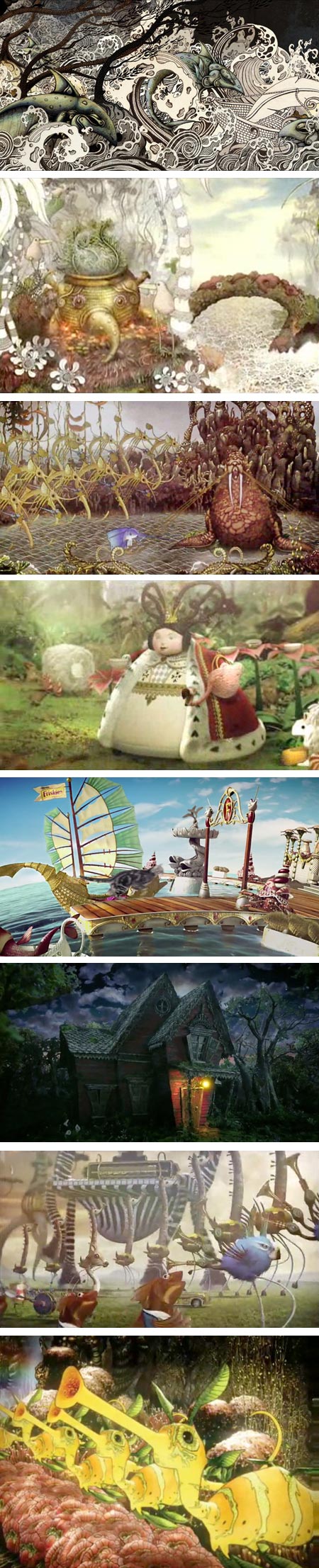
Back in 2006 I noticed the delightfully idiosyncratic work of a South African artist and illustrator named Ree Treweek (images above, top).In the time since, I have followed with fascination as Treweek and her partners Jannes Hendrikz and Marcus Smit, collectively known as The Blackheart Gang, produced a strikingly original and truly strange animation titled The Tale of How (above, 2nd down), which brought them to international attention, and leveraged that notice into a successful production company for animated commercial spots called Shy the Sun.
Shy the Sun produced a stunningly bizarre commercial called Sea Orchestra (above, 3rd down) for United Airlines (which was experimenting with exceptionally creative ad spots, like Jamie Caliri’s Dragon).
After that, I found a commercial not shown here in the U.S. that put their eccentric talents in service of selling Bakers Precious Biscuits (above, 4th down).
It was in the latter ad that I think they added to their techniques of combining hand drawings with computer coloring and compositing an additional animation style incorporating miniature models and sets. This approach has been very successful for them and they have utilized both approaches, as well as traditional CGI, in a series of terrific spots and promotions, some well known, others more obscure.
If you’ve ever wondered, as I did initially, who created the psychedelic cat food commercial, Friskies Adventureland (above, 5th down), it was Shy the Sun.
They applied their miniature set skills to ads for the South African subscription TV service Mnet in Ladybug and Firefly (above, 3rd from bottom). More traditional CGI seems to have been the choice for the darker ads for Electronic Arts’ game Alice: Madness Returns.
Treweek has been art director on most of the projects and co-director on some. She also contributed character design to the bizarre creatures seen at the end of Pete Candeland and Passion Pictures’ wild promo for Harmonix “The Beatles Rock Band” (above, 2nd from bottom).
My slightly blurry screen captures don’t begin to tell you what these animations look like in motion, particularly The Tale of How and Sea Orchestra.
There are now also videos available on The Making of The Tale of How, The Making of Sea Orchestra (above, bottom) and The Making of Bakers.
I’m looking forward to whatever projects they take on, as their work continues to be imaginative and original.
Now, if only someone would give them a big pile of money to do a feature length animation…
Categories:
-
David Gray

David Gray paints elegant, refined still life paintings and beautifully realized portraits in the classical realist tradition.In both his portraits and still life paintings, he evokes a feeling of stillness and contemplation, though in the portraits that feeling is often pierced by the quiet but intense aliveness projected by his subjects.
Similarly, Gray works with muted, limited palettes that are often punctuated by a single intense color. That kind of duality, in color, in emotional tone, in light and dark, and in the compositional contrasts of form and negative space that define his compositions, seems to pervade his work.
Many of his portraits are part of a series in which he explores a fascination with head wraps, and the contrasts of folded cloth against smooth skin. Though I was immediately drawn to a portrait of his daughter that seems very Vermeer-like, echoing the pose and colors from Girl With a Pearl Earring (images above, second down), Gray states that Vermeer was not in his mind when he composed and painted the piece; and that he takes his inspiration for figure and portrait painting most prominently from Jean-Auguste Dominique Ingres.
Gray was a finalist in the Figurative Category in the ARC 2009-2010 Salon (larger image here), and was an invited artist in the 2010 American Art Invitational.
David Gray is the subject of a featured article in the March 2011 issue of Southwest Art magazine. The online version of the article, which also includes a gallery of Gray’s work, can be read here.
Categories:
-
Manabu Ikeda

Though I doubt they were intended to be so, the striking works of Japanese artist Manabu Ikeda, seen at this juncture, can seem chillingly prophetic.The structures, shapes and waves of objects in his work are portrayed as enormous in scale, as revealed by the astonishingly complex textural elements of countless smaller items of which they are composed.
His works are large and created in pen ink and acrylic on paper mounted on board. The level of detail is striking, even though it is just hinted at in the images available on the web.
Ikeda was born in Saga and is now based in Tokyo. He studied at the Tokyo National University of Fine Arts and Music.
He is represented by the Mizuma Art Gallery, which has a selection of his work online. He doesn’t seem to have a dedicated web presence of his own (or else I don’t know how to find it as a Japanese language website).
The largest images I’ve been able to find are on Art Inconnu (click for larger versions). I’ve listed some articles and other resources below.
Ikeda is represented in the group exhibition now at the Japan Society in New York, Bye Bye Kitty!!! Between Heaven and Hell in Contemporary Japanese Art, which runs until June 12, 2011.
[Via Art Daily]
Categories:
-
Duane Keiser’s Peel

I just love this.Back in December of 2004, Virginia based painter and teacher Duane Keiser originated the phenomenon that has come to be known as “painting a day“, in which painter/bloggers paint a small work and post it to a blog each day.
He painted a small painting everyday for about two years, and has since then painted his small works on a varied schedule, but has maintained a strong painting practice.
Keiser has a wonderful recent post on his blog, a short time-lapse video called Peel, in which he paints a tangerine, peels it partway, repaints it on the same panel, peels it some more, repaints it again, sections it, paints it again, reduces it to a single section and paints it again. Wonderful!
You can view the video on Keiser’s site, or on YouTube somewhat larger.
You can see the finished painting here. As of this writing, the painting is up for bid on eBay.
To me, this is not just a fun and novel painting demo, it’s also a vivid demonstration of the real rewards of a dedicated painting regimen.
The accumulated years of frequent practice grant him the skill with eye, hand and materials to not only repaint his subject multiple times on the same canvas, passing up multiple opportunities to say “finished”, but to consider an experiment like this in the first place, in which painting is the point, rather than a painting.
[Via MetaFilter]
Categories:
-
Mucha’s The Slav Epic
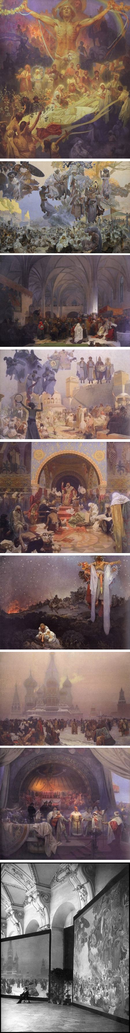
Most people who are familiar in passing with Art Nouveau artist Alphonse (Alfons) Mucha (see my recent post on Alphonse Mucha on Gallica Digital Library) are not aware of his body of work that is in a very different style.The most important and striking examples of this are a series of 20 very large canvasses called The Slav Epic, which Mucha considered the most important work of his lifetime and the culmination of his artistic career.
The paintings tell the history of Slavic people, and are housed in a castle in the small town of Moravský. There is long standing controversy about plans to bring them to Prague.
The paintings are little known outside of the Czech Republic and images of them are not readily available. There are few, if any, in most books on Mucha, though Mucha by Sarah Mucha is listed as containing some information and images on the Slav Epic paintings, even if incomplete. I haven’t seen the book myself.
There are a few scattered examples on the web, notably on the Mucha Foundation, Wikipedia and Wikimedia Commons and a complete set with commentary on the site of John Price, and an even better, larger set on the blog, A Journey Through Slavic Culture.
There is also a post on the Golden Age Comic Book Stories blog that features alternate states and preliminary photographs of some of the works.
[Golden Age Comic Book Stories link via @francisvallejo]
Categories:
-
Edward Kwong

Canadian illustrator Edward Kwong studied at the Alberta School of Art and Design in Calgary, and is now based in Montreal.Kwong takes his affection for early 20th Century art movements like Cubism, Art Deco and Futurism and mixes them in the blender of his strong graphic design sensibilities, resulting in a delightful amalgam of influence and inspiration, reference and reinvention, arrayed in his own unique compositions.
Some of his works deal in lines and flat shapes of color, others are more rendered, like his “Mythos Project” series (images above, second from the bottom); some are richly colored, others monochromatic, or rendered in a subdued range of hues.
The opening page of Kwong’s website serves as the portfolio, with choices of professional and personal work on the left. He maintains a blog in which you can see preliminary stages of portfolio pieces, as well as other works, finished or in progress.
Kwong was also a contributor to volumes 1 and 2 of The Anthology Project comics anthology (click on links for “Previews” from this page), and created the cover for the second volume (above, second down).
There is an illustrated interview with Kwong on Squidface & The Meddler.
He has a selection of prints available on inPRNT.
[Via @jonwoodward by way of @inkybat]
Categories:


Charley’s Picks
Bookshop.org
(Bookshop.org affilliate links; sales benefit independent bookshop owners; I get a small percentage to help support my work on Lines and Colors)

John Singer Sargent: Watercolors


Urban Sketching: Understanding Perspective


Charley’s Picks
Amazon
(Amazon.com affiliate links; sales go to a larger yacht for Jeff Bezos; but I get a small percentage to help support my work on Lines and Colors)
John Singer Sargent: Watercolors
Urban Sketching: Understanding Perspective