
Categories
- 3d CGI
- Amusements
- Animation
- Anime & Manga
- Art Materials
- Art Videos
- Blogroll
- Cartoons
- Color
- Comics
- Concept & Visual Dev.
- Creativity
- Digital Art
- Digital Painting
- Displaying Art on the Web
- Drawing
- Eye Candy for Today
- Gallery and Museum Art
- High-res Art Images
- Illustration
- Motion Graphics & Flash
- Museums
- Online Museums
- Outsider Art
- Painting
- Painting a Day
- Paleo Art
- Pastel, Conté & Chalk
- Pen & Ink
- Prints and Printmaking
- Reviews
- Sc-fi and Fantasy
- Sculpture & Dimensional
- Site Comments
- Sketching
- Storyboards
- Tools and Techniques
- Uncategorized
- Vector Art
- Videos & Podcasts
- Vision and Optics
- Watercolor and Gouache
- Webcomics
Archives
- May 2026
- April 2026
- March 2026
- February 2026
- January 2026
- December 2025
- November 2025
- October 2025
- September 2025
- August 2025
- July 2025
- June 2025
- May 2025
- January 2025
- December 2024
- November 2024
- October 2024
- September 2024
- August 2024
- June 2024
- April 2024
- March 2024
- February 2024
- January 2024
- December 2023
- November 2023
- October 2023
- September 2023
- August 2023
- July 2023
- May 2023
- April 2023
- March 2023
- February 2023
- January 2023
- December 2022
- November 2022
- September 2022
- August 2022
- July 2022
- June 2022
- May 2022
- April 2022
- March 2022
- February 2022
- January 2022
- December 2021
- November 2021
- October 2021
- September 2021
- August 2021
- July 2021
- June 2021
- May 2021
- April 2021
- March 2021
- February 2021
- January 2021
- December 2020
- November 2020
- October 2020
- September 2020
- August 2020
- July 2020
- June 2020
- May 2020
- April 2020
- March 2020
- February 2020
- January 2020
- December 2019
- November 2019
- October 2019
- September 2019
- August 2019
- July 2019
- June 2019
- May 2019
- April 2019
- March 2019
- February 2019
- January 2019
- December 2018
- November 2018
- October 2018
- September 2018
- August 2018
- July 2018
- June 2018
- May 2018
- April 2018
- March 2018
- February 2018
- January 2018
- December 2017
- November 2017
- October 2017
- September 2017
- August 2017
- July 2017
- June 2017
- May 2017
- April 2017
- March 2017
- February 2017
- January 2017
- December 2016
- November 2016
- October 2016
- September 2016
- August 2016
- July 2016
- June 2016
- May 2016
- April 2016
- March 2016
- February 2016
- January 2016
- December 2015
- November 2015
- October 2015
- September 2015
- August 2015
- July 2015
- June 2015
- May 2015
- April 2015
- March 2015
- February 2015
- January 2015
- December 2014
- November 2014
- October 2014
- September 2014
- August 2014
- July 2014
- June 2014
- May 2014
- April 2014
- March 2014
- February 2014
- January 2014
- December 2013
- November 2013
- October 2013
- September 2013
- August 2013
- July 2013
- June 2013
- May 2013
- April 2013
- March 2013
- February 2013
- January 2013
- December 2012
- November 2012
- October 2012
- September 2012
- August 2012
- July 2012
- June 2012
- May 2012
- April 2012
- March 2012
- February 2012
- January 2012
- December 2011
- November 2011
- October 2011
- September 2011
- August 2011
- July 2011
- June 2011
- May 2011
- April 2011
- March 2011
- February 2011
- January 2011
- December 2010
- November 2010
- October 2010
- September 2010
- August 2010
- July 2010
- June 2010
- May 2010
- April 2010
- March 2010
- February 2010
- January 2010
- December 2009
- November 2009
- October 2009
- September 2009
- August 2009
- July 2009
- June 2009
- May 2009
- April 2009
- March 2009
- February 2009
- January 2009
- December 2008
- November 2008
- October 2008
- September 2008
- August 2008
- July 2008
- June 2008
- May 2008
- April 2008
- March 2008
- February 2008
- January 2008
- December 2007
- November 2007
- October 2007
- September 2007
- August 2007
- July 2007
- June 2007
- May 2007
- April 2007
- March 2007
- February 2007
- January 2007
- December 2006
- November 2006
- October 2006
- September 2006
- August 2006
- July 2006
- June 2006
- May 2006
- April 2006
- March 2006
- February 2006
- January 2006
- December 2005
- November 2005
- October 2005
- September 2005
- August 2005
Relevant Blogs
Art, Painting & Sketch
- Gurney Journey
- Underpaintings
- Art and Influence
- Painting Perceptions
- Oil Painters of America
- Vasari Paint POV
- Flying Fox
- Urban Sketchers
- Bento (Smithsonian)
- Art Inconnu
- The Hidden Place
- Still Life
- Making a Mark
- The Art of the Landscape
- Exploring Color & Creativity
- Art Contrarian
- Artist A Day
- beinArt Surreal Art Collective
- Eye Level
- David Dunlop
- p.i.g.m.e.n.t.i.u.m
- CultureGrrl
- Joaquín Sorolla blog
- Artists in Pastel
“Painting a Day”
- A Painting a Day (Keiser)
- On Painting (Keiser)
- Julian Merrow-Smith
- Karen Jurick
- Jeffrey Hayes
- Carol Marine
- Abbey Ryan
- Daily Paintworks
Other Painting Blogs
- Virtual Gouache Land
- Neil Hollingsworth
- Marc Hanson
- Kevin Menck
- Marc Dalessio
- Larry Seiler
- Stapleton Kearns
- Colin Page
- Roos Schuring
- Hans Versfelt
- Titus Meeuws
- Régis Pettinari
- René Plein Air
- Belinda Del Pesco
- Robin Weiss
- Nathan Fowkes (Land Sketch)
- William Wray
- Frank Serrano
- Stephen Magsig
- Michael Chesley Johnson
- Twice a Week
- Sarah Wimperis
- Rob Adams
- Michael Cole Manley
- The Dirty Palette Club
- Mike Manley’s Draw!
Gallery Art & Illustration mix
Illustration
- Howard Pyle
- 100 Years of Illustration
- BibliOdyssey
- Illustration Art
- Today’s Inspiration
- Illustration Mundo
- Little Chimp Society
- Danny Gregory
- R D (John Martz
- Illustration Friday blog
- Monster Brains
- Illustrators & Illustrations (RU)
- Elwood H. Smith
- DaniDraws.com
- Designers Who Blog
- iSpot Blog
Sci-Fi & Fantasy
Illustration & Comics
Comics & Cartoons
- Comics Beat
- Robot 6
- Newsarama Blog
- Comic Vine
- Comics Alliance
- Forbidden Planet Int.
- Paolo Rivera
- Bolt City
- Flight
- Scott McCloud
- The Comics Journal
- Comixpedia
- Funnybook Babylon
- James Baker
- Middleton’s Sketchbook
- Boneville
- The Hotel Fred
- Paul Rivoche
- Daily Cartoonist
- Mad About Cartoons (William Wray)
- Digital Strips
Illustration & Concept
Animation & Concept
- Cartoon Brew
- Animation Blog
- Cold Hard Flash
- Concept Art World
- The CAB
- FY Concept Art
- Concept Ships
- Concept Robots
- John Nevarez
- Armand Serrano
- Marcos Mateu-Mestre
- all kinds of stuff (Kricfalusi)
- Yacin the faun (Man Arenas)
- Kelsey Mann
- Cre8tivemarks Blog
- Ice-Cream Monster Toon Cafe
- AAU Character & Creature Design
- AAU Animation Notes
- Articles and Texticles
Paleo & Scientific
Tools & Techniques
Other
Lists of Art Blogs
Art Image Resource Links
Historic Art Images
- Wikimedia Commons: Paintings
- Wikimedia Commons: Drawings
- The Athenaeum
- WikiArt (WikiPaintings)
- Google Art Project: Artists
- Google Art Project: Collections (Museums)
- ArtCyclopedia
- Web Gallery of Art
- Art Renewal Center
- Web Gallery of Impressionism
Auction Consolidation sites
Auction sites
- Sotheby’s
- Bonham’s
- Christies
- Heritage Auctions: Fine Art
- Heritage Auctions: Illustration
- Freeman’s Auctions
- Bukowskis
- Shannon’s
Image Search
Reverse Image Search (search by image)
- Tin Eye
- RevImg
- Google Image Search (camera icon)
- Bing Image Search (camera icon)
Promoting some friends and some clients of my website design business
- Twin Willows T’ai Chi studio in Wilmington DE. Taiji classes with Bryan Davis.
- Ray Hayward, Inspired Teacher of T’ai Chi ( Taiji ) in Minneapolis, Founder of Mindful Motion Tai Chi Academy
- OldHead Tattoo studio and Art Gallery in Wilmington DE. Tattoos and paintings by Bruce Gulick
- Sharon Domenico Art, pet portrait oil paintings
- Platinum Paperhanging, wallpaper hanging, Main Line and Philadelphia, PA
- Lisa Stone Design, interior designer, Main Line and Philadelphia, PA
- Studio12KPT, original art, prints, calendars and other custom printed items by Van Sickle & Rolleri
-
Sagaki Keita
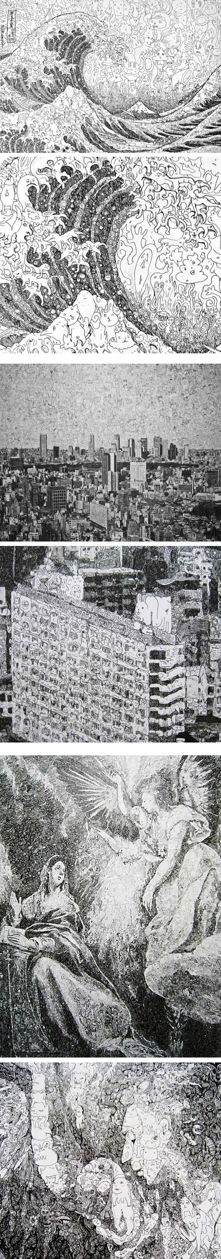
Japanese artist Sagaki Keita creates drawings in which the textures and tones are composed of smaller drawings, down to striking levels of detail and complexity.The large images are of cityscapes, faces, famous paintings, prints or sculpture, even atomic explosions. The images within the images are of little faces, figures, animals, fish, and assorted bizarre monsters and creatures, legions of them, waves of them (sometimes literally).
The drawings are done in pen and ink on paper mounted on board, some in relatively large scale, others not as large as you might assume. The works section of his website includes the dimensions of the individual pieces.
Even with Google Translate, I could find little other information specifically about the artist and his work, but the gallery includes a number of images with close ups that offer a fascinating glimpse of the nature of the works.
The images I’ve shown above, each with a corresponding detail, are still somewhat small. You can find a nice zoom-in on his interpretation of the Mona Lisa on Darizine, and several images previewed on Colossal.
Some of the images on his site are larger than they appear in the page, like his wonderful interpretation of Katsushika Hokusai’s In the Hollow of a Wave off the Coast at Kanagwa (see my post on Katsushika Hokusai).
It’s worth clicking on some of them to open the images in another browser tab or window to see if they are larger than the size they are represented in the page.
[Via MetaFilter]
Categories:
-
Janet Fish
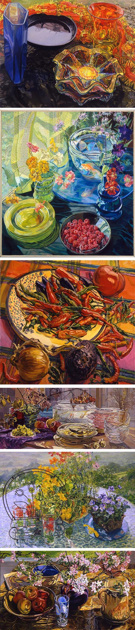
Janet Fish is an American painter whose still life paintings seem to radiate color. Using a high chroma palette, in combinations that in lesser hands might fall into the garish, Fish produces harmonious compositions that vibrate with energy and light.She often chooses as her subjects objects that are translucent, transparent or reflective, in particular colored glass. She surrounds these with flowers, bright cloth patterns and other objects in brilliant hues, balanced with strategically placed rich darks, and somehow manages to tame those wild arrays of color into images that seem at once preternaturally intense and perfectly naturalistic.
Fish is widely recognized and her work is in the collections of major museums, including the Metropolitan Museum of Art, The Whitney Museum of American Art, The Art Institute of Chicago and the Museum of Fine Arts Boston.
There are a few catalogs and collections of her work; Janet Fish: Paintings by Vincent Katz is in print and readily available.
Fish is represented by the DC Moore Gallery in NY, which also showcases a nice selection of her work online. I’ve listed other galleries and additional resources below.
I’ve had the pleasure of seeing some of her works in person. They are often fairly large in scale and striking.
In rooms in which there are works by several artists, hers inevitably stand out and command your attention. Unlike many contemporary works about which that can be said, Fish’s paintings also reward extended viewing; small areas can be looked at in detail as wonderfully arranged shapes of color and tone. Her command of the arrangement of elements of color can be seen even more clearly in her graphic work.
Categories:
-
New website for The Comics Journal
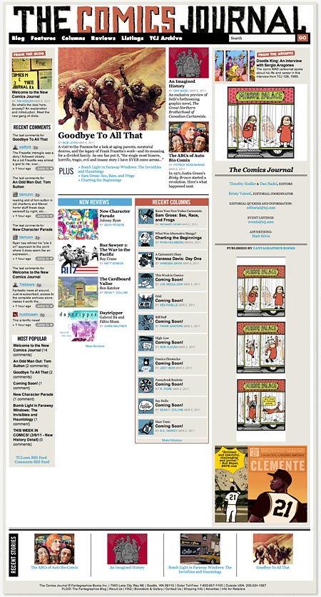
The Comics Journal is a venerable (30 year) print publication that aimed to bring highbrow criticism and commentary to the oft maligned field of comics.In the process it has been alternately unbearably stuffy and highbrow, and wonderfully informative and in-depth, often featuring book-length interviews with comics creators. I’ll take the good with the bad and say that it has overall been a welcome addition to the limited world of comics journalism, even as the mainstream media and web journalism have taken up the slack in recent years and expanded the range of writing about comics as an industry and an art form.
The Comics Journal’s own website, unfortunately, has been less than stellar. Despite some excellent blog writing and other occasional standouts, the overall presence has been weak and not well focused.
That looks to be changing, as new editors Dan Nadel and Tim Hoder, editors of the Comics Comics site, have launched a new, redesigned version of the TCJ site, with declared intentions that sound like the site can become a new destination site for those interested in comics on many levels (including highbrow). The first change of note is a new, much better and more usable interface.
The new editors promise that in addition to new material, both short posts and in depth material, the archives from the print magazine will continue to be added to the site, with the remainder of the past issues online by the end of 2011.
[Via Comics Beat, Heidi MacDonald (@Comixace) by way of Eric Orchard (@inkybat)]
Categories:
-
Picture Book Timeline
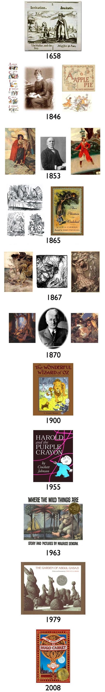
Part of a site called Picturing Books, the Picture Book Timeline is a brief overview of illustrated children’s books as they have changed over time.Not actually presented as a timeline (despite the appearance of my images above), but as a slide show, it steps through some significant titles and artists in the course of the presentation. The images are somewhat small, but large enough to get a feeling for the art and, along with the text describing the books, let you follow up by digging further elsewhere.
There are other resources on the site, but I found most of them less than compelling. The “Artistic Media” and “Artistic Style” sections near the bottom of the navigation include some more book covers and work by various artists. The “Artists and Authors” section, probably the most useful of them, is a list that includes links to the creators’ websites.
(Artists above, links are to my posts: Johannes Amos Comenius, Kate Greenaway, Howard Pyle, John Tenniel, Arthur Rackham, Maxfield Parrish, W.W. Denslow, Crokett Johnson, Maurice Sendak, Chris van Allsbugh, Brian Selznick)
[Vis MetaFilter]
Categories:
-
Thomas Moran
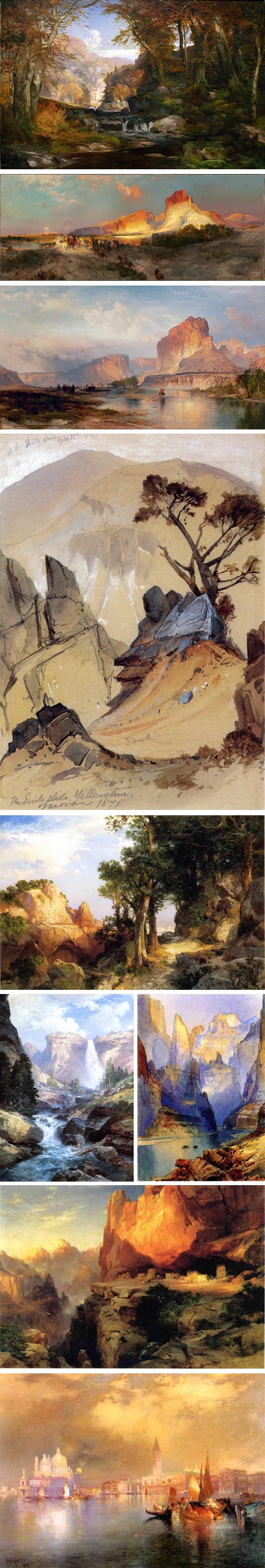
Though he was considered part of the Hudson River School of artists, it was for his evocation of the drama of the landscape in the western United States that Thomas Moran is best known.His watercolor location sketches of the landscape in Wyoming (image above, 4th down), along with photographs by William Henry Jackson, were instrumental in convincing Congress to create the first U.S. national park at Yellowstone.
Born in England, his family emigrated to the U.S. to an area near (now part of) Philadelphia in 1844 when Moran was 7. He started his art career as an apprentice in an engraving firm, quitting to join his brother Edward who was already established as an artist. He painted landscapes in the area around PHiladelphia (image above, top: Tohickon Creek, Bucks County) and established a reputation as a landscape artist.
At one point, Moran had the opportunity to study in England, where he encountered the dramatic landscapes of J.M.W. Turner. They would remain an influence in Moran’s mature work, particularly in his seascapes.
Moran became an illustrator for magazines. An assignment for an article in Scribner’s Magazine led to his opportunity to chronicle the wild beauty of Yellowstone in the summer of 1871.
On his way to Yellowstone, Moran embarked from the train in Green River, where the otherworldly rocky landscape would become the subject of several future works, including the striking Green River Cliffs, Wyoming, painted in 1881 (image above, second from top). This painting was just acquired by the National Gallery of Art in Washington, a gift of patrons.
Moran painted in many other places, areas of the Rocky Mountains, the grand Tetons (where Mt. Moran is now named for him), Europe, Florida and Long Island, where he later settled and painted many of his dramatic seascapes.
I particularly enjoy his beautiful series of luminescent views of Venice (above, bottom).
Moran’s paintings are large in scale, and the small images I’ve posted above don’t begin to do them justice. If you can’t visit a museum where you can see his work in person, at least look for some larger reproductions.
One of the best selections online is The Athenaeum (note links to three pages of thumbnails linked at top, click image on detail page for larger image). There is also a more quickly accessed selection on Wikimedia Commons. I’ve listed other resources below.
This book on Thomas Moran is well reviewed on Amazon, but I haven’t seen it myself; there is also a book of his Field Sketches.
[News of NGA acquisition via ArtDaily]
Categories:
-
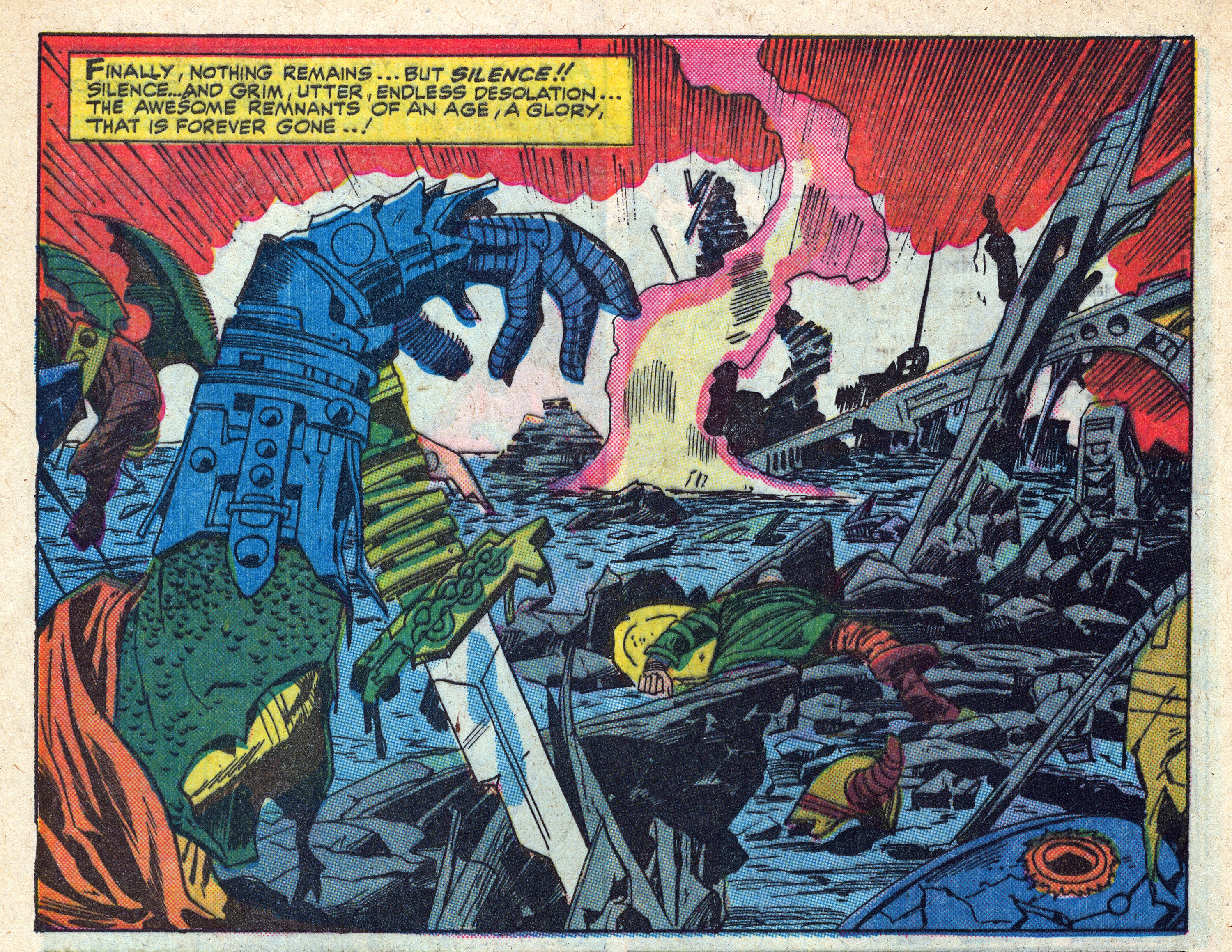
Kirb Your Enthusiasm

HiLoBrow, a cultural blog/zine/site whose motto is “Middlebrow is not the solution”, has asked 25 of their favorite writers to examine and write on individual comics panels by Jack “King” Kirby, one of the greats of late 20th Century comics art, in a feature called Kirb Your Enthusiasm. (I’ll write more on Jack Kirby, who is one of my favorites, in a future post.)The panels are taken from a wide range comics selected from various phases of Kirby’s extensive and highly influential career. Every Kirby fan has their favorite Kirby “era” and titles (mine being early “Silver Age” Fantastic Four, Thor and Strange Tales).
The panels themselves are linked to larger versions, posted in high resolution in all of their process color dots on cheap newsprint glory.
There’s an introductory post that begins the series and contains a list of the comics from which the panels are taken and the writers who are commenting on them, including those few in the series not yet posted.
I can’t say that any of these panels are ones that I personally would have singled out, but I find the entire exercise fascinating, even if just for prompting me to think about a few of my own favorites — a terrific notion.
Though the commentary is a bit “insider”, aimed at those already familiar with American comic books in general and Kirby in particular, other readers may find the way these writers have found individual comic panels worthy of discourse different and interesting.
(Comic titles for Jack Kirby images above: Thor, Captain America, Kamandi, Mr. Miracle, Fantastic Four)
[Via MetaFilter]
Categories:


Charley’s Picks
Bookshop.org
(Bookshop.org affilliate links; sales benefit independent bookshop owners; I get a small percentage to help support my work on Lines and Colors)

John Singer Sargent: Watercolors


Urban Sketching: Understanding Perspective


Charley’s Picks
Amazon
(Amazon.com affiliate links; sales go to a larger yacht for Jeff Bezos; but I get a small percentage to help support my work on Lines and Colors)
John Singer Sargent: Watercolors
Urban Sketching: Understanding Perspective