
Categories
- 3d CGI
- Amusements
- Animation
- Anime & Manga
- Art Materials
- Art Videos
- Blogroll
- Cartoons
- Color
- Comics
- Concept & Visual Dev.
- Creativity
- Digital Art
- Digital Painting
- Displaying Art on the Web
- Drawing
- Eye Candy for Today
- Gallery and Museum Art
- High-res Art Images
- Illustration
- Motion Graphics & Flash
- Museums
- Online Museums
- Outsider Art
- Painting
- Painting a Day
- Paleo Art
- Pastel, Conté & Chalk
- Pen & Ink
- Prints and Printmaking
- Reviews
- Sc-fi and Fantasy
- Sculpture & Dimensional
- Site Comments
- Sketching
- Storyboards
- Tools and Techniques
- Uncategorized
- Vector Art
- Videos & Podcasts
- Vision and Optics
- Watercolor and Gouache
- Webcomics
Archives
- May 2026
- April 2026
- March 2026
- February 2026
- January 2026
- December 2025
- November 2025
- October 2025
- September 2025
- August 2025
- July 2025
- June 2025
- May 2025
- January 2025
- December 2024
- November 2024
- October 2024
- September 2024
- August 2024
- June 2024
- April 2024
- March 2024
- February 2024
- January 2024
- December 2023
- November 2023
- October 2023
- September 2023
- August 2023
- July 2023
- May 2023
- April 2023
- March 2023
- February 2023
- January 2023
- December 2022
- November 2022
- September 2022
- August 2022
- July 2022
- June 2022
- May 2022
- April 2022
- March 2022
- February 2022
- January 2022
- December 2021
- November 2021
- October 2021
- September 2021
- August 2021
- July 2021
- June 2021
- May 2021
- April 2021
- March 2021
- February 2021
- January 2021
- December 2020
- November 2020
- October 2020
- September 2020
- August 2020
- July 2020
- June 2020
- May 2020
- April 2020
- March 2020
- February 2020
- January 2020
- December 2019
- November 2019
- October 2019
- September 2019
- August 2019
- July 2019
- June 2019
- May 2019
- April 2019
- March 2019
- February 2019
- January 2019
- December 2018
- November 2018
- October 2018
- September 2018
- August 2018
- July 2018
- June 2018
- May 2018
- April 2018
- March 2018
- February 2018
- January 2018
- December 2017
- November 2017
- October 2017
- September 2017
- August 2017
- July 2017
- June 2017
- May 2017
- April 2017
- March 2017
- February 2017
- January 2017
- December 2016
- November 2016
- October 2016
- September 2016
- August 2016
- July 2016
- June 2016
- May 2016
- April 2016
- March 2016
- February 2016
- January 2016
- December 2015
- November 2015
- October 2015
- September 2015
- August 2015
- July 2015
- June 2015
- May 2015
- April 2015
- March 2015
- February 2015
- January 2015
- December 2014
- November 2014
- October 2014
- September 2014
- August 2014
- July 2014
- June 2014
- May 2014
- April 2014
- March 2014
- February 2014
- January 2014
- December 2013
- November 2013
- October 2013
- September 2013
- August 2013
- July 2013
- June 2013
- May 2013
- April 2013
- March 2013
- February 2013
- January 2013
- December 2012
- November 2012
- October 2012
- September 2012
- August 2012
- July 2012
- June 2012
- May 2012
- April 2012
- March 2012
- February 2012
- January 2012
- December 2011
- November 2011
- October 2011
- September 2011
- August 2011
- July 2011
- June 2011
- May 2011
- April 2011
- March 2011
- February 2011
- January 2011
- December 2010
- November 2010
- October 2010
- September 2010
- August 2010
- July 2010
- June 2010
- May 2010
- April 2010
- March 2010
- February 2010
- January 2010
- December 2009
- November 2009
- October 2009
- September 2009
- August 2009
- July 2009
- June 2009
- May 2009
- April 2009
- March 2009
- February 2009
- January 2009
- December 2008
- November 2008
- October 2008
- September 2008
- August 2008
- July 2008
- June 2008
- May 2008
- April 2008
- March 2008
- February 2008
- January 2008
- December 2007
- November 2007
- October 2007
- September 2007
- August 2007
- July 2007
- June 2007
- May 2007
- April 2007
- March 2007
- February 2007
- January 2007
- December 2006
- November 2006
- October 2006
- September 2006
- August 2006
- July 2006
- June 2006
- May 2006
- April 2006
- March 2006
- February 2006
- January 2006
- December 2005
- November 2005
- October 2005
- September 2005
- August 2005
Relevant Blogs
Art, Painting & Sketch
- Gurney Journey
- Underpaintings
- Art and Influence
- Painting Perceptions
- Oil Painters of America
- Vasari Paint POV
- Flying Fox
- Urban Sketchers
- Bento (Smithsonian)
- Art Inconnu
- The Hidden Place
- Still Life
- Making a Mark
- The Art of the Landscape
- Exploring Color & Creativity
- Art Contrarian
- Artist A Day
- beinArt Surreal Art Collective
- Eye Level
- David Dunlop
- p.i.g.m.e.n.t.i.u.m
- CultureGrrl
- Joaquín Sorolla blog
- Artists in Pastel
“Painting a Day”
- A Painting a Day (Keiser)
- On Painting (Keiser)
- Julian Merrow-Smith
- Karen Jurick
- Jeffrey Hayes
- Carol Marine
- Abbey Ryan
- Daily Paintworks
Other Painting Blogs
- Virtual Gouache Land
- Neil Hollingsworth
- Marc Hanson
- Kevin Menck
- Marc Dalessio
- Larry Seiler
- Stapleton Kearns
- Colin Page
- Roos Schuring
- Hans Versfelt
- Titus Meeuws
- Régis Pettinari
- René Plein Air
- Belinda Del Pesco
- Robin Weiss
- Nathan Fowkes (Land Sketch)
- William Wray
- Frank Serrano
- Stephen Magsig
- Michael Chesley Johnson
- Twice a Week
- Sarah Wimperis
- Rob Adams
- Michael Cole Manley
- The Dirty Palette Club
- Mike Manley’s Draw!
Gallery Art & Illustration mix
Illustration
- Howard Pyle
- 100 Years of Illustration
- BibliOdyssey
- Illustration Art
- Today’s Inspiration
- Illustration Mundo
- Little Chimp Society
- Danny Gregory
- R D (John Martz
- Illustration Friday blog
- Monster Brains
- Illustrators & Illustrations (RU)
- Elwood H. Smith
- DaniDraws.com
- Designers Who Blog
- iSpot Blog
Sci-Fi & Fantasy
Illustration & Comics
Comics & Cartoons
- Comics Beat
- Robot 6
- Newsarama Blog
- Comic Vine
- Comics Alliance
- Forbidden Planet Int.
- Paolo Rivera
- Bolt City
- Flight
- Scott McCloud
- The Comics Journal
- Comixpedia
- Funnybook Babylon
- James Baker
- Middleton’s Sketchbook
- Boneville
- The Hotel Fred
- Paul Rivoche
- Daily Cartoonist
- Mad About Cartoons (William Wray)
- Digital Strips
Illustration & Concept
Animation & Concept
- Cartoon Brew
- Animation Blog
- Cold Hard Flash
- Concept Art World
- The CAB
- FY Concept Art
- Concept Ships
- Concept Robots
- John Nevarez
- Armand Serrano
- Marcos Mateu-Mestre
- all kinds of stuff (Kricfalusi)
- Yacin the faun (Man Arenas)
- Kelsey Mann
- Cre8tivemarks Blog
- Ice-Cream Monster Toon Cafe
- AAU Character & Creature Design
- AAU Animation Notes
- Articles and Texticles
Paleo & Scientific
Tools & Techniques
Other
Lists of Art Blogs
Art Image Resource Links
Historic Art Images
- Wikimedia Commons: Paintings
- Wikimedia Commons: Drawings
- The Athenaeum
- WikiArt (WikiPaintings)
- Google Art Project: Artists
- Google Art Project: Collections (Museums)
- ArtCyclopedia
- Web Gallery of Art
- Art Renewal Center
- Web Gallery of Impressionism
Auction Consolidation sites
Auction sites
- Sotheby’s
- Bonham’s
- Christies
- Heritage Auctions: Fine Art
- Heritage Auctions: Illustration
- Freeman’s Auctions
- Bukowskis
- Shannon’s
Image Search
Reverse Image Search (search by image)
- Tin Eye
- RevImg
- Google Image Search (camera icon)
- Bing Image Search (camera icon)
Promoting some friends and some clients of my website design business
- Twin Willows T’ai Chi studio in Wilmington DE. Taiji classes with Bryan Davis.
- Ray Hayward, Inspired Teacher of T’ai Chi ( Taiji ) in Minneapolis, Founder of Mindful Motion Tai Chi Academy
- OldHead Tattoo studio and Art Gallery in Wilmington DE. Tattoos and paintings by Bruce Gulick
- Sharon Domenico Art, pet portrait oil paintings
- Platinum Paperhanging, wallpaper hanging, Main Line and Philadelphia, PA
- Lisa Stone Design, interior designer, Main Line and Philadelphia, PA
- Studio12KPT, original art, prints, calendars and other custom printed items by Van Sickle & Rolleri
-
Christopher Peterson

Christopher Peterson is an illustrator known in particular for his rock posters. He also does a variety of illustration, storyboards, set designs and exhibit concept designs.Originally from New York, Peterson studied at the Art Institute of Boston and the Art Center College of Design in Pasadena. His clients include Time Magazine, The New York Times, The San Francisco Chronicle, Readers Digest, Fortune, McGraw-Hill, Watson-Guptill, Macy’s, Courvoisier, Warner Brothers, Joe Boxer and Bill Graham Presents, among others; and his rock posters have included such performers as Paul McCartney, Phish, The String Cheese Incident, Sting, Eric Clapton, Elvis Costello, John Hiatt, Taj Mahal and Gloria Estefan.
Peterson’s approach varies from relatively highly rendered, to painterly to loose and sketchlike. His website features sections for posters, illustration, concept renderings and sketches, and you can find an additional portfolio of his work on the Shannon Associates artists’ representative site.
I particularly enjoy the fun conceptual devices he employs in his rock posters, with band names and concert information arrayed on grain elevators, buildings, room interiors, train cars and the like.
Categories:
-
Thomas Hovenden

19th century painter Thomas Hovenden was noted both for his work as an artist and for his role as a teacher at the Pennsylvania Academy of the Fine Arts.As a painter, Hovenden painted domestic scenes, historical events and to some extent still life subjects. He is noted in particular for his depictions of African Americans, both in domestic and historic contexts, such as his well known depiction of The Last Moments of John Brown (images above, top), now in the collection of the Metropolitan Museum of Art, which has a zoomable high resolution version on the website.
Hovenden’s interest in African American subjects may have stemmed from his wife, artist Helen Corson, who he met while studying at the École des Beaux Arts in Paris. Her family were abolitionists, and the barn on their property that hosted anti-slavery meetings, and as a stop on the underground railroad, later served as Hovenden’s studio.
In 1886 Hovenden was appointed to replace Thomas Eakins as Professor of Painting and Drawing at the Pennsylvania Academy of the Fine Arts when Eakins was asked to leave amid conflicts with the board of directors over nude models, insubordination and other accusations of “inappropriate behavior”.
Hovenden’s students included such noted artists as Alexander Stirling Calder, Robert Henri and Henry Ossawa Tanner.
Categories:
-
Felideus (Juan Parra)
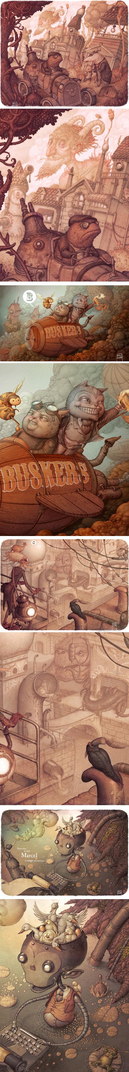
Based in Madrid, Spain, Felideus (pen name for Juan Parra) has worked as an art director, animator, screenwriter and graphic designer for film and video productions, and is now a freelance illustrator, designer and writer.As a writer and illustrator, Felideus has worked on book projects and in comic books.
He works both in traditional media like watercolor, acrylic, pencil and ink, and in digital media, using applications like Photoshop and Painter.
Felideus maintains a blog which also functions as his website, though the Portfolio section is labeled as Under Construction, and points to his portfolios on CG Society, deviantART, CG Gallery CGHub and Behance.
These appear somewhat redundant. I found the ones on CG Society or CG Hub as complete as any.
His blog, however, provides discussion of the work, names the projects for which the illustrations were intended, and provides additional images, including detail crops and in some cases, step-through process in the form of animated GIFs. The most recent blog entries feature translations of the text in four languages.
Felideus’ highly rendered, richly detailed style feels fresh and resists any feeling of being overworked, partly because of his superb use of value and color, and partly in his use of texture, contrasting highly detailed passages with areas that are almost flat. I particularly like the way he uses a limited palette and deft control of value, to push layers of an image back and dramatically bring others forward.
His more recent images, some of which are part of an advertising campaign for Buskers beer, and a few of which are for an in progress book project called “The Automatic Forest” (images above, bottom two) carry echoes of some of the Golden Age illustrators who worked in detailed and highly textural styles, like Arthur Rackham and Gustav Tenggren. Felideus manages at the same time to make his images feel ancient and modern, and uses his digital tools to great advantage.
Categories:
-
Janet Ternoff

Self taught New York artist Janet Ternoff finds great fascination in the facades and interiors of buildings.She works in a realistic style, at times with considerable detail. She works in a range of sizes, from 8×10 to considerably larger.
Her series of exteriors of bars, stores and restaurants feel in a way as if portraits of the establishments, with lots of attention to details of signs and other characteristics of the facades.
She also has a series of surface and subway trains as wall as a series of interiors that I particularly enjoy, particularly when they feature staircases in older buildings.
In all of her compositions, Ternoff is continually finding fascinating play of light, from brief splashes of highlights against weathered brick to deep contrasts of shadow and sunlight. She also paints scenes of twilight and nighttime, as well scenes with stormy or overcast skies.
Her website has a gallery divided into subsections, one of which, “New collection” is divided again into further subsections.
Ternoff also maintains a blog called New York Street Art.
Categories:
-
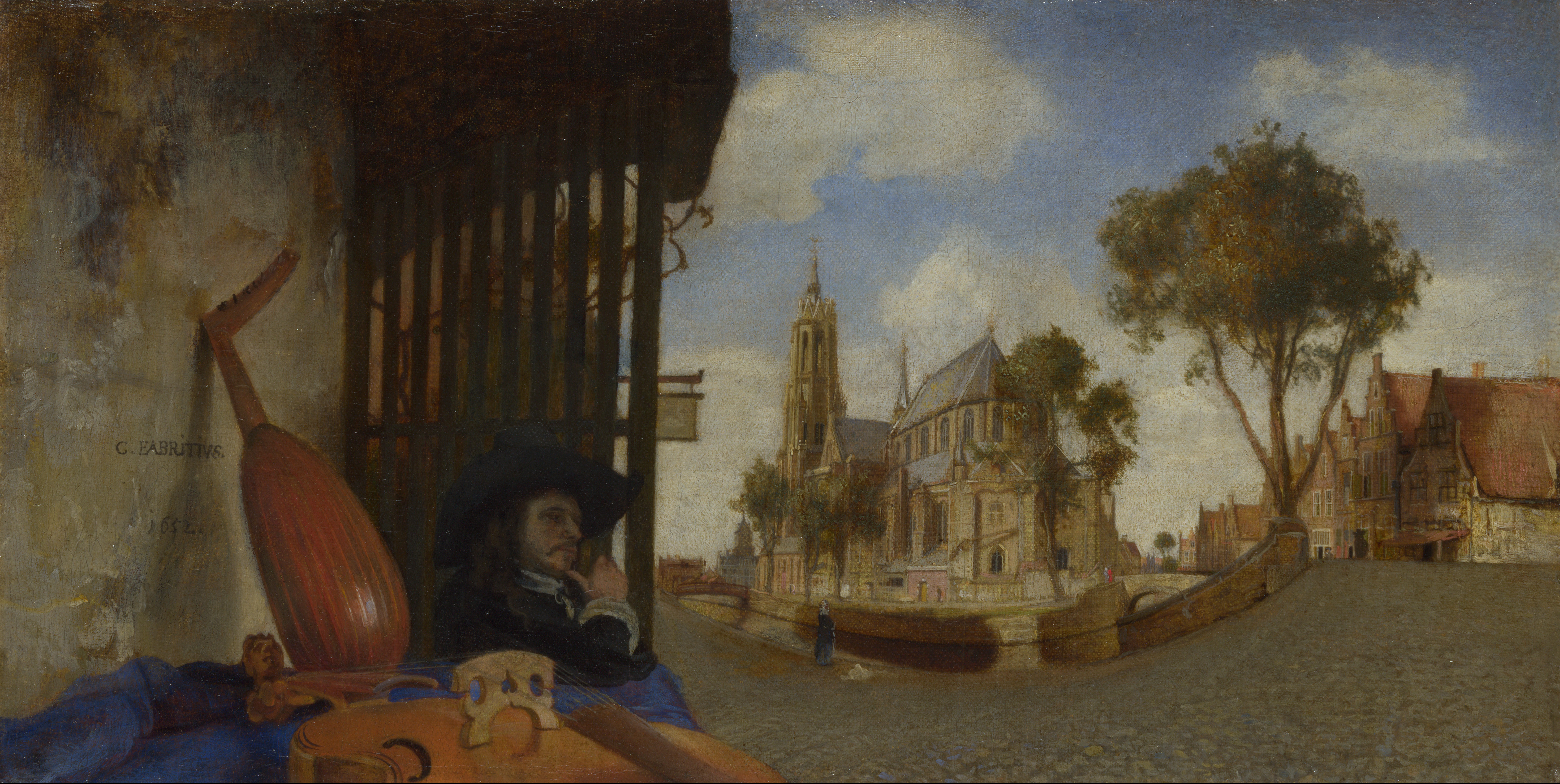
Carel Fabritius

Carel Fabritius was a Dutch painter whose adopted name comes from the latin for carpenter, or if more broadly used, craftsman.Fabritius studied in the the studio of Rembrandt, and is generally considered to be Rembrandt’s most talented pupil, and the only one to really break free of the master’s influence and develop his own style. This is notable in particular in the contrast of his color and texture filled portrait backgrounds with Rembrandt’s deep pools of darkness. His use of cool color harmonies is also distinctly different from the color choices of his master.
On leaving Rembrandt’s studio, he established himself for a time as an independent artist in his hometown of Beemster, and then moved to Delft, and is generally thought of as a Delft painter.
Fabritius was one of the most influential Dutch painters of his time, despite the fact that his career, and life, were tragically cut short in the “Delft Thunderclap“, an event in 1654 in which the Delft armory, and its large store of gunpowder, exploded, devastating a large part of the town.
It is presumed that much of Fabritius’ work was also lost in the explosion, as only about 12-15 of his paintings (depending on questions of attribution) are known to remain. Among those, however, is considerable variety, and Fabritius is also credited as one of starting points of trompe l’oeil painting.
I had the pleasure of seeing The Goldfinch (images above, top two; zoomable version here) in a Vermeer show in New York some years ago that included work by some of Vermeer’s contemporaries. It was the only non-Vermeer painting in the show to which I repeatedly returned. From a few feet away it is effectively trompe l’oeil illusionistic, close up, it’s a marvel of painterly loaded-brush painting.
Fabritius is generally acknowledged to have been an influence on Vermeer as well as De Hooch, who were also working in Delft at that time; though he was likely not, as you will sometimes see suggested, Vermeer’s teacher.
Like Vermeer, Fabritius is presumed to have made use of the camera obscura, and was fascinated with optical effects and linear perspective. Only one of his perspective experiments survives, but it’s a fascinating painting,
View of Delft (images above, bottom three; larger version here) has a fascinating curved perspective and oddly positioned and cut-off rendering of the violin in the left foreground. Taking clues from similar works by other artists, it was probably meant to be displayed on a curved surface inside a “peep-box“. These, viewed through a peephole, provide only one fixed-point view of the painting, giving the artist more control over what the viewer sees, and would have provided a realistic illusion of space and sense of place that must have been mesmerizing.
The painting, along with one of Fabritius’s presumed self-portraits, is in the collection of the National Gallery , London, which provides a wonderful full-screen and zoomable high resolution view of the painting (use controls at right of the image).
Categories:
-
Anthony S. Waters
 Anthony S. Waters is a California based concept artist and illustrator who does work for the gaming industry. He has worked with companies like Sony On-Line, DNA Productions, Lucasfilm, Electronic Arts, Microsoft and Hasbro, among others.
Waters works in both traditional and digital media, and often works with a bright palette, though at times almost monochromatically. His richly organic designs for environments and creatures seem at times to revel in convolutions of form, a feeling of graphic playfulness beneath their more dramatic surface.
I particularly enjoy his creature designs, in which he experiments with imaginative variations on subjects that can too often be formulaic.
His website has sections for Environments, Creatures, Characters, etc. and within each there are both finished work and sketches.
Waters also maintains a blog, contributes to Design-o-Matic and has a gallery on deviantART that has additional images.
Categories:


Charley’s Picks
Bookshop.org
(Bookshop.org affilliate links; sales benefit independent bookshop owners; I get a small percentage to help support my work on Lines and Colors)

John Singer Sargent: Watercolors


Urban Sketching: Understanding Perspective


Charley’s Picks
Amazon
(Amazon.com affiliate links; sales go to a larger yacht for Jeff Bezos; but I get a small percentage to help support my work on Lines and Colors)
John Singer Sargent: Watercolors
Urban Sketching: Understanding Perspective