
Categories
- 3d CGI
- Amusements
- Animation
- Anime & Manga
- Art Materials
- Art Videos
- Blogroll
- Cartoons
- Color
- Comics
- Concept & Visual Dev.
- Creativity
- Digital Art
- Digital Painting
- Displaying Art on the Web
- Drawing
- Eye Candy for Today
- Gallery and Museum Art
- High-res Art Images
- Illustration
- Motion Graphics & Flash
- Museums
- Online Museums
- Outsider Art
- Painting
- Painting a Day
- Paleo Art
- Pastel, Conté & Chalk
- Pen & Ink
- Prints and Printmaking
- Reviews
- Sc-fi and Fantasy
- Sculpture & Dimensional
- Site Comments
- Sketching
- Storyboards
- Tools and Techniques
- Uncategorized
- Vector Art
- Videos & Podcasts
- Vision and Optics
- Watercolor and Gouache
- Webcomics
Archives
- May 2026
- April 2026
- March 2026
- February 2026
- January 2026
- December 2025
- November 2025
- October 2025
- September 2025
- August 2025
- July 2025
- June 2025
- May 2025
- January 2025
- December 2024
- November 2024
- October 2024
- September 2024
- August 2024
- June 2024
- April 2024
- March 2024
- February 2024
- January 2024
- December 2023
- November 2023
- October 2023
- September 2023
- August 2023
- July 2023
- May 2023
- April 2023
- March 2023
- February 2023
- January 2023
- December 2022
- November 2022
- September 2022
- August 2022
- July 2022
- June 2022
- May 2022
- April 2022
- March 2022
- February 2022
- January 2022
- December 2021
- November 2021
- October 2021
- September 2021
- August 2021
- July 2021
- June 2021
- May 2021
- April 2021
- March 2021
- February 2021
- January 2021
- December 2020
- November 2020
- October 2020
- September 2020
- August 2020
- July 2020
- June 2020
- May 2020
- April 2020
- March 2020
- February 2020
- January 2020
- December 2019
- November 2019
- October 2019
- September 2019
- August 2019
- July 2019
- June 2019
- May 2019
- April 2019
- March 2019
- February 2019
- January 2019
- December 2018
- November 2018
- October 2018
- September 2018
- August 2018
- July 2018
- June 2018
- May 2018
- April 2018
- March 2018
- February 2018
- January 2018
- December 2017
- November 2017
- October 2017
- September 2017
- August 2017
- July 2017
- June 2017
- May 2017
- April 2017
- March 2017
- February 2017
- January 2017
- December 2016
- November 2016
- October 2016
- September 2016
- August 2016
- July 2016
- June 2016
- May 2016
- April 2016
- March 2016
- February 2016
- January 2016
- December 2015
- November 2015
- October 2015
- September 2015
- August 2015
- July 2015
- June 2015
- May 2015
- April 2015
- March 2015
- February 2015
- January 2015
- December 2014
- November 2014
- October 2014
- September 2014
- August 2014
- July 2014
- June 2014
- May 2014
- April 2014
- March 2014
- February 2014
- January 2014
- December 2013
- November 2013
- October 2013
- September 2013
- August 2013
- July 2013
- June 2013
- May 2013
- April 2013
- March 2013
- February 2013
- January 2013
- December 2012
- November 2012
- October 2012
- September 2012
- August 2012
- July 2012
- June 2012
- May 2012
- April 2012
- March 2012
- February 2012
- January 2012
- December 2011
- November 2011
- October 2011
- September 2011
- August 2011
- July 2011
- June 2011
- May 2011
- April 2011
- March 2011
- February 2011
- January 2011
- December 2010
- November 2010
- October 2010
- September 2010
- August 2010
- July 2010
- June 2010
- May 2010
- April 2010
- March 2010
- February 2010
- January 2010
- December 2009
- November 2009
- October 2009
- September 2009
- August 2009
- July 2009
- June 2009
- May 2009
- April 2009
- March 2009
- February 2009
- January 2009
- December 2008
- November 2008
- October 2008
- September 2008
- August 2008
- July 2008
- June 2008
- May 2008
- April 2008
- March 2008
- February 2008
- January 2008
- December 2007
- November 2007
- October 2007
- September 2007
- August 2007
- July 2007
- June 2007
- May 2007
- April 2007
- March 2007
- February 2007
- January 2007
- December 2006
- November 2006
- October 2006
- September 2006
- August 2006
- July 2006
- June 2006
- May 2006
- April 2006
- March 2006
- February 2006
- January 2006
- December 2005
- November 2005
- October 2005
- September 2005
- August 2005
Relevant Blogs
Art, Painting & Sketch
- Gurney Journey
- Underpaintings
- Art and Influence
- Painting Perceptions
- Oil Painters of America
- Vasari Paint POV
- Flying Fox
- Urban Sketchers
- Bento (Smithsonian)
- Art Inconnu
- The Hidden Place
- Still Life
- Making a Mark
- The Art of the Landscape
- Exploring Color & Creativity
- Art Contrarian
- Artist A Day
- beinArt Surreal Art Collective
- Eye Level
- David Dunlop
- p.i.g.m.e.n.t.i.u.m
- CultureGrrl
- Joaquín Sorolla blog
- Artists in Pastel
“Painting a Day”
- A Painting a Day (Keiser)
- On Painting (Keiser)
- Julian Merrow-Smith
- Karen Jurick
- Jeffrey Hayes
- Carol Marine
- Abbey Ryan
- Daily Paintworks
Other Painting Blogs
- Virtual Gouache Land
- Neil Hollingsworth
- Marc Hanson
- Kevin Menck
- Marc Dalessio
- Larry Seiler
- Stapleton Kearns
- Colin Page
- Roos Schuring
- Hans Versfelt
- Titus Meeuws
- Régis Pettinari
- René Plein Air
- Belinda Del Pesco
- Robin Weiss
- Nathan Fowkes (Land Sketch)
- William Wray
- Frank Serrano
- Stephen Magsig
- Michael Chesley Johnson
- Twice a Week
- Sarah Wimperis
- Rob Adams
- Michael Cole Manley
- The Dirty Palette Club
- Mike Manley’s Draw!
Gallery Art & Illustration mix
Illustration
- Howard Pyle
- 100 Years of Illustration
- BibliOdyssey
- Illustration Art
- Today’s Inspiration
- Illustration Mundo
- Little Chimp Society
- Danny Gregory
- R D (John Martz
- Illustration Friday blog
- Monster Brains
- Illustrators & Illustrations (RU)
- Elwood H. Smith
- DaniDraws.com
- Designers Who Blog
- iSpot Blog
Sci-Fi & Fantasy
Illustration & Comics
Comics & Cartoons
- Comics Beat
- Robot 6
- Newsarama Blog
- Comic Vine
- Comics Alliance
- Forbidden Planet Int.
- Paolo Rivera
- Bolt City
- Flight
- Scott McCloud
- The Comics Journal
- Comixpedia
- Funnybook Babylon
- James Baker
- Middleton’s Sketchbook
- Boneville
- The Hotel Fred
- Paul Rivoche
- Daily Cartoonist
- Mad About Cartoons (William Wray)
- Digital Strips
Illustration & Concept
Animation & Concept
- Cartoon Brew
- Animation Blog
- Cold Hard Flash
- Concept Art World
- The CAB
- FY Concept Art
- Concept Ships
- Concept Robots
- John Nevarez
- Armand Serrano
- Marcos Mateu-Mestre
- all kinds of stuff (Kricfalusi)
- Yacin the faun (Man Arenas)
- Kelsey Mann
- Cre8tivemarks Blog
- Ice-Cream Monster Toon Cafe
- AAU Character & Creature Design
- AAU Animation Notes
- Articles and Texticles
Paleo & Scientific
Tools & Techniques
Other
Lists of Art Blogs
Art Image Resource Links
Historic Art Images
- Wikimedia Commons: Paintings
- Wikimedia Commons: Drawings
- The Athenaeum
- WikiArt (WikiPaintings)
- Google Art Project: Artists
- Google Art Project: Collections (Museums)
- ArtCyclopedia
- Web Gallery of Art
- Art Renewal Center
- Web Gallery of Impressionism
Auction Consolidation sites
Auction sites
- Sotheby’s
- Bonham’s
- Christies
- Heritage Auctions: Fine Art
- Heritage Auctions: Illustration
- Freeman’s Auctions
- Bukowskis
- Shannon’s
Image Search
Reverse Image Search (search by image)
- Tin Eye
- RevImg
- Google Image Search (camera icon)
- Bing Image Search (camera icon)
Promoting some friends and some clients of my website design business
- Twin Willows T’ai Chi studio in Wilmington DE. Taiji classes with Bryan Davis.
- Ray Hayward, Inspired Teacher of T’ai Chi ( Taiji ) in Minneapolis, Founder of Mindful Motion Tai Chi Academy
- OldHead Tattoo studio and Art Gallery in Wilmington DE. Tattoos and paintings by Bruce Gulick
- Sharon Domenico Art, pet portrait oil paintings
- Platinum Paperhanging, wallpaper hanging, Main Line and Philadelphia, PA
- Lisa Stone Design, interior designer, Main Line and Philadelphia, PA
- Studio12KPT, original art, prints, calendars and other custom printed items by Van Sickle & Rolleri
-
John White Alexander (update)
When I first wrote about American painter and illustrator John White Alexander in 2006, not many image resources were available.Since then, the internet has done that which it does best, grown at an incredible rate, and several additional sources of images for this wonderful painter have appeared, and I’ve collected some of them below; though I’m still frustrated in my inability to find much representative of his illustration work.
As a painter, Alexander was primarily a portraitist, most notably of women, and his portraits ranged from relatively staid to sweepingly dramatic, handled with bravura brushwork and rich colors. Though not as dazzling with a brush as John Singer Sargent or Cecilia Beaux (how many were?), Alexander’s portraits delight with luxuriously rendered fabrics and theatrically lit compositions.
There is a book available, John White Alexander and the Construction of National Identity: Cosmopolitan American Art, 1880-1915 by Sarah J. Moore, but I haven’t personally seen it.
The Library of Congress, for which he did murals titled “The Evolution of the Book” (see images on Wikimedia Commons), has a collection of his papers, the web version of which includes some of his sketchbooks.
Categories:
-
The 50 best comic covers of 2010 on Robot 6

Comic book covers, like the covers of books and magazines, have a singular purpose, to attract your attention, get you to pick up the book and plunk down your hard earned dollars in exchange for the promised wonders within.Comic book covers are important enough that, though they are sometimes created by the artists who have created the interior art for the story, they are often created by other artists who specialize in creating gripping imagery just for covers.
Comic book covers in particular have come a long way from their roots in the traditions of the lurid pulp magazine covers of the 1930’s and 40’s. Some of that element still remains, of course (and I wouldn’t have it any other way), but the concept of capturing the attention of potential readers has expanded to include the subtle and thought provoking.
The variety of approaches to comics offered today has allowed for a range of cover art that includes some wonderful examples of concept, illustration and design.
Kevin Melrose, writing in the always interesting comics blog Robot 6 (part of the Comic Book Resources site), has given us his selection of The 50 best covers of 2010 (actually, he sneaks in 51).
You may not agree with all of his choices, of course, but what fun is a “best of” list if you agree with everything, and he certainly hits the mark for me in an number of cases.
Melrose gives thoughtful commentary on the covers and on the artists who created them. At the very least, the article serves as a fascinating cross section of some of the most interesting work being done in the field today.
Be sure to click on the images in his column to see the larger versions; for many of them, the appeal is in the details.
Also of interest is Melrose’s list of The best of the best of the year lists.
Images above:
J.O. Ladrönn gives us the feeling of the great pulp heroes in his interpretation of a classic comics detective for Will Eisner’s The Spirit #1.
Paolo Rivera’s striking cover for The Amazing Spider-Man #641 pays homage to the great American illustrator Coles Phillips.
Massimo Carnevale’s cover for Northlanders #35 is both subtle and gripping.
Gabriel Bá plays with the magic realist technique of transitioning between two seemingly unrelated scenes as part of the same image in his cover for Daytripper #2.
Rafael Albuquerque’s dramatically cropped image gives graphic power to his cover for Superboy #1.
Cliff Chiang uses strong graphic design, dark but intense colors and subtle textures to give an evocative image of Batman for Detective Comics #864.
J.H. Williams III gives Batwoman #0 a simultaneously modern and early 20th Century feeling, combining the image of the character and city skyline with dramatic Art Deco elements in the graphic design.
Darwyn Cooke’s wonderfully graphic cover illustration for The Outfit harkens to the stylized paperback covers and illustrations of the 1960’s.
Dave Johnson’s cover for Unknown Soldier #22 uses patterns, negative space and subtle color relationships to great advantage, leading your eye down to details like the skull faces in the center of the daisies.
The cover for The Unwritten #13 is awash with Yuko Shimizu‘s imaginative combination of images and graphic elements that play with scale, style and suggestions of motion.
Sean Phillips’ almost monochromatic composition, with its silhouetted background figures, spreads across both the back and front covers of Criminal: The Sinners #4.
[Via MetaFilter]
Categories:
-
Charles Kaufman

Charles Kaufman is a painter, cartoonist, illustrator and comics artist. His work has appeared in a long list of publications, from underground comix and CARtoons to the Wall Street Journal-Europe, Focus, Computer Artist, Editor & Publisher, New Media and a host of others, along with a range of commercial clients.His is the creator of Fred and Frank, a long running comics series published for U.S. military personnel stationed in Europe from 1979-1992.
Kaufman works both in digital media and traditional media like acrylic and pen and ink, applying his off-kilter style to gallery paintings as well as illustrations and cartoons.
His paintings, in acrylic on canvas and sometimes other supports like wood or paper, are often of cubist influenced compositions involving women, or wine, or wine and women, as well as a few other subjects including a selection of stylized landscapes. Kaufman has a description of his painting process here.
Among his choice of unusual supports for paintings are crushed soft drink or beer cans, panted with acrylic. The finished piece is then framed for hanging. His crushed can art is featured on both a website and blog.
Kaufman also creates limited edition 3-D constructions that are probably a little difficult to convey in photographs.
In addition he creates “Fish Art” under the pseudonym of F. Frank.
Some of Kaufman’s work is collected in a book called Detail Views: Paintings within paintings, that is available from Back Wall Art. New collections of his 116 Faces and Crushed Can Art are due soon.
Categories:
-
Oswald Achenbach
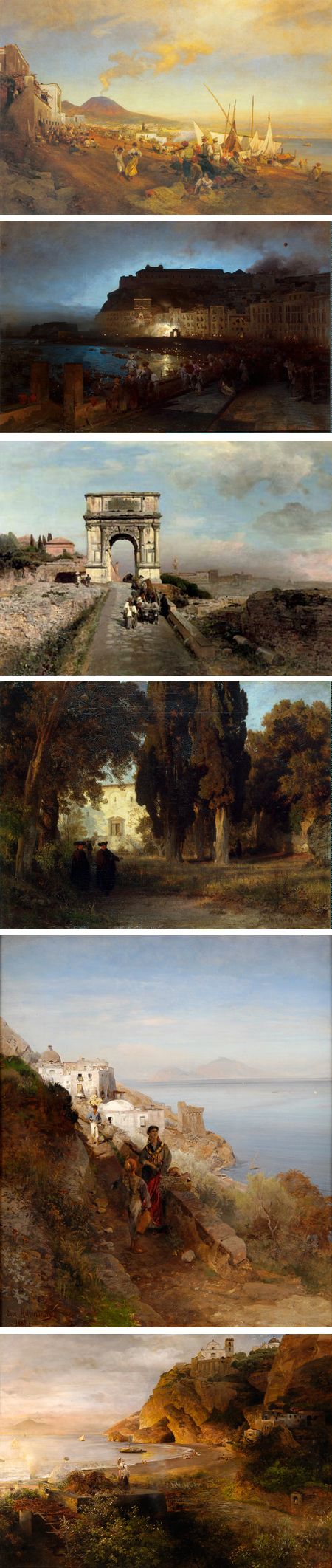
Oswald Achenbach was a 19th Century German landscape painter who found his greatest inspiration in italy, in particular in the area around the Bay of Naples, with it’s dramatic vistas of Mt. Vesuvius, and Rome and its environs.He found drama in landscapes and cities of Southern Italy as well as the daily lives the played out against them both.
Achenback was the brother of Andreas Achenback, who was also a noted landscape painter.
Oswald Achenbach studied at the Dusseldorf Art Academy and later returned there to teach. His students included Themistocles von Eckenbrecher.
Categories:
-
Peter Van Dyck

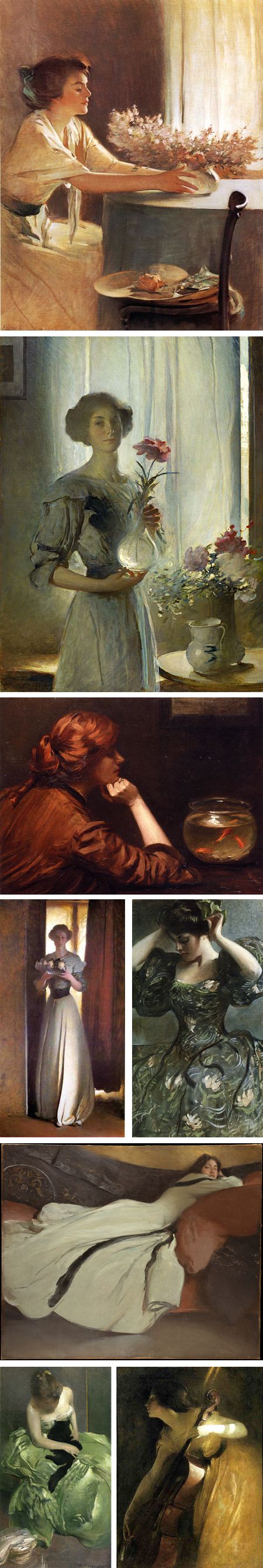
Painter Peter Van Dyck studied at Wesleyan University and at the Florence Academy of Art, and is currently a member of the faculty of the Pennsylvania Academy of the Fine Arts.His academic background shows in his dynamically balanced compositions, superbly handled color and refined draftsmanship.
Though his subjects include portraits and still life, he often focuses on interiors, in which the play of light though windows, in mirrors and across geometric arrangements of objects takes a central role.
His application of paint can vary from smooth to brusquely textured surfaces, on which his fascination with reflected and refracted light also comes into play.
His interior paintings can have some of the light infused stillness and rich reflections off dark wooden surfaces found in the interiors of Edmund Tarbell, and of the Dutch masters of interior painting like Vermeer and De Hooch who likely inspired both artists.
Van Dyck sometimes chooses subjects that other artists might see as unlikely to be rewarding, like a house heating system, a garden tractor or electric heaters, and finds in them patterns of color, texture and shape that make them seem as natural for subjects as traditional bowls of fruit or arrangements of pottery.
There are two galleries on his web site, recent work and an archive. You can also find his work represented by The John Pence Gallery, Eleanor Ettinger Gallery (work here), Grenning Gallery and Artists’ House Gallery here in Philadelphia, where he is currently part of a group exhibit that is on view until January 16, 2011.
Categories:
-
Dyana Hesson
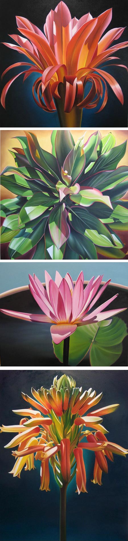
I’m not always appreciative of floral subjects in paintings, too often they focus on the pretty at the expense of the beautiful.Dyana E. Hesson is an artist who was born in California and is now living in Arizona, where she earned her degree in art from Arizona State University. She paints floral and botanical subjects with a difference, seeming to focus on each individual petal as if it was a sculptural object, wrapped in light and shadow.
Many of her luminous oils are painted at a relatively large scale, 40 x 40″ (100 x 100cm) or larger, though some are considerably smaller. She finds intricate landscapes of form within flowers, and renders them as crisply delineated shapes with rich colors, often accentuated by dark, softly gradated backgrounds.
Her subjects include plant forms other than flowers, and all of them have sense of botanical accuracy, though I’m certainly no expert in judging that.
Her website has a section of Original Oils, which is divided into sub-sections, as well as a section of limited edition prints. You can find additional galleries of her work on the websites for David Bonner Galleries (also here, here and here) and Manitou Galleries.
Hesson is featured in the current (January, 2011) issue of American Art Collector.
Categories:


Charley’s Picks
Bookshop.org
(Bookshop.org affilliate links; sales benefit independent bookshop owners; I get a small percentage to help support my work on Lines and Colors)

John Singer Sargent: Watercolors


Urban Sketching: Understanding Perspective


Charley’s Picks
Amazon
(Amazon.com affiliate links; sales go to a larger yacht for Jeff Bezos; but I get a small percentage to help support my work on Lines and Colors)
John Singer Sargent: Watercolors
Urban Sketching: Understanding Perspective