
Categories
- 3d CGI
- Amusements
- Animation
- Anime & Manga
- Art Materials
- Art Videos
- Blogroll
- Cartoons
- Color
- Comics
- Concept & Visual Dev.
- Creativity
- Digital Art
- Digital Painting
- Displaying Art on the Web
- Drawing
- Eye Candy for Today
- Gallery and Museum Art
- High-res Art Images
- Illustration
- Motion Graphics & Flash
- Museums
- Online Museums
- Outsider Art
- Painting
- Painting a Day
- Paleo Art
- Pastel, Conté & Chalk
- Pen & Ink
- Prints and Printmaking
- Reviews
- Sc-fi and Fantasy
- Sculpture & Dimensional
- Site Comments
- Sketching
- Storyboards
- Tools and Techniques
- Uncategorized
- Vector Art
- Videos & Podcasts
- Vision and Optics
- Watercolor and Gouache
- Webcomics
Archives
- April 2026
- March 2026
- February 2026
- January 2026
- December 2025
- November 2025
- October 2025
- September 2025
- August 2025
- July 2025
- June 2025
- May 2025
- January 2025
- December 2024
- November 2024
- October 2024
- September 2024
- August 2024
- June 2024
- April 2024
- March 2024
- February 2024
- January 2024
- December 2023
- November 2023
- October 2023
- September 2023
- August 2023
- July 2023
- May 2023
- April 2023
- March 2023
- February 2023
- January 2023
- December 2022
- November 2022
- September 2022
- August 2022
- July 2022
- June 2022
- May 2022
- April 2022
- March 2022
- February 2022
- January 2022
- December 2021
- November 2021
- October 2021
- September 2021
- August 2021
- July 2021
- June 2021
- May 2021
- April 2021
- March 2021
- February 2021
- January 2021
- December 2020
- November 2020
- October 2020
- September 2020
- August 2020
- July 2020
- June 2020
- May 2020
- April 2020
- March 2020
- February 2020
- January 2020
- December 2019
- November 2019
- October 2019
- September 2019
- August 2019
- July 2019
- June 2019
- May 2019
- April 2019
- March 2019
- February 2019
- January 2019
- December 2018
- November 2018
- October 2018
- September 2018
- August 2018
- July 2018
- June 2018
- May 2018
- April 2018
- March 2018
- February 2018
- January 2018
- December 2017
- November 2017
- October 2017
- September 2017
- August 2017
- July 2017
- June 2017
- May 2017
- April 2017
- March 2017
- February 2017
- January 2017
- December 2016
- November 2016
- October 2016
- September 2016
- August 2016
- July 2016
- June 2016
- May 2016
- April 2016
- March 2016
- February 2016
- January 2016
- December 2015
- November 2015
- October 2015
- September 2015
- August 2015
- July 2015
- June 2015
- May 2015
- April 2015
- March 2015
- February 2015
- January 2015
- December 2014
- November 2014
- October 2014
- September 2014
- August 2014
- July 2014
- June 2014
- May 2014
- April 2014
- March 2014
- February 2014
- January 2014
- December 2013
- November 2013
- October 2013
- September 2013
- August 2013
- July 2013
- June 2013
- May 2013
- April 2013
- March 2013
- February 2013
- January 2013
- December 2012
- November 2012
- October 2012
- September 2012
- August 2012
- July 2012
- June 2012
- May 2012
- April 2012
- March 2012
- February 2012
- January 2012
- December 2011
- November 2011
- October 2011
- September 2011
- August 2011
- July 2011
- June 2011
- May 2011
- April 2011
- March 2011
- February 2011
- January 2011
- December 2010
- November 2010
- October 2010
- September 2010
- August 2010
- July 2010
- June 2010
- May 2010
- April 2010
- March 2010
- February 2010
- January 2010
- December 2009
- November 2009
- October 2009
- September 2009
- August 2009
- July 2009
- June 2009
- May 2009
- April 2009
- March 2009
- February 2009
- January 2009
- December 2008
- November 2008
- October 2008
- September 2008
- August 2008
- July 2008
- June 2008
- May 2008
- April 2008
- March 2008
- February 2008
- January 2008
- December 2007
- November 2007
- October 2007
- September 2007
- August 2007
- July 2007
- June 2007
- May 2007
- April 2007
- March 2007
- February 2007
- January 2007
- December 2006
- November 2006
- October 2006
- September 2006
- August 2006
- July 2006
- June 2006
- May 2006
- April 2006
- March 2006
- February 2006
- January 2006
- December 2005
- November 2005
- October 2005
- September 2005
- August 2005
Relevant Blogs
Art, Painting & Sketch
- Gurney Journey
- Underpaintings
- Art and Influence
- Painting Perceptions
- Oil Painters of America
- Vasari Paint POV
- Flying Fox
- Urban Sketchers
- Bento (Smithsonian)
- Art Inconnu
- The Hidden Place
- Still Life
- Making a Mark
- The Art of the Landscape
- Exploring Color & Creativity
- Art Contrarian
- Artist A Day
- beinArt Surreal Art Collective
- Eye Level
- David Dunlop
- p.i.g.m.e.n.t.i.u.m
- CultureGrrl
- Joaquín Sorolla blog
- Artists in Pastel
“Painting a Day”
- A Painting a Day (Keiser)
- On Painting (Keiser)
- Julian Merrow-Smith
- Karen Jurick
- Jeffrey Hayes
- Carol Marine
- Abbey Ryan
- Daily Paintworks
Other Painting Blogs
- Virtual Gouache Land
- Neil Hollingsworth
- Marc Hanson
- Kevin Menck
- Marc Dalessio
- Larry Seiler
- Stapleton Kearns
- Colin Page
- Roos Schuring
- Hans Versfelt
- Titus Meeuws
- Régis Pettinari
- René Plein Air
- Belinda Del Pesco
- Robin Weiss
- Nathan Fowkes (Land Sketch)
- William Wray
- Frank Serrano
- Stephen Magsig
- Michael Chesley Johnson
- Twice a Week
- Sarah Wimperis
- Rob Adams
- Michael Cole Manley
- The Dirty Palette Club
- Mike Manley’s Draw!
Gallery Art & Illustration mix
Illustration
- Howard Pyle
- 100 Years of Illustration
- BibliOdyssey
- Illustration Art
- Today’s Inspiration
- Illustration Mundo
- Little Chimp Society
- Danny Gregory
- R D (John Martz
- Illustration Friday blog
- Monster Brains
- Illustrators & Illustrations (RU)
- Elwood H. Smith
- DaniDraws.com
- Designers Who Blog
- iSpot Blog
Sci-Fi & Fantasy
Illustration & Comics
Comics & Cartoons
- Comics Beat
- Robot 6
- Newsarama Blog
- Comic Vine
- Comics Alliance
- Forbidden Planet Int.
- Paolo Rivera
- Bolt City
- Flight
- Scott McCloud
- The Comics Journal
- Comixpedia
- Funnybook Babylon
- James Baker
- Middleton’s Sketchbook
- Boneville
- The Hotel Fred
- Paul Rivoche
- Daily Cartoonist
- Mad About Cartoons (William Wray)
- Digital Strips
Illustration & Concept
Animation & Concept
- Cartoon Brew
- Animation Blog
- Cold Hard Flash
- Concept Art World
- The CAB
- FY Concept Art
- Concept Ships
- Concept Robots
- John Nevarez
- Armand Serrano
- Marcos Mateu-Mestre
- all kinds of stuff (Kricfalusi)
- Yacin the faun (Man Arenas)
- Kelsey Mann
- Cre8tivemarks Blog
- Ice-Cream Monster Toon Cafe
- AAU Character & Creature Design
- AAU Animation Notes
- Articles and Texticles
Paleo & Scientific
Tools & Techniques
Other
Lists of Art Blogs
Art Image Resource Links
Historic Art Images
- Wikimedia Commons: Paintings
- Wikimedia Commons: Drawings
- The Athenaeum
- WikiArt (WikiPaintings)
- Google Art Project: Artists
- Google Art Project: Collections (Museums)
- ArtCyclopedia
- Web Gallery of Art
- Art Renewal Center
- Web Gallery of Impressionism
Auction Consolidation sites
Auction sites
- Sotheby’s
- Bonham’s
- Christies
- Heritage Auctions: Fine Art
- Heritage Auctions: Illustration
- Freeman’s Auctions
- Bukowskis
- Shannon’s
Image Search
Reverse Image Search (search by image)
- Tin Eye
- RevImg
- Google Image Search (camera icon)
- Bing Image Search (camera icon)
Promoting some friends and some clients of my website design business
- Twin Willows T’ai Chi studio in Wilmington DE. Taiji classes with Bryan Davis.
- Ray Hayward, Inspired Teacher of T’ai Chi ( Taiji ) in Minneapolis, Founder of Mindful Motion Tai Chi Academy
- OldHead Tattoo studio and Art Gallery in Wilmington DE. Tattoos and paintings by Bruce Gulick
- Sharon Domenico Art, pet portrait oil paintings
- Platinum Paperhanging, wallpaper hanging, Main Line and Philadelphia, PA
- Lisa Stone Design, interior designer, Main Line and Philadelphia, PA
- Studio12KPT, original art, prints, calendars and other custom printed items by Van Sickle & Rolleri
-
John Watkiss
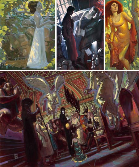
John Watkiss has created visual development art for films like Disney’s Tarzan, Treasure Planet, Atlantis: The Lost Empire, Fantasia 2000, Skycaptain and the World of Tomorrow and the proposed Sandman. In his movie related career he has done work for Twentieth Century Fox, Dreamworks, Francis Ford Coppola and Ridley Scott Associates.Watkiss has also had a career as a comic book artist, doing covers and interiors for D.C., Marvel and UK publishers on titles like Batman, Conan, Deadman and Sandman.
If that isn’t enough, Watkiss also is a gallery artist. His subjects are frequently images of women painted in a modern style but in costume and compositions influenced by Victorian painting.
You can see a mixture of his film development and gallery work on his blog, though not much of the work for comics. There are unofficial galleries of his comics work on ComicArtFans and Comic Art Community.
On his blog, there are some visual development paintings for a prospective Sandman movie on this page. Despite the huge red “SOLD” across some of them, clicking on them still takes you to viewable images (image above, bottom).
Watkiss has taught anatomy and other art subjects at Royal College of Art in London, as well as other schools. He is the author of several books on anatomy. These don’t seem to be available through the usual online bookstores, but can be ordered directly from the sidebar of Watkiss’ blog. Watkiss has a drawing approach that combines fluid linework with strong underlying geometry, reminiscent of George Bridgeman or Andrew Loomis. Students of figure construction may see a similarity to Burne Hogarth as well.
The books had a dedicated site at one time, and there was also a site devoted to his gallery art, but he seems to have dropped those in favor of the bog.
There is still a site dedicated to his gallery art, a different one, The Works of John Watkiss at seventhsealproductions.com, I don’t know if it is directly connected to Watkiss or not. Here you will find his Pre-Raphaelite influenced paintings of women in (and out of) classical gowns and idyllic settings. These are my favorites of his, in which subjects and styles we are used to seeing rendered with a high degree of finish are given a lighter, more gestural approach.
There is a YouTube video of a “Levi’s spec ad featuring John Watkiss” that Marcel Duchamp fans in particular may find amusing.
A new solo exhibition of Watkiss’ work from all three aspects of his career opens on August 2nd and runs to August 10, 2008 at Gallery Nucleus in Alhambra, California.
Categories:
-
Exquisite Visions of Japan

The Blanton Museum of Art, part of the University of Texas at Austin, is currently showing Exquisite Visions of Japan, which is an exhibition of Japanese woodblock prints from the James A. Michener Collection of the Honolulu Academy of Arts.Though the online image gallery on the museum’s site is minimal, it provides a nice jumping off point for revisiting some of the extraordinary Japanese woodblock print artists I’ve written about before, including Hiroshi Yoshida, Kawase Hasui, Katsushika Hokusai and Ito Shinsui; as well as looking for links for some artists I have not yet written about, like Utagawa Hiroshige, Hiratsuka Unichi, Okumura Masanobu, Katsukawa Shunsho and Kitagawa Utamaro.
Many of these artists are associated with the genre known as Ukiyo-e, or pictures of the “floating world”. (As I mentioned in my post on a recent exhibit of work from the Utagawa School at the Brooklyn Museum, the “floating world” is not what you might think on first hearing the term.) Others are associated with the “shin hanga” or “new print” movement.
These artists were tremendously influential on European artists in the late 19th and early 20th Centuries, particularly the Impressionists and others like Whistler.
Unfortunately, my knowledge of the history and relationship of these artists and their times is frustratingly minimal. You will also have to forgive me if I am inconsistent in the order in which I use the artist’s family and given names, as this varies in listings and the naming conventions are unfamiliar enough that I’m never quite clear about which is which.
I do know that some of these works are among the most beautiful prints I’ve ever encountered. Particular favorites of mine are those of Hiroshi Yoshida and Kawase Hasui.
(Image above: Okumura Masanobu, Utagawa Hiroshige, Hiroshi Yoshida)
[Link via Art Knowledge News]
Categories:
-
Shino Arihara

Shino Arihara’s often deceptively simple illustrations are usually in service of a concept, illustrating not only a particular article or story, but the underlying idea.However, as is often the case for me when viewing the work of illustrators, I find some of her most interesting work is among her personal pieces, unrestrained by the demands of publishing.
Arihara’s illustrations appear to be painted in gouache. Her brief bio page doesn’t mention anything about technique or medium. It does tell us, however, that her clients include L.A. Weekly, The Boston Globe, The Wall Street Journal and Time Magazine, among others.
Her work has been included in American Illustration, Spectrum and illustration annuals for Communications Arts, which also featured an interview with her in the October, 2007 issue. She is also the recipient of a Bronze Medal from the Society of Illustrators.
In addition to her editorial work, Arihara has illustrated books like Ceci Ann’s Day of Why by Christopher Phillips, and A Song for Cambodia by Michelle Lord.
One of the characteristics of her work that I find most appealing is her use of the texture of the paint as a pictorial element, particularly in backgrounds or large areas of color in which the paint not only keeps, but emphatically declares, its identity as paint, without losing its role in conveying the image.
Arihara often keeps her palette restrained, choosing muted, neutralized colors accented by stronger hued passages and enlivened with those wonderful paint textures.
Categories:
-
Philadelphia City Paper Comic Competition

For those who would like a little exposure for their comics in the Philadelphia area, Philadelphia City Paper has posted an open invitation for cartoonists and illustrators to submit their comics for the weekly paper’s Second Annual Comics Issue.All submissions will be posted on the paper’s web site, and editors picks will be published in the August 14th issue.
As their little bit of self-deprecating humor points out, they get free comics and you get “exposure”. Take it as you will.
Artists can submit Quarter Pages (4.875 x 4.875) or Half Pages (9.875 x 4.875) to:
comicsissue@citypaper.net
OR
Patrick Rapa
123 Chestnut Street, 3rd Floor
Philadelphia, PA 19106The deadline is August 6th.
Categories:
-
Jeffrey T. Larson

Minnesota artist Jeffrey Larson studied at the Atelier Lack, now simply called The Atelier, an academic studio program founded by Richard F. Lack (who will be the subject of a future post if I can ever find enough examples of his work online). Lack was a student of R.H. Ives Gammell and one of the pioneers of returning the now-thriving European atelier style system of art instruction to viability here in the U.S.Larson’s atelier training is most evident in his still life paintings, which have the refined clarity and precision of academic realism, but keep a painterly edge.
His figures, in contrast, are much looser, usually painted out of doors, and often posed in water or amid washlines full of sunlit sheets, bringing to mind the posed in water figures of Anders Zorn and the sun-drenced paintings of beach-goers by Joaquin Sorolla.
My favorites of Larson’s paintings, though, are his landscapes (bearing in mind that most of his figurative paintings are also landscapes in effect). These force me to resort to those overused terms “fresh” and “immediate” because nothing else sums them up quite as succinctly.
His landscapes evoke the dappled sunlight on an intimate creek or the cool haze of a winter sky with beautifully efficient brush strokes and a subtle handling of color variation. He’s chosen a position on the spectrum of tight to loose rendering that I find particularly appealing.
Something I found of special interest in Larson’s work is they way he constructs the image with the direction and shape of his brushstrokes. He isn’t just dabbing color in, filling in shapes with slapdash blots of paint, he’s drawing with his brushstrokes, defining the shapes of objects in same way lines and textures applied in a drawing can follow and define the form. (This is a characteristic I particularly associate with painters like Sargent or Cecilia Beaux.)
I’m also fascinated by the apparent difference in approach between Larson’s loose landscape and figurative work and his more tightly rendered still life paintings. There is no indication of dates for the work on his site, so perhaps the still life paintings are earlier; or perhaps Larson just enjoys applying the range of his considerable abilities in a different manner for those subjects.
Larson was featured in articles in Classical Realism Journal in 2001 and American Artist in 2004 (the latter as a cover story).
Addendum: Reader A.W.C. (see this post’s comments) was kind enough to write and let us know that there is currently a solo exhibition of Jeffrey Larson’s work at Tree’s Place Gallery in Orleans, Massashusetts. In addition to an online catalog, which features several images of his work, there is a multi-page gallery of images that can be enlarged by clicking on the thumbnails.
Categories:
-
Jeffery T. Larson
This it the original post on Jeffrey T. Larson, in which I made a typo in his name in the title the post.
I’m leaving it in place because changing the title changes the link to the post, and this post has been linked to from BoingBoing (thanks, Mark!).
The full post is now here.
I’m certain I will have a typo on my gravestone, probably a reference to the one that puts me under it.
Categories:


Charley’s Picks
Bookshop.org
(Bookshop.org affilliate links; sales benefit independent bookshop owners; I get a small percentage to help support my work on Lines and Colors)

John Singer Sargent: Watercolors


Urban Sketching: Understanding Perspective


Charley’s Picks
Amazon
(Amazon.com affiliate links; sales go to a larger yacht for Jeff Bezos; but I get a small percentage to help support my work on Lines and Colors)
John Singer Sargent: Watercolors
Urban Sketching: Understanding Perspective