
Categories
- 3d CGI
- Amusements
- Animation
- Anime & Manga
- Art Materials
- Art Videos
- Blogroll
- Cartoons
- Color
- Comics
- Concept & Visual Dev.
- Creativity
- Digital Art
- Digital Painting
- Displaying Art on the Web
- Drawing
- Eye Candy for Today
- Gallery and Museum Art
- High-res Art Images
- Illustration
- Motion Graphics & Flash
- Museums
- Online Museums
- Outsider Art
- Painting
- Painting a Day
- Paleo Art
- Pastel, Conté & Chalk
- Pen & Ink
- Prints and Printmaking
- Reviews
- Sc-fi and Fantasy
- Sculpture & Dimensional
- Site Comments
- Sketching
- Storyboards
- Tools and Techniques
- Uncategorized
- Vector Art
- Videos & Podcasts
- Vision and Optics
- Watercolor and Gouache
- Webcomics
Archives
- April 2026
- March 2026
- February 2026
- January 2026
- December 2025
- November 2025
- October 2025
- September 2025
- August 2025
- July 2025
- June 2025
- May 2025
- January 2025
- December 2024
- November 2024
- October 2024
- September 2024
- August 2024
- June 2024
- April 2024
- March 2024
- February 2024
- January 2024
- December 2023
- November 2023
- October 2023
- September 2023
- August 2023
- July 2023
- May 2023
- April 2023
- March 2023
- February 2023
- January 2023
- December 2022
- November 2022
- September 2022
- August 2022
- July 2022
- June 2022
- May 2022
- April 2022
- March 2022
- February 2022
- January 2022
- December 2021
- November 2021
- October 2021
- September 2021
- August 2021
- July 2021
- June 2021
- May 2021
- April 2021
- March 2021
- February 2021
- January 2021
- December 2020
- November 2020
- October 2020
- September 2020
- August 2020
- July 2020
- June 2020
- May 2020
- April 2020
- March 2020
- February 2020
- January 2020
- December 2019
- November 2019
- October 2019
- September 2019
- August 2019
- July 2019
- June 2019
- May 2019
- April 2019
- March 2019
- February 2019
- January 2019
- December 2018
- November 2018
- October 2018
- September 2018
- August 2018
- July 2018
- June 2018
- May 2018
- April 2018
- March 2018
- February 2018
- January 2018
- December 2017
- November 2017
- October 2017
- September 2017
- August 2017
- July 2017
- June 2017
- May 2017
- April 2017
- March 2017
- February 2017
- January 2017
- December 2016
- November 2016
- October 2016
- September 2016
- August 2016
- July 2016
- June 2016
- May 2016
- April 2016
- March 2016
- February 2016
- January 2016
- December 2015
- November 2015
- October 2015
- September 2015
- August 2015
- July 2015
- June 2015
- May 2015
- April 2015
- March 2015
- February 2015
- January 2015
- December 2014
- November 2014
- October 2014
- September 2014
- August 2014
- July 2014
- June 2014
- May 2014
- April 2014
- March 2014
- February 2014
- January 2014
- December 2013
- November 2013
- October 2013
- September 2013
- August 2013
- July 2013
- June 2013
- May 2013
- April 2013
- March 2013
- February 2013
- January 2013
- December 2012
- November 2012
- October 2012
- September 2012
- August 2012
- July 2012
- June 2012
- May 2012
- April 2012
- March 2012
- February 2012
- January 2012
- December 2011
- November 2011
- October 2011
- September 2011
- August 2011
- July 2011
- June 2011
- May 2011
- April 2011
- March 2011
- February 2011
- January 2011
- December 2010
- November 2010
- October 2010
- September 2010
- August 2010
- July 2010
- June 2010
- May 2010
- April 2010
- March 2010
- February 2010
- January 2010
- December 2009
- November 2009
- October 2009
- September 2009
- August 2009
- July 2009
- June 2009
- May 2009
- April 2009
- March 2009
- February 2009
- January 2009
- December 2008
- November 2008
- October 2008
- September 2008
- August 2008
- July 2008
- June 2008
- May 2008
- April 2008
- March 2008
- February 2008
- January 2008
- December 2007
- November 2007
- October 2007
- September 2007
- August 2007
- July 2007
- June 2007
- May 2007
- April 2007
- March 2007
- February 2007
- January 2007
- December 2006
- November 2006
- October 2006
- September 2006
- August 2006
- July 2006
- June 2006
- May 2006
- April 2006
- March 2006
- February 2006
- January 2006
- December 2005
- November 2005
- October 2005
- September 2005
- August 2005
Relevant Blogs
Art, Painting & Sketch
- Gurney Journey
- Underpaintings
- Art and Influence
- Painting Perceptions
- Oil Painters of America
- Vasari Paint POV
- Flying Fox
- Urban Sketchers
- Bento (Smithsonian)
- Art Inconnu
- The Hidden Place
- Still Life
- Making a Mark
- The Art of the Landscape
- Exploring Color & Creativity
- Art Contrarian
- Artist A Day
- beinArt Surreal Art Collective
- Eye Level
- David Dunlop
- p.i.g.m.e.n.t.i.u.m
- CultureGrrl
- Joaquín Sorolla blog
- Artists in Pastel
“Painting a Day”
- A Painting a Day (Keiser)
- On Painting (Keiser)
- Julian Merrow-Smith
- Karen Jurick
- Jeffrey Hayes
- Carol Marine
- Abbey Ryan
- Daily Paintworks
Other Painting Blogs
- Virtual Gouache Land
- Neil Hollingsworth
- Marc Hanson
- Kevin Menck
- Marc Dalessio
- Larry Seiler
- Stapleton Kearns
- Colin Page
- Roos Schuring
- Hans Versfelt
- Titus Meeuws
- Régis Pettinari
- René Plein Air
- Belinda Del Pesco
- Robin Weiss
- Nathan Fowkes (Land Sketch)
- William Wray
- Frank Serrano
- Stephen Magsig
- Michael Chesley Johnson
- Twice a Week
- Sarah Wimperis
- Rob Adams
- Michael Cole Manley
- The Dirty Palette Club
- Mike Manley’s Draw!
Gallery Art & Illustration mix
Illustration
- Howard Pyle
- 100 Years of Illustration
- BibliOdyssey
- Illustration Art
- Today’s Inspiration
- Illustration Mundo
- Little Chimp Society
- Danny Gregory
- R D (John Martz
- Illustration Friday blog
- Monster Brains
- Illustrators & Illustrations (RU)
- Elwood H. Smith
- DaniDraws.com
- Designers Who Blog
- iSpot Blog
Sci-Fi & Fantasy
Illustration & Comics
Comics & Cartoons
- Comics Beat
- Robot 6
- Newsarama Blog
- Comic Vine
- Comics Alliance
- Forbidden Planet Int.
- Paolo Rivera
- Bolt City
- Flight
- Scott McCloud
- The Comics Journal
- Comixpedia
- Funnybook Babylon
- James Baker
- Middleton’s Sketchbook
- Boneville
- The Hotel Fred
- Paul Rivoche
- Daily Cartoonist
- Mad About Cartoons (William Wray)
- Digital Strips
Illustration & Concept
Animation & Concept
- Cartoon Brew
- Animation Blog
- Cold Hard Flash
- Concept Art World
- The CAB
- FY Concept Art
- Concept Ships
- Concept Robots
- John Nevarez
- Armand Serrano
- Marcos Mateu-Mestre
- all kinds of stuff (Kricfalusi)
- Yacin the faun (Man Arenas)
- Kelsey Mann
- Cre8tivemarks Blog
- Ice-Cream Monster Toon Cafe
- AAU Character & Creature Design
- AAU Animation Notes
- Articles and Texticles
Paleo & Scientific
Tools & Techniques
Other
Lists of Art Blogs
Art Image Resource Links
Historic Art Images
- Wikimedia Commons: Paintings
- Wikimedia Commons: Drawings
- The Athenaeum
- WikiArt (WikiPaintings)
- Google Art Project: Artists
- Google Art Project: Collections (Museums)
- ArtCyclopedia
- Web Gallery of Art
- Art Renewal Center
- Web Gallery of Impressionism
Auction Consolidation sites
Auction sites
- Sotheby’s
- Bonham’s
- Christies
- Heritage Auctions: Fine Art
- Heritage Auctions: Illustration
- Freeman’s Auctions
- Bukowskis
- Shannon’s
Image Search
Reverse Image Search (search by image)
- Tin Eye
- RevImg
- Google Image Search (camera icon)
- Bing Image Search (camera icon)
Promoting some friends and some clients of my website design business
- Twin Willows T’ai Chi studio in Wilmington DE. Taiji classes with Bryan Davis.
- Ray Hayward, Inspired Teacher of T’ai Chi ( Taiji ) in Minneapolis, Founder of Mindful Motion Tai Chi Academy
- OldHead Tattoo studio and Art Gallery in Wilmington DE. Tattoos and paintings by Bruce Gulick
- Sharon Domenico Art, pet portrait oil paintings
- Platinum Paperhanging, wallpaper hanging, Main Line and Philadelphia, PA
- Lisa Stone Design, interior designer, Main Line and Philadelphia, PA
- Studio12KPT, original art, prints, calendars and other custom printed items by Van Sickle & Rolleri
-
Jacques-Louis David

Political revolution can often coincide with a revolution in art, but sometimes political upheaval can send art backwards, looking for reaffirmation in older forms.Jacques-Louis David (pronounced da-veed) was a painter at the height of French neo-classical style and at the center of the turmoil of the French Revolution and its aftermath.
As a student David won the prestigious Prix de Rome from the Royal Academy and, after studying in Italy for five years, returned to be made an Associate member of the Academy and later a full Academician.
He was a student of Boucher, the great painter of the Rococo (and a distant relative) who, along with Fragonard, represented the fun, frivolity, eroticism and decadence of a style that David would reject for the austere beauty of the neo-classical. David himself was an enormously influential teacher, counting among his pupils François Gérard, Antoine-Jean Gros, Jean-Babtiste Iasby, and the amazing Jean Aguste Dominique Ingres, as well as the American naturalist painter John James Audubon.
David was a masterful draughtsman, and representational drawing and respect for the refinement of form in the sculpture of antiquity formed the basis for his art, as evidenced in “The Death of Sacrates”, above, where we can see Socrates expounding while reaching for the hemlock in a formal tableaux drawn and rendered with consummate skill. Ol’ Socrates is looking pretty pumped-up and sprightly for being 70ish, but, hey, that’s the point of neo-classical art, it’s idealized to the max.
Looking back form the post-Romantic viewpoint of the 19th Century, let alone the 21st, it’s easy to see David’s monumental solidity as cold and lifeless, but the desire to live in the ideal of the classical was a passion, inextricable from his political passions. David was not only caught up in the revolution, but was directly and fervently involved. When Napoleon came to power there were many painters in the circle of the emperor (including Prud’hon), but David was the main painter to the emperor and it was he who created the painting that provides than now-clichéd image we have of Napolean with his hand tucked into his vest.
David’s life of political intrigue would undoubtedly fill a a fascinating book, as would his many paintings, austere perhaps, but masterful and supremely accomplished; and if you look for his portraits, you may find an unexpected warmth and force of personality lurking in the formal compositions.
Categories:
-
Marie-Denise Villers
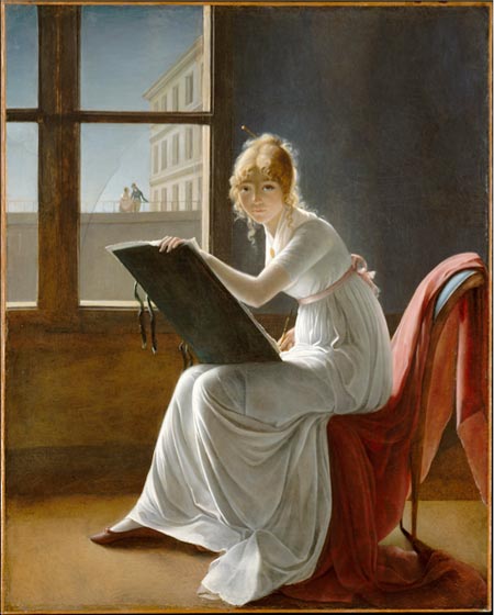
I used to think this was my favorite painting by Jacques-Louis David. I was mistaken.But then, so were art scholars who for years had attributed it incorrectly to David and subsequently decided that it was the work of Marie-Denise Villers, a French portrait painter about whom little is known.
We tend to think of art history as immutable, set in stone, perhaps literally. But history, while not exactly a science, is like science in that new evidence, and sometimes just new thinking about existing facts, can change things overnight.
Prior to the change in attribution of this work, not much attention was focused on Villers and I haven’t had much success in searching her out on the web, other than to find dozens of references to this particular painting. We know that she was a student of Anne-Louis Girodet-Trioson, called Girodet, who was in turn a pupil of David’s. You might add that Villers was a very talented student, given that her work had been mistaken for that of David by art historians.
She painted for a while under her maiden name of Lemoine and later took the name of her husabnd, architecture student Michel-Jean-Maximilien Villers. Her portraits apparently attracted favorable attention when she exhibited in the Salon as a student of Girodet. She carved a niche for herself with paintings that combined some of the characteristics of portraits and genre paintings, which she called “studies of women”.
You will still find this painting in books listed as a portrait of Charlotte du Val d’Ognes by David. The Metropolitan Museum of Art in New York, which has the painting in its permanent collection, now attributes it to Villers and lists it as simply “Young Woman Drawing“.
The painting is striking. It’s large, 63 x 50 in. (161 x 128 cm), and when you enter the gallery in which it hangs, the painting is facing you on the opposite wall. It’s hard not to be struck by the luminous figure of this beautiful young woman, drawing board in hand, the folds of her white dress bathed in the soft light from the window behind her, who is gazing directly at you, as though you were the subject of her drawing.
Not knowing anything about the painting, I had made an assumption that here was a student of David’s, drawing the master as he, in turn, painted her. It now seems more likely that the painting is actually a self portrait, an idea that just feels “right” when you look at the painting with that in mind.
Artists’ faces often have a certain look to them in self portraits, due, I believe, to a shift in consciousness into a mode of perception associated with artistic seeing (see my post on Drawing on the Right Side of the Brain). The woman might have that look whether she was drawing herself or another, but the semi-hidden position of her drawing hand and other elements just make it feel like a self portrait now that the idea of attribution to David is removed.
I certainly hope the Met doesn’t move this striking painting now that it’s assigned to a “lesser” artist. I think we need to supplement our art history with some literature and remember Shakespeare’s lesson that “a rose by any other name would smell as sweet”, and a beautiful painting by another artist’s name is still a beautiful painting.
Addendum: I’ve come back and added what resources I could find on Villers as of November 2009 to the list below, and replaced the smaller image I had here with a new version from the Met’s updated site. There is also now a zoomable image of the painting. I’ve also written a new post about Marie-Denise VIllers.
Categories:
-
Heinrich Kley

The relationship of humanity to the natural world is receiving a bit more attention these days, as it becomes clearer that we’re not cleaning the big cat-box we’ve made of our Eden. Artists are often quicker to notice these things than others and some have been pointing out that strained relationship for a long time.Heinrich Kley was an Austrian artist with a background in portraying modern industrial life around the turn of the last century, when the industrial revolution had made that separation of humans from nature stand out in sharp relief.
Kley’s brilliant satirical drawings often portrayed humans unclothed and other animals in finery or in anthropomorphic situations, pointing out the similarities and differences, often in a way that was not flattering to the human side of the equation. He was adept pointing out our foibles with a simple image and perhaps a brief caption.
Kley was a wonderful draughtsman, whether drawing highly rendered pen and ink compositions or conveying sophisticated ideas with a scant few lines, his beautifully fluid ink line glides across the page like marks left by the movements of a graceful ice dancer.
Kley’s bizarre and imaginative juxtapositions of humans and other animals, engaged in social situations, dancing, eating or in bizarre dream-like and surreal situations, were printed in Simplizissimus and Jungend, popular satirical magazines of the time. Kley also illustrated several books.
He often portrayed mother nature as a woman, either offering comfort to humans or subject to various indignities at their hands, and many of his drawings have an erotic tinge to them.
Walt Disney was introduced to Kley at one point and became an avid collector of his work. The influence is dramatically clear, particularly in works like Fantasia, where you can see Kley’s drawings of women dancing with alligators translated into the beautiful and hilarious “Dance of the Hours” sequence which featured hippos waltzing with alligators (brilliantly animated by Preston Blair — more on him in a future post).
As a quirky pen and ink artist from the turn of the 20th Century, Kley is the kind of artist who is often lost from view. Fortunately good ol’ Dover Books comes through again, keeping his work in print in a terrific and very inexpensive edition, The Drawings of Heinrich Kley (a steal at $15). The second volume, More Drawings of Heinrich Kley is out of print but you should be able to find it used.
There is also a nice tribute online, courtesy of the good folks at Coconino World, and a few other web resources. It’s worth looking for the books, though, even if in the library. The online images tend to be too small to get a real feeling for his beautiful ink line, and the books offer translations of the captions, which often brings the point of the drawing into focus, despite cultural differences between the modern world and Austrian society of 100 years ago. (The image above, top, is captioned “Inspiration”.)
In a career path that is something of the opposite of many artists today, Kley started as a gallery artist, moved into cartoon drawings and editorial illustrations and then into other areas of commercial art. The satirical drawings for which he is most renowned were largely the product of a ten year span.
Categories:
-
Karl Kofoed (update)

This weekend in Philadelphia science fiction fans will be buzzing around Philcon, The Philadelphia Conference on Science Fiction and Fantasy, a venerable sci-fi convention (excuse me, conference) that is celebrating its 70th anniversary this year.The artist guest of honor at this years convention is Karl Kofoed, a visionary creator of alien worlds that I profiled in this post back in July.
Kofoed is a veteran science fiction illustrator and the creator of The Galactic Geographic, a remarkable “coffee table book from the future” that is one of the more thoughtful and provocative explorations of the possibilities of life on other worlds.
Kofoed works in both traditional and digital media and is a writer in addition to being an artist, with two novels to his credit, Deep Ice, and the recently published JOKO.
Convention goers (er,.. conference attendees) will have a rare opportunity to meet Karl and see his original art first hand in the con’s art exhibit. Here’s the info on con registration.
Categories:
-
Julian Merrow-Smith

You will often hear people say that artists, in particular the Impressionists and post-Impressionists like van Gogh and Gauguin, found the quality of the light particularly appealing in Provence, that area in the south of France that was the first province established by the Romans outside of Italy.I have to say that I was skeptical of this until I visited the region around Arles a few years ago and experienced it for myself. There really is something extraordinary about the light there and the effect it has on the appearance of color in the area’s beautiful landscape, and I can easily understand why artists find the region particularly appealing.
Julian Merrow-Smith is an English painter in Provence. (Sounds like it should be a Sting song, doesn’t it?) He paints in a direct, Impressionist influenced style that is spare on details and rich in color and light.
His deceptively simple compositions are wonderful expressions of how much can be suggested with a minimum of brush strokes. (The image above is actually one of his more elaborate paintings, I just happen to really like it.) He pulls short of flattening his compositions into planes like Cezanne, who is obviously an influence, and leaves enough suggestion of detail to keep them vibrantly three-dimensional; creating in his landscapes scenes that are at once inviting to walk into and yet obviously paint on a surface.
He paints the countryside in and around his adopted home of Crillon le Brave, a small village in the hill country in the south of France, with an eye to the extraordinary in the ordinary. He has recurring theme that I particularly enjoy of compositions that find rich contrasts in the shadows of trees laying across roads or paths in the warm light of the Provence sun.
Merrow-Smith also paints still life and portraits, but as much as I like his other work, particularly his small scale still lifes, it is the Provence landscapes that I enjoy the most.
His portraits have a rough-hewn appearance, as if the paint were applied like a sculptor adding clay with his thumb. His still lifes range from very simple compositions of a few objects to the more formal large scale paintings that were commissioned by Cunard to hang in the Britannia Restaurant aboard the Queen Mary 2.
In a practice that goes back almost as far as, and I think is independent of, Duane Keiser’s “Painting a Day” project, Merrow-Smith has been posting his small postcard-sized paintings on his “Postcard from Provence” blog. Although not strictly daily, he has kept pretty close to that, and, more importantly, kept a high-level of quality and consistency.
Like Keiser and the growing number of “painting a day” adherents who are following in their footsteps, Merrow-Smith puts his small paintings up for sale on the blog as he creates them. Unlike Keiser, (and much to my amazement) he has not allowed demand to raise his price much and still offers his small works at $120. He sends out notice of new paintings to a mailing list of subscribers where they are, not surprisingly, snapped up within minutes of being posted. He also sometimes photographs the works and makes them available as limited edition prints.
The paintings on the Postcard from Provence site can be viewed by category, so you can contemplate his serene still lifes and intimate flower studies, relax by the Mediterranean or talk a walk through the sunlit fields of Provence.
Categories:
-
Moira Hahn

Moira Hahn was born in Boston and moved west, both physically and artistically, until west met east. She moved to California at one point to continue her education, studied animation as an addition to her BFA and, after working in animation and illustration for time, studied Japanese art in Hawaii and Japan for several years.Her enthusiasm for Asian art extends to Persian, Tibetan, indian and Chinese art, but it is Japanese woodblock prints that most seem to inform her current gallery paintings, particularly Ukiyo-e (“pictures of the floating world”) with their colorful depictions of city life, entertainment and pleasurable pursuits.
Hahn’s work brings together the formal compositions, colors, dress, architecture and decorative elements of those prints with a very modern juxtaposition of elements. In most of the current images in her online gallery you’ll find paintings that almost look as if they could be traditional woodblock prints, except that the houses, rooms and landscapes are populated with animals, anthropomorphically dressed in the stylized and elaborately patterned kimonos and robes of traditional Japanese society at the time of the Ukiyo-e prints.
I don’t know enough about these prints, or others of the time (see my posts on Hokusai, Yoshida and Hasui) to know how accurate any of these representations are, but I do know that Hahn’s work is often laced with liberal doses of humor. Just the images of birds and cats in formal dress can be funny, but they’re made more so by the fact they the animals themselves, particularly the cats, are rendered with the kind of stylistic exaggerations usually assigned to images of tigers and lions.
You’ll also find pop culture references, like Astro Boy and Godzilla, popping up in her images (and in her titles, the image above is titled “A Three Hour Tour”). There are also humorous stories suggested in the relationships and situations portrayed in the images.
Hahn’s online gallery is arranged by time period, so you can follow back from the present (or forward from the 80’s) and watch her work progress through several phases and degrees of influence from various Asian arts.
Hahn also has a blog called sink hole on which she discusses art, exhibitions, travels and anything else that crosses her mind.
Link via recogedor.
Categories:


Charley’s Picks
Bookshop.org
(Bookshop.org affilliate links; sales benefit independent bookshop owners; I get a small percentage to help support my work on Lines and Colors)

John Singer Sargent: Watercolors


Urban Sketching: Understanding Perspective


Charley’s Picks
Amazon
(Amazon.com affiliate links; sales go to a larger yacht for Jeff Bezos; but I get a small percentage to help support my work on Lines and Colors)
John Singer Sargent: Watercolors
Urban Sketching: Understanding Perspective