
Categories
- 3d CGI
- Amusements
- Animation
- Anime & Manga
- Art Materials
- Art Videos
- Blogroll
- Cartoons
- Color
- Comics
- Concept & Visual Dev.
- Creativity
- Digital Art
- Digital Painting
- Displaying Art on the Web
- Drawing
- Eye Candy for Today
- Gallery and Museum Art
- High-res Art Images
- Illustration
- Motion Graphics & Flash
- Museums
- Online Museums
- Outsider Art
- Painting
- Painting a Day
- Paleo Art
- Pastel, Conté & Chalk
- Pen & Ink
- Prints and Printmaking
- Reviews
- Sc-fi and Fantasy
- Sculpture & Dimensional
- Site Comments
- Sketching
- Storyboards
- Tools and Techniques
- Uncategorized
- Vector Art
- Videos & Podcasts
- Vision and Optics
- Watercolor and Gouache
- Webcomics
Archives
- April 2026
- March 2026
- February 2026
- January 2026
- December 2025
- November 2025
- October 2025
- September 2025
- August 2025
- July 2025
- June 2025
- May 2025
- January 2025
- December 2024
- November 2024
- October 2024
- September 2024
- August 2024
- June 2024
- April 2024
- March 2024
- February 2024
- January 2024
- December 2023
- November 2023
- October 2023
- September 2023
- August 2023
- July 2023
- May 2023
- April 2023
- March 2023
- February 2023
- January 2023
- December 2022
- November 2022
- September 2022
- August 2022
- July 2022
- June 2022
- May 2022
- April 2022
- March 2022
- February 2022
- January 2022
- December 2021
- November 2021
- October 2021
- September 2021
- August 2021
- July 2021
- June 2021
- May 2021
- April 2021
- March 2021
- February 2021
- January 2021
- December 2020
- November 2020
- October 2020
- September 2020
- August 2020
- July 2020
- June 2020
- May 2020
- April 2020
- March 2020
- February 2020
- January 2020
- December 2019
- November 2019
- October 2019
- September 2019
- August 2019
- July 2019
- June 2019
- May 2019
- April 2019
- March 2019
- February 2019
- January 2019
- December 2018
- November 2018
- October 2018
- September 2018
- August 2018
- July 2018
- June 2018
- May 2018
- April 2018
- March 2018
- February 2018
- January 2018
- December 2017
- November 2017
- October 2017
- September 2017
- August 2017
- July 2017
- June 2017
- May 2017
- April 2017
- March 2017
- February 2017
- January 2017
- December 2016
- November 2016
- October 2016
- September 2016
- August 2016
- July 2016
- June 2016
- May 2016
- April 2016
- March 2016
- February 2016
- January 2016
- December 2015
- November 2015
- October 2015
- September 2015
- August 2015
- July 2015
- June 2015
- May 2015
- April 2015
- March 2015
- February 2015
- January 2015
- December 2014
- November 2014
- October 2014
- September 2014
- August 2014
- July 2014
- June 2014
- May 2014
- April 2014
- March 2014
- February 2014
- January 2014
- December 2013
- November 2013
- October 2013
- September 2013
- August 2013
- July 2013
- June 2013
- May 2013
- April 2013
- March 2013
- February 2013
- January 2013
- December 2012
- November 2012
- October 2012
- September 2012
- August 2012
- July 2012
- June 2012
- May 2012
- April 2012
- March 2012
- February 2012
- January 2012
- December 2011
- November 2011
- October 2011
- September 2011
- August 2011
- July 2011
- June 2011
- May 2011
- April 2011
- March 2011
- February 2011
- January 2011
- December 2010
- November 2010
- October 2010
- September 2010
- August 2010
- July 2010
- June 2010
- May 2010
- April 2010
- March 2010
- February 2010
- January 2010
- December 2009
- November 2009
- October 2009
- September 2009
- August 2009
- July 2009
- June 2009
- May 2009
- April 2009
- March 2009
- February 2009
- January 2009
- December 2008
- November 2008
- October 2008
- September 2008
- August 2008
- July 2008
- June 2008
- May 2008
- April 2008
- March 2008
- February 2008
- January 2008
- December 2007
- November 2007
- October 2007
- September 2007
- August 2007
- July 2007
- June 2007
- May 2007
- April 2007
- March 2007
- February 2007
- January 2007
- December 2006
- November 2006
- October 2006
- September 2006
- August 2006
- July 2006
- June 2006
- May 2006
- April 2006
- March 2006
- February 2006
- January 2006
- December 2005
- November 2005
- October 2005
- September 2005
- August 2005
Relevant Blogs
Art, Painting & Sketch
- Gurney Journey
- Underpaintings
- Art and Influence
- Painting Perceptions
- Oil Painters of America
- Vasari Paint POV
- Flying Fox
- Urban Sketchers
- Bento (Smithsonian)
- Art Inconnu
- The Hidden Place
- Still Life
- Making a Mark
- The Art of the Landscape
- Exploring Color & Creativity
- Art Contrarian
- Artist A Day
- beinArt Surreal Art Collective
- Eye Level
- David Dunlop
- p.i.g.m.e.n.t.i.u.m
- CultureGrrl
- Joaquín Sorolla blog
- Artists in Pastel
“Painting a Day”
- A Painting a Day (Keiser)
- On Painting (Keiser)
- Julian Merrow-Smith
- Karen Jurick
- Jeffrey Hayes
- Carol Marine
- Abbey Ryan
- Daily Paintworks
Other Painting Blogs
- Virtual Gouache Land
- Neil Hollingsworth
- Marc Hanson
- Kevin Menck
- Marc Dalessio
- Larry Seiler
- Stapleton Kearns
- Colin Page
- Roos Schuring
- Hans Versfelt
- Titus Meeuws
- Régis Pettinari
- René Plein Air
- Belinda Del Pesco
- Robin Weiss
- Nathan Fowkes (Land Sketch)
- William Wray
- Frank Serrano
- Stephen Magsig
- Michael Chesley Johnson
- Twice a Week
- Sarah Wimperis
- Rob Adams
- Michael Cole Manley
- The Dirty Palette Club
- Mike Manley’s Draw!
Gallery Art & Illustration mix
Illustration
- Howard Pyle
- 100 Years of Illustration
- BibliOdyssey
- Illustration Art
- Today’s Inspiration
- Illustration Mundo
- Little Chimp Society
- Danny Gregory
- R D (John Martz
- Illustration Friday blog
- Monster Brains
- Illustrators & Illustrations (RU)
- Elwood H. Smith
- DaniDraws.com
- Designers Who Blog
- iSpot Blog
Sci-Fi & Fantasy
Illustration & Comics
Comics & Cartoons
- Comics Beat
- Robot 6
- Newsarama Blog
- Comic Vine
- Comics Alliance
- Forbidden Planet Int.
- Paolo Rivera
- Bolt City
- Flight
- Scott McCloud
- The Comics Journal
- Comixpedia
- Funnybook Babylon
- James Baker
- Middleton’s Sketchbook
- Boneville
- The Hotel Fred
- Paul Rivoche
- Daily Cartoonist
- Mad About Cartoons (William Wray)
- Digital Strips
Illustration & Concept
Animation & Concept
- Cartoon Brew
- Animation Blog
- Cold Hard Flash
- Concept Art World
- The CAB
- FY Concept Art
- Concept Ships
- Concept Robots
- John Nevarez
- Armand Serrano
- Marcos Mateu-Mestre
- all kinds of stuff (Kricfalusi)
- Yacin the faun (Man Arenas)
- Kelsey Mann
- Cre8tivemarks Blog
- Ice-Cream Monster Toon Cafe
- AAU Character & Creature Design
- AAU Animation Notes
- Articles and Texticles
Paleo & Scientific
Tools & Techniques
Other
Lists of Art Blogs
Art Image Resource Links
Historic Art Images
- Wikimedia Commons: Paintings
- Wikimedia Commons: Drawings
- The Athenaeum
- WikiArt (WikiPaintings)
- Google Art Project: Artists
- Google Art Project: Collections (Museums)
- ArtCyclopedia
- Web Gallery of Art
- Art Renewal Center
- Web Gallery of Impressionism
Auction Consolidation sites
Auction sites
- Sotheby’s
- Bonham’s
- Christies
- Heritage Auctions: Fine Art
- Heritage Auctions: Illustration
- Freeman’s Auctions
- Bukowskis
- Shannon’s
Image Search
Reverse Image Search (search by image)
- Tin Eye
- RevImg
- Google Image Search (camera icon)
- Bing Image Search (camera icon)
Promoting some friends and some clients of my website design business
- Twin Willows T’ai Chi studio in Wilmington DE. Taiji classes with Bryan Davis.
- Ray Hayward, Inspired Teacher of T’ai Chi ( Taiji ) in Minneapolis, Founder of Mindful Motion Tai Chi Academy
- OldHead Tattoo studio and Art Gallery in Wilmington DE. Tattoos and paintings by Bruce Gulick
- Sharon Domenico Art, pet portrait oil paintings
- Platinum Paperhanging, wallpaper hanging, Main Line and Philadelphia, PA
- Lisa Stone Design, interior designer, Main Line and Philadelphia, PA
- Studio12KPT, original art, prints, calendars and other custom printed items by Van Sickle & Rolleri
-
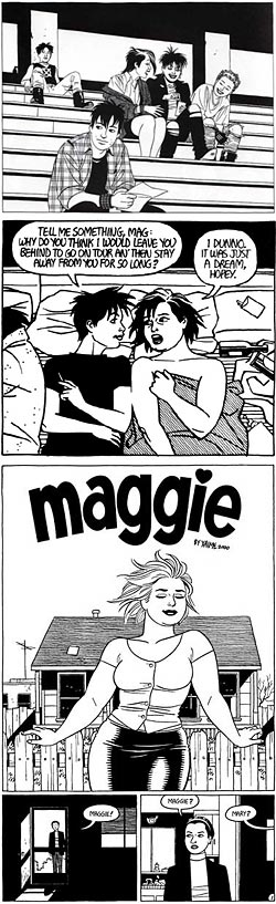
Jaime Hernandez
 Most comic creators, in keeping with the majority of popular entertainment that involves telling continuing stories with the same characters, keep a weird kind of “no-time”, in which the times and events change, but the characters neither change significantly or age.
There have been exceptions, of course, like Frank King’s remarkable newspaper strip from the early 20th Century, Gasoline Alley, in which the characters grew, changed, aged, had kids who aged and so on through generations.
Most creators, however are afraid to rock the boat and mess with a successful formula, so the characters stay the same while the world changes around them.
Jaime (I think pronounced “high-may” or “high-me”) Hernandez not only bucks that trend, but defies most of the expectations for pop culture in creating comic characters that are deeply human, richly portrayed, agonizingly frail, astonishingly strong and remarkably affecting. His primary character, a bisexual Mexican-American woman named Maggie Chascarrillo, has been going through changes (hard changes) since she first appeared in the fanzine style publication Love and Rockets in the 80’s.
Love and Rockets was a showcase for Jaime and his brother Gilbert (Beto) Hernandez, who are often referred to as “Los Bros Hernandez”. Gilbert has his own different and distinct style and can be the subject of another post.
Jaime’s Maggie, and her punky lover/friend/antagonist/companion Hopey, were the subject of a long and involving series of stories in Love and Rockets for over 20 years. The stories have recently been collected into Locas, a 700 page “graphic novel” by Fantagraphics Books. There have also been a series of smaller collections, Music for Mechanics, Wigwam Bam and Blood of Palomar.
In the course of these stories Maggie ages, gains weight (she started out kind of cute-heavy, never the clichéd bombshell type) and goes through the kind of changes, hard learning and disillusionment that real people come up against in the real world. In the beginning, Hernandez mixed her “real world” stories with sci-fi fantasies in which she was a “ProSolar Mechanic”, but eventually dropped that in favor of following Maggie, Hopey and a rich cast of supporting characters through the even stranger world of here and now.
Love and Rockets ceased for a while but reappeared in 2001. Maggie is now middle aged, overweight, dyes her hair and is still struggling to figure out where she fits in a life that seems to sweep her along in strange, scary and unpredictable currents. There is new collection of the most recent stories called Ghost of Hoppers.
Hernandez’s clean, spare and elegant drawing style borrows from the pleasing simplicity of Dan DeCarlo Archie comics, the stark chiaroscuro of Milton Caniff and Noel Sickles and the clarity and efficiency of Alex Toth. Like Toth, his pages are masterful compositions of black and white balance, with bold blacks and delicate sinuous lines.
Unfortunately, I can’t point you to an official site or large collection of Hernendez art on the web, so I’ll suggest several smaller bits. The Fantagraphics page for Hernendez lists current books, including a six-page preview of Ghost of Hoppers.
Note: the links here include some NSFW material.
Categories:
-
Leonardo’s drawings animated
 As part of an exhibit called Leonardo Da Vinci: Experience, Experiment, Design at the Victoria & Albert Museum in the UK, there is an online exhibit of Animated Illustrations, in which the director of animations, Steve Maher and his team have used a combination of hand-drawn and computer-modeled animations to bring some of Leonardo’s amazing notebook pages to life.
There are animations of his drawings of the human figure that have been set in motion, his intricate studies of the anatomy of a bird’s wing, his crafty, and craftsmanlike, war machines, studies of rays of light reflecting from a convex mirror and a 3-D excursion between his floor plans and elevations for a church. The animated progressions from one geometric solid to another are obviously computer animated, but are quite beautiful as animated drawings.
I was particularly fascinated by the animations of Leonardo’s drawings for the working of the human heart because I took on task of animating the heart for this project on organ and tissue donation (click on “The Interactive Body”, I did the Flash module in the pop-up). In addition to explaining organ and tissue donation, the aim was also to demonstrate how the transplantable organs work and I found the animation of the heart the most challenging.
Leonardo’s heart drawings, like his other detailed anatomical drawings are the result of his practice of dissecting corpses in secret, a process which seemed to have no other motivation than Loenardo’s insatiable curiosity, and for which he risked imprisonment (or worse) for heresy.
While all of Loenardo’s drawings should be interesting to artists, of particular interest is the animated version of the Virtuvian Man, in which you get to see the master’s anatomy lessons in motion and watch, for example, the changes in the forearm as it pronates. (Now there’s a great idea – a complete animated anatomy text, rotating the forms in 3-D space and showing changes to the various muscle groups as they flex and extend!)
They’ve taken some liberties, of course, and these animation s should not be thought of as the original drawings, although they are always the starting point. The result is not only a nice series of animations. Sitting in front of a computer screen on which Leonardo’s 15th Century drawings are being rendered in motion or rotated in three dimensional space produces a fascinating feeling of immediate connection between the present and past.
Categories:
-
Tony Auth

People who enjoy reading the days’ editorial cartoon feel lucky if they live in a city where the editorial cartoonist in the major paper is one they like.I’m fortunate to live in the Philadelphia area where we have two (count ’em, two) terrific cartoonists that I like: Tony Auth, in the Philadelphia Inquirer, and Signe Wilkerson in the Philadelphia Daily News.
Tony Auth has been the editorial cartoonist for the Inquirer (which happens to be a great paper, even if it is being gutted by cost cutting like the rest of the nation’s great papers), for over 30 years. Auth drew cartoons for his college newspaper at UCLA. He started a career as a medical illustrator, but kept drawing cartoons for the UCLA Daily Bruin and eventually joined the staff of the Inquirer as their editorial cartoonist in 1971. He also currently serves on the editorial board of the Inquirer.
When he started, he was a brash, headstrong, angry young maverick, hot to expose injustice, fraud, idiocy and corruption in government and wherever else he encountered it. Delightfully, the subsequent years don’t seem to have changed him that much.
Right off the bat, Auth ran against the current of drawing styles among editorial cartoonists at the time, presaging today’s somewhat more divergent array of styles. Where most editorial cartoonists favored more highly rendered images, utilizing cross hatching, croquille board or heavy washes to create detailed drawings, Auth chose a style that leans more toward the pared down ink line and subtle wash drawings of sophisticated magazine gag cartooning. Except for their obvious political content, Auth’s cartoons would not look out of place in the pages of The New Yorker.
There is a delightful efficiency in his his linework that goes straight to the point, much like the writing of his cartoons. Where others might devote a lot of detail to their caricature of political leaders, or go through a lot of machinations to make a point, Auth makes his statement with a few carefully chosen lines.
Auth has won numerous awards. In 1976 he won the Pulitzer Prize for Editorial Cartooning and in 2002 he won the infrequently awarded Thomas Nast Prize, named for the father of American political cartooning. (See my post on Thomas Nast.)
There is an archive of Auth’s cartoons on the Universal Press Syndicate GoComics page
For reasons that completely elude me, the Inquirer doesn’t have a single, easily bookmarked web page for accessing the latest Auth cartoon. You have to find your way to the editorial page and then click on “Today’s Auth Cartoon” at the top of the center column. Or, you can go to good ol’ Slate Magazine, which actually knows how to do an online publication, and gets it right with an easily bookmarked Tony Auth page.
Open note to the Philadelphia Inquirer online edition: Umm… just a thought, but if you’re trying to increase traffic, and you have a cartoonist of this caliber, instead of burying him three clicks in, you might put a nice big, colorful “Today’s Auth Cartoon” button on the home page and make it easy to bookmark. You think?
Categories:
-
John Wallin Liberto
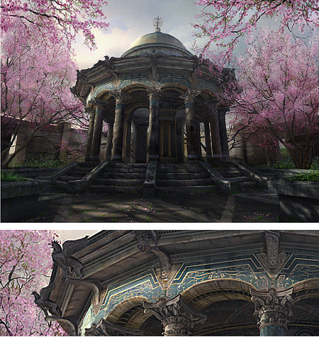
John Wallin Liberto is a matte painter and concept artist based in Sweden who works in the film and gaming industries. He has worked films such as Harry Potter and the Prisoner of Azkaban , Tim Burton’s Big Fish, Riddick and Alien Vs Predator, done video concept art for the Shania Twain “Gonna Getcha Good” music video, and is currently working on games like the upcoming Gears of War from Epic Games.He is well known on computer graphics forums like Sijun and The GCSociety, where he goes by the handle of Capt.FlushGarden.
Liberto paints digitally in Adobe Photoshop and Corel Painter, moving between the two based on effects he wants from certain tools. He uses the digital painting medium to advantage, particularly in giving his richly detailed images a feeling of realistic texture and a sense of tactile surfaces. Notice the underside of the arches and overhangs in the image of the round temple above.
This painting (details here on CGSociety) is one of several online from his work for the new Gears of War game. You can find others by going to the gallery section for Gears of War on his site. (I can’t give you a direct link because the site is in Flash.)
Liberto, who is sometimes referred to as simply John Wallin, is also involved with the D’Artiste: Digital Painting volumes from Ballistic Publishing.
There isn’t much bio or techinque info on his site, but there is an Interview on MAX3D.pl. (The “Next” link from page 2 is broken. Page 3 is here.)
Categories:
-
Cali Rezo
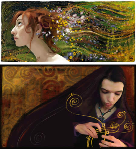
Cali Rezo is a French artist who works digitally in Photoshop.She concentrates largely on faces, either direct portraits, or somewhat stylized portraits in which she sometimes plays with drawing the eyes larger than normal, giving the faces, particularly those of children, a doll-like effect. She will also often incorporate a graphic background rather than a naturalistic one, making a nice blend of portrait and design.
You can see examples of that in the section of her online gallery devoted to personal work, where you will also find a fascinating series of self-portraits.
My favorites, which you will also find on that page, are her “Klimteries”, a series of paintings inspired by the designs/paintings of Gustav Klimt, as in the examples above.
Her portfolio also contains examples of her professional work, illustrations for magazines and agencies.
Rezo works from photographs that she takes herself and considers the photography part of the artistic process, although she doesn’t use the photograph directly in her paintings. Like many digital painters, she follows a painting process that is remarkably like that for traditional media, from initial sketches to a more refined drawing, blocking in color and then adding detail and working to a finished state.
She does, however, utilize photography directly for her collage works, which you can find on her Info page.
You can find articles on her working process from the French editions of Computer Arts and Mac Universe magazines in the “Making Of” section.
Although the “How-to” articles are in French, her site is more or less bi-lingual. There are English translations for most of the text and English speakers will have little problem finding their way around.
Rezo also has a blog called On the other side of the rocks.
Categories:
-
James Bama

I first became impressed with the work of James Bama when I encountered his dramatic covers for the paperback versions of the Doc Savage pulp novels. (Doc Savage was an interesting pulp character that I think influenced modern superheroes in a big way, i.e. Superman = Doc Savage + Flash Gordon, and Batman = The Shadow + Doc Savage + Dick Tracy; but, I digress…)Bama did a long series of those wonderful covers, with their melodramatic lighting and intense color, portraying the hero amid fiendish villains and horrific monsters, all rendered in a superbly accomplished realism that made them jump off the cover.
Bama had 20-year plus career doing illustrations for books, movie posters and magazines like The Satuday Evening Post, Argosy and The Reader’s Digest, and even did the covers for Aurora’s famous monster model kits.
At one point he changed course, moved from New York to Wyoming, and moved from a career as an illustrator to a new career as a gallery artist pursuing a fascination with the contemporary American West.
His work since then has concentrated on western character studies — portraits of cowboys, contemporary American natives in formal or casual dress and studies of the Montana wilderness. His sharp focused realism brings these subjects to life with a masterful touch.
There is a new book just released by Flesk Publications, (a terrific small art publisher that I have written about before), titled James Bama, American Realist, that features a great mix of his western art and his illustration (including all 65 Doc Savage covers).
The JamseBama.com site is mostly a catalog of available posters, but the poster previews make a good gallery of his recent paintings. I’ve added other links below to galleries that handle his work.
Categories:


Charley’s Picks
Bookshop.org
(Bookshop.org affilliate links; sales benefit independent bookshop owners; I get a small percentage to help support my work on Lines and Colors)

John Singer Sargent: Watercolors


Urban Sketching: Understanding Perspective


Charley’s Picks
Amazon
(Amazon.com affiliate links; sales go to a larger yacht for Jeff Bezos; but I get a small percentage to help support my work on Lines and Colors)
John Singer Sargent: Watercolors
Urban Sketching: Understanding Perspective