
Categories
- 3d CGI
- Amusements
- Animation
- Anime & Manga
- Art Materials
- Art Videos
- Blogroll
- Cartoons
- Color
- Comics
- Concept & Visual Dev.
- Creativity
- Digital Art
- Digital Painting
- Displaying Art on the Web
- Drawing
- Eye Candy for Today
- Gallery and Museum Art
- High-res Art Images
- Illustration
- Motion Graphics & Flash
- Museums
- Online Museums
- Outsider Art
- Painting
- Painting a Day
- Paleo Art
- Pastel, Conté & Chalk
- Pen & Ink
- Prints and Printmaking
- Reviews
- Sc-fi and Fantasy
- Sculpture & Dimensional
- Site Comments
- Sketching
- Storyboards
- Tools and Techniques
- Uncategorized
- Vector Art
- Videos & Podcasts
- Vision and Optics
- Watercolor and Gouache
- Webcomics
Archives
- April 2026
- March 2026
- February 2026
- January 2026
- December 2025
- November 2025
- October 2025
- September 2025
- August 2025
- July 2025
- June 2025
- May 2025
- January 2025
- December 2024
- November 2024
- October 2024
- September 2024
- August 2024
- June 2024
- April 2024
- March 2024
- February 2024
- January 2024
- December 2023
- November 2023
- October 2023
- September 2023
- August 2023
- July 2023
- May 2023
- April 2023
- March 2023
- February 2023
- January 2023
- December 2022
- November 2022
- September 2022
- August 2022
- July 2022
- June 2022
- May 2022
- April 2022
- March 2022
- February 2022
- January 2022
- December 2021
- November 2021
- October 2021
- September 2021
- August 2021
- July 2021
- June 2021
- May 2021
- April 2021
- March 2021
- February 2021
- January 2021
- December 2020
- November 2020
- October 2020
- September 2020
- August 2020
- July 2020
- June 2020
- May 2020
- April 2020
- March 2020
- February 2020
- January 2020
- December 2019
- November 2019
- October 2019
- September 2019
- August 2019
- July 2019
- June 2019
- May 2019
- April 2019
- March 2019
- February 2019
- January 2019
- December 2018
- November 2018
- October 2018
- September 2018
- August 2018
- July 2018
- June 2018
- May 2018
- April 2018
- March 2018
- February 2018
- January 2018
- December 2017
- November 2017
- October 2017
- September 2017
- August 2017
- July 2017
- June 2017
- May 2017
- April 2017
- March 2017
- February 2017
- January 2017
- December 2016
- November 2016
- October 2016
- September 2016
- August 2016
- July 2016
- June 2016
- May 2016
- April 2016
- March 2016
- February 2016
- January 2016
- December 2015
- November 2015
- October 2015
- September 2015
- August 2015
- July 2015
- June 2015
- May 2015
- April 2015
- March 2015
- February 2015
- January 2015
- December 2014
- November 2014
- October 2014
- September 2014
- August 2014
- July 2014
- June 2014
- May 2014
- April 2014
- March 2014
- February 2014
- January 2014
- December 2013
- November 2013
- October 2013
- September 2013
- August 2013
- July 2013
- June 2013
- May 2013
- April 2013
- March 2013
- February 2013
- January 2013
- December 2012
- November 2012
- October 2012
- September 2012
- August 2012
- July 2012
- June 2012
- May 2012
- April 2012
- March 2012
- February 2012
- January 2012
- December 2011
- November 2011
- October 2011
- September 2011
- August 2011
- July 2011
- June 2011
- May 2011
- April 2011
- March 2011
- February 2011
- January 2011
- December 2010
- November 2010
- October 2010
- September 2010
- August 2010
- July 2010
- June 2010
- May 2010
- April 2010
- March 2010
- February 2010
- January 2010
- December 2009
- November 2009
- October 2009
- September 2009
- August 2009
- July 2009
- June 2009
- May 2009
- April 2009
- March 2009
- February 2009
- January 2009
- December 2008
- November 2008
- October 2008
- September 2008
- August 2008
- July 2008
- June 2008
- May 2008
- April 2008
- March 2008
- February 2008
- January 2008
- December 2007
- November 2007
- October 2007
- September 2007
- August 2007
- July 2007
- June 2007
- May 2007
- April 2007
- March 2007
- February 2007
- January 2007
- December 2006
- November 2006
- October 2006
- September 2006
- August 2006
- July 2006
- June 2006
- May 2006
- April 2006
- March 2006
- February 2006
- January 2006
- December 2005
- November 2005
- October 2005
- September 2005
- August 2005
Relevant Blogs
Art, Painting & Sketch
- Gurney Journey
- Underpaintings
- Art and Influence
- Painting Perceptions
- Oil Painters of America
- Vasari Paint POV
- Flying Fox
- Urban Sketchers
- Bento (Smithsonian)
- Art Inconnu
- The Hidden Place
- Still Life
- Making a Mark
- The Art of the Landscape
- Exploring Color & Creativity
- Art Contrarian
- Artist A Day
- beinArt Surreal Art Collective
- Eye Level
- David Dunlop
- p.i.g.m.e.n.t.i.u.m
- CultureGrrl
- Joaquín Sorolla blog
- Artists in Pastel
“Painting a Day”
- A Painting a Day (Keiser)
- On Painting (Keiser)
- Julian Merrow-Smith
- Karen Jurick
- Jeffrey Hayes
- Carol Marine
- Abbey Ryan
- Daily Paintworks
Other Painting Blogs
- Virtual Gouache Land
- Neil Hollingsworth
- Marc Hanson
- Kevin Menck
- Marc Dalessio
- Larry Seiler
- Stapleton Kearns
- Colin Page
- Roos Schuring
- Hans Versfelt
- Titus Meeuws
- Régis Pettinari
- René Plein Air
- Belinda Del Pesco
- Robin Weiss
- Nathan Fowkes (Land Sketch)
- William Wray
- Frank Serrano
- Stephen Magsig
- Michael Chesley Johnson
- Twice a Week
- Sarah Wimperis
- Rob Adams
- Michael Cole Manley
- The Dirty Palette Club
- Mike Manley’s Draw!
Gallery Art & Illustration mix
Illustration
- Howard Pyle
- 100 Years of Illustration
- BibliOdyssey
- Illustration Art
- Today’s Inspiration
- Illustration Mundo
- Little Chimp Society
- Danny Gregory
- R D (John Martz
- Illustration Friday blog
- Monster Brains
- Illustrators & Illustrations (RU)
- Elwood H. Smith
- DaniDraws.com
- Designers Who Blog
- iSpot Blog
Sci-Fi & Fantasy
Illustration & Comics
Comics & Cartoons
- Comics Beat
- Robot 6
- Newsarama Blog
- Comic Vine
- Comics Alliance
- Forbidden Planet Int.
- Paolo Rivera
- Bolt City
- Flight
- Scott McCloud
- The Comics Journal
- Comixpedia
- Funnybook Babylon
- James Baker
- Middleton’s Sketchbook
- Boneville
- The Hotel Fred
- Paul Rivoche
- Daily Cartoonist
- Mad About Cartoons (William Wray)
- Digital Strips
Illustration & Concept
Animation & Concept
- Cartoon Brew
- Animation Blog
- Cold Hard Flash
- Concept Art World
- The CAB
- FY Concept Art
- Concept Ships
- Concept Robots
- John Nevarez
- Armand Serrano
- Marcos Mateu-Mestre
- all kinds of stuff (Kricfalusi)
- Yacin the faun (Man Arenas)
- Kelsey Mann
- Cre8tivemarks Blog
- Ice-Cream Monster Toon Cafe
- AAU Character & Creature Design
- AAU Animation Notes
- Articles and Texticles
Paleo & Scientific
Tools & Techniques
Other
Lists of Art Blogs
Art Image Resource Links
Historic Art Images
- Wikimedia Commons: Paintings
- Wikimedia Commons: Drawings
- The Athenaeum
- WikiArt (WikiPaintings)
- Google Art Project: Artists
- Google Art Project: Collections (Museums)
- ArtCyclopedia
- Web Gallery of Art
- Art Renewal Center
- Web Gallery of Impressionism
Auction Consolidation sites
Auction sites
- Sotheby’s
- Bonham’s
- Christies
- Heritage Auctions: Fine Art
- Heritage Auctions: Illustration
- Freeman’s Auctions
- Bukowskis
- Shannon’s
Image Search
Reverse Image Search (search by image)
- Tin Eye
- RevImg
- Google Image Search (camera icon)
- Bing Image Search (camera icon)
Promoting some friends and some clients of my website design business
- Twin Willows T’ai Chi studio in Wilmington DE. Taiji classes with Bryan Davis.
- Ray Hayward, Inspired Teacher of T’ai Chi ( Taiji ) in Minneapolis, Founder of Mindful Motion Tai Chi Academy
- OldHead Tattoo studio and Art Gallery in Wilmington DE. Tattoos and paintings by Bruce Gulick
- Sharon Domenico Art, pet portrait oil paintings
- Platinum Paperhanging, wallpaper hanging, Main Line and Philadelphia, PA
- Lisa Stone Design, interior designer, Main Line and Philadelphia, PA
- Studio12KPT, original art, prints, calendars and other custom printed items by Van Sickle & Rolleri
-
Bill Mather (update)
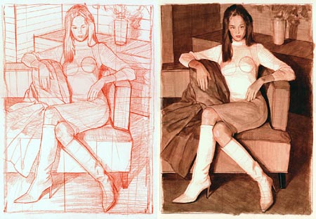
Bill Mather loves to draw and paint women. If that wasn’t obvious enough from the galleries on his site, he’s named his blog Painter of Women.I wrote about Mather in September of last year. Since then he has added to his online galleries and started a blog. The blog isn’t frequently updated, so you’ll find more artwork on the main site.
Mather’s site has several online galleries, largely consisting of lively portrait drawings, paintings and painted studies of women in various media: chalk, conté crayon, vine charcoal, pencil, acrylic, gouache and oil. Many of the thumbnail images have additional links below them to detail images in which you can see the surface of the drawing or painting in enough detail to see how the media were applied.
The work he features most prominently, and is more recent, is actually not the work I find most appealing. In the newer work he surrounds his figures and faces with swirls and splashes of texture and wild scrawls of colored line. While it makes for interesting compositions, I find I prefer his work when he approaches his subjects more directly, with just a bit of the graphic enthusiasm popping in around the edges. These images have a great balance of solid draftsmanship, confident application of materials and fun graphic experimentation.
The nice variety of his approach and the freedom of his linework make all of the galleries worth investigating. There are also drawing class figure studies and, if you look hard enough, a section of landscapes.
Oddly enough, what you won’t find on the main site, or on the blog, is a mention of the fact that Mather is a high-end concept artist by profession and has done matte painting and design work for films like War of the Worlds, the Star Wars Trilogy, Forest Gump, Jumanji and The Polar Express. He received an Academy Award nomination in 1993 for his work on Batman Returns.
As a concept artist, Mather is affiliated with Doug Chiang’s Ice Blink Studios, members of which have been the subject of several posts on lines and colors.
Mather also teaches figure drawing at the Academy of Art College in San Francisco.
Addendum: I neglected to mention that Mather has published two collections of his drawings and paintngs, DRAWN TO BEAUTY: Collected Sketches by Bill Mather Vol 1 and DRAWN TO BEAUTY: Collected Sketches by Bill Mather Vol 2. The links are to the excellent Bud Plant online store.
Categories:
-
Rhonda Nass

I came across Rhonda Nass on a site dedicated to botanical illustration and was struck by the textural qualities and dimensionality of her plant paintings.There isn’t any information about technique on her site, but I assume from the look of her paintings that she works from photographs in the studio, even utilizing the out of focus background effect often found in photographs to control your eye in the composition of her paintings.
She uses detail and texture to bring her subjects into high relief, giving them a tactile quality, and also emphasizes the play of light across their surfaces.
Her site includes examples of her commercial work, stock images and available originals. In addition to her botanical illustrations there are paintings of birds and objects like gloves and jackets.
Nass is married to illustrator Rick Nass, and the web site divided on the home page between her work with his highly rendered cartoon style images.
Categories:
-
Dave’s [comic book artist] Art Nouveau Collection
 This is a collection of Art Nouveau style images by modern comic book artists.
It’s part of a larger collection called Dave’s Gallery of Comic Art, which, in turn, is part of the Digital Medusa site.
Digital Medusa contains other comic art collections, including a unique collection of Artistic Interpretations of Literary Figures by comic book artists that I wrote this post about back in October of last year.
Dave’s Art Nouveau Collection contains drawings and sketches by people like Paul Chadwick, Brom, Tony DiTerlizzi, Rick Geary, JG Jones, Rudy Nebres, George Perez, Steve Rude, Michael Whelan, Mike Kaluta and Aaron Lopresti (image at left), among others.
Some of them are convention sketches, some are more finished pieces and the quality varies. Also the term “art nouveau’ is pretty vaguely interpreted (basically meaning, “I have a book on Mucha“), but the results are a lot of fun.
The site contains some teasing “cheesecake” style nudity. You can avoid it if you’re likely to be offended.
Categories:
-
Optical Illusions Sites
 As much as I despise the deliberate campaign by mid-20th Century modernist art critics like Clement Greenberg and Harold Rosenberg to denigrate the history and traditions of western art in order to elevate their own pompous theories (in the process killing realism for half a century), I will grant that they were correct about one thing.
Representational art is an illusion.
It is the illusion of a three dimensional scene or object created by the arrangement of paint or other marks on a two dimensional surface.
With that in mind, most artists should at least have a passing interest in vision, optics and the fascinating subject of optical illusions. (Proponents of the modernist doctrine of flatness are, of course, excused and may go sit in the hall for the duration.)
I’ve featured some optical illusions in the past, such as the calculated space-altering architectural patterns of Felice Varini (images at left, top), the anamorphosis in Hans Holbein the Younger’s The Ambassadors and the anamorphic sidewalk art of Kurt Wenner (left, middle) and Julian Beever (left, two bottom images).
Here are some general interest optical illusions blogs and sites of varying quality and subject matter. They are at the very least fun to poke around in, and at best can be genuinely illuminating.
Of particular interest to artists should be optical illusions that deal with color and dramatically demonstrate how utterly and completely the perception of color is affected by the surrounding colors.
Notable in that respect is this series of color perception experiments on eChalk, which are the most striking examples of that principle I have ever seen.
Categories:
-
Pierre-Paul Prud’hon
 In one of my recent posts I was talking about the place of value in painting. It brought to mind one of the greatest masters of value and tone, both in painting and drawing, whose chalk figure drawings are among my favorites by any artist.
Pierre-Paul Prud’hon was a French painter of the Romantic era, a time he shared with Gothe, Gainsborough and Mozart, among others. Napoleon commissioned him for portraits and allegory paintings. Napoleon’s first wife, Joséphine was also his patron, as was his second wife, Marie-Louise, who employed Prud’hon to teach her drawing.
Prud’hon’s paintings are something of a bridge between the neo-classicism of Jacques-Louis David and his followers and Romanticism. He was particularly influenced by italian masters like Correggio.
As beautiful as Prud’hon’s portraits and allegorical paintings are, it’s his drawings that wow me. Prud’hon was a master draftsman and his academic figure studies are among the finest ever done. As someone fascinated by tone when I draw the figure, Prud’hon’s drawings are examples of the level of skill I would strive to acquire.
After achieving considerable success as a painter he began collaborating with Constance Mayer, who would finish many of their joint works, leaving Prud’hon free to pursue his academic figure drawings, something a master painter supposedly leaves behind on graduating from the Academy and uses only as studies for paintings. Not so for Prud’hon; drawing figures in chalk was apparently what he wanted to do with his life.
And what drawings they are! Usually starting with a toned paper as a middle ground, Prud’hon pulls the living form out of the surface with lights and darks that revel in the volume of the form, follow rippling shadows and highlights along the curves and turns of the body and create the figure’s shapes as revelations of value, often with little or no evidence of line.
Prud’hon’s figures can seem oddly mixed-gendered, his muscular male forms often oddly paired with heads and faces that seem feminine; and his women are often classical to the point of appearing ready to be made into statues; but the confidence and subtlety with which he draws them is never in doubt.
Prud’hon did not have an easy life, despite his success, and separated from his wife of 25 years, who was reportedly prone to drunkeness and violence, taking custody of his 5 children when she was committed to an asylum. I’m not sure of the nature of his relationship with his young collaborator, Constance Mayer, but Prud’hon’s beautiful portrait drawing of her certainly shows great affection, and he was devastated by her suicide in 1821, dying himself two years later.
I was fortunate to catch a show of Prud’hon’s work at the Met in New York a few years ago that included many of his drawings. The control and sensitivity with which he handles the chalk is just amazing. Some of his drawings are larger, but he usually worked at a size that most artists today would find comfortable for life drawing, roughly 18″ x 24″. The drawing shown here, which is in the collection of the Boston Museum of Fine Arts, is about 13 x 24″ (35 x 61 cm). The Art Renewal Center has a great high-resolution image of this drawing.
There is a catalog from the exhibition at the Met, “Prud’hon, ou, Le rêve du bonheur, by Sylvain Laveissiére. The exhibit was organized by the Galeries nationales du Grand Palais in Paris and the catalog is in French, but the reproductions are obviously in the universal language of art.
There is another book on Prud’hon by the same author, simply titled Pierre-Paul Prud’hon, but it emphasizes his paintings over the drawings. Unfortunately the excellent Language of the Body by John Elderfield is out of print and expensive on the used book market, but look for it in libraries.
For a wonderful contrast in the study of master drawing techniques, compare the drawings of Prud’hon, master of value and tone, to the drawings of Jean Auguste Dominique Ingres, master of line.
Categories:
-
Frank Reilly
 Some artists have as much, or more, impact as a teacher as they do as an artist.
Although Frank Reilly had been fulfilling assignments as a professional illustrator even while he was still a pupil at the Art Students League, it was on his return there as a teacher that he would make his greatest contribution.
Reilly was one of the most influential American art teachers in the 20th Century. He is credited with codifying methods for teaching drawing, painting, illustration and other aspects of representational art in ways that became the foundation for teaching techniques still in use today.
Reilly organized the study of color, value, form, composition and other elements of painting and drawing into systematic programs built on Munsell’s scientific study of color and the knowledge he acquired from his own teachers (who included renowned anatomist George Bridgeman, Frank Vincent DuMond and his friend and neighbor, the great illustrator Dean Cornwell), as well as his own experience as a working illustrator.
For the 35 years he taught at the Art Students League his classes and lectures were waiting list and standing room only.
I can point you to two excellent sources of information about Reilly on the web. One is an article American Art Archives, the other is a remembrance by contemporary realist Doug Higgins in which he gives a wonderfully detailed account of his experiences as a student of Reilly’s, profusely illustrated with his notes, drawings and paintings from his classes (images at left, bottom).
Because Higgin’s site is in frames, I’ve popped it out of context here because it’s the only way to link to it directly. The original context is a link within Higgin’s main site.
Another of Reilly’s students, Jack Faragasso, who succeeded Reilly at the school he founded, has published a book, Mastering Drawing The Human Figure From Life, Memory, Imagination which is based in large part on Reilly’s instruction.
Categories:


Charley’s Picks
Bookshop.org
(Bookshop.org affilliate links; sales benefit independent bookshop owners; I get a small percentage to help support my work on Lines and Colors)

John Singer Sargent: Watercolors


Urban Sketching: Understanding Perspective


Charley’s Picks
Amazon
(Amazon.com affiliate links; sales go to a larger yacht for Jeff Bezos; but I get a small percentage to help support my work on Lines and Colors)
John Singer Sargent: Watercolors
Urban Sketching: Understanding Perspective