
Categories
- 3d CGI
- Amusements
- Animation
- Anime & Manga
- Art Materials
- Art Videos
- Blogroll
- Cartoons
- Color
- Comics
- Concept & Visual Dev.
- Creativity
- Digital Art
- Digital Painting
- Displaying Art on the Web
- Drawing
- Eye Candy for Today
- Gallery and Museum Art
- High-res Art Images
- Illustration
- Motion Graphics & Flash
- Museums
- Online Museums
- Outsider Art
- Painting
- Painting a Day
- Paleo Art
- Pastel, Conté & Chalk
- Pen & Ink
- Prints and Printmaking
- Reviews
- Sc-fi and Fantasy
- Sculpture & Dimensional
- Site Comments
- Sketching
- Storyboards
- Tools and Techniques
- Uncategorized
- Vector Art
- Videos & Podcasts
- Vision and Optics
- Watercolor and Gouache
- Webcomics
Archives
- May 2026
- April 2026
- March 2026
- February 2026
- January 2026
- December 2025
- November 2025
- October 2025
- September 2025
- August 2025
- July 2025
- June 2025
- May 2025
- January 2025
- December 2024
- November 2024
- October 2024
- September 2024
- August 2024
- June 2024
- April 2024
- March 2024
- February 2024
- January 2024
- December 2023
- November 2023
- October 2023
- September 2023
- August 2023
- July 2023
- May 2023
- April 2023
- March 2023
- February 2023
- January 2023
- December 2022
- November 2022
- September 2022
- August 2022
- July 2022
- June 2022
- May 2022
- April 2022
- March 2022
- February 2022
- January 2022
- December 2021
- November 2021
- October 2021
- September 2021
- August 2021
- July 2021
- June 2021
- May 2021
- April 2021
- March 2021
- February 2021
- January 2021
- December 2020
- November 2020
- October 2020
- September 2020
- August 2020
- July 2020
- June 2020
- May 2020
- April 2020
- March 2020
- February 2020
- January 2020
- December 2019
- November 2019
- October 2019
- September 2019
- August 2019
- July 2019
- June 2019
- May 2019
- April 2019
- March 2019
- February 2019
- January 2019
- December 2018
- November 2018
- October 2018
- September 2018
- August 2018
- July 2018
- June 2018
- May 2018
- April 2018
- March 2018
- February 2018
- January 2018
- December 2017
- November 2017
- October 2017
- September 2017
- August 2017
- July 2017
- June 2017
- May 2017
- April 2017
- March 2017
- February 2017
- January 2017
- December 2016
- November 2016
- October 2016
- September 2016
- August 2016
- July 2016
- June 2016
- May 2016
- April 2016
- March 2016
- February 2016
- January 2016
- December 2015
- November 2015
- October 2015
- September 2015
- August 2015
- July 2015
- June 2015
- May 2015
- April 2015
- March 2015
- February 2015
- January 2015
- December 2014
- November 2014
- October 2014
- September 2014
- August 2014
- July 2014
- June 2014
- May 2014
- April 2014
- March 2014
- February 2014
- January 2014
- December 2013
- November 2013
- October 2013
- September 2013
- August 2013
- July 2013
- June 2013
- May 2013
- April 2013
- March 2013
- February 2013
- January 2013
- December 2012
- November 2012
- October 2012
- September 2012
- August 2012
- July 2012
- June 2012
- May 2012
- April 2012
- March 2012
- February 2012
- January 2012
- December 2011
- November 2011
- October 2011
- September 2011
- August 2011
- July 2011
- June 2011
- May 2011
- April 2011
- March 2011
- February 2011
- January 2011
- December 2010
- November 2010
- October 2010
- September 2010
- August 2010
- July 2010
- June 2010
- May 2010
- April 2010
- March 2010
- February 2010
- January 2010
- December 2009
- November 2009
- October 2009
- September 2009
- August 2009
- July 2009
- June 2009
- May 2009
- April 2009
- March 2009
- February 2009
- January 2009
- December 2008
- November 2008
- October 2008
- September 2008
- August 2008
- July 2008
- June 2008
- May 2008
- April 2008
- March 2008
- February 2008
- January 2008
- December 2007
- November 2007
- October 2007
- September 2007
- August 2007
- July 2007
- June 2007
- May 2007
- April 2007
- March 2007
- February 2007
- January 2007
- December 2006
- November 2006
- October 2006
- September 2006
- August 2006
- July 2006
- June 2006
- May 2006
- April 2006
- March 2006
- February 2006
- January 2006
- December 2005
- November 2005
- October 2005
- September 2005
- August 2005
Relevant Blogs
Art, Painting & Sketch
- Gurney Journey
- Underpaintings
- Art and Influence
- Painting Perceptions
- Oil Painters of America
- Vasari Paint POV
- Flying Fox
- Urban Sketchers
- Bento (Smithsonian)
- Art Inconnu
- The Hidden Place
- Still Life
- Making a Mark
- The Art of the Landscape
- Exploring Color & Creativity
- Art Contrarian
- Artist A Day
- beinArt Surreal Art Collective
- Eye Level
- David Dunlop
- p.i.g.m.e.n.t.i.u.m
- CultureGrrl
- Joaquín Sorolla blog
- Artists in Pastel
“Painting a Day”
- A Painting a Day (Keiser)
- On Painting (Keiser)
- Julian Merrow-Smith
- Karen Jurick
- Jeffrey Hayes
- Carol Marine
- Abbey Ryan
- Daily Paintworks
Other Painting Blogs
- Virtual Gouache Land
- Neil Hollingsworth
- Marc Hanson
- Kevin Menck
- Marc Dalessio
- Larry Seiler
- Stapleton Kearns
- Colin Page
- Roos Schuring
- Hans Versfelt
- Titus Meeuws
- Régis Pettinari
- René Plein Air
- Belinda Del Pesco
- Robin Weiss
- Nathan Fowkes (Land Sketch)
- William Wray
- Frank Serrano
- Stephen Magsig
- Michael Chesley Johnson
- Twice a Week
- Sarah Wimperis
- Rob Adams
- Michael Cole Manley
- The Dirty Palette Club
- Mike Manley’s Draw!
Gallery Art & Illustration mix
Illustration
- Howard Pyle
- 100 Years of Illustration
- BibliOdyssey
- Illustration Art
- Today’s Inspiration
- Illustration Mundo
- Little Chimp Society
- Danny Gregory
- R D (John Martz
- Illustration Friday blog
- Monster Brains
- Illustrators & Illustrations (RU)
- Elwood H. Smith
- DaniDraws.com
- Designers Who Blog
- iSpot Blog
Sci-Fi & Fantasy
Illustration & Comics
Comics & Cartoons
- Comics Beat
- Robot 6
- Newsarama Blog
- Comic Vine
- Comics Alliance
- Forbidden Planet Int.
- Paolo Rivera
- Bolt City
- Flight
- Scott McCloud
- The Comics Journal
- Comixpedia
- Funnybook Babylon
- James Baker
- Middleton’s Sketchbook
- Boneville
- The Hotel Fred
- Paul Rivoche
- Daily Cartoonist
- Mad About Cartoons (William Wray)
- Digital Strips
Illustration & Concept
Animation & Concept
- Cartoon Brew
- Animation Blog
- Cold Hard Flash
- Concept Art World
- The CAB
- FY Concept Art
- Concept Ships
- Concept Robots
- John Nevarez
- Armand Serrano
- Marcos Mateu-Mestre
- all kinds of stuff (Kricfalusi)
- Yacin the faun (Man Arenas)
- Kelsey Mann
- Cre8tivemarks Blog
- Ice-Cream Monster Toon Cafe
- AAU Character & Creature Design
- AAU Animation Notes
- Articles and Texticles
Paleo & Scientific
Tools & Techniques
Other
Lists of Art Blogs
Art Image Resource Links
Historic Art Images
- Wikimedia Commons: Paintings
- Wikimedia Commons: Drawings
- The Athenaeum
- WikiArt (WikiPaintings)
- Google Art Project: Artists
- Google Art Project: Collections (Museums)
- ArtCyclopedia
- Web Gallery of Art
- Art Renewal Center
- Web Gallery of Impressionism
Auction Consolidation sites
Auction sites
- Sotheby’s
- Bonham’s
- Christies
- Heritage Auctions: Fine Art
- Heritage Auctions: Illustration
- Freeman’s Auctions
- Bukowskis
- Shannon’s
Image Search
Reverse Image Search (search by image)
- Tin Eye
- RevImg
- Google Image Search (camera icon)
- Bing Image Search (camera icon)
Promoting some friends and some clients of my website design business
- Twin Willows T’ai Chi studio in Wilmington DE. Taiji classes with Bryan Davis.
- Ray Hayward, Inspired Teacher of T’ai Chi ( Taiji ) in Minneapolis, Founder of Mindful Motion Tai Chi Academy
- OldHead Tattoo studio and Art Gallery in Wilmington DE. Tattoos and paintings by Bruce Gulick
- Sharon Domenico Art, pet portrait oil paintings
- Platinum Paperhanging, wallpaper hanging, Main Line and Philadelphia, PA
- Lisa Stone Design, interior designer, Main Line and Philadelphia, PA
- Studio12KPT, original art, prints, calendars and other custom printed items by Van Sickle & Rolleri
-
Richard Schmid

Richard Schmid, though a well known and well respected contemporary American painter, is perhaps even better known as a teacher, through his widely read book and, more recently, series of instructional videos.His web site doesn’t do much to change this, in that the images of his work, though presented well enough, are frustratingly small. At least they’re frustrating to me, as I’m particularly interested in his economical and beautifully handled brush work, which you can only really appreciate in large images.
You can still see in the reproductions his beautiful handling of color and value, his remarkable ability with “lost and found” edges, and his wonderful control of texture, light and atmosphere. When viewing work on his site, there are images in the Lithographs section in addition to Available Work and Archive Gallery.
Schmid paints alla prima; an a Italian phrase meaning “at once” or “at the first”, that defines the kind of painting done all in one session while the paint is wet, as opposed to the layers of paint used in classical painting. Most “plein air” painting (see my recent post on pochade boxes) is done alla prima.
It is also the title of Schmid’s highly regarded instructional book, Alla Prima: Everything I Know About Painting. (You will find used copies listed for unreasonably high prices on Amazon and elsewhere; it’s in print and reasonable ($50 paperback) from Schmid’s own site.)
Whether the subtitle is true, I don’t know. I suspect Schmid knows considerably more about painting than can be put in one book, but the book is valuable and he has put a great deal of information into its 200 or so pages.
This is not a painting instruction book in the sense of “here is what brush to use” and “here’s how to paint water”. Neither is it conceptual in the manner of books by Hawthorne or Henri, it’s somewhere between those two types of painting books, simultaneously high-concept and down to earth instructional.
The book is divided into chapters like “Starting”, “Values”, “Edges”, “Color and Light” and “Composition”, that are filled with both both practical techniques and food for thought about your approach and intent, with the end goal of using the natural world as your final arbiter in choosing colors, arranging compositions and conveying light and atmosphere.
Not that Schmid is slavishly realistic, far from it. His paintings are quite poetic, but they are based firmly in direct observation of the visual world.
Occasionally you may find him waxing philosophical; and you might disagree with some of his pronouncements. For instance he asserts that there are no such thing as “neutralized” colors; and while I understand his argument, I think it’s a matter of semantics and the term is a useful one. I disagree with him in a number of areas, but bear in mind that he is a better painter than I by a couple orders of magnitude (grin).
My impression of Schmid, and his sometimes lofty tone of voice in the book, was dramatically softened when I watched one of his videos, in which his personal demeanor and tone are much more appealing.
Schmid has a series of four instructional landscape DVDs and one on portraiture. I’ve seen the second in the series, Richard Schmid Paints the Landscape: June (bottom two images, above), and I found it well done, well paced and full of useful information and techniques; particularly for those who are painting alla prima, en plen air (I’m just having fun with painting terms today).
Unlike some instructional videos, this one proceeds at a relaxed pace, in keeping with a pace appropriate for the mindset of painting, and allowing time to see a great deal of his painting process in detail. It’s truncated in places, but the jumps are artfully chosen. The shoot is well directed, dwelling where appropriate on his palette and color mixing process, with close ups of the canvas and shots of the subject that emphasize the points he makes while painting.
The DVD has two parts, the first is a complete on location painting session, from sketch to finished painting, and the second, in the studio, revisits the painting for analysis and goes beyond; into a discussion of color range and the control of edges and color transitions that alone is worthwhile as an instructional video.
Like similar art instruction videos, these are not inexpensive ($75), and the site doesn’t give you a preview video clip to let you know how you might like it (which I think would be a good selling point), though it does offer a few stills from each video.
There is a brief excerpt from one of his videos on YouTube, unfortunately, it’s not a very good or representational segment, and the video compression distorts the image quality, so I wouldn’t judge the videos by it.
Another nice thing about his videos is that you finally get to see his brushwork close up, something that is missing even in the book.
In both his book and videos, Schmid emphasizes some fundamentals that are often glossed over, but are worth being reminded of. One in particular is “doing the charts”; a process that young art students often think is onerous busywork, but seasoned painters know is as invaluable to a painter as practicing scales is to a musician.
This is the process of painting your own color charts, in which you mix a value scale of each color, and then value scales of each color in combination with each of the other colors in your basic palette. It is a process that gives you more color mixing knowledge than a truckload of color mixing books and preprinted charts could ever begin to provide.
It is this kind of adherence to the time tested painting fundamentals, that work and have been successful for representational painters through history, that is the basis for both Schmid’s teaching and his beautifully economical and lyrically poetic paintings.
Categories:
-
Rudolph Zallinger
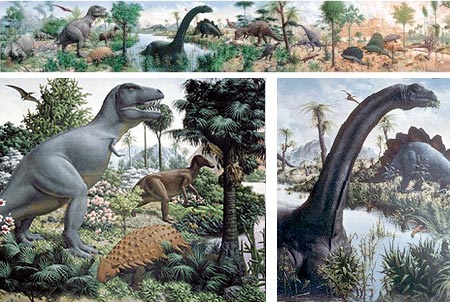
I’ve wanted to do a post on Rudolph Zallinger for some time, but I keep putting it off in the hope that more of his work will be posted on the web. Unfortunately, that doesn’t seem to be happening. I may still be able to make some people who aren’t already familiar with him aware of his work, even if I can’t show you a great deal of it.Zallinger was one of the pioneers of of paleontological art, perhaps second only to Charles R. Knight in that respect. Zallinger is best known for his stunning 110×16′ (33.5×4.9m) mural, The Age of Reptiles, that covers the entire east wall of the Yale Peabody Museum’s Great Hall (watermarked poster version here).
The mural depicts the evolution of life on earth over 300 million years, with different sections, separated by the visual device of foreground trees, for geologic periods. It was painted with egg tempera in the fresco secco method; meaning “dry plaster”, as opposed to the more familiar traditional method of painting with into wet plaster (buon fresco) as practiced by Michelangelo for his frescos in the Sistine Chapel.
Rudolph Franz Zallinger was born in Irkutsk, Siberia to Austrian and Polish parents. They eventually emigrated to the U.S. and settled in Seattle where Rudolph was raised. His early interest in art was encouraged; and at age 17 he started study at Yale University’s School of Fine Arts on a merit scholarship as a painting major, and was also trained in illustration. He taught at the school after graduating.
He also started doing some scientific illustration and his talents were noticed by the director of the Yale Peabody Museum, who approached him about the possibility of doing a mural on the museum’s east wall.
Zallinger undertook a six month crash course in prehistoric plant and animal life and comparative anatomy with scientists from Yale and Harvard, and spent a year and a half creating preliminary studies and sketches before commencing work on the mural, which took three and a half years. The museum appointed him “artist in residence” a post he held for the remainder of his life.
Life magazine commissioned Zallenger for a series of illustrations and covers depicting prehistoric life, and his work also appeared in several books, notably The World We Live In, culled from the Life magazine articles, and The Giant Golden Book of Dinosaurs and Other Prehistoric Reptiles (which I still have my treasured copy of — look for it used, see a preview here).
One of his commissions for the magazine was later expanded into a new mural at the Yale Peabody Museum of Natural History as The Age of Mammals, depicting prehistoric mammals that, though they don’t get the same press, are every bit as wonderfully weird as the dinosaurs.
The past is always changing, particularly the distant past, as new information is brought to light. Knight’s active, leaping dinosaurs were replaced by Zallinger’s slow, gravity-bound behemoths, which were based on the prevailing scientific theories of the time. In them you’ll see the classic upright, tail dragging stance of tyrannosaurs, and elongated sauropods semi-submerded to support their weight, that were characteristic of mid-20th Century paleo art. It was Zallinger, in fact, who set the standards for that art, the artistic component of which has seldom, if ever, been matched.
Since then, the continued revision of our vision of the past has gone back to more lively dinosaurs with very different interpretations of anatomical reconstruction (which some modern paleo artists carry too far, indulging in fanciful depictions of 5 ton tyrannosaurs sprinting like leopards and brachiosaurs rearing on their hind legs in defiance of physics and bio mechanics).
The Yale Alumni Magazine commissioned contemporary artist Alan Male to create a virtual update of Zallinger’s mural, showing the animals in a more modern interpretation.
As anachronistic as they may seem in light of modern interpretations of dinosaurs, Zallinger’s inspired visions still have an uncommon visual power, unlike any paleontological artist before or since. They are now best appreciated as artworks, and powerfully evocative artworks. Zallinger studied traditional painting techniques and his paintings of dinosaurs look as though they are the interpretation of a Renaissance master, which I find just an amazingly great combination.
Reportedly Daniel Varney Thompson, the most authoritative translator of Cennino Cennini’s 15th-century classic The Art of Painting, on seeing The Age of Reptiles nearing completion, stated: “That wall is the most important since the 15th Century”.
Unfortunately, the Peabody Yale site is a bit confusingly organized; and, though it has information about the murals, including podcasts by contemporary scientists on the subject, and an article on the making of the mural by Zallinger himself; it is disappointing shy on images. They seem so desperately paranoid that someone will print a low-res version on a T-shirt or something, that they would apparently rather let Zallinger languish in obscurity than give the web audience a taste of how fantastic his work was.
Though I have never seen the actual murals (they’re high on my list whenever I get to Massachusetts), I have had the privilege of seeing a small (perhaps 12×50″) preparatory painting for the larger work.
I simply love the feeling in Zallinger’s work, his Renaissance flavored visions of steamy prehistoric jungles where hulking, leather skinned giants lashed at one another in slow motion fury under storm-darkened skies — wonderful stuff.
Categories:
-
Chris Sprouse

Chris Sprouse is an American comics artist whose clean elegant drawing style lies somewhere between the open line styles of European comics and the more heavily rendered styles common in American mainstream comics.Sprouse is most noted for his work on Alan Moore’s Tom Strong, a comics series that combined some of the best elements of Lee/Kirby stories for The Fantastic Four, the early Challengers of the Unknown comics and the Doc Savage pulp novels.
The series was wonderfully fun and beautifully drawn, and Sprouse was the perfect choice to bring it to life. It was, in fact, designed around his predilections. Moore fashioned all of the titles in his ABC comics line around his co-creators strengths and drawing styles. In Sprouse’s case, that meant lots of high-tech gadgets, spaceships, and a robust family of characters. Sprouse garnered two Eisner awards for his work on the series. The image above shows one of his covers for the series in pencilled and finished form.
Unlike the tendency on the part of a lot of superhero artists to go over the top in trying to make their characters look “super”, Sprouse stays grounded in a more naturalistic portrayal of people, giving his stories an extra feeling of realism, in spite of the delightful degree of lively stylization in his drawing style. His figures, in particular, have the kind of power-under-the-surface feeling you see in athletes, as opposed to the too-musclebound-to-do-anything-but-grimace style all too common in superhero comics.
Sprouse has also worked for other major comics companies on titles like Legionnaires, Supreme and Midnighter. He drew a Star Wars story for Dark Horse, Star Wars: Splinter in the Mind’s Eye, and an under-appreciated science fiction graphic story called Ocean with Warren Ellis. His most recent project was Wildstorm’s Number of the Beast, written by Scott Beatty.
As far as I can determine, Sprouse does not have a web site or blog, so I’ve dug up what resources I can find. There is an unofficial gallery of his work on Comic Art Community.
Addendum: Johnny Bacardi was kind enough to write and let us know that Sprouse does, in fact, have a blog. (Thanks!)
Categories:
-
“Painting a Day” Blogs (Round 7)
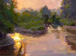
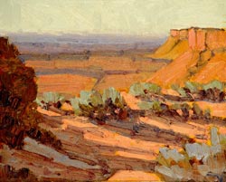
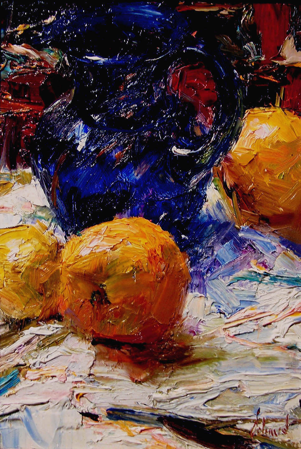
 I’ve been reporting on the “Painting a Day” phenomenon since well before it was a phenomenon, since my initial 2005 post on Duane Keiser (left); who originated the practice in its commonly understood form of painting one small painting each day and posting it on a blog, usually also offering it for sale.
The demands of the practice frequently encourage artists to paint small still life subjects of objects close at hand, fruit, china, painting supplies and so on, but a number of painters focus more on landscape and painting en plein air, so I’ll concentrate on some of those for this round. These painters usually work a little larger than the daily painters who focus on still life, roughly 8×10″ (20x25cm) instead of 6×8″ (15x20cm).
Though Keiser largely concentrates on still life, he does paint landscape, and I like to mention him in these posts.
Here are some other daily painters who concentrate more on landscape than on still life.
 John K. Harrell is a Denver based painter. His subjects include the Colorado countryside, as well as paintings from his travels in the U.S. and Europe. Harrell has a nice economy of notation, in which impressionist handling is used for areas like foliage and textured surfaces where broken color is most effective; but like the American Impressionist painters from the turn of the last century he has not locked himself into rendering everything with short strokes, allowing larger areas of color to predominate when appropriate.
While most daily painters work in oil, Harrell works in acrylic and occasionally pastel. He seems to be using thickened acrylics, though, as they have a feeling of surface texture and brush strokes. Harrell also is a participant in the Daily Impressionist Painters group blog and has a dedicated web site that features his larger and more finished work.
 Christopher Greco is a daily painter who paints primarily en plein air. His loose, painterly handling of landscape subjects is particularly effective, I think, in his paintings of small creeks and streams.
He also paints landscapes with structures in them, like houses, barns, garages and storefronts, where his succinct brushwork defines their forms in a series of brief strokes. Greco makes a point of saying that he doesn’t “edit” his work, in that every painting is posted, so that we see his daily progress as he experiments and grows as a painter.
 Edward B. Gordon is a painter from Germany and has been practicing the painting a day regimen for longer than most, since November of 2006, and credits Duane Keiser with his impetus to begin the practice. He posts small paintings of a variety of subjects including figures, landscapes and still life.
He has a nicely angular approach to brushwork, laying in individual brush strokes that serve to define a plane. Unfortunately, his posted images are a bit small, leaving me wishing there were lager versions in addition, though he does occasionally post detail images of some of them.
Note: he has some kind of Flash map/comment widget running in his sidebar that my copy of Safari momentarily choked on. Your milage may vary.
 George Coll lives in Colorado and his daily paintings are of the mountainous landscape surrounding him. Coll treks from his two acre property out into the back country with with 2 pack llamas carrying his supplies (now that’s different). His location paintings are often in the muted tones of daylight softened by the shadows of the mountains, accented with brilliant light on distant peaks.
He also paints figures and town scenes and his blog will occasionally feature images of his larger works, done in the studio from his location sketches. Coll also has a web site that showcases his larger finished work.
 Candy Barr is a painter from Vermont who frequently paints landscapes. Her paintings are sometimes very straightforward in their color palette and at other times “pushed” into brighter, almost expressionistic color.
She also has a web site on which you will find her larger pantings. Of particular interest are her “floaters“, images of nude figures floating in water.
Categories:
-
More Gustav Tenggren treasures from ASIFA

The indefatigable archivists at the ASIFA-Hollywood Animation Archive continue to amaze, amuse, entertain and enlighten us with great examples of Golden Age illustration that are being added to their database.Notably, they have added to their considerable reserve of dazzlingly beautiful illustrations by Gustaf Tenggren, an underappreciated Swedish illustrator who I wrote about previously here and here. The latest article includes images from a rare 1923 edition of Grimm’s Fairy Tales.
Tenggren’s illustrations carry some of the best pictorial elements to be found in the work of his contemporaries Arthur Rackham, Kay Neilsen and Edmund Dulac, and his equally underappreciated countryman, John Bauer, along with his own unique style that probably had equal influence on them.
Tenggren was at his best illustrating fairy tales, but he ventured into other territory, and other posts on the ASIFA Archive include some of his early work in styles rarely seen, like his illustrations for Nethaniel Hawthorne’s Wonderbook and Tanglewood Tales, Johanna Spyri’s Heidi and Juan and Juanita by Frances Courtenay Baylor, all three of which are featured in this article.
In addition they have posted two of Tenggren’s other books, D’aulnoy’s Fairy Tales (from which the image above is taken) and The Good Dog Book in this article.
I’ve listed some of the other ASIFA articles on Tenggren below. You’ll find links to them, and lots of other amazing work, in the Classic Illustration section of their “Top Ten Reasons to Contribute to A-HAA” page, which, as they point out, is just the tip of the iceberg.
As always with the ASIFA posts, click on the image for stunning high-resolution versions that begin to do justice to this amazing artist’s landmark illustrations.
Categories:
-
Arthur Mount (update)

What strikes me about Arthur Mount’s crisp, clean illustrations is what he leaves out.I’m not just talking about the degree to which he simplifies his images, extracting from his reference material just those visual elements that are crucial to conveying the subject, but the line he draws (if you’ll excuse the expression) between a final piece and the temptation to add more.
There are areas in his drawings, particularly of faces, in which most artists would find it difficult to resist adding more, like shadows on noses. Mount holds back, leaving a kind of dynamic balance between rendering and abstraction that walks the edge, and works wonderfully.
He conveys much with his carefully placed and shaped areas of color (which I presume are drawn in a vector illustration program), choosing colors that, though they appear naturalistic, are actually not the colors you might find in a photograph or representational painting of the subject, but are carefully designed to “fill in” for a wider range of colors, a bit like bass players who fill in for rhythm guitar in power pop trios.
I first wrote about Arthur Mount back in 2005. Since then he has added considerably to his portfolio. In addition to his people, who include a number of famous faces, he has sections for architecture, places, objects and maps.
Both his “Storyboards” and “Instructional” sections contain some fascinating wordless storytelling.
Once you pop up a detail image from a thumbnail, you can move forward or backward through the gallery selections. It’s worth noting that simply clicking on the image will move you forward, a nice usability touch.
Mount has an extensive client list, including The New York Times, Fortune, GQ, The London Times, Popular Science, and a number of commercial clients. The Selected Projects section walks though a few of his projects in depth.
I really enjoy beautifully done diagrams, which at their best are a seamless blend of art and design. Mount brings those design skills to his illustrations, with a control of negative space that is the powerful foundation on which he builds his clear, forceful images.
Categories:


Charley’s Picks
Bookshop.org
(Bookshop.org affilliate links; sales benefit independent bookshop owners; I get a small percentage to help support my work on Lines and Colors)

John Singer Sargent: Watercolors


Urban Sketching: Understanding Perspective


Charley’s Picks
Amazon
(Amazon.com affiliate links; sales go to a larger yacht for Jeff Bezos; but I get a small percentage to help support my work on Lines and Colors)
John Singer Sargent: Watercolors
Urban Sketching: Understanding Perspective