
Categories
- 3d CGI
- Amusements
- Animation
- Anime & Manga
- Art Materials
- Art Videos
- Blogroll
- Cartoons
- Color
- Comics
- Concept & Visual Dev.
- Creativity
- Digital Art
- Digital Painting
- Displaying Art on the Web
- Drawing
- Eye Candy for Today
- Gallery and Museum Art
- High-res Art Images
- Illustration
- Motion Graphics & Flash
- Museums
- Online Museums
- Outsider Art
- Painting
- Painting a Day
- Paleo Art
- Pastel, Conté & Chalk
- Pen & Ink
- Prints and Printmaking
- Reviews
- Sc-fi and Fantasy
- Sculpture & Dimensional
- Site Comments
- Sketching
- Storyboards
- Tools and Techniques
- Uncategorized
- Vector Art
- Videos & Podcasts
- Vision and Optics
- Watercolor and Gouache
- Webcomics
Archives
- May 2026
- April 2026
- March 2026
- February 2026
- January 2026
- December 2025
- November 2025
- October 2025
- September 2025
- August 2025
- July 2025
- June 2025
- May 2025
- January 2025
- December 2024
- November 2024
- October 2024
- September 2024
- August 2024
- June 2024
- April 2024
- March 2024
- February 2024
- January 2024
- December 2023
- November 2023
- October 2023
- September 2023
- August 2023
- July 2023
- May 2023
- April 2023
- March 2023
- February 2023
- January 2023
- December 2022
- November 2022
- September 2022
- August 2022
- July 2022
- June 2022
- May 2022
- April 2022
- March 2022
- February 2022
- January 2022
- December 2021
- November 2021
- October 2021
- September 2021
- August 2021
- July 2021
- June 2021
- May 2021
- April 2021
- March 2021
- February 2021
- January 2021
- December 2020
- November 2020
- October 2020
- September 2020
- August 2020
- July 2020
- June 2020
- May 2020
- April 2020
- March 2020
- February 2020
- January 2020
- December 2019
- November 2019
- October 2019
- September 2019
- August 2019
- July 2019
- June 2019
- May 2019
- April 2019
- March 2019
- February 2019
- January 2019
- December 2018
- November 2018
- October 2018
- September 2018
- August 2018
- July 2018
- June 2018
- May 2018
- April 2018
- March 2018
- February 2018
- January 2018
- December 2017
- November 2017
- October 2017
- September 2017
- August 2017
- July 2017
- June 2017
- May 2017
- April 2017
- March 2017
- February 2017
- January 2017
- December 2016
- November 2016
- October 2016
- September 2016
- August 2016
- July 2016
- June 2016
- May 2016
- April 2016
- March 2016
- February 2016
- January 2016
- December 2015
- November 2015
- October 2015
- September 2015
- August 2015
- July 2015
- June 2015
- May 2015
- April 2015
- March 2015
- February 2015
- January 2015
- December 2014
- November 2014
- October 2014
- September 2014
- August 2014
- July 2014
- June 2014
- May 2014
- April 2014
- March 2014
- February 2014
- January 2014
- December 2013
- November 2013
- October 2013
- September 2013
- August 2013
- July 2013
- June 2013
- May 2013
- April 2013
- March 2013
- February 2013
- January 2013
- December 2012
- November 2012
- October 2012
- September 2012
- August 2012
- July 2012
- June 2012
- May 2012
- April 2012
- March 2012
- February 2012
- January 2012
- December 2011
- November 2011
- October 2011
- September 2011
- August 2011
- July 2011
- June 2011
- May 2011
- April 2011
- March 2011
- February 2011
- January 2011
- December 2010
- November 2010
- October 2010
- September 2010
- August 2010
- July 2010
- June 2010
- May 2010
- April 2010
- March 2010
- February 2010
- January 2010
- December 2009
- November 2009
- October 2009
- September 2009
- August 2009
- July 2009
- June 2009
- May 2009
- April 2009
- March 2009
- February 2009
- January 2009
- December 2008
- November 2008
- October 2008
- September 2008
- August 2008
- July 2008
- June 2008
- May 2008
- April 2008
- March 2008
- February 2008
- January 2008
- December 2007
- November 2007
- October 2007
- September 2007
- August 2007
- July 2007
- June 2007
- May 2007
- April 2007
- March 2007
- February 2007
- January 2007
- December 2006
- November 2006
- October 2006
- September 2006
- August 2006
- July 2006
- June 2006
- May 2006
- April 2006
- March 2006
- February 2006
- January 2006
- December 2005
- November 2005
- October 2005
- September 2005
- August 2005
Relevant Blogs
Art, Painting & Sketch
- Gurney Journey
- Underpaintings
- Art and Influence
- Painting Perceptions
- Oil Painters of America
- Vasari Paint POV
- Flying Fox
- Urban Sketchers
- Bento (Smithsonian)
- Art Inconnu
- The Hidden Place
- Still Life
- Making a Mark
- The Art of the Landscape
- Exploring Color & Creativity
- Art Contrarian
- Artist A Day
- beinArt Surreal Art Collective
- Eye Level
- David Dunlop
- p.i.g.m.e.n.t.i.u.m
- CultureGrrl
- Joaquín Sorolla blog
- Artists in Pastel
“Painting a Day”
- A Painting a Day (Keiser)
- On Painting (Keiser)
- Julian Merrow-Smith
- Karen Jurick
- Jeffrey Hayes
- Carol Marine
- Abbey Ryan
- Daily Paintworks
Other Painting Blogs
- Virtual Gouache Land
- Neil Hollingsworth
- Marc Hanson
- Kevin Menck
- Marc Dalessio
- Larry Seiler
- Stapleton Kearns
- Colin Page
- Roos Schuring
- Hans Versfelt
- Titus Meeuws
- Régis Pettinari
- René Plein Air
- Belinda Del Pesco
- Robin Weiss
- Nathan Fowkes (Land Sketch)
- William Wray
- Frank Serrano
- Stephen Magsig
- Michael Chesley Johnson
- Twice a Week
- Sarah Wimperis
- Rob Adams
- Michael Cole Manley
- The Dirty Palette Club
- Mike Manley’s Draw!
Gallery Art & Illustration mix
Illustration
- Howard Pyle
- 100 Years of Illustration
- BibliOdyssey
- Illustration Art
- Today’s Inspiration
- Illustration Mundo
- Little Chimp Society
- Danny Gregory
- R D (John Martz
- Illustration Friday blog
- Monster Brains
- Illustrators & Illustrations (RU)
- Elwood H. Smith
- DaniDraws.com
- Designers Who Blog
- iSpot Blog
Sci-Fi & Fantasy
Illustration & Comics
Comics & Cartoons
- Comics Beat
- Robot 6
- Newsarama Blog
- Comic Vine
- Comics Alliance
- Forbidden Planet Int.
- Paolo Rivera
- Bolt City
- Flight
- Scott McCloud
- The Comics Journal
- Comixpedia
- Funnybook Babylon
- James Baker
- Middleton’s Sketchbook
- Boneville
- The Hotel Fred
- Paul Rivoche
- Daily Cartoonist
- Mad About Cartoons (William Wray)
- Digital Strips
Illustration & Concept
Animation & Concept
- Cartoon Brew
- Animation Blog
- Cold Hard Flash
- Concept Art World
- The CAB
- FY Concept Art
- Concept Ships
- Concept Robots
- John Nevarez
- Armand Serrano
- Marcos Mateu-Mestre
- all kinds of stuff (Kricfalusi)
- Yacin the faun (Man Arenas)
- Kelsey Mann
- Cre8tivemarks Blog
- Ice-Cream Monster Toon Cafe
- AAU Character & Creature Design
- AAU Animation Notes
- Articles and Texticles
Paleo & Scientific
Tools & Techniques
Other
Lists of Art Blogs
Art Image Resource Links
Historic Art Images
- Wikimedia Commons: Paintings
- Wikimedia Commons: Drawings
- The Athenaeum
- WikiArt (WikiPaintings)
- Google Art Project: Artists
- Google Art Project: Collections (Museums)
- ArtCyclopedia
- Web Gallery of Art
- Art Renewal Center
- Web Gallery of Impressionism
Auction Consolidation sites
Auction sites
- Sotheby’s
- Bonham’s
- Christies
- Heritage Auctions: Fine Art
- Heritage Auctions: Illustration
- Freeman’s Auctions
- Bukowskis
- Shannon’s
Image Search
Reverse Image Search (search by image)
- Tin Eye
- RevImg
- Google Image Search (camera icon)
- Bing Image Search (camera icon)
Promoting some friends and some clients of my website design business
- Twin Willows T’ai Chi studio in Wilmington DE. Taiji classes with Bryan Davis.
- Ray Hayward, Inspired Teacher of T’ai Chi ( Taiji ) in Minneapolis, Founder of Mindful Motion Tai Chi Academy
- OldHead Tattoo studio and Art Gallery in Wilmington DE. Tattoos and paintings by Bruce Gulick
- Sharon Domenico Art, pet portrait oil paintings
- Platinum Paperhanging, wallpaper hanging, Main Line and Philadelphia, PA
- Lisa Stone Design, interior designer, Main Line and Philadelphia, PA
- Studio12KPT, original art, prints, calendars and other custom printed items by Van Sickle & Rolleri
-
The Montclair Art Museum
 I’ve written before in the course of other posts about the pleasures, and treasures, to be found in small art museums.
By small, I mean compared to the large museums we associate with major metropolitan areas. These smaller museums are sometimes in those same cities, but more often are in smaller cities or towns.
I had the pleasure yesterday of visiting the Montclair Museum in Montclair, New Jersey, about 30 miles outside of New York (correction: 17 miles, see this post’s comments).
Most small museums, and many larger ones, have their origin as the collection of an individual. In this case museum co-founder William T. Evans started the ball rolling with a donation of 36 paintings to the Municipal Art Commission of Montclair in 1909. The museum has a short history on its web site that is a textbook case in how art museums like this are established.
The museum’s collection now includes pieces by John Singer Sargent, William Merritt Chase (above, lower right), Edmund Tarbell, J. Alden Weir and Thomas Eakins (above, top right); as well as strong pieces from the Hudson River School, represented by Thomas Cole, Jasper Cropsey and a particularly striking work by Ashser B. Durand, Early Morning at Cold Spring (image above, top left).
I was impressed in the latter painting, not only by Durand’s skill at rendering large scale subjects, filling them with lush detail and moving your eye around the canvas as if on a guided tour, but also by the contrast between his detailed passages, areas of suggested detail and other areas in which he confidently executed large shapes with broad, painterly brushstrokes. After having recently seen large scale landscapes by Corot and other painters of the Barbizon School, I couldn’t help by draw comparisons.
The museum also has items from Surrealism (Man Ray’s hilarious Indestructible Object), Modernism, Abstract Expressionism and 20th century works by African-American artists.
The real star of the collection, though, is a dedicated gallery containing nine works by Montclair’s native son, George Inness, who not only settled in Montclair, but painted many of his well known works there.
The paintings in the collection cover a good range of the artist’s career and life and are arranged around the gallery chronologically. You can follow his progress from his early 20’s (at which point he looked more like a junior member of the Hudson River School than his mature self), through a developing period in which he was obviously highly skilled and accomplished at handling large scale, complex landscapes in a straightforward and painterly manner, deftly handling intricate detail in the process (Delaware Water Gap, image above, bottom left), to the more recognizable paintings of his mid and later career, in which he exhibited the stylized rendering he is noted for (the only style of Inness painting I have encountered in other museums.) The paintings continue up to just a couple of years before Inness’ death, in which his images dissolve into a poetic haze of tonalist color, and what appear to be indistinct smears of color at close range magically transform into representational images at a distance.
This is a remarkable little gallery of his work, and if you appreciate Inness, is worth a visit to the museum on its own. Combined with the museum’s other treasures, it’s a noteworthy destination if you’re in the New York area.
Another sharp contrast between museums like this and the huge scale museums in major cities is the comfortable atmosphere and warm personal approach. We met a few members of the museum staff and one of the new volunteers, and found them charming, friendly and obviously proud of the treasures their museum had to offer.
Categories:
-
Will Elder 1921-2008

I was sorry to hear that Will Elder died last Thursday. He was one of the best, and certainly one of the funniest, comic book artists (those of you in the expensive seats read “graphic storytellers”) ever to put pen to paper, and always one of my favorites.For a brief appreciation, see my previous post on Will Elder.
Categories:
-
Marguerite Sauvage

Marguerite Sauvage mines the crisp stylish line and color styles of the mid 20th Century, particularly the 1960’s, refines an hones them with a modern edge, and enlivens them with delicate applications of watercolor (or perhaps digital color meant to emulate watercolor).Her illustrations have appeared in Elle, Cosmopolitan and Glamour, as well as in books for children’s publishers and in advertising for clients like Apple, Azzaro and Continental Airlines. She has also worked on animation for McDonalds, Paul and Joe, Sawaroski and Galeries Lafayette Service.
Her web site includes galleries of her work in animation, children’s, fashion and lifestyle. (I can’t give you direct links because the designer has chosen to consign the site to a pop-up window.)
Her drawings often display a nicely flowing line style reminiscent of Art Nouveau, which combines with the “60’s modern” charm to make them particularly appealing.
Her work is part of the La Femme group show currently at Gallery Nucleus in Alhambra, California (until June 3, 2008). The Gallery Nucleus site includes available prints of her work.
Note: Some of the images in the sites linked here could be considered mildly NSFW.
Categories:
-
The Orphan Works Act of 2008

I was hoping to have a thoughtful and well-informed analysis of this situation for this post, but my personal schedule has made that difficult.I can only say that this is about two pieces of legislation coming up before the House and Senate here in the U.S. that may adversely affect visual artists here (and those abroad who show or sell there work here), in terms of making it much more difficult to protect your work with copyright.
I will point you to more detailed information elsewhere and urge you to at least get an understanding of the issues.
Here is a description from the Illustrators Partnership of how the bills will affect visual artists:
H.R. 5889, The Orphan Works Act of 2008
S. 2913, The Shawn Bentley Orphan Works Act of 2008
Here are the actual bills if you want to wade through them, H.R.5889 and S.2913, on THOMAS from the Library of Congress.
The Illustrators Partnership has a series of form letters that you can send to your Representative or Senators by simply filling out a form and sending it. The system will even find your legislators by your zip code or address.
The letters themselves can give you some idea of the impact the bills will have on various aspects of the visual arts, as they are presented from the various points of view (illustrators, cartoonists, biomedical and scientific illustrators, photographers, etc.).
I’m not opposed to the original stated intention of the bills, to provide for the use by museums, libraries and other cultural institutions of works for which the copyright is no longer being actively defended; but the bills as they are worded don’t put the necessary definitions in place to restrict the provision to those kind of institutions and non-profit use, and go way beyond that into the creation of a bureaucratic nightmare for visual artists, who will now have to devote unreasonable time and resources to defending their art against opportunists, image thieves and copyright sharks.
The bills as they stand basically undermine many of the copyright protections we now enjoy and blithely take for granted. They need to be changed to protect those of us who don’t have the resources of Warner Brothers or Disney to constantly monitor use of our work with armies of lawyers.
Take a look. Be informed. Take a simple action.
I will only take a few minutes and it could save you hours of grief and countless dollars in the future.
Categories:
-
History of the Color Wheel
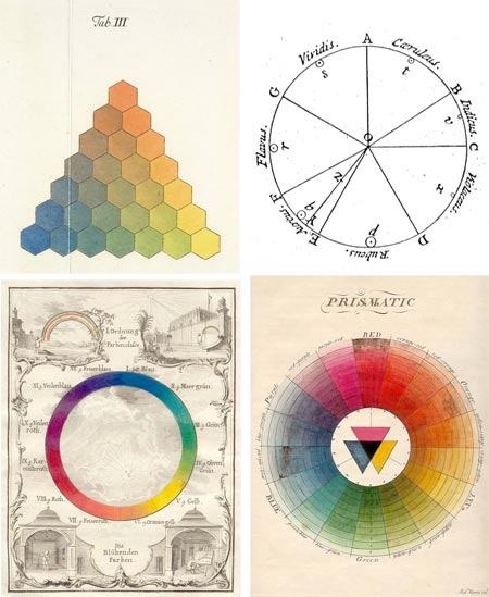
It’s been the subject of much discussion, some suggesting that it is misleading enough that it should be rethought entirely, but the color wheel remains the most common and convenient method for visually understanding and comparing the relationships of different hues.As part of the Gutenberg-e project by the American Historical Association and Columbia University Press, Sarah Lowengard has written a scholarly treatise on The Creation of Color in Eighteenth-Century Europe, the third chapter of which, Number Order, Form, delves into the history of color wheels and other visual systems of ordering and visualizing the relationships of colors.
The link going around the web currently (I found it on Digg) is to a post on the Color Lovers blog, which has extracted selections from her paper into an article on the History of the Color Wheel.
Color circles have been used to describe associations of colors from medieval times, but the first known example of the representation of hue in the form of a wheel, or circle, commonly suggested as the original color wheel, is traced to Sir Isaac Newton; whose keen mind was for some time focused on the nature of light and color.
Other systematic visual arrangements of colors precede it, like Tobias Mayer’s Trhchromatic Graph [correction – see below], which he first described in 1758 (interpreted by Georg Christoph Lichtenberg, image above, top left), but Newton’s circle is recognizable as the predecessor of the one in modern art texts. (For a couple of color wheels that I find particularly useful, see my links to Bruce MacEvoy’s artist pigment color wheels on handprint at the end of this article.)
Newton’s experimentation splitting sunlight with a prism is relatively well-known. (It’s still a fun and instructive practice is you haven’t indulged in it, I got mine from Edmund Scientific.)
Less well known is Newton’s original color circle, or hue circle, which was actually a kind of pie-chart (image above, top right), in which the bands of color he observed were distributed in wedges corresponding to their width in the observed spectrum, and arranged around the circle in the order of their wavelength. Newton emphasized that his circle represented the properties of the color of light (additive color), not artists’ pigments (subtractive color).
It was Newton who accomplished something that I have long been fascinated with, and confused by — the “closing of the circle”.
Physical wavelengths of light, which our eyes and brains interpret as different hues, can be thought of a part of a linear arrangement, segments of the electromagnetic spectrum; a continuous band of wavelengths of energy from the very short (X-rays and Gamma rays), with wavelengths measured in the distances equivalent to atomic nuclei, to the very long (radio waves) with wavelengths measured in distances on a human scale (meters or 10’s of meters).
The spectrum of visible light sits somewhere in between, at wavelengths the size of protozoa (micrometers, or millionths of a meter, also known as microns), ranging from red on the short end at 700nm, to violet on the long end at 400nm.
But how, my fevered little brain would like to know, does this linear relationship bend back on itself, like the optical equivalent of a Möebius strip, and connect in a continuous band; and how does it fit into that neat and oh-so-convenient system of primary, secondary and tertiary colors, triads; and in particular, the dramatic, and apparently biologically founded, relationship of color wheel opposites, or complementary colors?
This seems to have something to do with a “gap” in the color wheel, between the physical wavelengths of red and violet, in which the purples fill in with colors that are not discrete frequencies on the spectrum, but combinations of others.
I have to admit that I’m still basically unclear about this, but let’s face it, we always knew purple was weird.
Correction and addendum: Divid Briggs, author of The Dimensions of Color, was kind enough to write a comment and point out that though many systems of color charts precede Newton, Mayer’s was not one of them.
He also appears to have an answer to my question about the “closing of the circle”, which comes from the opponent model of vision. He explains if briefly in his comment on this post, and in more detail on The Dimensions of Color.
It turns out that I’m obliquely familiar with this model of human vision, which is based on two “channels” or scales of color, redness vs greenness and yellowness vs blueness, and a lightness scale or channel, in that this is the color model on which the LAB (CIELAB) color space is modeled.
CIELAB (“LAB color”) is a color space used in Photoshop, and is the fundamental color space on which Photoshop bases its interpretations of other color spaces. If you convert between CMYK and RGB, for example, Photoshop converts to the first color space to LAB and then from LAB to the other. (Here’s Adobe’s Technote.)
The CIELAB color space, based in part on Munsell but founded on the biological way in which the cones in the eye react to color, was codified in 1931 by the Commission Internationale d’Eclairage (International Commission on Illumination) to describe all colors visible to the human eye.
The closed circle of the color wheel is a product of the related opponent model of vision in which the interaction of the redness to greenness and blueness to yellowness scales forms a circle, and the oppositions produce the famous complementary color effects with which artists are so familiar.
So there’s my answer. It’s in the eye of the beholder.
Categories:
-
Piltdown
Here’s a little diversion for a Saturday morning.Fresh on the heels of Free Comic Book Day we have a free comic with prehistoric theme, in either HTML or downloadable PDF from, called Piltdown, from Wide Awake Press.
Naming the book after one of the great scientific hoaxes of the 20th Century gives you an idea of how serious it is. The book is an anthology with short stories by a variety of artists.
This is the second free downloadable comic from WAP, the first being EATS, which can also be viewed in HTML or PDF format, as well as the specialty comic book screen reader format of CBZ.
[Link via Palaeoblog, via The Comics Reporter]
Categories:


Charley’s Picks
Bookshop.org
(Bookshop.org affilliate links; sales benefit independent bookshop owners; I get a small percentage to help support my work on Lines and Colors)

John Singer Sargent: Watercolors


Urban Sketching: Understanding Perspective


Charley’s Picks
Amazon
(Amazon.com affiliate links; sales go to a larger yacht for Jeff Bezos; but I get a small percentage to help support my work on Lines and Colors)
John Singer Sargent: Watercolors
Urban Sketching: Understanding Perspective