
Categories
- 3d CGI
- Amusements
- Animation
- Anime & Manga
- Art Materials
- Art Videos
- Blogroll
- Cartoons
- Color
- Comics
- Concept & Visual Dev.
- Creativity
- Digital Art
- Digital Painting
- Displaying Art on the Web
- Drawing
- Eye Candy for Today
- Gallery and Museum Art
- High-res Art Images
- Illustration
- Motion Graphics & Flash
- Museums
- Online Museums
- Outsider Art
- Painting
- Painting a Day
- Paleo Art
- Pastel, Conté & Chalk
- Pen & Ink
- Prints and Printmaking
- Reviews
- Sc-fi and Fantasy
- Sculpture & Dimensional
- Site Comments
- Sketching
- Storyboards
- Tools and Techniques
- Uncategorized
- Vector Art
- Videos & Podcasts
- Vision and Optics
- Watercolor and Gouache
- Webcomics
Archives
- June 2026
- May 2026
- April 2026
- March 2026
- February 2026
- January 2026
- December 2025
- November 2025
- October 2025
- September 2025
- August 2025
- July 2025
- June 2025
- May 2025
- January 2025
- December 2024
- November 2024
- October 2024
- September 2024
- August 2024
- June 2024
- April 2024
- March 2024
- February 2024
- January 2024
- December 2023
- November 2023
- October 2023
- September 2023
- August 2023
- July 2023
- May 2023
- April 2023
- March 2023
- February 2023
- January 2023
- December 2022
- November 2022
- September 2022
- August 2022
- July 2022
- June 2022
- May 2022
- April 2022
- March 2022
- February 2022
- January 2022
- December 2021
- November 2021
- October 2021
- September 2021
- August 2021
- July 2021
- June 2021
- May 2021
- April 2021
- March 2021
- February 2021
- January 2021
- December 2020
- November 2020
- October 2020
- September 2020
- August 2020
- July 2020
- June 2020
- May 2020
- April 2020
- March 2020
- February 2020
- January 2020
- December 2019
- November 2019
- October 2019
- September 2019
- August 2019
- July 2019
- June 2019
- May 2019
- April 2019
- March 2019
- February 2019
- January 2019
- December 2018
- November 2018
- October 2018
- September 2018
- August 2018
- July 2018
- June 2018
- May 2018
- April 2018
- March 2018
- February 2018
- January 2018
- December 2017
- November 2017
- October 2017
- September 2017
- August 2017
- July 2017
- June 2017
- May 2017
- April 2017
- March 2017
- February 2017
- January 2017
- December 2016
- November 2016
- October 2016
- September 2016
- August 2016
- July 2016
- June 2016
- May 2016
- April 2016
- March 2016
- February 2016
- January 2016
- December 2015
- November 2015
- October 2015
- September 2015
- August 2015
- July 2015
- June 2015
- May 2015
- April 2015
- March 2015
- February 2015
- January 2015
- December 2014
- November 2014
- October 2014
- September 2014
- August 2014
- July 2014
- June 2014
- May 2014
- April 2014
- March 2014
- February 2014
- January 2014
- December 2013
- November 2013
- October 2013
- September 2013
- August 2013
- July 2013
- June 2013
- May 2013
- April 2013
- March 2013
- February 2013
- January 2013
- December 2012
- November 2012
- October 2012
- September 2012
- August 2012
- July 2012
- June 2012
- May 2012
- April 2012
- March 2012
- February 2012
- January 2012
- December 2011
- November 2011
- October 2011
- September 2011
- August 2011
- July 2011
- June 2011
- May 2011
- April 2011
- March 2011
- February 2011
- January 2011
- December 2010
- November 2010
- October 2010
- September 2010
- August 2010
- July 2010
- June 2010
- May 2010
- April 2010
- March 2010
- February 2010
- January 2010
- December 2009
- November 2009
- October 2009
- September 2009
- August 2009
- July 2009
- June 2009
- May 2009
- April 2009
- March 2009
- February 2009
- January 2009
- December 2008
- November 2008
- October 2008
- September 2008
- August 2008
- July 2008
- June 2008
- May 2008
- April 2008
- March 2008
- February 2008
- January 2008
- December 2007
- November 2007
- October 2007
- September 2007
- August 2007
- July 2007
- June 2007
- May 2007
- April 2007
- March 2007
- February 2007
- January 2007
- December 2006
- November 2006
- October 2006
- September 2006
- August 2006
- July 2006
- June 2006
- May 2006
- April 2006
- March 2006
- February 2006
- January 2006
- December 2005
- November 2005
- October 2005
- September 2005
- August 2005
Relevant Blogs
Art, Painting & Sketch
- Gurney Journey
- Underpaintings
- Art and Influence
- Painting Perceptions
- Oil Painters of America
- Vasari Paint POV
- Flying Fox
- Urban Sketchers
- Bento (Smithsonian)
- Art Inconnu
- The Hidden Place
- Still Life
- Making a Mark
- The Art of the Landscape
- Exploring Color & Creativity
- Art Contrarian
- Artist A Day
- beinArt Surreal Art Collective
- Eye Level
- David Dunlop
- p.i.g.m.e.n.t.i.u.m
- CultureGrrl
- Joaquín Sorolla blog
- Artists in Pastel
“Painting a Day”
- A Painting a Day (Keiser)
- On Painting (Keiser)
- Julian Merrow-Smith
- Karen Jurick
- Jeffrey Hayes
- Carol Marine
- Abbey Ryan
- Daily Paintworks
Other Painting Blogs
- Virtual Gouache Land
- Neil Hollingsworth
- Marc Hanson
- Kevin Menck
- Marc Dalessio
- Larry Seiler
- Stapleton Kearns
- Colin Page
- Roos Schuring
- Hans Versfelt
- Titus Meeuws
- Régis Pettinari
- René Plein Air
- Belinda Del Pesco
- Robin Weiss
- Nathan Fowkes (Land Sketch)
- William Wray
- Frank Serrano
- Stephen Magsig
- Michael Chesley Johnson
- Twice a Week
- Sarah Wimperis
- Rob Adams
- Michael Cole Manley
- The Dirty Palette Club
- Mike Manley’s Draw!
Gallery Art & Illustration mix
Illustration
- Howard Pyle
- 100 Years of Illustration
- BibliOdyssey
- Illustration Art
- Today’s Inspiration
- Illustration Mundo
- Little Chimp Society
- Danny Gregory
- R D (John Martz
- Illustration Friday blog
- Monster Brains
- Illustrators & Illustrations (RU)
- Elwood H. Smith
- DaniDraws.com
- Designers Who Blog
- iSpot Blog
Sci-Fi & Fantasy
Illustration & Comics
Comics & Cartoons
- Comics Beat
- Robot 6
- Newsarama Blog
- Comic Vine
- Comics Alliance
- Forbidden Planet Int.
- Paolo Rivera
- Bolt City
- Flight
- Scott McCloud
- The Comics Journal
- Comixpedia
- Funnybook Babylon
- James Baker
- Middleton’s Sketchbook
- Boneville
- The Hotel Fred
- Paul Rivoche
- Daily Cartoonist
- Mad About Cartoons (William Wray)
- Digital Strips
Illustration & Concept
Animation & Concept
- Cartoon Brew
- Animation Blog
- Cold Hard Flash
- Concept Art World
- The CAB
- FY Concept Art
- Concept Ships
- Concept Robots
- John Nevarez
- Armand Serrano
- Marcos Mateu-Mestre
- all kinds of stuff (Kricfalusi)
- Yacin the faun (Man Arenas)
- Kelsey Mann
- Cre8tivemarks Blog
- Ice-Cream Monster Toon Cafe
- AAU Character & Creature Design
- AAU Animation Notes
- Articles and Texticles
Paleo & Scientific
Tools & Techniques
Other
Lists of Art Blogs
Art Image Resource Links
Historic Art Images
- Wikimedia Commons: Paintings
- Wikimedia Commons: Drawings
- The Athenaeum
- WikiArt (WikiPaintings)
- Google Art Project: Artists
- Google Art Project: Collections (Museums)
- ArtCyclopedia
- Web Gallery of Art
- Art Renewal Center
- Web Gallery of Impressionism
Auction Consolidation sites
Auction sites
- Sotheby’s
- Bonham’s
- Christies
- Heritage Auctions: Fine Art
- Heritage Auctions: Illustration
- Freeman’s Auctions
- Bukowskis
- Shannon’s
Image Search
Reverse Image Search (search by image)
- Tin Eye
- RevImg
- Google Image Search (camera icon)
- Bing Image Search (camera icon)
Promoting some friends and some clients of my website design business
- Twin Willows T’ai Chi studio in Wilmington DE. Taiji classes with Bryan Davis.
- Ray Hayward, Inspired Teacher of T’ai Chi ( Taiji ) in Minneapolis, Founder of Mindful Motion Tai Chi Academy
- OldHead Tattoo studio and Art Gallery in Wilmington DE. Tattoos and paintings by Bruce Gulick
- Sharon Domenico Art, pet portrait oil paintings
- Platinum Paperhanging, wallpaper hanging, Main Line and Philadelphia, PA
- Lisa Stone Design, interior designer, Main Line and Philadelphia, PA
- Studio12KPT, original art, prints, calendars and other custom printed items by Van Sickle & Rolleri
-
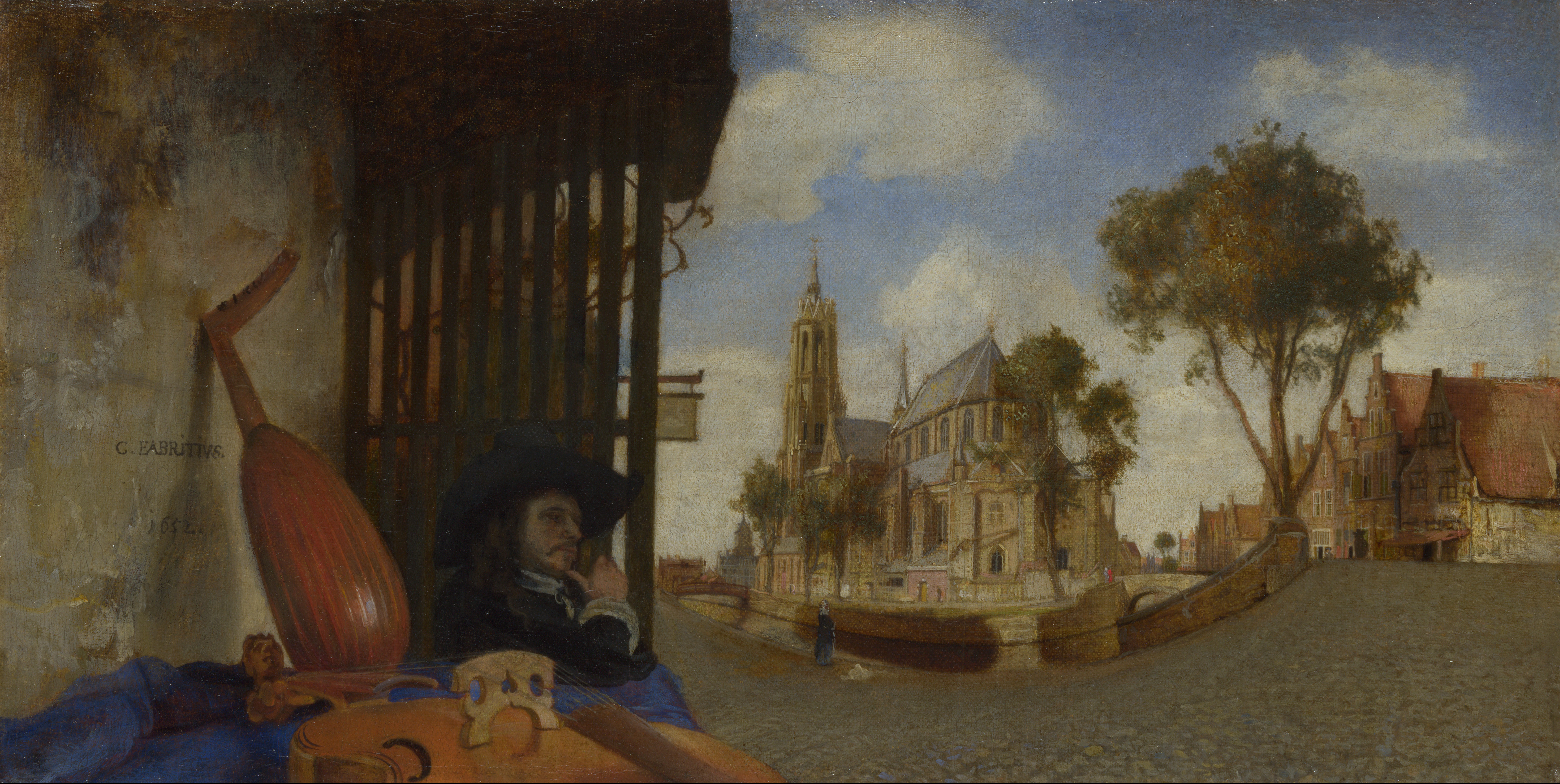
Carel Fabritius

Carel Fabritius was a Dutch painter whose adopted name comes from the latin for carpenter, or if more broadly used, craftsman.Fabritius studied in the the studio of Rembrandt, and is generally considered to be Rembrandt’s most talented pupil, and the only one to really break free of the master’s influence and develop his own style. This is notable in particular in the contrast of his color and texture filled portrait backgrounds with Rembrandt’s deep pools of darkness. His use of cool color harmonies is also distinctly different from the color choices of his master.
On leaving Rembrandt’s studio, he established himself for a time as an independent artist in his hometown of Beemster, and then moved to Delft, and is generally thought of as a Delft painter.
Fabritius was one of the most influential Dutch painters of his time, despite the fact that his career, and life, were tragically cut short in the “Delft Thunderclap“, an event in 1654 in which the Delft armory, and its large store of gunpowder, exploded, devastating a large part of the town.
It is presumed that much of Fabritius’ work was also lost in the explosion, as only about 12-15 of his paintings (depending on questions of attribution) are known to remain. Among those, however, is considerable variety, and Fabritius is also credited as one of starting points of trompe l’oeil painting.
I had the pleasure of seeing The Goldfinch (images above, top two; zoomable version here) in a Vermeer show in New York some years ago that included work by some of Vermeer’s contemporaries. It was the only non-Vermeer painting in the show to which I repeatedly returned. From a few feet away it is effectively trompe l’oeil illusionistic, close up, it’s a marvel of painterly loaded-brush painting.
Fabritius is generally acknowledged to have been an influence on Vermeer as well as De Hooch, who were also working in Delft at that time; though he was likely not, as you will sometimes see suggested, Vermeer’s teacher.
Like Vermeer, Fabritius is presumed to have made use of the camera obscura, and was fascinated with optical effects and linear perspective. Only one of his perspective experiments survives, but it’s a fascinating painting,
View of Delft (images above, bottom three; larger version here) has a fascinating curved perspective and oddly positioned and cut-off rendering of the violin in the left foreground. Taking clues from similar works by other artists, it was probably meant to be displayed on a curved surface inside a “peep-box“. These, viewed through a peephole, provide only one fixed-point view of the painting, giving the artist more control over what the viewer sees, and would have provided a realistic illusion of space and sense of place that must have been mesmerizing.
The painting, along with one of Fabritius’s presumed self-portraits, is in the collection of the National Gallery , London, which provides a wonderful full-screen and zoomable high resolution view of the painting (use controls at right of the image).
Categories:
-
Anthony S. Waters
 Anthony S. Waters is a California based concept artist and illustrator who does work for the gaming industry. He has worked with companies like Sony On-Line, DNA Productions, Lucasfilm, Electronic Arts, Microsoft and Hasbro, among others.
Waters works in both traditional and digital media, and often works with a bright palette, though at times almost monochromatically. His richly organic designs for environments and creatures seem at times to revel in convolutions of form, a feeling of graphic playfulness beneath their more dramatic surface.
I particularly enjoy his creature designs, in which he experiments with imaginative variations on subjects that can too often be formulaic.
His website has sections for Environments, Creatures, Characters, etc. and within each there are both finished work and sketches.
Waters also maintains a blog, contributes to Design-o-Matic and has a gallery on deviantART that has additional images.
Categories:
-
Met Museum’s American Wing reopens

The American Wing of the Metropolitan Museum of Art in New York, which has been undergoing extensive renovations, reopened this week, with a revitalized showcase for one of the best and most extensive collections of American art in the country.For those who can’t visit in person, I’ll take the opportunity to point out again the terrific resource that is the Met’s recently redone website.
I know I just did an article on their extensive collection of John Singer Sargent on the recent anniversary of his birth, but I can’t resist the opportunity to point out more terrific images, and mention that most are available on the site in high-resolution versions, as my detail crop of the John White Alexander painting, above, bottom, shows.
There is a sampling of images from the collection on this page, from which the above examples were drawn.
(Images above: Matthew Pratt, Kenyon Cox, Albert Bierstadt, William Merritt Chase, Thomas Eakins, Winslow Homer, John White Alexander)
Categories:
-
Rob Gonsalves (update)

Canadian magic realist Rob Gonsalves likes to portray the juxtapsotion of two differing but related points of view.These are often presented in scenes in which objects gradually morph through a series of similar shapes into something else entirely, and compositions in which two different aspects of the same scene are viewed at an entirely different scale, but are gradually joined into parts of a seemingly impossible whole.
Gonsalves plays with similar themes in a variety of compositions. There are also other repeated themes, such as scenes in which bodies of water in the distance gradually become something else in the foreground- stretches of mirrored tiles or a crowd with umbrellas.
I mentioned in my previous post about Gonsalves, that I see his work in a way as a collision between visual approaches to rearranging reality utilized by M.C. Escher and René Magritte.
Some of Gonsalves’ brain-teasing shifts in reality are more successful than others, but at their best they can give you that delightful “Ah-ha!” feeling as your perception slips from one level to another.
In all of them it’s fun to trace through his transitions and try to decide exactly where one view of the world transforms into the other.
Gonsalves works in acrylic, and in the short video you can see here on YouTube, shows the scale of his work and describes the time frame for painting an individual painting as about two months.
Gonsalves does not appear to have an official web presence. Since I last wrote about him, one of the resources I knew of has disappeared, but there is a new one that is even a bit more comprehensive.
You may find other resources by searching, but most of what I’ve found to date is redundant with the two gallery sites I’ve listed below.
Unfortunately, none of them have images that are very large.
There are books featuring Gonsalves’ work, though they’re not exactly collections, but combinations of his images with bits of text and aimed at children: Imagine a Day, Imagine a Night and Imagine a Place. Each contains about 16 or 17 pictures by the artist.
You can also find a 2012 Master of Illusion wall calendar featuring his work, and similar calendars from previous years if you just want them for the images.
Gonsalves’ work is also featured in, and highlighted on the cover of, Masters of Deception, a collection of work by 20 artists working in illusionistic styles that includes 16 pages on Gonsalves.
Categories:
-
Stop PIPA and SOPA
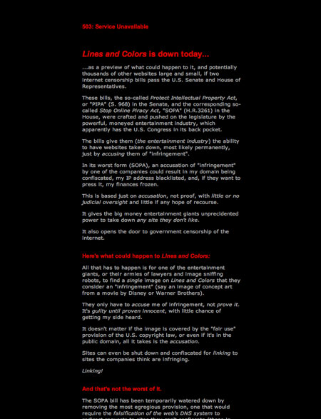
If you stopped by Lines and Colors yesterday, January 18, you may have noticed that Lines and Colors had gone dark, along with a significant number of other sites, in protest, and to raise awareness of the “anti-piracy” internet censorship bills looming in the U.S. Congress.If you didn’t happen to stop by yesterday, but would like to know more about why it matters, what I had to say about the issue, and why the continued existence of Lines and Colors and websites like it hinges on the defeat of these bills, here is the page that was up in place of the site yesterday.
The effort to raise awareness of this issue across the web has apparently begun to have an effect, as a number of legislators have withdrawn their support for the bills, at least in their current form. But the fight is far from over; the hugely powerful and influential lobbies that represent the entertainment industry will not slink quietly away and call it a day; they will continue to pressure congress to give them the kind of extraordinary and frightening control over internet content that these bills provide.
Those in other countries may feel this doesn’t affect them (it will if hundreds or thousands of websites go dark at the whim of the big corporations), or you may feel frustrated that you can’t affect it directly. Right now, the spread of information and awareness is important, and those of you in Europe and elsewhere will soon enough have your own fight on your hands over similar legislation that these companies are trying to force into law around the world.
Those in the U.S. can directly affect the immediate danger of these bills passing by calling or writing your U.S. senators and representatives and urging them to reject the bills. Here is a site called Stop American Censorship that has more information on how easy it is to do that.
I’m not exaggerating when I say that if these bills pass, Lines and Colors, and significant other portions of the web, will cease to exist.
-Charley
Categories:
-
Peder Severin Krøyer

Peder Severin Krøyer (sometimes Peter or just P.S. Krøyer) was born in Norway but moved to Denmark with his foster parents at an early age.He studied at the Royal Danish Academy of Art, traveled Europe and studied in Paris, where he was introduced to the work of the French Impressionists, an influence that resonates in his open, painterly, color-filled later work.
When he returned to Denmark he spent time painting in a remote fishing village called Skagen, and began to divide his time between Skagen and a studio in Copenhagen. Kroyer became the unofficial leader of an arts colony that sprang up in Skagen, and you will find reference to the group as the Skagen Painters. The Skagens Museum is dedicated to the group.
There is currently an exhibition, Krøyer; an international perspective at the Hirschprung Collection in Copenhagen where it will be on view until 10 April, 2012. After that it moves to the Skagens Museum where it will be on view from 5 April to 2 September, 2012.
There are scattered sources for Krøyer’s work in the web. Two of the best are Michael Hirsh’s Painters I should Have Known About (004) Peter Krøyer on his always superb Articles And Texticles blog, which also has some images of Skagen; and an article on a blog titled ensuciando las paredes.
Like the painting by John Atkinson Grimshaw that I mentioned in my recent post on that artist, Krøyer’s painting Interior of a Tavern (images above, third down) is one I love to revisit when at the Philadelphia Museum of Art.
[Addendum: Though I didn’t see it on the Hirschsprung site, there is a catalog for the exhibition available from the Skagens museum. (Thanks to Ron Washington)]
Categories:


Charley’s Picks
Bookshop.org
(Bookshop.org affilliate links; sales benefit independent bookshop owners; I get a small percentage to help support my work on Lines and Colors)

John Singer Sargent: Watercolors


Urban Sketching: Understanding Perspective


Charley’s Picks
Amazon
(Amazon.com affiliate links; sales go to a larger yacht for Jeff Bezos; but I get a small percentage to help support my work on Lines and Colors)
John Singer Sargent: Watercolors
Urban Sketching: Understanding Perspective