
Categories
- 3d CGI
- Amusements
- Animation
- Anime & Manga
- Art Materials
- Art Videos
- Blogroll
- Cartoons
- Color
- Comics
- Concept & Visual Dev.
- Creativity
- Digital Art
- Digital Painting
- Displaying Art on the Web
- Drawing
- Eye Candy for Today
- Gallery and Museum Art
- High-res Art Images
- Illustration
- Motion Graphics & Flash
- Museums
- Online Museums
- Outsider Art
- Painting
- Painting a Day
- Paleo Art
- Pastel, Conté & Chalk
- Pen & Ink
- Prints and Printmaking
- Reviews
- Sc-fi and Fantasy
- Sculpture & Dimensional
- Site Comments
- Sketching
- Storyboards
- Tools and Techniques
- Uncategorized
- Vector Art
- Videos & Podcasts
- Vision and Optics
- Watercolor and Gouache
- Webcomics
Archives
- June 2026
- May 2026
- April 2026
- March 2026
- February 2026
- January 2026
- December 2025
- November 2025
- October 2025
- September 2025
- August 2025
- July 2025
- June 2025
- May 2025
- January 2025
- December 2024
- November 2024
- October 2024
- September 2024
- August 2024
- June 2024
- April 2024
- March 2024
- February 2024
- January 2024
- December 2023
- November 2023
- October 2023
- September 2023
- August 2023
- July 2023
- May 2023
- April 2023
- March 2023
- February 2023
- January 2023
- December 2022
- November 2022
- September 2022
- August 2022
- July 2022
- June 2022
- May 2022
- April 2022
- March 2022
- February 2022
- January 2022
- December 2021
- November 2021
- October 2021
- September 2021
- August 2021
- July 2021
- June 2021
- May 2021
- April 2021
- March 2021
- February 2021
- January 2021
- December 2020
- November 2020
- October 2020
- September 2020
- August 2020
- July 2020
- June 2020
- May 2020
- April 2020
- March 2020
- February 2020
- January 2020
- December 2019
- November 2019
- October 2019
- September 2019
- August 2019
- July 2019
- June 2019
- May 2019
- April 2019
- March 2019
- February 2019
- January 2019
- December 2018
- November 2018
- October 2018
- September 2018
- August 2018
- July 2018
- June 2018
- May 2018
- April 2018
- March 2018
- February 2018
- January 2018
- December 2017
- November 2017
- October 2017
- September 2017
- August 2017
- July 2017
- June 2017
- May 2017
- April 2017
- March 2017
- February 2017
- January 2017
- December 2016
- November 2016
- October 2016
- September 2016
- August 2016
- July 2016
- June 2016
- May 2016
- April 2016
- March 2016
- February 2016
- January 2016
- December 2015
- November 2015
- October 2015
- September 2015
- August 2015
- July 2015
- June 2015
- May 2015
- April 2015
- March 2015
- February 2015
- January 2015
- December 2014
- November 2014
- October 2014
- September 2014
- August 2014
- July 2014
- June 2014
- May 2014
- April 2014
- March 2014
- February 2014
- January 2014
- December 2013
- November 2013
- October 2013
- September 2013
- August 2013
- July 2013
- June 2013
- May 2013
- April 2013
- March 2013
- February 2013
- January 2013
- December 2012
- November 2012
- October 2012
- September 2012
- August 2012
- July 2012
- June 2012
- May 2012
- April 2012
- March 2012
- February 2012
- January 2012
- December 2011
- November 2011
- October 2011
- September 2011
- August 2011
- July 2011
- June 2011
- May 2011
- April 2011
- March 2011
- February 2011
- January 2011
- December 2010
- November 2010
- October 2010
- September 2010
- August 2010
- July 2010
- June 2010
- May 2010
- April 2010
- March 2010
- February 2010
- January 2010
- December 2009
- November 2009
- October 2009
- September 2009
- August 2009
- July 2009
- June 2009
- May 2009
- April 2009
- March 2009
- February 2009
- January 2009
- December 2008
- November 2008
- October 2008
- September 2008
- August 2008
- July 2008
- June 2008
- May 2008
- April 2008
- March 2008
- February 2008
- January 2008
- December 2007
- November 2007
- October 2007
- September 2007
- August 2007
- July 2007
- June 2007
- May 2007
- April 2007
- March 2007
- February 2007
- January 2007
- December 2006
- November 2006
- October 2006
- September 2006
- August 2006
- July 2006
- June 2006
- May 2006
- April 2006
- March 2006
- February 2006
- January 2006
- December 2005
- November 2005
- October 2005
- September 2005
- August 2005
Relevant Blogs
Art, Painting & Sketch
- Gurney Journey
- Underpaintings
- Art and Influence
- Painting Perceptions
- Oil Painters of America
- Vasari Paint POV
- Flying Fox
- Urban Sketchers
- Bento (Smithsonian)
- Art Inconnu
- The Hidden Place
- Still Life
- Making a Mark
- The Art of the Landscape
- Exploring Color & Creativity
- Art Contrarian
- Artist A Day
- beinArt Surreal Art Collective
- Eye Level
- David Dunlop
- p.i.g.m.e.n.t.i.u.m
- CultureGrrl
- Joaquín Sorolla blog
- Artists in Pastel
“Painting a Day”
- A Painting a Day (Keiser)
- On Painting (Keiser)
- Julian Merrow-Smith
- Karen Jurick
- Jeffrey Hayes
- Carol Marine
- Abbey Ryan
- Daily Paintworks
Other Painting Blogs
- Virtual Gouache Land
- Neil Hollingsworth
- Marc Hanson
- Kevin Menck
- Marc Dalessio
- Larry Seiler
- Stapleton Kearns
- Colin Page
- Roos Schuring
- Hans Versfelt
- Titus Meeuws
- Régis Pettinari
- René Plein Air
- Belinda Del Pesco
- Robin Weiss
- Nathan Fowkes (Land Sketch)
- William Wray
- Frank Serrano
- Stephen Magsig
- Michael Chesley Johnson
- Twice a Week
- Sarah Wimperis
- Rob Adams
- Michael Cole Manley
- The Dirty Palette Club
- Mike Manley’s Draw!
Gallery Art & Illustration mix
Illustration
- Howard Pyle
- 100 Years of Illustration
- BibliOdyssey
- Illustration Art
- Today’s Inspiration
- Illustration Mundo
- Little Chimp Society
- Danny Gregory
- R D (John Martz
- Illustration Friday blog
- Monster Brains
- Illustrators & Illustrations (RU)
- Elwood H. Smith
- DaniDraws.com
- Designers Who Blog
- iSpot Blog
Sci-Fi & Fantasy
Illustration & Comics
Comics & Cartoons
- Comics Beat
- Robot 6
- Newsarama Blog
- Comic Vine
- Comics Alliance
- Forbidden Planet Int.
- Paolo Rivera
- Bolt City
- Flight
- Scott McCloud
- The Comics Journal
- Comixpedia
- Funnybook Babylon
- James Baker
- Middleton’s Sketchbook
- Boneville
- The Hotel Fred
- Paul Rivoche
- Daily Cartoonist
- Mad About Cartoons (William Wray)
- Digital Strips
Illustration & Concept
Animation & Concept
- Cartoon Brew
- Animation Blog
- Cold Hard Flash
- Concept Art World
- The CAB
- FY Concept Art
- Concept Ships
- Concept Robots
- John Nevarez
- Armand Serrano
- Marcos Mateu-Mestre
- all kinds of stuff (Kricfalusi)
- Yacin the faun (Man Arenas)
- Kelsey Mann
- Cre8tivemarks Blog
- Ice-Cream Monster Toon Cafe
- AAU Character & Creature Design
- AAU Animation Notes
- Articles and Texticles
Paleo & Scientific
Tools & Techniques
Other
Lists of Art Blogs
Art Image Resource Links
Historic Art Images
- Wikimedia Commons: Paintings
- Wikimedia Commons: Drawings
- The Athenaeum
- WikiArt (WikiPaintings)
- Google Art Project: Artists
- Google Art Project: Collections (Museums)
- ArtCyclopedia
- Web Gallery of Art
- Art Renewal Center
- Web Gallery of Impressionism
Auction Consolidation sites
Auction sites
- Sotheby’s
- Bonham’s
- Christies
- Heritage Auctions: Fine Art
- Heritage Auctions: Illustration
- Freeman’s Auctions
- Bukowskis
- Shannon’s
Image Search
Reverse Image Search (search by image)
- Tin Eye
- RevImg
- Google Image Search (camera icon)
- Bing Image Search (camera icon)
Promoting some friends and some clients of my website design business
- Twin Willows T’ai Chi studio in Wilmington DE. Taiji classes with Bryan Davis.
- Ray Hayward, Inspired Teacher of T’ai Chi ( Taiji ) in Minneapolis, Founder of Mindful Motion Tai Chi Academy
- OldHead Tattoo studio and Art Gallery in Wilmington DE. Tattoos and paintings by Bruce Gulick
- Sharon Domenico Art, pet portrait oil paintings
- Platinum Paperhanging, wallpaper hanging, Main Line and Philadelphia, PA
- Lisa Stone Design, interior designer, Main Line and Philadelphia, PA
- Studio12KPT, original art, prints, calendars and other custom printed items by Van Sickle & Rolleri
-
ImageS 11

I’ve pointed this out before, but it’s worth mentioning again. Lovers of beautiful illustration, and classic illustration from the “Golden Age” in particular, will tell you that computer monitors, for all of their glowing, zillions of colors brilliance, fall behind print when it comes to viewing images. (Seeing the original drawings or paintings in person is always first, of course).You can get used to viewing images on the screen; and unless you stop and compare, you can forget that computer screens are low-resolution!
Images in print are created by a process in which the tiny dots of color that make up the image are packed 300 per linear inch (2.54cm), or “300dpi”, while even the highest resolution computer monitors in common use display images as somewhere between 100 and 110 pixels per inch (ppi).
If you can find an onscreen image the same size as a printed image and can hold them up together, you’ll see the difference. When it comes to crispness, sharpness and detail, print wins.
I bring this up because I’m reminded how beautiful classic illustration is in print when ever I open a copy of Jim Vedeboncoeur’s ImageS (see my previous post on The Vadeboncoeur Collection of ImageS).
ImageS 11, which just brightened up my mailbox, and my day, is no exception.
ImageS goes beyond even the normal high-resolution methods of ordinary color printing and uses screenless stochastic printing, in which the dot pattern is rendered imperceptible, giving you an image that the closest you will get to viewing the original art by way of magazine or book format reproduction.
In addition, 30 of the reproductions in this issue were reproduced directly from the original art, not from the printed illustrations.
This issue is guest-curated by Susan McKinsey Goldberg and features work from the collection of Susan and Eric Goldberg. It continues the ImageS tradition of showcasing great classic illustrators, well known, lesser known and even unknown, including three previously unpublished paintings by J.C. Leyendecker, and beautiful works by Edmund Dulac, Kay Nielsen, Willy Pogany and more.
The page for ImageS 11 features a small animated-GIF slideshow that doesn’t at all do justice to the real images, but gives you a small notion of the variety of artists and styles.
Images 11 is 44 pages of cover-to cover great illustrations, most full size at 9″ x 12″, on 100 lb coated stock magazine format for $25 ($27.50 USD outside the US); less expensive and more beautiful than most of the illustration books you’ll find at Borders or Barnes & Noble, as if they’d even have a clue who these amazing artists are in a typical bookstore (small independent booksellers excepted, of course).
Worth noting: they only printed 2,000 copies.
(Images above, left to right: Umberto Brunelleschi, George Studdy, Ida Rentoul Outhwaite, J.C. Leyendecker)
Categories:
-
Eric Orchard

Eric Orchard is a Canadian illustrator whose book credits include Anything but Hank! written by Rachel Lebowitz, Zachariah Wells, A Forest for Christmas, written by Michael Harris, and The Terrible Horrible Smelly Pirate written by Carrie Muller and Jacqueline Halsey.His painted comics work include a story for Scholastic called Robot Museum, which is an offshoot of a longer project Orchard has had in the works for a long time (image above, bottom right, larger version here).
Orchard’s drawings and paintings, done with loose, informal linework and textural passages of watercolor or gouache, can have a charming, almost innocent feeling, while still edged with darker themes.
Orchard seems to have, at least for the time being, abandoned his dedicated web site in favor of his blog and another Revolving Portfolio blog. He also has a small gallery on toonpool.
On his blog you’ll find a variety of posts about his projects, in progress or finished, sketches, drawings and bits of personal news, as well as mentions of other artists he finds interesting. I’m uncertain how often the “Revolving Portfolio” revolves.
Orchard was a participant in last year’s Totoro Forest Project (and was the one who let me know about it) and his work was recently showcased in the Spectrum collection of contemporary fantastic art (image at top, larger version here).
There is a nice article on Orchard, featuring large reproductions of his work, on Seven Impossible Things Before Breakfast.
Orchard also maintains a blog called Meta Chronicles, dedicated to anachronistic science fiction themes, which often showcases related illustration.
Categories:
-
The Charcoal Club of Baltimore

Having lived in the Philadelphia area for most of my life, I’ve long been acquainted with two of the oldest independent artists’ organizations in the U.S., The Plastic Club and the Philadelphia Sketch Club. I know them both from attending drawing workshops and participating in exhibits at each of the clubs.The Philadelphia Sketch Club is, as far as I know, the oldest continuing arts club in the country; started in 1860 by students from The Pennsylvania Academy of the Fine Arts, the nation’s oldest art school.
I know those in Europe will look at Americans quizzically when we act as though things from a century and a half ago are “old”; but bear in mind that we are a young country, and age is a matter of perspective.
There are other American arts organizations that trace their origins to the latter part of the 19th Century, the Salmagundi Art Club in New York for example; and many of them have had some of the country’s finest painters and illustrators among their membership.
They often have colorful histories and origins that delineate patterns of dissatisfaction among artists with the artistic establishment of the time, or the desire to practice life drawing from the nude when such practices were frowned upon.
I was delighted to find out recently about another such artists’ organization, which dates as the second oldest in the U.S., The Charcoal Club of Baltimore.
Organized around classes nude figure drawing, and for 20 years the only institution in Baltimore offering life drawing sessions, the club was intended to encourage art appreciation, the sharing of techniques and the promotion of local artists.
The club also became a bastion of civic pride as the sponsor of at least two Salon des Refuses in the 1920’s and 30’s when the Baltimore Museum of Art bypassed Baltimore artists in its juried exhibitions of Maryland artists.
The club, like the other arts clubs I mention, carries on its traditions of promoting life drawing sessions, the sharing of information, techniques and resources among members and the promotion of local artists.
There is a gallery on the club’s site, from which I’ve picked a few member artists whose work struck me and who happen to have web sites displaying more of their work.
(Images above: Lee Alban, David Buckley Good, Rita Curtis)
[Suggestion courtesy of Ray Ridenour]
Categories:
-
Sorolla at the Prado
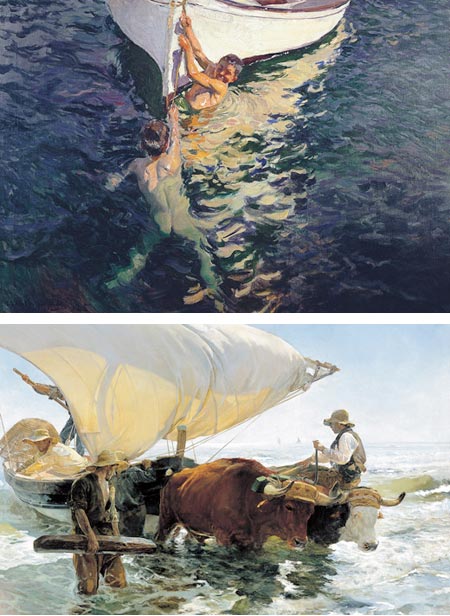
The rich, vibrant colors; the loose, confident brushstrokes; the painterly surface and broken color, the translucent sparkle of water on the skin of swimming children; the brilliant wash of sunlight defining a billowing sail; the sparkling daubs of suggested wavelets; the dappled corners of a summer garden; the saturated shadows of sun bathed cloth and the physical feeling of light, pouring through his paintings like a mist of illumination, may give you the… um, impression that Spanish painter Joaquín Sorolla y Bastida is an impressionist. He has more in common, though, with painters like his friends John Singer Sargent or William Merritt Chase, and some of the other so-called “American Impressionists”, than with the French “painters of light”.Yes, Sorolla too is certainly a painter of light; light in all of its dazzling brilliance, light that acts like its own prism, breaking up into sparkling shards of intense color, but with a touch and an intention that is all his own. Veláquez was as much an influence Sargent or Chase, and his early exposure to the work of Jules Bastien-Lepage, and some of the Orientalist painters, along with his extensive classical training and study of the masters, lent his work an underlying classical solidity that the French rebels (with the notable exception of Degas) deliberately obscured with their own kaleidoscopic explosions of color.
Sorolla received attention and honors in Europe. With a dramatic show at the Hispanic Society of New York in 1909, and subsequent shows in New York, he entered a number of collections here in the U.S., including the Getty Museum.
It is at the Museo Nacional del Prado in Madrid, where the young Sorolla spent countless hours studying the work of the masters, and Veláquez in particular, that there is now a major exhibition of Sorolla’s paintings.
Simply called Joaquín Sorolla (1863-1923), the exhibition runs until September 6, 2009. There is a catalogue accompanying the exhibition.
The pages of the exhibition listing include reproductions of some of the pieces in the show, including the images above.
The Prado also has other paintings by Sorolla that you can search for here (hint, click into the zoomable image, then control-click or right-click on the zoomable image and choose “View in another window” to see the entire high-res image).
There are excellent sources for Sorolla’s work online, including Joaquín Sorolla y Bastida – The complete works, and the collection of Museo Sorolla, as well as others I’ll list below.
For more, see my previous post on Joaquín Sorolla. Sorolla was also friends with Aureliano Beruete, another independently minded painter who gets labeled as s “Spanish Impressionist”, and painted his portrait.
Categories:
-
Gobelins Students Animations for Annecy 2009

Over a period of four months, teams of students in the animation division of the extraordinary Gobelins, l’école de l’image (Goeblins School of Communications) in Paris develop short (60-90 second) animated films that serve as introductions to the events of each day of that years Festival International du Film d’Animation d’Annecy (Annecy Animation Festival).As I’ve mentioned before, these films are usually clever, witty, well drawn and well animated. Each year they give me great hope that the traditions of hand drawn animation are alive and well in the face of the tidal wave of CGI (both good and bad) from Hollywood.
This year there are five films (I think the official festival events are one day shorter this year), and the films are stunningly beautiful and well executed, even by past standards of extraordinary work from Gobelins students.
The Gobelins Student Work 2009 page lists the animations, along with credits, and has links (“Découvrir ce film”) for viewing the animations. (Non-French speakers can also view the page using Google Translate.) The films themselves are largely wordless so language is not a barrier.
One of the best ways to preview the animations before watching them, view large stills and a brief description, is by way of Michael Hirsh’s Articles & Texticles; which is what I do every year.
Form more, see my past articles on Gobelins Annecy Animations, which includes a list of links to previous years’ animations.
Categories:
-
Kim Lordier

Pastel is one of those interesting areas where definitions of media show their limitations.Pastel is a dry medium and is applied in may ways like a drawing medium, and of course can be used for drawing; but pastel is often used in applications that are more like painting, and “pastel painting” is a accepted term to a degree, though pastel doesn’t employ the liquid mediums and binders that are associated with paint.
I mention this because if there is one word that I want to use in describing the work of pastel artist Kim Fancher Lordier, it’s “painterly”.
Her passages of rich, textural color, woven together in luscious slabs and chunks into atmospheric wholes, are vibrant with the kind of feeling for the physical nature of the medium that ordinarily prompts the use the word painterly to refer to visible brushstrokes.
Lordier is a California artist who takes inspiration from the turn of the 20th Century California Impressionist painters (see my posts on Granville Redmond, Guy Rose – also here, Hanson Puthuff and George Gardner Symons).
She uses the painterly qualities of pastel to explore the light and atmosphere of the California countryside, her images evocative of time and season as well as place. She juxtaposes bright, high chroma passages with more muted colors, misty atmospheric perspective and subtle, color saturated darks.
Lordier’s website showcases and extensive array of her work. (Click to view the larger image and then use the arrows to click through.) There are also works visible on the sites of the galleries listed below.
Lordier conducts pastel workshops; one is coming up July 10-13 in Mt Vernon, Washington, and anther July 27-28 in San Mateo County, California.
Categories:


Charley’s Picks
Bookshop.org
(Bookshop.org affilliate links; sales benefit independent bookshop owners; I get a small percentage to help support my work on Lines and Colors)

John Singer Sargent: Watercolors


Urban Sketching: Understanding Perspective


Charley’s Picks
Amazon
(Amazon.com affiliate links; sales go to a larger yacht for Jeff Bezos; but I get a small percentage to help support my work on Lines and Colors)
John Singer Sargent: Watercolors
Urban Sketching: Understanding Perspective