
Categories
- 3d CGI
- Amusements
- Animation
- Anime & Manga
- Art Materials
- Art Videos
- Blogroll
- Cartoons
- Color
- Comics
- Concept & Visual Dev.
- Creativity
- Digital Art
- Digital Painting
- Displaying Art on the Web
- Drawing
- Eye Candy for Today
- Gallery and Museum Art
- High-res Art Images
- Illustration
- Motion Graphics & Flash
- Museums
- Online Museums
- Outsider Art
- Painting
- Painting a Day
- Paleo Art
- Pastel, Conté & Chalk
- Pen & Ink
- Prints and Printmaking
- Reviews
- Sc-fi and Fantasy
- Sculpture & Dimensional
- Site Comments
- Sketching
- Storyboards
- Tools and Techniques
- Uncategorized
- Vector Art
- Videos & Podcasts
- Vision and Optics
- Watercolor and Gouache
- Webcomics
Archives
- June 2026
- May 2026
- April 2026
- March 2026
- February 2026
- January 2026
- December 2025
- November 2025
- October 2025
- September 2025
- August 2025
- July 2025
- June 2025
- May 2025
- January 2025
- December 2024
- November 2024
- October 2024
- September 2024
- August 2024
- June 2024
- April 2024
- March 2024
- February 2024
- January 2024
- December 2023
- November 2023
- October 2023
- September 2023
- August 2023
- July 2023
- May 2023
- April 2023
- March 2023
- February 2023
- January 2023
- December 2022
- November 2022
- September 2022
- August 2022
- July 2022
- June 2022
- May 2022
- April 2022
- March 2022
- February 2022
- January 2022
- December 2021
- November 2021
- October 2021
- September 2021
- August 2021
- July 2021
- June 2021
- May 2021
- April 2021
- March 2021
- February 2021
- January 2021
- December 2020
- November 2020
- October 2020
- September 2020
- August 2020
- July 2020
- June 2020
- May 2020
- April 2020
- March 2020
- February 2020
- January 2020
- December 2019
- November 2019
- October 2019
- September 2019
- August 2019
- July 2019
- June 2019
- May 2019
- April 2019
- March 2019
- February 2019
- January 2019
- December 2018
- November 2018
- October 2018
- September 2018
- August 2018
- July 2018
- June 2018
- May 2018
- April 2018
- March 2018
- February 2018
- January 2018
- December 2017
- November 2017
- October 2017
- September 2017
- August 2017
- July 2017
- June 2017
- May 2017
- April 2017
- March 2017
- February 2017
- January 2017
- December 2016
- November 2016
- October 2016
- September 2016
- August 2016
- July 2016
- June 2016
- May 2016
- April 2016
- March 2016
- February 2016
- January 2016
- December 2015
- November 2015
- October 2015
- September 2015
- August 2015
- July 2015
- June 2015
- May 2015
- April 2015
- March 2015
- February 2015
- January 2015
- December 2014
- November 2014
- October 2014
- September 2014
- August 2014
- July 2014
- June 2014
- May 2014
- April 2014
- March 2014
- February 2014
- January 2014
- December 2013
- November 2013
- October 2013
- September 2013
- August 2013
- July 2013
- June 2013
- May 2013
- April 2013
- March 2013
- February 2013
- January 2013
- December 2012
- November 2012
- October 2012
- September 2012
- August 2012
- July 2012
- June 2012
- May 2012
- April 2012
- March 2012
- February 2012
- January 2012
- December 2011
- November 2011
- October 2011
- September 2011
- August 2011
- July 2011
- June 2011
- May 2011
- April 2011
- March 2011
- February 2011
- January 2011
- December 2010
- November 2010
- October 2010
- September 2010
- August 2010
- July 2010
- June 2010
- May 2010
- April 2010
- March 2010
- February 2010
- January 2010
- December 2009
- November 2009
- October 2009
- September 2009
- August 2009
- July 2009
- June 2009
- May 2009
- April 2009
- March 2009
- February 2009
- January 2009
- December 2008
- November 2008
- October 2008
- September 2008
- August 2008
- July 2008
- June 2008
- May 2008
- April 2008
- March 2008
- February 2008
- January 2008
- December 2007
- November 2007
- October 2007
- September 2007
- August 2007
- July 2007
- June 2007
- May 2007
- April 2007
- March 2007
- February 2007
- January 2007
- December 2006
- November 2006
- October 2006
- September 2006
- August 2006
- July 2006
- June 2006
- May 2006
- April 2006
- March 2006
- February 2006
- January 2006
- December 2005
- November 2005
- October 2005
- September 2005
- August 2005
Relevant Blogs
Art, Painting & Sketch
- Gurney Journey
- Underpaintings
- Art and Influence
- Painting Perceptions
- Oil Painters of America
- Vasari Paint POV
- Flying Fox
- Urban Sketchers
- Bento (Smithsonian)
- Art Inconnu
- The Hidden Place
- Still Life
- Making a Mark
- The Art of the Landscape
- Exploring Color & Creativity
- Art Contrarian
- Artist A Day
- beinArt Surreal Art Collective
- Eye Level
- David Dunlop
- p.i.g.m.e.n.t.i.u.m
- CultureGrrl
- Joaquín Sorolla blog
- Artists in Pastel
“Painting a Day”
- A Painting a Day (Keiser)
- On Painting (Keiser)
- Julian Merrow-Smith
- Karen Jurick
- Jeffrey Hayes
- Carol Marine
- Abbey Ryan
- Daily Paintworks
Other Painting Blogs
- Virtual Gouache Land
- Neil Hollingsworth
- Marc Hanson
- Kevin Menck
- Marc Dalessio
- Larry Seiler
- Stapleton Kearns
- Colin Page
- Roos Schuring
- Hans Versfelt
- Titus Meeuws
- Régis Pettinari
- René Plein Air
- Belinda Del Pesco
- Robin Weiss
- Nathan Fowkes (Land Sketch)
- William Wray
- Frank Serrano
- Stephen Magsig
- Michael Chesley Johnson
- Twice a Week
- Sarah Wimperis
- Rob Adams
- Michael Cole Manley
- The Dirty Palette Club
- Mike Manley’s Draw!
Gallery Art & Illustration mix
Illustration
- Howard Pyle
- 100 Years of Illustration
- BibliOdyssey
- Illustration Art
- Today’s Inspiration
- Illustration Mundo
- Little Chimp Society
- Danny Gregory
- R D (John Martz
- Illustration Friday blog
- Monster Brains
- Illustrators & Illustrations (RU)
- Elwood H. Smith
- DaniDraws.com
- Designers Who Blog
- iSpot Blog
Sci-Fi & Fantasy
Illustration & Comics
Comics & Cartoons
- Comics Beat
- Robot 6
- Newsarama Blog
- Comic Vine
- Comics Alliance
- Forbidden Planet Int.
- Paolo Rivera
- Bolt City
- Flight
- Scott McCloud
- The Comics Journal
- Comixpedia
- Funnybook Babylon
- James Baker
- Middleton’s Sketchbook
- Boneville
- The Hotel Fred
- Paul Rivoche
- Daily Cartoonist
- Mad About Cartoons (William Wray)
- Digital Strips
Illustration & Concept
Animation & Concept
- Cartoon Brew
- Animation Blog
- Cold Hard Flash
- Concept Art World
- The CAB
- FY Concept Art
- Concept Ships
- Concept Robots
- John Nevarez
- Armand Serrano
- Marcos Mateu-Mestre
- all kinds of stuff (Kricfalusi)
- Yacin the faun (Man Arenas)
- Kelsey Mann
- Cre8tivemarks Blog
- Ice-Cream Monster Toon Cafe
- AAU Character & Creature Design
- AAU Animation Notes
- Articles and Texticles
Paleo & Scientific
Tools & Techniques
Other
Lists of Art Blogs
Art Image Resource Links
Historic Art Images
- Wikimedia Commons: Paintings
- Wikimedia Commons: Drawings
- The Athenaeum
- WikiArt (WikiPaintings)
- Google Art Project: Artists
- Google Art Project: Collections (Museums)
- ArtCyclopedia
- Web Gallery of Art
- Art Renewal Center
- Web Gallery of Impressionism
Auction Consolidation sites
Auction sites
- Sotheby’s
- Bonham’s
- Christies
- Heritage Auctions: Fine Art
- Heritage Auctions: Illustration
- Freeman’s Auctions
- Bukowskis
- Shannon’s
Image Search
Reverse Image Search (search by image)
- Tin Eye
- RevImg
- Google Image Search (camera icon)
- Bing Image Search (camera icon)
Promoting some friends and some clients of my website design business
- Twin Willows T’ai Chi studio in Wilmington DE. Taiji classes with Bryan Davis.
- Ray Hayward, Inspired Teacher of T’ai Chi ( Taiji ) in Minneapolis, Founder of Mindful Motion Tai Chi Academy
- OldHead Tattoo studio and Art Gallery in Wilmington DE. Tattoos and paintings by Bruce Gulick
- Sharon Domenico Art, pet portrait oil paintings
- Platinum Paperhanging, wallpaper hanging, Main Line and Philadelphia, PA
- Lisa Stone Design, interior designer, Main Line and Philadelphia, PA
- Studio12KPT, original art, prints, calendars and other custom printed items by Van Sickle & Rolleri
-
Edward Tufte
Visual art is often presented as something that exists in its purest form “for art’s sake”, removed from any purpose other than to exist as art, sometimes seen as a rare and noble sort of abstracted “expression” of something.This is the impression that is glibly, and I believe wrongly, put forth by the 20th Century Modernist art theorists; whose influence still permeates the museums, galleries and auction houses that form the foundation of the modern “art world”.
It is from the bulwarks of these notions that art snobs feel immune in presenting their vehemently held belief that illustration, for example, is “not art”, as an accepted art standard, rather than as the shameless class warfare it actually represents.
The notion of “art for art’s sake” is belied by centuries of art history, throughout most of which art has had purpose and meaning; whether to reinforce the doctrine of the church, enlighten and educate the upper classes, display power and wealth, illustrate literary or religious texts, decorate spaces, entertain the public, open windows to other times and places, tell stories, entertain, amuse, horrify, dazzle, illuminate, instruct and/or inform.
Visual art has all of those functions, and many more, and its multicolored threads are inextricably woven into the patchwork cloth of our day to day lives.
We are constantly interacting with graphics, symbols, images, drawings, logos, signs, maps, charts and all manner of visual marks that have differing degrees of impact on our decisions as we find our path through a labyrinth of choices.
Most of these, though decidedly visual and readily seen, are “invisible” in the sense that we take them for granted, are often oblivious to their influence on us, and rarely stop to think about their veracity, accuracy or effectiveness; or the intention with which they were prepared and presented.
Enter Edward Tufte, who has made his mark, so to speak, by doing just that. Though an artist to a degree, Tufte is noted primarily as a thinker about the visual presentation of information.
His groundbreaking, dryly titled book, The Visual Display of Qualitative Information (also here), became a classic that opened eyes and minds to the way that statistical graphics in particular (the use of charts, graphs, and what are now called “info-graphics”), affect the way we accept, understand and interpret information.
Using a range of widely disparate examples, he shows not only how such graphic displays can be used and misused, both intentionally and through incompetence; but how they can be thoughtfully designed to convey information superbly. He also demonstrates how well designed informational graphics can be much more information dense than text based statistics (a picture is worth a thousand numbers…).

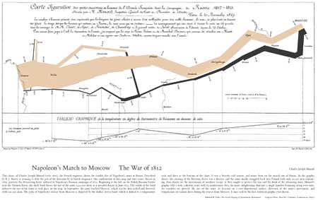
Tufte, a Professor Emeritus at Yale University, followed up with several other books, two of which, Envisioning Information (also here, image above) and the new Visual Explanations: Images and Quantities, Evidence and Narrative (also here), are also considered classics in the field of the visual display of information, which Tufte helped establish as a recognized field of study.He illustrates his points with such diverse examples as 16th century maps, modern info-graphics, 20th Century propaganda graphics, a cosmonaut’s hand drawn cyclogram of a 96-day spaceflight, and Charles Joseph Minard’s strikingly visceral chart of the devastation of Napoleon’s army through its advance on and retreat from Moscow (image at top, large version here).
Tufte is a harsh critic of Microsoft’s PowerPoint, in particular, as an exemplar of the way visual information is clouded and obscured in useless presentation dressing, or “ChartJunk”; which affects, he asserts, not only the way we perceive visual data, but the way we think. (Wired magazine, in a fun juxtaposition, published Tufte’s essay, PowerPoint is Evil (which was expanded into a short book The Cognitive Style of PowerPoint: Pitching Out Corrupts Within, also here) back to back with David Byrne’s article Learning to Love PowerPoint, in which Byrne explores the ubiquitous presentation application as an art medium.)

Conversely, Tufte is a fan of well done displays of information, and has a high regard for the work currently being done in newspaper info-graphics, which he feels are well in advance of the presentation of such information by government and academia. In particular he points to the beautifully done info-graphics of Megan Jaegerman for the New York Times (above), which Tufte features prominently on his site.For someone who is such an incisive thinker about information display, I have to say I’m disappointed in Tufte’s own web site (I tend to be cranky about that); but there are lots of gems to be found if you poke around enough, like the articles linked in the Ask E.T section, the “Graphic of the Day” list on this page, his video critique of the iPhone interface, and articles about all kinds of visual thinking; like this article about the notion that Cezanne’s early cubist landscapes were, in fact, a response to the inherently cubist geometric arrangement of older European towns (image below). (This is something I noticed myself when I was in Arles).

Tufte is a highly regarded lecturer, those who have attended his lectures usually have very high praise for them, and he is about to tour several U.S. cities with a one day course on Presenting Data and Information. It starts on July 28, 2009 here in Philadelphia and winds up on December 10, 2009 in San Jose, California.It would be difficult to show how influential Tufte’s thinking has been among those who are working to improve the way that data and information are conveyed, both in print and electronically. To do so effectively, I’d have to draw you a well designed, information dense chart.
Categories:
-
The Tale of How book

I’ve written before about The Tale of How, a short, wonderfully original animation by The Blackheart Gang, featuring the artwork of Ree Treweek.I’ve also talked about Shy the Sun, a commercial production company featuring members of the Blackheart Gang, including Treweek and Jannes Hendrikz, which has been producing marvelously eccentric ads for companies like United Airlines and Bakers Precious Biscuits.
Art from The Tale of How, which is planned as part of a larger ongoing project called The Household, has now been published as a coffee table art book, in a deluxe slipcase version that includes a DVD with the animation and reproductions of a print series.
The book is available directly from the Blackheart Gang web site, I don’t know if it will be available in other distribution channels. There are additional images from the book here.
The print series will also be made available for purchase on their site (“soon”).
The original Tale of How animation is visible here, and there is now a short Making of the Tale of How video on the site.
For more on Ree Treweek and The Blackheart Gang, see my previous posts listed below.
Categories:
-
Brett Helquist

Brett Helquist is best known for his illustrations for the popular A Series of Unfortunate Events children’s books by “Lemony Snicket” (Daniel Handler).Helquist was born in Arizona, grew up in Utah, where he earned a bachelor’s degree in fine arts from Brigham Young University, and currently lives and works in New York City.
He cites as his inspiration some of the all time great American illustrators like Howard Pyle, N.C. Wyeth and Dean Cornwell (also here).
Helquist’s first job was as an intern for illustrator Robert Neubecker, he then went on to do editorial illustrations for newspapers and magazines. Lemony Snicket’s The Bad Beginning, the first in the series, was his first book illustration assignment.
Since then he has done both cover and interior illustrations for many other books in the series, as well as many in the Tales from the House of Bunnicula series written by James Howe, and cover illustrations for the recent reprinting of the Green Knowe series, along with a number of others. (It’s easy to miss the small navigation to the second page of his portfolio.)
In addition, Helquist is both the author and illustrator of Roger, the Jolly Pirate (above, bottom, right).
Categories:
-
Joseph Zbukvic
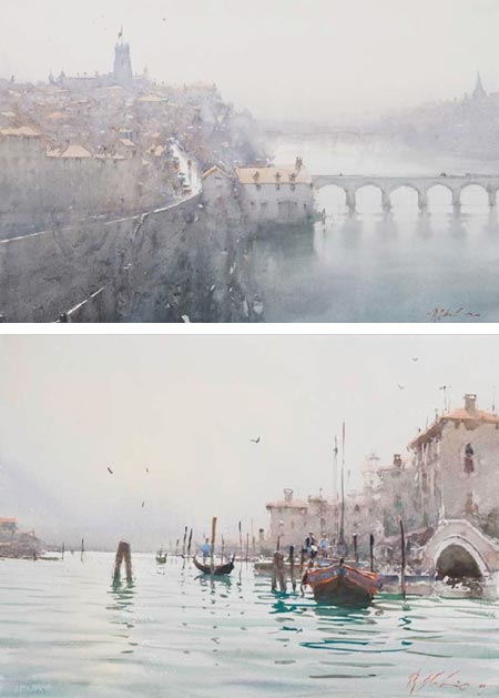
Joseph Zbukvic is a Croation born artist living and working in Melbourne, Australia.Zbukvic’s atmospheric, emotionally resonant watercolors have a wonderful characteristic of being simultaneously loose and crisp — loose in that he suggests rather than elaborating, and crisp because of his masterful command of edges. He has a highly refined sense of when to define a sharp edge, and when to let an edge disappear into mists of hazy textured color.
His landscapes and cityscapes, often of locations in Europe, are highly evocative of the place, without being rigid in their portrayal of details and specifics. He portrays the kind of visual image we might call up as a memory of a fondly remembered place, both hazy and sharp.
Many of Zbukvic’s paintings are done on location. His palette is often muted and understated, though sometimes punctuated with higher chroma passages. Zbukvick enjoys dwelling on misty atmosphere, rain and overcast shadow, as well as the haze of bright sunlight.
Zbukvick gives highly regarded workshops. This year’s schedule includes dates in France, Spain and Canada as well as Australia. His DVD, Watercolor Impressions, includes scenes from previous workshops; you can see a short excerpt by clicking on the second image on the workshop page.
I also came across this video clip from Inside Joseph Zbukvic’s Sketchbook, related I think to a June, 2008 cover story on him in Watercolor Artist magazine.
In addition to his workshops, Zbukvick also teaches at Charles Sturt University and the Mitchell School of Arts.
Some of the galleries that represent his work have additional galleries in which you will find images not on his site (and/or larger reproductions, particularly the first two listed).
[Suggestion courtesy of Jeroen Coert]
Addendum: Adebanji Alade wrote to let us know about Zbukvic’s book Mastering Atmosphere & Mood in Watercolor: The Critical Ingredients That Turn Paintings into Art. Unfortunately, it is out of print and resellers seem to be asking high prices for it at the moment. Perhaps something to keep an eye out for.
Categories:
-
Blue and green, or is it?
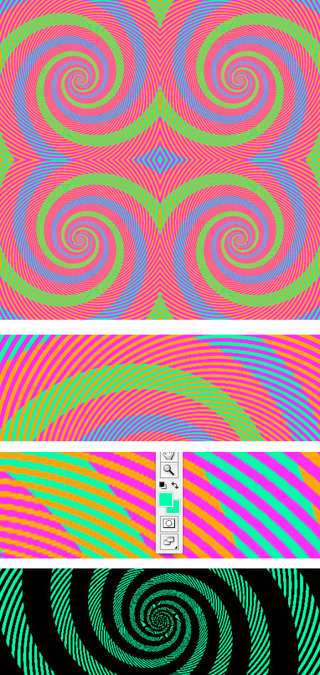
Like anyone who works with painting, design or color in any form, I occasionally struggle with color; not just with mixing and choosing colors, but with the actual perception of color, the ability to answer the seemingly simple question “What color is that?”All of my studies of color and color theory have led me to the inexorable conclusion that the single most important rule of color is that the human perception of any color is almost entirely dependent on adjacent or surrounding colors.
This is the basis of Eugene Delacroix’s wonderful quote: “I can paint you the skin of Venus with mud, provided you let me surround it as I will.”
While this principle is visible to the trained eye, both in painting and in life, it is never made more clear than in deliberately created optical illusions, like the e-Chalk color perception illusion I wrote about in this post.
This image shown here is one of the most striking illustrations of this principle I’ve seen.
I came across it in a post by Phil Plait on Bad Astronomy, who indicated the the original is from Akiyoshi Kitaokaâ’s optical illusion website (scroll to the bottom of the page).
Anyone with normal color vision will see a series of green and blue spirals. There would be little chance that a casual observer would suggest that the blue and green might be the same color, and yet they are.
You can see in the first detail image that the “green” spirals are only crossed by bands of orange, and the “blue” spirals are only crossed by bands of magenta.
In the second detail, you can see the Photoshop foreground/background color blocks where I have used the Eyedropper tool to pick one color out of the “green” band, and the other out of the “blue” band.
They are identical RGB values, 0, 255, 150. The same color.
The color is actually a green leaning toward blue. Richard Wiseman used Photoshop to change all of the values except the green and blue bands to black, and you can see a detail of the result in the bottom image. There is also a simplified version of the illusion here.
So the next time you’re looking at a color an think “that’s green” or “that’s blue”, well, maybe it is, maybe it isn’t, depending on the surrounding colors.
Categories:
-
John Pugh

Trompe l’oeil, French for “trick the eye” is an illusionary art technique with a long history in Western art. The intention is to create an optical illusion, in that the viewer is given the impression that there is a three dimensional object or scene before them, not just a realistic image (see some of my posts relevant to trompe l’oeil, in particular my post on Eric Grohe).California born artist John Pugh paints large scale trompe l’oeil images, usually on the sides of buildings, that reveal impossible, and often amusing, dimensions to an otherwise flat wall.
In his Mana Nalu (power of the wave) Mural Project (image above, top, large version here) in Hawaii, the flat side of a building appears to be deeply concave, and filed with an enormous cresting wave, in which we see a personification of Queen Lili’uokalani. Riding the wave is pioneering surfer Duke Kahanamoku, and standing at the foot of the wave, looking for all the world like real children walking on a ledge in front of the oncoming wall of water, are three painted children.
Pugh likes to give our sensibilities an extra tease at times by including a painted observer in his illusionary scene.
In his Siete Punto Uno in Los Gatos, California (image above, bottom, large version here), a red jacketed woman peers into an apparently earthquake caused break in the wall of a cafe, that reveals a hidden temple of the Mayan Jaguar God (the bringer of earthquakes in their mythology).
Pugh’s web site showcases his mural work, public and residential and corporate. It also includes a page of “mural mishap” accounts, in which the illusion of the murals has prompted amusing responses from people, such as patrons in a bar who break glasses trying to set them on trompe l’oeil “shelf”, or people who walk into walls trying to walk “into” his paintings, a la Road Runner cartoons.
In addition to his site, Pugh maintains a site for prints and mural posters that also has galleries of images.
[Via Daily Mail Online]
Categories:


Charley’s Picks
Bookshop.org
(Bookshop.org affilliate links; sales benefit independent bookshop owners; I get a small percentage to help support my work on Lines and Colors)

John Singer Sargent: Watercolors


Urban Sketching: Understanding Perspective


%3C/i%3E%20Los%20Gatos,%20California&im=images/dbSietePuntoUnofull.jpg)
Charley’s Picks
Amazon
(Amazon.com affiliate links; sales go to a larger yacht for Jeff Bezos; but I get a small percentage to help support my work on Lines and Colors)
John Singer Sargent: Watercolors
Urban Sketching: Understanding Perspective