
Categories
- 3d CGI
- Amusements
- Animation
- Anime & Manga
- Art Materials
- Art Videos
- Blogroll
- Cartoons
- Color
- Comics
- Concept & Visual Dev.
- Creativity
- Digital Art
- Digital Painting
- Displaying Art on the Web
- Drawing
- Eye Candy for Today
- Gallery and Museum Art
- High-res Art Images
- Illustration
- Motion Graphics & Flash
- Museums
- Online Museums
- Outsider Art
- Painting
- Painting a Day
- Paleo Art
- Pastel, Conté & Chalk
- Pen & Ink
- Prints and Printmaking
- Reviews
- Sc-fi and Fantasy
- Sculpture & Dimensional
- Site Comments
- Sketching
- Storyboards
- Tools and Techniques
- Uncategorized
- Vector Art
- Videos & Podcasts
- Vision and Optics
- Watercolor and Gouache
- Webcomics
Archives
- June 2026
- May 2026
- April 2026
- March 2026
- February 2026
- January 2026
- December 2025
- November 2025
- October 2025
- September 2025
- August 2025
- July 2025
- June 2025
- May 2025
- January 2025
- December 2024
- November 2024
- October 2024
- September 2024
- August 2024
- June 2024
- April 2024
- March 2024
- February 2024
- January 2024
- December 2023
- November 2023
- October 2023
- September 2023
- August 2023
- July 2023
- May 2023
- April 2023
- March 2023
- February 2023
- January 2023
- December 2022
- November 2022
- September 2022
- August 2022
- July 2022
- June 2022
- May 2022
- April 2022
- March 2022
- February 2022
- January 2022
- December 2021
- November 2021
- October 2021
- September 2021
- August 2021
- July 2021
- June 2021
- May 2021
- April 2021
- March 2021
- February 2021
- January 2021
- December 2020
- November 2020
- October 2020
- September 2020
- August 2020
- July 2020
- June 2020
- May 2020
- April 2020
- March 2020
- February 2020
- January 2020
- December 2019
- November 2019
- October 2019
- September 2019
- August 2019
- July 2019
- June 2019
- May 2019
- April 2019
- March 2019
- February 2019
- January 2019
- December 2018
- November 2018
- October 2018
- September 2018
- August 2018
- July 2018
- June 2018
- May 2018
- April 2018
- March 2018
- February 2018
- January 2018
- December 2017
- November 2017
- October 2017
- September 2017
- August 2017
- July 2017
- June 2017
- May 2017
- April 2017
- March 2017
- February 2017
- January 2017
- December 2016
- November 2016
- October 2016
- September 2016
- August 2016
- July 2016
- June 2016
- May 2016
- April 2016
- March 2016
- February 2016
- January 2016
- December 2015
- November 2015
- October 2015
- September 2015
- August 2015
- July 2015
- June 2015
- May 2015
- April 2015
- March 2015
- February 2015
- January 2015
- December 2014
- November 2014
- October 2014
- September 2014
- August 2014
- July 2014
- June 2014
- May 2014
- April 2014
- March 2014
- February 2014
- January 2014
- December 2013
- November 2013
- October 2013
- September 2013
- August 2013
- July 2013
- June 2013
- May 2013
- April 2013
- March 2013
- February 2013
- January 2013
- December 2012
- November 2012
- October 2012
- September 2012
- August 2012
- July 2012
- June 2012
- May 2012
- April 2012
- March 2012
- February 2012
- January 2012
- December 2011
- November 2011
- October 2011
- September 2011
- August 2011
- July 2011
- June 2011
- May 2011
- April 2011
- March 2011
- February 2011
- January 2011
- December 2010
- November 2010
- October 2010
- September 2010
- August 2010
- July 2010
- June 2010
- May 2010
- April 2010
- March 2010
- February 2010
- January 2010
- December 2009
- November 2009
- October 2009
- September 2009
- August 2009
- July 2009
- June 2009
- May 2009
- April 2009
- March 2009
- February 2009
- January 2009
- December 2008
- November 2008
- October 2008
- September 2008
- August 2008
- July 2008
- June 2008
- May 2008
- April 2008
- March 2008
- February 2008
- January 2008
- December 2007
- November 2007
- October 2007
- September 2007
- August 2007
- July 2007
- June 2007
- May 2007
- April 2007
- March 2007
- February 2007
- January 2007
- December 2006
- November 2006
- October 2006
- September 2006
- August 2006
- July 2006
- June 2006
- May 2006
- April 2006
- March 2006
- February 2006
- January 2006
- December 2005
- November 2005
- October 2005
- September 2005
- August 2005
Relevant Blogs
Art, Painting & Sketch
- Gurney Journey
- Underpaintings
- Art and Influence
- Painting Perceptions
- Oil Painters of America
- Vasari Paint POV
- Flying Fox
- Urban Sketchers
- Bento (Smithsonian)
- Art Inconnu
- The Hidden Place
- Still Life
- Making a Mark
- The Art of the Landscape
- Exploring Color & Creativity
- Art Contrarian
- Artist A Day
- beinArt Surreal Art Collective
- Eye Level
- David Dunlop
- p.i.g.m.e.n.t.i.u.m
- CultureGrrl
- Joaquín Sorolla blog
- Artists in Pastel
“Painting a Day”
- A Painting a Day (Keiser)
- On Painting (Keiser)
- Julian Merrow-Smith
- Karen Jurick
- Jeffrey Hayes
- Carol Marine
- Abbey Ryan
- Daily Paintworks
Other Painting Blogs
- Virtual Gouache Land
- Neil Hollingsworth
- Marc Hanson
- Kevin Menck
- Marc Dalessio
- Larry Seiler
- Stapleton Kearns
- Colin Page
- Roos Schuring
- Hans Versfelt
- Titus Meeuws
- Régis Pettinari
- René Plein Air
- Belinda Del Pesco
- Robin Weiss
- Nathan Fowkes (Land Sketch)
- William Wray
- Frank Serrano
- Stephen Magsig
- Michael Chesley Johnson
- Twice a Week
- Sarah Wimperis
- Rob Adams
- Michael Cole Manley
- The Dirty Palette Club
- Mike Manley’s Draw!
Gallery Art & Illustration mix
Illustration
- Howard Pyle
- 100 Years of Illustration
- BibliOdyssey
- Illustration Art
- Today’s Inspiration
- Illustration Mundo
- Little Chimp Society
- Danny Gregory
- R D (John Martz
- Illustration Friday blog
- Monster Brains
- Illustrators & Illustrations (RU)
- Elwood H. Smith
- DaniDraws.com
- Designers Who Blog
- iSpot Blog
Sci-Fi & Fantasy
Illustration & Comics
Comics & Cartoons
- Comics Beat
- Robot 6
- Newsarama Blog
- Comic Vine
- Comics Alliance
- Forbidden Planet Int.
- Paolo Rivera
- Bolt City
- Flight
- Scott McCloud
- The Comics Journal
- Comixpedia
- Funnybook Babylon
- James Baker
- Middleton’s Sketchbook
- Boneville
- The Hotel Fred
- Paul Rivoche
- Daily Cartoonist
- Mad About Cartoons (William Wray)
- Digital Strips
Illustration & Concept
Animation & Concept
- Cartoon Brew
- Animation Blog
- Cold Hard Flash
- Concept Art World
- The CAB
- FY Concept Art
- Concept Ships
- Concept Robots
- John Nevarez
- Armand Serrano
- Marcos Mateu-Mestre
- all kinds of stuff (Kricfalusi)
- Yacin the faun (Man Arenas)
- Kelsey Mann
- Cre8tivemarks Blog
- Ice-Cream Monster Toon Cafe
- AAU Character & Creature Design
- AAU Animation Notes
- Articles and Texticles
Paleo & Scientific
Tools & Techniques
Other
Lists of Art Blogs
Art Image Resource Links
Historic Art Images
- Wikimedia Commons: Paintings
- Wikimedia Commons: Drawings
- The Athenaeum
- WikiArt (WikiPaintings)
- Google Art Project: Artists
- Google Art Project: Collections (Museums)
- ArtCyclopedia
- Web Gallery of Art
- Art Renewal Center
- Web Gallery of Impressionism
Auction Consolidation sites
Auction sites
- Sotheby’s
- Bonham’s
- Christies
- Heritage Auctions: Fine Art
- Heritage Auctions: Illustration
- Freeman’s Auctions
- Bukowskis
- Shannon’s
Image Search
Reverse Image Search (search by image)
- Tin Eye
- RevImg
- Google Image Search (camera icon)
- Bing Image Search (camera icon)
Promoting some friends and some clients of my website design business
- Twin Willows T’ai Chi studio in Wilmington DE. Taiji classes with Bryan Davis.
- Ray Hayward, Inspired Teacher of T’ai Chi ( Taiji ) in Minneapolis, Founder of Mindful Motion Tai Chi Academy
- OldHead Tattoo studio and Art Gallery in Wilmington DE. Tattoos and paintings by Bruce Gulick
- Sharon Domenico Art, pet portrait oil paintings
- Platinum Paperhanging, wallpaper hanging, Main Line and Philadelphia, PA
- Lisa Stone Design, interior designer, Main Line and Philadelphia, PA
- Studio12KPT, original art, prints, calendars and other custom printed items by Van Sickle & Rolleri
-
Al Jaffee

Al Jaffee is a cartoonist and comics artist who is best known as a long-time contributor to Mad magazine. Early in his career, Jaffee worked for Timely Comics and then Atlas Comics, which were early forms of the company that became Marvel Comics.Jaffee joined Mad magazine in in 1955, shortly after editor Harvey Kurtzman transformed it from a comic book to magazine format to dodge the restrictions of the anti-comics backlash that had been stirred up against Mad’s sibling E.C. horror comics.
Jaffee is the longest running contributor to the magazine and may have been in more issues than any other single artist. He also joined Kurtzman on his other humor magazines, Trump and Humbug.
Jaffee is a writer as well as an artist and has created many series and single features for the magazine over the years, including Snappy Answers to Stupid Questions, many of which have been published as a series of collections. There have also been collections of some of Jaffee’s other work for the magazine published as Mad’s Vastly Overrated Al Jaffee and Al Jaffee Gets His Just Deserts.
Jaffee always seemed to be part cartoonist, part inventor, and many of his features have been based on weird gadgets, outrageous fake inventions and clever designs for things. Jaffee is most associated with one of his own “inventions”, the “Mad Fold-in”, which is one of the longest-runing features in the magazine, started in 1964 and continuing today. There is also a collection of those: Mad Fold This Book!: A Ridiculous Collection of Fold-Ins.
These were originally a parody of “fold-outs” in Playboy and other men’s magazines, in which an extra, originally folded over page would fold out to allow an extra large photograph to be printed across three pages (bringing to mind Martin Mull’s quip: “Playboy is like National Geographic — lots of nice pictures of beautiful places you’ll never visit.”)
Jafee’s Mad version was, of course, the opposite, a fold-in in which the image became smaller, but in the process changed its meaning by becoming a different image altogether. This requires some cleverness and careful planning, a task to which Jaffee’s inventive mind is adroitly suited. The idea was a hit, and has become, in essence, the toy prize in the Crackerjack box for each issue the magazine. Jaffee has used the idea both for fun and for sometimes biting social commentary that has ruffled more than a few feathers.
Jaffee has won major cartoonists awards from National Cartoonist Society and is one of three nominees for this year’s Ruben Awards.
Much to the delight of Jaffee fans everywhere, he’s still at it today at the age of 87. In 2006, on his 85th Birthday, Steven Colbert invited Jaffee on his show and presented him with a fold-in birthday cake, which had typically complimentary wishes written on the icing that, when the middle section of the cake was removed, became reduced to “Al, you are old.”
The New York Times has just published an article on Jaffee, along with a great interactive feature of Al Jaffee’s Fold-ins, Past and Present, that showcases a dozen or more of his clever pieces, starting from the early 1960’s, in an Flash module that lets you fold them over.
This, of course, neatly sidesteps the dilemma we had as kids of whether to fold in and crease your copy of the back cover, or try to figure out what it was without folding, or hope your friends had already folded theirs.
Categories:
-
Kurt Weiser

The history of the art of china painting is a long one. It is an art in which the application of paint and glazes was initially used to decorate ceramic vessels with patterns and eventually with images of varying degrees of representational detail and complexity.Kurt Weiser is a contemporary ceramics artist and painter who creates unique pottery, both vessels and objects, that are painted with detailed representational imagery.
The paintings, inspired by the styles of old master paintings, depict allegories and scenes related to the relationship of man and nature. They are painted in a painstaking china painting technique that requires careful planning of the order and placement of colors, the application of overglazing and multiple firings.
The result is objects that are striking in their shape and physical characteristics as well as carrying the visual and emotional impact of representational imagery.
Some of his pieces are almost straightforward vessels — vases or jars that look as though they could be functional. Others are skewed away from functionality in a way that leaves no doubt that this object only exists as an art object.
Some of them seem to be the fusing of two separate vessels that inadvertently touched in some pan-dimensional way, and are now warped along with the distorted juncture of space-time in which they sit; a surreal effect that is heightened by the spacial sense within the representational paintings wrapped across their surfaces.
There are several series of globe-like objects, irregularly shaped, almost amorphous variations of spheres with paintings on their surface depicting continents, animals and people in juxtapositions that carry multi-leveled musings on the natural world. These are suspended in mountings that function like traditional globe-holders, but curved to match the unique non-speherical shapes of the ceramic object.
The Belleville Arts Museum in Belleville, Washington is currently presenting an exhibit of Weiser’s work: Eden Revisited: The Ceramic Art of Kurt Weiser that runs through April 20, 2008.
In it, you will see globes that span ephemeral worlds and vessels that are made as containers for ideas and emotions.
[Link via Art Knowledge News]
Categories:
-
Heinrich Zille

Heinrich Zille is an artist I was unfamiliar with until I came across this article in the New York Times.Apparently, I’m not alone, in that he is not well known outside his native Germany. There, however, he is not only well known but celebrated, particularly in his adopted home of Berlin, where he came to be revered as something of a symbol of the spirit of the city at the time he was active, in the late 19th and early 20th Century.
Zille was an illustrator and photographer noted for celebrating common people at a time when their lot was a difficult one, particularly in his portrayals of life in the Berllin Mietskasernen, or tenement barracks, roughshod buildings crammed with desperate peasants who had fled a life of toil and poverty in the farmlands and fallen into deeper poverty in the industrialized city.
On moving to Berlin, Zille became familiar with some of the noted artists of the time, including Max Beckmann, Käthe Kollwitz, August Gaul and Max Liebermann.
Zille became Liebermann’s protege and created a reputation for witty but incisive social commentary in the form of cartoon-like illustrations about the life of the common and poor in turn of the century Berlin. He became known as “Pinselheinrich”, or “Heinrich the Brush”.
He frequented the bars and cellars of the seedier quarters of the city and became a familair figure there, often called “Papa Zille”, taking in that life in all of its rough character and honesty. He would later say “No one would believe all the things I’ve seen.”
He also documented the Berlin he knew as a photographer. Less well know are his forays into erotic drawing.
Berliners are celebrating the 150th anniversary of Zille’s birth this year with events and exhibitions. There is a small museum there devoted to his work.
There are some resources on the web, including a dedicated Heinrich Zille web site, but the best images I’ve found are in the slideshow accompanying the NYT article.
Categories:
-
Ivan Nikolaevich Kramskoy

Ivan Nikolaevich Kramskoy was the leader of the 19th Century group of Russian realist artists known as the Peredvizhniki, (in English the “Itinerants” or the “Wanderers”), who mounted joint traveling exhibitions in protest of the restrictive policies of the official Russian Academy (somewhat parallel to the French Impressionists’ participation in the “Salon des Refusés”).Members of the Society for Traveling Art Exhibitions, as it was formally named, were among Russia’s finest painters, not only of the time, but in general. Among them were such notable figures as Ilya Repin, Vasily Surikov and Ivan Shishkin.
Kramskoy was primarily a portrait artist, and his portraits are quite remarkable; they can feel formal at times but at other times can be penetrating to the point that they seem to be painted from the bones out.
They were not limited, however, to one strata of society, as is often the case with portrait painters. Kramskoy’s portraits included royalty, peasants, family members, actors, writers (like Leo Tolstoy) and a number of portraits of his fellow Itinerants artists, including several portraits over time of painter Ivan Shishkin (image above).
Kramskoy’s portrait session with Leo Tolstoy, who was initially reluctant to have his portrait painted, resulted not only in the incisive painting, but in Kramskoy serving as the model for Tolstoy’s character of the portrait artist Mikhailov in Anna Karenina.
Kramskoy and the Itinerants were tremendously influential on the course of Russian art, and their work, along with the academicism they turned away from, formed much of the realist foundation for Socialist Realism.
Kramskoy’s own leanings were democratic, an important movement in the later part of the 19th Century in Russia, and he was an art critic and theoretician as well as a painter and teacher.
Though he painted his portraits from life, he painted a few portraits of an individual he did not meet directly, at least in the usual sense. He said of his his hauntingly visceral portrayal of Christ in the Wilderness (detail here), that the image appeared to him as a vision of almost hallucinatory intensity, and he painted it without reference to a model.
Kramskoy’s most famous painting is a portrait of an Unknown Woman, whose enigmatic gaze and uncertain origin made her the subject of much speculation, and, eventually, adulation by the Russian public, who came to see her as a symbol of themselves.
Categories:
-
Alan Pollack

After studying as several colleges, including the School of Visual Arts and the New York Academy of Figurative Art, fantasy artist Alan Pollack decided to focus on illustrations for role playing game companies.He worked for a while for TSR, the company responsible for Dungeons and Dragons, and has since gone freelance, adding companies like Del-Rey, ROC, Tor Books and Wizards of the Coast to his client list, book covers to his ouevre and science fiction subjects to his subject matter.
His web site galleries include role playing game art, collectable card game art, unpublished art, book covers and available originals. Though he applies his detailed realist style to each genre with equal aplomb, it is the book cover art I find most appealing, particularly in cases where he plays with areas of color as compositional elements, as in the image above, Memory of Fire.
Most of his paintings are in oil on illustration board and are sometimes done at a fairly large size (30″x40″, 76x100cm).
Pollack seems to have a fun sense of the lineage of classic science fiction and fantasy illustration that developed out of pulp illustration of the early to mid 20th Century, and cites his early fascination with somewhat more modern influences such as Frazetta, Boris, the Hildebrandt Brothers and Michael Whelan, and the later discovery of artists like Brom, Keith Parkinson, Robh Ruppel and Donato Giancola.
For me, one of the most appealing factors in Pollack’s work is his sense of fun. You get the impression he is having a blast painting the kind of subjects he grew up fascinated with, and that enthusiasm comes through in the finished paintings.
Categories:
-
Mouse Guard (David Peterson)
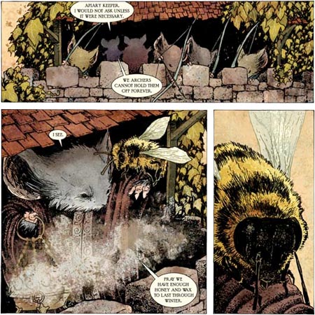
Mouse Guard is a comics series (graphic story) about medieval knights, life in medieval villages and communities, territorial differences, commerce, war, and the harsh conditions that marked life in Europe in the middle of the 12th Century; except that the story is about communities of mice, told almost in parallel, as though this were a history of what was occurring beneath the feet and notice of the actual medieval humans at the time.The stories are named for the times, Mouse Guard: Fall 1152, and Mouse Guard: Winter 1152, the current series. The Fall series ran six issues and was collected into a hardcover edition, Mouse Guard Volume 1: Fall 1152, and later released as a trade paperback.
Drawn in an illustrative style that would be suitable for children’s books, the stories appeal to adults and are charming and direct in a way that would appeal to children of a certain age (though there is some actual violence, so parents should read through before getting younger kids interested).
The illustration style stands out from most other comics, bearing more relation to pen and ink illustration from earlier times and carrying a nice flavor for the setting and story. Author/artist David Peterson draws the art in traditional ink on bristol board; the coloring looks like watercolor, though I don’t know if it is applied to stats manually or, like most modern comics, applied digitally once the drawings have been digitized.
Peterson also bucked the current market trends with another choice, making his books a different size from traditional American comics (8″ x 8″ instead of 6½” x 10″), which can make it more difficult to get past the mainstream mindset of many comic shop owners (as I know from the personal experience of publishing the print version of my own webcomic in a horizontal format).
Those comic shop owners who do opt to carry the title, though, are finding that they have a comic they can recommend to people new to comics, female as well as male, and of varying ages; something not nearly common enough as the American comic book market struggles to break out if its superhero ghetto.
Peterson’s stories would appeal to the broad audience that responded to the Lord of the Rings movies, with many similar themes and a similar (though more modest) approach to world building, creating a detailed setting in which to unfold his tales.
In addition to stories in keeping with the medieval sword and castle milieu, the mice protagonists face challenges familiar to real mice (owls, scarcity of food), but resolve them in distinctly anthropomorphic ways (swords and slings, negotiation and cooperation between disparate communities).
I find it particularly interesting in the current series that their greatest enemy doesn’t seem to be an evil warlord or ravaging beast, but the Winter itself, very much in keeping with the realities of Medieval life.
Peterson earned a degree in Fine Arts from Michigan University and has a personal web site that includes illustrations, many of which are for children’s books or in a similar style.
Unfortunately, like so many sites for comics and web comics in particular, the official Mouse Guard site seems skewed toward those who are already familiar with the series, and doesn’t do the best job of introducing a new reader to the material. You can actually get a better introduction and overview on the extensive Wikipedia entry devoted to the title.
There is also brief description and several preview excerpts on the Archaia Studios Press site, a nice 5-page excerpt from Mouse Guard: Fall 1152 on the New York Magazine site, and an interview with Peterson on the Silver Bullet Comics site.
The official site does have an introduction to the characters, but in hunting for artwork, you may be misled into thinking there is not much available. There is no “Gallery” section; the Downloads section features small Avatars, but larger Wallpapers are promised as “Coming Soon”.
The For Sale section yields paydirt in the form of pages of original art for sale. Clicking on the thumbnails produces large versions of the original pages. These are presented in the increasingly popular Lightbox JavaScript pop-up, that I find mildly annoying for it’s tendency to make you wait while it resizes the window, but that’s a minor quibble. The Lightbox pop-up does provide the ability to click through the images in sequence (hidden control to the right an left of the image).
As nice as it is to see the original pen and ink pages, this is only part of the art, missing Peterson’s nicely emotive color.
What is not made obvious (and really should be) is that there is a series of terrific 8-page previews linked to the small cover thumbnails on the “Books” page. There are many pages of art here from the sequence of issues that can give you a real feeling for the nature of this original and fascinating series.
[Suggestion courtesy of James Gurney]
Categories:


Charley’s Picks
Bookshop.org
(Bookshop.org affilliate links; sales benefit independent bookshop owners; I get a small percentage to help support my work on Lines and Colors)

John Singer Sargent: Watercolors


Urban Sketching: Understanding Perspective


Charley’s Picks
Amazon
(Amazon.com affiliate links; sales go to a larger yacht for Jeff Bezos; but I get a small percentage to help support my work on Lines and Colors)
John Singer Sargent: Watercolors
Urban Sketching: Understanding Perspective