
Categories
- 3d CGI
- Amusements
- Animation
- Anime & Manga
- Art Materials
- Art Videos
- Blogroll
- Cartoons
- Color
- Comics
- Concept & Visual Dev.
- Creativity
- Digital Art
- Digital Painting
- Displaying Art on the Web
- Drawing
- Eye Candy for Today
- Gallery and Museum Art
- High-res Art Images
- Illustration
- Motion Graphics & Flash
- Museums
- Online Museums
- Outsider Art
- Painting
- Painting a Day
- Paleo Art
- Pastel, Conté & Chalk
- Pen & Ink
- Prints and Printmaking
- Reviews
- Sc-fi and Fantasy
- Sculpture & Dimensional
- Site Comments
- Sketching
- Storyboards
- Tools and Techniques
- Uncategorized
- Vector Art
- Videos & Podcasts
- Vision and Optics
- Watercolor and Gouache
- Webcomics
Archives
- May 2026
- April 2026
- March 2026
- February 2026
- January 2026
- December 2025
- November 2025
- October 2025
- September 2025
- August 2025
- July 2025
- June 2025
- May 2025
- January 2025
- December 2024
- November 2024
- October 2024
- September 2024
- August 2024
- June 2024
- April 2024
- March 2024
- February 2024
- January 2024
- December 2023
- November 2023
- October 2023
- September 2023
- August 2023
- July 2023
- May 2023
- April 2023
- March 2023
- February 2023
- January 2023
- December 2022
- November 2022
- September 2022
- August 2022
- July 2022
- June 2022
- May 2022
- April 2022
- March 2022
- February 2022
- January 2022
- December 2021
- November 2021
- October 2021
- September 2021
- August 2021
- July 2021
- June 2021
- May 2021
- April 2021
- March 2021
- February 2021
- January 2021
- December 2020
- November 2020
- October 2020
- September 2020
- August 2020
- July 2020
- June 2020
- May 2020
- April 2020
- March 2020
- February 2020
- January 2020
- December 2019
- November 2019
- October 2019
- September 2019
- August 2019
- July 2019
- June 2019
- May 2019
- April 2019
- March 2019
- February 2019
- January 2019
- December 2018
- November 2018
- October 2018
- September 2018
- August 2018
- July 2018
- June 2018
- May 2018
- April 2018
- March 2018
- February 2018
- January 2018
- December 2017
- November 2017
- October 2017
- September 2017
- August 2017
- July 2017
- June 2017
- May 2017
- April 2017
- March 2017
- February 2017
- January 2017
- December 2016
- November 2016
- October 2016
- September 2016
- August 2016
- July 2016
- June 2016
- May 2016
- April 2016
- March 2016
- February 2016
- January 2016
- December 2015
- November 2015
- October 2015
- September 2015
- August 2015
- July 2015
- June 2015
- May 2015
- April 2015
- March 2015
- February 2015
- January 2015
- December 2014
- November 2014
- October 2014
- September 2014
- August 2014
- July 2014
- June 2014
- May 2014
- April 2014
- March 2014
- February 2014
- January 2014
- December 2013
- November 2013
- October 2013
- September 2013
- August 2013
- July 2013
- June 2013
- May 2013
- April 2013
- March 2013
- February 2013
- January 2013
- December 2012
- November 2012
- October 2012
- September 2012
- August 2012
- July 2012
- June 2012
- May 2012
- April 2012
- March 2012
- February 2012
- January 2012
- December 2011
- November 2011
- October 2011
- September 2011
- August 2011
- July 2011
- June 2011
- May 2011
- April 2011
- March 2011
- February 2011
- January 2011
- December 2010
- November 2010
- October 2010
- September 2010
- August 2010
- July 2010
- June 2010
- May 2010
- April 2010
- March 2010
- February 2010
- January 2010
- December 2009
- November 2009
- October 2009
- September 2009
- August 2009
- July 2009
- June 2009
- May 2009
- April 2009
- March 2009
- February 2009
- January 2009
- December 2008
- November 2008
- October 2008
- September 2008
- August 2008
- July 2008
- June 2008
- May 2008
- April 2008
- March 2008
- February 2008
- January 2008
- December 2007
- November 2007
- October 2007
- September 2007
- August 2007
- July 2007
- June 2007
- May 2007
- April 2007
- March 2007
- February 2007
- January 2007
- December 2006
- November 2006
- October 2006
- September 2006
- August 2006
- July 2006
- June 2006
- May 2006
- April 2006
- March 2006
- February 2006
- January 2006
- December 2005
- November 2005
- October 2005
- September 2005
- August 2005
Relevant Blogs
Art, Painting & Sketch
- Gurney Journey
- Underpaintings
- Art and Influence
- Painting Perceptions
- Oil Painters of America
- Vasari Paint POV
- Flying Fox
- Urban Sketchers
- Bento (Smithsonian)
- Art Inconnu
- The Hidden Place
- Still Life
- Making a Mark
- The Art of the Landscape
- Exploring Color & Creativity
- Art Contrarian
- Artist A Day
- beinArt Surreal Art Collective
- Eye Level
- David Dunlop
- p.i.g.m.e.n.t.i.u.m
- CultureGrrl
- Joaquín Sorolla blog
- Artists in Pastel
“Painting a Day”
- A Painting a Day (Keiser)
- On Painting (Keiser)
- Julian Merrow-Smith
- Karen Jurick
- Jeffrey Hayes
- Carol Marine
- Abbey Ryan
- Daily Paintworks
Other Painting Blogs
- Virtual Gouache Land
- Neil Hollingsworth
- Marc Hanson
- Kevin Menck
- Marc Dalessio
- Larry Seiler
- Stapleton Kearns
- Colin Page
- Roos Schuring
- Hans Versfelt
- Titus Meeuws
- Régis Pettinari
- René Plein Air
- Belinda Del Pesco
- Robin Weiss
- Nathan Fowkes (Land Sketch)
- William Wray
- Frank Serrano
- Stephen Magsig
- Michael Chesley Johnson
- Twice a Week
- Sarah Wimperis
- Rob Adams
- Michael Cole Manley
- The Dirty Palette Club
- Mike Manley’s Draw!
Gallery Art & Illustration mix
Illustration
- Howard Pyle
- 100 Years of Illustration
- BibliOdyssey
- Illustration Art
- Today’s Inspiration
- Illustration Mundo
- Little Chimp Society
- Danny Gregory
- R D (John Martz
- Illustration Friday blog
- Monster Brains
- Illustrators & Illustrations (RU)
- Elwood H. Smith
- DaniDraws.com
- Designers Who Blog
- iSpot Blog
Sci-Fi & Fantasy
Illustration & Comics
Comics & Cartoons
- Comics Beat
- Robot 6
- Newsarama Blog
- Comic Vine
- Comics Alliance
- Forbidden Planet Int.
- Paolo Rivera
- Bolt City
- Flight
- Scott McCloud
- The Comics Journal
- Comixpedia
- Funnybook Babylon
- James Baker
- Middleton’s Sketchbook
- Boneville
- The Hotel Fred
- Paul Rivoche
- Daily Cartoonist
- Mad About Cartoons (William Wray)
- Digital Strips
Illustration & Concept
Animation & Concept
- Cartoon Brew
- Animation Blog
- Cold Hard Flash
- Concept Art World
- The CAB
- FY Concept Art
- Concept Ships
- Concept Robots
- John Nevarez
- Armand Serrano
- Marcos Mateu-Mestre
- all kinds of stuff (Kricfalusi)
- Yacin the faun (Man Arenas)
- Kelsey Mann
- Cre8tivemarks Blog
- Ice-Cream Monster Toon Cafe
- AAU Character & Creature Design
- AAU Animation Notes
- Articles and Texticles
Paleo & Scientific
Tools & Techniques
Other
Lists of Art Blogs
Art Image Resource Links
Historic Art Images
- Wikimedia Commons: Paintings
- Wikimedia Commons: Drawings
- The Athenaeum
- WikiArt (WikiPaintings)
- Google Art Project: Artists
- Google Art Project: Collections (Museums)
- ArtCyclopedia
- Web Gallery of Art
- Art Renewal Center
- Web Gallery of Impressionism
Auction Consolidation sites
Auction sites
- Sotheby’s
- Bonham’s
- Christies
- Heritage Auctions: Fine Art
- Heritage Auctions: Illustration
- Freeman’s Auctions
- Bukowskis
- Shannon’s
Image Search
Reverse Image Search (search by image)
- Tin Eye
- RevImg
- Google Image Search (camera icon)
- Bing Image Search (camera icon)
Promoting some friends and some clients of my website design business
- Twin Willows T’ai Chi studio in Wilmington DE. Taiji classes with Bryan Davis.
- Ray Hayward, Inspired Teacher of T’ai Chi ( Taiji ) in Minneapolis, Founder of Mindful Motion Tai Chi Academy
- OldHead Tattoo studio and Art Gallery in Wilmington DE. Tattoos and paintings by Bruce Gulick
- Sharon Domenico Art, pet portrait oil paintings
- Platinum Paperhanging, wallpaper hanging, Main Line and Philadelphia, PA
- Lisa Stone Design, interior designer, Main Line and Philadelphia, PA
- Studio12KPT, original art, prints, calendars and other custom printed items by Van Sickle & Rolleri
-
Chardin: Painter of Silence

Still life, that genre of painting with a name that seems a contradiction in terms, is, in itself, quiet.Still life never receives the attention paid to more prominent types of paintings. Dramatic interpretations of Biblical, history or literary scenes, genre painting, portraits and even landscapes, overshadow it easily.
Still life is the Rodney Dangerfield of painting genres, liked, but not often respected, and the masters of the art are seldom the most celebrated names.
But still life, even more than other forms of painting, can often embody what I feel is one of the most important and valuable properties of art — the revelation that the ordinary can be extraordinary, if we only stop to see it as extraordinary.
A master of this message, and of still life painting in general, was the 18th Century French painter Jean-Baptiste-Siméon Chardin.
His is hardly a household name, though his influence on other painters has been considerable. His contribution is, I think, particularly relevant to the new generation of still life painters working today, whether they are aware of his influence or not.
His work is important not only in its mastery and quality, but in the approach he took in the application of paint and the character of the painted surface.
In a letter to his brother Theo in 1888, Vincent van Gogh wrote:
“The best pictures, and, from a technical point of view the most complete, seen from near by, are but patches of colour side by side, and only make an effect at a certain distance.
That is what Rembrandt stuck to, notwithstanding all the trouble it caused him (the honest citizens greatly preferred Van der Helst, because his work can also be looked at up close).
In that respect Chardin is as great as Rembrandt.”
Still life was not highly regarded in the time of Chardin’s early career, though he himself helped elevate the subject matter as his stature in the French art establishment grew over time.
In the middle of his career he took to painting portraits and genre pictures, focusing on aspects of French society as humble as the plain kitchen utensils of his still life paintings, another area not in keeping with the then accepted standards of Academic art. His style could hardly have been further form the flamboyant Rococo manner that was dominant at the time.
Chardin returned to still life later in his career; and even later, when his eyesight was failing, took up pastels and used them brilliantly.
The Palazzo dei Diamanti in Ferrara, Italy is currently hosting an exhibition, Chardin: Il pittore del silenzio, that is on view until 30 January 2011. The exhibition was curated in cooperation with the Museo Nacional del Prado in Madrid, where it will be on display from 1 March to 28 May 2011.
The Palazzo dei Diamanti has a selection of works from the exhibit on their site, and a catalog has been published.
There is also a selection of works online from an exhibition at the Met back in 2000 that I’m sorry to say I missed.
One of the best online resources for Chardin’s works is the Web Gallery of Art (second page and bio); I’ve assembled some others below.
For more, see my previous post about Jean-Baptiste-Siméon Chardin.
Like Vermeer, Chardin dwelled in the quiet suspension of time, where the sublime qualities of light reveal the magic in commonplace objects.
19th/20th Century novelist Marcel Proust wrote of Chardin:
“We have learned from Chardin that a pear is as living as a woman, that an ordinary piece of pottery is as beautiful as a precious stone.”
and:
“Everyday life will charm you once you have absorbed Chardin’s painting for a few days like a lesson. Then, having understood the life of his painting, you will have discovered the beauty of life.”
Categories:
-
Happy Leyendecker Baby New Year 2011!

In spite of the fact that I’ve featured him twice just in the past two weeks, I’ll continue my tradition of ringing out the old year and bringing in the new with a couple of New Year’s babies from J.C. Leyendecker, the American illustrator who started the practice of representing the new year as a baby (or, initially in his case, as a winged cherub) on the covers of the Saturday Evening Post.I don’t have an enlargement of the New Year 1911 SEP cover (December 1910, above, top left), in which the baby new year greets not the old year, but Father Time.
However, courtesy of Scott Anderson and his generous post here, we have a nice set of images of the original art from Leyendecker’s SEP cover ushering in 1926 (a year in which tax laws were changed and some tax rates reduced).
Another good excuse to display more of Leyendecker’s bravura brushwork.
Here is the Saturday Evening Post’s collection of their Leyendecker baby covers, and page 2.
For more on Leyendecker starting the tradition of representing the new year as a baby, see my post from 2006. I’ve listed links to my other Leyendecker posts, many of which have additional links and resources, below.
I hope you all have a terrific new year, filled with great art, old and new!
-Charley
Categories:
-
Hendrick Avercamp and the “Little Ice Age”

So what to you do in the winter when the ground is covered in snow and the rivers are frozen over? Get out and enjoy of course.Though we have other, more familiar names associated with 17th Century scenes of gatherings on the ice of frozen rivers and streams in Dutch towns (notably Bruegel), Avercamp was the first to specialize in the subject, effectively making it into a genre.
Avercamp was born in Amsterdam but grew up in Kampen, on the river IJssel. He returned to Amsterdam to study and apprentice to the portrait painter Pieter Isacqs. He also apparently absorbed influence from Flemish landscape painters who were present in Amsterdam at the time, but overall his style was unique and somewhat idiosyncratic.
Historical records indicate that Avercamp was deaf and could not speak. After his time in Amsterdam he returned to Kampen and specialized in his winter ice scenes.
This was at a time, sometimes dubbed the “Little Ice Age” when the winters were so severe that the creeks, canals and even rivers in Europe and North America froze solidly enough to support walking, skating and winter festivals. The waterways became, in effect, a different kind of town square.
I love these scenes, they seem to give us a glimpse of everyday life and people from the time. Avercamp made a point of portraying the mix of classes and levels of society that mingled on the ice, with their accordingly different modes of dress, parading in their finery, skating, working or indulging in winter sports.
In the painting above, bottom, with detail (larger version here), he has emphasized the difference between the upperclass gentleman playing colf, a predecessor of golf in which the object was to hit a ball to a pole in as few strokes as possible, and a fisherman and (presumably) his son, who look on with interest.
This was pointed out in an excellent online feature from the National Gallery in Washington, which had a show of Avercamp’s work titled Hendrick Avercamp: The Little Ice Age, back in the summer of this year (sorry I missed it) and at the Rijksmuseum in Amsterdam before that. The online features are still accessible, however.
There are other sources for Avercamp’s work. notably Wikimedia Commons, which has reproductions large enough to see some of the fascinating details Avercamp has worked into his scenes.
His renditions of the towns buildings and bridges, sometimes specific, sometimes imaginary, are also interesting, as is his atmospheric evocation of the winter season in the “Little Ice Age”.
Categories:
-
Illustration Magazine Archives, Online Free in Fullscreen

Wow.I’ve raved before about Dan Zimmer’s beautifully edited, produced and printed Illustration Magazine.
Devoted to classic illustration, this magazine is, in a way, more like a series of short books, with in-depth, profusely illustrated articles about great illustrators.
While most magazines are stingy about putting their precious content online, Zimmer has made every issue of the 31 printed so far available in their entirety, online, to be read for free in full-screen.
Go to the archives, select an issue, and you’re presented with an illustrated table of contents for that issue. Click on the cover of the issue in the grey box at the bottom of the page and the magazine is displayed for you in the Issu online magazine reader, with page thumbnails at the bottom, and even the ability to zoom in to an extent (the row of dots below the thumbnails leads to additional thumbnails, the issues are long).
First I will give my Major Time Sink Warning, this is a dazzling array of great illustrators, and the articles are well worth reading; they are in-depth, well researched and well written.
Secondly, I will again point out that even the relatively high (for on-screen) resolution here does not really do these images justice compared to the way they look printed at genuine high resolution in the magazine. If you pick up an issue or two you’ll see what I mean. The current issue features J. Frederick Smith, John Fleming Gould and Clark Hulings (see my post on Clark Hulings).
But still,… wow.
[Via Dave Gibbons]
Categories:
-
Wil Freeborn

Wil Freeborn is an illustrator and graphic designer based in Glasgow, Scotland.Though his professional portfolio focuses on his (quite nice) graphic design rather than illustration, his blog features a number of wonderful sketches.
These are of a variety of subjects — cafe and store interiors, schoolrooms, townscapes, landscapes and a particularly nice series of people working on a steam locomotive (also here). There are also life drawings and pantings and a few other projects mixed in.
Most of his sketches appear to be in pencil and watercolor in the pages of Moleskine sketchbooks. They combine the informal, loose qualities of travel sketches with clear observation and occasionally more elaborate rendering in watercolor.
Categories:
-
Jake Baddeley
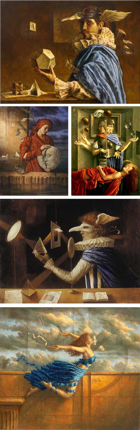
Jake Baddeley gives little information about himself on his website, save to call himself a symbolist painter and artist.Looking through his work, I see classical training, influences from the Surrealists and Magic Realists, and a fascination with the art and invention of the Renaissance.
He uses a muted, controlled palette, with passages of restrained but rich color, and his compositions often have feeling of deliberately arranged tableaux, with questions posed and hints of meaning scattered through the subjects. Often there are objects floating, either in frozen motion or defiance of gravity, and repeated themes of masks, blindfolds and curtains, suggesting subliminal meaning.
The paintings on his website are arranged by year, the sections for which provide a click-through navigation of Next and Previous, though there are no thumbnails. In addition there is a gallery of drawings in the “Other work” section.
You can also find a selection of his paintings on the Ten Dreams Gallery in an arrangement that more readily gives an overview of his work. There are also galleries of his paintings on the beinArt Surreal Art Collective and the imaginary realism art print site.
Prints of his work are also available directly through his web shop. Editions of a book called Dreamscapes, that feature a number of artists, including Baddeley in the 2009 and 2010 volumes, are available from both his shop and the imaginary realism site.
Categories:


Charley’s Picks
Bookshop.org
(Bookshop.org affilliate links; sales benefit independent bookshop owners; I get a small percentage to help support my work on Lines and Colors)

John Singer Sargent: Watercolors


Urban Sketching: Understanding Perspective


Charley’s Picks
Amazon
(Amazon.com affiliate links; sales go to a larger yacht for Jeff Bezos; but I get a small percentage to help support my work on Lines and Colors)
John Singer Sargent: Watercolors
Urban Sketching: Understanding Perspective