
Categories
- 3d CGI
- Amusements
- Animation
- Anime & Manga
- Art Materials
- Art Videos
- Blogroll
- Cartoons
- Color
- Comics
- Concept & Visual Dev.
- Creativity
- Digital Art
- Digital Painting
- Displaying Art on the Web
- Drawing
- Eye Candy for Today
- Gallery and Museum Art
- High-res Art Images
- Illustration
- Motion Graphics & Flash
- Museums
- Online Museums
- Outsider Art
- Painting
- Painting a Day
- Paleo Art
- Pastel, Conté & Chalk
- Pen & Ink
- Prints and Printmaking
- Reviews
- Sc-fi and Fantasy
- Sculpture & Dimensional
- Site Comments
- Sketching
- Storyboards
- Tools and Techniques
- Uncategorized
- Vector Art
- Videos & Podcasts
- Vision and Optics
- Watercolor and Gouache
- Webcomics
Archives
- June 2026
- May 2026
- April 2026
- March 2026
- February 2026
- January 2026
- December 2025
- November 2025
- October 2025
- September 2025
- August 2025
- July 2025
- June 2025
- May 2025
- January 2025
- December 2024
- November 2024
- October 2024
- September 2024
- August 2024
- June 2024
- April 2024
- March 2024
- February 2024
- January 2024
- December 2023
- November 2023
- October 2023
- September 2023
- August 2023
- July 2023
- May 2023
- April 2023
- March 2023
- February 2023
- January 2023
- December 2022
- November 2022
- September 2022
- August 2022
- July 2022
- June 2022
- May 2022
- April 2022
- March 2022
- February 2022
- January 2022
- December 2021
- November 2021
- October 2021
- September 2021
- August 2021
- July 2021
- June 2021
- May 2021
- April 2021
- March 2021
- February 2021
- January 2021
- December 2020
- November 2020
- October 2020
- September 2020
- August 2020
- July 2020
- June 2020
- May 2020
- April 2020
- March 2020
- February 2020
- January 2020
- December 2019
- November 2019
- October 2019
- September 2019
- August 2019
- July 2019
- June 2019
- May 2019
- April 2019
- March 2019
- February 2019
- January 2019
- December 2018
- November 2018
- October 2018
- September 2018
- August 2018
- July 2018
- June 2018
- May 2018
- April 2018
- March 2018
- February 2018
- January 2018
- December 2017
- November 2017
- October 2017
- September 2017
- August 2017
- July 2017
- June 2017
- May 2017
- April 2017
- March 2017
- February 2017
- January 2017
- December 2016
- November 2016
- October 2016
- September 2016
- August 2016
- July 2016
- June 2016
- May 2016
- April 2016
- March 2016
- February 2016
- January 2016
- December 2015
- November 2015
- October 2015
- September 2015
- August 2015
- July 2015
- June 2015
- May 2015
- April 2015
- March 2015
- February 2015
- January 2015
- December 2014
- November 2014
- October 2014
- September 2014
- August 2014
- July 2014
- June 2014
- May 2014
- April 2014
- March 2014
- February 2014
- January 2014
- December 2013
- November 2013
- October 2013
- September 2013
- August 2013
- July 2013
- June 2013
- May 2013
- April 2013
- March 2013
- February 2013
- January 2013
- December 2012
- November 2012
- October 2012
- September 2012
- August 2012
- July 2012
- June 2012
- May 2012
- April 2012
- March 2012
- February 2012
- January 2012
- December 2011
- November 2011
- October 2011
- September 2011
- August 2011
- July 2011
- June 2011
- May 2011
- April 2011
- March 2011
- February 2011
- January 2011
- December 2010
- November 2010
- October 2010
- September 2010
- August 2010
- July 2010
- June 2010
- May 2010
- April 2010
- March 2010
- February 2010
- January 2010
- December 2009
- November 2009
- October 2009
- September 2009
- August 2009
- July 2009
- June 2009
- May 2009
- April 2009
- March 2009
- February 2009
- January 2009
- December 2008
- November 2008
- October 2008
- September 2008
- August 2008
- July 2008
- June 2008
- May 2008
- April 2008
- March 2008
- February 2008
- January 2008
- December 2007
- November 2007
- October 2007
- September 2007
- August 2007
- July 2007
- June 2007
- May 2007
- April 2007
- March 2007
- February 2007
- January 2007
- December 2006
- November 2006
- October 2006
- September 2006
- August 2006
- July 2006
- June 2006
- May 2006
- April 2006
- March 2006
- February 2006
- January 2006
- December 2005
- November 2005
- October 2005
- September 2005
- August 2005
Relevant Blogs
Art, Painting & Sketch
- Gurney Journey
- Underpaintings
- Art and Influence
- Painting Perceptions
- Oil Painters of America
- Vasari Paint POV
- Flying Fox
- Urban Sketchers
- Bento (Smithsonian)
- Art Inconnu
- The Hidden Place
- Still Life
- Making a Mark
- The Art of the Landscape
- Exploring Color & Creativity
- Art Contrarian
- Artist A Day
- beinArt Surreal Art Collective
- Eye Level
- David Dunlop
- p.i.g.m.e.n.t.i.u.m
- CultureGrrl
- Joaquín Sorolla blog
- Artists in Pastel
“Painting a Day”
- A Painting a Day (Keiser)
- On Painting (Keiser)
- Julian Merrow-Smith
- Karen Jurick
- Jeffrey Hayes
- Carol Marine
- Abbey Ryan
- Daily Paintworks
Other Painting Blogs
- Virtual Gouache Land
- Neil Hollingsworth
- Marc Hanson
- Kevin Menck
- Marc Dalessio
- Larry Seiler
- Stapleton Kearns
- Colin Page
- Roos Schuring
- Hans Versfelt
- Titus Meeuws
- Régis Pettinari
- René Plein Air
- Belinda Del Pesco
- Robin Weiss
- Nathan Fowkes (Land Sketch)
- William Wray
- Frank Serrano
- Stephen Magsig
- Michael Chesley Johnson
- Twice a Week
- Sarah Wimperis
- Rob Adams
- Michael Cole Manley
- The Dirty Palette Club
- Mike Manley’s Draw!
Gallery Art & Illustration mix
Illustration
- Howard Pyle
- 100 Years of Illustration
- BibliOdyssey
- Illustration Art
- Today’s Inspiration
- Illustration Mundo
- Little Chimp Society
- Danny Gregory
- R D (John Martz
- Illustration Friday blog
- Monster Brains
- Illustrators & Illustrations (RU)
- Elwood H. Smith
- DaniDraws.com
- Designers Who Blog
- iSpot Blog
Sci-Fi & Fantasy
Illustration & Comics
Comics & Cartoons
- Comics Beat
- Robot 6
- Newsarama Blog
- Comic Vine
- Comics Alliance
- Forbidden Planet Int.
- Paolo Rivera
- Bolt City
- Flight
- Scott McCloud
- The Comics Journal
- Comixpedia
- Funnybook Babylon
- James Baker
- Middleton’s Sketchbook
- Boneville
- The Hotel Fred
- Paul Rivoche
- Daily Cartoonist
- Mad About Cartoons (William Wray)
- Digital Strips
Illustration & Concept
Animation & Concept
- Cartoon Brew
- Animation Blog
- Cold Hard Flash
- Concept Art World
- The CAB
- FY Concept Art
- Concept Ships
- Concept Robots
- John Nevarez
- Armand Serrano
- Marcos Mateu-Mestre
- all kinds of stuff (Kricfalusi)
- Yacin the faun (Man Arenas)
- Kelsey Mann
- Cre8tivemarks Blog
- Ice-Cream Monster Toon Cafe
- AAU Character & Creature Design
- AAU Animation Notes
- Articles and Texticles
Paleo & Scientific
Tools & Techniques
Other
Lists of Art Blogs
Art Image Resource Links
Historic Art Images
- Wikimedia Commons: Paintings
- Wikimedia Commons: Drawings
- The Athenaeum
- WikiArt (WikiPaintings)
- Google Art Project: Artists
- Google Art Project: Collections (Museums)
- ArtCyclopedia
- Web Gallery of Art
- Art Renewal Center
- Web Gallery of Impressionism
Auction Consolidation sites
Auction sites
- Sotheby’s
- Bonham’s
- Christies
- Heritage Auctions: Fine Art
- Heritage Auctions: Illustration
- Freeman’s Auctions
- Bukowskis
- Shannon’s
Image Search
Reverse Image Search (search by image)
- Tin Eye
- RevImg
- Google Image Search (camera icon)
- Bing Image Search (camera icon)
Promoting some friends and some clients of my website design business
- Twin Willows T’ai Chi studio in Wilmington DE. Taiji classes with Bryan Davis.
- Ray Hayward, Inspired Teacher of T’ai Chi ( Taiji ) in Minneapolis, Founder of Mindful Motion Tai Chi Academy
- OldHead Tattoo studio and Art Gallery in Wilmington DE. Tattoos and paintings by Bruce Gulick
- Sharon Domenico Art, pet portrait oil paintings
- Platinum Paperhanging, wallpaper hanging, Main Line and Philadelphia, PA
- Lisa Stone Design, interior designer, Main Line and Philadelphia, PA
- Studio12KPT, original art, prints, calendars and other custom printed items by Van Sickle & Rolleri
-
James Jean

James Jean is an illustrator who is widely recognized in the comic book community for his distinctive and beautifully done covers for DC Comics.Born in Taiwan, educated at the School of Visual Arts and currently living in LA, Jean has an impressive list of illustration clients including Time, Playboy, Wired, SPIN, The New York Times and Rolling Stone. In addition to his work for DC comics, his clients in the comic book industry include Marvel, Dark Horse and Fantagraphics.
His main site has galleries of his work arranged either by client and by project. You’ll find comic covers in the section called “Coverwork”. There are also sections for sketchbooks, paintings and “Recess”, a project about “childhood and ghosts”.
His work can be in turns elegant and beautiful or startling and disturbing. There is always a firm underpinning of solid draftsmanship and strong design.
Jean has a well regarded blog called Process Recess, that includes examples of his work, sometimes presented in several stages as in his cover for the special 5Oth issue of DC Comics’ Fables, shown above. You will also find sketches and figure drawings.
There is a book of his work, Process Recess: The Art of James Jean.
Link via Cat Morley’s Designers who blog. There is an interview with Jean in this column of Morley’s Cat’s fancy, on the same page as interviews with yours truly and John Martz of Drawn!, who has also posted about James Jean here and here.
Drawn! also points out that there is an interview with Jean on The Hundreds. Unfortunately, it’s hidden in abysmally poor navigation and is in an awkward horizontally scrolling interface. Go here and look for the James Jean link – I think it’s about the fifth or sixth thumbnail down on the left.
Categories:
-
Pablo Lobato
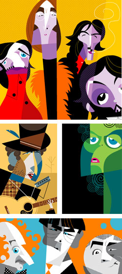 I was writing about the geometry of faces in yesterday’s post about Modigliani. Well, there’s geometry of faces and then there’s geometry of faces!
Pablo Lobato is an designer, illustrator and caricaturist from Argentina who has an uncanny ability to distill the essence of a likeness out of starkly graphic geometric shapes.
The structures of his famous faces are amazingly abstract (in the true meaning of that word) and the images are wonderfully composed as graphic designs. The result is a beautiful blend and balance of design and drawing.
Caricaturists often seem to try to push the envelope to see how far they can distort a face and yet keep or reinforce the strength of the likeness. Lobato excels here as well, presenting objects that almost seem like they couldn’t even be used to represent a human face if viewed individually, that come together in an uncannily strong likeness.
Most of his portraits are of musicians and actors, and occasionally of sports or political figures or even one of his artistic heroes, Picasso.
Lobato has done work for Rolling Stone, The Chicago Tribune, The Boston Globe, Time, TV Guide and The New York Daily News, among others.
There is an article here on Illustration Mundo, and a gallery on the site of his rep, Anna Goodson.
The links page of his site includes links to other artists and caricaturists as well as related sites.
Link via Metafilter.
Categories:
-
Amedeo Modigliani
 Amedeo Modigliani was one of the first artists, beyond my teenage infatuation with Surrealism, that led me into an appreciation for modern art. (I should make a caveat that my appreciation for modernism is largely concentrated in the first half of the 20th Century, before the boring postwar theorists elected themselves the raison d’être for visual art.)
I stumbled across Modigliani’s work while thumbing through art books in the school library, and immediately hunted down an inexpensive paperback of his work at the local bookstore. There was just some innate charm about the freedom with which he distorts the faces and figures, drawing them out with an almost cartoon-like sensibility, that captured my attention.
His brash colors and large graphic shapes filled with texture add to the appeal, making a fascinating visual soup of lines, colors and forms. Modigliani’s figures lean and twist, their geometry askew as though gravity has shifted to an an angle off of perpendicular. His faces are sometimes perched atop elongated necks, as if striving to be taller, and are often tilted to one side in some quizzical inflection.
His geometrically distilled portraits and languorous nudes project a warmth and humanity that is often lacking in the work of many of the other modern painters, who seemed to be striving to remove those characteristics from their angular collisions of shapes and colors.
Modigliani was friends with Romanian sculptor Constantin Brancusi, who sparked his interest in sculpture and introduced him to the primal appeal of African masks, which would greatly influence his work.,
Modigliani’s charms were wasted on the art patrons of the time, even those interested in the other emerging modern painters. His work became very popular years after it was too late to do anyone but the gallery owners any good.
Sadly, Modigliani lived the tragic, falsely romanticized life of the “starving artist”. So charming and romantic was this lifestyle that the desperation and shame of his poverty, along with bouts of chronic illness, drove him to be consumed by drink and drugs in addition to the tuberculosis that cut short his life in 1920 at the age of 35.
The Royal Academy of Arts in London, UK has just mounted the first major exhibition of his work in forty plus years: “Modigliani and His Models“, which runs from July 6 to October 15, 2006. There is also a book associated with the exhibit, Modigliani and His Models by Emily Braun, Kenneth Silver, Simonetta Fraquelli and Kenneth Wayne, but it hasn’t been released in the US yet. Modigliani is well represented in art publishing, though, and you’ll find numerous titles in bookstores.
Taks a look through Modigliani’s portraits and figures and you’ll see the source for much of the stylization in the 50’s and 60’s animators and the current crop of retro-sixties-modern animators and illustrators. At the very least, you may get a different slant on things.
Link via Art Knowledge News.
Categories:
-
Aaron St. Goddard

Canadian concept artist Aaron St. Goddard has done illustration, concept design, storyboards and matte painting for companies like Piazo Publishing (who seems to have taken over Dungeon and Dragon magazines from TSR), Darrel Brown Media, Radical Entertainment and Mainframe Entertainment. (Mainframe is responsible for my all-time favorite 3-D CGI TV show, Reboot.)St. Goddard’s site showcases his designs for environments and characters (like the hazard-suited character above left), but the stars of his oeuvre are his nicely scary creatures (like the minotaur above right).
The site also features a step-through (not exactly a tutorial) of his coloring process and promises a similar feature for his drawing process in the near future.
St Goddard seems to work primarily digitally, drawing and painting his characters and environments in Photoshop. He also works in 3-D applications.
His approach is generally one of color-filled linework, rendered far enough to give a relatively finished painted appearance. This gives his exotic creatures and wild characters a degree of realism while keeping the loose feeling of a drawing.
There is a brief interview with him on Animation Arena.
St. Goddard is also the creator of Bunchies (inset) which are um,.. animal creature kind of thingies that have become something of a phenomenon on the Web.
Categories:
-
The 9/11 Report: a Graphic Adaptation

The 9/11 Report: a Graphic Adaptation is an an attempt to adapt the 568 page 9/11 Commission Report into graphic story (i.e. comics) format.The project is being published as webcomic by Slate, the long running online magazine. The graphic adaptation is written by Sid Jacobson and illustrated by Ernie Colón, both of whom have a long history in the comic book field.
The story is divided into chapters, the first thirty page chapter is devoted to the dramatic events of the day itself and the second chapter begins to go into some of the backstory, including the rise of Bin-laden and al-Qaeda. It looks like there will be about 13 chapters in all, so there is quite a bit of backstory and probably more detail on the events of the day to come.
It’s an ambitious undertaking, but Jacobson and Colón seem up to the challenge. Colón’s art is clear, unfussy, straightforward and built on solid draftsmanship, which seems essential to conveying this kind of information-dense account.
Colón’s drawings are also lively enough to keep your attention, and Jacobson knows how to break the story and backstory down into smaller coherent sub-stories, which also seems important in dealing with what could otherwise be a dry mountain of information overload.
The full graphic story project is available as a hardback print edition: The 9/11 Report: A Graphic Adaptation.
We have a chance here to see a broadly circulated example of the medium of comics conveying complex information in a way that is unique to the nature of graphic stories.
Comics are the only visual storytelling medium in which readers move at their own pace, hopefully making it easier for all of us to digest what actually happened on that fateful morning.
Categories:
-
Eyvind Earle

Eyvind Earle was an illustrator, author, animation art director and background artist. He did backgrounds for a number of Disney’s notable short films in the ’50’s and was the background artist and art director for Disney’s Sleeping Beauty feature length animation. He also worked on Lady and the Tramp and Paul Bunyan.His illustrations appeared in Time, The New York Times, The New York Sun and The Los Angeles Times, among others. His designs have also been the center of successful lines of greeting cards.
He focused in his later career on images for gallery display and is represented by Gallery 21 in Carmel California. In the gallery’s site you’ll find Earle’s limited edition edition serigraphs (screen printing, often anachronistically called “silkscreen”).
His landscapes are very stylized and yet highly evocative of time, season and atmosphere. He uses color combinations that in lesser hands might dissolve into treacle (read: Thomas Kinkade), but in service of his swirling oriental art and 1960’s animation inspired compositions work remarkably well.
There is an article on the Cartoon Modern blog with some images of his Disney production work.
There are a couple of beautiful, but unfortunately expensive, volumes of his work: The Complete Graphics of Eyvind Earle and Selected Poems and Writings 1940-1990 and The Complete Graphics of Eyvind Earle and Selected Poems, Drawings and Writings by Eyvind Earle 1991-2000.
Earle is also featured in the short Disney documentary “4 Artists Paint 1 Tree” which is included on the special edition DVD release of Sleeping Beauty.
Thanks to Cully Long for the suggestion and information.
Categories:


Charley’s Picks
Bookshop.org
(Bookshop.org affilliate links; sales benefit independent bookshop owners; I get a small percentage to help support my work on Lines and Colors)

John Singer Sargent: Watercolors


Urban Sketching: Understanding Perspective


Charley’s Picks
Amazon
(Amazon.com affiliate links; sales go to a larger yacht for Jeff Bezos; but I get a small percentage to help support my work on Lines and Colors)
John Singer Sargent: Watercolors
Urban Sketching: Understanding Perspective