
Categories
- 3d CGI
- Amusements
- Animation
- Anime & Manga
- Art Materials
- Art Videos
- Blogroll
- Cartoons
- Color
- Comics
- Concept & Visual Dev.
- Creativity
- Digital Art
- Digital Painting
- Displaying Art on the Web
- Drawing
- Eye Candy for Today
- Gallery and Museum Art
- High-res Art Images
- Illustration
- Motion Graphics & Flash
- Museums
- Online Museums
- Outsider Art
- Painting
- Painting a Day
- Paleo Art
- Pastel, Conté & Chalk
- Pen & Ink
- Prints and Printmaking
- Reviews
- Sc-fi and Fantasy
- Sculpture & Dimensional
- Site Comments
- Sketching
- Storyboards
- Tools and Techniques
- Uncategorized
- Vector Art
- Videos & Podcasts
- Vision and Optics
- Watercolor and Gouache
- Webcomics
Archives
- June 2026
- May 2026
- April 2026
- March 2026
- February 2026
- January 2026
- December 2025
- November 2025
- October 2025
- September 2025
- August 2025
- July 2025
- June 2025
- May 2025
- January 2025
- December 2024
- November 2024
- October 2024
- September 2024
- August 2024
- June 2024
- April 2024
- March 2024
- February 2024
- January 2024
- December 2023
- November 2023
- October 2023
- September 2023
- August 2023
- July 2023
- May 2023
- April 2023
- March 2023
- February 2023
- January 2023
- December 2022
- November 2022
- September 2022
- August 2022
- July 2022
- June 2022
- May 2022
- April 2022
- March 2022
- February 2022
- January 2022
- December 2021
- November 2021
- October 2021
- September 2021
- August 2021
- July 2021
- June 2021
- May 2021
- April 2021
- March 2021
- February 2021
- January 2021
- December 2020
- November 2020
- October 2020
- September 2020
- August 2020
- July 2020
- June 2020
- May 2020
- April 2020
- March 2020
- February 2020
- January 2020
- December 2019
- November 2019
- October 2019
- September 2019
- August 2019
- July 2019
- June 2019
- May 2019
- April 2019
- March 2019
- February 2019
- January 2019
- December 2018
- November 2018
- October 2018
- September 2018
- August 2018
- July 2018
- June 2018
- May 2018
- April 2018
- March 2018
- February 2018
- January 2018
- December 2017
- November 2017
- October 2017
- September 2017
- August 2017
- July 2017
- June 2017
- May 2017
- April 2017
- March 2017
- February 2017
- January 2017
- December 2016
- November 2016
- October 2016
- September 2016
- August 2016
- July 2016
- June 2016
- May 2016
- April 2016
- March 2016
- February 2016
- January 2016
- December 2015
- November 2015
- October 2015
- September 2015
- August 2015
- July 2015
- June 2015
- May 2015
- April 2015
- March 2015
- February 2015
- January 2015
- December 2014
- November 2014
- October 2014
- September 2014
- August 2014
- July 2014
- June 2014
- May 2014
- April 2014
- March 2014
- February 2014
- January 2014
- December 2013
- November 2013
- October 2013
- September 2013
- August 2013
- July 2013
- June 2013
- May 2013
- April 2013
- March 2013
- February 2013
- January 2013
- December 2012
- November 2012
- October 2012
- September 2012
- August 2012
- July 2012
- June 2012
- May 2012
- April 2012
- March 2012
- February 2012
- January 2012
- December 2011
- November 2011
- October 2011
- September 2011
- August 2011
- July 2011
- June 2011
- May 2011
- April 2011
- March 2011
- February 2011
- January 2011
- December 2010
- November 2010
- October 2010
- September 2010
- August 2010
- July 2010
- June 2010
- May 2010
- April 2010
- March 2010
- February 2010
- January 2010
- December 2009
- November 2009
- October 2009
- September 2009
- August 2009
- July 2009
- June 2009
- May 2009
- April 2009
- March 2009
- February 2009
- January 2009
- December 2008
- November 2008
- October 2008
- September 2008
- August 2008
- July 2008
- June 2008
- May 2008
- April 2008
- March 2008
- February 2008
- January 2008
- December 2007
- November 2007
- October 2007
- September 2007
- August 2007
- July 2007
- June 2007
- May 2007
- April 2007
- March 2007
- February 2007
- January 2007
- December 2006
- November 2006
- October 2006
- September 2006
- August 2006
- July 2006
- June 2006
- May 2006
- April 2006
- March 2006
- February 2006
- January 2006
- December 2005
- November 2005
- October 2005
- September 2005
- August 2005
Relevant Blogs
Art, Painting & Sketch
- Gurney Journey
- Underpaintings
- Art and Influence
- Painting Perceptions
- Oil Painters of America
- Vasari Paint POV
- Flying Fox
- Urban Sketchers
- Bento (Smithsonian)
- Art Inconnu
- The Hidden Place
- Still Life
- Making a Mark
- The Art of the Landscape
- Exploring Color & Creativity
- Art Contrarian
- Artist A Day
- beinArt Surreal Art Collective
- Eye Level
- David Dunlop
- p.i.g.m.e.n.t.i.u.m
- CultureGrrl
- Joaquín Sorolla blog
- Artists in Pastel
“Painting a Day”
- A Painting a Day (Keiser)
- On Painting (Keiser)
- Julian Merrow-Smith
- Karen Jurick
- Jeffrey Hayes
- Carol Marine
- Abbey Ryan
- Daily Paintworks
Other Painting Blogs
- Virtual Gouache Land
- Neil Hollingsworth
- Marc Hanson
- Kevin Menck
- Marc Dalessio
- Larry Seiler
- Stapleton Kearns
- Colin Page
- Roos Schuring
- Hans Versfelt
- Titus Meeuws
- Régis Pettinari
- René Plein Air
- Belinda Del Pesco
- Robin Weiss
- Nathan Fowkes (Land Sketch)
- William Wray
- Frank Serrano
- Stephen Magsig
- Michael Chesley Johnson
- Twice a Week
- Sarah Wimperis
- Rob Adams
- Michael Cole Manley
- The Dirty Palette Club
- Mike Manley’s Draw!
Gallery Art & Illustration mix
Illustration
- Howard Pyle
- 100 Years of Illustration
- BibliOdyssey
- Illustration Art
- Today’s Inspiration
- Illustration Mundo
- Little Chimp Society
- Danny Gregory
- R D (John Martz
- Illustration Friday blog
- Monster Brains
- Illustrators & Illustrations (RU)
- Elwood H. Smith
- DaniDraws.com
- Designers Who Blog
- iSpot Blog
Sci-Fi & Fantasy
Illustration & Comics
Comics & Cartoons
- Comics Beat
- Robot 6
- Newsarama Blog
- Comic Vine
- Comics Alliance
- Forbidden Planet Int.
- Paolo Rivera
- Bolt City
- Flight
- Scott McCloud
- The Comics Journal
- Comixpedia
- Funnybook Babylon
- James Baker
- Middleton’s Sketchbook
- Boneville
- The Hotel Fred
- Paul Rivoche
- Daily Cartoonist
- Mad About Cartoons (William Wray)
- Digital Strips
Illustration & Concept
Animation & Concept
- Cartoon Brew
- Animation Blog
- Cold Hard Flash
- Concept Art World
- The CAB
- FY Concept Art
- Concept Ships
- Concept Robots
- John Nevarez
- Armand Serrano
- Marcos Mateu-Mestre
- all kinds of stuff (Kricfalusi)
- Yacin the faun (Man Arenas)
- Kelsey Mann
- Cre8tivemarks Blog
- Ice-Cream Monster Toon Cafe
- AAU Character & Creature Design
- AAU Animation Notes
- Articles and Texticles
Paleo & Scientific
Tools & Techniques
Other
Lists of Art Blogs
Art Image Resource Links
Historic Art Images
- Wikimedia Commons: Paintings
- Wikimedia Commons: Drawings
- The Athenaeum
- WikiArt (WikiPaintings)
- Google Art Project: Artists
- Google Art Project: Collections (Museums)
- ArtCyclopedia
- Web Gallery of Art
- Art Renewal Center
- Web Gallery of Impressionism
Auction Consolidation sites
Auction sites
- Sotheby’s
- Bonham’s
- Christies
- Heritage Auctions: Fine Art
- Heritage Auctions: Illustration
- Freeman’s Auctions
- Bukowskis
- Shannon’s
Image Search
Reverse Image Search (search by image)
- Tin Eye
- RevImg
- Google Image Search (camera icon)
- Bing Image Search (camera icon)
Promoting some friends and some clients of my website design business
- Twin Willows T’ai Chi studio in Wilmington DE. Taiji classes with Bryan Davis.
- Ray Hayward, Inspired Teacher of T’ai Chi ( Taiji ) in Minneapolis, Founder of Mindful Motion Tai Chi Academy
- OldHead Tattoo studio and Art Gallery in Wilmington DE. Tattoos and paintings by Bruce Gulick
- Sharon Domenico Art, pet portrait oil paintings
- Platinum Paperhanging, wallpaper hanging, Main Line and Philadelphia, PA
- Lisa Stone Design, interior designer, Main Line and Philadelphia, PA
- Studio12KPT, original art, prints, calendars and other custom printed items by Van Sickle & Rolleri
-
Dermot Power

Dermot Power is a concept artist and designer whose work not only has a wonderful degree of variation from project to project, but who also exhibits an unusual flair and style in many of his concept paintings.He was done stage, prop, character and costume designs, and concept paintings and drawings for films like Charlie and the Chocolate Factory (image at top), Batman Begins, Harry Potter and the Prisoner of Azkaban, Harry Potter and the Chamber of Secrets (image above), Star Wars: Attack of the Clones, Leprechauns, Fear Dot Com and others.
His style ranges from straightforwardly realistic to highly stylized, but always seems appropriate to the material he is visualizing.
His site includes concept art and design work from many of the films as well as some storyboards for Prisoner of Azkaban and Fear Dot Com. Some of his most stylized work is for Charlie and the Chocolate Factory, for which he did set designs, props, merchandise art, character and creature design as well as film visuals.
Power is also a comics artist and has done work for the UK comics magazine 2000AD on characters like Judge Dredd and Slane. If you search Amazon.com you can find collections of those titles that include his work.
In addition he has done game design and concept art for Virgin Games (Wonderland, Overlord, Golden Axe) and Konami (Lure of the Temptress).
Power is currently working with Doug Chiang at Ice Blink Studios.
If you look through his work in the various arenas, you can see the skills of character and costume design, the ability to design and render environments and the language of of visual storytelling that cross over into the seemingly separate disciplines of film design, storyboarding, game design and comic book art.
Categories:
-
Karin Jurick
 One of the things that art does at its best is to let us see the familiar as new and the ordinary as extraordinary. This is why I often like simple scenes of everyday things painted well enough to open your eyes to them. I also tend to like work that is immediate and “painterly”, in which you can see the artist’s hand in the form of visible brushstrokes.
When I did my post on “Painting a Day” blogs, I found that the conditions of painting a small painting each day make an immediate, painterly approach and the depiction of convenient everyday objects almost a prerequisite. As a result I discovered several painters at the time whose work I like for just those reasons; and I continue to find that true as I discover new artists for my follow up post on “Painting a Day” blogs, part 2 (coming fairly soon, I think).
As much as I like all of the painters I included in the first post, (in addition to the remarkable Duane Keiser, who started the practice), I found one new painter in particular whose paintings I enjoy very much.
Karin Jurick’s work exemplifies all of those things that I find so appealing in those small, quickly done paintings. Her paintings are bright, fresh, colorful, painterly, direct, and full of the textures and light of everyday life. When I went from her “Painting a Day” blog to the galleries on her regular web site, I was delighted to find the she carries those traits over into her more fully realized work .
Her daily painting subjects are generally small objects – flowers, jars, cheeses, fruit or other items found in the kitchen or studio. It would be easy for an arist to treat quick paintings of these humble objects as a simple study, but Jurick’s confident approach turns them into a statement.
One of the nice things about her Painting a Day blog posts is they are usually accompanied by a small bit of writing. She often gives her comments on the piece, why she chose the subject or made certain color choices; or just gives her observations about life in general, which, like her paintings, are direct, to the point and often charming.
Although I think she works from life for some of the smaller subjects that she can find or place in her studio, most of her larger compositions are painted from photographs that she composes on location, and works from later in her studio.
While there are occasional paintings that have a “from a photograph” look, most transcend it because of Jurick’s approach to simplifying he composition, abstracting the shapes, “pushing” the color and handling the paint. In many cases the only way you can tell she is referencing a photograph is from the subject matter, which is often of subjects that would be obviously difficult to paint on location – street scenes viewed from the middle of the street, airport waiting lounges, restaurant interiors, and a series I particularly like of gallery interiors.
She has a number of wonderful paintings of patrons of museums and art galleries interacting with and reacting to art on the walls. In these she not only captures the flavor of these spaces that are so familiar to many of us, but often gives her interpretation of the work being viewed in the course of portraying her subject interacting with it.
Jurick’s blog starts here, but her adoption of the practice of a painting a day starts here. The current page has only names and links no preview images, but once you click into an image they are conveniently linked by “Previous” and “Next” navigation. There is also a nice thumbnail gallery of the Painting a Day paintings (don’t miss page 2).
Her main web site has a “Still Wet” section of her most recent work as well as more extensive galleries of “Past Paintings“. In addition to selling her work directly through eBay, she is represented by galleries in Atlanta and San Francisco. There is also a selection of older work on an archive of her previous web site.
There are many things to be said for the practice of doing a small painting every day, not the least of which is the clarity and brevity of expression exemplified by Karin Jurick’s “of the moment” paintings.
Categories:
-
Lok Jansen
 Architecture is not only a fascinating art in itself, it’s a wonderful subject for other visual arts. In particular the architectural structure of cities, with all of the rich detail of interlocking geometry, makes for fascinating subjects.
Lok Jansen is an architect and illustrator living in Tokyo. There is something about the amazing and unique three dimensional space and complex structures of Tokyo that has an impact on artists. Jansen’s response, as both an architect an illustrator, has been multi-fold. His site features photos, sketches, visual essays on architecture and illustrations.
The illustrations show a fascination with the city as complex architectural and sculptural forms, textured with mechanical structures like bark on a tree.
He writes: “The metropolis to me, is like an organism. Growing. The tech seems almost organic. Highways, train lines, fly-overs, aircons, ducts, wires – they’re so wild its almost like greenery.”
Jansen’s linear response to these forms brings to mind the drawings of manga artists and anime background artists who specialize in architectural rendering, as well as the memory drawings of Tokyo by Steven Wiltshire and the complex comic art backgrounds of Geof Darrow. All seem to respond to the intricate topography of Tokyo as an expression of line.
Jansen’s site also includes drawings and sketches of other subjects from direct observation or flights of imagination. There are images of his design work, often involving three dimensional spaces , a large scale mural of the history of Europe and a fascinating illustrated essay on the current and potential use of space in Tokyo called Tokyo Parasito.
I particularly enjoy Jansen’s drawings of what appear to be layers of buildings and streets abstracted into block-like forms floating in space.
Categories:
-
Alexander Calder
 We think of drawing, naturally enough, as lines or shapes on paper. Similarly, we think of sculpture as forms in space, particularly solid forms. Rarely do we think of drawing as three dimensional or sculpture as lines.
When I was younger I was fascinated with drawing telephone wires and the transformers on the poles that they intersected with because they seemed to be lines drawn in the air, lines in three dimensions, which I just thought was unbelievably cool. Then I discovered Alexander Calder.
Calder drew with lines in space. His remarkable constructions of twisted wire, metal and wood redefined sculpture and are wonderful excursions into drawing with lines in three dimensional space. His wonderful objects loop, swirl, and bounce their way through the air with the freedom of a Miro drawing and carve up space into amazingly playful forms like Henry Moore at his best.
Most of us have followed in Calder’s footsteps as children when we construct mobiles in art classes. Calder essentially invented the concept of a “mobile”, a sculputural construction in which shapes, often of metal, are suspended in a balanced arrangement from wires, most often in a way that allows for motion. These kinetic sculptures are usually suspended from the ceiling of a room or other space.
Calder’s familiar hanging mobiles actually evolved from earlier versions, kinetic sculptures of similar construction that were meant to sit on a flat surface and whose shapes incorporated elements that acted as a base or footing. He later went on to investigate more traditional sculptures that exhibited the same feeling, but in the swooping intersections of static forms; which Jean Arp named “stabiles”.
One of the delights of my frequent visits to the Philadelphia Museum of Art is glancing up at the crazy cool Calder mobile called Ghost that hangs in all of its kinetic glory in the Great Stair Hall of the museum. Calder was born here in Philadelphia and the city has several fine examples of his work, including a large mobile and stabile on and near the Ben Franklin Parkway.
Calder sculpture in Philadelphia is a family tradition. If you ask people about a family of artists from the Delaware Valley with three generations of working artists, they will inevitably think of the Wyeths, most are unaware of the Calders.
Calder’s father, Stirling Calder was also a Philadelphia sculptor, and his grandfather, Alexander Milne Calder, created the giant sculpture of William Penn on the top of City Hall Tower that is one of the prime symbols of the city. A.M. Calder also created more than 250 other sculptures for the building (which some not-too-bright politicians wanted tear down and replace with a “modern” office building some years ago, but were fortunately voted down).
Unfortunately, plans to honor the grandson and inventor of the mobile, Alexander “Sandy” Calder, with a museum here have been abandoned.
The Calder Foundation administers much of his work and looks after his legacy. The site has some good resources even if the arrangement isn’t the best.
You can’t experience Calder from photographs, though. You have to inhabit the same room with one of his delightful kinetic marvels to really get a feeling for how they liven up the three dimensional space in which they exist. The Artcyclopedia page for Calder lists museums that have his work on display, try to see some in person.
Then, you may be tempted to take up your own bits of wire and metal and “mobilize” your creativity to capture some of that playful balance that was Alexander Calder’s genius.
Categories:
-
Hiroshi Yoshida

Hiroshi Yoshida devoted the first part of his career to painting. In his late 40’s he moved into woodblock printing and became one of the major artists of the “shin hanga” (“new print”) movement.Yoshida was one of the first major woodblock printers in Japan to step outside the traditional separation of skills in which wood block prints were designed by artists but carved and printed by separate printing studios, by establishing his own studio of carvers and printers who worked under his close supervision.
Yoshida’s quietly beautiful landscapes are composed of delicate linework enlivened with soft but somehow vivid colors. Like many Japanese printmakers, he suggests even more than he shows, and his deceptively simple images carry an uncanny emotional resonance.
Like his contemporary Kawase Hasui, who I profiled back in January, Yoshida had superb control over atmospheric perspective and excelled at the depiction of light and reflections on the surface of water.
Also like Hasui, Yoshida traveled extensively on sketching expeditions, although Yoshida’s travels extended well outside Japan to North America, Europe, North Africa, India and other parts of Asia. His images display a broad range of subjects not normally encountered in Japanese prints, including places more familiar to western eyes like Yosemite and Niagra Falls, perhaps helping those of us with an untrained eye to differentiate style from subject.
The image shown above, Sekishozan – Shizhongshan (Jizuri) is from China.
As a result of his travels Yoshida also was exposed to influences of stye from western art that he subtly incorporated into his own unique style.
The Hanga Gallery includes more prints from European and North American subjects than the Artlino Art Auctions, but the latter features larger scale images of his work (click on the image for an enlargement), which I highly recommend.
In either case, I hope you can set aside some time to spend with Yoshida’s sublime images. Like many aspects of arts from Japan and other parts of eastern Asia, I find that contemplation is rewarded.
Link courtesy of Lok Jansen.
Categories:
-
Michael Sowa
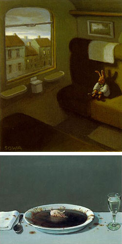 There is a world in which pigs dive into ponds like olympic athletes, play with balls of string like cats or wallow in your soup bowl, sheep work as accountants in the meadow, cats return to the door with their arms in a sling, dogs attend Victrola concerts, rabbits stand on their ears as street performers, wear trenchcoats and ride bicycles, and Guinea hens wear pearl necklaces.
It is the world of German artist and illustrator Michael Sowa, whose mildly surreal images tweak your brain just enough to make you stop and smile.
Sowa is obviously influenced by the logic-teasing juxtapositions of Rene Magritte, to which he adds an affection for charmingly painted childrens book scenes and a bit of pop culture.
There is a collection of his art: Sowa’s Ark : An Enchanted Bestiary, and there are children’s books by Axel Hacke for which he did the illustrations: A Bear Called Sunday and The Little King December.
Sowa has also done a little bit of movie production art, notably for Wallace & Gromit in The Curse of the Were-Rabbit, for which he did production art, and the charming Le Fabuleux destin d’Amélie Poulain (The Fabulous destiny of Amelie Poulian, released in the U.S. as simply Amelie), for which Sowa did matte painting and provided images that were used in the film (on the wall in Amelie’s bedroom). This post was prompted obliquely by the fact that Audrey Tautou, who was the delightful lead in Amelie, is currently appearing in The DaVinci Code (in which she gets to do very little).
Most of the art available on the web for Sowa is in the form of posters and note cards, So I’ve given links below to some of those sites. His work in never reproduced big enough, but at least you can get a glimpse into that world where giraffes take canoe rides, rabbits ride trains, sushi rolls swim in the ocean, men take dog-sized elephants for a walk, birthday cakes are launched from catapults, rhinos play the trumpet and, oh yes,… pigs fly.
Categories:


Charley’s Picks
Bookshop.org
(Bookshop.org affilliate links; sales benefit independent bookshop owners; I get a small percentage to help support my work on Lines and Colors)

John Singer Sargent: Watercolors


Urban Sketching: Understanding Perspective


Charley’s Picks
Amazon
(Amazon.com affiliate links; sales go to a larger yacht for Jeff Bezos; but I get a small percentage to help support my work on Lines and Colors)
John Singer Sargent: Watercolors
Urban Sketching: Understanding Perspective