
Categories
- 3d CGI
- Amusements
- Animation
- Anime & Manga
- Art Materials
- Art Videos
- Blogroll
- Cartoons
- Color
- Comics
- Concept & Visual Dev.
- Creativity
- Digital Art
- Digital Painting
- Displaying Art on the Web
- Drawing
- Eye Candy for Today
- Gallery and Museum Art
- High-res Art Images
- Illustration
- Motion Graphics & Flash
- Museums
- Online Museums
- Outsider Art
- Painting
- Painting a Day
- Paleo Art
- Pastel, Conté & Chalk
- Pen & Ink
- Prints and Printmaking
- Reviews
- Sc-fi and Fantasy
- Sculpture & Dimensional
- Site Comments
- Sketching
- Storyboards
- Tools and Techniques
- Uncategorized
- Vector Art
- Videos & Podcasts
- Vision and Optics
- Watercolor and Gouache
- Webcomics
Archives
- April 2026
- March 2026
- February 2026
- January 2026
- December 2025
- November 2025
- October 2025
- September 2025
- August 2025
- July 2025
- June 2025
- May 2025
- January 2025
- December 2024
- November 2024
- October 2024
- September 2024
- August 2024
- June 2024
- April 2024
- March 2024
- February 2024
- January 2024
- December 2023
- November 2023
- October 2023
- September 2023
- August 2023
- July 2023
- May 2023
- April 2023
- March 2023
- February 2023
- January 2023
- December 2022
- November 2022
- September 2022
- August 2022
- July 2022
- June 2022
- May 2022
- April 2022
- March 2022
- February 2022
- January 2022
- December 2021
- November 2021
- October 2021
- September 2021
- August 2021
- July 2021
- June 2021
- May 2021
- April 2021
- March 2021
- February 2021
- January 2021
- December 2020
- November 2020
- October 2020
- September 2020
- August 2020
- July 2020
- June 2020
- May 2020
- April 2020
- March 2020
- February 2020
- January 2020
- December 2019
- November 2019
- October 2019
- September 2019
- August 2019
- July 2019
- June 2019
- May 2019
- April 2019
- March 2019
- February 2019
- January 2019
- December 2018
- November 2018
- October 2018
- September 2018
- August 2018
- July 2018
- June 2018
- May 2018
- April 2018
- March 2018
- February 2018
- January 2018
- December 2017
- November 2017
- October 2017
- September 2017
- August 2017
- July 2017
- June 2017
- May 2017
- April 2017
- March 2017
- February 2017
- January 2017
- December 2016
- November 2016
- October 2016
- September 2016
- August 2016
- July 2016
- June 2016
- May 2016
- April 2016
- March 2016
- February 2016
- January 2016
- December 2015
- November 2015
- October 2015
- September 2015
- August 2015
- July 2015
- June 2015
- May 2015
- April 2015
- March 2015
- February 2015
- January 2015
- December 2014
- November 2014
- October 2014
- September 2014
- August 2014
- July 2014
- June 2014
- May 2014
- April 2014
- March 2014
- February 2014
- January 2014
- December 2013
- November 2013
- October 2013
- September 2013
- August 2013
- July 2013
- June 2013
- May 2013
- April 2013
- March 2013
- February 2013
- January 2013
- December 2012
- November 2012
- October 2012
- September 2012
- August 2012
- July 2012
- June 2012
- May 2012
- April 2012
- March 2012
- February 2012
- January 2012
- December 2011
- November 2011
- October 2011
- September 2011
- August 2011
- July 2011
- June 2011
- May 2011
- April 2011
- March 2011
- February 2011
- January 2011
- December 2010
- November 2010
- October 2010
- September 2010
- August 2010
- July 2010
- June 2010
- May 2010
- April 2010
- March 2010
- February 2010
- January 2010
- December 2009
- November 2009
- October 2009
- September 2009
- August 2009
- July 2009
- June 2009
- May 2009
- April 2009
- March 2009
- February 2009
- January 2009
- December 2008
- November 2008
- October 2008
- September 2008
- August 2008
- July 2008
- June 2008
- May 2008
- April 2008
- March 2008
- February 2008
- January 2008
- December 2007
- November 2007
- October 2007
- September 2007
- August 2007
- July 2007
- June 2007
- May 2007
- April 2007
- March 2007
- February 2007
- January 2007
- December 2006
- November 2006
- October 2006
- September 2006
- August 2006
- July 2006
- June 2006
- May 2006
- April 2006
- March 2006
- February 2006
- January 2006
- December 2005
- November 2005
- October 2005
- September 2005
- August 2005
Relevant Blogs
Art, Painting & Sketch
- Gurney Journey
- Underpaintings
- Art and Influence
- Painting Perceptions
- Oil Painters of America
- Vasari Paint POV
- Flying Fox
- Urban Sketchers
- Bento (Smithsonian)
- Art Inconnu
- The Hidden Place
- Still Life
- Making a Mark
- The Art of the Landscape
- Exploring Color & Creativity
- Art Contrarian
- Artist A Day
- beinArt Surreal Art Collective
- Eye Level
- David Dunlop
- p.i.g.m.e.n.t.i.u.m
- CultureGrrl
- Joaquín Sorolla blog
- Artists in Pastel
“Painting a Day”
- A Painting a Day (Keiser)
- On Painting (Keiser)
- Julian Merrow-Smith
- Karen Jurick
- Jeffrey Hayes
- Carol Marine
- Abbey Ryan
- Daily Paintworks
Other Painting Blogs
- Virtual Gouache Land
- Neil Hollingsworth
- Marc Hanson
- Kevin Menck
- Marc Dalessio
- Larry Seiler
- Stapleton Kearns
- Colin Page
- Roos Schuring
- Hans Versfelt
- Titus Meeuws
- Régis Pettinari
- René Plein Air
- Belinda Del Pesco
- Robin Weiss
- Nathan Fowkes (Land Sketch)
- William Wray
- Frank Serrano
- Stephen Magsig
- Michael Chesley Johnson
- Twice a Week
- Sarah Wimperis
- Rob Adams
- Michael Cole Manley
- The Dirty Palette Club
- Mike Manley’s Draw!
Gallery Art & Illustration mix
Illustration
- Howard Pyle
- 100 Years of Illustration
- BibliOdyssey
- Illustration Art
- Today’s Inspiration
- Illustration Mundo
- Little Chimp Society
- Danny Gregory
- R D (John Martz
- Illustration Friday blog
- Monster Brains
- Illustrators & Illustrations (RU)
- Elwood H. Smith
- DaniDraws.com
- Designers Who Blog
- iSpot Blog
Sci-Fi & Fantasy
Illustration & Comics
Comics & Cartoons
- Comics Beat
- Robot 6
- Newsarama Blog
- Comic Vine
- Comics Alliance
- Forbidden Planet Int.
- Paolo Rivera
- Bolt City
- Flight
- Scott McCloud
- The Comics Journal
- Comixpedia
- Funnybook Babylon
- James Baker
- Middleton’s Sketchbook
- Boneville
- The Hotel Fred
- Paul Rivoche
- Daily Cartoonist
- Mad About Cartoons (William Wray)
- Digital Strips
Illustration & Concept
Animation & Concept
- Cartoon Brew
- Animation Blog
- Cold Hard Flash
- Concept Art World
- The CAB
- FY Concept Art
- Concept Ships
- Concept Robots
- John Nevarez
- Armand Serrano
- Marcos Mateu-Mestre
- all kinds of stuff (Kricfalusi)
- Yacin the faun (Man Arenas)
- Kelsey Mann
- Cre8tivemarks Blog
- Ice-Cream Monster Toon Cafe
- AAU Character & Creature Design
- AAU Animation Notes
- Articles and Texticles
Paleo & Scientific
Tools & Techniques
Other
Lists of Art Blogs
Art Image Resource Links
Historic Art Images
- Wikimedia Commons: Paintings
- Wikimedia Commons: Drawings
- The Athenaeum
- WikiArt (WikiPaintings)
- Google Art Project: Artists
- Google Art Project: Collections (Museums)
- ArtCyclopedia
- Web Gallery of Art
- Art Renewal Center
- Web Gallery of Impressionism
Auction Consolidation sites
Auction sites
- Sotheby’s
- Bonham’s
- Christies
- Heritage Auctions: Fine Art
- Heritage Auctions: Illustration
- Freeman’s Auctions
- Bukowskis
- Shannon’s
Image Search
Reverse Image Search (search by image)
- Tin Eye
- RevImg
- Google Image Search (camera icon)
- Bing Image Search (camera icon)
Promoting some friends and some clients of my website design business
- Twin Willows T’ai Chi studio in Wilmington DE. Taiji classes with Bryan Davis.
- Ray Hayward, Inspired Teacher of T’ai Chi ( Taiji ) in Minneapolis, Founder of Mindful Motion Tai Chi Academy
- OldHead Tattoo studio and Art Gallery in Wilmington DE. Tattoos and paintings by Bruce Gulick
- Sharon Domenico Art, pet portrait oil paintings
- Platinum Paperhanging, wallpaper hanging, Main Line and Philadelphia, PA
- Lisa Stone Design, interior designer, Main Line and Philadelphia, PA
- Studio12KPT, original art, prints, calendars and other custom printed items by Van Sickle & Rolleri
-
Terrible Yellow Eyes
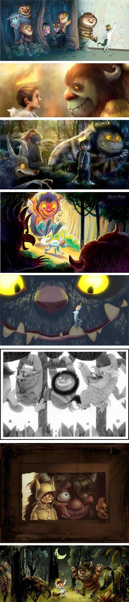
Terrible Yellow Eyes is a blog established by illustrator Cory Godbey to express his fascination and admiration for the work of Maurice Sendak, and in particular, his classic Where the Wild Things Are.The blog is a growing collection of artwork from a variety of artists, each expressing their own admiration for Sendak’s work with homages to the book and its characters.
The list of contributing artists includes some wonderful talents and Godby has curated an exhibition at Gallery Nucleus in Alhambra, CA, also titled Terrible Yellow Eyes, that puts many of these works together in a gallery setting.
The Gallery Nucleus exhibition runs to October 6, 2009. Godby’s blog has some photos from the opening.
Here is the initial post in which Godby explains his inspiration for Terrible Yellow Eyes.
Both Godby’s blog and the Gallery Nucleus page about the exhibition have links to the artist’s sites and blogs, a list that can keep Lines and Colors readers happily clicking deeper for may hours (timesink warning).
Images above:
Jason Caffoe
C.G. Young
Joel Furtado
David Miles
Mike Daley
Mike Lee
Shaun Pendergast
Saud Boksmati[Thanks to Masha Dutoit for the suggestion]
Categories:
-
Maurice Sendak

Maurice Sendak has been a window dresser for F.A.O. Schwartz, an illustrator for All-American Comics, and, since 1951, the author and illustrator of some of the most well-known and influential books in children’s literature.A fair bit of attention is currently focused on Where the Wild Things Are, his award winning and controversial classic that has just been adapted as a movie.
Sendak is the author/illustrator of several other books and the illustrator of over 40 more. My personal favorite is In the Night Kitchen, the illustrations for which harken back to the illustrators of the early 20th Century, as well as carrying a flavor of the surreal (i.e. dream based) comic strip flights of Winsor McCay.
The controversy about Where the Wild Things Are focused on the darkness of the illustrations, deemed “too frightening” by adults unfamiliar with the nature of traditional fairy tales.
In the Night Kitchen aroused concerns because the young protagonist loses his clothing and is naked for the first part of the story, something innocent to children who only learn the concept of shame that shame-filled adults teach them. Many of those shame-filled adults have challenged the book, tried to ban it from libraries or actually censor library copies by defacing the book, covering the “naughty bits”.
Also controversial is the implied darkness of the story sequence in which the threat of being placed in an oven with the bread dough, by bakers sporting Hitler-like mustaches, is an allusion to Sendak’s own preoccupation with the events of the Holocaust. (See the excerpt on Google Books.)
Sendak’s willingness to interject darkness and sophisticated themes (however tangentially referenced) into his children’s books, along with wild imaginings and his wonderful use of color and texture, light and shadow, has made his work resonate with generations of readers, young and old.
The Rosenbach Museum and Library here in Philadelphia is the official repository for Sendak’s work, with a permanent gallery devoted to his collection and frequent special exhibits.
I don’t know of an online repository for Sendak’s illustrations, but searching on Google, Google Books and Amazon will produce plenty of images. I’ve listed some other resources below.
One of them is an audio interview in which Sendak discusses one of my all time favorite children’s books, Crocket Johnson’s Harold and the Purple Crayon.
Categories:
-
RK Post
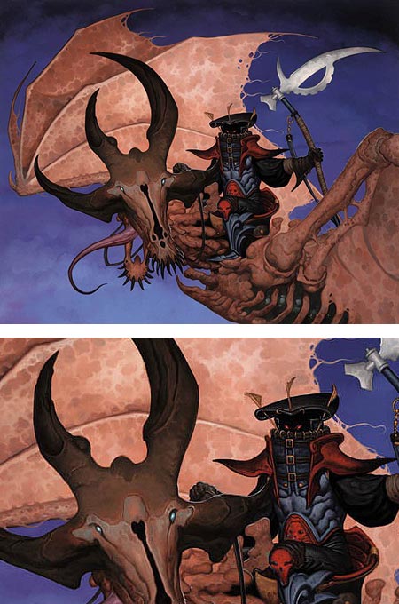
Randy “RK” Post is an illustrator who has a fascination with monsters and a penchant for the gruesome and grotesque, an inclination that serves him well in his role creating fantasy and gaming illustrations for clients like TSR, Wizards of the Coast, LucasFilm, 20th Century Fox, Sega, and others. He also counts comics companies like Marvel, DC and Dark Horse among his clients.Post’s richly detailed and vividly imagined monsters are joined by warriors, priestesses, wizards, and demonic figures of all shapes and sizes. His intricate renderings of characters and their accoutrements, along with his wildly bizarre monsters, are often set against spare, but highly textured backgrounds, giving a nice counterbalance while still serving up lots of fantasy eye candy.
Post also plays with his color palette, contrasting deep, color filled darks with intense color areas, and arraying them across detailed costume and creature designs.
There is a book of Post’s work called Postmortem: The Art of RK Post.
Categories:
-
Todd Bonita

Todd Bonita is a New Hampshire based painter who studied at the Art Institute of Boston, and here in Philadelphia at the Pennsylvania Academy of the Fine Arts.He has worked as a muralist, designer, sculptor, painter and illustrator, and has over 30 books to his credit.
As an oil painter, Bonita paints a variety of subjects, but focuses in particular on compositions involving small boats in the water. These are often in shallows, adding interesting effects of rocky, sandy or muddy bottom surfaces through layers of translucent water; along with weathered docks, reeds and shorelines arranged against the often colorful and texturally rich boats themselves.
Texture plays such a part in these paintings, in fact, that at first glance, I thought they were thickly layered pastels. Bonita works most often in oil on Masonite, wood panel or canvas; and the paintings featured on his blogs (he maintains two, painting life and Todd Bonita’s Art Blog) and web site vary in size from roughly 24×30″ to 6×8″.
He finds in his subjects wonderful areas filled with colors and textures of ground and water between his boats and their surroundings. Look at those areas as negative shapes to appreciate the strong design aspect of his compositions.
[Via Mick McGinty (see my posts on Mick McGinty)]
Categories:
-
Dan Santat

Dan Santat is a California based illustrator and children’s book writer.His clients include The Wall Street Journal, Esquire, The Village Voice, Harper Collins, Simon and Schuster and many others. Santat is also the creator of the Disney Channel animated series, The Replacements.
Santat’s style ranges from detailed to quite spare, but always seems to have a freshness and snap, in part because of his lively linework, rich colors and loose, painterly textures.
Santat used to paint in acrylics. He moved into a process of starting pieces in acrylic and developing the finish in Photoshop; and now does many of his illustrations directly in Photoshop.
Even when working digitally, Santat says he works from dark to light with opaque strokes of color, analogous to the way he paints in traditional media.
Santat’s site includes a blog, portfolio and a list of books he has authored or contributed to.
There is an interview with him on Diskursdisko.
[Via LCSV4]
Categories:
-
Kazuki Takamatsu

At first I thought these images by Japanese artist Kazuki Takamatsu were 3-D depth mattes, renderings of 3-D CGI models in which shades of gray are assigned to areas according to their distance from the virtual camera. (Their white, sculptural quality also brought to mind the paintings of A. Andrew Gonzalez.)However, even if CGI depth mattes, or something similar, are the source material or inspiration for them, Takamatsu’s finished works are actually gouache paintings, and fairly large in scale as you can see from these photos at Gallery Tomura.
Takamatsu uses the term Distanfeerism to name his style. Other than that, and the fact that he graduated from Tohoku University of Art and Design, I can find very little information about the artist.
Takamatsu’s site is in Japanese, but there are link titles in English.
(Note: the sites linked here may be considered mildly NSFW.)
[Via Jason Kottke]
Categories:


Charley’s Picks
Bookshop.org
(Bookshop.org affilliate links; sales benefit independent bookshop owners; I get a small percentage to help support my work on Lines and Colors)

John Singer Sargent: Watercolors


Urban Sketching: Understanding Perspective


Charley’s Picks
Amazon
(Amazon.com affiliate links; sales go to a larger yacht for Jeff Bezos; but I get a small percentage to help support my work on Lines and Colors)
John Singer Sargent: Watercolors
Urban Sketching: Understanding Perspective