
Categories
- 3d CGI
- Amusements
- Animation
- Anime & Manga
- Art Materials
- Art Videos
- Blogroll
- Cartoons
- Color
- Comics
- Concept & Visual Dev.
- Creativity
- Digital Art
- Digital Painting
- Displaying Art on the Web
- Drawing
- Eye Candy for Today
- Gallery and Museum Art
- High-res Art Images
- Illustration
- Motion Graphics & Flash
- Museums
- Online Museums
- Outsider Art
- Painting
- Painting a Day
- Paleo Art
- Pastel, Conté & Chalk
- Pen & Ink
- Prints and Printmaking
- Reviews
- Sc-fi and Fantasy
- Sculpture & Dimensional
- Site Comments
- Sketching
- Storyboards
- Tools and Techniques
- Uncategorized
- Vector Art
- Videos & Podcasts
- Vision and Optics
- Watercolor and Gouache
- Webcomics
Archives
- April 2026
- March 2026
- February 2026
- January 2026
- December 2025
- November 2025
- October 2025
- September 2025
- August 2025
- July 2025
- June 2025
- May 2025
- January 2025
- December 2024
- November 2024
- October 2024
- September 2024
- August 2024
- June 2024
- April 2024
- March 2024
- February 2024
- January 2024
- December 2023
- November 2023
- October 2023
- September 2023
- August 2023
- July 2023
- May 2023
- April 2023
- March 2023
- February 2023
- January 2023
- December 2022
- November 2022
- September 2022
- August 2022
- July 2022
- June 2022
- May 2022
- April 2022
- March 2022
- February 2022
- January 2022
- December 2021
- November 2021
- October 2021
- September 2021
- August 2021
- July 2021
- June 2021
- May 2021
- April 2021
- March 2021
- February 2021
- January 2021
- December 2020
- November 2020
- October 2020
- September 2020
- August 2020
- July 2020
- June 2020
- May 2020
- April 2020
- March 2020
- February 2020
- January 2020
- December 2019
- November 2019
- October 2019
- September 2019
- August 2019
- July 2019
- June 2019
- May 2019
- April 2019
- March 2019
- February 2019
- January 2019
- December 2018
- November 2018
- October 2018
- September 2018
- August 2018
- July 2018
- June 2018
- May 2018
- April 2018
- March 2018
- February 2018
- January 2018
- December 2017
- November 2017
- October 2017
- September 2017
- August 2017
- July 2017
- June 2017
- May 2017
- April 2017
- March 2017
- February 2017
- January 2017
- December 2016
- November 2016
- October 2016
- September 2016
- August 2016
- July 2016
- June 2016
- May 2016
- April 2016
- March 2016
- February 2016
- January 2016
- December 2015
- November 2015
- October 2015
- September 2015
- August 2015
- July 2015
- June 2015
- May 2015
- April 2015
- March 2015
- February 2015
- January 2015
- December 2014
- November 2014
- October 2014
- September 2014
- August 2014
- July 2014
- June 2014
- May 2014
- April 2014
- March 2014
- February 2014
- January 2014
- December 2013
- November 2013
- October 2013
- September 2013
- August 2013
- July 2013
- June 2013
- May 2013
- April 2013
- March 2013
- February 2013
- January 2013
- December 2012
- November 2012
- October 2012
- September 2012
- August 2012
- July 2012
- June 2012
- May 2012
- April 2012
- March 2012
- February 2012
- January 2012
- December 2011
- November 2011
- October 2011
- September 2011
- August 2011
- July 2011
- June 2011
- May 2011
- April 2011
- March 2011
- February 2011
- January 2011
- December 2010
- November 2010
- October 2010
- September 2010
- August 2010
- July 2010
- June 2010
- May 2010
- April 2010
- March 2010
- February 2010
- January 2010
- December 2009
- November 2009
- October 2009
- September 2009
- August 2009
- July 2009
- June 2009
- May 2009
- April 2009
- March 2009
- February 2009
- January 2009
- December 2008
- November 2008
- October 2008
- September 2008
- August 2008
- July 2008
- June 2008
- May 2008
- April 2008
- March 2008
- February 2008
- January 2008
- December 2007
- November 2007
- October 2007
- September 2007
- August 2007
- July 2007
- June 2007
- May 2007
- April 2007
- March 2007
- February 2007
- January 2007
- December 2006
- November 2006
- October 2006
- September 2006
- August 2006
- July 2006
- June 2006
- May 2006
- April 2006
- March 2006
- February 2006
- January 2006
- December 2005
- November 2005
- October 2005
- September 2005
- August 2005
Relevant Blogs
Art, Painting & Sketch
- Gurney Journey
- Underpaintings
- Art and Influence
- Painting Perceptions
- Oil Painters of America
- Vasari Paint POV
- Flying Fox
- Urban Sketchers
- Bento (Smithsonian)
- Art Inconnu
- The Hidden Place
- Still Life
- Making a Mark
- The Art of the Landscape
- Exploring Color & Creativity
- Art Contrarian
- Artist A Day
- beinArt Surreal Art Collective
- Eye Level
- David Dunlop
- p.i.g.m.e.n.t.i.u.m
- CultureGrrl
- Joaquín Sorolla blog
- Artists in Pastel
“Painting a Day”
- A Painting a Day (Keiser)
- On Painting (Keiser)
- Julian Merrow-Smith
- Karen Jurick
- Jeffrey Hayes
- Carol Marine
- Abbey Ryan
- Daily Paintworks
Other Painting Blogs
- Virtual Gouache Land
- Neil Hollingsworth
- Marc Hanson
- Kevin Menck
- Marc Dalessio
- Larry Seiler
- Stapleton Kearns
- Colin Page
- Roos Schuring
- Hans Versfelt
- Titus Meeuws
- Régis Pettinari
- René Plein Air
- Belinda Del Pesco
- Robin Weiss
- Nathan Fowkes (Land Sketch)
- William Wray
- Frank Serrano
- Stephen Magsig
- Michael Chesley Johnson
- Twice a Week
- Sarah Wimperis
- Rob Adams
- Michael Cole Manley
- The Dirty Palette Club
- Mike Manley’s Draw!
Gallery Art & Illustration mix
Illustration
- Howard Pyle
- 100 Years of Illustration
- BibliOdyssey
- Illustration Art
- Today’s Inspiration
- Illustration Mundo
- Little Chimp Society
- Danny Gregory
- R D (John Martz
- Illustration Friday blog
- Monster Brains
- Illustrators & Illustrations (RU)
- Elwood H. Smith
- DaniDraws.com
- Designers Who Blog
- iSpot Blog
Sci-Fi & Fantasy
Illustration & Comics
Comics & Cartoons
- Comics Beat
- Robot 6
- Newsarama Blog
- Comic Vine
- Comics Alliance
- Forbidden Planet Int.
- Paolo Rivera
- Bolt City
- Flight
- Scott McCloud
- The Comics Journal
- Comixpedia
- Funnybook Babylon
- James Baker
- Middleton’s Sketchbook
- Boneville
- The Hotel Fred
- Paul Rivoche
- Daily Cartoonist
- Mad About Cartoons (William Wray)
- Digital Strips
Illustration & Concept
Animation & Concept
- Cartoon Brew
- Animation Blog
- Cold Hard Flash
- Concept Art World
- The CAB
- FY Concept Art
- Concept Ships
- Concept Robots
- John Nevarez
- Armand Serrano
- Marcos Mateu-Mestre
- all kinds of stuff (Kricfalusi)
- Yacin the faun (Man Arenas)
- Kelsey Mann
- Cre8tivemarks Blog
- Ice-Cream Monster Toon Cafe
- AAU Character & Creature Design
- AAU Animation Notes
- Articles and Texticles
Paleo & Scientific
Tools & Techniques
Other
Lists of Art Blogs
Art Image Resource Links
Historic Art Images
- Wikimedia Commons: Paintings
- Wikimedia Commons: Drawings
- The Athenaeum
- WikiArt (WikiPaintings)
- Google Art Project: Artists
- Google Art Project: Collections (Museums)
- ArtCyclopedia
- Web Gallery of Art
- Art Renewal Center
- Web Gallery of Impressionism
Auction Consolidation sites
Auction sites
- Sotheby’s
- Bonham’s
- Christies
- Heritage Auctions: Fine Art
- Heritage Auctions: Illustration
- Freeman’s Auctions
- Bukowskis
- Shannon’s
Image Search
Reverse Image Search (search by image)
- Tin Eye
- RevImg
- Google Image Search (camera icon)
- Bing Image Search (camera icon)
Promoting some friends and some clients of my website design business
- Twin Willows T’ai Chi studio in Wilmington DE. Taiji classes with Bryan Davis.
- Ray Hayward, Inspired Teacher of T’ai Chi ( Taiji ) in Minneapolis, Founder of Mindful Motion Tai Chi Academy
- OldHead Tattoo studio and Art Gallery in Wilmington DE. Tattoos and paintings by Bruce Gulick
- Sharon Domenico Art, pet portrait oil paintings
- Platinum Paperhanging, wallpaper hanging, Main Line and Philadelphia, PA
- Lisa Stone Design, interior designer, Main Line and Philadelphia, PA
- Studio12KPT, original art, prints, calendars and other custom printed items by Van Sickle & Rolleri
-
Gris Grimly

Gris Grimly is the author and illustrator of children’s books like Jordan Ray’s Muddy Spud and the Wicked Nursery Rhymes series. He is also the illustrator for numerous other books, including The Dangerous Alphabet with Neil Gaiman.His web site, Mad Creator Productions, has a showcase of many of them, as well as a portfolio of art that includes both color and black and white illustration and gallery art. (I can’t give you direct links because the site is in Flash.)
He works in ink and watercolor, often using fine lines drawn with technical pens over which he lays washes, splotches and glorious spatters of watercolor. He also appears to use ink spatters, giving his gothic horror themed illustrations a wonderful feeling of looseness and texture.
Grimly also maintains a MySpace page, and there is a gallery of his book covers, along with a short bio, on the Tor.com site.
Categories:
-
Kerr Eby
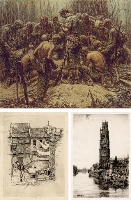
For the benefit of those in other parts of the world, I’ll point out that today is Veterans Day here in the U.S., a day set aside to honor those who have given or risked their lives, endured hardships and put themselves in the service of their country in military service.The same date, November 11, is also observed in many other countries as Armistice Day or Remembrance Day, a date taken from the signing of the Armistice that ended World War I.
Harold Kerr Eby, usually known as simply Kerr Eby, was an artist who made first hand observations of both World War I and World War II, the former as an artist/soldier, the latter as a civilian member of the combat art program sponsored by Abbott Laboratories (see my posts on They Drew Fire: Combat Artists of World War II and Art of War: Eyewitness U.S. Combat Art From the Revolution through the Twentieth Century).
You can see his impressions of World War I in the form of his dark and emotional etchings, done after the fact but carrying the weight of first hand observation. His World War II images (image above, top) were more direct, often done on the spot with charcoal, pencil and other dry media, with piercing observations of the horror, extremes and physical and emotional fatigue suffered by the soldiers.
Eby was born in Japan, where his father was as a missionary for the Canadian Methodist Church. He studied at Pratt Institute and the Art Students League in New York, at the later studying with George Bellows. He also frequented the Cos Cob artist colony in Connecticut and became friends with Childe Hassam, giving lessons in etching to the senior artist.
He enlisted in the Army and served as ambulance crew during World War I (known at the time as “the war to end all wars” because of its horrible scale; little did they know).
Eby was never officially commissioned to cover the war as an artist, but recorded many of his impressions on his own, later rendered into a series of lithographs that were published as a book.
At the entry of the U.S into World War II he attempted to enlist again, but was over the age limit. Instead he participated in the combat artist reportage program in the Pacific, landing with the Marines at Guadalcanal and Tarawa. He died of a disease contracted while covering the war.
In between the wars, Eby created a a body of work, apparently mostly in the form of etchings and lithographs. If he was a painter to any great extent, I’ve been unable to find any examples.
His etchings, though, are wonderful, with scenes from his trips abroad as well as domestic subjects, and to my eye showing the influence of etchers like James Whistler and Joseph Pennell. The best display of these is on the Old Print Shop site.
There is a long series of Eby’s drawings from WW II on the Navy Art Collection. (The server can be a bit slow, give it time, and note the links to multiple pages at the bottom.)
At times while looking through Eby’s WW II battlefield sketches, I found myself thinking about Gustav Dore’s illustrations for Dante’s Inferno, not from any stylistic similarities, but from the emotional weight of the images.
These are the hardships we’re called on to remember and honor on Veterans Day.
[Suggestion courtesy of Robert Tracy (see my post on Robert Tracy)]
Categories:
-
Gilles Tréhin (update)

In 2006 I wrote about autistic savant Gilles Tréhin and Urville, a large and fantastically detailed city that he has been creating in mind since the age of 12, and shares with us by way of hundreds of intricate drawings.I recently learned that shortly after I wrote that post, Tréhin’s English language book about the project, Urville, was released, containing an elaborate tour of the imaginary city in over 300 of his drawings.
Tréhin is an autistic savant, with extraordinary abilities in mathematics, music, language and art. His visions of Urville form a comprehensive image of this city, complete with economic, social, political and historic background, in addition to geography and architecture.
There are two sites devoted to Urville, http://urvillecity.free.fr, and the newer http://urville.com/. The latter can seem a little hard to navigate unless you notice links at the top dividing the site into two sections, one for Tréhin, and the other for his partner Catherine Mouet. Once in Tréhin’s section you can navigate to pages of images for skyscrapers, transportation, public buildings and squares.
The http://urvillecity.free.fr is a bit more straightforward, with sections for views of Urville and recent drawings.
There is an article about Thehin on the site of the Wisconsin Medical Society, and 4 videos about him on YouTube. There is an extract of the book on Google Book Search.
The fascinating thing about these drawings is that they are not an unconnected series of make-believe street scenes and envisioned architecture, but glimpses of a connected whole, a complete city that exists as a mental construct; a matrix, if you will, of interconnected buildings, plazas, streets and their relationships in a projected geographical space.
For more, see my previous post about Gilles Tréhin.
Categories:
-
A Vermeer Comes to California

There are painters, there are painter’s painters and then there’s Vermeer.Ever since I became entranced on seeing his work at the Metropolitan Museum of Art in New York when I was younger, I’ve thought of Vermeer as less like other painters and more like an alchemist of light, an artistic sorcerer whose works transcend the boundaries of art and ascend into the realm of magic.
This impression has been reinforced each time I’ve encountered his irresistible visual spells; in New York at the Met and the Frick Collection, at the National Gallery of Art in Washington, D.C.; and at the mind-boggling show at the Met in 2001, which collected 15 of his strikingly beautiful paintings and put them in context with some 50 works by his contemporaries.
Have I gotten it across? If not, see my previous post about Vermeer and the Essential Vermeer web site.
Vermeer the artist and man is an enigmatic figure; there is little verifiable information about him, and much of what is discussed is the result of inference or conjecture; the art world’s perfect mystery man.
There are no surviving drawings attributed to Vermeer and only 36 generally accepted paintings (a few of which are still in question). Of these, 22 are in Europe and 14 are in the U.S. All of those in the U.S., except for one piece that is supposed to be in Las Vegas, but the actual whereabouts of which is unknown (What happens in Vegas stays in Vegas?), are in collections on the East Coast.
That number was reduced by one in 1990, when Vermeer’s The Concert was stolen from the Isabella Stewart Gardner Museum in Boston, along with 12 other works in what was the largest art theft in history.
Unless you live on the East Coast (or in Europe), seeing a Vermeer in person has always been a matter of travel.
From now until February 2, 2009, there is a rare opportunity to see a Vermeer on the West Coast of the U.S., as the Norton Simon Museum in Pasadena displays Vermeer’s A Lady Writing, on loan from the National Gallery in Washington.
There is a large version here on Essential Vermeer, along with an interactive feature (rollover image for notes) and analysis and background for the painting.
A Lady Writing is perhaps not the most celebrated of Vermeer’s works, it is still most definitely a fine Vermeer, a characteristic example of his pan-dimensional mastery of the magic of paint and light.
Most importantly, it is a beautiful painting.
Like many of Vermeer’s works, there is great room to spin stories into the enigmatic hints of the setting and surroundings, as well as the countenance of the sitter (as was done with the recent novel and film conjured up from his Girl With a Pearl Earring).
What events are suggested by this woman’s letter writing, the fine objects arrayed on her desk, the dark still life behind her, and her own equanimous gaze, directed squarely at the viewer, unabashed, unconcerned, and with a hint of a smile?
Perhaps the sitter’s seemingly complete ease with the act of being painted, and her subtle, confident smile, are attributable to suggestions that she is actually Catharina Bolnes, Vermeer’s wife.
I love the extraordinary way Vermeer has used delicately applied touches of pure white here, in the sparkling highlights of the ornate box, the studs on the lion-headed chair, famous for appearing in so many of his paintings, the shaft of the quill, the string of pearls on the table, the woman’s hair ribbons and, yes, her pearl earrings.
Look at the texture of the cloth and fur, the deep shadows both in the foreground and background, almost creating a secondary frame around the highlighted subject, the delicacy of her fingers, the miniature landscape formed by her hands, the table cover, pearls, inkwell and the horizontal streaks of light across blue cloth behind the ornate box.
Most captivating of all, as in most of Vermeer’s best work, is that timeless sense of captured light, in this case coming from the suggested, but characteristic, light of an unseen window to the viewer’s left, rendered palpable, liquid, pouring over the figure like a mist of gold.
It’s fascinating to compare this painting to Vermeer’s later work Mistress and Maid, in the Frick Collection in New York, which uses a very similar composition and many of the same objects.
If you’re in visiting range of the Norton Simon Museum, or if you’re near the permanent collections in new York or Washington, make a visit and immerse yourself in the crystalized stillness of Vermeer’s magical captured light.
[Link via Art Knowledge News]
Categories:
-
Early Star Wars Storyboards

Nearly all movies these days, an certainly all movies that involve animation or special effects, are plotted out visually beforehand using storyboards; a comic strip like series of drawings, often done simply in markers, showing the basic on screen composition and sequences of action.There is a nice Flickr set of early storyboards from the original Star Wars movie, early enough that the design of the “pirate ship” in some sequences is very different from the eventual design of the Millenium Falcon.
The art credit for most of these is apparently Joe Johnston.
[Via Kottke]
Categories:
-
Analog Photoshop Interface

As a long time Photoshop user, I just love this version of the Photoshop interface as represented by real-world objects.It’s a poster for software-asli.com, the creative credits are: creative director : Hendra Lesmono, art director : Andreas Junus & Irawandhani Kamarga, copywriter : Darrick Subrata and photgrapher : Anton Ismael.
The mock up is actually quite large, as you can see in the accompanying Flickr set that shows how they assembled it. Be sure to view the full size image to get the real effect.
I love the little details like the fact that the grabber hand glove is smudged.
[Via BoingBoing]
Categories:


Charley’s Picks
Bookshop.org
(Bookshop.org affilliate links; sales benefit independent bookshop owners; I get a small percentage to help support my work on Lines and Colors)

John Singer Sargent: Watercolors


Urban Sketching: Understanding Perspective


Charley’s Picks
Amazon
(Amazon.com affiliate links; sales go to a larger yacht for Jeff Bezos; but I get a small percentage to help support my work on Lines and Colors)
John Singer Sargent: Watercolors
Urban Sketching: Understanding Perspective