
Categories
- 3d CGI
- Amusements
- Animation
- Anime & Manga
- Art Materials
- Art Videos
- Blogroll
- Cartoons
- Color
- Comics
- Concept & Visual Dev.
- Creativity
- Digital Art
- Digital Painting
- Displaying Art on the Web
- Drawing
- Eye Candy for Today
- Gallery and Museum Art
- High-res Art Images
- Illustration
- Motion Graphics & Flash
- Museums
- Online Museums
- Outsider Art
- Painting
- Painting a Day
- Paleo Art
- Pastel, Conté & Chalk
- Pen & Ink
- Prints and Printmaking
- Reviews
- Sc-fi and Fantasy
- Sculpture & Dimensional
- Site Comments
- Sketching
- Storyboards
- Tools and Techniques
- Uncategorized
- Vector Art
- Videos & Podcasts
- Vision and Optics
- Watercolor and Gouache
- Webcomics
Archives
- April 2026
- March 2026
- February 2026
- January 2026
- December 2025
- November 2025
- October 2025
- September 2025
- August 2025
- July 2025
- June 2025
- May 2025
- January 2025
- December 2024
- November 2024
- October 2024
- September 2024
- August 2024
- June 2024
- April 2024
- March 2024
- February 2024
- January 2024
- December 2023
- November 2023
- October 2023
- September 2023
- August 2023
- July 2023
- May 2023
- April 2023
- March 2023
- February 2023
- January 2023
- December 2022
- November 2022
- September 2022
- August 2022
- July 2022
- June 2022
- May 2022
- April 2022
- March 2022
- February 2022
- January 2022
- December 2021
- November 2021
- October 2021
- September 2021
- August 2021
- July 2021
- June 2021
- May 2021
- April 2021
- March 2021
- February 2021
- January 2021
- December 2020
- November 2020
- October 2020
- September 2020
- August 2020
- July 2020
- June 2020
- May 2020
- April 2020
- March 2020
- February 2020
- January 2020
- December 2019
- November 2019
- October 2019
- September 2019
- August 2019
- July 2019
- June 2019
- May 2019
- April 2019
- March 2019
- February 2019
- January 2019
- December 2018
- November 2018
- October 2018
- September 2018
- August 2018
- July 2018
- June 2018
- May 2018
- April 2018
- March 2018
- February 2018
- January 2018
- December 2017
- November 2017
- October 2017
- September 2017
- August 2017
- July 2017
- June 2017
- May 2017
- April 2017
- March 2017
- February 2017
- January 2017
- December 2016
- November 2016
- October 2016
- September 2016
- August 2016
- July 2016
- June 2016
- May 2016
- April 2016
- March 2016
- February 2016
- January 2016
- December 2015
- November 2015
- October 2015
- September 2015
- August 2015
- July 2015
- June 2015
- May 2015
- April 2015
- March 2015
- February 2015
- January 2015
- December 2014
- November 2014
- October 2014
- September 2014
- August 2014
- July 2014
- June 2014
- May 2014
- April 2014
- March 2014
- February 2014
- January 2014
- December 2013
- November 2013
- October 2013
- September 2013
- August 2013
- July 2013
- June 2013
- May 2013
- April 2013
- March 2013
- February 2013
- January 2013
- December 2012
- November 2012
- October 2012
- September 2012
- August 2012
- July 2012
- June 2012
- May 2012
- April 2012
- March 2012
- February 2012
- January 2012
- December 2011
- November 2011
- October 2011
- September 2011
- August 2011
- July 2011
- June 2011
- May 2011
- April 2011
- March 2011
- February 2011
- January 2011
- December 2010
- November 2010
- October 2010
- September 2010
- August 2010
- July 2010
- June 2010
- May 2010
- April 2010
- March 2010
- February 2010
- January 2010
- December 2009
- November 2009
- October 2009
- September 2009
- August 2009
- July 2009
- June 2009
- May 2009
- April 2009
- March 2009
- February 2009
- January 2009
- December 2008
- November 2008
- October 2008
- September 2008
- August 2008
- July 2008
- June 2008
- May 2008
- April 2008
- March 2008
- February 2008
- January 2008
- December 2007
- November 2007
- October 2007
- September 2007
- August 2007
- July 2007
- June 2007
- May 2007
- April 2007
- March 2007
- February 2007
- January 2007
- December 2006
- November 2006
- October 2006
- September 2006
- August 2006
- July 2006
- June 2006
- May 2006
- April 2006
- March 2006
- February 2006
- January 2006
- December 2005
- November 2005
- October 2005
- September 2005
- August 2005
Relevant Blogs
Art, Painting & Sketch
- Gurney Journey
- Underpaintings
- Art and Influence
- Painting Perceptions
- Oil Painters of America
- Vasari Paint POV
- Flying Fox
- Urban Sketchers
- Bento (Smithsonian)
- Art Inconnu
- The Hidden Place
- Still Life
- Making a Mark
- The Art of the Landscape
- Exploring Color & Creativity
- Art Contrarian
- Artist A Day
- beinArt Surreal Art Collective
- Eye Level
- David Dunlop
- p.i.g.m.e.n.t.i.u.m
- CultureGrrl
- Joaquín Sorolla blog
- Artists in Pastel
“Painting a Day”
- A Painting a Day (Keiser)
- On Painting (Keiser)
- Julian Merrow-Smith
- Karen Jurick
- Jeffrey Hayes
- Carol Marine
- Abbey Ryan
- Daily Paintworks
Other Painting Blogs
- Virtual Gouache Land
- Neil Hollingsworth
- Marc Hanson
- Kevin Menck
- Marc Dalessio
- Larry Seiler
- Stapleton Kearns
- Colin Page
- Roos Schuring
- Hans Versfelt
- Titus Meeuws
- Régis Pettinari
- René Plein Air
- Belinda Del Pesco
- Robin Weiss
- Nathan Fowkes (Land Sketch)
- William Wray
- Frank Serrano
- Stephen Magsig
- Michael Chesley Johnson
- Twice a Week
- Sarah Wimperis
- Rob Adams
- Michael Cole Manley
- The Dirty Palette Club
- Mike Manley’s Draw!
Gallery Art & Illustration mix
Illustration
- Howard Pyle
- 100 Years of Illustration
- BibliOdyssey
- Illustration Art
- Today’s Inspiration
- Illustration Mundo
- Little Chimp Society
- Danny Gregory
- R D (John Martz
- Illustration Friday blog
- Monster Brains
- Illustrators & Illustrations (RU)
- Elwood H. Smith
- DaniDraws.com
- Designers Who Blog
- iSpot Blog
Sci-Fi & Fantasy
Illustration & Comics
Comics & Cartoons
- Comics Beat
- Robot 6
- Newsarama Blog
- Comic Vine
- Comics Alliance
- Forbidden Planet Int.
- Paolo Rivera
- Bolt City
- Flight
- Scott McCloud
- The Comics Journal
- Comixpedia
- Funnybook Babylon
- James Baker
- Middleton’s Sketchbook
- Boneville
- The Hotel Fred
- Paul Rivoche
- Daily Cartoonist
- Mad About Cartoons (William Wray)
- Digital Strips
Illustration & Concept
Animation & Concept
- Cartoon Brew
- Animation Blog
- Cold Hard Flash
- Concept Art World
- The CAB
- FY Concept Art
- Concept Ships
- Concept Robots
- John Nevarez
- Armand Serrano
- Marcos Mateu-Mestre
- all kinds of stuff (Kricfalusi)
- Yacin the faun (Man Arenas)
- Kelsey Mann
- Cre8tivemarks Blog
- Ice-Cream Monster Toon Cafe
- AAU Character & Creature Design
- AAU Animation Notes
- Articles and Texticles
Paleo & Scientific
Tools & Techniques
Other
Lists of Art Blogs
Art Image Resource Links
Historic Art Images
- Wikimedia Commons: Paintings
- Wikimedia Commons: Drawings
- The Athenaeum
- WikiArt (WikiPaintings)
- Google Art Project: Artists
- Google Art Project: Collections (Museums)
- ArtCyclopedia
- Web Gallery of Art
- Art Renewal Center
- Web Gallery of Impressionism
Auction Consolidation sites
Auction sites
- Sotheby’s
- Bonham’s
- Christies
- Heritage Auctions: Fine Art
- Heritage Auctions: Illustration
- Freeman’s Auctions
- Bukowskis
- Shannon’s
Image Search
Reverse Image Search (search by image)
- Tin Eye
- RevImg
- Google Image Search (camera icon)
- Bing Image Search (camera icon)
Promoting some friends and some clients of my website design business
- Twin Willows T’ai Chi studio in Wilmington DE. Taiji classes with Bryan Davis.
- Ray Hayward, Inspired Teacher of T’ai Chi ( Taiji ) in Minneapolis, Founder of Mindful Motion Tai Chi Academy
- OldHead Tattoo studio and Art Gallery in Wilmington DE. Tattoos and paintings by Bruce Gulick
- Sharon Domenico Art, pet portrait oil paintings
- Platinum Paperhanging, wallpaper hanging, Main Line and Philadelphia, PA
- Lisa Stone Design, interior designer, Main Line and Philadelphia, PA
- Studio12KPT, original art, prints, calendars and other custom printed items by Van Sickle & Rolleri
-
Robert Crumb Exhibit in Philadelphia
 Just a quick note that there is a new extensive exhibit of works from demented genius cartoonist and underground comix pioneer Robert Crumb at the Institute for Contemporary Art here in Philadelphia.
I’ll write a post about the show, and Robert Crumb, in more detail after I’ve had a chance to see the exhibit, but I wanted to give a heads-up about it now for those within traveling distance.
The ICA site has a list of events and public programs related to the show, including tours, a showing of the film Crumb, and a lecture by cartoonist Charles Burns.
The exhibit is called “R. Crumb’s Underground” and features over 100 works. It runs until December 7, 2008.
Categories:
-
Thomas Paquette (update)
It’s always a treat for me to get to meet and talk to some of the contemporary artists I write about. This past Friday, I had the opportunity to attend an opening of a new show at the Gross McCleaf Gallery here in Philadelphia of works by Western Pennsylvania artist Thomas Paquette.I wrote about Thomas Paquette back in the Spring of 2007 on the occasion of another show at the same gallery, but I just made it to that show before it closed, and missed the opening.
At the time I was fascinated with his small works in gouache that I had seen in reproduction, and since then in a beautiful book, Thomas Paquette: Gouaches, that is available directly through the artist’s site, or though Amazon. The pieces featured in the book are also available as archival prints.
Though the gouache paintings weren’t part of the show that time (or this time), I became fascinated with some of the gouache-like characteristics of his much larger scale oils, that seem to carry some of the same feeling.
This time I had a chance to meet the artist and talk with him about his work and technique. Though still pursuing many of the same subjects and approaches that were evident in his work before, he is pushing with some of his new paintings in new directions, notably in paintings in which large color filled skies dominate the composition.
You can see some of his recent work on his own site, and a selection of additional work on the Gross McCleaf site.
In asking about his working methods, I found out that Paquette often works over his oils in layers, painting and repainting areas, partly building up texture and placing areas of color within areas of color, and partly searching out the forms and colors, almost like an additive sculptor working back and forth in clay. It reminded me that there is actually a sculptural quality to his work, in which the surface texture of his paint is one of the appealing elements of the painting; unfortunately, one that is lost in reproduction.
Paquette’s work strikes me as a delightful blending of seemingly contradictory elements, impressionistic in its color and open brushwork, yet academically strong in the drawing and composition. Close up, the shapes and areas of color seem abstract, in the true sense of that word, meaning to extract the essence of something, but also in the sense that you could crop out a small section of almost any area of his paintings and have a vibrant non-representaional composition, filled with lively variations in color and texture.
That texture itself, layers of richly applied paint, well raised above the surface in places, is also a contrast with the apparently flat nature some of his shapes take on from a middle distance. Step back more and that graphic quality, a sense of line and color that reminds me of colored woodblock prints, resolves into a lush naturalism.
The surface character of his paintings, and the nature of the areas of color close up, seem so different form the naturalistic appearance of the works from a distance that I asked him if he does a lot of stepping up and back as he paints; something I’ve been curious about in regard to a number of painters in who exhibit similar characteristics, like Sargent or Daniel Garber.
In Paquette’s case, the answer is no. He told me that it is more of a mental grasp of overall work, maintained while working close, than a technique of constantly viewing the work from close up and back.
Paquette is, after all is said and done, a realist; but his rendering technique pays attention to paint as paint, areas of color as individual abstract elements; and texture as an exploration in itself.
The tension between these opposites, along with his strong sense of value and color and the dynamics of his compositions, are what make his work so fascinating.
The show at the Gross McCleaf Gallery runs until September 27th, 2008.
Categories:
-
Harry Grant Dart

Harry Grant Dart was an American illustrator and comics artist active in the late 1800’s and early 1900s.He worked for the Boston Herald and then the New York World, where he eventually held the position of Art Editor. He was one of the newspaper sketch artists who sketched important events for newspapers prior to the use of photographs (see my post on The Illustrators of La Domenica del Corriere). He also maintained an outside career as a magazine illustrator, working for titles like Life and Judge.
As a cartoonist Dart created a comic strip called The Explorigator, about a an airship staffed by a crew of adventurous kids. Meant to be a competitor for Winsor McCay’s spectacular strip Little Nemo in Slumberland, The Explorigator only ran for 14 weeks in 1908.
There aren’t a lot of resources on Dart that I could find, but there is a treasure of an archive of The Explorigator on the Barnicle Press site; sadly, not in color, but still a stunning example of this detailed, beautifully drawn and wildly imaginative strip.
The strip featured Dart’s penchant for drawing fantastic Victorian era aircraft, which also showed up in his other illustrations, like the image above (large version here on Flickr), done for a magazine called The All-Story.
I love the fact that he’s given us a liberated, fashionably attired Victorian era woman pilot, years before women could vote.
Categories:
-
Alex Niño

There are a number of strong communities of comics art (those of you in the expensive seats read: “graphic storytelling”) in various parts of the world, each with its own stylistic leanings. Some, like Japan, France and Belgium are more familiar to us here in the U.S. than others, like Italy, the UK, South America, China, Korea and the Phillipines.Unlike comics artists in China, Korea and most other countries in the Western Pacific rim that produce comics, artists in the Philippines took their primary influences not from Japanese Manga styles but from Spanish, South American and North American influences.
In the early 1970’s established artists from the Phillipines, many of them with with their own studios and publishing endeavors, like Alfredo Alcala, Nestor Redondo (a personal favorite), and Tony De Zuñiga began to do work for American companies like Marvel, DC and Warren.
I don’t know the details, but it may have had a lot to do with the crackdown and sanitization of the comics medium that resulted when the Marcos government declared martial law and began to outlaw or control all mass media in the country.
In the U.S., the Filipino artists’ unique styles and intense, detailed rendering brought them the immediate attention of publishers and readers, and had a dramatic impact on the American comics artists working at the time.
The elder Filipino comics artists (in the Phillipines, is was “komiks”, as there is apparently no “C” in the alphabet), soon began to bring some of their younger contemporaries into the American market. One of the most notable of these was Alex Niño, who would become a star comics (and komiks) artist in his own right.
Niño illustrated over 300 stories for publishers in the Phillipines; and in the U.S. did work for Marvel, DC, Warren, Byron Preiss and Heavy Metal magazine.
Drawing on influences that ranged from his fellow Filipino artists to golden age pen and ink illustrators like Franklin Booth and Joseph Clement Coll and science fiction illustrators like Virgil Finlay, Niño created a synthesis of pen and ink styles that he used to propel his highly imaginative flights of fantasy.
His work ranged from quietly elegant renderings to over-the-top, wildly stylized fantasies that had some of the manic energy of American underground comics.
His rendering style combined the calligraphic thin-to-thick line work common to American comics with the intensely textural rendering of pen and ink illustration, to unique effect.
In the late 80’s and early 90’s Niño’s decorative style and fertile imagination led him to doing production and design work for Disney Studios, contributing to feature animation like Treasure Planet, Mulan, The Emperor’s New Grove and Atlantis.
Auad Publishing, who I have mentioned in the past as the publisher of terrific books on Franklin Booth, Alex Toth and other illustrators and comics artists, has just released The Art of Alex Niño, a 160 page labor of love into which Auad had crammed page after page of Niño’s lavishly rendered illustrations, drawings and comics pages, including several complete short stories.
The book covers a wide range of Niño’s styles, and includes a healthy sampling of color work (perhaps a quarter of the book). As much as I enjoy his color work, it was in his black and white work, particularly in the Warren magazines, that I think Niño was able to utilize his drawing and rendering strengths, and his dramatic sense of page design, to best advantage.
The Gallery of Niño’s work on the Auad site is small, and the is no official site for Niño or large single repository of his work in the web that I’m aware of. I’ve tried to line up some other resources for you below.
Categories:
-
Anna Richards Brewster in American Art Review

Another quick magazine mention. Anna Richards Brewster, an under-sung American painter who I profiled recently, is featured in a 10-page article in the October, 2008 Issue of American Art Review.For $6 (U.S.), you get a nice overview of her work and 20 images. The article bears the same title as the current traveling exhibit, and related book, Anna Richards Brewster, American Impressionist.
The issue is on newsstands now (try larger bookstores) and should be available on the American Art Review web site as a back issue (Volume XX, Number 5) in a month or so.
Categories:
-
Dean Cornwell in Illustration Magazine
As I mentioned in my previous article on Dean Cornwell, he was a second generation inheritor of the traditions of the Brandywine School of American illustration, having studied with Harvey Dunn, a student of Howard Pyle.Cornwell’s other major influence was painter and muralist Frank Brangwyn, with whom he studied when he turned his career toward mural painting.
Cornwell’s vivid, muscular murals and dramatic, painterly magazine illustrations earned him the appellation “Dean of Illustrators’.
The new issue of Illustration Magazine has an extensive and (I love this phrase) lavishly illustrated article on Cornwell; that plays a much needed role in filling in for the books on Cornwell that should be, but aren’t, in print; notably Dean Cornwell: Dean of Illustrators by Patricia Janis Broder.
You can see a preview of thumbnail images of the entire issue here, though the images are too small to appreciate his work. I give some links to other Cornwell resources in my previous post.
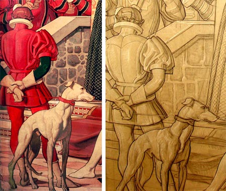
The article features a wide range of Cornwell’s work, including editorial illustrations, posters and pubic service ads for War Bonds, and some of his major mural work, including the famous murals in New York that I mentioned in my other post (images above), and a series for the Los Angeles Central Library, both of which were the subject of controversy.
Jim Winstead, on his blog trainedMonkey, relates how Cornwell was so desperate to win the competition for the latter commission that he entered the contest three times, twice under assumed names; and came in first under the submission for his own name, and second and third for the submissions under his two assumed names.
The Illustration Magazine article also includes some of Cornwell’s detailed and beautifully realized preliminary drawings, which were reputedly were the main reason, along with his limited palette and pre-mixing of colors, that he could sometimes execute a finished illustration in a little as three or four hours.
[Link and notice about the issue via Gurney Journey]
Categories:


Charley’s Picks
Bookshop.org
(Bookshop.org affilliate links; sales benefit independent bookshop owners; I get a small percentage to help support my work on Lines and Colors)

John Singer Sargent: Watercolors


Urban Sketching: Understanding Perspective


Charley’s Picks
Amazon
(Amazon.com affiliate links; sales go to a larger yacht for Jeff Bezos; but I get a small percentage to help support my work on Lines and Colors)
John Singer Sargent: Watercolors
Urban Sketching: Understanding Perspective