
Categories
- 3d CGI
- Amusements
- Animation
- Anime & Manga
- Art Materials
- Art Videos
- Blogroll
- Cartoons
- Color
- Comics
- Concept & Visual Dev.
- Creativity
- Digital Art
- Digital Painting
- Displaying Art on the Web
- Drawing
- Eye Candy for Today
- Gallery and Museum Art
- High-res Art Images
- Illustration
- Motion Graphics & Flash
- Museums
- Online Museums
- Outsider Art
- Painting
- Painting a Day
- Paleo Art
- Pastel, Conté & Chalk
- Pen & Ink
- Prints and Printmaking
- Reviews
- Sc-fi and Fantasy
- Sculpture & Dimensional
- Site Comments
- Sketching
- Storyboards
- Tools and Techniques
- Uncategorized
- Vector Art
- Videos & Podcasts
- Vision and Optics
- Watercolor and Gouache
- Webcomics
Archives
- April 2026
- March 2026
- February 2026
- January 2026
- December 2025
- November 2025
- October 2025
- September 2025
- August 2025
- July 2025
- June 2025
- May 2025
- January 2025
- December 2024
- November 2024
- October 2024
- September 2024
- August 2024
- June 2024
- April 2024
- March 2024
- February 2024
- January 2024
- December 2023
- November 2023
- October 2023
- September 2023
- August 2023
- July 2023
- May 2023
- April 2023
- March 2023
- February 2023
- January 2023
- December 2022
- November 2022
- September 2022
- August 2022
- July 2022
- June 2022
- May 2022
- April 2022
- March 2022
- February 2022
- January 2022
- December 2021
- November 2021
- October 2021
- September 2021
- August 2021
- July 2021
- June 2021
- May 2021
- April 2021
- March 2021
- February 2021
- January 2021
- December 2020
- November 2020
- October 2020
- September 2020
- August 2020
- July 2020
- June 2020
- May 2020
- April 2020
- March 2020
- February 2020
- January 2020
- December 2019
- November 2019
- October 2019
- September 2019
- August 2019
- July 2019
- June 2019
- May 2019
- April 2019
- March 2019
- February 2019
- January 2019
- December 2018
- November 2018
- October 2018
- September 2018
- August 2018
- July 2018
- June 2018
- May 2018
- April 2018
- March 2018
- February 2018
- January 2018
- December 2017
- November 2017
- October 2017
- September 2017
- August 2017
- July 2017
- June 2017
- May 2017
- April 2017
- March 2017
- February 2017
- January 2017
- December 2016
- November 2016
- October 2016
- September 2016
- August 2016
- July 2016
- June 2016
- May 2016
- April 2016
- March 2016
- February 2016
- January 2016
- December 2015
- November 2015
- October 2015
- September 2015
- August 2015
- July 2015
- June 2015
- May 2015
- April 2015
- March 2015
- February 2015
- January 2015
- December 2014
- November 2014
- October 2014
- September 2014
- August 2014
- July 2014
- June 2014
- May 2014
- April 2014
- March 2014
- February 2014
- January 2014
- December 2013
- November 2013
- October 2013
- September 2013
- August 2013
- July 2013
- June 2013
- May 2013
- April 2013
- March 2013
- February 2013
- January 2013
- December 2012
- November 2012
- October 2012
- September 2012
- August 2012
- July 2012
- June 2012
- May 2012
- April 2012
- March 2012
- February 2012
- January 2012
- December 2011
- November 2011
- October 2011
- September 2011
- August 2011
- July 2011
- June 2011
- May 2011
- April 2011
- March 2011
- February 2011
- January 2011
- December 2010
- November 2010
- October 2010
- September 2010
- August 2010
- July 2010
- June 2010
- May 2010
- April 2010
- March 2010
- February 2010
- January 2010
- December 2009
- November 2009
- October 2009
- September 2009
- August 2009
- July 2009
- June 2009
- May 2009
- April 2009
- March 2009
- February 2009
- January 2009
- December 2008
- November 2008
- October 2008
- September 2008
- August 2008
- July 2008
- June 2008
- May 2008
- April 2008
- March 2008
- February 2008
- January 2008
- December 2007
- November 2007
- October 2007
- September 2007
- August 2007
- July 2007
- June 2007
- May 2007
- April 2007
- March 2007
- February 2007
- January 2007
- December 2006
- November 2006
- October 2006
- September 2006
- August 2006
- July 2006
- June 2006
- May 2006
- April 2006
- March 2006
- February 2006
- January 2006
- December 2005
- November 2005
- October 2005
- September 2005
- August 2005
Relevant Blogs
Art, Painting & Sketch
- Gurney Journey
- Underpaintings
- Art and Influence
- Painting Perceptions
- Oil Painters of America
- Vasari Paint POV
- Flying Fox
- Urban Sketchers
- Bento (Smithsonian)
- Art Inconnu
- The Hidden Place
- Still Life
- Making a Mark
- The Art of the Landscape
- Exploring Color & Creativity
- Art Contrarian
- Artist A Day
- beinArt Surreal Art Collective
- Eye Level
- David Dunlop
- p.i.g.m.e.n.t.i.u.m
- CultureGrrl
- Joaquín Sorolla blog
- Artists in Pastel
“Painting a Day”
- A Painting a Day (Keiser)
- On Painting (Keiser)
- Julian Merrow-Smith
- Karen Jurick
- Jeffrey Hayes
- Carol Marine
- Abbey Ryan
- Daily Paintworks
Other Painting Blogs
- Virtual Gouache Land
- Neil Hollingsworth
- Marc Hanson
- Kevin Menck
- Marc Dalessio
- Larry Seiler
- Stapleton Kearns
- Colin Page
- Roos Schuring
- Hans Versfelt
- Titus Meeuws
- Régis Pettinari
- René Plein Air
- Belinda Del Pesco
- Robin Weiss
- Nathan Fowkes (Land Sketch)
- William Wray
- Frank Serrano
- Stephen Magsig
- Michael Chesley Johnson
- Twice a Week
- Sarah Wimperis
- Rob Adams
- Michael Cole Manley
- The Dirty Palette Club
- Mike Manley’s Draw!
Gallery Art & Illustration mix
Illustration
- Howard Pyle
- 100 Years of Illustration
- BibliOdyssey
- Illustration Art
- Today’s Inspiration
- Illustration Mundo
- Little Chimp Society
- Danny Gregory
- R D (John Martz
- Illustration Friday blog
- Monster Brains
- Illustrators & Illustrations (RU)
- Elwood H. Smith
- DaniDraws.com
- Designers Who Blog
- iSpot Blog
Sci-Fi & Fantasy
Illustration & Comics
Comics & Cartoons
- Comics Beat
- Robot 6
- Newsarama Blog
- Comic Vine
- Comics Alliance
- Forbidden Planet Int.
- Paolo Rivera
- Bolt City
- Flight
- Scott McCloud
- The Comics Journal
- Comixpedia
- Funnybook Babylon
- James Baker
- Middleton’s Sketchbook
- Boneville
- The Hotel Fred
- Paul Rivoche
- Daily Cartoonist
- Mad About Cartoons (William Wray)
- Digital Strips
Illustration & Concept
Animation & Concept
- Cartoon Brew
- Animation Blog
- Cold Hard Flash
- Concept Art World
- The CAB
- FY Concept Art
- Concept Ships
- Concept Robots
- John Nevarez
- Armand Serrano
- Marcos Mateu-Mestre
- all kinds of stuff (Kricfalusi)
- Yacin the faun (Man Arenas)
- Kelsey Mann
- Cre8tivemarks Blog
- Ice-Cream Monster Toon Cafe
- AAU Character & Creature Design
- AAU Animation Notes
- Articles and Texticles
Paleo & Scientific
Tools & Techniques
Other
Lists of Art Blogs
Art Image Resource Links
Historic Art Images
- Wikimedia Commons: Paintings
- Wikimedia Commons: Drawings
- The Athenaeum
- WikiArt (WikiPaintings)
- Google Art Project: Artists
- Google Art Project: Collections (Museums)
- ArtCyclopedia
- Web Gallery of Art
- Art Renewal Center
- Web Gallery of Impressionism
Auction Consolidation sites
Auction sites
- Sotheby’s
- Bonham’s
- Christies
- Heritage Auctions: Fine Art
- Heritage Auctions: Illustration
- Freeman’s Auctions
- Bukowskis
- Shannon’s
Image Search
Reverse Image Search (search by image)
- Tin Eye
- RevImg
- Google Image Search (camera icon)
- Bing Image Search (camera icon)
Promoting some friends and some clients of my website design business
- Twin Willows T’ai Chi studio in Wilmington DE. Taiji classes with Bryan Davis.
- Ray Hayward, Inspired Teacher of T’ai Chi ( Taiji ) in Minneapolis, Founder of Mindful Motion Tai Chi Academy
- OldHead Tattoo studio and Art Gallery in Wilmington DE. Tattoos and paintings by Bruce Gulick
- Sharon Domenico Art, pet portrait oil paintings
- Platinum Paperhanging, wallpaper hanging, Main Line and Philadelphia, PA
- Lisa Stone Design, interior designer, Main Line and Philadelphia, PA
- Studio12KPT, original art, prints, calendars and other custom printed items by Van Sickle & Rolleri
-
Art of the Poster 1880-1918

The era around the end of the 19th Century and the beginning of the 20th Century was the high water mark for the art of poster design.Technological innovations at the time allowed the use of mass-produced zinc plates instead of awkward and expensive lithographic stones to reproduce multiple images, and the artists could take advantage of multiple plates, each printing a different color ink and aligned in close registration, to produce beautifully colored images in quantities that made them suitable for distribution as posters.
This was also a landmark in that it began a social revolution that was at the heart of the Art Nouveau movement to produce egalitarian art, available to the masses and not just the monied elite (see my post on Alphonse Mucha).
Art posters are an almost forgotten art form, and represent a fascinating intersection of drawing, color and graphic design. The artists at the top of this form were those who excelled at all three skills, and the posters themselves are often astonishingly beautiful.
The university library of Lawrence University in Wisconsin, as part of their Digital Image Collections, has assembled an online collection of the Art of the Poster 1880-1918, an amazing treasure trove of beautiful Art Nouveau and other turn of the Twentieth Century posters.
The online collection at Lawrence is (at the moment) composed of 162 images and includes many famous, almost iconic images, including the poster for the first DADA exhibition, the original James Montgomery Flagg Uncle Sam “I Want You” Army recruiting poster, and Mucha’s poster for JOB Cigarette Papers that became famous and widely reproduced in the 1960’s.
There are posters for theatrical performances, expositions, burlesque, art exhibits, champagne, newspapers, magazines, cigarettes, safety matches, shoes, clothing, war bonds, books, cameras, typewriters, electric lamps, bicycles, biscuits and chocolate.
The artists and designers include Jules Cheret, Privat Livemont, Manuel Orazi, Maxfield Parrish, Louis John Rhead, Joseph Pennell, Will Bradley and many others.
But the star here is Alphonse Mucha, who was the master of this form; and is well represented in the collection, including many of the beautiful posters for Sarah Bernhardt that made his reputation as poster artist.
His poster for Princess Hyacinta is a stunning work, that will reward close study.
The library has chosen an image zooming feature with a somewhat awkward implementation, requiring page reloads, and apparently limited to a set grid of enlargement area choices instead of a continuous drag. A small quibble, though, in light of the wonderful collection of images they have prepared and made available online.
Once you select an image from the browsing thumbnails, you can click on an area of the image to enlarge that area, or modify enlargement levels and pan across the image with arrow controls at top left.
Clicking again on the enlarged image will take you in another level of magnification, until you reach 100%, which looks like it may be close to life size in some cases.
Best of all, however, is the easy-to-miss link at the top of the detail pages, just under “Art of the Poster”, for “export image” that allows you to download a full-resolution image (or smaller if you choose). It can take a while, even on a high-bandwidth connection, as the hi-res images are wonderfully large and can be 3 or 4mb in size. (If the display of the downloading image doesn’t appear right away, give it a few seconds.)
Time sink warning: If you like beautiful Art Nouveau posters, and there are some amazing ones in this collection, you could be here for hours, especially if you start downloading high-resolution images.
(Image above, clockwise from left: Alphonse Mucha, Louis John Rhead, Manuel Orazi, Maxfield Parrish)
[Link via Kattulus on MetaFilter]
Categories:
-
Chris Jordan

In the course of writing about science fiction, fantasy and horror illustration and concept and production art for movies and games, I’ve come across lots of wonderfully scary Monsters and icky creatures, but rarely do I encounter images that are truly scary.I find Chris Jordan’s images genuinely frightening.
The image above, an interpretation of Seurat’s pointillist masterpiece, A sunday Afternoon at the Island of Le Grande Jatte, was created by Jordan using digital compositing, and depicts the image as composed of 106,000 aluminum cans, the number used in the U.S. every thirty seconds.
In his series Running the Numbers: An American Self-portrait, Jordan has set out to convey with photographic manipulations and a few succinct statistics the magnitude of our consumerist society, an out-of-control rampaging monster that would send Godzilla, King Kong and the Cloverfield monster whimpering for cover.
As Jordan points out in interviews, the human mind isn’t wired to grasp numbers beyond a certain scale, so he has constructed images using the cast-offs from our consumer madness to create beautifully scary images that, once you understand the reference point of their scale, are shockingly visceral.
His images themselves have some scale when viewed in a gallery setting, displayed as large photographic prints about 5 ft (1.5m) high, large enough to see the whole from a few steps away and the individual elements close up.
Jordan started out as a straightforward photographer, searching for “accidental color” in places like container import shipyards and garbage heaps, but his images of colors found in large scale trash heaps started to elicit responses from people that made him realize the power they had to convey a bit of the enormous scale of what we discard. He eventually began searching for a way to communicate that more effectively and turned to digital compositing in Photoshop.
Jordan explains this more eloquently in this video from the Greener Gadgets Conference and a more extensive one from Bill Moyers Journal.
In the videos you can see some of his photographic prints on display in galleries and get a feeling for their size. He also places silhouettes against some of the images on his site for the same purpose.
Most of Jordan’s images are not versions of famous artworks like the one above, I just naturally gravitated to that one, but many form a recognizable image; like a forest of tree trunks composed of 1.14 million shopping bags, the number used in the U.S. every hour, a skull formed from 200,000 cigarette packs, and a series of tubes made of one million plastic cups.
He has broadened his scope to encompass other social issues, like a wall of large childrens’ alphabet building blocks, composed of nine million smaller photographs of childrens’ building blocks to represent the number of children in the U.S. without health insurance in 2007, and, in a recent addition, the top of the first page of the U.S. Constitution, composited from 83,000 photographs of the mistreatment of prisoners at Abu Ghraib.
Some of the earlier works in the series are more direct, like a field of 60,000 plastic bags, the number used in the U.S. every five seconds and a wall of 3.6 million tire valve caps, one for each new SUV sold in the U.S. in 2004, and many others in the Intolerable Beauty series. (His site is unfortunately in frames, so I have to pop you out of the site context to link to the individual series.)
The numbers are vaguely scary, but seeing the numbers in a way you can immediately grasp is much much scarier, and displays some of the power inherent in the skillful use of images to communicate ideas.
[Link and suggestion courtesy of Eric Smith]
Note: Some of the images linked to here, though they should be seen by every American adult, should be considered Not Safe For Work; particularly those from Abu Ghraib, which are unacceptable in the truest sense of the word.
Categories:
-
Brian Blood

When I first encountered the paintings of California plein air painter Brian Blood on the site of the Jones and Terwilliger Galleries, it was in compositions that brought to mind the work of pioneering California Impressionist Granville Redmond, who reveled in the intense colors of the California poppy fields around the turn of the 20th Century.Apparently, those fields are still in evidence in parts of the California countryside, giving Blood the opportunity to fill some of his canvasses with brilliant splays of color against verdant hills.
On viewing the extensive portfolio on his own site, I found his direct painterly approach applied to scenes of the rocky California coastline, particularly in places with those wonderfully shaped Cypress trees with horizontally extended crowns, as well as other views of California hills, valleys and mountains.
When viewing the work on his site, you can click to enlarge one of the images and then continue to click through in the larger versions (actually, the middle-size images are superfluous in this age of large monitors and fast connections).
If you go deeply enough into the series of works, you’ll find very nice on location paintings of various places in Paris, as well as a few still life paintings that are often composed in the theatrical glow of a table lamp.
Blood’s early career was as an illustrator and graphic designer. He transitioned into gallery painting about 17 years ago and has been a participant in numerous plein air organizations and events. He also taught for over ten years in the Fine Art Department of Academy of Art University, and currently leads workshops and advanced workshops in plein air painting at several locations in California.
His work has been featured in Southwest Art, Art of the West, Artists Magazine, Coast Magazine and American Artist.
Categories:
-
Matthias Lechner
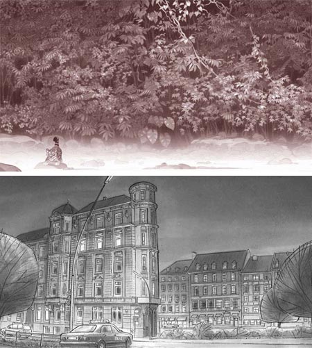
Matthias Lechner is a German born art director, production designer and visual development artist living and working in Vancouver, British Columbia, Canada.He is currently Art Director for a 3-D feature from Vangard animation called Space Chimps, but what I found most fascinating in his online galleries are the production and design drawings for a range of European (I think mostly German and Belgian) films that have unfortunately not made their way “across the pond”.
These mey be more familiar to European readers than they are to me, and include titles like Little Dodo (above, top), The Little Polarbear 2, Laura’s Star, Derrick (above, bottom), Globi and the Stolen Shadows, Troll-Story and Help, I’m as Fish, as well as several television productions.
Lechner’s monochromatic drawings for these are nothing short of wonderful. Mostly environments and backgrounds, they are simultaneously lush with detail and beautifully free, sharing the characteristics of a finished tone painting and a sketch.
His control of value and texture give these wash drawings an ability to evoke a place, atmosphere and time of day that could hardly be improved on by the addition of color. Lechner wields his monochromatic “palette” with uncanny aplomb. You will find a bit of color work for one of his productions; but as nicely handled as those pieces are, I don’t miss the color when looking through the rest of his portfolio.
What strikes me most is his ability to completely master the particular environment he is constructing; whether thick jungle foliage, craggy seacoast rocks, undersea pools lit by shafts of sunlight or the rich architectural details of European cities.
[Link via Man Arenas (see my previous post on Dodecaden/Man Arenas)]
Categories:
-
Giovanni Bellini
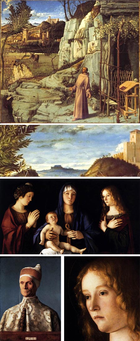
Those who think they don’t like dusty old Renaissance paintings of religious scenes might find themselves delightfully surprised if they took time to investigate some of the Renaissance painters more closely.There are astonishingly great painters in the history of art who often get less contemporary attention than they might because they are are eclipsed by the brighter stars of better known figures. One of these is the late Fifteenth, early Sixteenth Century Venetian painter Giovanni Bellini.
Bellini was on the cusp of several shifting paradigms, the shift from Gothic revival painting to the first flowering of the Renaissance, the shift from egg tempera to the remarkable new medium of oil painting (see my post on Rogier van der Weyden); and the adoption by painters of new ways of handling color and atmosphere, new methods of modeling the human face and form and new approaches to the representation of landscape, all of which were in part related to his experimentation and influence.
Bellini is considered the founder of the Venetian school of painting, and instrumental in the elevation of art from that city to a status in league with Rome and Florence, no small feat. His father, Jacopo Bellini, was an artist and one of the founders of the Renaissance style of painting. His brother, Gentile Bellini became a noted painter and official portrait artist of the Doges of Venice; and his brother in law was the painter Andrea Mantegna, quite a family.
Even in his early work in tempera, Bellini strove to convey the characteristics of natural light in the background landscapes of his paintings. Landscape as an art in itself would not really appear for centuries, but within the context of his religious themed paintings, Bellini was one of the great landscape artists. He brought to his landscapes, and to his figures and faces, a higher degree of realism and skillful modeling than his immediate predecessors and most of his contemporaries.
He experimented with the new medium of oil paint to great effect, achieving rich glowing passages of of color in layered glazes that paved the way for the painters of the High Renaissance who would follow.
He was also instrumental in introducing elements and techniques from the early masters of the Northern Renaissance to Venetian painting and Italian painting in general. Durer visited Bellini in Venice, and in 1506 wrote of him “He is very old, and still he is the best painter of them all.”
Giovanni Bellini became the official painter of the Venetian Republic (Venice was at the time an independent city-state), and the master of its most prestigious school; but his accomplishments were eventually outshone by those of his remarkable students Giorgione and, in particular, Titian.
The image at top, with a detail below it, is St Francis in the Desert, sometimes called St. Francis in Ecstasy. It is in the Frick Collection in New York, and it is quite amazing. The Frick web site has a zoomable version of this image, along with a selection of detail images which show fascinating details like a rabbit emerging from his burrow, just under St Francis’ outstretched right hand (the painting is full of understated religious symbolism).
The image at bottom left is a Portrait of Doge Loenardo Loredan, then Doge of Venice, and is remarkable not only for its realistic portrayal and the powerful presence of the face, but the beautiful rendering of his intricate garment.
Third down and with a detail at bottom right is Madonna and Child with Two Saints (detail here, click for enlarged version in each case), which shows Bellini’s beautiful naturalistic rendering of faces, where he has incorporated lessons learned form his contemporary Antonello da Messina, and is approaching the style of the High Renaissance.
There are many resources on the web for Giovani Bellini (and deservedly so), and I urge you to spend a few minutes exploring his wonderfully strange compositions, his remarkably rich and human portraits and the astonishing intricacies of his sculptural landscapes.
Look in particular at the resources where large reproductions of his images can be found, like WGA, ARC, and the individual museum listings, which often have zoomable images.
(My comment in the first paragraph about visual development artists and contemporary landscape painters who think they don’t like Renaissance painting only applies to a few, of course, but I wanted to specifically get their attention. One of my main goals with Lines and Colors is to get people to cross boundaries and discover treasures they’ve been missing.)
Categories:
-
Antonio Javier Caparo

Antonio Caparo is a Cuban born illustrator currently living and working in Toronto, Canada.Caparo studied graphic design at the High Institute of Design in Havana and devoted much of his early career to design, but gradually sifted his focus to illustration.
He has a muscular, energetic style that uses texture and tonal contrast to make his images pop off the page. They are at once realistically dimensional and freely stylized, sometimes in a cartoon-like direction. The result is a visual charm that immediately draws you in, and invites you to linger over the image.
He often opts for a muted palette and dark base tones, allowing him to give theatrical emphasis to key elements with passages of more intense color and lighter values.
Caparo’s images are often accented not only with textural variety, but with visual extras, incidental characters and little details.
I’ve found little information about his overall technique, but I know that some of his images are digitally painted, if only from their presence in his gallery on CGSociety.
There is also a Antonio Javier Caparo gallery on the new Tor Books site that I mentioned in a recent post, and a more extensive one on Shannon Associates, along with a brief bio.
Caparo has also done some comics work, notably for the American version of Heavy Metal magazine, and apparently still keeps his hand in as a graphic designer.
Outside of the online galleries mentioned above, Caparo doesn’t appear to have dedicated web site, but he started a blog just last month.
His latest book illustration project is The Magic Thief by Sarah Prineas, for which he created characters, places, animals, decorations, a typeface and maps for both the book and an interactive minisite devoted to the book on the Harper Collins site.
Categories:


Charley’s Picks
Bookshop.org
(Bookshop.org affilliate links; sales benefit independent bookshop owners; I get a small percentage to help support my work on Lines and Colors)

John Singer Sargent: Watercolors


Urban Sketching: Understanding Perspective


Charley’s Picks
Amazon
(Amazon.com affiliate links; sales go to a larger yacht for Jeff Bezos; but I get a small percentage to help support my work on Lines and Colors)
John Singer Sargent: Watercolors
Urban Sketching: Understanding Perspective