
Categories
- 3d CGI
- Amusements
- Animation
- Anime & Manga
- Art Materials
- Art Videos
- Blogroll
- Cartoons
- Color
- Comics
- Concept & Visual Dev.
- Creativity
- Digital Art
- Digital Painting
- Displaying Art on the Web
- Drawing
- Eye Candy for Today
- Gallery and Museum Art
- High-res Art Images
- Illustration
- Motion Graphics & Flash
- Museums
- Online Museums
- Outsider Art
- Painting
- Painting a Day
- Paleo Art
- Pastel, Conté & Chalk
- Pen & Ink
- Prints and Printmaking
- Reviews
- Sc-fi and Fantasy
- Sculpture & Dimensional
- Site Comments
- Sketching
- Storyboards
- Tools and Techniques
- Uncategorized
- Vector Art
- Videos & Podcasts
- Vision and Optics
- Watercolor and Gouache
- Webcomics
Archives
- April 2026
- March 2026
- February 2026
- January 2026
- December 2025
- November 2025
- October 2025
- September 2025
- August 2025
- July 2025
- June 2025
- May 2025
- January 2025
- December 2024
- November 2024
- October 2024
- September 2024
- August 2024
- June 2024
- April 2024
- March 2024
- February 2024
- January 2024
- December 2023
- November 2023
- October 2023
- September 2023
- August 2023
- July 2023
- May 2023
- April 2023
- March 2023
- February 2023
- January 2023
- December 2022
- November 2022
- September 2022
- August 2022
- July 2022
- June 2022
- May 2022
- April 2022
- March 2022
- February 2022
- January 2022
- December 2021
- November 2021
- October 2021
- September 2021
- August 2021
- July 2021
- June 2021
- May 2021
- April 2021
- March 2021
- February 2021
- January 2021
- December 2020
- November 2020
- October 2020
- September 2020
- August 2020
- July 2020
- June 2020
- May 2020
- April 2020
- March 2020
- February 2020
- January 2020
- December 2019
- November 2019
- October 2019
- September 2019
- August 2019
- July 2019
- June 2019
- May 2019
- April 2019
- March 2019
- February 2019
- January 2019
- December 2018
- November 2018
- October 2018
- September 2018
- August 2018
- July 2018
- June 2018
- May 2018
- April 2018
- March 2018
- February 2018
- January 2018
- December 2017
- November 2017
- October 2017
- September 2017
- August 2017
- July 2017
- June 2017
- May 2017
- April 2017
- March 2017
- February 2017
- January 2017
- December 2016
- November 2016
- October 2016
- September 2016
- August 2016
- July 2016
- June 2016
- May 2016
- April 2016
- March 2016
- February 2016
- January 2016
- December 2015
- November 2015
- October 2015
- September 2015
- August 2015
- July 2015
- June 2015
- May 2015
- April 2015
- March 2015
- February 2015
- January 2015
- December 2014
- November 2014
- October 2014
- September 2014
- August 2014
- July 2014
- June 2014
- May 2014
- April 2014
- March 2014
- February 2014
- January 2014
- December 2013
- November 2013
- October 2013
- September 2013
- August 2013
- July 2013
- June 2013
- May 2013
- April 2013
- March 2013
- February 2013
- January 2013
- December 2012
- November 2012
- October 2012
- September 2012
- August 2012
- July 2012
- June 2012
- May 2012
- April 2012
- March 2012
- February 2012
- January 2012
- December 2011
- November 2011
- October 2011
- September 2011
- August 2011
- July 2011
- June 2011
- May 2011
- April 2011
- March 2011
- February 2011
- January 2011
- December 2010
- November 2010
- October 2010
- September 2010
- August 2010
- July 2010
- June 2010
- May 2010
- April 2010
- March 2010
- February 2010
- January 2010
- December 2009
- November 2009
- October 2009
- September 2009
- August 2009
- July 2009
- June 2009
- May 2009
- April 2009
- March 2009
- February 2009
- January 2009
- December 2008
- November 2008
- October 2008
- September 2008
- August 2008
- July 2008
- June 2008
- May 2008
- April 2008
- March 2008
- February 2008
- January 2008
- December 2007
- November 2007
- October 2007
- September 2007
- August 2007
- July 2007
- June 2007
- May 2007
- April 2007
- March 2007
- February 2007
- January 2007
- December 2006
- November 2006
- October 2006
- September 2006
- August 2006
- July 2006
- June 2006
- May 2006
- April 2006
- March 2006
- February 2006
- January 2006
- December 2005
- November 2005
- October 2005
- September 2005
- August 2005
Relevant Blogs
Art, Painting & Sketch
- Gurney Journey
- Underpaintings
- Art and Influence
- Painting Perceptions
- Oil Painters of America
- Vasari Paint POV
- Flying Fox
- Urban Sketchers
- Bento (Smithsonian)
- Art Inconnu
- The Hidden Place
- Still Life
- Making a Mark
- The Art of the Landscape
- Exploring Color & Creativity
- Art Contrarian
- Artist A Day
- beinArt Surreal Art Collective
- Eye Level
- David Dunlop
- p.i.g.m.e.n.t.i.u.m
- CultureGrrl
- Joaquín Sorolla blog
- Artists in Pastel
“Painting a Day”
- A Painting a Day (Keiser)
- On Painting (Keiser)
- Julian Merrow-Smith
- Karen Jurick
- Jeffrey Hayes
- Carol Marine
- Abbey Ryan
- Daily Paintworks
Other Painting Blogs
- Virtual Gouache Land
- Neil Hollingsworth
- Marc Hanson
- Kevin Menck
- Marc Dalessio
- Larry Seiler
- Stapleton Kearns
- Colin Page
- Roos Schuring
- Hans Versfelt
- Titus Meeuws
- Régis Pettinari
- René Plein Air
- Belinda Del Pesco
- Robin Weiss
- Nathan Fowkes (Land Sketch)
- William Wray
- Frank Serrano
- Stephen Magsig
- Michael Chesley Johnson
- Twice a Week
- Sarah Wimperis
- Rob Adams
- Michael Cole Manley
- The Dirty Palette Club
- Mike Manley’s Draw!
Gallery Art & Illustration mix
Illustration
- Howard Pyle
- 100 Years of Illustration
- BibliOdyssey
- Illustration Art
- Today’s Inspiration
- Illustration Mundo
- Little Chimp Society
- Danny Gregory
- R D (John Martz
- Illustration Friday blog
- Monster Brains
- Illustrators & Illustrations (RU)
- Elwood H. Smith
- DaniDraws.com
- Designers Who Blog
- iSpot Blog
Sci-Fi & Fantasy
Illustration & Comics
Comics & Cartoons
- Comics Beat
- Robot 6
- Newsarama Blog
- Comic Vine
- Comics Alliance
- Forbidden Planet Int.
- Paolo Rivera
- Bolt City
- Flight
- Scott McCloud
- The Comics Journal
- Comixpedia
- Funnybook Babylon
- James Baker
- Middleton’s Sketchbook
- Boneville
- The Hotel Fred
- Paul Rivoche
- Daily Cartoonist
- Mad About Cartoons (William Wray)
- Digital Strips
Illustration & Concept
Animation & Concept
- Cartoon Brew
- Animation Blog
- Cold Hard Flash
- Concept Art World
- The CAB
- FY Concept Art
- Concept Ships
- Concept Robots
- John Nevarez
- Armand Serrano
- Marcos Mateu-Mestre
- all kinds of stuff (Kricfalusi)
- Yacin the faun (Man Arenas)
- Kelsey Mann
- Cre8tivemarks Blog
- Ice-Cream Monster Toon Cafe
- AAU Character & Creature Design
- AAU Animation Notes
- Articles and Texticles
Paleo & Scientific
Tools & Techniques
Other
Lists of Art Blogs
Art Image Resource Links
Historic Art Images
- Wikimedia Commons: Paintings
- Wikimedia Commons: Drawings
- The Athenaeum
- WikiArt (WikiPaintings)
- Google Art Project: Artists
- Google Art Project: Collections (Museums)
- ArtCyclopedia
- Web Gallery of Art
- Art Renewal Center
- Web Gallery of Impressionism
Auction Consolidation sites
Auction sites
- Sotheby’s
- Bonham’s
- Christies
- Heritage Auctions: Fine Art
- Heritage Auctions: Illustration
- Freeman’s Auctions
- Bukowskis
- Shannon’s
Image Search
Reverse Image Search (search by image)
- Tin Eye
- RevImg
- Google Image Search (camera icon)
- Bing Image Search (camera icon)
Promoting some friends and some clients of my website design business
- Twin Willows T’ai Chi studio in Wilmington DE. Taiji classes with Bryan Davis.
- Ray Hayward, Inspired Teacher of T’ai Chi ( Taiji ) in Minneapolis, Founder of Mindful Motion Tai Chi Academy
- OldHead Tattoo studio and Art Gallery in Wilmington DE. Tattoos and paintings by Bruce Gulick
- Sharon Domenico Art, pet portrait oil paintings
- Platinum Paperhanging, wallpaper hanging, Main Line and Philadelphia, PA
- Lisa Stone Design, interior designer, Main Line and Philadelphia, PA
- Studio12KPT, original art, prints, calendars and other custom printed items by Van Sickle & Rolleri
-
Jody Hewgill
Canadian illustrator Jody Hegwell’s illustrations seem almost constructed rather than simply painted, with subtle granular textures applied to curved sheets of delicately modeled color, which in turn are set into compositions in which the positive and negative spaces interlock like pieces of a puzzle, all set on a bedrock of solid cubist geometry.Her forceful arrangements of figures and background de-empahsize value and color contrast in favor of the iconic weight of forms in which the geometry of individual shapes is predominant.
Color seems to play a supporting role, adding emotional depth to the intensity of the images, and her work carries strong echos of Picasso, Modigliani and Rousseau.
Hegwell’s client list includes Rolling Stone, Entertainment Weekly, The Grammy Awards, Random House, Simon & Schuster, and Time-Warner. Her work has been featured in Communication Arts, Print Magazine, and Spectrum; and she has received awards from The Society of Illustrators, Spectrum, and The Design Club of Canada. She has also created a number of posters, some of which are in the Permanent Poster Collection of the Library of Congress.
Hewgill works in acrylic on gessoed board. On initial entry, her web site is divided into two separate sub-sites, for illustration and gallery art, though there is some cross-over.
Unfortunately, both sites are hampered by unnecessary pop-ups, roll-overs and browser resizing scripts, but it’s worth the effort to view her work.
You can also see her work in portfolios on illoz, and on the group portfolio/blog site Picture Mechanics.
Categories:
-
Michael Naples

Here is an interesting study in contrasts within the work of an artist that, to my eye, seems to be reaping the rewards of taking on the practice of daily painting, in terms of growth as an artist and noticeable increase in skill and confidence.Michael Naples has been doing portraits in graphite for ten years. In August of last year he started a regimen of a drawing a day, and initiated a corresponding blog. A month later, you can see apparent marked increase in control and technique between two drawings of a similar subject (August & September).
A few days later he has switched from a drawing a day to a painting a day and, as you scroll up the page (the blog is entirely displayed on one page, convenient once it’s loaded, but perhaps problematic as it grows), you can see a progression into stronger contrasts, bolder colors and more confident paint handling.
His daily paintings quickly become much more interesting, for me at least, than his more practiced portrait drawings. Though his portrait drawings are certainly competently rendered, they seem to be restrained the same limitations that often characterize portraits drawn from photographs: a vague softness, limited tonal range, and lack of defining line or strong chiaroscuro to give them the “punch” that a life drawing might have, uninhibited by the requirement of pleasing the subject with the result.
Naples’ current paintings from life, however, exhibit the opposite characteristics: bold compositions, bright energetic color, strong value contrasts and an overall confidence and enthusiasm that almost seem like the work of a different artist.
Perhaps I’m reading too much into this, interpreting an artist’s development from a series of blog posts, but I think you can see him progress through stages of experimentation, different approaches in brush handling, palette and composition and see a real progression in terms of his control of color, composition, value and command of the materials.
In Naples’ most recent work he has tended to frame simple subjects with warm, dark backgrounds, pushing them forward and modeling them with bold, lively brushstrokes and rich colors. Many of them exhibit a maturity as a painter that belie the short time since he undertook the daily painting routine to “get back into the groove of painting”.
You will also find his work on a daily painters group site, Daily Paintworks, which appears to be one of the stronger of the recent daily painter community sites. The site itself is new to me, but it seems I’ve written posts on all but two of the 12 current members.
Categories:
-
Arthur Adams
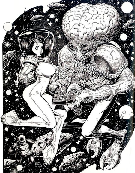
Art Adams first grabbed the attention of comic art fans with his work on the Marvel Comics’ mini-series Long Shot in the mid-80’s. He went on to work on major titles like X-Men and Fantastic Four for Marvel, as well as numerous titles for the other major American comic book publishers. In particular, he became know for his striking cover art, and developed an avid fan following.He was a co-founder of the Dark Horse Comics creator owned line “Legend”, where his Monkeyman and O’Brien feature ran as a back-up to Mike Mignola’s initial Hellboy mini-series. He co-created the Jonni Future series in Tom Strong’s Terrific Tales with writer Alan Moore.
Adams’ distinctive style combines intricate drawing, detailed rendering, and a light, cartoony touch that makes his work a cherry-topped ice cream treat for they eyes. He has a fondness for movie monsters, pulp science fiction subjects and a raft of pop culture influences that add up to a wonderfully fun visual toybox.
As snappy as his work looks in color, in particular on his many comic book covers, I’m particularly fond of it in its black and white “inks” state, where his penchant for spotting blacks and adding textures and hatching make for a rich pen and ink drawing meets superhero comics feeling.
As far as I can determine, Adams doesn’t have an official web presence. Fortunately, as a fan favorite, there are many unofficial galleries and pages devoted to his work, the most extensive of which is probably the 13-page gallery on Comic Art Community.
Some of his work was collected as a volume of the Modern Masters series devoted to contemporary comic book artists: Modern Masters, Vol. 6: Arthur Adams.
The image above is from his Sampler V, as reprinted in the recent Spectrum 14 collection (borrowed from Li-An’s post on the topic).
Categories:
-
Robert F. Walters

Scientific illustration is sometimes thought of as mundane, but there is an area where it crosses over into subject matter that is more dramatic, bizarre and wild than the most fevered dreams of Surrealist painters, fantasy illustrators or movie concept artists, namely paleo art.Dinosaurs can capture our imagination like few other aspects of the natural world. Ranging in size from tiny to gargantuan, with an astonishing variety of body shapes, plating, armor, horns, claws and almost unimaginable lengths of neck and tail, these glorious monsters are the dragons of our imaginations, except that they’re real.
When working in an area where reality frequently outdoes imagination, but everything is essentially a matter of educated guesswork, it’s sometimes difficult for artists to walk the line between trying to create accurate representations of these long-gone animals and trying to convey the sense of amazement they can spark in us.
Some paleo artists will let their desire for drama get away from them, and portray improbable scenes like 7 ton tyrannosaurs sprinting like cheetahs or 35 ton brachiosaurs rearing on their hind legs like giant elephants, ideas that stretch the limits of biology, physics and animal anatomy. One of the current fads is to represent all manner of dinosaurs as feathered, whether there is any direct evidence for feathering in that species or not.
The best reconstructions of long extinct species are just that, rigorous scientific reconstructions based on the physical data of fossilized bone, animal trackways and other evidence in the fossil record, combined with a thorough working knowledge of existing animal anatomy (plus a little physics, which might give a clue about how unlikely the above scenarios are). One of the problems here is that even trained paleontologists themselves are seldom anatomists, their training is in the study of fossils, but not necessarily in the physical anatomy of animals.
One of the major paleo artists that museums, publishers and paleontologists call on when they are most concerned with anatomical accuracy, combined with the artistic skills to make the animals and their environment as exciting and realistic as possible is Robert F. Walters.
Walters combines a keen understanding of animal anatomy, paleontology and natural history with an academic training as an artist. That, plus a flair for displaying scientifically accurate animal reconstructions in dramatic compositions, gives him a superb ability to portray prehistoric life in murals, illustrations and museum displays.
Walters’ background, interestingly enough, included an early career as a widely known science fiction artist. His covers and interior illustrations graced numerous science fiction books and magazines in the 70’s and 80’s. He was noted for his revival of the painstaking pen and ink stipple techniques employed by Virgil Finlay, as well as techniques that came out of his admiration for Joseph Clement Coll, Franklin Booth and other great pen and ink artists.
Fans of cyberpunk will recognize Walters as the cover artist for the original edition of True Names, the 1981 novella by Vernor Vinge that is generally acknowledged to be the first major work in that genre.
Walters’ fondness for golden age illustration carried over into his work as a paleo artist, with herds of dinosaurs roaming through landscapes ablaze with with Maxfield Parrish inspired colors.
Walters eventually curtailed his other work in favor of concentrating on dinosaurs as a paleontological life reconstruction artist. Along with his wife, Tess Kissinger, who is also a paleo artist and the author of an industry standard guide to copyright and contracts for dinosaur artists, he now heads a studio of paleontological artists and sculptors under the name of Walters & Kissinger.
I’ve had the pleasure of knowing Bob since high school, where we found we had a mutual interest in science fiction, comics, Dada and Surrealism, as well as Howard Pyle, N.C. Wyeth and the other great illustrators in the Delaware Art Museum and, of course, dinosaurs. We both also went on to study at the Pennsylvania Academy of the Fine Arts in Philadelphia, though at slightly different times.
Walters’ clients as a paleontological artist include The Smithsonian, The American Museum of Natural History, The Academy of Natural Sciences, Universal Studios, The National Aquarium, The Royal Tyrell Museum, The Discovery Channel and a long list of other notable museums, publishers and entertainment production companies.
Walters & Kissinger’s latest project has been their participation in the new installation and complete renovation of the dinosaur exhibits at the Carnegie Museum of Natural History, for which they have just finished the world’s largest dinosaur mural.
The mural is 15 feet high and 179 feet long (4.5m x 54m), wrapping around two walls of the gallery, a scale which allowed the portrayal of both giant dinosaurs and tiny mammals. The studio also created 100 illustrations and two additional murals for the exhibit. (You can read a news release here.) The mural was just awarded the prestigious Lanzendorf prize for 2-dimensional art by the Society of Vertebrate Paleontologists.
Like most modern large scale murals, this one was painted digitally and transferred to the walls by photomechanical process. Walters was one of the first paleontological artists to make the transition to digital painting. He paints with a Wacom tablet in Photoshop; in the case of large scale murals like this, producing enormous high-resolution files that tax the capabilities of high-end desktop computers. The image above, showing Diplodocus carnegii in all his 90 foot glory, is a crop from one section of the Carnegie mural. I’ve indicated the position of the crop on a representation of the whole mural at bottom.
You can see the entire mural as a scrolling animation on the home page of the Walters & Kissinger web site at dinoart.com. You can also see more detailed images from the mural here, and in a slide show on this page. There is also a gallery of older work on the site. Unfortunately the images there are much smaller. Even in larger images on the web, it can be difficult to get an appreciation for the details in texture, shading and color that go into his paintings.
If you have the chance, of course, the best way to see Walters’ striking paintings of prehistoric animals is to see something like the world’s largest dinosaur mural in person. If you’re not in Pittsburgh, check with the natural history museum near you; he has done work for a large number of museums around the U.S. and internationally.
Walters has also illustrated and painted covers for numerous dinosaur books, including the Jurassic Park Institute Dinosaur Field Guide, The Complete Dinosaur and the Big Book of Dinosaurs (which, at the surprising price of $10 for a large scale full-color book of dinosaur art, is probably one of the best introductions to his work).
Categories:
-
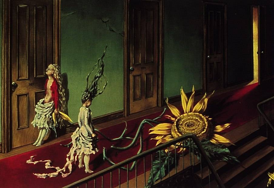
Dorothea Tanning
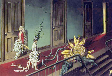
Dorothea Tanning was a librarian from Galesburg, Illinois who is now the oldest surviving member of the circle of Surrealist painters that was centered in Paris in the mid-20th Century.Tanning moved from Galesburg to Chicago at the age of 20, and studied painting by “looking at paintings in museums”, supplemented with some evening courses at the Academy of Fine Art. She then moved to New York, in the midst of the depression with $25 to her name, and found enough work as a commercial artist to survive.
She began exhibiting in galleries and her work attracted the attention of a group of expatriate Surrealists that included Yves Tanguy and Max Ernst. She and Ernst were later married, in a double wedding with Man Ray and Juliet Browner, and Tanning returned with Ernst to Paris, when she lived and worked for almost 30 years.
Tanning is thought of as a Surrealist and most noted for her haunting, dream-inspired works like Eine Kleine Nachtmusik (image above), the disconcerting nature of which belies the reference to Mozart’s cheery piece. The original is in the Tate Collection in London.
The Philadelphia Museum of Art mounted an exhibition of her work in 2000, when they acquired her well-known painting Birthday, a self portrait in which she appears in a hallway with a seemingly infinite sequence of doors, bare breasted in a feathered gown, with a sort of lemur-griffin at her feet. (Unfortunately, despite the attention given to the acquisition at the time, the painting is almost never on view; perhaps, as Surrealist works sometimes are, a victim of internal politics at the museum.)
Though known as a Surrealist, Tanning’s work past 1950 moved into other realms, in which softly splintered geometries of color mix with hints of representational forms. Tanning is also an established writer and poet, and has continued to work into her advanced age.
You are likely to find more books by her than about her, though there are a few; and she is often included, if briefly, in collections of Surrealist works.
There is a good interview with the artist from 2002 on Salon.
It’s a long way from the Galesburg, Illinois library to hanging out with Duchamp, Magritte, Picasso, Miro and Dylan Thomas. Perhaps Tanning was just headstrong and restless; or maybe she had vision, in addition to visions.
Categories:
-
Gerry Mooney

Back in the mid to late 90’s, when the webcomics landscape looked more like an empty plain dotted with tiny houses than today’s bustling metropolis, one of those houses was an online comic called Bugbots: The Mansect Rebellion.Created by husband and wife team Gerry and Viki Mooney, the strip had a fun, brash, 60’s Marvel feeling to it, with nice touches of humor thrown in. In the fourth issue, the comic became interactive, with panels that changed and revealed their word balloons on rollover. Unfortunately, that comic was eventually abandoned (or is ona long long hiatus), and the Mooneys moved on to other things.
Gerry Mooney, in addition to his continuing work in the areas of cartoon illustration, technical illustration and gallery painting, has ventured back into comics with a new graphic novel project called Sister Mary Dracula.
Based on a Flash animation that he created in 2001, it tells the story of fourth grader named Terry Malloy, a thinly-veiled stand in for Mooney himself as a schoolboy, who is convinced that one of his teachers at St. Egregius the Stricter Elementary, is, in fact, a vampire.
The 100 page story is being published in 20-page chapters, the first of which has been printed and is available through the site. You can read some sample pages on the site, as well as viewing the original animation. (I can’t give you direct links because the site is in frames and the navigation is in Flash.)
It may appear from the wording on the site that “Buy Chapter One” refers to purchasing a chapter of a webcomic, but it actually refers to an issue of the print comic (I think just due to the use of the word “chapter” instead of “issue”). The online pages are simply previews. They are large enough, though, to give a nice feeling for the light touch Mooney has applied to the drawing, with just enough tone work to set an appropriate mood for the story.
I don’t have the background to identify with a strict Catholic school upbringing, but I think most of us, particularly those who liked to draw in school when we were supposed to be doing other things, can find resonance in the protagonist’s experiences and flights of escapist fantasy.
Categories:


Charley’s Picks
Bookshop.org
(Bookshop.org affilliate links; sales benefit independent bookshop owners; I get a small percentage to help support my work on Lines and Colors)

John Singer Sargent: Watercolors


Urban Sketching: Understanding Perspective


Charley’s Picks
Amazon
(Amazon.com affiliate links; sales go to a larger yacht for Jeff Bezos; but I get a small percentage to help support my work on Lines and Colors)
John Singer Sargent: Watercolors
Urban Sketching: Understanding Perspective