
Categories
- 3d CGI
- Amusements
- Animation
- Anime & Manga
- Art Materials
- Art Videos
- Blogroll
- Cartoons
- Color
- Comics
- Concept & Visual Dev.
- Creativity
- Digital Art
- Digital Painting
- Displaying Art on the Web
- Drawing
- Eye Candy for Today
- Gallery and Museum Art
- High-res Art Images
- Illustration
- Motion Graphics & Flash
- Museums
- Online Museums
- Outsider Art
- Painting
- Painting a Day
- Paleo Art
- Pastel, Conté & Chalk
- Pen & Ink
- Prints and Printmaking
- Reviews
- Sc-fi and Fantasy
- Sculpture & Dimensional
- Site Comments
- Sketching
- Storyboards
- Tools and Techniques
- Uncategorized
- Vector Art
- Videos & Podcasts
- Vision and Optics
- Watercolor and Gouache
- Webcomics
Archives
- April 2026
- March 2026
- February 2026
- January 2026
- December 2025
- November 2025
- October 2025
- September 2025
- August 2025
- July 2025
- June 2025
- May 2025
- January 2025
- December 2024
- November 2024
- October 2024
- September 2024
- August 2024
- June 2024
- April 2024
- March 2024
- February 2024
- January 2024
- December 2023
- November 2023
- October 2023
- September 2023
- August 2023
- July 2023
- May 2023
- April 2023
- March 2023
- February 2023
- January 2023
- December 2022
- November 2022
- September 2022
- August 2022
- July 2022
- June 2022
- May 2022
- April 2022
- March 2022
- February 2022
- January 2022
- December 2021
- November 2021
- October 2021
- September 2021
- August 2021
- July 2021
- June 2021
- May 2021
- April 2021
- March 2021
- February 2021
- January 2021
- December 2020
- November 2020
- October 2020
- September 2020
- August 2020
- July 2020
- June 2020
- May 2020
- April 2020
- March 2020
- February 2020
- January 2020
- December 2019
- November 2019
- October 2019
- September 2019
- August 2019
- July 2019
- June 2019
- May 2019
- April 2019
- March 2019
- February 2019
- January 2019
- December 2018
- November 2018
- October 2018
- September 2018
- August 2018
- July 2018
- June 2018
- May 2018
- April 2018
- March 2018
- February 2018
- January 2018
- December 2017
- November 2017
- October 2017
- September 2017
- August 2017
- July 2017
- June 2017
- May 2017
- April 2017
- March 2017
- February 2017
- January 2017
- December 2016
- November 2016
- October 2016
- September 2016
- August 2016
- July 2016
- June 2016
- May 2016
- April 2016
- March 2016
- February 2016
- January 2016
- December 2015
- November 2015
- October 2015
- September 2015
- August 2015
- July 2015
- June 2015
- May 2015
- April 2015
- March 2015
- February 2015
- January 2015
- December 2014
- November 2014
- October 2014
- September 2014
- August 2014
- July 2014
- June 2014
- May 2014
- April 2014
- March 2014
- February 2014
- January 2014
- December 2013
- November 2013
- October 2013
- September 2013
- August 2013
- July 2013
- June 2013
- May 2013
- April 2013
- March 2013
- February 2013
- January 2013
- December 2012
- November 2012
- October 2012
- September 2012
- August 2012
- July 2012
- June 2012
- May 2012
- April 2012
- March 2012
- February 2012
- January 2012
- December 2011
- November 2011
- October 2011
- September 2011
- August 2011
- July 2011
- June 2011
- May 2011
- April 2011
- March 2011
- February 2011
- January 2011
- December 2010
- November 2010
- October 2010
- September 2010
- August 2010
- July 2010
- June 2010
- May 2010
- April 2010
- March 2010
- February 2010
- January 2010
- December 2009
- November 2009
- October 2009
- September 2009
- August 2009
- July 2009
- June 2009
- May 2009
- April 2009
- March 2009
- February 2009
- January 2009
- December 2008
- November 2008
- October 2008
- September 2008
- August 2008
- July 2008
- June 2008
- May 2008
- April 2008
- March 2008
- February 2008
- January 2008
- December 2007
- November 2007
- October 2007
- September 2007
- August 2007
- July 2007
- June 2007
- May 2007
- April 2007
- March 2007
- February 2007
- January 2007
- December 2006
- November 2006
- October 2006
- September 2006
- August 2006
- July 2006
- June 2006
- May 2006
- April 2006
- March 2006
- February 2006
- January 2006
- December 2005
- November 2005
- October 2005
- September 2005
- August 2005
Relevant Blogs
Art, Painting & Sketch
- Gurney Journey
- Underpaintings
- Art and Influence
- Painting Perceptions
- Oil Painters of America
- Vasari Paint POV
- Flying Fox
- Urban Sketchers
- Bento (Smithsonian)
- Art Inconnu
- The Hidden Place
- Still Life
- Making a Mark
- The Art of the Landscape
- Exploring Color & Creativity
- Art Contrarian
- Artist A Day
- beinArt Surreal Art Collective
- Eye Level
- David Dunlop
- p.i.g.m.e.n.t.i.u.m
- CultureGrrl
- Joaquín Sorolla blog
- Artists in Pastel
“Painting a Day”
- A Painting a Day (Keiser)
- On Painting (Keiser)
- Julian Merrow-Smith
- Karen Jurick
- Jeffrey Hayes
- Carol Marine
- Abbey Ryan
- Daily Paintworks
Other Painting Blogs
- Virtual Gouache Land
- Neil Hollingsworth
- Marc Hanson
- Kevin Menck
- Marc Dalessio
- Larry Seiler
- Stapleton Kearns
- Colin Page
- Roos Schuring
- Hans Versfelt
- Titus Meeuws
- Régis Pettinari
- René Plein Air
- Belinda Del Pesco
- Robin Weiss
- Nathan Fowkes (Land Sketch)
- William Wray
- Frank Serrano
- Stephen Magsig
- Michael Chesley Johnson
- Twice a Week
- Sarah Wimperis
- Rob Adams
- Michael Cole Manley
- The Dirty Palette Club
- Mike Manley’s Draw!
Gallery Art & Illustration mix
Illustration
- Howard Pyle
- 100 Years of Illustration
- BibliOdyssey
- Illustration Art
- Today’s Inspiration
- Illustration Mundo
- Little Chimp Society
- Danny Gregory
- R D (John Martz
- Illustration Friday blog
- Monster Brains
- Illustrators & Illustrations (RU)
- Elwood H. Smith
- DaniDraws.com
- Designers Who Blog
- iSpot Blog
Sci-Fi & Fantasy
Illustration & Comics
Comics & Cartoons
- Comics Beat
- Robot 6
- Newsarama Blog
- Comic Vine
- Comics Alliance
- Forbidden Planet Int.
- Paolo Rivera
- Bolt City
- Flight
- Scott McCloud
- The Comics Journal
- Comixpedia
- Funnybook Babylon
- James Baker
- Middleton’s Sketchbook
- Boneville
- The Hotel Fred
- Paul Rivoche
- Daily Cartoonist
- Mad About Cartoons (William Wray)
- Digital Strips
Illustration & Concept
Animation & Concept
- Cartoon Brew
- Animation Blog
- Cold Hard Flash
- Concept Art World
- The CAB
- FY Concept Art
- Concept Ships
- Concept Robots
- John Nevarez
- Armand Serrano
- Marcos Mateu-Mestre
- all kinds of stuff (Kricfalusi)
- Yacin the faun (Man Arenas)
- Kelsey Mann
- Cre8tivemarks Blog
- Ice-Cream Monster Toon Cafe
- AAU Character & Creature Design
- AAU Animation Notes
- Articles and Texticles
Paleo & Scientific
Tools & Techniques
Other
Lists of Art Blogs
Art Image Resource Links
Historic Art Images
- Wikimedia Commons: Paintings
- Wikimedia Commons: Drawings
- The Athenaeum
- WikiArt (WikiPaintings)
- Google Art Project: Artists
- Google Art Project: Collections (Museums)
- ArtCyclopedia
- Web Gallery of Art
- Art Renewal Center
- Web Gallery of Impressionism
Auction Consolidation sites
Auction sites
- Sotheby’s
- Bonham’s
- Christies
- Heritage Auctions: Fine Art
- Heritage Auctions: Illustration
- Freeman’s Auctions
- Bukowskis
- Shannon’s
Image Search
Reverse Image Search (search by image)
- Tin Eye
- RevImg
- Google Image Search (camera icon)
- Bing Image Search (camera icon)
Promoting some friends and some clients of my website design business
- Twin Willows T’ai Chi studio in Wilmington DE. Taiji classes with Bryan Davis.
- Ray Hayward, Inspired Teacher of T’ai Chi ( Taiji ) in Minneapolis, Founder of Mindful Motion Tai Chi Academy
- OldHead Tattoo studio and Art Gallery in Wilmington DE. Tattoos and paintings by Bruce Gulick
- Sharon Domenico Art, pet portrait oil paintings
- Platinum Paperhanging, wallpaper hanging, Main Line and Philadelphia, PA
- Lisa Stone Design, interior designer, Main Line and Philadelphia, PA
- Studio12KPT, original art, prints, calendars and other custom printed items by Van Sickle & Rolleri
-
John Henry Twachtman

Like Edmund Tarbell, John Twachtman is usually labeled an “American Impressionist”. Also like Tarbell, that essentially means he took what he liked from French Impressionism and generally went his own way.In Twachtman’s case, what he took was the light and atmosphere, the fascination for brilliantly lit landscape, the free and direct application of paint and the rich color captured by painting en plein air.
What he left out were the separate dabs of pure color, “optical color mixing” and Impressionist theories, substituting instead a fascination for the texture of roughly applied brushstrokes, scumbled pigment, drybrush effects and large blocks of color that presaged Cezanne’s eventual trek up the mountain of abstraction.
Twtchman’s approach varied throughout his career and reached in both directions through time. His palette was often darker than the French Impressionists, owing more to Courbet than Monet, and his Whistler-influenced masses of soft color reached past Impressionism to what would later be called “Post-Impressionism” and knocked on the door of Modernism.
Twachtman was born in Ohio and studied with Frank Duveneck. He traveled to Europe with Duvenek and William Merrit Chase, studying in Munich, Venice and Paris, where his paintings took on the soft look sometimes called “tonalist” as in the beautiful example above, Arques-la-Bataille, now in the collection of the Metropolitan Museum of Art in New York.
After returning to America, he settled in Connecticut, married and spent many years painting his own house and gardens. He was good friends with J. Alden Weir; and along with Weir, Childe Hassam, Frank Benson, Edmund Tarbell and others, formed the “Ten American Painters”, a loose alliance of Impressionist-influenced painters, mostly in New York and Boston, who were linked primarily for their desire to push outside the bounds of traditional art.
I don’t know of any individual books on Twachtman that I can recommend, although you’ll find him in books on American Impressionism.
As you look through Twachtman’s paintings and graphics (he was an accomplished etcher), don’t be too quick to judge whether you like his work until you have sampled it from several points in the history of his many stylistic reinventions.
Twachtman was restless in his approach, but his paintings can be the essence of tranquility.
Categories:
-
Jacek Yerka

You will often find contemporary artists, particularly young artists, who become so fascinated with Surrealism, or a particular Surrealist, that they immerse themselves in that artist’s style, as if trying to live in their skin. The results are usually less than inspiring.Polish artist Jacek Yerka, on the other hand, has swum in the Surrealist oceans, absorbed the influences of Surrealists like Dali and Magritte through his pores, gulped in the turgid waters of Brueghel and Bocsh, bathed in the calm pools of Northern European masters and tuned his sonar to the frequencies of Escher.
To this heady brew he has added his own other-worldly visions and produced a unique synthesis of fantastic art. Yerka borrows tools from those masters, but bends gravity, reverses time and pulls reality out of its own hat in his own unique way.
His bright, sharp-focused acrylics make outside in, up down, and near far. Walls and doors exchange places with trees and sky. Cities float and blow away as they age. Sea and sand change roles, household objects become towns, buildings become land, land becomes animals, animals become mountains and islands. Hidden worlds wait around every corner and magic seeps through every door.
There is a book of Yerka’s work matched to the writing of science fiction author Harlan Ellison, Mind Fields: The Art of Jacek Yerka, the Fiction of Harlan Ellison and a collection, The Fantastic Art of Jacek Yerka.
Yerka is one of those delightful artists that I have a very hard time picking a single image for. It would be difficult to pick any single image and say it was “representative” of his work. I picked this one because I like it, but I like many of his images. Dive in, and swim through Yerka’s sea of imagination for yourself.
Categories:
-
Big Spanish Castle and
e-Chalk color perception Here are a couple of interesting diversions that dramatically illustrate the degree to which color perception is controlled by the effect of previous or adjacent colors.
The first, Big Spanish Castle, is a simple, but dramatic and fun, color-based optical illusion. Based on the visual effects of complementary colors and the optical/brain phenomenon known as an afterimage, the illusion is similar to others in which these principles are used, as in the American Flag illusion on the Wikipedia page for afterimage.
In this case, however, the effect has been cleverly combined with a photograph for a fun and striking effect.
Go to the page linked here, and below, which is posted by graphic designer John Sadowski. There you will find a larger version of the image at top-left. Stare at the dot in the center of the image for 30 seconds (the one on the linked page, not the one here) and then, without moving your eyes, mouse over the image; and you will see what appears to be a color photograph. Once you move your eyes, however, you will find that the photograph is, in fact, black and white. Fascinating.
Sadowski gives links to instructions for creating your own version of the illusion (requires Photoshop), and a list of various versions of the illusion that people have sent in.
The second, which is one of three color perception demonstrations on e-Chalk (image at left, bottom), is one of the most dramatic examples I have seen of how adjacent colors affect the perception of the value and hue of a color.
Choose the “illusion 1” button at the bottom of the page. The interface requires Flash (which you probably have) and allows you to move a dragable mask over the image, isolating two parts of it that look initially to be radically different colors, dark blue-gray and bright yellow, but are demonstrated to actually be the same color. The effect is quite dramatic. The other two experiments are similar in nature.
There is also a related image on the Wikipedia page for optical illusions that demonstrates the same principle, but with the value of a gray tone. It requires a bit more work on your part to view the proof but the effect is also striking.
All of them demonstrate that color, like beauty, is in the eye of the beholder.
Categories:
-
Pencils!
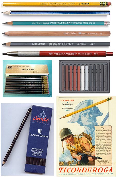
It’s often said that the greatest joy comes from the simplest things.In these days of gel pens, precision markers, synthetic brushes, high-tech plastic paints and digital painting software, it’s easy to overlook the humble pencil, which was actually something of a technological marvel itself at one time.
Pencils were created after the first major deposit of pure solid graphite was discovered in England sometime in the 1500’s. The graphite was first thought to be coal (which it technically is), and then, because it didn’t burn easily, mistakenly thought to be a form of lead. It was initially used for medicinal purposes and then to line cannonball molds; and for a while its use for anything else was strictly controlled and export forbidden (war before art, as always).
It was soon realized that the new substance (which, like diamond, is an allotrope of carbon created under high pressure and heat) was useful for making marks, hence the name graphite.
The first graphite pencils (from the latin pencillus, “little tail”) were made in Keswick, England by wrapping rough pieces of the graphite in sheepskin. One of the early uses, in fact, was for marking sheep there in the countryside where the graphite was discovered.
It was the Italians who first encased the graphite in wooden holders (the modern form of which uses incense cedar), and Dutch traders who spread the new drawing instruments to artists throughout Europe.
In 1795, during the Napoleonic wars when English pencils were not available to the French, Nicholas Conté, an officer in the French army, discovered that mixing amorphous (powdered) graphite with fine clay and firing the mixture in a furnace could produce a substitute for the rare solid form from the original English deposit, (which was the only such deposit known and would eventually run out in 1890).
In addition, Conté realized that altering the proportions of the clay to graphite mixture produced varying degrees of hardness. Conté originally pressed the graphite and clay mixture into sticks, called Conté Crayons, setting them apart from other drawing and writing crayons, which were chalks; and the mixture itself was called Conté. Modern Conté Crayons (image above, middle right) ironically are refined versions of chalk crayons.
Eventually Conté’s mixtures were encased in wood, as with the Engilsh solid form of graphite, thus producing the modern pencil as we know it today.
Pencils have had a colorful history in the social, political and scientific realms as well as in art. In recent times, famous pencil brands and models have come and gone with great devotion from artists and writers alike, from the legendary Eberhard Faber Blackwing 602 (a favorite writing tool of John Steinbeck and Tom Wolfe, also loved by artists, now discontinued and selling on eBay for up to $20 each), to the Sanford Design Ebony Pencil (smooooth), to the good old Dixon Ticonderoga (inexpensive and great).
There are all manner of mechanical pencils too, of course. One of my favorite forms of pencils for drawing is the 2mm leadholder, or drafting pencil (red Koh-I-Noor model shown above), which I wrote about in this post and is a favorite among professional comic book artists.
There are some good books on pencil drawing. Some of them are unfortunately out of print classics, but still available: The Art of Pencil Drawing by Ernest W. Watson, and my personal favorites (but perhaps a bit dated looking for some) Rendering in Pencil and Pencil Drawing Step by Step by Arthur L. Guptill. (Together they are the Watson and Guptill of Watson-Guptill art book publishers.)
Below are a number of links to pencil related sites and blogs from my bookmarks; particularly note The Pencil Pages, a large site with lots of pencil info that includes reproductions of classic pencil advertisements (above, right), and the Pencil Revolution blog, which is devoted to increasing appreciation of this humble marvel of drawing technology.
Categories:
-
MKZDK

Beautiful fractal-based tessellations by Stephen Miller. The “visions” section contains the images, with links to downloadable desktop-size files. “Cosmos” is quotes on cosmology from various sources. “Lounge” and “Site” are mixed bags. This site has been on the Net as long as I can remember (and that’s going back to when the Internet was considered a “fad” for geeks and nerds). It hasn’t been updated recently, but is still nice digital eye-candy.“Visions” page has links to images on the side, small oval links to additional galleries at the bottom. If you like the images, don’t miss the small text links to the Archives in the text of the page. There’s more variety and experimantation in the older work.
Categories:
-
Art Out Loud
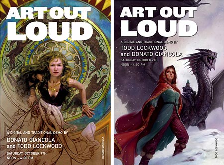
There are a number of illustrators and artists who have posted demonstrations of their painting techniques online, but how much better it is when you can see artists demonstrate their working process in person.Art Out Loud is a series of demos at the Society of Illustrators in New York, conceived and arranged by Tor/Forge Books Art Director Irene Gallo (who I recently profiled here) and illustrator Daniel Dos Santos.
There are two events scheduled for this Fall. The first is on Saturday, October 7th, 2006 from Noon to 4:00 and features science fiction greats Donato Giancola (image above, left), and Todd Lockwood (above, right), both of whom I’ve profiled here on lines and colors.
Giancola will give a demonstration of his oil painting technique, which owes a great deal to old master painting fundamentals, and Lockwood will demonstrate his digital painting techniques. It should be a fascinating comparison as both artists have a great respect for the old masters and the great illustrators of the Golden Age.
The next event will be on Saturday November 11th, 2006 from Noon to 4:00, and will feature James Bennett, Gary Kelly and Greg Manchess, who I also recently profiled on lines and colors.
There is additional information and images on this post on Gallos’ blog, The Art Department.
Past events have sold out, so early registration would be a good idea.
Categories:


Charley’s Picks
Bookshop.org
(Bookshop.org affilliate links; sales benefit independent bookshop owners; I get a small percentage to help support my work on Lines and Colors)

John Singer Sargent: Watercolors


Urban Sketching: Understanding Perspective


Charley’s Picks
Amazon
(Amazon.com affiliate links; sales go to a larger yacht for Jeff Bezos; but I get a small percentage to help support my work on Lines and Colors)
John Singer Sargent: Watercolors
Urban Sketching: Understanding Perspective