
Categories
- 3d CGI
- Amusements
- Animation
- Anime & Manga
- Art Materials
- Art Videos
- Blogroll
- Cartoons
- Color
- Comics
- Concept & Visual Dev.
- Creativity
- Digital Art
- Digital Painting
- Displaying Art on the Web
- Drawing
- Eye Candy for Today
- Gallery and Museum Art
- High-res Art Images
- Illustration
- Motion Graphics & Flash
- Museums
- Online Museums
- Outsider Art
- Painting
- Painting a Day
- Paleo Art
- Pastel, Conté & Chalk
- Pen & Ink
- Prints and Printmaking
- Reviews
- Sc-fi and Fantasy
- Sculpture & Dimensional
- Site Comments
- Sketching
- Storyboards
- Tools and Techniques
- Uncategorized
- Vector Art
- Videos & Podcasts
- Vision and Optics
- Watercolor and Gouache
- Webcomics
Archives
- June 2026
- May 2026
- April 2026
- March 2026
- February 2026
- January 2026
- December 2025
- November 2025
- October 2025
- September 2025
- August 2025
- July 2025
- June 2025
- May 2025
- January 2025
- December 2024
- November 2024
- October 2024
- September 2024
- August 2024
- June 2024
- April 2024
- March 2024
- February 2024
- January 2024
- December 2023
- November 2023
- October 2023
- September 2023
- August 2023
- July 2023
- May 2023
- April 2023
- March 2023
- February 2023
- January 2023
- December 2022
- November 2022
- September 2022
- August 2022
- July 2022
- June 2022
- May 2022
- April 2022
- March 2022
- February 2022
- January 2022
- December 2021
- November 2021
- October 2021
- September 2021
- August 2021
- July 2021
- June 2021
- May 2021
- April 2021
- March 2021
- February 2021
- January 2021
- December 2020
- November 2020
- October 2020
- September 2020
- August 2020
- July 2020
- June 2020
- May 2020
- April 2020
- March 2020
- February 2020
- January 2020
- December 2019
- November 2019
- October 2019
- September 2019
- August 2019
- July 2019
- June 2019
- May 2019
- April 2019
- March 2019
- February 2019
- January 2019
- December 2018
- November 2018
- October 2018
- September 2018
- August 2018
- July 2018
- June 2018
- May 2018
- April 2018
- March 2018
- February 2018
- January 2018
- December 2017
- November 2017
- October 2017
- September 2017
- August 2017
- July 2017
- June 2017
- May 2017
- April 2017
- March 2017
- February 2017
- January 2017
- December 2016
- November 2016
- October 2016
- September 2016
- August 2016
- July 2016
- June 2016
- May 2016
- April 2016
- March 2016
- February 2016
- January 2016
- December 2015
- November 2015
- October 2015
- September 2015
- August 2015
- July 2015
- June 2015
- May 2015
- April 2015
- March 2015
- February 2015
- January 2015
- December 2014
- November 2014
- October 2014
- September 2014
- August 2014
- July 2014
- June 2014
- May 2014
- April 2014
- March 2014
- February 2014
- January 2014
- December 2013
- November 2013
- October 2013
- September 2013
- August 2013
- July 2013
- June 2013
- May 2013
- April 2013
- March 2013
- February 2013
- January 2013
- December 2012
- November 2012
- October 2012
- September 2012
- August 2012
- July 2012
- June 2012
- May 2012
- April 2012
- March 2012
- February 2012
- January 2012
- December 2011
- November 2011
- October 2011
- September 2011
- August 2011
- July 2011
- June 2011
- May 2011
- April 2011
- March 2011
- February 2011
- January 2011
- December 2010
- November 2010
- October 2010
- September 2010
- August 2010
- July 2010
- June 2010
- May 2010
- April 2010
- March 2010
- February 2010
- January 2010
- December 2009
- November 2009
- October 2009
- September 2009
- August 2009
- July 2009
- June 2009
- May 2009
- April 2009
- March 2009
- February 2009
- January 2009
- December 2008
- November 2008
- October 2008
- September 2008
- August 2008
- July 2008
- June 2008
- May 2008
- April 2008
- March 2008
- February 2008
- January 2008
- December 2007
- November 2007
- October 2007
- September 2007
- August 2007
- July 2007
- June 2007
- May 2007
- April 2007
- March 2007
- February 2007
- January 2007
- December 2006
- November 2006
- October 2006
- September 2006
- August 2006
- July 2006
- June 2006
- May 2006
- April 2006
- March 2006
- February 2006
- January 2006
- December 2005
- November 2005
- October 2005
- September 2005
- August 2005
Relevant Blogs
Art, Painting & Sketch
- Gurney Journey
- Underpaintings
- Art and Influence
- Painting Perceptions
- Oil Painters of America
- Vasari Paint POV
- Flying Fox
- Urban Sketchers
- Bento (Smithsonian)
- Art Inconnu
- The Hidden Place
- Still Life
- Making a Mark
- The Art of the Landscape
- Exploring Color & Creativity
- Art Contrarian
- Artist A Day
- beinArt Surreal Art Collective
- Eye Level
- David Dunlop
- p.i.g.m.e.n.t.i.u.m
- CultureGrrl
- Joaquín Sorolla blog
- Artists in Pastel
“Painting a Day”
- A Painting a Day (Keiser)
- On Painting (Keiser)
- Julian Merrow-Smith
- Karen Jurick
- Jeffrey Hayes
- Carol Marine
- Abbey Ryan
- Daily Paintworks
Other Painting Blogs
- Virtual Gouache Land
- Neil Hollingsworth
- Marc Hanson
- Kevin Menck
- Marc Dalessio
- Larry Seiler
- Stapleton Kearns
- Colin Page
- Roos Schuring
- Hans Versfelt
- Titus Meeuws
- Régis Pettinari
- René Plein Air
- Belinda Del Pesco
- Robin Weiss
- Nathan Fowkes (Land Sketch)
- William Wray
- Frank Serrano
- Stephen Magsig
- Michael Chesley Johnson
- Twice a Week
- Sarah Wimperis
- Rob Adams
- Michael Cole Manley
- The Dirty Palette Club
- Mike Manley’s Draw!
Gallery Art & Illustration mix
Illustration
- Howard Pyle
- 100 Years of Illustration
- BibliOdyssey
- Illustration Art
- Today’s Inspiration
- Illustration Mundo
- Little Chimp Society
- Danny Gregory
- R D (John Martz
- Illustration Friday blog
- Monster Brains
- Illustrators & Illustrations (RU)
- Elwood H. Smith
- DaniDraws.com
- Designers Who Blog
- iSpot Blog
Sci-Fi & Fantasy
Illustration & Comics
Comics & Cartoons
- Comics Beat
- Robot 6
- Newsarama Blog
- Comic Vine
- Comics Alliance
- Forbidden Planet Int.
- Paolo Rivera
- Bolt City
- Flight
- Scott McCloud
- The Comics Journal
- Comixpedia
- Funnybook Babylon
- James Baker
- Middleton’s Sketchbook
- Boneville
- The Hotel Fred
- Paul Rivoche
- Daily Cartoonist
- Mad About Cartoons (William Wray)
- Digital Strips
Illustration & Concept
Animation & Concept
- Cartoon Brew
- Animation Blog
- Cold Hard Flash
- Concept Art World
- The CAB
- FY Concept Art
- Concept Ships
- Concept Robots
- John Nevarez
- Armand Serrano
- Marcos Mateu-Mestre
- all kinds of stuff (Kricfalusi)
- Yacin the faun (Man Arenas)
- Kelsey Mann
- Cre8tivemarks Blog
- Ice-Cream Monster Toon Cafe
- AAU Character & Creature Design
- AAU Animation Notes
- Articles and Texticles
Paleo & Scientific
Tools & Techniques
Other
Lists of Art Blogs
Art Image Resource Links
Historic Art Images
- Wikimedia Commons: Paintings
- Wikimedia Commons: Drawings
- The Athenaeum
- WikiArt (WikiPaintings)
- Google Art Project: Artists
- Google Art Project: Collections (Museums)
- ArtCyclopedia
- Web Gallery of Art
- Art Renewal Center
- Web Gallery of Impressionism
Auction Consolidation sites
Auction sites
- Sotheby’s
- Bonham’s
- Christies
- Heritage Auctions: Fine Art
- Heritage Auctions: Illustration
- Freeman’s Auctions
- Bukowskis
- Shannon’s
Image Search
Reverse Image Search (search by image)
- Tin Eye
- RevImg
- Google Image Search (camera icon)
- Bing Image Search (camera icon)
Promoting some friends and some clients of my website design business
- Twin Willows T’ai Chi studio in Wilmington DE. Taiji classes with Bryan Davis.
- Ray Hayward, Inspired Teacher of T’ai Chi ( Taiji ) in Minneapolis, Founder of Mindful Motion Tai Chi Academy
- OldHead Tattoo studio and Art Gallery in Wilmington DE. Tattoos and paintings by Bruce Gulick
- Sharon Domenico Art, pet portrait oil paintings
- Platinum Paperhanging, wallpaper hanging, Main Line and Philadelphia, PA
- Lisa Stone Design, interior designer, Main Line and Philadelphia, PA
- Studio12KPT, original art, prints, calendars and other custom printed items by Van Sickle & Rolleri
-
Designing your web site

How to Display Your Art on the Web: Part 5
[This is part of a series of articles for which the introduction and list of articles is here. If you haven’t read the introduction yet, it would be helpful to read it first.]
OK, big news flash here, in case you weren’t aware of it, but artists, even good artists, don’t necessarily know squat about graphic design. (Gasp!) Yes, true fact: art and design are two different skill sets, even though there is some cross over. Sorry if I’m stepping on any toes, but if you want proof, look no further than the endless array of horribly designed artists’ web sites already out there.
To make matters worse, traditional print designers, even good ones, don’t necessarily know squat about web site design. Again, it’s two different skill sets, though the overlap is much more extensive.
Print designers, if they know their craft, can specify a page design that turns out in print precisely as they designed it, with pinpoint placement of graphic elements, total typographical control and exactly specified colors.
The web, on the other hand, still offers very limited typographical control; color space and page size vary between operating systems and individual computers; and even web pages designed by pros, that once looked fine across the board, can go wonky with the newest release of the most popular browser from The Giant Software Company That Shall Not Be Named. The web is wiggly and squirmy, and designing for pages that can be different sizes and shapes on different computers is a little like eating Jell-O with a fork; it can drive stout-hearted print designers to madness and acts of desperation.
Alternatives
You have some of the same alternatives I mentioned in my article on Building your site, notably hiring a professional and using, or starting with and altering, existing page templates. I can’t give you a course in design here, but I can try to point out some important considerations.Size and proportion
Here’s where web design gets all twitchy right off the bat. Unlike print design, you don’t know the final size or shape of the area in which your design will display; it varies from computer to computer among those viewing your site over the web. EEK! This understandably drives long-time print designers completely crazy, and they will very often make their pages un-web-like by freezing them at a set width and height, or popping them up in a specifically sized window, and otherwise trying to make them behave like print pages. This is one option if it makes life easier for you, but I think it’s better to approach a web page as a web page and take advantage of the fact that it can shrink and grow to accommodate different amounts of content. Web design has lots of advantages over print design, it’s not all disadvantages.While you can’t predict the exact size in which viewers will be seeing your pages, you can predict the most likely “window”, based on statistics. Most people are viewing the web in one of several common screen resolutions. The most common, as measured in pixels, are: 1024 x 768, 800 x 600 and 1280 x 1024, in order of current popularity. These figures change over time as more people buy larger monitors. Up until a couple of years ago, I was designing for 800 x 600, but smaller monitors are giving way to larger and I now design sites to display comfortably in 1024 x 768, and try to nicely accommodate the way they will look in higher resolutions.
How big is that doggie in the window?
Taking into consideration typical “browser chrome”, the space taken up by the browser interface and all its wonderful widgets and tool bars, and allowing a little extra wiggle room, I work within a “safe” size of 980 x 550. The page can be longer vertically, of course, but that initial size before the user starts scrolling (if they take the trouble to scroll) is the most important. Try to keep your most important content, navigation elements, etc. “above the fold” in that window. (“Above the fold” is a reference to the front page of newspapers, in which the most important stuff has to be seen when the papers are folded in half on the stack.) You may want to leave more or less in terms of horizontal margins. On larger resolutions, the background will expand to fill out the difference.Remember in designing your page elements that you don’t want to force part of your main image gallery display, or the gallery navigation, below the bottom of the window so users have to scroll to see or use it.
Would you like ice with that?
The content area of your design can either change width with the window width (“fluid”), be a set width, locked to the upper left (“ice”), or be a set width that floats to the center of the window, with the background expanding or contracting to either side (sometimes called “floating ice”). The first is the hardest to implement, the second the easiest, and the third is currently the most popular design structure.Design elements
Think of a web page as a grid. You can make it as curve-u-licious as you want, but it’s going to have a rectangular grid underneath it, and you need to make your curves work within that structure.Where to start
You’d be surprised at the number of high-end sites that are based on a few simple elements with some graphic design embellishments. Try starting with a top bar or banner, a horizontal space across the top of the site containing your “logo”, name or the name of the site, and maybe an image element. Under that arrange a navigation area, perhaps horizontal if your site is very simple, or a vertical column to allow for subsections and expansion, and a content area with your page heading, text and images. If you want you can tie the bottom of the page off with a horizontal footer, usually containing a copyright notice or contact information.Consistency, consistency, consistency.
Ah-ha! you say. Consistency is the hob-goblin of little minds! Perhaps, but on the web, it’s the guardian of clarity and your best defense against confusing or discouraging your visitors. At any given moment after a visitor opens your site, they should be able to glance at page elements and know: What site am I on? What page within that site am I on; and where am I in relation to the other pages (or major sections) in the site?Consistency means things like: every page should have the navigation in the same place and in the same form. (Don’t, for example, drop out the nav element for the page you’re on, or change its position. Highlight it, perhaps, but leave it in place and in the same order.)
Headings (page titles) and sub-headings should look the same, and be in the same position on every page. Sub-headings should be clearly subordinate to headings. If you have a footer, keep it consistent.
The exception
While there may be variation within your consistent page layout (a text page for information About the Artist will be different from a portfolio or gallery page, for example); the one page that can be dramatically different from the others is the home page, which acts much like the cover of a book or magazine. It should have some continuity, in that it should look like part of the same web site, but it doesn’t have to follow the same pattern as the interior pages, and in fact, should look different so users can distinguish it easily as the home page. It also serves like the lobby of a building, from which visitors can orient themselves.Navigation
Here’s another area where the web is very different from print. In print you have page numbers and chapter headings that let readers know where they are and help them find something; on the web you must offer them clickable navigation as well. Some important points:Put it somewhere users expect to find navigation (usually toward top or left).
Make it look like navigation.
Keep it consistent.
Ideally, highlight the navigation element for the page or section they’re in as a sort of “you are here” indicator.Every page but the home page should have a link to “Home”, preferably as the first navigation element. Every page should have access to all of the major pages or sections. If you’re in a sub-section (e.g. “Portfolio”), every page in the sub-section should have access to every other page in that sub-section, as well as to the main site pages. Don’t make them use their “Back” button, or your own version of a “Back” button (like “Up” arrows, etc.). This is a web site, not a directory on your computer.
Pop this
I’m not a big fan of “pop-out” or “drop-down” menus. I think it’s a poor substitute for visible hierarchical menus. Lots of people love them, but then lots of people love Michael Bolton and Yanni, I’m just not one of them.More info
For more on navigation concerns, see Don’t Make Me Think: A Common Sense Approach to Web Usability by Steve Krug. Start looking at sites you visit with an eye toward which ones are easy to navigate, and which are not, and see if you can understand why.Color
Color can be as personal as clothing choice, and likewise will impact the immediate (and perhaps lasting) impression made on others.There are a number of color utilities out there, many of then free, that are designed to help you choose “color schemes”, groups of colors that ostensibly work together. They are often accompanied by web sites where color schemes can be posted by users. There is a large list on the Web Developer’s Handbook. (Here’s an interesting variation for atists: Web Design Color Inspiration from the Masters based on picking colors from paintings.)
The most important piece of color advice I can give you is to remember the purpose of your site. Don’t choose a color scheme that will overwhelm, conflict with, or otherwise detract from the display of your work. This may often mean using low-chroma, neutralized colors or even grays, or choosing colors that compliment the predominant colors in your work. But, hey, if you think a background of electric green or baby-puke yellow will set off your work to best advantage, go wild.
The so-called “Web Safe Palette”
Back when web site design was a fledgling art, the major software companies were clueless about our need to access the palette of colors that would display reliably across different operating systems, particularly when one of them was often running on machines with a very limited ability to display colors. (Older Windows computers could often display only 256 colors.) So we were left with third party utilities to choose colors from the small palette of 216 colors common to the two systems. Now that almost all computers can display millions, or at least thousands, of colors, the major software companies are once again displaying their ignorance by acting as if the web safe palette is this wonderful web-aware feature they’re providing for you, when it essentially no longer matters! If you are trying to match the edge of a flat color in a graphic or Flash file with a background color set by hex code in the HTML, it can be helpful to use a color from the web safe palette; otherwise use the colors you want.Different visions of the world
Be aware that your site will look different on Mac and Windows machines. They have a different “gamma” settings, and colors will generally look darker on Windows than on the Mac. Image editors like Photoshop and Fireworks have provisions for previewing your work in the other system’s color space.Also be aware, very aware, that your fledgling site design can look fine in one browser, and fall apart in another. Though there are standards for how HTML and CSS should work, the engineers that write the browser code that interprets those standards in displaying your page often appear to live in a Bizzarro World where “rite am rong”. Whenever possible, test in different browsers. Impose on your friends who use a different operating system. I test in IE6, IE7 and Firefox for Windows, and Firefox and Safari for Mac. (Occassionally you may want to ensure compatibility by painting yourself blue and sacrificing a chicken to the Web Gods at midnight on a full moon in a bar-b-que pit that faces Redmond, Washington.)
Typography
If CSS has brought web design out of the stone age and up to Victorian levels of technological sophisitication, web typography is still in the medieval dungeons and is the domain of witches and demons. The problem is that your “live” text has to display in a font (typeface) that exists on the user’s machine. You can specify any font you want, but if the user doesn’t have it on their machine, the browser will default to whatever it can find, sometimes with unpredictable results. This is another thing that drives print designers crazy and I don’t blame them, it’s a terrible limitation that leaves very few font choices. The best universally installed fonts are Verdana, for sans-serif body copy, Trebuchet MS or Arial for sans-serif headings and Georgia for serif. In general serif fonts don’t read well at small sizes on the low resolution of a computer screen. Verdana, Trebuchet MS and Georgia were specifically designed for display on screen rather than in print. Avoid things like Times New Roman, and surpress any temporary possession by demons that may make you think about using Comic Sans.I can’t give you a whole primer on web type, but I often use 11px Verdana for body copy, 12px Arial or Trebuchet for subheadings or text-based navigation elements. Your milage may vary.
Page headings and navigation elements can be created as graphics, allowing you to use any font and restoring full typographic graphic control to at least those areas. Be sure to use image “alt” tags in the HTML for those images for the benefit of search engines.
Don’t use more then three different typefaces.
Text columns.
Here is an area where some big-time web usability gurus (Jacob Neilsen are you listening?) fall flat on their faces, in apparent ignorance of one of the most fundamental rules of graphic design (and one that has been known for literally hundreds of years): human beings read text more easily if it is constrained to a certain width. The general rule is about two alphabets, 50 or so characters, which is approximately the width you’ll see in most hardbound novels. This is the primary reason that magazines and newspapers have columns, though selling ads is a close second, and in newspapers columns are broken down to even smaller widths to make it easier to sell small ads.White space is your friend
More than that, it’s a page’s highway system and tour guide, the way you move someone’s eye around the page. White space is one of your most powerful design tools, and the proper use of it is one of the quickest indicators of high end design. (“White space” doesn’t have to be white.) Look at the most appealing professional sites and note the amount of space in the design that is “empty”. You’ll notice the same thing in newspaper and magazine ads. The really high end ones will appear to “waste” a lot of the very expensive ad space, but are actually using it to control your eye and attach importance to the highly focused message. Give your text columns plenty of room to “breathe”. Even artists who understand the concept of “negative space” in painting and composition may not grasp its importance in design. What is not there, Grasshopper, is often more important than what is there.The elements of style (web version)
Make sure it’s clear what is and is not a link. Don’t use colored text except for links and headings. Never underline anything on a web page that is not a link. Use bold or italic (sparingly) for emphasis.
Don’t center your text! Unless the site is one big wedding invitation, never center anything that is not a headline. For some reason, perhaps exposure to too many Microsoft Word documents, a large number of people suffer from the delusion that centering text makes it look more professional, when in fact the opposite is true.
Don’t use italics for long passages, like centered text, it’s hard to read.
Inspiration
Like artists learning to draw by studying the masters, one of the best ways to learn about web site design is to look at existing successful designs. I’ll list some sites below that are large indexes of sites that someone thinks are well-designed. This, of course, is always a matter of opinion, but you will certainly find a higher percentage of well-designed sites here than on the web in general.CSS Mania
CSS Beauty
CSS Tux
Stylegala
Netdiver
Styleboost
Wow Web Designs
Media Inspiration (categories for Illustrators, Painters, Sculptors, etc.)And a big list (Under Creativity, CSS Showcases and CSS Galleries) of many more design inspiration sites on Web Developer’s Handbook, along with a ton of links to other web design and building resources.
Here are a couple of design resources for “stuckness” from The Crafted Webmaster.
Other Resources
In addition to the above links, I’ll send you back to the same resources listed in the articles on Planning your site and Building your site which have information relevant to design issues as well.
Categories:
-
Armel Gaulme
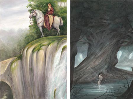
Armel Gaulme is a French illustrator and graphic designer living in Paris. The bio on his site is very brief, but emphasizes that his love for painting and illustration, and the study of artists whose work he admires, has carried him farther than his formal academic training, though he continues to pursue courses at the Ateliers des Beaux-Arts and the Duperré School.There is no client list on his site, but the names of books that he has illustrated and collections (albums) of his work are included under the images. Unfortunately, they don’t seem to be directly available in the U.S. but you can see a selection on Amazon.fr.
Gaulme leans toward fantasy and historical subjects, with a nice emphasis on medieval knights, castles and the Arthurian legends. There is also a book, apparently new, showcased on his site, called Créatures: Insolites & Stupéfiantes (Strange and Amazing Creatures), an imaginary bestiary accumulated during the travels of a fictional adventurer. (I can’t give you direct links within his site because it’s in a single Flash file.)
When looking though his online galleries, be aware of their multi tiered nature so you don’t inadvertently miss things. Within the categories and sub categories at the top of the page, there are third-level tabs at the left of the image space, and the rows of thumbnails have “Prev” and “Next” buttons to additional screens. Also there is a bio and list of links tucked away in the “Contact” section. Interestingly, the text portions of his site are in English.
Gaulme has a nicely imaginative approach, in a variety and sometimes mixture of media. Occasionally his pieces are accompanied by preliminary sketches. There are also sketches and drawings in their own sections. Though many of them are quick suggestions and gesture drawings, some are carried to a high degree of finish as works in themselves.
Gaulme is still fairly young, and I think we’ll be seeing more from this talented illustrator in the future, hopefully on both sides of the Atlantic.
[Suggestion courtesy of Cecile]
Categories:
-
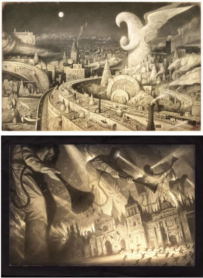
Brigid Marlin

Visionary artist Brigid Marlin was born in Washington, D.C., studied in Dublin, Paris and New York, and now lives and works in London, England. She eventually travelled to Vienna, specifically to learn the Mische Technique, a painstaking Renaissance painting method in which an ink drawing and detailed egg tempera painting form a basis on which layers of oil glazes are built into the final image.The particulars of this old master technique, once thought lost, were revived by visionary artist Ernst Fuchs. (See my recent posts on Robert Venosa and Martina Hoffmann.) Marlin has a step-by-step demonstration of the technique on her site.
The galleries on Marlin’s web site vary from straightforward portraits, painted in the Mische Technique, to Visionary Paintings to Fantasy Portraits, where the two approaches collide.
Even her straightforward portraits can’t help but have a touch of atmosphere that has drifted in from the other worlds that Marlin frequents, infusing them with a touch of secret strangeness, as in this beautiful portrait, Girl in Bluebell Wood.
Marlin has painted portraits of several notable individuals. She was chosen as the first artist to paint an official portrait of the Dalai Lama, for which there is a fascinating story accompanying the images of the painting on her site. Her portrait of J.G. Ballard, an admiring quote from whom forms the introduction to Marlin’s site, hangs in the National Portrait Gallery in London.
Unfortunately, Marlin’s own site may not be the best representation of her work. While there is a variety of her images, they are reproduced too small to get a good feeling for the detail and textural qualities of her work. (Though it’s worth noting that when in the gallery for Visionary Paintings, it’s easy to miss the text links at the top to galleries for two additional series of paintings.) There is a page of available giclee prints as well as a listing of available books.
I’ve listed below some other places on the web that you can see Marlin’s work. The largest reproductions I’ve found are on the Surrealism Now! site.
Brigid Marlin is also the founder of the Society for Art of the Imagination, the web site for which contains an extensive array of galleries of works by the society’s members, including a gallery Marlin’s work.
Though can see the bloodline of her visionary paintings reaching back through surrealist painters like Dali and Magritte (and perhaps even to Giorgio di Chirico), she becomes most intriguing for me when you can see her affection for Renaissance masters like Botticelli and the influence of underappreciated Surrealist greats like Paul Delvaux.
Categories:
-
Bogota Painter William K. Moore

William K. Moore appears to live with a foot, and brush, in two worlds. Originally from Los Angeles, he has spent many years living in Bogota, Columbia and chronicling both cities in photographs and paintings.His primary blog, Bogota Painter William K. Moore, is set up as a “painting a day” blog. In it he concentrates on paintings of the people living in the center of Bogota. He has a particular affection for those on whom financial fortune has not smiled, but who manage to find their way through life with a strength of character that Moore attempts to capture in paint.
Moore works in a variety of media, occasionally oil and acrylic, but most often watercolor and gouache. Occasionally he will list an interesting media mix like “watercolor and grime”. The area of the city he captures most often is an industrial section that provides lots of rough and gritty buildings and objects as backgrounds for his portraits.
He briefly gives the story of his interaction with his subjects, how he often works out some kind of payment in exchange for permission to photograph them, and sometimes describes their circumstances, creating in the process a visual and verbal picture of a city unknown to most Americans.
He also mixes in paintings of his native Los Angeles, which provide an interesting contrast to life in Bogota.
There is a gallery of Moore’s work assembled on the Daily Painters Gallery. He also maintains a Spanish language blog presence in Bogota, Bogotá según William Moore, and a blog of Bogota Documentary Photos.
Categories:
-
Shaun Tan (update)
When I first wrote about Australian illustrator and writer Shaun Tan back in March, it looked as though his site was on a server with limited bandwidth, which visits from lines and colors readers quickly overloaded. This unfortunately rendered his site inaccessible for several days, if not weeks, so many of you didn’t get to see it at the time.Tan has revised his site, and added some striking new material from his most recent book, The Arrival (slated for US release in October), which are more than enough to warrant another visit. These are beautiful and fascinating pencil illustrations that tell their story without words. Though there is definitely a narrative, the actual story presented by the images is open to much interpretation and imaginative fancy on the part of the “reader”.
(Wonderful experimental narratives like this are one of the reasons you’ll hear me gripe about the misappropriation of the term “graphic novel” by the comic book industry to refer to any old bunch of comics with a book-like binding.)
Unfortunately, though improved in many ways, Tan’s new site is in frames (for reasons that elude me), and I can’t give you a direct link. Go to the picture books page and click on the cover of The Arrival.
If you haven’t seen Tan’s work be sure to investigate the rest of the site, particularly the other entries in the picture books section.
[Suggestion courtesy of Seven Withrow & Jack Harris]
Categories:
-
Planning your web site

How to Display Your Art on the Web: Part 4
[This is part of a series of articles for which the introduction and list of articles is here. If you haven’t read the introduction yet, it would be helpful to read it first.]
Hey! What’s with this “planning” stuff? I want to just start making my beautiful site design and get going!
Well, design is what I’m talking about, and planning is part of that, perhaps the most important part. If you were laying out a magazine ad, or a painting, you would rough out some preliminaries, do some sketches, or engage in some kind of brainstroming or planning in order to have some idea of what you were doing. Same, and even more so, with web site.
Perhaps you’re the type to start a cross-country trip with half a tank of gas and $1.45 in your pocket. If so, go right ahead and start your design; just don’t be surprised if you wind up in Tierra del Fuego instead of San Diego.
“Design”, for the benefit of the uninitiated, doesn’t just mean making something look good, though that’s certainly part of it. Good design, in print or on the web, is about making a something work, making it communicate something. It doesn’t matter how “pretty” or “cutting edge” a design is (or how many awards it’s won); if it doesn’t work, it’s bad design.
This factor is even more critical on the web than it is in print. A web site isn’t something you just look at or read, it’s something you use; which is why a web site is often referred to as an interface (not in yer face, though that happens too), meaning a layer of control that allows a human to interact with a machine or program. The palettes, windows and tools in Photoshop, for example, are an interface designed to allow users of the application to create and edit images (or paint superhero costumes on pictures of fashion models).
The purpose of a web site interface can vary, based on the overall purpose of the site, which is the first key decision you must make as a designer.
What is the purpose of your site?
Sounds like a rhetorical question, but think about it. Are you exposing your work to potential painting buyers? Gallery owners? Art directors? Publishers? Web comic readers? Are you selling originals or prints directly over the web? Are you chronicling your artistic progress in a blog as part of your learning process? Are you selling books? Impressing someone who sits next to you in your art history class? What exactly do you want your shiny new web site to do?The answer may be less than simple, and composed of several of the above elements or others, but it’s important that you understand it, and if the intention is multi-fold, determine the order of importance.
The site map (outline version)
Once you understand what you are trying to accomplish with your site, you need to decide what content you’re going to include. Your bio? Links to all your friends’ sites? How-to demonstrations? Listings of gallery shows? Older work? Preliminary or alternate versions? Art outside your specialty?The way to answer this question is to focus on the one above. What is the purpose of your site and what will contribute to that purpose? Also, consider what will detract from it. If you want to include extra stuff, that’s not specifically on target, but you feel may enhance the site and make it more interesting, that’s fine as long as it doesn’t detract from or hinder the site’s actual purpose. In deciding what to include, and how to name, prioritize and arrange the pages that will contain that material, you should make a simple site map.
On the web, a “site map” can be a page on a web site with links to every other page in the site, often arranged as a hierarchical outline, and is usually only needed for large, potentially confusing sites. However, it also refers to a preliminary plan of a site, used for building it, something necessary even for the smallest sites.
Even if you choose to make a fancy flow chart style diagram with something like OmniGraffle or Concept Draw, you still start with a simple text outline. Write a list of the pages in your site. It may be a simple, flat list, but if you break a section like the portfolio down into sub-sections, arrange them under the heading for Portfolio as sub-categories. They will become links referred to as sub-navigation (and no, I’m not talking about piloting Jules Verne’s Nautilus). You’re planning both your pages, and the navigation part of your interface.
A simple site map might look like this:
Home
About the Artist
Portfolio
Recent work
Selected Pieces
Older Work
Contact
LinksThe first rank is the main navigation, visible on every page; the subsections, or sub-navigation, for the Portfolio section might only be visible when you are in that section.
Obviously, the naming of sub-sections in the Portfolio (or “Gallery”) section would vary depending on the type of art you’re presenting. Illustrations or gallery paintings might be arranged by genre, webcomics pages by date or story line, concept art by project, etc.; but the overall naming of web site sections should follow one important rule:
Don’t make me guess.
Or, to quote the title of a book on web site usability by Steve Krug that I will recommend heartily, Don’t make me think.If you want me to look at your work, regardless of whether I’m an art director, gallery owner, potential buyer, webcomics reader, art blog writer or your aunt’s second cousin, don’t discourage me! Don’t do anything to make me pause, slow down, hesitate, get confused, discouraged or annoyed or put any kind of potential barrier between me and your work. If you do, I will go away.
It only takes one click, the work of milliseconds, for me to leave your site for one of the ten billion other sites out there.
If it takes me one click to go away and five to drill down to your portfolio, I will go away. If you make me wait through your 30 second, animated Flash intro before I can get to your navigation, I will go away. If you make me look for a little “Enter Site” button hidden somewhere on a splash page before I can get to the navigation, I will go away. If you befuddle me with an enigmatic design, or confuse me with clever conceptual names for your links, I will curse you and your unborn children for making me feel like a fool, and then I will go away.
When it comes to navigation design, there are three important principles: clarity, consistency and ease of use. Did I mention clarity?
If you think an artsy, “clever”, or “cutting edge” concept for your web space is going to make potential visitors so intrigued they’ll spend time guessing about where your portfolio is, or what “Super Whizzyness” means as a link name, you’re sadly mistaken. Your friends and fans will tell you how awesome it is; art directors and gallery owners won’t, because they will be long gone.
I’m not saying you can’t be creative or clever with your design, far from it; but if you’re really creative and clever, you’ll design a site that is clear and easy to use, as well as attractive and interesting.
The home page
Hoo-boy! Home pages are the most problematic in any web site. Since everyone perceives them as the most important page in the site, and rightly so, they are most often the worst page in the site, as “important” item after “important” item is crammed onto their fragile little camel’s back, until they look like a K-Mart aisle as seen through kaleidoscopic glasses.Here’s the rule: The more things you put on your home page, the less important each of them becomes; and the less effective the home page is as a whole.
If you walk into a big social gathering and 20 people in your immediate vicinity are talking, the chances that you will be able to focus on what any one person is saying are slim. If, on the other hand, only three people are talking, you can pretty easily pick which one to focus on, and if only one person is talking, there is no doubt.
A home page should speak clearly, and should immediately and unequivocally answer three questions for a visitor who has, by any of several avenues, come to it:
What kind of web site is this?
Is there anything here of interest to me?
If so, how do I get to it?You want your target audience to say “Yes” to the second question, and not have to slow down and guess about either of the other two.
Focus your home page on introducing yourself to new visitors. Returning visitors are more likely to go to the trouble of clicking in to other content. It’s amazing how many artists’ sites have these priorities reversed.
If you feel the need to put news on the home page, stick in a column to one side. If you urgently need to list your current gallery opening or new images, put them to the side or “below the fold”, after the first screen depth worth of content. If a visitor doesn’t get those three questions answered, they won’t stick around to figure out who you are and why they should care where your next gallery opening is.
Put at least one of your best images on the home page; make it integral to the design. The images are what’s it’s about, put them to good use in the service of answering those three questions. Your images should be part of answer to both of the first two questions. If you’re tempted to put lots of them on the home page, remember the social gathering image. One or two (or maybe a short, subtle, rotating slide show, if you can do one well) should be enough.
Where to guide them
Good web site designs don’t just offer navigation to where the user wants to go, they offer a gentle but firm nudge in the direction you, as the site owner, want them to go. Just where that is comes back to that first question about the purpose of your site. Presumably you want them to see your work (and I’ll talk specifically about Portfolio or Gallery page design in a future post), but once they have seen your work do you want them to contact you? By email or other means? Are you selling something directly? Do you want them to join a mailing list? Do you want them to come back often? Are you directing them elsewhere (eBay, PayPal, Amazon or the site of a brick and mortar gallery)? All of the above?When you understand your focus, make this process as simple and easy as possible.
All about you
For most of the purposes I can think of for an artist’s site, information about the artist, history, accomplishments, accolades, reviews, materials and process, is not only relevant but essential. Do I want buy a painting from someone I know nothing about? Do I want to give an illustration assignment to someone whose background, and potential reliability, is a mystery? Do I want to spend my time reading a webcomic that is going to go nowhere? Am I interested enough to contact this artist about their work?Give me, the art director, editor, gallery owner, potential buyer, webcomics reader, or other visitor, enough background to feel comfortable with my potential interaction with you and your work. Think Goldilocks — not too much, not too little, just enough.
Contact
Even if direct contact is not the point of the site, you should offer some means of contact. It may be indirect, through a publisher, rep or other intermediary, or something that doesn’t involve an email address, like Contact Form. The latter can be handled well or poorly, but it’s better than no avenue of contact at all. (Even if it’s just a way for someone to tell you part of your site is displaying wonky, which you may not be aware of.)If you post your email address, do it in a way that protects you from spammers’ email harvesting robots. i.e. a JavaScript encoding of the email link, or using a phrase like “cparker (at) zark.com”, or an image of the address, rather than a live link that the harvester bots will recognize.
If you really want to encourage contact, put your (protected) email address on the footer of every page, in addition to having a dedicated Contact page.
Links
While not necessary, a page of links to other sites can add a bit of interest and serves the additional purpose of encouraging others to link to your site, in the hope of a link back. (Make them relevant and well-chosen, I’m not suggesting you engage in random “link exchanges”.) Incoming links from other sites, particularly relevant and highly ranked ones, are a factor in search engine optimization (which I will also address in a future post).Putting it together
Armed with your site map, knowledge of navigation issues, and clear sense of the purpose of your site, you can more confidently design the site’s look and feel. Form follows function.Resources:
Diagraming and visualization software list from Vitaly Friedman
Don’t Make Me Think: A Common Sense Approach to Web Usability by Steve Krug
Web Site Design from w3schools
Basics of Website Design from Penn State University
Site Planning Basics from eFuse
Web Design Basics from SteveDawson.com
How to Make a Website of Your Own from Mardiros Internet Marketing
Web Design Basics from About.comNext: Designing your site – ooooooh, pretty!
Categories:


Charley’s Picks
Bookshop.org
(Bookshop.org affilliate links; sales benefit independent bookshop owners; I get a small percentage to help support my work on Lines and Colors)

John Singer Sargent: Watercolors


Urban Sketching: Understanding Perspective


Charley’s Picks
Amazon
(Amazon.com affiliate links; sales go to a larger yacht for Jeff Bezos; but I get a small percentage to help support my work on Lines and Colors)
John Singer Sargent: Watercolors
Urban Sketching: Understanding Perspective