
Categories
- 3d CGI
- Amusements
- Animation
- Anime & Manga
- Art Materials
- Art Videos
- Blogroll
- Cartoons
- Color
- Comics
- Concept & Visual Dev.
- Creativity
- Digital Art
- Digital Painting
- Displaying Art on the Web
- Drawing
- Eye Candy for Today
- Gallery and Museum Art
- High-res Art Images
- Illustration
- Motion Graphics & Flash
- Museums
- Online Museums
- Outsider Art
- Painting
- Painting a Day
- Paleo Art
- Pastel, Conté & Chalk
- Pen & Ink
- Prints and Printmaking
- Reviews
- Sc-fi and Fantasy
- Sculpture & Dimensional
- Site Comments
- Sketching
- Storyboards
- Tools and Techniques
- Uncategorized
- Vector Art
- Videos & Podcasts
- Vision and Optics
- Watercolor and Gouache
- Webcomics
Archives
- May 2026
- April 2026
- March 2026
- February 2026
- January 2026
- December 2025
- November 2025
- October 2025
- September 2025
- August 2025
- July 2025
- June 2025
- May 2025
- January 2025
- December 2024
- November 2024
- October 2024
- September 2024
- August 2024
- June 2024
- April 2024
- March 2024
- February 2024
- January 2024
- December 2023
- November 2023
- October 2023
- September 2023
- August 2023
- July 2023
- May 2023
- April 2023
- March 2023
- February 2023
- January 2023
- December 2022
- November 2022
- September 2022
- August 2022
- July 2022
- June 2022
- May 2022
- April 2022
- March 2022
- February 2022
- January 2022
- December 2021
- November 2021
- October 2021
- September 2021
- August 2021
- July 2021
- June 2021
- May 2021
- April 2021
- March 2021
- February 2021
- January 2021
- December 2020
- November 2020
- October 2020
- September 2020
- August 2020
- July 2020
- June 2020
- May 2020
- April 2020
- March 2020
- February 2020
- January 2020
- December 2019
- November 2019
- October 2019
- September 2019
- August 2019
- July 2019
- June 2019
- May 2019
- April 2019
- March 2019
- February 2019
- January 2019
- December 2018
- November 2018
- October 2018
- September 2018
- August 2018
- July 2018
- June 2018
- May 2018
- April 2018
- March 2018
- February 2018
- January 2018
- December 2017
- November 2017
- October 2017
- September 2017
- August 2017
- July 2017
- June 2017
- May 2017
- April 2017
- March 2017
- February 2017
- January 2017
- December 2016
- November 2016
- October 2016
- September 2016
- August 2016
- July 2016
- June 2016
- May 2016
- April 2016
- March 2016
- February 2016
- January 2016
- December 2015
- November 2015
- October 2015
- September 2015
- August 2015
- July 2015
- June 2015
- May 2015
- April 2015
- March 2015
- February 2015
- January 2015
- December 2014
- November 2014
- October 2014
- September 2014
- August 2014
- July 2014
- June 2014
- May 2014
- April 2014
- March 2014
- February 2014
- January 2014
- December 2013
- November 2013
- October 2013
- September 2013
- August 2013
- July 2013
- June 2013
- May 2013
- April 2013
- March 2013
- February 2013
- January 2013
- December 2012
- November 2012
- October 2012
- September 2012
- August 2012
- July 2012
- June 2012
- May 2012
- April 2012
- March 2012
- February 2012
- January 2012
- December 2011
- November 2011
- October 2011
- September 2011
- August 2011
- July 2011
- June 2011
- May 2011
- April 2011
- March 2011
- February 2011
- January 2011
- December 2010
- November 2010
- October 2010
- September 2010
- August 2010
- July 2010
- June 2010
- May 2010
- April 2010
- March 2010
- February 2010
- January 2010
- December 2009
- November 2009
- October 2009
- September 2009
- August 2009
- July 2009
- June 2009
- May 2009
- April 2009
- March 2009
- February 2009
- January 2009
- December 2008
- November 2008
- October 2008
- September 2008
- August 2008
- July 2008
- June 2008
- May 2008
- April 2008
- March 2008
- February 2008
- January 2008
- December 2007
- November 2007
- October 2007
- September 2007
- August 2007
- July 2007
- June 2007
- May 2007
- April 2007
- March 2007
- February 2007
- January 2007
- December 2006
- November 2006
- October 2006
- September 2006
- August 2006
- July 2006
- June 2006
- May 2006
- April 2006
- March 2006
- February 2006
- January 2006
- December 2005
- November 2005
- October 2005
- September 2005
- August 2005
Relevant Blogs
Art, Painting & Sketch
- Gurney Journey
- Underpaintings
- Art and Influence
- Painting Perceptions
- Oil Painters of America
- Vasari Paint POV
- Flying Fox
- Urban Sketchers
- Bento (Smithsonian)
- Art Inconnu
- The Hidden Place
- Still Life
- Making a Mark
- The Art of the Landscape
- Exploring Color & Creativity
- Art Contrarian
- Artist A Day
- beinArt Surreal Art Collective
- Eye Level
- David Dunlop
- p.i.g.m.e.n.t.i.u.m
- CultureGrrl
- Joaquín Sorolla blog
- Artists in Pastel
“Painting a Day”
- A Painting a Day (Keiser)
- On Painting (Keiser)
- Julian Merrow-Smith
- Karen Jurick
- Jeffrey Hayes
- Carol Marine
- Abbey Ryan
- Daily Paintworks
Other Painting Blogs
- Virtual Gouache Land
- Neil Hollingsworth
- Marc Hanson
- Kevin Menck
- Marc Dalessio
- Larry Seiler
- Stapleton Kearns
- Colin Page
- Roos Schuring
- Hans Versfelt
- Titus Meeuws
- Régis Pettinari
- René Plein Air
- Belinda Del Pesco
- Robin Weiss
- Nathan Fowkes (Land Sketch)
- William Wray
- Frank Serrano
- Stephen Magsig
- Michael Chesley Johnson
- Twice a Week
- Sarah Wimperis
- Rob Adams
- Michael Cole Manley
- The Dirty Palette Club
- Mike Manley’s Draw!
Gallery Art & Illustration mix
Illustration
- Howard Pyle
- 100 Years of Illustration
- BibliOdyssey
- Illustration Art
- Today’s Inspiration
- Illustration Mundo
- Little Chimp Society
- Danny Gregory
- R D (John Martz
- Illustration Friday blog
- Monster Brains
- Illustrators & Illustrations (RU)
- Elwood H. Smith
- DaniDraws.com
- Designers Who Blog
- iSpot Blog
Sci-Fi & Fantasy
Illustration & Comics
Comics & Cartoons
- Comics Beat
- Robot 6
- Newsarama Blog
- Comic Vine
- Comics Alliance
- Forbidden Planet Int.
- Paolo Rivera
- Bolt City
- Flight
- Scott McCloud
- The Comics Journal
- Comixpedia
- Funnybook Babylon
- James Baker
- Middleton’s Sketchbook
- Boneville
- The Hotel Fred
- Paul Rivoche
- Daily Cartoonist
- Mad About Cartoons (William Wray)
- Digital Strips
Illustration & Concept
Animation & Concept
- Cartoon Brew
- Animation Blog
- Cold Hard Flash
- Concept Art World
- The CAB
- FY Concept Art
- Concept Ships
- Concept Robots
- John Nevarez
- Armand Serrano
- Marcos Mateu-Mestre
- all kinds of stuff (Kricfalusi)
- Yacin the faun (Man Arenas)
- Kelsey Mann
- Cre8tivemarks Blog
- Ice-Cream Monster Toon Cafe
- AAU Character & Creature Design
- AAU Animation Notes
- Articles and Texticles
Paleo & Scientific
Tools & Techniques
Other
Lists of Art Blogs
Art Image Resource Links
Historic Art Images
- Wikimedia Commons: Paintings
- Wikimedia Commons: Drawings
- The Athenaeum
- WikiArt (WikiPaintings)
- Google Art Project: Artists
- Google Art Project: Collections (Museums)
- ArtCyclopedia
- Web Gallery of Art
- Art Renewal Center
- Web Gallery of Impressionism
Auction Consolidation sites
Auction sites
- Sotheby’s
- Bonham’s
- Christies
- Heritage Auctions: Fine Art
- Heritage Auctions: Illustration
- Freeman’s Auctions
- Bukowskis
- Shannon’s
Image Search
Reverse Image Search (search by image)
- Tin Eye
- RevImg
- Google Image Search (camera icon)
- Bing Image Search (camera icon)
Promoting some friends and some clients of my website design business
- Twin Willows T’ai Chi studio in Wilmington DE. Taiji classes with Bryan Davis.
- Ray Hayward, Inspired Teacher of T’ai Chi ( Taiji ) in Minneapolis, Founder of Mindful Motion Tai Chi Academy
- OldHead Tattoo studio and Art Gallery in Wilmington DE. Tattoos and paintings by Bruce Gulick
- Sharon Domenico Art, pet portrait oil paintings
- Platinum Paperhanging, wallpaper hanging, Main Line and Philadelphia, PA
- Lisa Stone Design, interior designer, Main Line and Philadelphia, PA
- Studio12KPT, original art, prints, calendars and other custom printed items by Van Sickle & Rolleri
-
Harry Anderson
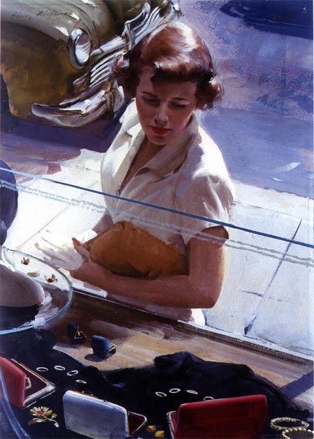
Harry Anderson was an illustrator active in the mid-20th Century, particularly during a period when the influences of modernism, editorial photography and changes in printing and reproduction techniques were encouraging many illustrators to forge new paths.While illustrators like Al Parker were redefining the way representational imagery was incorporated with design elements in magazine illustration, Anderson held fast to the principles of traditional representational imagery, producing warm, straightforward and richly modeled paintings for magazines like The Saturday Evening post, The Ladies’ Home Journal, Colliers, Redbook, Cosmopolitan and Good Housekeeping.
It’s not that Anderson’s approach was unaffected by the tendencies of his contemporaries to flatten objects into their geometric fundamentals and emphasize negative shapes, it’s that he never let those influences override his devotion to the principles of representational art that he admired.
Devotion of another sort played an important part in Anderson’s career. After his marriage, he and his wife joined the Seventh Day Adventist church and he began to devote a good deal of his energy to creating religious themed paintings, which he created at near minimum wage, in addition to his regular commercial work. These days he is probably better know for those paintings than his commercial illustration. The first of them, a painting called “What Happened to Your Hand”, showed Christ amid contemporary children, a scene that seems innocuous now, but caused controversy and was considered blasphemous by some at the time.
He also went to work for Haddon Sundblom’s studio, producing work for a number of commercial accounts. In both the commercial and religious areas of work, his paintings have a feeling of warm emotion and the play of light, often bright sunlight, but at times moody interior light in the case of romance themed articles for women’s magazines. His approach was very painterly, enriched by broad, visible brushstrokes and a luxurious feeling of paint, with roughly scumbled background textures and drybrush techniques, particularly in his later work.
Much of the work in the middle of his career was in water-based casein. He had to abandon oil paint due to allergies to turpentine, but was able to return to it later with the availability of alternate thinners. His casein paintings often have the remarkably painterly look of oil paintings.
Anderson was featured in American Artist in 1956; he received awards from the New York Art Directors club and other notable organizations, and was inducted into the Society of Illustrators Hall of Fame in 1994.
Kent Steine wrote and excellent article that was published in the October 2000 issue of Step by Step Graphics and is reprinted on Stein’s site: Harry Anderson and the Art of Loose Realism. The article is partly biographical, but goes into wonderful detail about Anderson’s palette, materials and technique.
There is currently a Harry Anderson painting for sale on Heritage Auction Galleries for which a large image has been posted that will allow you to see his technique clearly. (Click on “Look Closer”.) It may not be there for long.
There is a a nice introduction to Anderson’s work on American Art Archives and a tribute page on Pinkoski.com , with photos of Anderson at work in his studio.
One of the best resources is Leif Peng’s wonderful Flickr set for Anderson, in addition to his two Today’s Inspiration blog posts on him here and here.
Categories:
-
Volkan Baga

I wasn’t particularly surprised to find that, in addition to his other training and education, German illustrator Volkan Baga spent some time as a studio assistant to Donato Giancola. I say that not because I saw overt similarities in the work, but because of the presence of traditional old-school European painting techniques evident in the approach of both artists.Like Giancola, Baga works in the science fiction, fantasy and gaming genres, painting highly finished images of otherworldly characters and scenes. His paintings often feature elaborately detailed backgrounds, as in the Alchemist shown here, and employ a dark color range and deep value contrasts.
His site includes a step-by step process of this particular painting, progressing from a colored pencil on toned paper sketch through a more detailed grey toned sketch (not quite a grisaille) and several steps of intricate colors, presumably with transparent glazes. The site is in frames. so I can’t give you a direct link. Go to the Paintings section and click on the third thumbnail. Also note that it may be easy to miss the small link to a second page of thumbnails under the first set.
Braga’s colors are often subdued, but rich with undertones, notably the greens in skin colors. He lets shadows and subtle backlighting define his forms, eschewing the more blatant complementary color contrasts often found in the work of others working in the same genres.
Notable too is his emphasis on facial expression, rather than contorted figures and violent motion, as the emotional focus of his images.
Categories:
-
Julian Beever (update)

Julian Beever is perhaps the best known “pavement painter”. He uses colored chalk to create complex drawings on sidewalks in public spaces. Like those of his contemporary Kurt Wenner, these sometimes are giant reproductions of old master paintings. The most interesting, though, take the form of large scale anamorphoses, images distorted in such a way that only assume their proper form when seen from a particular viewpoint (or, in the case of mirror anamorphoses, when viewed in reflection on a curved surface).Anamorphosis has a long history in art, since the time of Leonardo having been used to startle or amuse, or even to hide the subject of an image from casual view. One of the most famous is the anamorphic apparition of a skull in The Ambassadors, a famous double-portrait by Hans Holbien the Younger.
In the case of the sidewalk artists like Beever, the purpose is still to startle and amuse, notably with anamorphic images that form striking three dimensional illusions when viewed from a certain angle, as in the image above.
Beever often poses for photographs, interacting in some way with his three dimensional illusions, in this case, mirrored by a self-portrait in the “foreground”.
Beever’s web site has a number of his images, but in only a couple of cases does he show you the image from other angles, as you would see it in life, to understand the process (see his globe image in my post on Optical Illusion Sites for an example).
Beever most often does his sidewalk art in European cities, where there may be a higher tolerance for impromptu art in public spaces, but he occasionally does do his trompe l’oiel illusions here in the U.S., where they, unsurprisingly, are simetimes in the form of advertising.
Beever’s site doesn’t seem to be updated often, but other mentions of him continue to pop up. Here is a post on Mighty Optical Illusions that features some of his recent work. There are also some videos of his work (and here) and his working process (and here).
See also my previous post on Julian Beever. That post has a attracted a number of comments requesting contact information for Beever. Those wishing to purchase his paintings on canvas or hire him for corporate events can contact him through his web site.
Categories:
-
Jody Hewgill
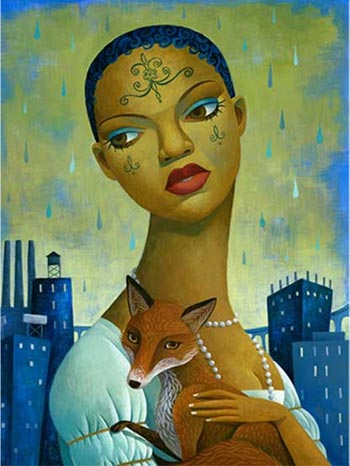
Canadian illustrator Jody Hegwell’s illustrations seem almost constructed rather than simply painted, with subtle granular textures applied to curved sheets of delicately modeled color, which in turn are set into compositions in which the positive and negative spaces interlock like pieces of a puzzle, all set on a bedrock of solid cubist geometry.Her forceful arrangements of figures and background de-empahsize value and color contrast in favor of the iconic weight of forms in which the geometry of individual shapes is predominant.
Color seems to play a supporting role, adding emotional depth to the intensity of the images, and her work carries strong echos of Picasso, Modigliani and Rousseau.
Hegwell’s client list includes Rolling Stone, Entertainment Weekly, The Grammy Awards, Random House, Simon & Schuster, and Time-Warner. Her work has been featured in Communication Arts, Print Magazine, and Spectrum; and she has received awards from The Society of Illustrators, Spectrum, and The Design Club of Canada. She has also created a number of posters, some of which are in the Permanent Poster Collection of the Library of Congress.
Hewgill works in acrylic on gessoed board. On initial entry, her web site is divided into two separate sub-sites, for illustration and gallery art, though there is some cross-over.
Unfortunately, both sites are hampered by unnecessary pop-ups, roll-overs and browser resizing scripts, but it’s worth the effort to view her work.
You can also see her work in portfolios on illoz, and on the group portfolio/blog site Picture Mechanics.
Categories:
-
Michael Naples

Here is an interesting study in contrasts within the work of an artist that, to my eye, seems to be reaping the rewards of taking on the practice of daily painting, in terms of growth as an artist and noticeable increase in skill and confidence.Michael Naples has been doing portraits in graphite for ten years. In August of last year he started a regimen of a drawing a day, and initiated a corresponding blog. A month later, you can see apparent marked increase in control and technique between two drawings of a similar subject (August & September).
A few days later he has switched from a drawing a day to a painting a day and, as you scroll up the page (the blog is entirely displayed on one page, convenient once it’s loaded, but perhaps problematic as it grows), you can see a progression into stronger contrasts, bolder colors and more confident paint handling.
His daily paintings quickly become much more interesting, for me at least, than his more practiced portrait drawings. Though his portrait drawings are certainly competently rendered, they seem to be restrained the same limitations that often characterize portraits drawn from photographs: a vague softness, limited tonal range, and lack of defining line or strong chiaroscuro to give them the “punch” that a life drawing might have, uninhibited by the requirement of pleasing the subject with the result.
Naples’ current paintings from life, however, exhibit the opposite characteristics: bold compositions, bright energetic color, strong value contrasts and an overall confidence and enthusiasm that almost seem like the work of a different artist.
Perhaps I’m reading too much into this, interpreting an artist’s development from a series of blog posts, but I think you can see him progress through stages of experimentation, different approaches in brush handling, palette and composition and see a real progression in terms of his control of color, composition, value and command of the materials.
In Naples’ most recent work he has tended to frame simple subjects with warm, dark backgrounds, pushing them forward and modeling them with bold, lively brushstrokes and rich colors. Many of them exhibit a maturity as a painter that belie the short time since he undertook the daily painting routine to “get back into the groove of painting”.
You will also find his work on a daily painters group site, Daily Paintworks, which appears to be one of the stronger of the recent daily painter community sites. The site itself is new to me, but it seems I’ve written posts on all but two of the 12 current members.
Categories:
-
Arthur Adams
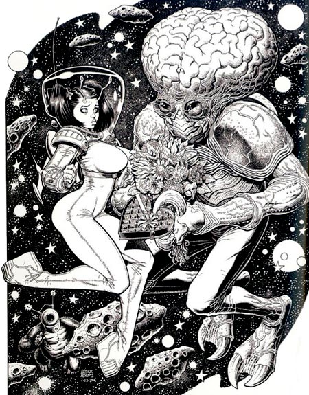
Art Adams first grabbed the attention of comic art fans with his work on the Marvel Comics’ mini-series Long Shot in the mid-80’s. He went on to work on major titles like X-Men and Fantastic Four for Marvel, as well as numerous titles for the other major American comic book publishers. In particular, he became know for his striking cover art, and developed an avid fan following.He was a co-founder of the Dark Horse Comics creator owned line “Legend”, where his Monkeyman and O’Brien feature ran as a back-up to Mike Mignola’s initial Hellboy mini-series. He co-created the Jonni Future series in Tom Strong’s Terrific Tales with writer Alan Moore.
Adams’ distinctive style combines intricate drawing, detailed rendering, and a light, cartoony touch that makes his work a cherry-topped ice cream treat for they eyes. He has a fondness for movie monsters, pulp science fiction subjects and a raft of pop culture influences that add up to a wonderfully fun visual toybox.
As snappy as his work looks in color, in particular on his many comic book covers, I’m particularly fond of it in its black and white “inks” state, where his penchant for spotting blacks and adding textures and hatching make for a rich pen and ink drawing meets superhero comics feeling.
As far as I can determine, Adams doesn’t have an official web presence. Fortunately, as a fan favorite, there are many unofficial galleries and pages devoted to his work, the most extensive of which is probably the 13-page gallery on Comic Art Community.
Some of his work was collected as a volume of the Modern Masters series devoted to contemporary comic book artists: Modern Masters, Vol. 6: Arthur Adams.
The image above is from his Sampler V, as reprinted in the recent Spectrum 14 collection (borrowed from Li-An’s post on the topic).
Categories:


Charley’s Picks
Bookshop.org
(Bookshop.org affilliate links; sales benefit independent bookshop owners; I get a small percentage to help support my work on Lines and Colors)

John Singer Sargent: Watercolors


Urban Sketching: Understanding Perspective


Charley’s Picks
Amazon
(Amazon.com affiliate links; sales go to a larger yacht for Jeff Bezos; but I get a small percentage to help support my work on Lines and Colors)
John Singer Sargent: Watercolors
Urban Sketching: Understanding Perspective