
Categories
- 3d CGI
- Amusements
- Animation
- Anime & Manga
- Art Materials
- Art Videos
- Blogroll
- Cartoons
- Color
- Comics
- Concept & Visual Dev.
- Creativity
- Digital Art
- Digital Painting
- Displaying Art on the Web
- Drawing
- Eye Candy for Today
- Gallery and Museum Art
- High-res Art Images
- Illustration
- Motion Graphics & Flash
- Museums
- Online Museums
- Outsider Art
- Painting
- Painting a Day
- Paleo Art
- Pastel, Conté & Chalk
- Pen & Ink
- Prints and Printmaking
- Reviews
- Sc-fi and Fantasy
- Sculpture & Dimensional
- Site Comments
- Sketching
- Storyboards
- Tools and Techniques
- Uncategorized
- Vector Art
- Videos & Podcasts
- Vision and Optics
- Watercolor and Gouache
- Webcomics
Archives
- May 2026
- April 2026
- March 2026
- February 2026
- January 2026
- December 2025
- November 2025
- October 2025
- September 2025
- August 2025
- July 2025
- June 2025
- May 2025
- January 2025
- December 2024
- November 2024
- October 2024
- September 2024
- August 2024
- June 2024
- April 2024
- March 2024
- February 2024
- January 2024
- December 2023
- November 2023
- October 2023
- September 2023
- August 2023
- July 2023
- May 2023
- April 2023
- March 2023
- February 2023
- January 2023
- December 2022
- November 2022
- September 2022
- August 2022
- July 2022
- June 2022
- May 2022
- April 2022
- March 2022
- February 2022
- January 2022
- December 2021
- November 2021
- October 2021
- September 2021
- August 2021
- July 2021
- June 2021
- May 2021
- April 2021
- March 2021
- February 2021
- January 2021
- December 2020
- November 2020
- October 2020
- September 2020
- August 2020
- July 2020
- June 2020
- May 2020
- April 2020
- March 2020
- February 2020
- January 2020
- December 2019
- November 2019
- October 2019
- September 2019
- August 2019
- July 2019
- June 2019
- May 2019
- April 2019
- March 2019
- February 2019
- January 2019
- December 2018
- November 2018
- October 2018
- September 2018
- August 2018
- July 2018
- June 2018
- May 2018
- April 2018
- March 2018
- February 2018
- January 2018
- December 2017
- November 2017
- October 2017
- September 2017
- August 2017
- July 2017
- June 2017
- May 2017
- April 2017
- March 2017
- February 2017
- January 2017
- December 2016
- November 2016
- October 2016
- September 2016
- August 2016
- July 2016
- June 2016
- May 2016
- April 2016
- March 2016
- February 2016
- January 2016
- December 2015
- November 2015
- October 2015
- September 2015
- August 2015
- July 2015
- June 2015
- May 2015
- April 2015
- March 2015
- February 2015
- January 2015
- December 2014
- November 2014
- October 2014
- September 2014
- August 2014
- July 2014
- June 2014
- May 2014
- April 2014
- March 2014
- February 2014
- January 2014
- December 2013
- November 2013
- October 2013
- September 2013
- August 2013
- July 2013
- June 2013
- May 2013
- April 2013
- March 2013
- February 2013
- January 2013
- December 2012
- November 2012
- October 2012
- September 2012
- August 2012
- July 2012
- June 2012
- May 2012
- April 2012
- March 2012
- February 2012
- January 2012
- December 2011
- November 2011
- October 2011
- September 2011
- August 2011
- July 2011
- June 2011
- May 2011
- April 2011
- March 2011
- February 2011
- January 2011
- December 2010
- November 2010
- October 2010
- September 2010
- August 2010
- July 2010
- June 2010
- May 2010
- April 2010
- March 2010
- February 2010
- January 2010
- December 2009
- November 2009
- October 2009
- September 2009
- August 2009
- July 2009
- June 2009
- May 2009
- April 2009
- March 2009
- February 2009
- January 2009
- December 2008
- November 2008
- October 2008
- September 2008
- August 2008
- July 2008
- June 2008
- May 2008
- April 2008
- March 2008
- February 2008
- January 2008
- December 2007
- November 2007
- October 2007
- September 2007
- August 2007
- July 2007
- June 2007
- May 2007
- April 2007
- March 2007
- February 2007
- January 2007
- December 2006
- November 2006
- October 2006
- September 2006
- August 2006
- July 2006
- June 2006
- May 2006
- April 2006
- March 2006
- February 2006
- January 2006
- December 2005
- November 2005
- October 2005
- September 2005
- August 2005
Relevant Blogs
Art, Painting & Sketch
- Gurney Journey
- Underpaintings
- Art and Influence
- Painting Perceptions
- Oil Painters of America
- Vasari Paint POV
- Flying Fox
- Urban Sketchers
- Bento (Smithsonian)
- Art Inconnu
- The Hidden Place
- Still Life
- Making a Mark
- The Art of the Landscape
- Exploring Color & Creativity
- Art Contrarian
- Artist A Day
- beinArt Surreal Art Collective
- Eye Level
- David Dunlop
- p.i.g.m.e.n.t.i.u.m
- CultureGrrl
- Joaquín Sorolla blog
- Artists in Pastel
“Painting a Day”
- A Painting a Day (Keiser)
- On Painting (Keiser)
- Julian Merrow-Smith
- Karen Jurick
- Jeffrey Hayes
- Carol Marine
- Abbey Ryan
- Daily Paintworks
Other Painting Blogs
- Virtual Gouache Land
- Neil Hollingsworth
- Marc Hanson
- Kevin Menck
- Marc Dalessio
- Larry Seiler
- Stapleton Kearns
- Colin Page
- Roos Schuring
- Hans Versfelt
- Titus Meeuws
- Régis Pettinari
- René Plein Air
- Belinda Del Pesco
- Robin Weiss
- Nathan Fowkes (Land Sketch)
- William Wray
- Frank Serrano
- Stephen Magsig
- Michael Chesley Johnson
- Twice a Week
- Sarah Wimperis
- Rob Adams
- Michael Cole Manley
- The Dirty Palette Club
- Mike Manley’s Draw!
Gallery Art & Illustration mix
Illustration
- Howard Pyle
- 100 Years of Illustration
- BibliOdyssey
- Illustration Art
- Today’s Inspiration
- Illustration Mundo
- Little Chimp Society
- Danny Gregory
- R D (John Martz
- Illustration Friday blog
- Monster Brains
- Illustrators & Illustrations (RU)
- Elwood H. Smith
- DaniDraws.com
- Designers Who Blog
- iSpot Blog
Sci-Fi & Fantasy
Illustration & Comics
Comics & Cartoons
- Comics Beat
- Robot 6
- Newsarama Blog
- Comic Vine
- Comics Alliance
- Forbidden Planet Int.
- Paolo Rivera
- Bolt City
- Flight
- Scott McCloud
- The Comics Journal
- Comixpedia
- Funnybook Babylon
- James Baker
- Middleton’s Sketchbook
- Boneville
- The Hotel Fred
- Paul Rivoche
- Daily Cartoonist
- Mad About Cartoons (William Wray)
- Digital Strips
Illustration & Concept
Animation & Concept
- Cartoon Brew
- Animation Blog
- Cold Hard Flash
- Concept Art World
- The CAB
- FY Concept Art
- Concept Ships
- Concept Robots
- John Nevarez
- Armand Serrano
- Marcos Mateu-Mestre
- all kinds of stuff (Kricfalusi)
- Yacin the faun (Man Arenas)
- Kelsey Mann
- Cre8tivemarks Blog
- Ice-Cream Monster Toon Cafe
- AAU Character & Creature Design
- AAU Animation Notes
- Articles and Texticles
Paleo & Scientific
Tools & Techniques
Other
Lists of Art Blogs
Art Image Resource Links
Historic Art Images
- Wikimedia Commons: Paintings
- Wikimedia Commons: Drawings
- The Athenaeum
- WikiArt (WikiPaintings)
- Google Art Project: Artists
- Google Art Project: Collections (Museums)
- ArtCyclopedia
- Web Gallery of Art
- Art Renewal Center
- Web Gallery of Impressionism
Auction Consolidation sites
Auction sites
- Sotheby’s
- Bonham’s
- Christies
- Heritage Auctions: Fine Art
- Heritage Auctions: Illustration
- Freeman’s Auctions
- Bukowskis
- Shannon’s
Image Search
Reverse Image Search (search by image)
- Tin Eye
- RevImg
- Google Image Search (camera icon)
- Bing Image Search (camera icon)
Promoting some friends and some clients of my website design business
- Twin Willows T’ai Chi studio in Wilmington DE. Taiji classes with Bryan Davis.
- Ray Hayward, Inspired Teacher of T’ai Chi ( Taiji ) in Minneapolis, Founder of Mindful Motion Tai Chi Academy
- OldHead Tattoo studio and Art Gallery in Wilmington DE. Tattoos and paintings by Bruce Gulick
- Sharon Domenico Art, pet portrait oil paintings
- Platinum Paperhanging, wallpaper hanging, Main Line and Philadelphia, PA
- Lisa Stone Design, interior designer, Main Line and Philadelphia, PA
- Studio12KPT, original art, prints, calendars and other custom printed items by Van Sickle & Rolleri
-
Mark Campana

Some landscape and cityscape paintings have a distinct sense of place. There is a certain appeal to paintings with subjects that are exotic and imply the romance of travel, for those of us in the U.S. that might be exemplified by images of Venice or Paris.There is also a strong appeal, however, in the near and familiar, and many artists will devote them selves to the portrayal of the areas near where they live, finding resonance with those who have familiarity and identification with the places pictured.
Mark Campana is a Philadelphia painter who covers a range of subjects, but I particularly enjoy his depictions of houses, streets, cafes and shops in the areas of Center City (what those of us in Philadelphia call our downtown) around Rittenhouse Square and Fitler Square, both of which are areas in which I lived at one time, and both of which contain a rich array of architecture. It’s a section of the city criss-crossed with small streets that are lined with old, real townhouses, (large, 19th Century, single family city houses, as opposed to the misnamed suburban constructions for which “townhouse” is a euphemism used to avoid calling them what they actually are, row houses).
Campana has also found a rich source of subjects in the city parks themselves, Rittenhouse Square is a marvel of a city park, and Fitler Square is a small treasure, unknown even to many Philadelphia residents. The two areas actually adjoin one another, and I used to enjoy the visual richness as I walked through them on my way to school when I was a student at the Pennsylvania Academy of the Fine Arts.
Campana, was a graphic design student at the Art Institute (Philadelphia has more art schools per capita than any other city in the U.S.), but moved into gallery art shortly after graduating; and, like many artists, considers most of his painting skills self-taught. Campana is from South Philadelphia and has exhibited in the city for years, both in galleries like The Newman Galleries, The Home Works Gallery and the Kevin Butler Gallery, but also in the city’s juried outdoor art exhibitions.
I’ve encountered Campana and his work before at the Rittenhouse Square Fine Arts Annual (one of the oldest juried outdoor art shows in the nation), and I ran into him again last weekend at the Manayunk Art Show. Manayunk is an area of Philadelphia that feels a bit like a European town, perched on a hillside above a river, filled with tiny streets and small houses, and is an ideal setting for an event that is part juried art show, part street fair.
These kind of exhibitions allow Campana, and artists like him, to connect directly with their patrons in a way not ordinarily possible in a gallery setting, which lends itself particularly well to artists whose work has that element of a local connection.
Unfortunately the images of Campana’s paintings on his web site are a bit small and not always reproduced as well as I would like, making it difficult to see the visual charm in his brush marks and paint surface, lively with bits of scumbling and broken color.
I particularly like his contrasts of light and dark, textures of stone and brick and his frequent portrayal of dappled light and shade on the small side streets.
To those of you not in Philadelphia, or even the U.S., perhaps his images will pass over into the distant and different, but for me they’re wonderfully familiar.
Categories:
-
Simon Ng
 Illustrator Simon Ng was born in Singapore, acquired his illustration degree from Otis College in Los Angeles, worked for publishing houses and a children’s magazine company in Hong Kong for several years, and is now back in Singapore, doing freelance illustration for a number of agencies.
One of his projects was a series of three (as far as I know) illustrations used to raise awareness for the Gambling Helpline of the National Council on Problem Gambling, Singapore.
These took the form of three playing cards, the Ace of Hearts, 7 of Diamonds and a Joker, in which Ng has created the card markings in smaller illustrated vignettes of scenes of domestic violence, abandonment, financial and emotional distress.
The image at left shows the 7 of Diamonds illustration with a detail below it of the “7”, suit marker diamond and one of the interior diamond markings.
A terrific idea, beautifully executed. Art direction is credited to Bob Tay from McCann-Erickson, Singapore. You can see all three of the Gambling Helpline illustrations on Ng’s blog, simon @rtwork.
The campaign and illustrations have garnered awards from many quarters, including The Singapore Creative Circle Awards, Adfest, The World Press Award and the D&AD Yellow Pencil.
Simon Ng also has a portfolio site where you can see his illustrations, character designs and storyboard illustrations. Ng works in a variety of stylistic approaches and seems to enjoy taking on wide range of projects.
Link via StartDrawing.org
Categories:
-
Caravaggio

Multiple Choice: Michelangelo Merisi da Caravaggio (Michelangelo Merisi from the town of Caravaggio, Italy) was:A. One of the greatest painters in the history of Western art
B. A rebellious upstart who defied the conventions of religious painting, alienated patrons and incensed the church
C. A master of chiaroscuro, the dramatic contrast of light and dark, perhaps matched only by Rembrandt
D. A master of foreshortening, the difficult representation of the body or limbs from end on, possibly matched only by Michelangelo Buonerotti
E. A bragging, swaggering show off who specialized in dramatic, violent scenes of fights, struggles and particularly beheadings, one of which featured his self-portrait as the severed head of Goliath
F. One of the most respected and envied painters in Rome at the beginning of the Baroque period, and a tremendous influence on other artists
G. Largely forgotten in the centuries following his death until “rediscovered” in the 20th Century
H. A violent, irresponsible, brawling miscreant, who went looking for fights and was arrested and imprisoned for multiple assaults, one of which resulted in the death of his opponent over a disputed game of court tennis and forced him to take it on the lam for several years until pardoned by the Pope
I. All of the above.
Well, whatever else you may say of him, one thing stands out about Caravaggio: this guy could paint!
Look at his famous painting of the Supper at Emmaus (image and details, above). This is no glossed over, idealized religious scene, aglow with the unreality of poetic divinity, this a real scene with very real figures.
Everything here is tangible, and rendered with the kind of palpable fidelity to life that got some of Caravaggio’s other works rejected as vulgar and secular. Look at the disciple’s hand on the chair in the foreground, the “instant in time” position as that figure is about to rise, the outstretched hand of the beardless figure of Christ and other disciple’s hands extended into space, suspended toward or away from us in dramatic foreshortening, the rich, dark shadows, against which the whites of the cloth pop forward, the tactile physicality of the food and plates on the table, rendered with as much care and emphasis as the figures themselves, the odd way one disciple’s elbow and the other’s fingertips are cut off by the edge of the canvas, and the striking realism of the faces, more portraits than idealized figures. What a tour de force of painting skill. What a show-off. What a painter!
Though I can’t say I was unequivocally thrilled with last week’s showings of the PBS series The Power of Art (see my previous post), I will say that they were interesting and thought provoking and for that reason worthwhile. Tonight’s program will be on Caravaggio (10PM on most PBS stations), and it will be interesting to see which of Caravaggio’s faces the program chooses for its focus.
There are many angles by which to approach Caravaggio; he was a pretty remarkable fellow in more ways than one. Take your choice.
Categories:
-
Willy Pogany
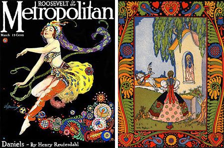
William Andrew Pogany, called “Willy”, was a prolific Hungarian born illustrator, active around the turn of the last century, who illustrated over a hundred books. Most were children’s classics like Arabian Nights, and Mother Goose, even Alice’s Adventures in Wonderland, but also included less common titles like the Bhagavad Gita and the Rubiat.Before coming to the US in 1914, he studied in Budapest, Munich and Paris, and lived in London for 10 years where he illustrated four titles that were considered his masterpieces, Colridge’s The Rime of the Ancient Mariner, Wagner’s Tannhauser, Parsifal and Lohengrin.
Pogany worked in a fluid Art-Nouveau influenced style that varied widely throughout his career. He seemed to alter his approach at will to suit the subject matter. His prints for Tisza Tales (above, right) are reminiscent of Ivan Bilibin. He also did a variety of commercial and editorial work for periodicals (above, left).
Pogany designed stage sets for the Metropolitan Opera and various Broadway productions in NY, painted murals, did art direction for movies, including uncredited work for the 1932 version of The Mummy, created architectural designs, did sculpture and, in his later years, portraits, including subjects like John Barrymore and Carole Lombard.
VictorianWeb has Pogany’s Rime of the Ancient Mariner posted online, but it’s not very satisfying. Like much of the Gutenberg Project, and the Willy Pogany archive from the University of Pennsylvania Library, it suffers from the apparent unwritten rule that public domain books posted on the web must have poorly scanned and badly reproduced versions of the illustrations.
It’s unfortunate, because his pen and ink illustrations are particularly good, but I’ve found few on the web that are reproduced well enough to get an idea of what they really look like, here’s one.
Pogany also authored a number of books on painting and drawing techniques. I first encountered Pogany in the wonderfully inexpensive Dover Books reproduction of his classic The Art of Drawing. Though perhaps not as thorough or authoritative as Loomis‘ Figure Drawing for All it’s Worth, it is still a terrific resource for any comic book artist, illustrator, animator or other artist interested in constructing the figure.
His figures have a touch of designerly, Art Nouveau charm that the more straightforward instructional drawings from Loomis and Bridgeman lack. You should be able to find some of his other illustrated books from Amazon and other sources.
Categories:
-
The drawing bench (horse)

Though I use them for painting, I have never been fond of easels when attending life drawing sessions. They always seemed awkward, uncomfortable and in my way when trying to get from model to eye to hand to paper as directly as possible.Fortunately, I encountered many interesting tools from the academic art tradition early on when I began taking classes. One of them was the use of a drawing bench, which is often called a “drawing horse” or an “art horse”, I assume because one sits astride it, and/or because one looks about as silly as a child on a wooden hobby horse when using it.
A drawing bench or horse is a wooden bench with one raised end, or with two raised ends, one higher than the other, that is designed to allow an artist (or young buckaroo) to sit astride one end and prop a drawing board up against the other.
The wonderful advantage of a drawing bench over an easel is that the drawing is below your line of sight to the model, rather than to one side.
You look up at the model, straight on and directly above your drawing, rather than stepping back or repeatedly turning your head from side to side. To me this is a much more natural and satisfactory method of drawing from life. I also think it’s significantly more comfortable, particularly over the course of an extended drawing session, or in classes day after day. Despite the notion of noble suffering for one’s art, I prefer to be as comfortable as possible when I’m concentrating on drawing.
Of course, shortly after I began to use a drawing bench, I found I preferred to misuse it. Rather than propping the drawing board almost vertically on the bench, with its lower end in one of the grooves intended for that purpose, allowing the correct arms-length pivot from the shoulder when drawing large scale (shown in my sketch above, bottom left), I began to sit forward on the bench, drawing board propped in my lap and leaning over it so that it served as miniature drawing table, allowing me to finesse small scale drawings (above, bottom right).
Many art schools and drawing sessions provide them, particularly those with 19th century academic traditions, and you can also find them from larger art suppliers. Here’s a fairly standard one from Dick Blick (image above, left). I’ve also come across models like this one (image above, top right), from chlidren’s supplier Sensory Edge that has a rounded end, that restricts your ability to misuse the thing the way I like to.
You can also find variations that have a built in easel, which defeat the purpose in my mind, or that actually have a small adjustable drawing table incorporated.
I’m not suggesting that you run out and drop $$ on a drawing bench. If you’re inclined, and modestly carpentry enabled, you can cobble one together from scrap lumber, as in this fine example of a homemade drawing horse from Meer Image (shown above, top middle).
Also, you can approximate the use of a drawing bench, or at least my assiduously incorrect application of one, by using two folding chairs, one to sit in and the other placed in front of you with its back to you, allowing you to prop your drawing board against the back and lean over it a bit like a drawing table.
If you’ve always done life drawing by turning your head side to side from an easel, this approach is certainly worth investigating; and you may find you like riding the range on your trusty drawing horse.
Giddyup!
Categories:
-
Greg Pro
Greg Pro creates concept designs and character designs for the entertainment industry, though his emphasis is not on films and games as much as it is the presentation of entertainment concepts in the form of theme park rides, theme park architecture and related designs for casinos and other venues where the physical environment is, in essence, a form of entertainment.Pro’s clients include Disney, Universal Studios, Paramount Parks and Landmark Entertainment. His web site includes galleries of illustration, storyboards, character designs and sketches.
As much as I like the ostensibly more exciting images of scenes from theme park thrill rides, I’m actually most interested his renderings for architectural environments (in the “Illustration” section).
I find the idea of creating physical spaces that are visual entertainment particularly fascinating. When I go to a theme park, I get as much, or more, enjoyment out of the appearance of the attractions as I do out of the rides and entertainment. Pro manages to convey that visual appeal in his paintings (even though the “Full Size” images on his site are still a bit small to get a real feeling for the rendering).
Pro works digitally and the “Process” section has a brief description of his approach.
Note: Like a theme park ride, Pro’s site throws sound effects at you. You may want to turn sound off if you’re viewing at work.
Categories:


Charley’s Picks
Bookshop.org
(Bookshop.org affilliate links; sales benefit independent bookshop owners; I get a small percentage to help support my work on Lines and Colors)

John Singer Sargent: Watercolors


Urban Sketching: Understanding Perspective


Charley’s Picks
Amazon
(Amazon.com affiliate links; sales go to a larger yacht for Jeff Bezos; but I get a small percentage to help support my work on Lines and Colors)
John Singer Sargent: Watercolors
Urban Sketching: Understanding Perspective