
Categories
- 3d CGI
- Amusements
- Animation
- Anime & Manga
- Art Materials
- Art Videos
- Blogroll
- Cartoons
- Color
- Comics
- Concept & Visual Dev.
- Creativity
- Digital Art
- Digital Painting
- Displaying Art on the Web
- Drawing
- Eye Candy for Today
- Gallery and Museum Art
- High-res Art Images
- Illustration
- Motion Graphics & Flash
- Museums
- Online Museums
- Outsider Art
- Painting
- Painting a Day
- Paleo Art
- Pastel, Conté & Chalk
- Pen & Ink
- Prints and Printmaking
- Reviews
- Sc-fi and Fantasy
- Sculpture & Dimensional
- Site Comments
- Sketching
- Storyboards
- Tools and Techniques
- Uncategorized
- Vector Art
- Videos & Podcasts
- Vision and Optics
- Watercolor and Gouache
- Webcomics
Archives
- May 2026
- April 2026
- March 2026
- February 2026
- January 2026
- December 2025
- November 2025
- October 2025
- September 2025
- August 2025
- July 2025
- June 2025
- May 2025
- January 2025
- December 2024
- November 2024
- October 2024
- September 2024
- August 2024
- June 2024
- April 2024
- March 2024
- February 2024
- January 2024
- December 2023
- November 2023
- October 2023
- September 2023
- August 2023
- July 2023
- May 2023
- April 2023
- March 2023
- February 2023
- January 2023
- December 2022
- November 2022
- September 2022
- August 2022
- July 2022
- June 2022
- May 2022
- April 2022
- March 2022
- February 2022
- January 2022
- December 2021
- November 2021
- October 2021
- September 2021
- August 2021
- July 2021
- June 2021
- May 2021
- April 2021
- March 2021
- February 2021
- January 2021
- December 2020
- November 2020
- October 2020
- September 2020
- August 2020
- July 2020
- June 2020
- May 2020
- April 2020
- March 2020
- February 2020
- January 2020
- December 2019
- November 2019
- October 2019
- September 2019
- August 2019
- July 2019
- June 2019
- May 2019
- April 2019
- March 2019
- February 2019
- January 2019
- December 2018
- November 2018
- October 2018
- September 2018
- August 2018
- July 2018
- June 2018
- May 2018
- April 2018
- March 2018
- February 2018
- January 2018
- December 2017
- November 2017
- October 2017
- September 2017
- August 2017
- July 2017
- June 2017
- May 2017
- April 2017
- March 2017
- February 2017
- January 2017
- December 2016
- November 2016
- October 2016
- September 2016
- August 2016
- July 2016
- June 2016
- May 2016
- April 2016
- March 2016
- February 2016
- January 2016
- December 2015
- November 2015
- October 2015
- September 2015
- August 2015
- July 2015
- June 2015
- May 2015
- April 2015
- March 2015
- February 2015
- January 2015
- December 2014
- November 2014
- October 2014
- September 2014
- August 2014
- July 2014
- June 2014
- May 2014
- April 2014
- March 2014
- February 2014
- January 2014
- December 2013
- November 2013
- October 2013
- September 2013
- August 2013
- July 2013
- June 2013
- May 2013
- April 2013
- March 2013
- February 2013
- January 2013
- December 2012
- November 2012
- October 2012
- September 2012
- August 2012
- July 2012
- June 2012
- May 2012
- April 2012
- March 2012
- February 2012
- January 2012
- December 2011
- November 2011
- October 2011
- September 2011
- August 2011
- July 2011
- June 2011
- May 2011
- April 2011
- March 2011
- February 2011
- January 2011
- December 2010
- November 2010
- October 2010
- September 2010
- August 2010
- July 2010
- June 2010
- May 2010
- April 2010
- March 2010
- February 2010
- January 2010
- December 2009
- November 2009
- October 2009
- September 2009
- August 2009
- July 2009
- June 2009
- May 2009
- April 2009
- March 2009
- February 2009
- January 2009
- December 2008
- November 2008
- October 2008
- September 2008
- August 2008
- July 2008
- June 2008
- May 2008
- April 2008
- March 2008
- February 2008
- January 2008
- December 2007
- November 2007
- October 2007
- September 2007
- August 2007
- July 2007
- June 2007
- May 2007
- April 2007
- March 2007
- February 2007
- January 2007
- December 2006
- November 2006
- October 2006
- September 2006
- August 2006
- July 2006
- June 2006
- May 2006
- April 2006
- March 2006
- February 2006
- January 2006
- December 2005
- November 2005
- October 2005
- September 2005
- August 2005
Relevant Blogs
Art, Painting & Sketch
- Gurney Journey
- Underpaintings
- Art and Influence
- Painting Perceptions
- Oil Painters of America
- Vasari Paint POV
- Flying Fox
- Urban Sketchers
- Bento (Smithsonian)
- Art Inconnu
- The Hidden Place
- Still Life
- Making a Mark
- The Art of the Landscape
- Exploring Color & Creativity
- Art Contrarian
- Artist A Day
- beinArt Surreal Art Collective
- Eye Level
- David Dunlop
- p.i.g.m.e.n.t.i.u.m
- CultureGrrl
- Joaquín Sorolla blog
- Artists in Pastel
“Painting a Day”
- A Painting a Day (Keiser)
- On Painting (Keiser)
- Julian Merrow-Smith
- Karen Jurick
- Jeffrey Hayes
- Carol Marine
- Abbey Ryan
- Daily Paintworks
Other Painting Blogs
- Virtual Gouache Land
- Neil Hollingsworth
- Marc Hanson
- Kevin Menck
- Marc Dalessio
- Larry Seiler
- Stapleton Kearns
- Colin Page
- Roos Schuring
- Hans Versfelt
- Titus Meeuws
- Régis Pettinari
- René Plein Air
- Belinda Del Pesco
- Robin Weiss
- Nathan Fowkes (Land Sketch)
- William Wray
- Frank Serrano
- Stephen Magsig
- Michael Chesley Johnson
- Twice a Week
- Sarah Wimperis
- Rob Adams
- Michael Cole Manley
- The Dirty Palette Club
- Mike Manley’s Draw!
Gallery Art & Illustration mix
Illustration
- Howard Pyle
- 100 Years of Illustration
- BibliOdyssey
- Illustration Art
- Today’s Inspiration
- Illustration Mundo
- Little Chimp Society
- Danny Gregory
- R D (John Martz
- Illustration Friday blog
- Monster Brains
- Illustrators & Illustrations (RU)
- Elwood H. Smith
- DaniDraws.com
- Designers Who Blog
- iSpot Blog
Sci-Fi & Fantasy
Illustration & Comics
Comics & Cartoons
- Comics Beat
- Robot 6
- Newsarama Blog
- Comic Vine
- Comics Alliance
- Forbidden Planet Int.
- Paolo Rivera
- Bolt City
- Flight
- Scott McCloud
- The Comics Journal
- Comixpedia
- Funnybook Babylon
- James Baker
- Middleton’s Sketchbook
- Boneville
- The Hotel Fred
- Paul Rivoche
- Daily Cartoonist
- Mad About Cartoons (William Wray)
- Digital Strips
Illustration & Concept
Animation & Concept
- Cartoon Brew
- Animation Blog
- Cold Hard Flash
- Concept Art World
- The CAB
- FY Concept Art
- Concept Ships
- Concept Robots
- John Nevarez
- Armand Serrano
- Marcos Mateu-Mestre
- all kinds of stuff (Kricfalusi)
- Yacin the faun (Man Arenas)
- Kelsey Mann
- Cre8tivemarks Blog
- Ice-Cream Monster Toon Cafe
- AAU Character & Creature Design
- AAU Animation Notes
- Articles and Texticles
Paleo & Scientific
Tools & Techniques
Other
Lists of Art Blogs
Art Image Resource Links
Historic Art Images
- Wikimedia Commons: Paintings
- Wikimedia Commons: Drawings
- The Athenaeum
- WikiArt (WikiPaintings)
- Google Art Project: Artists
- Google Art Project: Collections (Museums)
- ArtCyclopedia
- Web Gallery of Art
- Art Renewal Center
- Web Gallery of Impressionism
Auction Consolidation sites
Auction sites
- Sotheby’s
- Bonham’s
- Christies
- Heritage Auctions: Fine Art
- Heritage Auctions: Illustration
- Freeman’s Auctions
- Bukowskis
- Shannon’s
Image Search
Reverse Image Search (search by image)
- Tin Eye
- RevImg
- Google Image Search (camera icon)
- Bing Image Search (camera icon)
Promoting some friends and some clients of my website design business
- Twin Willows T’ai Chi studio in Wilmington DE. Taiji classes with Bryan Davis.
- Ray Hayward, Inspired Teacher of T’ai Chi ( Taiji ) in Minneapolis, Founder of Mindful Motion Tai Chi Academy
- OldHead Tattoo studio and Art Gallery in Wilmington DE. Tattoos and paintings by Bruce Gulick
- Sharon Domenico Art, pet portrait oil paintings
- Platinum Paperhanging, wallpaper hanging, Main Line and Philadelphia, PA
- Lisa Stone Design, interior designer, Main Line and Philadelphia, PA
- Studio12KPT, original art, prints, calendars and other custom printed items by Van Sickle & Rolleri
-
Flame Fractals
 Art and mathematics have a long but somewhat strained history. Well, that’s not quite true. It isn’t the intersection of art and mathematics that’s problematic, but our limited ability to understand and appreciate that relationship.
So images that are the result of mathematical calculations are immediately suspect as “not art”, and I’ll be the first to admit that Photoshop filters and Painter brushes that promise to make “paintings” out of photographs make this a very grey area (colorful, but grey).
But the proof, as they say, is in the putting, and the deciding factor is your response to the images.
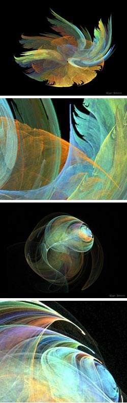
Fractals are part of a branch of mathematics that embraces infinity, dealing with infinite recursions, infinite depth and capable of generating images represent edges of infinite length, wrapped within themselves in exquisite crinolations.
The term fractal, and the equations associated with it, are the work of mathematician Benoit Mandelbrot, who I wrote about back in June. Others have built on that work and there are a number of variations on the original equations.
One is the algorithm that creates Flame fractals, created by Scott Draves in 1992, graciously made open source and incorporated into Apophysis freeware fractal designing program for Windows, the Corel KPT Collection of commercial filters for Painter and Photoshop and The GIMP open source image editor for Linux and multiple other platforms. There is a central site devoted to Flame Fractals at flam3.com.
So this is a form of mathematically generated images that you, or anyone else, can access and work with. If you view enough images created from this algorithm you’ll begin to see what is inherent in the math and what is the result of the artfulness and vision with which the parameters are manipulated to make images that stand out and are memorable, in somewhat the same manner as photography crossing the line from snapshots into art.
A nice place to start is this gallery of Flame Fractal images created by Roger Johnston on the Tech Republic site. Most of the images are linked to larger versions if you click on them, where you will begin to see the intricate detail of these wispy fantasias.
Images created using this math look as if they are delicately woven from gossamer threads of light, at times astonishingly organic in appearance, suggesting crystaline lettuce leaves, angelic wings or threads of cosmic wool. They are usually isolated into something that might be considered a virtual object or light sculpture composed of delicate lines of color interleaved with sheets of translucent patterns, cascading in not-quite-repetition and leading your eye into whorls of detail.
This kind of computer art invites your imagination to indulge in seeing images within the patterns and textures as readily as Max Ernst’s delerious decoupage, Jackson Pollock’s intricate drip-loop panoramas and, perhaps the best analogy of all, the dreamy “lay on your back on a Summer hillside” fantasies seen in passing clouds.
Categories:
-
Titian (Tiziano Vecellio)
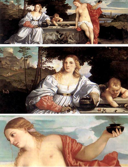
Many artists, though certainly not all, are obsessed with beauty. Titian, also known by a number of other names, but most properly Tiziano Vecellio, was obviously one of them.In addition to his desire to create works of great beauty, which he certainly did, was his fascination with the physical beauty of idealized women, as realized in his many canvasses of the goddess Venus. Beyond that, however, seemed to be a fascination with the fleeting nature of beauty and how our obsession with it dominates us.
His famous masterpiece, Sacred and Profane Love (above), which I’ve had the pleasure of being dazzled by in the Borghese Gallery in Rome, was incorrectly titled in the late 18th Century and interpreted to elevate the spiritual above the base concerns of the flesh (“profane love” meaning vanity, not sex). Modern Americans might also look at the painting and mis-identify the figures based on misguided ideas of propriety.
The painting was commissioned to celebrate a marriage. It is the clothed figure of the bride, sitting on a sarcophagus carved with the crest of the of the groom’s family, that represents the Earthly and temporal. Prior to the marriage, she is visited by cupid and Venus herself, who carries the eternal flame of God’s love and represents the sacred and eternal. Rather than condemning one and extolling the other, the painting actually glorifies both aspects of love. These were warm-blooded Italians in the flowering of the Renaissance, not the dour English Puritans from whom we Americans inherited much of our “morality”.
Titian knew that beauty was fleeting, though, and often played with the themes like the Worship of Venus and vanity.
Titian was an enormously influential artist. Rembrandt used one of Titian’s portraits (possibly a self-portrait) as a model for the composition of one his own self-portraits. Rubens copied his compositions, and many other great artists, at the time and subsequently, have been dramatically influenced by his refined color, sweeping compositions and masterful handling of the medium of oil paint. Titian was one of the first to use the medium on canvas rather than on boards.
It’s difficult to tell from the reproductions available on the web, but Titian’s rich, subtle colors were both smoothly blended and applied with ground-breaking visible strokes that presaged the work of later painters. In his later work, however, he seems to almost regress, losing the boldness of his color and adopting a more subdued palette. This may have been an emotional response to the death of his wife.
Titian is almost always mentioned with two other great Venetian painters, Bellini and Giorgione, his teacher and collaborator, respectively. Both are worth investigating if you have the time.
There are currently two exhibits in Europe that feature Titian’s works: Bellini, Giorgione, Titian at the Kunsthistorisches Museum in Vienna (more here on Art Knowledge News), which I just missed at the NGA in Washington, and From Titian to Tiepopo, a show of Venetian Drawings at the Stadel Museum in Frankfurt (more here on Art Knowledge News).
There are a number of Titian’s works on view at museums here in the US, you’ll find many of them listed on Artcyclopedia. (Several pieces from the NGA are currently in Vienna.)
Sacred and Profane Love is not on loan and still resides in the Borghese Gallery in Rome. Collector Sciopione Borghese bought the painting in 1608.
In 1899 the Rothschilds offered to buy Sacred and Profane Love for a sum that was greater then the acknowledged value of the entire Galleria Borghese and all its works. The offer was refused.
Categories:
-
Tom Kidd
 I’ve long had a fascination with airships. The idea of an aircraft that drifts slowly through the sea of sky, gently buoyed by the density of air rather than forcing its way up with raw power, has always seemed appealing. If they ever get around to offering luxury cruises by airship, I’ll be among the first to sign up.
It was airships that attracted me to Tom Kidd’s work. I first encountered his illustrations a number of years ago at a comics and science fiction convention (somewhere on Long Island) in which some of his originals were on display as part of the art show. The first thing I noticed were his wonderful depictions of airships, not ordinary airships, mind you, but airships as H.G Wells might have enjoyed them, imaginatively designed, richly decorated and finely arrayed.
The paintings were from an ongoing project of Kidd’s called Gnemo, a series of images of a fantastical world, the origin of which he assigns to a mythical artist of the same name.
The name, of course, it a take off on the lead character from Winsor McCay’s incredible newspaper strip from the early 20th Century, Little Nemo In Slumberland. The world Kidd has conjured up, in fact is filled with references to McCay (such at the name of the city pictured here, “Winsor McCay City”) and other famous illustrators and artists like Wyeth, Schoonover, Pyle, Dunne, Moran, Sloane, Krenkel and others.
Kidd is a fantasy and science fiction illustrator who has done illustrations for publishers like Tor Books, Random House, Doubleday and William Morrow. He has also done work for Marvel Comics and has illustrated versions of classic books like Dumas’ The Three Musketeers (gallery here) and Wells’ The War of The Worlds. His illustrations can also be found in The Banquet of the Lords of Night and Other Stories, written by Liz Williams, and in the new collection of his work, Kiddography: The Art and Life of Tom Kidd.
Kiddogrophy is also the name of Kidd’s blog, in which he posts his work, both recent and past, and talks about how it was created, including a detailed discussion of the Gnemo image of Winsor McCay City shown here. The blog is supplemented with another, Gnemo’s Sketchbook, dedicated to the imaginary artist from which Kidd supposedly “inherited” the drawings.
Kidd’s illustrations run from straight-ahead science fiction subjects to dragons-and-wizards fantasy, but the ones I enjoy most, in addition to the Gnemo illustrations, are the ones in which his penchant for portraying the style and feeling of Victorian fantasy holds sway. His illustrations are richly colored, wonderfully imaginative and often lavishly detailed.
Kidd is a 4-time winner of Science Fiction’s prestigious Hugo Award and a 5-time winner of the Chesley Award, named for pioneering space illustrator Chesley Bonestell, who Kidd lists as one of his influences.
There are quite a few images on Kidd’s site, and there is a nice click-through feature for browsing through them, but many of them are unfortunately a bit small to get a real feeling for his work. I’ve listed a couple of unofficial galleries below with larger images, but they require a strong pop-up blocker and stomach for animated banner ads.
Kidd is currently working on a new book with more of his delightful flights of fancy on the Gnemo theme, Gnemo: Airships, Adventure, Exploration. Hopefully, it will be among the books found in the reading rooms on the next generation of luxury cruise airships.
Categories:
-
Francis Livingston
 Although influenced by Sargent and Whistler, Francis Livingston painted for a while almost monochromatically, but eventually embraced color with a vengeance, apparently after studying the painters of the Bay Area Figurative Movement, the California Impressionists and their inspiration, the original French Impressionists.
I wouldn’t put Livingston’s work in the Impressionist mold, though. Instead of small strokes of color optically blended to make larger shapes, he uses big bold blocks of color, chips and chunks of color, (perhaps troweled in with a palette knife in places) to define his forms.
In fact he seems to luxuriate in the physical presence of the paint, using wonderful fat strokes of buttery oil paint, laid on with three-dimensional thickness, stroke defining edges raised above the surface of the canvas. The effect is one of energetic abandon to the luxury of color, and a feeling of the rich sensuality of paint, looking as if it was just squeezed from the tube.
His subjects vary from urban scenes, particularly theater fronts and amusement parks, to landscapes of the American west, specifically Idaho where he moved with his family after living in San Francisco for a number of years. His color range varies with subject, at times with bright contrasts and other times in muted, atmospheric harmony. He also seems particularly intrigued with the geometry of his subjects, and his compositions often emphasize the primitive shapes he sees in them.
Livingston’s bios list him as having been a successful illustrator, although I haven’t been able to find much in the way of examples of his illustration on the web. Fortunately, there are plenty of examples of his gallery work on several sites for commercial galleries, a couple of which have large enough versions of the images to get a feeling for the rich, painterly quality of his canvasses.
Categories:
-
Russ Manning

You might look at the comic page above and think “Oh, someone’s doing a take-off of Star Wars.”, except that you’d be wrong by almost 40 years. It’s a page from Magnus, Robot Fighter 4000 AD, a character created and drawn by comics artist Russ Manning in the early 1960’s.Magnus, Robot Fighter depicted a semi-utopian world of the year 4000, in which great-looking men and women living in cities of sleek skyscrapers and flying cars had abdicated many of their personal responsibilities to domestic and official robots, with less than ideal consequences. The strip was drawn in a beautiful style with elegant linework and superb draftsmanship. His futuristic designs still look advanced, where most science fiction illustration and comic art from the time looks impossibly dated.
Ironically, Manning did later work on Star Wars comics, writing and drawing the Star Wars newspaper strip in the late 1970’s, toward the end of his career. He also worked on the newspaper strip Tarzan as well as the Tarzan comic book other comics for Dell and Gold Key. He also created Tarzan graphic albums that were aimed at the European market (and are now being reprinted by Dark Horse).
Manning was influenced by comics greats like Alex Raymond and Al Williamson, and in turn has been a great influence on many contemporary comics artists, among them William Stout and Dave Stevens, who worked as his assistants at one time, and in particular Steve Rude, who shows a dramatic influence from Manning’s solid draftsmanship and beautifully controlled line.
There an extensive, if somewhat awkward to navigate, Russ Manning Tribute on the online Edgar Rice Burroughs magazine ERBZine. Look for images outlined in blue, which connect to enlarged images or additional pages. Most of the images are not large, but you can get a feeling for the quality of his work and the extent of his career. The Magnus, Robot Fighter sequence from which the above page comes is on this page.
The beautiful Magnus , Robot Fighter 4000 AD stories are being collected by Dark Horse and released as hardback collections, Volume 1, Volume 2 and Volume 3. There are also collections of the European-aimed Tarzan albums, Tarzan the Untamed, Tarzan: Jewels of Opar and Tarzan: The Land that Time Forgot.
Categories:
-
Malcolm McNeill
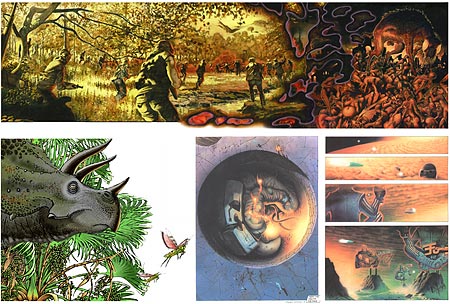
Malcolm McNeill is an illustrator, concept artist and comics artist based in New York. His work has appeared in publications like The New York Times, National Lampoon and titles for Marvel Comics.McNeill was collaborating with William S. Burroughs, before his death, on an “word/image novel” called Ah Pook is Here (image above, top), based, I believe, on a short story by the same name (which was also the inspiration for an animated short by Philip Hunt). McNeill worked on the project with Burroughs intermittently for seven years. Unfortunately the project was eventually abandoned because of insufficient funding. The glimpse of the work is tantalizing. It looks like McNeill is playing with the comics narrative form in some interesting and novel ways.
McNeill is at work on his own graphic novel, 0º, and a non-fiction graphic narrative called 1%, in which he also seems to be playing with narrative conventions. It’s too bad that the images on the site are relatively small.
He wrote and illustrated a science fiction comic series called Tetra (above, two images at bottom, right) that ran in Gallery magazine for two years.
He has also done concept design for TV, including concept, design and art direction for the Saturday Night Live opening sequence in which the cast appeared as giants among the buildings of New York, as well as a number of commercial spots.
There are some nicely done illustrations for a dinosaur-themed project in the Kids section (above, image at bottom, left), for which he lists contributions of character design and script development but doesn’t indicate the name of the project.
Addendum: Malcolm has let me know that he in now in LA, not NY, he’s just completed a book about the collaboration with Burroughs, which took place in the 70’s, and the book will include the artwork in various stages of completion. The dinosaur images are for a book/film called “Pterrence with a P”, which he storyboarded, but has left to work on 0º. He also notes that anyone interested in contacting him for professional inquiries can simply ask for larger versions of the images.
Note: Site contains NSFW images.
Addendum 2 (9/11/07): McNeill has posted a sited devoted specifically to the Burroughs project, which is now spelled Ah Puch is Here. There is now a fairly extensive interview with malcom McNeill posted on RealityStudio.org, and another on George Laughead’s Beats in Kansas, in which he talks about collaborating with Burroughs.
Categories:


Charley’s Picks
Bookshop.org
(Bookshop.org affilliate links; sales benefit independent bookshop owners; I get a small percentage to help support my work on Lines and Colors)

John Singer Sargent: Watercolors


Urban Sketching: Understanding Perspective


Charley’s Picks
Amazon
(Amazon.com affiliate links; sales go to a larger yacht for Jeff Bezos; but I get a small percentage to help support my work on Lines and Colors)
John Singer Sargent: Watercolors
Urban Sketching: Understanding Perspective